


 本文介绍如何使用 CSS3 的 transform 属性实现沿轴翻转和跑马灯效果,包括设置 perspective 和 transform-style 保持 3D 空间感,并通过关键帧动画实现连续动态效果。
transform加到需要3D转换的元素上,perspective加到父元素上:
rotateX:
rotateY:
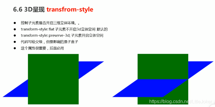
假如子盒子添加的3D效果,父盒子又加了3D效果,则需要给父盒子添加 transform-style: preserve-3d;属性才可以保留子盒子的3D效果
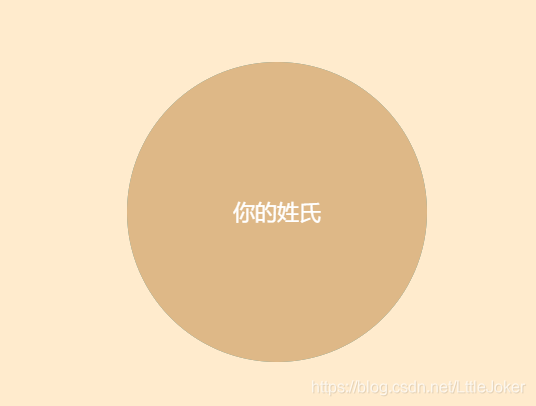
小案例1:当鼠标指向父盒子的时候,父盒子沿Y轴翻转。

<div class="box">
    <div class="front">我的名字</div>
    <div class="back">你的姓氏</div>
</div>
.box {
position: relative;
width: 300px;
height: 300px;
margin: 100px auto;
transition: all 0.4s;
/*让背面的紫色盒子保留立体空间*/
transform-style: preserve-3d;
font-size: 22px;
}
.box:hover{
transform: rotateY(180deg);
}
.front, .back {
position: absolute;
top: 0;
left: 0;
width: 100%;
height: 100%;
border-radius: 50%;
color: white;
text-align: center;
line-height: 300px;
}
.front {
background-color: cadetblue;
}
.back {
background-color: burlywood;
transform: rotateY(180deg);
}
body{
background-color: blanchedalmond;
perspective: 400px;
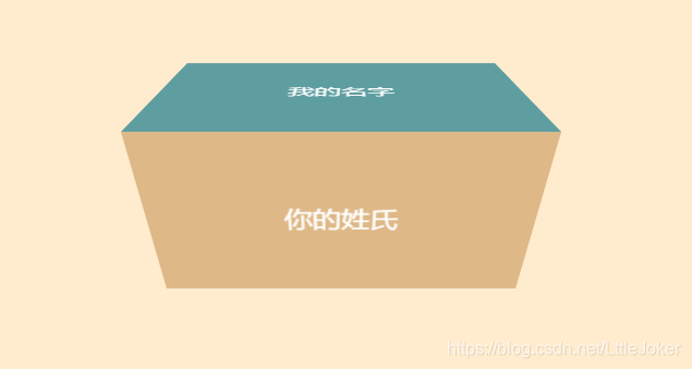
}小案例2:当鼠标指向盒子,盒子将沿X轴翻转。
<div class="box">
    <div class="front">我的名字</div>
    <div class="back">你的姓氏</div>
</div>
.box {
position: relative;
width: 300px;
height: 150px;
margin: 100px auto;
transition: all 2s;
/*让背面的紫色盒子保留立体空间*/
transform-style: preserve-3d;
font-size: 22px;
}
.box:hover {
transform: rotateX(90deg);
}
.front, .back {
position: absolute;
top: 0;
left: 0;
width: 100%;
height: 100%;
color: white;
text-align: center;
line-height: 150px;
}
.front {
background-color: cadetblue;
transform: translateZ(75px);
}
.back {
background-color: burlywood;
transform: translateY(75px) rotateX(-90deg);
}
body {
background-color: blanchedalmond;
perspective: 400px;
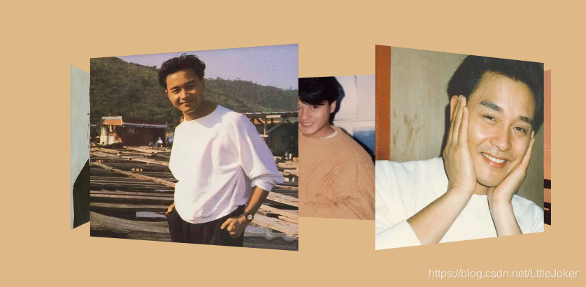
}跑马灯案例:核心原理就是将几张图片绕着Y轴旋转,添加动画效果即可
效果图:
<section>
    <img src="img/img.jpg">
    <img src="img/img2.jpg">
    <img src="img/img3.jpg">
    <img src="img/img4.jpg">
    <img src="img/img5.jpg">
    <img src="img/img6.jpg">
    <img src="img/img7.jpg">
</section>
body {
perspective: 1000px;
background-color: burlywood;
}
@keyframes rotate {
0% {
transform: rotateY(0);
}
100% {
transform: rotateY(360deg);
}
}
section:hover {
animation-play-state: paused;
}
section {
position: relative;
width: 260px;
height: 200px;
margin: 150px auto;
transform-style: preserve-3d;
animation-name: rotate;
animation-duration: 10s;
animation-iteration-count: infinite;
animation-timing-function: linear;
}
section img {
position: absolute;
top: 0;
left: 0;
width: 100%;
height: 100%;
}
section img:first-child {
transform: translateZ(300px);
}
section img:nth-child(2) {
transform: rotateY(60deg) translateZ(300px);
}
section img:nth-child(3) {
transform: rotateY(120deg) translateZ(300px);
}
section img:nth-child(4) {
transform: rotateY(180deg) translateZ(300px);
}
section img:nth-child(5) {
transform: rotateY(240deg) translateZ(300px);
}
section img:nth-child(6) {
transform: rotateY(300deg) translateZ(300px);
}


 扫一扫
扫一扫


 1176
1176

 被折叠的 条评论
为什么被折叠?
被折叠的 条评论
为什么被折叠?
 到【灌水乐园】发言


