


 本文详细介绍了CSS3的perspective属性和perspective-origin属性,用于实现三维空间的透视效果。perspective定义了元素的透视距离,使得元素呈现近大远小的视觉感受。而perspective-origin则允许指定观察者的角度,可以调整透视的出发点。通过实例代码和变化演示,帮助读者深入理解这两个属性的工作原理。
CSS3 perspective & perspective-origin
perspective 属性:定义一个透视距离,实现透视效果
perspective 属性是 CSS3 新增的特性,可以使我们的页面呈现出透视的效果。
- 透视:就是在平面或曲面中描绘出物体的空间感、立体感,就像现实生活中看到景物有着近大远小的效果
perspective 的值是一个长度,表示可透视的最大距离。例如: perspective: 1000px;。
设置了 perspective 属性之后,使用含有3D效果的属性,就会产生近大远小的效果。
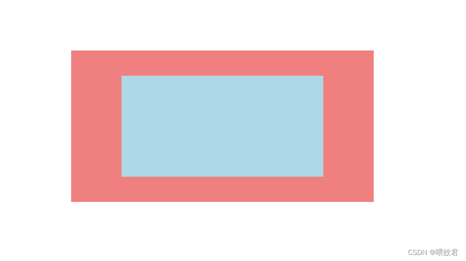
例子1:
- 我们给父子关系的两个元素设置成同样大小,不同的背景色(这时候,我们只能看见蓝色的子元素)
- 我们给父元素添加透视属性
perspective: 1000px,给子元素添加transform: translateZ(-500px);让子元素沿Z轴后退 500px 的距离(这时候,子元素缩小了,有了近大远小的效果。如图所示)
<!DOCTYPE html>
<html lang="en">
<head>
    <meta charset="UTF-8">
    <title>Document</title>
    <style>
        body {
            margin: 0;
        }

        .father {
            background: lightcoral;
            width: 400px;
            height: 200px;
            margin: 200px auto;
            perspective: 1000px;
        }

        .son {
            background: lightblue;
            width: 400px;
            height: 200px;
            transform: translateZ(-500px);
        }
    </style>
</head>
<body>
    <div class="father">
        <div class="son"></div>
    </div>
</body>
</html>
!!!注意:按道理子元素沿Z轴后退 500px 的距离,我们是看不见的才对,应该在父元素的后面,被父元素遮住。但是因为我们现在是2D渲染的效果,若给父元素添加 transform-style: preserve-3d; 使父元素变成一个3D渲染的元素,那么我们就看不见子元素了。
perspective-origin 属性:定义一个观察者的角度
perspective-origin 属性可以定义一个观察者的角度,俯视、仰视、左右侧视等等。
perspective-origin 属性有两个值,取值有3种方式:长度、百分比、方位单词。
取值:
perspective-origin: x轴距离 y轴距离;
perspective-origin: x轴百分比 y轴百分比; 默认观察源为 50% 50%,父元素的中心点
perspective-origin: 方位单词1 方位单词2; 方位单词:top、bottom、center、left、right
- 若只设置了一个值,则第二个值默认为 50%
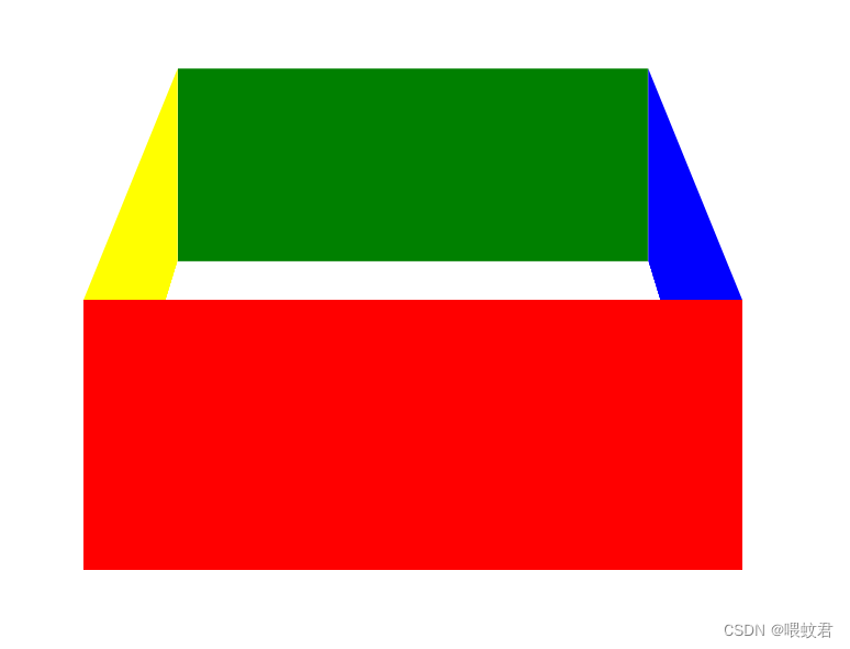
例子2:
- 可以复制源码到自己的html文件里,用开发者工具调试 ul 里的
transform: rotateX(-35deg);的值。改变盒子的倾斜度,更容易观察盒子 - 可以调试
perspective-origin: 50% 50%;里的值,观察盒子的变化,更容易理解。
<!DOCTYPE html>
<html lang="en">

<head>
    <meta charset="UTF-8">
    <title>Document</title>

    <style>
        body {
            margin: 0;
        }

        ul {
            position: relative;
            width: 400px;
            height: 200px;
            margin: 200px auto;
            padding: 0;
            list-style: none;
            perspective: 1000px;
            perspective-origin: 50% 50%;
            transform-style: preserve-3d;
            transform: rotateX(-35deg);
        }

        li {
            position: absolute;
            top: 0;
            left: 0;
        }

        li:nth-child(1) {
            background: red;
            width: 400px;
            height: 200px;
        }

        li:nth-child(2) {
            background: yellow;
            width: 400px;
            height: 200px;
            transform-origin: 0;
            transform: rotateY(90deg);
        }

        li:nth-child(3) {
            background: blue;
            width: 400px;
            height: 200px;
            transform-origin: 400px;
            transform: rotateY(-90deg);
        }

        li:nth-child(4) {
            background: green;
            width: 400px;
            height: 200px;
            transform: translateZ(-400px);
        }
    </style>
</head>

<body>
    <ul>
        <li></li>
        <li></li>
        <li></li>
        <li></li>
    </ul>
    </div>
</body>

</html>


 扫一扫
扫一扫


 106
106

 被折叠的 条评论
为什么被折叠?
被折叠的 条评论
为什么被折叠?
 到【灌水乐园】发言


