


制作人员介绍卡片
目标

Step 1.
基本架构与文字内容
每个item容器里都有图片跟文字区块
<body>
<div class="wrap">
<div class="item">
<img src="https://picsum.photos/300/300/?random=1">
<div class="txt">
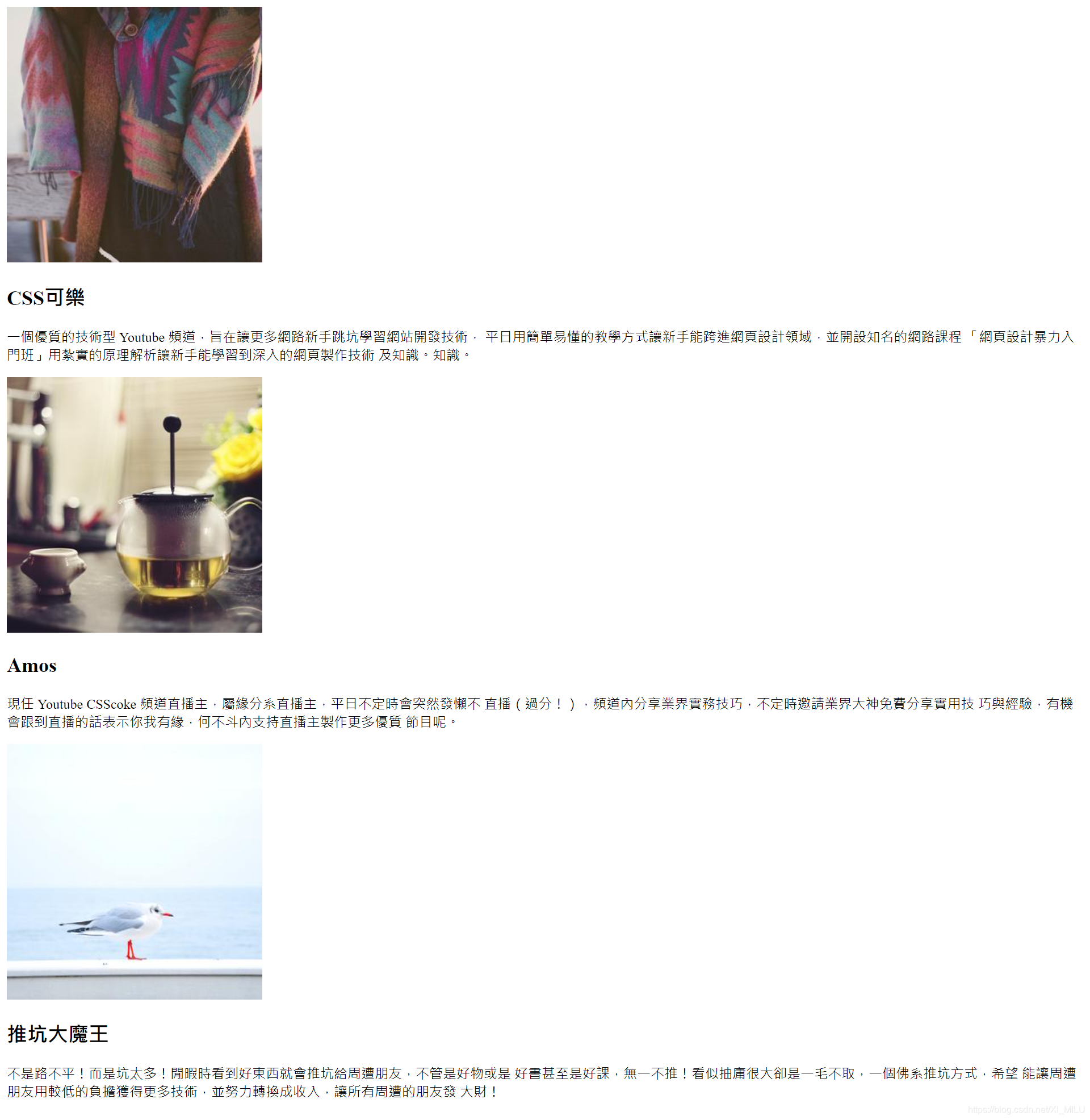
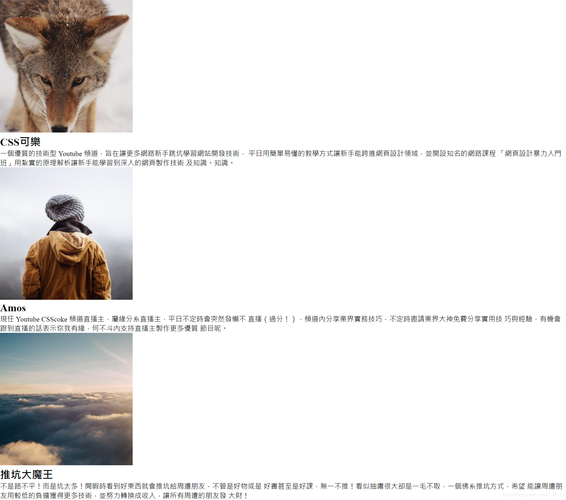
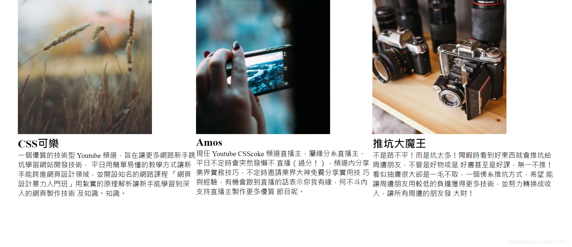
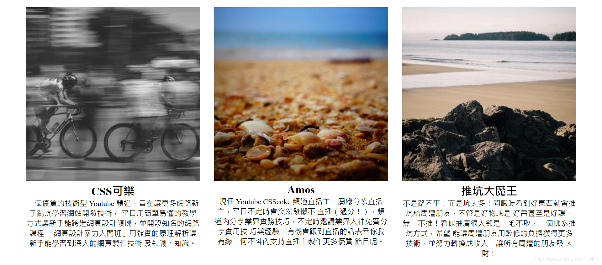
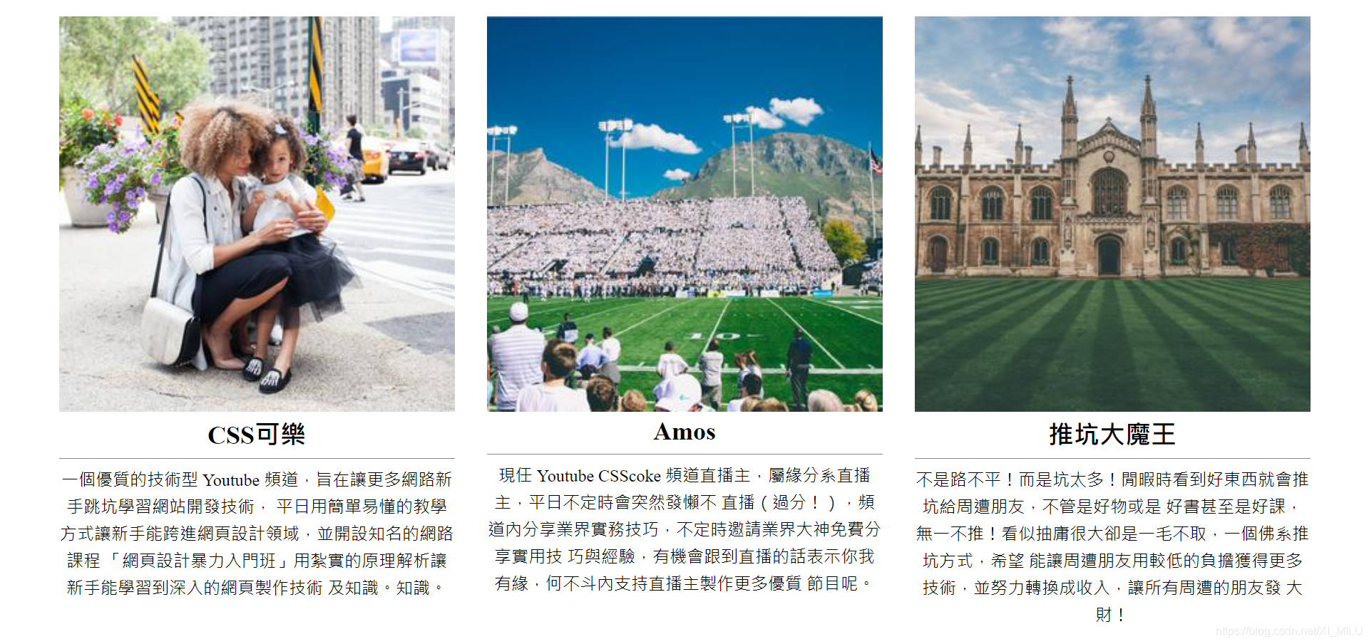
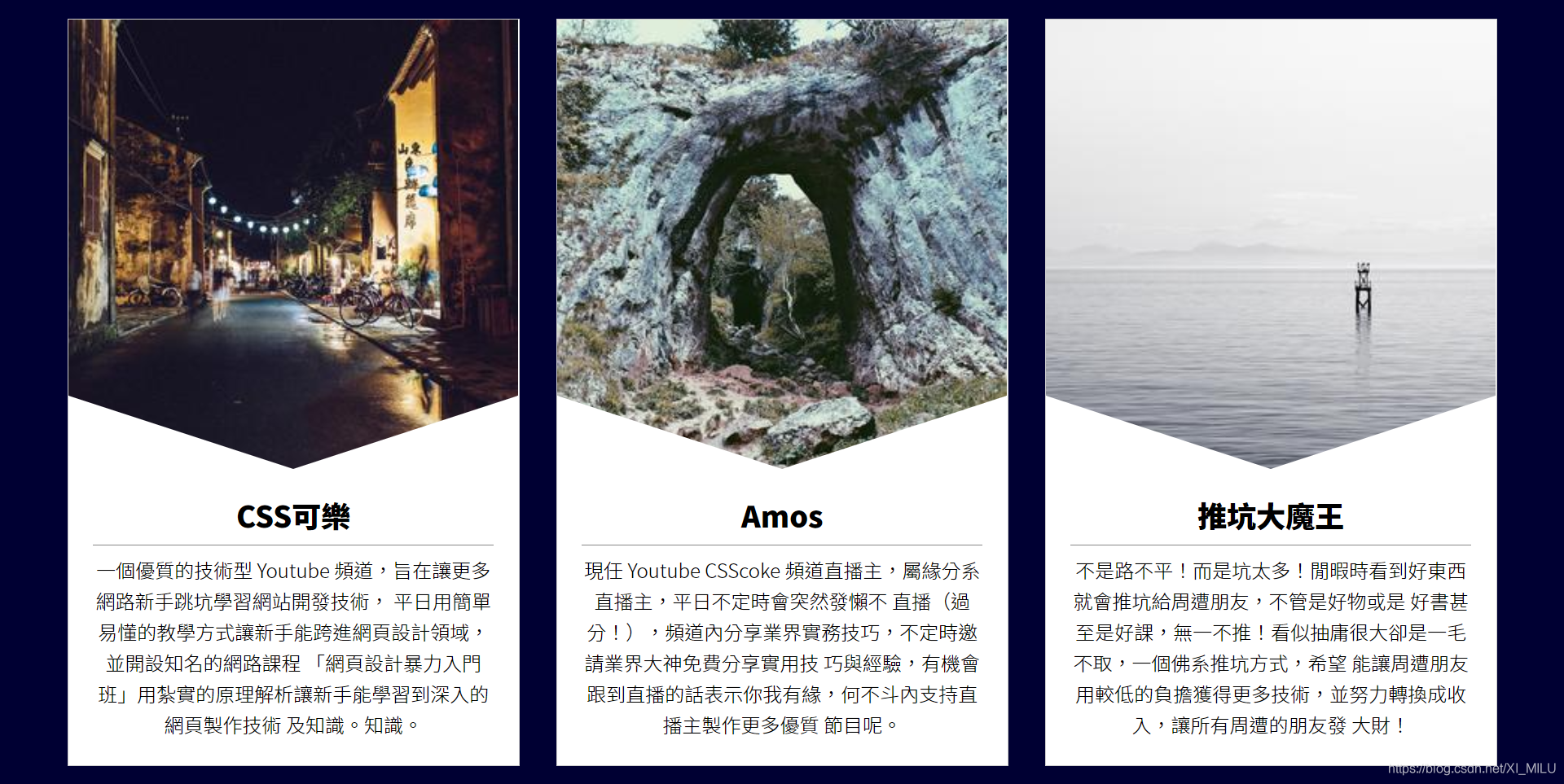
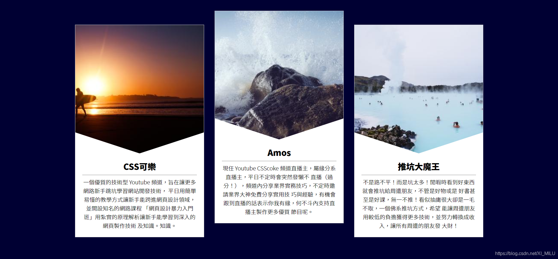
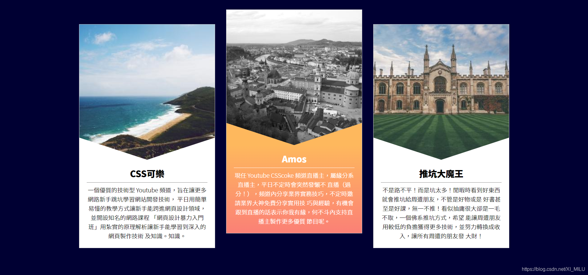
<h2>CSS可樂</h2>
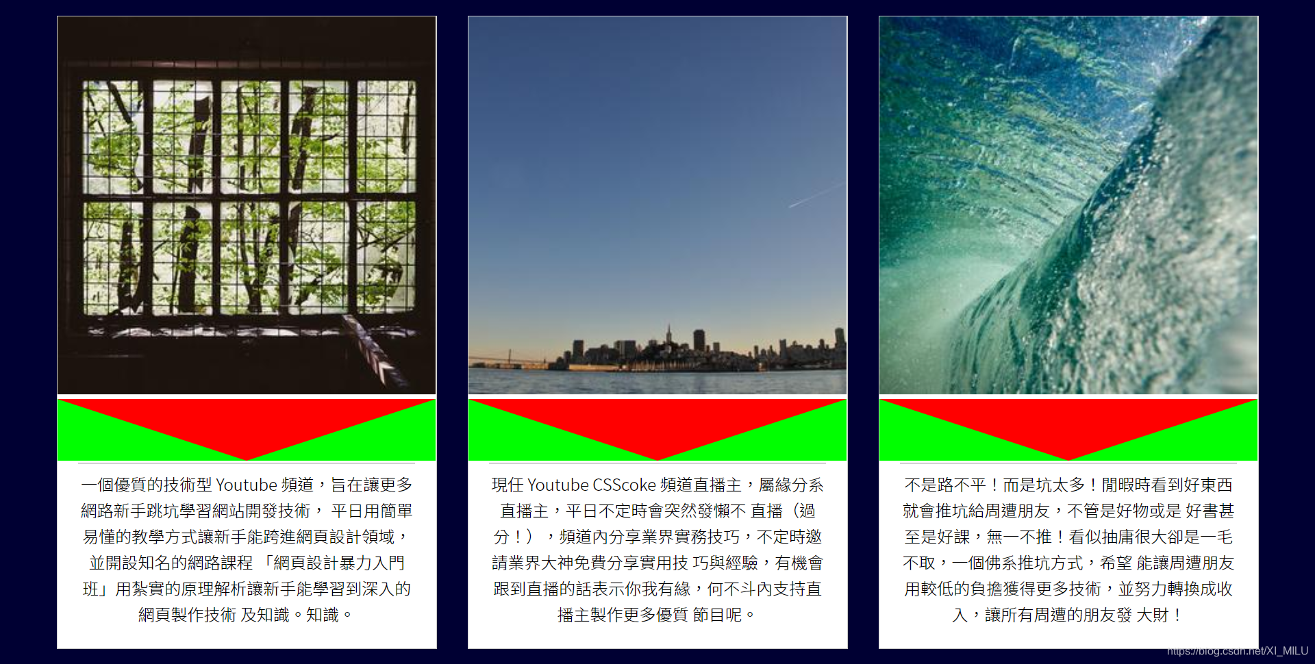
<p>一個優質的技術型 Youtube 頻道,旨在讓更多網路新手跳坑學習網站開發技術,
平日用簡單易懂的教學方式讓新手能跨進網頁設計領域,並開設知名的網路課程
「網頁設計暴力入門班」用紮實的原理解析讓新手能學習到深入的網頁製作技術
及知識。知識。</p>
</div>
</div>
<div class="item">
<img src="https://picsum.photos/300/300/?random=2">
<div class="txt">
<h2>Amos</h2>
<p>現任 Youtube CSScoke 頻道直播主,屬緣分系直播主,平日不定時會突然發懶不
直播(過分!),頻道內分享業界實務技巧,不定時邀請業界大神免費分享實用技
巧與經驗,有機會跟到直播的話表示你我有緣,何不斗內支持直播主製作更多優質
節目呢。</p>
</div>
</div>
<div class="item">
<img src="https://picsum.photos/300/300/?random=3">
<div class="txt">
<h2>推坑大魔王</h2>
<p>不是路不平!而是坑太多!閒暇時看到好東西就會推坑給周遭朋友,不管是好物或是
好書甚至是好課,無一不推!看似抽庸很大卻是一毛不取,一個佛系推坑方式,希望
能讓周遭朋友用較低的負擔獲得更多技術,並努力轉換成收入,讓所有周遭的朋友發
大財!</p>
</div>
</div>
</div>
</body>
Step 2.
版面初始化
<style>
	* {
	    margin: 0;
	    padding: 0;
	    list-style: none;
	}
</style>
Step 3.
wrap容器CSS设定
<style>
	.wrap {
	    width: 1200px;
	    display: flex;
	    margin: auto;
	}
</style>
margin: auto;auto代表左右两边一起平分剩下的可用空间,所以可以得到置中的结果。
Step 4.
item容器CSS设定
<style>
	.item {
	     width: 370px; /* 400- 15*2(margin) */
	     margin: 15px;
	     text-align: center; /* 文字置中 */
	 }
	 .item img {
	     width: 100%;
	 }
</style>
Step 5.
在標題下添加底线,並為段落設定行高
<style>
	.item h2 {
	    border-bottom: 1px solid #888;
	    padding-bottom: .3em;
	    margin-bottom: .3em;
	}
	.item p {
	    line-height: 1.6; /* 行高 */
	}
</style>
認識「em」單位
在 CSS 中,em 單位是相對長度單位。它是相對於該元素本身字體大小(font-size 屬性)的值。
若在一個沒有設定 font-size 的「元素」上,有其他屬性是以 em 做為長度單位,它則會繼承「父元素」的 font-size 屬性值,做為 em 單位的參考值。若父元素也無設定 font-size 屬性值,則繼續往上繼承,直到根元素;若 CSS 中皆無設定,則依照瀏覽器預設值:通常是 16px。
Step 6.
设定网页字型、文字粗细 ( 使用google api )
<link href="https://fonts.googleapis.com/css2?family=Noto+Sans+TC:wght@100;300;500;900&display=swap" rel="stylesheet">
<style>
    * {
        margin: 0;
        padding: 0;
        list-style: none;
        font-family: 'Noto Sans TC', sans-serif;
    }
    .item h2 {
        border-bottom: 1px solid #888;
        padding-bottom: .3em;
        margin-bottom: .3em;
        font-weight: 900;
    }
    .item p {
        line-height: 1.6;
        font-weight: 300;
    }
</style>
Step 7.
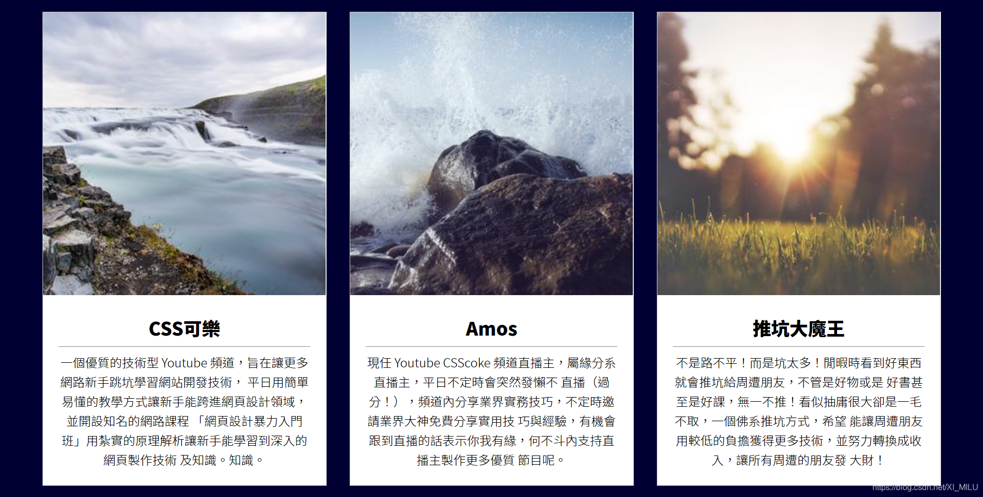
为网页设定背景色(深蓝色)、把item容器垂直居中并改成白色背景
<style>
        html, body {
            height: 100%;
        }
        body {
            display: flex;
            align-items: center;
            background-color: #003; /* 深蓝色 */
        }
        .item {
            width: 370px;
            margin: 15px;
            text-align: center;
            background-color: #fff; /* 白色背景 */
        }
    </style>
Step 8.
替item容器加边匡( width要扣回来 )、文字加padding
<style>
	.item {
	     width: 368px;
	     margin: 15px;
	     text-align: center;
	     background-color: #fff;
	     border: 1px solid #ccc; /*边匡*/
	 }
	 .item .txt {
	     padding: 20px;
	 }
</style>
Step 9.
建立三角形区域
<style>
	.item .txt {
	    padding: 20px;
	    position: relative;
	}
	.item .txt:before{
	    content: '';
	    position: absolute; /*设定定位后东西会自动转成block*/
	    width: 0;
	    height: 0;
	    left: 0; /*位置*/
	    top: 0; /*位置*/
	    border-top: 60px solid #f00;
	    border-left: 184px solid #0f0;
	    border-right: 184px solid #0f0;
	}
</style>
Step 10.
去除图片下方空白区块
可以透过将vertical-align设定为baseline以外的值实现。
<style>
	.item img {
	    width: 100%;
	    vertical-align: middle;
	}
</style>
Step 11.
修改边匡线颜色(透明色、白色)并移到适当位置
<style>
	.item .txt:before{
	   content: '';
	    position: absolute;
	    width: 0;
	    height: 0;
	    left: 0;
	    top: 0;
	    border-top: 60px solid transparent; /*透明色*/
	    border-left: 184px solid #fff; /*白色*/
	    border-right: 184px solid #fff; /*白色*/
	    transform: translateY(-100%);
	}
</style>
translate功能介紹
語法:
transform: translate(單位或百分比, 單位或百分比);
transform: translateX(單位或百分比);
transform: translateY(單位或百分比);
第一種語法可以同時聲明X軸、Y軸的平移數值 ; 第二、三種語法可以單純聲明X軸或Y軸的平移數值。
-
單位平移
以單位平移的方式很單純,單位值為多少就平移多少,且transform支援負值。 -
%百分比平移
translate的百分比基準是自己的width跟height。
Step 12.
制作上下移动的动画,当滑鼠碰到item区块时会往上移动
<style>
	.item {
	    width: 368px;
	    margin: 15px;
	    text-align: center;
	    background-color: #fff;
	    border: 1px solid #ccc;
	    transform: translateY(0px);
	    transition: .5s;
	}
	.item:hover {
	    transform: translateY(-40px);
	}
</style>
Step 13.
替txt区块背景、边匡线、文字与底线制作变色动画
- 背景变成渐层式橘色
- 边匡线变成橘色
- 文字与底线变成白色
<style>
    .item p {
        line-height: 1.6;
        font-weight: 300;
        transition: .25s; /*动画长度*/
    }
    .item:hover .txt {
        background-image: linear-gradient(0deg, #FB8076, #FEB85D ); /*从下到上开始变色*/
    }
    .item:hover .txt:before {
        border-left: 184px solid #FEB85D; /*橘色*/
        border-right: 184px solid #FEB85D; /*橘色*/
    }
    .item:hover h2 {
        color: #fff; /*白色*/
        border-bottom-color: #fff; /*白色底线*/
    }
    .item:hover p {
        color: #fff; /*白色*/
    }
</style>


 扫一扫
扫一扫


 1740
1740

 被折叠的 条评论
为什么被折叠?
被折叠的 条评论
为什么被折叠?
 到【灌水乐园】发言


