


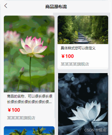
uniapp移动端的商品列表和商品分类页面,虽然这种页面样式已经烂大街了,但不可否认的是这样的页面布局依然很常见,所以为了避免重复写代码,在此记录,用到了就复制过去修改下细节,理论上应该可以节省一些时间
预览效果

商品列表页源码
<template>
  <view class="content">
    <div class="tops">
      <div class="t-item">综合</div>
      <div class="t-item">销量</div>
      <div class="t-item choose" @click="clickPrice">
        <span>价格</span>
        <span v-if="isPrice">
          <svg t="1712993436208" class="icon" viewBox="0 0 1024 1024" version="1.1"
            xmlns="http://www.w3.org/2000/svg" p-id="6150" width="15" height="15">
            <path d="M512 0l307.2 409.6H204.8z" fill="#EB6A0D" p-id="6151"></path>
            <path d="M512 1024l307.2-409.6H204.8z" fill="#EBEBEB" p-id="6152"></path>
          </svg>
        </span>
        <span v-else>
          <svg t="1712993501022" class="icon" viewBox="0 0 1024 1024" version="1.1"
            xmlns="http://www.w3.org/2000/svg" p-id="6301" width="15" height="15">
            <path d="M512 0l307.2 409.6H204.8z" fill="#EBEBEB" p-id="6302"></path>
            <path d="M512 1024l307.2-409.6H204.8z" fill="#EB6A0D" p-id="6303"></path>
          </svg>
        </span>
      </div>
      <div class="t-item">筛选</div>
    </div>

    <div class="lists">
      <div class="l-item" v-for="(item,index) in 20" :key="index">
        <image
          src="https://images.pexels.com/photos/5272964/pexels-photo-5272964.jpeg?auto=compress&cs=tinysrgb&w=600"
          mode="aspectFill"></image>
        <view class="desc">
          <view class="tit">
            商品名称商品名称
          </view>
          <view class="infos">
            <view class="price">
              <span class="buyPrice">¥120.00</span>
              <span class="hua">¥120.00</span>
            </view>
            <view class="btn">
              去购买
            </view>
          </view>
        </view>
      </div>
    </div>
  </view>
</template>

<script>
  export default {
    data() {
      return {
        isPrice: false,
      }
    },
    methods: {
      clickPrice() {
        this.isPrice = !this.isPrice
      },
    }
  }
</script>

<style scoped>
  .content {
    min-height: calc(100vh - 88rpx);
    padding: 0rpx 35rpx 20rpx;
    box-sizing: border-box;
    background-color: #f5f5f5;
  }

  .tops {
    position: fixed;
    top: 80rpx;
    left: 0;
    width: 100%;
    z-index: 99;
    padding: 0rpx 35rpx;
    box-sizing: border-box;
    display: flex;
    justify-content: space-around;
    align-items: center;
    line-height: 70rpx;
    background-color: #fff;
    box-shadow: 2rpx 2rpx 10rpx #eee;
  }

  .tops .t-item {
    font-size: 30rpx;
    color: #333;
  }

  .t-item:hover {
    color: #ff5500;
  }

  .choose {
    display: flex;
    align-items: center;
  }

  .choose span {
    margin-right: 5rpx;
  }

  .lists {
    display: flex;
    justify-content: space-between;
    flex-wrap: wrap;
    padding-top: 60rpx;
  }

  .l-item {
    width: 48%;
    box-shadow: 2rpx 2rpx 10rpx #bdbdbd;
    background-color: #fff;
    margin-top: 30rpx;
  }

  .l-item image {
    width: 100%;
    height: 200rpx;
    margin-bottom: 2rpx;
  }

  .l-item .desc .tit {
    font-size: 28rpx;
    color: #333;
    font-weight: 700;
    margin-bottom: 5rpx;
    overflow: hidden;
    text-overflow: ellipsis;
    white-space: nowrap;
  }

  .l-item .desc {
    padding: 10rpx;
    box-sizing: border-box;
  }

  .l-item .desc .infos {
    display: flex;
    justify-content: space-between;
    flex-wrap: wrap;
  }

  .price span {
    margin-right: 15rpx;
    font-size: 28rpx;
  }

  .buyPrice {
    color: #ff5500;
    font-weight: 700;
  }

  .hua {
    text-decoration: line-through;
    color: #999;
    font-size: 24rpx !important;
  }

  .btn {
    font-size: 28rpx;
    border: 1px solid #ff5500;
    color: #ff5500;
    text-align: center;
    width: 100%;
    line-height: 45rpx;
    margin-top: 10rpx;
    border-radius: 8rpx;
  }

  .btn:hover {
    background-color: #ff5500;
    color: #fff;
  }
</style>
商品分类页源码
<template>
  <view class="container">
    <view class="searchBox">
      <uni-section>
        <uni-search-bar placeholder="自定义背景色" bgColor="#ffffff" @confirm="search" />
      </uni-section>
    </view>
    <!--左侧栏-->
    <scroll-view scroll-y="true" class="nav_left">
      <block v-for="(item,index) in leftList" :key="item.id">
        <view class="nav_left_items" :class="index == isActive?'active':''" @click="clickFun(item.id,index)">
          {{item.tit}}
        </view>
      </block>
    </scroll-view>
    <!--右侧栏-->
    <scroll-view scroll-y="true" class="nav_right">
      <view>
        <block v-for="(item,index) in rights" :key="item.id">
          <view class="nav_right_items">
            <label>
              <image :src="item.img"></image>
              <text>{{item.tit}}</text>
            </label>
          </view>
        </block>
      </view>
      <!--如果无数据,则显示数据-->
      <view class="nodata_text" v-if="rights.length == 0">该分类暂无数据</view>
    </scroll-view>
  </view>
</template>

<script>
  export default {
    data() {
      return {
        leftList: [{
          id: 1,
          tit: '电视',
        }, {
          id: 2,
          tit: '电脑',
        }, {
          id: 3,
          tit: '手机',
        }, {
          id: 4,
          tit: '家具',
        }, {
          id: 5,
          tit: '冰箱',
        }],
        rights: [],
        rightList: [
          [{
              id: 1,
              tit: '海尔电视',
              img: '../../static/logo.png'
            },
            {
              id: 2,
              tit: '海尔电视',
              img: '../../static/logo.png'
            },
            {
              id: 3,
              tit: '海尔电视',
              img: '../../static/logo.png'
            },
            {
              id: 4,
              tit: '海尔电视',
              img: '../../static/logo.png'
            },
            {
              id: 5,
              tit: '海尔电视',
              img: '../../static/logo.png'
            },
            {
              id: 6,
              tit: '海尔电视',
              img: '../../static/logo.png'
            },
          ],
          [{
              id: 1,
              tit: '联想电脑',
              img: '../../static/logo.png'
            },
            {
              id: 2,
              tit: '联想电脑',
              img: '../../static/logo.png'
            },
            {
              id: 3,
              tit: '联想电脑',
              img: '../../static/logo.png'
            },
            {
              id: 4,
              tit: '联想电脑',
              img: '../../static/logo.png'
            },
            {
              id: 5,
              tit: '联想电脑',
              img: '../../static/logo.png'
            }
          ],
          [{
              id: 1,
              tit: '小米手机',
              img: '../../static/logo.png'
            },
            {
              id: 2,
              tit: '小米手机',
              img: '../../static/logo.png'
            },
            {
              id: 3,
              tit: '小米手机',
              img: '../../static/logo.png'
            },
            {
              id: 4,
              tit: '小米手机',
              img: '../../static/logo.png'
            },
            {
              id: 5,
              tit: '小米手机',
              img: '../../static/logo.png'
            }
          ],
          [{
              id: 1,
              tit: '家具',
              img: '../../static/logo.png'
            },
            {
              id: 2,
              tit: '家具',
              img: '../../static/logo.png'
            },
            {
              id: 3,
              tit: '家具',
              img: '../../static/logo.png'
            },
            {
              id: 4,
              tit: '家具',
              img: '../../static/logo.png'
            }
          ],
          [{
              id: 1,
              tit: 'xxx冰箱',
              img: '../../static/logo.png'
            },
            {
              id: 2,
              tit: 'xxx冰箱',
              img: '../../static/logo.png'
            },
            {
              id: 3,
              tit: 'xxx冰箱',
              img: '../../static/logo.png'
            },
            {
              id: 4,
              tit: 'xxx冰箱',
              img: '../../static/logo.png'
            },
            {
              id: 5,
              tit: 'xxx冰箱',
              img: '../../static/logo.png'
            },
            {
              id: 6,
              tit: 'xxx冰箱',
              img: '../../static/logo.png'
            },

          ]
        ],
        isActive: 0,
      }
    },
    onShow() {
      this.rights = this.rightList[0]
    },
    methods: {
      clickFun(id, index) {
        console.log(id, index);
        this.rights = this.rightList[id - 1]
        this.isActive = index
      }
    }
  }
</script>

<style scoped>
  page {
    background: #f5f5f5;
  }

  .container {
    position: relative;
    width: 100%;
    height: calc(100vh - 149.8rpx);
    background-color: #fff;
    color: #939393;
  }

  .searchBox {
    width: 100%;
    padding-bottom: 10rpx;
  }

  /*左侧*/
  .nav_left {
    display: inline-block;
    width: 25%;
    height: calc(100vh - 200rpx);
    background: #f5f5f5;
    text-align: center;
  }

  /*左侧项*/
  .nav_left .nav_left_items {
    line-height: 70rpx;
    padding: 12rpx 0;
    font-size: 14px;
  }

  .nav_left .nav_left_items.active {
    background: #00aa7f;
    color: #fff;
  }

  /*右侧*/
  .nav_right {
    position: absolute;
    top: 96rpx;
    right: 0;
    flex: 1;
    width: 75%;
    height: calc(100vh - 190rpx);
    padding: 0;
    box-sizing: border-box;
    background: #fff;
  }

  .nav_right .nav_right_items {
    float: left;
    width: 33.33%;
    height: 120px;
    text-align: center;
  }

  .nav_right .nav_right_items image {
    width: 60px;
    height: 60px;
    margin-top: 15px;
  }

  .nav_right .nav_right_items text {
    display: block;
    margin-top: 15rpx;
    font-size: 26rpx;
    color: black;
    overflow: hidden;
    white-space: nowrap;
    text-overflow: ellipsis;
  }

  .nodata_text {
    color: black;
    font-size: 14px;
    text-align: center;
  }

  /deep/.uni-searchbar__box {
    border: 1px solid #00aa7f !important;
    border-radius: 33rpx !important;
  }
</style>
更多干货🎁
如果我的博客对你有帮助、如果你喜欢我的博客内容,请 “👍点赞” “✍️评论” “💙收藏” 一键三连哦!
【👇🏻👇🏻👇🏻关注我| 获取更多源码 | 优质文章】 带您学习各种前端插件、3D炫酷效果、图片展示、文字效果、以及整站模板 、大学生毕业HTML模板 、期末大作业模板 、等!
以上内容技术相关问题😈欢迎一起交流学习🔥嘉vx+18634371151
—— 往期推荐 ——
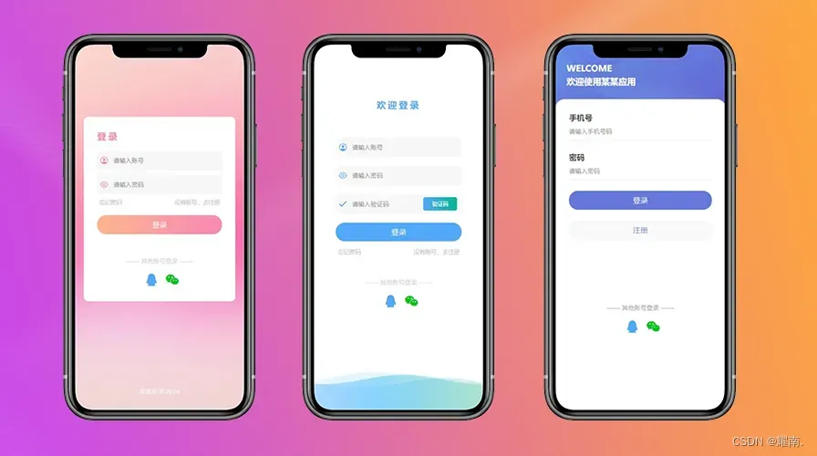
高颜值登录界面(一键复制)
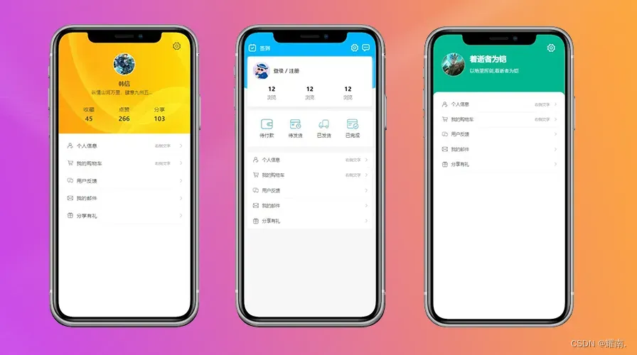
个人中心页面(一键复制)
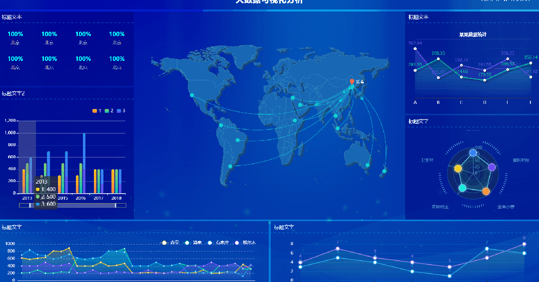
Echarts大屏(一键复制)
uniapp瀑布流实现(一键复制)
更多内容请前往我的首页侧边栏有专栏哦~!
......
....
..


 4942
4942


 被折叠的 条评论
为什么被折叠?
被折叠的 条评论
为什么被折叠?
 到【灌水乐园】发言


