


Qt Quick Controls 2: iOS Style
Qt Quick Controls 2:iOS风格
September 20, 2022 by Doris Verria | Comments
2022年9月20日 Doris Verria评论
Introduction
介绍
Qt Quick Controls 2 applications provide a native look and feel for several target platforms by using styles such as the macOS, Windows, or the Material style for Android. This has so far not been the case for iOS. QQC2 applications running on iOS did not look native and developers had to manually customise the controls or create their own style in order to give their UIs a more native look.
Qt Quick Controls 2应用程序通过使用macOS、Windows或Android的Material样式等样式,为多个目标平台提供本地外观。到目前为止,iOS的情况并非如此。运行在iOS上的QQC2应用程序看起来并不是本地的,开发人员必须手动定制控件或创建自己的风格,以便让UI看起来更为本地。
Those days are now over as the new iOS style is joining the list of built-in styles to for Qt Quick Controls 2!
随着新iOS风格加入Qt Quick Controls 2的内置风格列表,那些日子已经过去了!
The iOS Style is a native-looking style for iOS. It is based on pixmaps and designed to look and feel as similar as possible to the native controls in UIKit. To achieve this, most of the controls use 9-patch images to draw their components and use QML to add animations. We chose a pixmap-based approach, as opposed to using native APIs like we do for the macOS and Windows style, in order to have a style that is easier to maintain, opens up for more animations, and that is not subject to visual regressions resulting from periodic updates and changes in iOS. This also means that over time the controls can deviate from the controls in UIKit, and will therefore need regular design updates from our side.
iOS风格是iOS的原生风格。它基于pixmaps,设计为外观和感觉尽可能类似于UIKit中的本地控件。为了实现这一点,大多数控件使用9-patch图像绘制组件,并使用QML添加动画。我们选择了一种基于pixmap的方法,而不是像我们对macOS和Windows样式那样使用本地API,目的是使样式更易于维护,可以为更多动画打开窗口,并且不受iOS定期更新和更改导致的视觉回归的影响。这也意味着随着时间的推移,控件可能会偏离UIKit中的控件,因此需要我们定期更新设计。
Controls
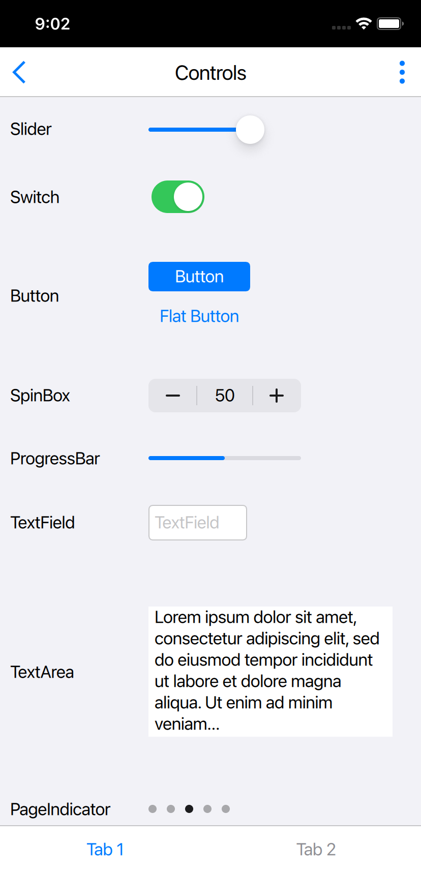
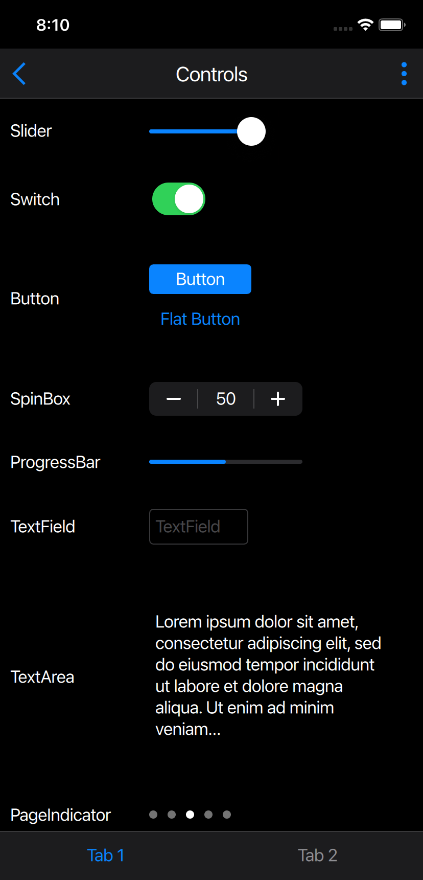
Most of the controls have a similar look and feel to the UIKit controls. However, there are slight differences. Below is a general description of some of the controls as compared to the iOS native ones.
大多数控件的外观与UIKit控件类似。然而,两者略有不同。以下是与iOS本地控件相比的一些控件的一般描述。
Button
In iOS 15 the UIButton comes with a configuration API that allows the developer to select between different stylings for the button. The iOS style supports two of those stylings: the plain one, which draws no background, and the filled one, which draws a background filled with a solid colour. The filled look is the default, but users can choose the plain style by setting the flat property of the button to true.
在iOS 15中,UIButton带有一个配置API,允许开发者在按钮的不同样式之间进行选择。iOS风格支持其中两种样式:普通样式(不绘制背景)和填充样式(使用纯色填充背景)。填充外观是默认外观,但用户可以通过将按钮的flat属性设置为true来选择纯样式。
SpinBox
The SpinBox also provides a custom look by incorporating a text field inside, which is missing in the correlative UIStepper. Nevertheless, it feels at home on iOS.
SpinBox还通过在内部合并文本字段提供了自定义外观,该文本字段在相关的UIStepper中缺失。尽管如此,在iOS上它还是有宾至如归的感觉。
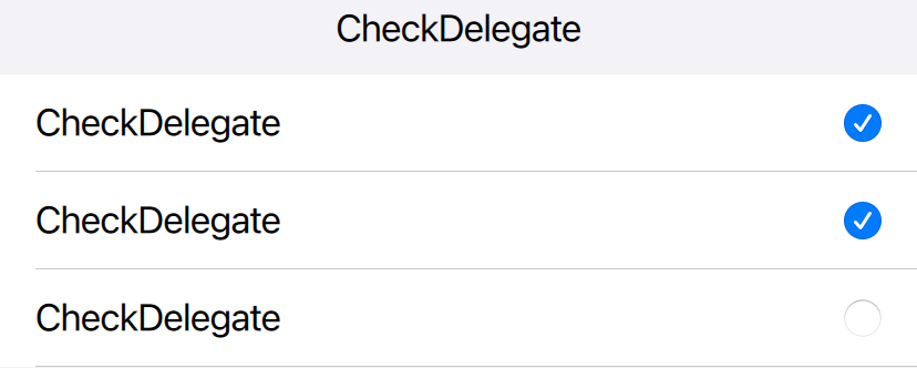
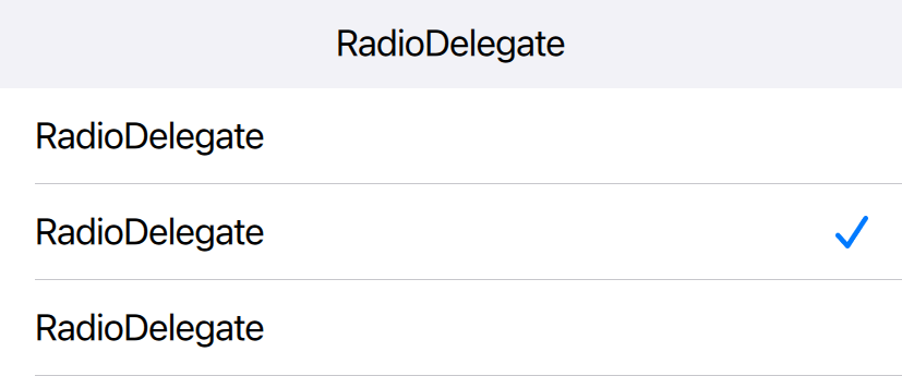
Delegates
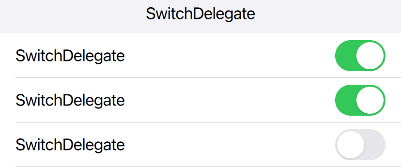
Delegates correspond to views in iOS. Each delegate draws a background similar to the Table View Cell in iOS and make use of the respective indicators. The CheckDelegate and the SwitchDelegate use the same indicator as the CheckButton and the Switch controls respectively, but the RadioDelegate unlike the RadioButton, uses a checkmark that resembles the one used in iOS when selecting an option from a list.
委托与iOS中的视图相对应。每个代表绘制与iOS中的表视图单元格类似的背景,并使用各自的指示器。CheckDelegate和SwitchDelegates分别使用与CheckButton和Switch控件相同的指示器,但RadioDelegate-与RadioButton不同,在从列表中选择选项时使用与iOS中使用的复选标记类似的复选标记。

Controls that are missing in UIKit
UIKit中缺少的控件
Qt Quick Controls 2 comes with a large set of controls, some of which do not have a similar component in UIKit. For these controls, we chose to provide a custom look, inspired and based on other native components in iOS.
Qt Quick Controls 2附带了一组大型控件,其中一些控件在UIKit中没有类似的组件。对于这些控件,我们选择了基于iOS中其他本地组件的定制外观。
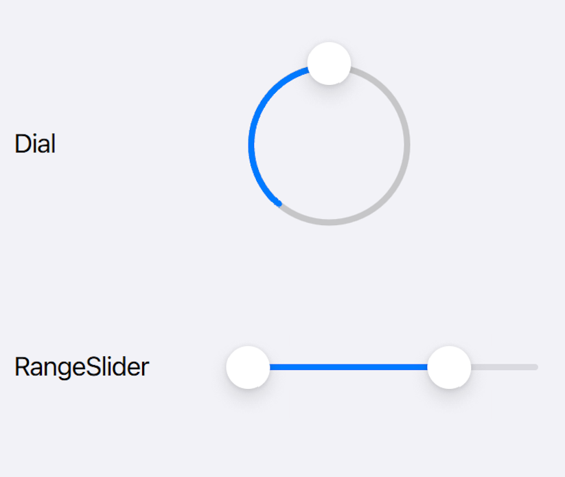
Dial & RangeSlider
The Dial and RangeSlider use the same image assets as the Slider component giving them a look that feels “at-home” in iOS, despite them being non-native controls (see image below).
Dial和RangeSlider使用与Slider组件相同的图像资源,尽管它们是非本机控件(参见下图),但在iOS中给人一种“宾至如归”的感觉。
CheckBox
In UIKit, the native component for a toggle widget is the UISwitch. For the iOS style, we decided to provide a checkbox component to keep a similar cross-platform behaviour as well as to allow users to set the tristate property which is configurable for the CheckBox in QQC2.
在UIKit中,切换小部件的本机组件是UISwitch。对于iOS风格,我们决定提供一个复选框组件,以保持类似的跨平台行为,并允许用户设置可为QQC2中的checkbox配置的三态属性。
RadioButton
Similarly, we opted for a custom look for the radio buttons even though a radio button in native iOS applications is most often represented by a checkmark.
类似地,我们选择了单选按钮的自定义外观,即使本地iOS应用程序中的单选按钮通常由复选标记表示。
Frame & GroupBox
The Frame and GroupBox controls are also missing in UIKit but their look for the iOS style is inspired by UIKit’s grouped Table View style with rounded corners.
UIKit中也缺少Frame和GroupBox控件,但它们对iOS样式的外观灵感来自UIKit的圆角分组表视图样式。
Themes
主題
The iOS style supports both the light and dark theme. They are set accordingly based on the system/application-wide configurations.
iOS风格支持明暗主题。它们是根据系统/应用程序范围的配置进行相应设置的。
Using the Style
使用样式
The style is used just like any other style in Qt Quick Controls 2. It can be selected at compile-time by explicitly importing the style:
该样式与Qt Quick Controls 2中的任何其他样式一样使用。可以在编译时通过显式导入样式来选择:
import QtQuick.Controls.iOS
or alternatively, let the style be resolved at runtime by importing the QtQuick.Controls module and setting the style via one of the following approaches:
或者,通过导入QtQuick在运行时解析样式。通过以下方法之一控制模块并设置样式:
-
The
-stylecommand line argument -
-style命令行参数
-
The
QT_QUICK_CONTROLS_STYLEenvironment variable -
QT_QUICK_CONTROLS_STYLE环境变量
-
The
qtquickcontrols2.confconfiguration file -
qtquickcontrols2.conf配置文件
Once the iOS style becomes a fully-supported feature, Qt Quick Controls 2 applications running on iOS will run with the iOS style by default.
一旦iOS风格成为完全受支持的功能,在iOS上运行的Qt Quick Controls 2应用程序将默认使用iOS风格运行。
The style is available both on iOS and macOS, making it easy to develop Quick UIs on macOS! The style should look the same on both platforms, besides minor differences that may occur due to variations in available system fonts and font rendering engines.
该样式在iOS和macOS上都可用,因此可以轻松在macOS上开发Quick UI!除了由于可用系统字体和字体呈现引擎的变化而可能出现的细微差异外,两个平台上的样式应该看起来相同。
Tech Preview
技术预览
The iOS style is in Tech-preview for 6.4, which means that development is still ongoing. Not all of the controls are ported yet. The missing controls include BusyIndicator, ComboBox, DelayButton, Dialog, DialogButtonBox, SelectionRectangle, Tumbler and ToolTip.
iOS风格在6.4版的技术预览版中,这意味着开发仍在进行中。并非所有控件都已移植。缺少的控件包括BusyIndicator、ComboBox、DelayButton、Dialog、DialogButtonBox、SelectionRectangle、Tumbler和ToolTip。
To see how a Qt Quick Controls 2 iOS app looks like with the iOS style, make sure to check out the Qt To Do List example available on the App Store: Qt To Do List on the App Store
要查看iOS风格的Qt Quick Controls 2 iOS应用程序的外观,请查看app Store上提供的Qt To Do List示例:Qt To Do List on the App Store


 2860
2860


 被折叠的 条评论
为什么被折叠?
被折叠的 条评论
为什么被折叠?
 到【灌水乐园】发言


