


 该博客介绍了如何使用Python对YOLO格式的标注文件进行统计和可视化,包括绘制类别的直方图、目标的空间分布以及保存到Excel。通过修改代码,可以适配不同尺寸的图片,并展示了如何保存类别数量到Excel文件,便于快速查看各类别实例数量。
坚持写博客💪,分享自己的在学习、工作中的所得
- 给自己做备忘
- 对知识点记录、总结,加深理解
- 给有需要的人一些帮助,少踩一个坑,多走几步路
尽量以合适的方式排版,图文兼有
如果写的有误,或者有不理解的,均可在评论区留言
如果内容对你有帮助,欢迎点赞 👍 收藏 ⭐留言 📝。
虽然平台并不会有任何奖励,但是我会很开心,可以让我保持写博客的热情🙏🙏🙏
🧁统计标注文件
使用代码对数据集进行统计,可以对数据集进行可视化,得到一些有用的信息
使用的数据集标注格式时yolo格式的
# 坐标格式:
# VOC: [x_min, y_min, x_max, y_max] 左上角和右下角
# COCO: [x_min, y_min, width, height] 左上角和宽高
# YOLO: [x_center, y_center, width, height] 归一化的中心点和宽高
import os
import random
import numpy as np
import pandas as pd
import matplotlib
import matplotlib.pyplot as plt
import seaborn as sn
from glob import glob
from PIL import Image, ImageDraw
category = ['class1', 'class2', 'class3', ..., 'class100']  # 类别
num_classes = len(category)  # 类别数
colors = [(random.randint(0,255),random.randint(0,255),random.randint(0,255)) for _ in range(num_classes)]  # 每个类别生成一个随机颜色
这部分代码来自yolov5,已经做了初步修改:
def plot_labels(labels, names=(), save_dir=''):
# plot dataset labels
print('Plotting labels... ')
c, b = labels[:, 0], labels[:, 1:].transpose() # classes, boxes
nc = int(c.max() + 1) # number of classes
x = pd.DataFrame(b.transpose(), columns=['x', 'y', 'width', 'height'])
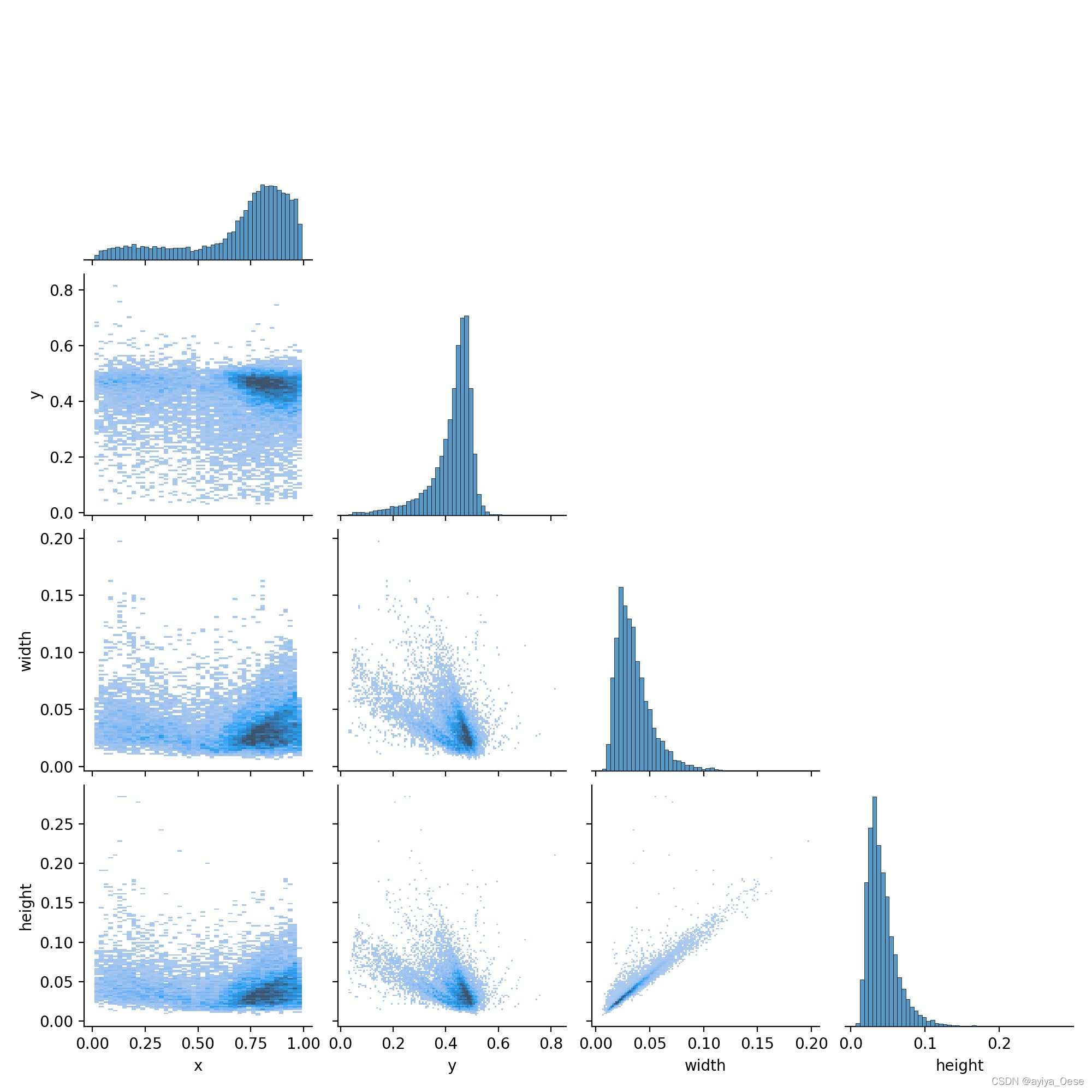
# seaborn correlogram
sn.pairplot(x, corner=True, diag_kind='auto', kind='hist', diag_kws=dict(bins=50), plot_kws=dict(pmax=0.9))
plt.savefig(os.path.join(save_dir, 'labels_correlogram.jpg'), dpi=200)
plt.close()
# matplotlib labels
matplotlib.use('svg') # faster
ax = plt.subplots(2, 2, figsize=(8, 8), tight_layout=True)[1].ravel()
y = ax[0].hist(c, bins=np.linspace(0, nc, nc + 1) - 0.5, rwidth=0.8)
# [y[2].patches[i].set_color([x / 255 for x in colors(i)]) for i in range(nc)] # update colors bug #3195
ax[0].set_ylabel('instances')
if 0 < len(names) < 30:
ax[0].set_xticks(range(len(names)))
ax[0].set_xticklabels(names, rotation=90, fontsize=10)
else:
ax[0].set_xlabel('classes')
sn.histplot(x, x='x', y='y', ax=ax[2], bins=50, pmax=0.9)
sn.histplot(x, x='width', y='height', ax=ax[3], bins=50, pmax=0.9)
# rectangles
labels[:, 1:3] = 0.5 # center
labels[:, 1:] = xywh2xyxy(labels[:, 1:]) * 2000
img = Image.fromarray(np.ones((2000, 2000, 3), dtype=np.uint8) * 255)
for cls, *box in labels[:1000]:
ImageDraw.Draw(img).rectangle(box, width=1, outline=colors[int(cls)]) # plot
ax[1].imshow(img)
ax[1].axis('off')
for a in [0, 1, 2, 3]:
for s in ['top', 'right', 'left', 'bottom']:
ax[a].spines[s].set_visible(False)
plt.savefig(os.path.join(save_dir, 'labels.jpg'), dpi=200)
matplotlib.use('Agg')
plt.close()
def xywh2xyxy(x):
# Convert nx4 boxes from [x, y, w, h] to [x1, y1, x2, y2] where xy1=top-left, xy2=bottom-right
y = np.copy(x)
y[:, 0] = x[:, 0] - x[:, 2] / 2 # top left x
y[:, 1] = x[:, 1] - x[:, 3] / 2 # top left y
y[:, 2] = x[:, 0] + x[:, 2] / 2 # bottom right x
y[:, 3] = x[:, 1] + x[:, 3] / 2 # bottom right y
return y
all_files = glob(r'path\to\labels\*.txt')
shapes = []  # 标注框
ids = []  # 类别名的索引
for file in all_files:
    if file.endswith('classes.txt'):
        continue
    with open(file, 'r') as f:
        for l in f.readlines():
            line = l.split()  # ['11' '0.724877' '0.309082' '0.073938' '0.086914']
            ids.append([int(line[0])])
            shapes.append(list(map(float, line[1:])))

shapes = np.array(shapes)
ids = np.array(ids)
lbs = np.hstack((ids, shapes))
# print(lbs)
plot_labels(labels=lbs, names=np.array(category))
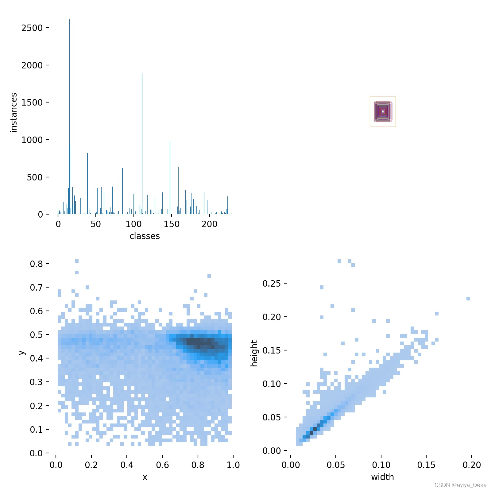
解释一下rectangles部分:代码中的注释rectangles,对应labels.jpg的第二个子图。
因为标注数据时归一化过的,将所有标注框的中心点设置为(0.5, 0.5),将图片宽高设置为2000 x 2000,并且只对前1000个框进行可视化,如果全部可视化的话,数据太大就会密密麻麻一团黑。
labels.jpg
labels_correlogram.jpg
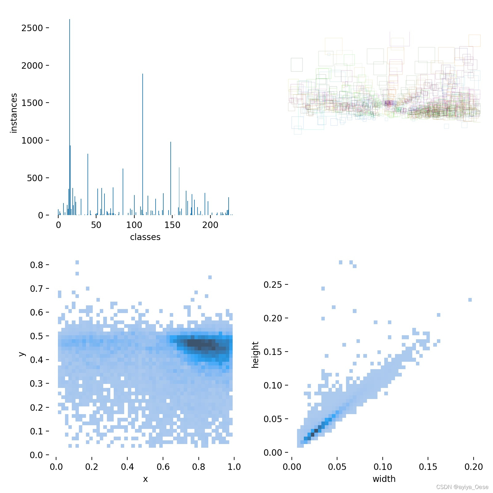
🧁修改rectangles部分
如果图片都是同样宽高的情况下,rectangles部分可以像下面修改
    # labels[:, 1:3] = 0.5  # center
    # labels[:, 1:] = xywh2xyxy(labels[:, 1:]) * 2000
    # img = Image.fromarray(np.ones((2000, 2000, 3), dtype=np.uint8) * 255)
    labels[:, 1:] = xywh2xyxy(labels[:, 1:]) * np.array([width, height, width, height])
    img = Image.fromarray(np.ones((height, width, 3), dtype=np.uint8) * 255)
如下图,这样可以清楚看出目标在标注文件中的空间分布
labels.jpg
🧁保存到Excel
在上面的plot_labels函数中y = ax[0].hist(c, bins=np.linspace(0, nc, nc + 1) - 0.5, rwidth=0.8)之后添加:
    data = {'category':names, 'nums':y[0]}
    df0 = pd.DataFrame(data)
    df0.to_excel(os.path.join(save_dir, 'labels.xlsx'), na_rep=False)
即可将每个类别的实例数量保存到文件中,因为类别多的时候,光看直方图并不容易准确知道每个类别的实例数量。
在我的数据集,由于有些类别还没有实例,按照上面的代码会出现category和nums维度不匹配的情况。可以修改:
    # nc = int(c.max() + 1)  # number of classes
    nc = len(names)
如果内容对你有帮助,或者觉得写的不错
🏳️🌈欢迎点赞 👍 收藏 ⭐留言 📝
有问题,请在评论区留言


 736
736

 被折叠的 条评论
为什么被折叠?
被折叠的 条评论
为什么被折叠?
 到【灌水乐园】发言


