


本章内容
- CSS盒子模型-概述
- CSS盒子模型-内边距
- CSS盒子模型-边框
- CSS盒子模型-外边距
- CSS盒子模型-外边距合并
- CSS盒子模型-盒子模型应用
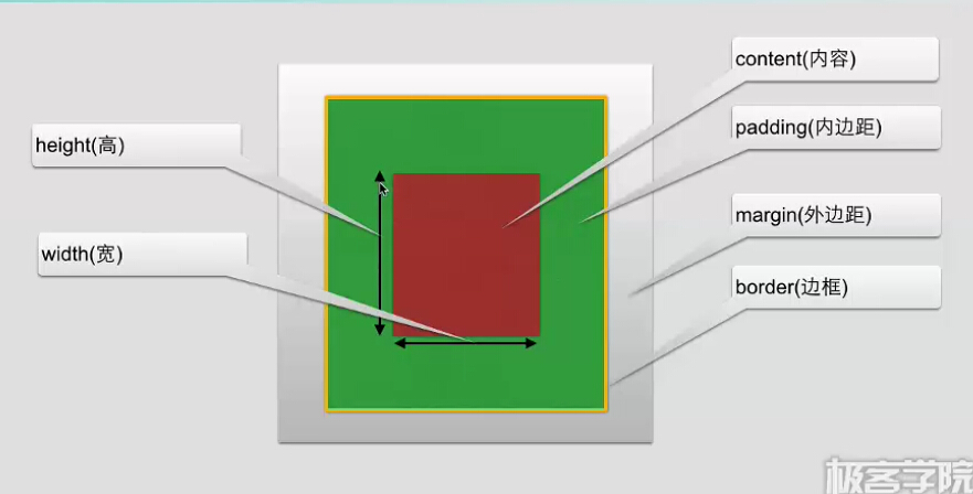
CSS盒子模型-概述
盒子模型的内容范围包括
margin、border、padding、content部分组成
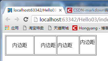
CSS盒子模型-内边距
内边距
内边距在content外,边框内
属性
padding                     设置所有边距

padding-bottom              设置底边距

padding-left                设置左边距

padding-right               设置右边距

padding-top                 设置上边距
示例:
html:
<body>
    <table border="1">
        <tr>
            <td class="td1">内边距</td>
            <td class="td2">内边距</td>
            <td class="td3">内边距</td>
            <td class="td4">内边距</td>
        </tr>
    </table>
</body>
CSS
.td1{
    padding: 20px;
}
.td2{
    padding-left: 20px;
}
.td3{
    padding-right: 20px;
}
.td4{
    padding-bottom: 20px;
}
效果
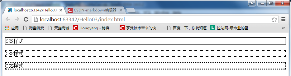
CSS盒子模型-边框
CSS边框
我们可以创建出效果出色的边框,并且可以应用于任何元素
CSS边框
border-style:定义了10个不同的非继承样式,包括none
示例,例举了3个样式:
html:
<body>
    <p class="p1">CSS样式</p>
    <p class="p2">CSS样式</p>
    <p class="p3">CSS样式</p>
</body>
CSS:
.p1{
     border-style: double;
 }
.p2{
    border-style: dashed;
}
.p3{
    border-style: dotted;
}
效果:
CSS边框的单边样式
border-top-style
border-left-style
border-right-style
border-bottom-style
CSS边框宽度
border-width
border-top-width
border-bottom-width
border-right-width
border-left-width
CSS边框颜色
border-color
border-top-color
border-left-color
border-right-color
border-bottom-color
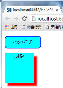
CSS3边框
border-radius               圆角边框

box-shadow                  边框阴影

border-image                边框图片
示例:
html
<body>
    <p class="p1">CSS3样式</p>
    <p class="p2">阴影</p>
</body>
CSS:
.p1{
    border-radius: 10px;
    width: 100px;
    padding: 10px;
    background-color: aqua;
    text-align: center;
    border: 2px solid blue;
}
.p2{
    background-color: aqua;
    width: 100px;
    height: 100px;
    text-align: center;
    box-shadow: 10px 10px 5px #FF0000;
}
效果:
CSS盒子模型-外边距
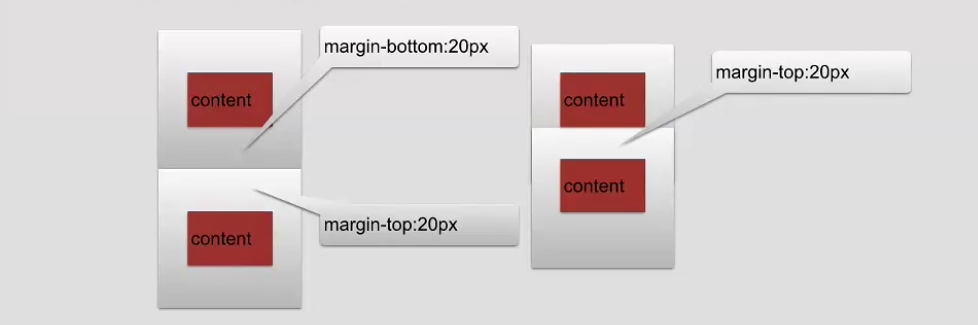
外边距
围绕在内容边框的区域就是外边距,外边距默认为透明区域
外边距接受任何长度单位、百分数值
外边距常用属性
margin 设置所有边距
margin-bottom 设置底边距
margin-left 设置左边距
margin-right 设置有边距
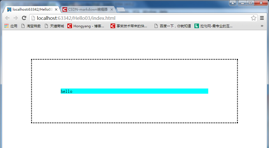
margin-top 设置上边距padding&margin 示例:
html:
<body>
    <div class="container">
        <div class="bd">
            <div class="pd">
                <div class="content">hello</div>
            </div>
        </div>
    </div>
</body>
CSS:
body{
    margin: 0px;
}
.container{
    margin: 100px;
}
.bd{
    border-style: dotted;
}
.pd{
    padding: 100px;
}
.content{
    background-color: aqua;
}
效果
CSS盒子模型-外边距合并
外边距合并
外边距合并就是一个叠加的概念
举个栗子:
html:
<body>
    <div class="container">
        <div class="bd">
            <div class="pd">
                <div class="content">hello</div>
            </div>
        </div>
    </div>

    <div class="container1">
        <div class="bd1">
            <div class="pd1">
                <div class="content1">hello</div>
            </div>
        </div>
    </div>
</body>
CSS:
body{
    margin: 0px;
}
.container{
    margin: 50px;
}
.bd{
    border-style: dotted;
}
.pd{
    padding: 100px;
}
.content{
    background-color: aqua;
}

.container1{
    margin: 100px;
}
.bd1{
    border-style: dotted;
}
.pd1{
    padding: 100px;
}
.content1{
    background-color: aqua;
}
为了区分,两个最外层的div,一个margin是50,一个是100,效果:
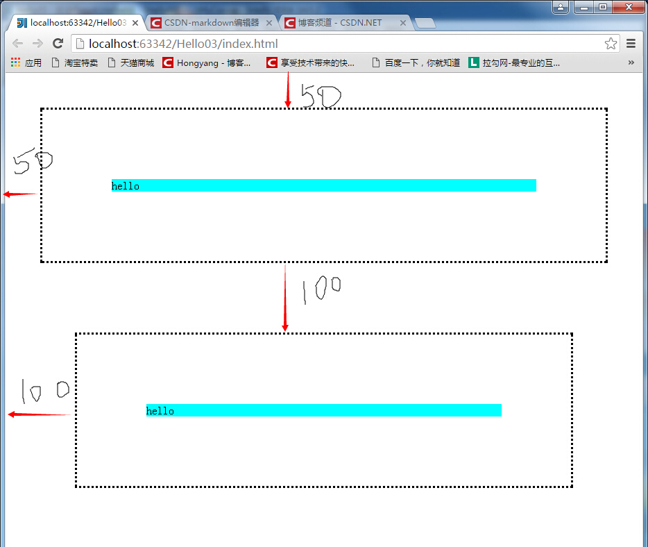
理论上,两个div之间应该有150的间隔,实际上却是100,这体现了两个概念:
外边距叠加的概念
叠加以最大值为准
CSS盒子模型-盒子模型应用
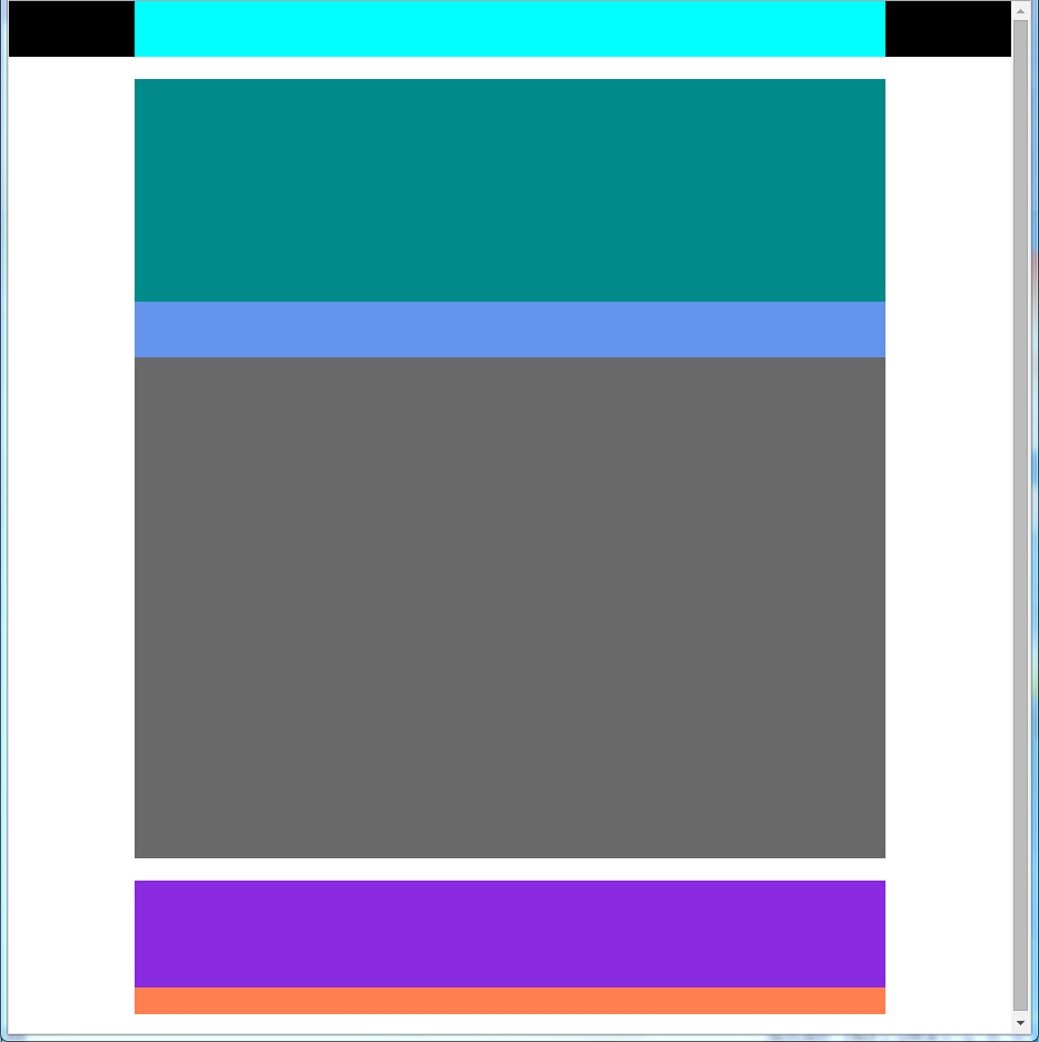
示例模型:
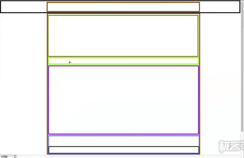
html:
<body>
    <div class="title">
        <div class="title_content"></div>
    </div>
    <div class="body">
        <div class="body_img"></div>
        <div class="body_content">
            <div class="body_notify"></div>
        </div>
    </div>
    <div class="footing">
        <div class="foot_content"></div>
        <div class="foot_subnav"></div>
    </div>
</body>
CSS:
*{
    margin: 0px;
    padding: 0px;
}
.title{
    background-color: black;
    width: 100%;
    height: 50px;
}
.title_content{
    width: 75%;
    height: 50px;
    margin: 0px auto;
    background-color: aqua;
}
.body{
    margin: 20px auto;
    width: 75%;
    height: 700px;
    background-color: cornflowerblue;
}
.body_img{
    width: 100%;
    height: 200px;
    background-color: darkcyan;
}
.body_content{
    background-color: dimgray;
    width: 100%;
    height: 500px;
}
.body_notify{
    width: 100%;
    height: 50px;
    background-color: cornflowerblue;
}
.footing{
    margin: 20px auto;
    width: 75%;
    height: 120px;
    background-color: brown;
}
.foot_content{
    background-color: blueviolet;
    height: 80%;
    width: 100%;
}
.foot_subnav{
    background-color: coral;
    height: 20%;
    width: 100%;
}
效果:
OVER!


 288
288


 被折叠的 条评论
为什么被折叠?
被折叠的 条评论
为什么被折叠?
 到【灌水乐园】发言


