


c语言自定义元素类型
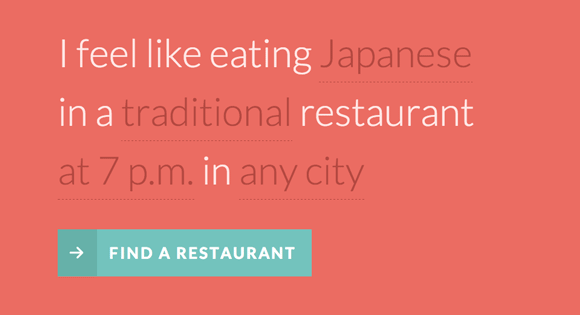
There is something really interesting about Natural Language UIs so we wanted to play around with NL forms and custom form elements. The idea is to turn a classic form into one that uses natural language to obtain information from the user. For that we’ll construct a sentence where some words and parts are select elements and text inputs. We’ll then transform the select elements so that we can customize them.
自然语言UI确实有一些有趣的东西,因此我们想使用NL表单和自定义表单元素。 想法是将经典形式转换为使用自然语言从用户那里获取信息的形式。 为此,我们将构建一个句子,其中一些单词和部分是选择元素和文本输入。 然后,我们将转换选择元素,以便我们可以自定义它们。
Natural language forms are quite suitable for some UI cases, not for all, of course. They have a couple of limitations but they can also be more engaging for users if used in the right place and in the right way. Anyway, we wanted to give this concept a try and we’ll show you how we did it.
当然,自然语言形式非常适合某些UI情况,但并不适合所有情况。 它们有两个局限性,但如果在正确的位置以正确的方式使用它们,也可以使用户更具吸引力。 无论如何,我们想尝试一下这个概念,然后向您展示我们是如何做到的。
标记 (The Markup)
The HTML will be composed of a form with a sentence and some select and text input elements:
HTML将由带有句子的表单以及一些select和text输入元素组成:
<form id="nl-form" class="nl-form">
	I feel like eating
	<select>
		<option value="1" selected>any food</option>
		<option value="2">Indian</option>
		<option value="3">French</option>
		<option value="4">Japanese</option>
		<option value="2">Italian</option>
	</select>
	<br />in a
	<select>
		<option value="1" selected>standard</option>
		<option value="2">fancy</option>
		<option value="3">hip</option>
		<option value="4">traditional</option>
		<option value="2">fine</option>
	</select>
	restaurant
	<select>
		<option value="1" selected>anytime</option>
	 	<option value="1">at 7 p.m.</option>
	 	<option value="2">at 8 p.m.</option>
	 	<option value="3">at 9 p.m.</option>
	</select>
	in <input type="text" value="" placeholder="any city" data-subline="For example: <em>Los Angeles</em> or <em>New York</em>"/>
	<div class="nl-submit-wrap">
		<button class="nl-submit" type="submit">Find a restaurant</button>
	</div>
	<div class="nl-overlay"></div>
</form>
We want to transform the select elements to a custom drop-down list, like this:
我们希望将select元素转换为自定义下拉列表,如下所示:
<div class="nl-field nl-dd">
	<a class="nl-field-toggle">any food</a>
	<ul>
		<li class="nl-dd-checked">any food</li>
		<li>Indian</li>
		<li>French</li>
		<li>Japanese</li>
		<li>Italian</li>
	</ul>
</div>
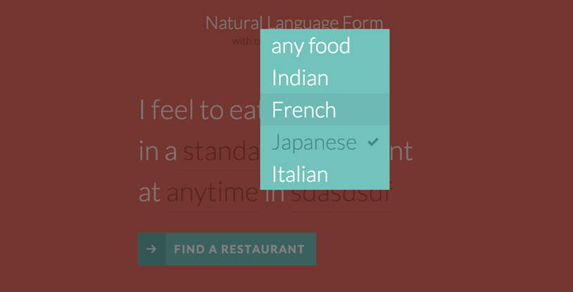
The toggle is the visual part in the sentence. We’ll hide the list and when we click on the toggle we want the list to appear with a nice transition. Once we click on one of the list items, we’ll replace the toggle value with the newly selected one.
切换是句子中的视觉部分。 我们将隐藏该列表,并在单击切换按钮时希望该列表以良好的过渡出现。 单击列表项之一后,将切换值替换为新选择的项。
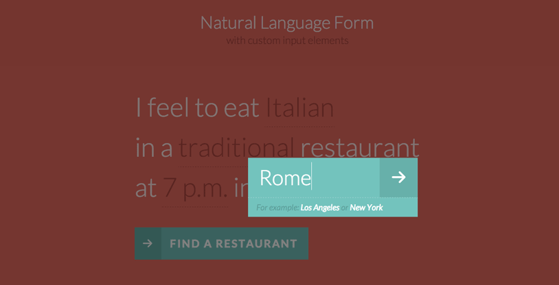
The text input will also be transformed into a similar element:
文本输入也将转换为类似的元素:
<div class="nl-field nl-ti-text">
	<a class="nl-field-toggle">any city</a>
	<ul>
		<li class="nl-ti-input">
			<input type="text" value="" placeholder="any city" />
			<button class="nl-field-go">Go</button>
		</li>
		<li class="nl-ti-example">For example: <em>Los Angeles</em> or <em>New York</em></li>
	</ul>
</div>
CSS(The CSS)
Note that the CSS will not contain any vendor prefixes, but you will find them in the files. Some proprietary browser rules will be listed, though.
请注意,CSS将不包含任何供应商前缀,但是您可以在文件中找到它们。 不过,将列出一些专有的浏览器规则。
Let’s first add some icons (checkmark and arrow):
首先添加一些图标(选中标记和箭头):
@font-face {
	font-family: 'nlicons';
	src:url('../fonts/nlicons/nlicons.eot');
	src:url('../fonts/nlicons/nlicons.eot?#iefix') format('embedded-opentype'),
		url('../fonts/nlicons/nlicons.woff') format('woff'),
		url('../fonts/nlicons/nlicons.ttf') format('truetype'),
		url('../fonts/nlicons/nlicons.svg#nlicons') format('svg');
	font-weight: normal;
	font-style: normal;
}
The form will have some general styles:
表单将具有一些常规样式:
/* general style for the form */
.nl-form {
	width: 100%;
	margin: 0.3em auto 0 auto;
	font-size: 4em;
	line-height: 1.5;
}
Let’s remove the default styling for all the lists:
让我们删除所有列表的默认样式:
.nl-form ul {
	list-style: none;
	margin: 0;
	padding: 0;
}
And we’ll also normalize the form elements and make them look like everything else:
我们还将标准化表单元素并使它们看起来像其他所有元素:
.nl-form input,
.nl-form select,
.nl-form button {
	border: none;
	background: transparent;
	font-family: inherit;
	font-size: inherit;
	color: inherit;
	font-weight: inherit;
	line-height: inherit;
	display: inline-block;
	padding: 0;
	margin: 0;
}
We don’t want any outline on a focussed element:
我们不希望在聚焦元素上有任何轮廓:
.nl-form input:focus {
	outline: none;
}
Now, let’s take care of the custom field element. Remember, this is the custom class that we give to the transformed drop-down list and the text input element:
现在,让我们来处理自定义字段元素。 请记住,这是我们提供给转换后的下拉列表和文本输入元素的自定义类:
.nl-field {
	display: inline-block;
	position: relative;
}
Using inline-block will keep the element in the flow of our sentence.
使用inline-block将使元素保持在句子流中。
When we click on the toggle, we want the whole thing to open. For that we also need to set a high z-index to the custom field:
当我们点击切换开关时,我们希望整个东西都打开。 为此,我们还需要为自定义字段设置较高的z-index:
.nl-field.nl-field-open {
	z-index: 10000;
}
The toggle itself, which is the visible part in the sentence, will have the following style:
切换器本身,即句子中的可见部分,将具有以下样式:
.nl-field-toggle,
.nl-form input,
.nl-form select  {
	line-height: inherit;
	display: inline-block;
	color: #b14943;
	cursor: pointer;
	border-bottom: 1px dashed #b14943;
}
The same style we’ll apply to the default form elements if JS is disabled.
如果禁用了JS,我们将对默认表单元素应用相同的样式。
The unordered list will be hidden and positioned absolutely. We will use the visibility transition trick to be able to transition the opacity properly. The trick is about setting a delay for the visibility transition by default (when it disappears) and no delay when the .nl-field-open class is applied to its parent (when it appears):
无序列表将被完全隐藏并定位。 我们将使用可见性转换技巧来正确转换不透明度。 诀窍是在默认情况下(当消失时)为可见性过渡设置延迟,而将.nl-field-open类应用于其父级(当它出现时)则没有延迟:
/* drop-down list / text element */
.nl-field ul {
	position: absolute;
	visibility: hidden;
	background: #76C3BD;
	left: -0.5em;
	top: 50%;
	font-size: 80%;
	opacity: 0;
	transform: translateY(-40%) scale(0.9);
	transition: visibility 0s 0.3s, opacity 0.3s, transform 0.3s;
}

.nl-field.nl-field-open ul {
	visibility: visible;
	opacity: 1;
	transform: translateY(-50%) scale(1);
	transition: visibility 0s 0s, opacity 0.3s, transform 0.3s;
}
The style for the list elements and specifically for the ones of the drop-down are the following:
列表元素的样式,尤其是下拉菜单的样式,如下所示:
.nl-field ul li {
	color: #fff;
	position: relative;
}

.nl-dd ul li {
	padding: 0 1.5em 0 0.5em;
	cursor: pointer;
	white-space: nowrap;
}

.nl-dd ul li.nl-dd-checked {
	color: #478982;
}

.no-touch .nl-dd ul li:hover {
	background: rgba(0,0,0,0.05);
}

.no-touch .nl-dd ul li:hover:active {
	color: #478982;
}
Let’s define the icons for some of our elements:
让我们为一些元素定义图标:
/* icons for some elements */
.nl-dd ul li.nl-dd-checked:before,
.nl-submit:before,
.nl-field-go:before {
	font-family: 'nlicons';
	speak: none;
	font-style: normal;
	font-weight: normal;
	font-variant: normal;
	text-transform: none;
	-webkit-font-smoothing: antialiased;
}

.nl-dd ul li.nl-dd-checked:before {
	content: "e000";
	position: absolute;
	right: 1em;
	font-size: 50%;
	line-height: 3;
}
The text input replacement field will have a minimum width:
文本输入替换字段将具有最小宽度:
.nl-ti-text ul {
	min-width: 8em;
}
The text input field, which we are still using but wrapped in our overlay field structure, will have the following style:
仍在使用但包装在叠加字段结构中的文本输入字段将具有以下样式:
.nl-ti-text ul li.nl-ti-input input {
	width: 100%;
	padding: 0.2em 2em 0.2em 0.5em;
	border-bottom: none;
	color: #fff;
}
The arrow button will be positioned absolutely and we’ll out it on the right side:
箭头按钮将绝对定位,我们将在右侧显示它:
.nl-form .nl-field-go {
	position: absolute;
	right: 0;
	top: 0;
	height: 100%;
	cursor: pointer;
	background: rgba(0,0,0,0.1);
	width: 1.8em;
	text-align: center;
	color: transparent;
}
The icon itself will have the following style:
图标本身将具有以下样式:
.nl-field-go:before {
	content: "e001";
	font-size: 75%;
	color: #fff;
	width: 100%;
	line-height: 2.5;
	display: block;
}
Let’s change the placeholder text colors to fit into the color scheme:
让我们更改占位符文本颜色以适合配色方案:
/* custom placeholder color */
input::-webkit-input-placeholder {
	color: rgba(255,255,255,0.8);
}

input:active::-webkit-input-placeholder ,
input:focus::-webkit-input-placeholder {
	color: rgba(255,255,255,0.2);
}

input::-moz-placeholder {
	color: rgba(255,255,255,0.8);
}

input:active::-moz-placeholder,
input:focus::-moz-placeholder {
	color: rgba(255,255,255,0.2);
}

input:-ms-input-placeholder {
	color: rgba(255,255,255,0.8);
}

input:active::-ms-input-placeholder ,
input:focus::-ms-input-placeholder {
	color: rgba(255,255,255,0.2);
}
The description text item will have a smaller font size:
说明文字项目的字体较小:
/* example field below text input */
.nl-ti-text ul li.nl-ti-example {
	font-size: 40%;
	font-style: italic;
	font-weight: 400;
	padding: 0.4em 1em;
	color: rgba(0,0,0,0.2);
	border-top: 1px dashed rgba(255,255,255,0.7);
}

.nl-ti-text ul li.nl-ti-example em {
	color: #fff
}
Let’s style the submit button and the icon:
让我们设置“提交”按钮和图标的样式:
.nl-submit-wrap {
	margin-top: 0.4em;
}

.nl-form .nl-submit {
	line-height: 3;
	text-transform: uppercase;
	cursor: pointer;
	position: relative;
	background: #76C3BD;
	color: #fff;
	padding: 0 1em 0 0;
	font-size: 40%;
	font-weight: bold;
	letter-spacing: 3px;
}

.nl-submit:before {
	content: "e001";
	color: #fff;
	float: left;
	padding: 0 0.7em;
	margin: 0 0.8em 0 0;
	background: #69B1A9;
}

.no-touch .nl-form .nl-submit:hover,
.no-touch .nl-form .nl-submit:active {
	background: #69B1A9;
}

.no-touch .nl-form .nl-submit:hover:before {
	background: #58a199;
}
The overlay will be a fixed element and we’ll show it when one of the field elements are opened using the general sibling selector:
叠加层将是固定元素,当使用通用的同级选择器打开一个字段元素时,我们将对其进行展示:
.nl-overlay {
	position: fixed;
	top: 0;
	left: 0;
	width: 100%;
	height: 100%;
	background: rgba(0,0,0,0.5);
	opacity: 0;
	z-index: 9999;
	visibility: hidden;
	transition: visibility 0s 0.3s, opacity 0.3s;
}

.nl-field.nl-field-open ~ .nl-overlay {
	opacity: 1;
	visibility: visible;
	-webkit-transition-delay: 0s;
	-moz-transition-delay: 0s;
	transition-delay: 0s;
}
Last, but not least, let’s add some media queries for adjusting the size on smaller devices:
最后但并非最不重要的一点,让我们添加一些媒体查询以调整较小设备上的大小:
@media screen and (max-width: 45em) {
	.nl-form {
		font-size: 3em;
	}
}

@media screen and (max-width: 25em) {
	.nl-form {
		font-size: 2em;
	}
}
And that’s all the style. Now, let’s have a look at the JavaScript.
这就是所有样式。 现在,让我们看一下JavaScript。
JavaScript (The JavaScript)
Let’s start by defining the object representing the form element:
让我们从定义代表表单元素的对象开始:
function NLForm( el ) {
	// the form element
	this.el = el;
	// the overlay
	this.overlay = this.el.querySelector( '.nl-overlay' );
	// array with all the possible custom fields
	this.fields = [];
	// counter for each custom field
	this.fldOpen = -1;
	this._init();
}
We will start by creating some custom structure by replacing all the select and input elements inside the form. We will define a object that represents each one of these custom fields – NLField.
我们将通过替换表单中的所有select和input元素来创建一些自定义结构。 我们将定义一个代表每个自定义字段NLField的对象。
NLForm.prototype = {
	_init : function() {
		var self = this;
		Array.prototype.slice.call( this.el.querySelectorAll( 'select' ) ).forEach( function( el, i ) {
			self.fldOpen++;
			self.fields.push( new NLField( self, el, 'dropdown', self.fldOpen ) );
		} );
		Array.prototype.slice.call( this.el.querySelectorAll( 'input' ) ).forEach( function( el, i ) {
			self.fldOpen++;
			self.fields.push( new NLField( self, el, 'input', self.fldOpen ) );
		} );
	},
	...
}

function NLField( form, el, type, idx ) {
	this.form = form;
	// the original HTML element
	this.elOriginal = el;
	this.pos = idx;
	this.type = type;
	this._create();
	this._initEvents();
}
NLField.prototype = {
	_create : function() {
		if( this.type === 'dropdown' ) {
			this._createDropDown();
		}
		else if( this.type === 'input' ) {
			this._createInput();
		}
	},
	...
}
The structure will be different depending if it’s a select box or an input field.
结构是选择框还是输入字段,将有所不同。
NLField.prototype = {
	...
	_createDropDown : function() {
		var self = this;
		this.fld = document.createElement( 'div' );
		this.fld.className = 'nl-field nl-dd';
		this.toggle = document.createElement( 'a' );
		this.toggle.innerHTML = this.elOriginal.options[ this.elOriginal.selectedIndex ].innerHTML;
		this.toggle.className = 'nl-field-toggle';
		this.optionsList = document.createElement( 'ul' );
		var ihtml = '';
		Array.prototype.slice.call( this.elOriginal.querySelectorAll( 'option' ) ).forEach( function( el, i ) {
ihtml += self.elOriginal.selectedIndex === i ? '- ' + el.innerHTML + ' '+ el.innerHTML +'
- ' : '
- ' + el.innerHTML + ' '+ el.innerHTML +'
- '; // selected index value if( self.elOriginal.selectedIndex === i ) { self.selectedIdx = i; } } ); this.optionsList.innerHTML = ihtml; this.fld.appendChild( this.toggle ); this.fld.appendChild( this.optionsList ); this.elOriginal.parentNode.insertBefore( this.fld, this.elOriginal ); this.elOriginal.style.display = 'none'; }, _createInput : function() { var self = this; this.fld = document.createElement( 'div' ); this.fld.className = 'nl-field nl-ti-text'; this.toggle = document.createElement( 'a' ); this.toggle.innerHTML = this.elOriginal.placeholder; this.toggle.className = 'nl-field-toggle'; this.optionsList = document.createElement( 'ul' ); this.getinput = document.createElement( 'input' ); this.getinput.setAttribute( 'type', 'text' ); this.getinput.placeholder = this.elOriginal.placeholder; this.getinputWrapper = document.createElement( 'li' ); this.getinputWrapper.className = 'nl-ti-input'; this.inputsubmit = document.createElement( 'button' ); this.inputsubmit.className = 'nl-field-go'; this.inputsubmit.innerHTML = 'Go'; this.getinputWrapper.appendChild( this.getinput ); this.getinputWrapper.appendChild( this.inputsubmit ); this.example = document.createElement( 'li' ); this.example.className = 'nl-ti-example'; this.example.innerHTML = this.elOriginal.getAttribute( 'data-subline' ); this.optionsList.appendChild( this.getinputWrapper ); this.optionsList.appendChild( this.example ); this.fld.appendChild( this.toggle ); this.fld.appendChild( this.optionsList ); this.elOriginal.parentNode.insertBefore( this.fld, this.elOriginal ); this.elOriginal.style.display = 'none'; }, ... }
Finally we will bind some events to the custom fields. For the dropdown we want to update the form field with the value chosen from the list of options, and for the input the User will type the desired value and either press enter, the submit button or simply click the overlay to update the form value.
最后,我们将一些事件绑定到自定义字段。 对于下拉菜单,我们要使用从选项列表中选择的值来更新表单字段,对于输入,用户将键入所需的值,然后按Enter,提交按钮或简单地单击覆盖图以更新表单值。
NLField.prototype = {
	...
	_initEvents : function() {
		var self = this;
		this.toggle.addEventListener( 'click', function( ev ) { ev.preventDefault(); ev.stopPropagation(); self._open(); } );
		this.toggle.addEventListener( 'touchstart', function( ev ) { ev.preventDefault(); ev.stopPropagation(); self._open(); } );

		if( this.type === 'dropdown' ) {
			var opts = Array.prototype.slice.call( this.optionsList.querySelectorAll( 'li' ) );
			opts.forEach( function( el, i ) {
				el.addEventListener( 'click', function( ev ) { ev.preventDefault(); self.close( el, opts.indexOf( el ) ); } );
				el.addEventListener( 'touchstart', function( ev ) { ev.preventDefault(); self.close( el, opts.indexOf( el ) ); } );
			} );
		}
		else if( this.type === 'input' ) {
			this.getinput.addEventListener( 'keydown', function( ev ) {
				if ( ev.keyCode == 13 ) {
					self.close();
				}
			} );
			this.inputsubmit.addEventListener( 'click', function( ev ) { ev.preventDefault(); self.close(); } );
			this.inputsubmit.addEventListener( 'touchstart', function( ev ) { ev.preventDefault(); self.close(); } );
		}

	},
	_open : function() {
		if( this.open ) {
			return false;
		}
		this.open = true;
		this.form.fldOpen = this.pos;
		var self = this;
		this.fld.className += ' nl-field-open';
	},
	close : function( opt, idx ) {
		if( !this.open ) {
			return false;
		}
		this.open = false;
		this.form.fldOpen = -1;
		this.fld.className = this.fld.className.replace(/b nl-field-openb/,'');

		if( this.type === 'dropdown' ) {
			if( opt ) {
				// remove class nl-dd-checked from previous option
				var selectedopt = this.optionsList.children[ this.selectedIdx ];
				selectedopt.className = '';

				opt.className = 'nl-dd-checked';
				this.toggle.innerHTML = opt.innerHTML;

				// update selected index value
				this.selectedIdx = idx;
				// update original select element´s value
				this.elOriginal.value = this.elOriginal.children[ this.selectedIdx ].value;
			}
		}
		else if( this.type === 'input' ) {
			this.getinput.blur();
			this.toggle.innerHTML = this.getinput.value.trim() !== '' ? this.getinput.value : this.getinput.placeholder;
			this.elOriginal.value = this.getinput.value;
		}
	}
	...
}
And that’s it! I hope you enjoyed this tutorial and find it inspiring!
就是这样! 希望您喜欢本教程并从中获得启发!
翻译自: https://tympanus.net/codrops/2013/05/21/natural-language-form-with-custom-input-elements/
c语言自定义元素类型


 1817
1817


 被折叠的 条评论
为什么被折叠?
被折叠的 条评论
为什么被折叠?
 到【灌水乐园】发言


