


 本文介绍如何仅使用CSS创建一个图像手风琴菜单。通过嵌套结构和单选按钮,实现幻灯片的控制,使每个项目可点击并改变子元素的位置。示例代码展示了如何布局和样式化滑动效果,以及如何通过媒体查询实现响应式设计。
css3手风琴菜单
Today we are going to create a CSS-only image accordion. We’ll use a nested structure and apply a technique of radio buttons and the sibling combinator in order to control the slides. The idea is to make each item, or slide, “clickable” by overlaying the radio button over the entire slide, and change the position of a child element when clicking on it.
今天,我们将创建一个仅CSS的图像手风琴。 我们将使用嵌套结构,并应用单选按钮和同级组合器技术以控制幻灯片。 想法是通过在整个幻灯片上覆盖单选按钮,使每个项目或幻灯片“可点击”,并在单击子元素时更改其位置。
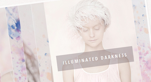
The images used in the demo are from the “L’aquarelle” project by Andrey & Lili: L’aquarelle on Behance. It is licensed under the Creative Commons Attribution-NonCommercial 3.0 Unported License .
该演示中使用的图像来自Andrey&Lili的“ L'aquarelle”项目: Behance上的L'aquarelle 。 它是根据知识共享署名-非商业3.0非端口许可许可的。
标记 (The Markup)
The main idea is to create a nested structure that will allow us to simply move the respective accordion slides to one side, i.e. moving one slide will move all its inner slides (the nested elements). Each of the figures will have the image, a radio button for controlling the “opening” of a slide, and a caption.
主要思想是创建一个嵌套结构,使我们可以将相应的手风琴幻灯片简单地移动到一侧,即,移动一个幻灯片将移动其所有内部幻灯片(嵌套元素)。 每个图都有图像,用于控制幻灯片“打开”的单选按钮和标题。
<div class="ia-container">

	<figure>
		<img src="images/1.jpg" alt="image01" />
		<input type="radio" name="radio-set" checked="checked" />
		<figcaption><span>True Colors</span></figcaption>

		<figure>
			<img src="images/2.jpg" alt="image02" />
			<input type="radio" name="radio-set" />
			<figcaption><span>Honest Light</span></figcaption>

			<figure>
				<!-- ... -->

				<figure>
					<!-- ... -->

					<figure>
						<!-- ... -->

						<figure>
							<!-- ... -->

							<figure>
								<!-- ... -->

								<figure>
									<!-- ... -->
								</figure>

							</figure>

						</figure>

					</figure>

				</figure>

			</figure>

		</figure>

	</figure>

</div>
You could also use different kind of content here, what is important is the nested structure and the radio input.
您还可以在此处使用其他类型的内容,重要的是嵌套结构和无线电输入。
CSS (The CSS)
We’ll give the slider a width value and hide the excess part with overflow hidden.
我们将为滑块指定一个宽度值,并隐藏多余的部分并隐藏溢出。
.ia-container {
	width: 685px;
	margin: 20px auto;
	overflow: hidden;
	box-shadow: 1px 1px 4px rgba(0,0,0,0.08);
	border: 7px solid rgba(255,255,255,0.6);
}
The width is calculated as follows:
宽度计算如下:
( (Number of images - 1) * 50px ) + 335px
where 50 is the width of the visible piece of an image and 335 is the width of the image. In our case, that gives us ( (8 – 1) * 50px ) + 335px = 350px + 335px = 685px.
其中50是可见图像的宽度,而335是图像的宽度。 在我们的情况下,这使我们((8 – 1)* 50px)+ 335px = 350px + 335px = 685px 。
Each of the figures will have a left value of 50 pixel (visible piece). That should be their position relatively to their parent. This makes the slider look like an accordion. The width of a figure is 335 pixel, just like the image inside. The figure will also have a transition for a smooth movement:
每个图的左值均为50像素(可见部分)。 那应该是他们相对于父母的立场。 这使滑块看起来像手风琴。 像里面的图像一样,图形的宽度是335像素。 该图还将进行平滑过渡:
.ia-container figure {
    position: absolute;
	top: 0;
	left: 50px; /* width of visible piece */
	width: 335px;
    box-shadow: 0 0 0 1px rgba(255,255,255,0.6);
    transition: all 0.3s ease-in-out;
}
The first figure will be positioned completely to the left and we set the !important because we will use media queries later and we always want the left to be 0 for this figure. The position will be set to “relative” in order to give the slider a height:
第一个数字将完全位于左侧,我们将设置!important为重要信息,因为稍后我们将使用媒体查询,并且我们始终希望该数字的左侧为0。 该位置将设置为“相对”,以使滑块具有高度:
.ia-container > figure {
    position: relative;
	left: 0 !important;
}
The image will have a width of 100% so that it fills the figure:
图片将具有100%的宽度,以使其充满图形:
.ia-container img {
	display: block;
	width: 100%;
}
Each of the radio buttons will cover the visible part of a slide. We set the opacity to 0 so that we can’t see it but still be able to click it. The z-index should be high, so that it covers everything else:
每个单选按钮将覆盖幻灯片的可见部分。 我们将不透明度设置为0,以便我们看不到它,但仍然可以单击它。 z索引应较高,以便涵盖其他所有内容:
.ia-container input {
	position: absolute;
	top: 0;
	left: 0;
	width: 50px; /* just cover visible part */
	height: 100%;
	cursor: pointer;
	border: 0;
	padding: 0;
    opacity: 0;
	z-index: 100;
	-webkit-appearance: none;
	-moz-appearance: none;
	appearance: none;
}
When an input is selected or clicked, we want the input to disappear. Actually, we could say something like width: 0px but because of some kind of strange behavior in the Chrome browser we still need it at the right side (the next item won’t trigger the hover if we haven’t hovered over the current input). We also want the sibling figures to move to the left with a transition:
当选择或单击输入时,我们希望输入消失。 实际上,我们可以说诸如width:0px之类的内容,但是由于Chrome浏览器中的某种奇怪行为,我们仍然需要在右侧使用它(如果我们没有将鼠标悬停在当前输入上,则下一项不会触发悬停)。 我们还希望同级图形在过渡时向左移动:
.ia-container input:checked{
	width: 5px;
	left: auto;
	right: 0px;
}
.ia-container input:checked ~ figure {
    left: 335px;
    transition: all 0.7s ease-in-out;
}
Giving two different transition durations (one in the “default” state, one when we check an input) will give us the “shuffle” effect. Playing with these values will give you different effects.
提供两个不同的过渡持续时间(一个处于“默认”状态,一个在我们检查输入时)将为我们提供“随机播放”效果。 玩这些值将给您不同的效果。
The caption of the figure will cover all the element with a transparent dark overlay and the span will be positioned over the upper half of the figure initially:
图的标题将用透明的深色覆盖物覆盖所有元素,并且跨度最初将定位在图的上半部分:
.ia-container figcaption {
	width: 100%;
	height: 100%;
	background: rgba(87, 73, 81, 0.1);
	position: absolute;
	top: 0px;
    transition: all 0.2s linear;
}

.ia-container figcaption span {
	position: absolute;
	top: 40%;
	margin-top: -30px;
	right: 20px;
	left: 20px;
	overflow: hidden;
	text-align: center;
	background: rgba(87, 73, 81, 0.3);
	line-height: 20px;
	font-size: 18px;
    opacity: 0;
	text-transform: uppercase;
	letter-spacing: 4px;
	font-weight: 700;
	padding: 20px;
	color: #fff;
	text-shadow: 1px 1px 1px rgba(0,0,0,0.1);
}
When a slide gets selected, we will remove the overlay by setting the opacity value of the RGBA to 0:
选中幻灯片后,我们将RGBA的不透明度值设置为0,以删除叠加层:
.ia-container input:checked + figcaption,
.ia-container input:checked:hover + figcaption{
	background: rgba(87, 73, 81, 0);
}
The span will fade in and move from the top with a delay (the slide should open first):
跨度将逐渐消失并从顶部移出一段时间(幻灯片应先打开):
.ia-container input:checked + figcaption span {
    transition: all 0.4s ease-in-out 0.5s;
	opacity: 1;
	top: 50%;
}
Since the last slide does not have any other slides coming from the right when we select it, the delay does not need to be as high (we’ve given the last radio input an id ia-selector-last):
由于最后一张幻灯片在选择时没有其他来自右侧的幻灯片,因此延迟不必太高(我们为最后一个单选输入指定了id ia-selector-last ):
.ia-container #ia-selector-last:checked + figcaption span {
	transition-delay: 0.3s;
}
When we hover over the visible piece of a closed slide, we want a slight hover effect. But because the radio input is covering this part (it’s on top of all the other elements) we will use the adjacent sibling combinator (this requires that the input is directly followed by the figcaption element):
当我们将鼠标悬停在闭合幻灯片的可见部分上时,我们希望有一点悬停效果。 但是,因为无线电输入覆盖了这部分(它在所有其他元素的顶部),所以我们将使用相邻的同级组合器(这需要在输入后直接加上figcaption元素):
.ia-container input:hover + figcaption {
	background: rgba(87, 73, 81, 0.03);
}
All the following siblings of a checked input should get a low z-index, again to prevent some unwanted behavior in Chrome:
检查输入的以下所有同级兄弟都应获得较低的z-index,以再次防止Chrome中出现某些不良行为:
.ia-container input:checked ~ figure input{
    z-index: 1;
}
And finally, we’ll add some media queries to make the slider responsive:
最后,我们将添加一些媒体查询以使滑块响应:
@media screen and (max-width: 720px) {
    .ia-container {
		width: 540px;
	}

	.ia-container figure {
		left: 40px;
		width: 260px;
	}

	.ia-container input {
		width: 40px;
	}

	.ia-container input:checked ~ figure {
		left: 260px;
	}

	.ia-container figcaption span {
		font-size: 16px;
	}
}

@media screen and (max-width: 520px) {
    .ia-container {
		width: 320px;
	}

	.ia-container figure {
		left: 20px;
		width: 180px;
	}

	.ia-container input {
		width: 20px;
	}

	.ia-container input:checked ~ figure {
		left: 180px;
	}

	.ia-container figcaption span {
		font-size: 12px;
		letter-spacing: 2px;
		padding: 10px;
		margin-top: -20px;
	}

}
That’s all, hope you like it!
仅此而已,希望您喜欢!
翻译自: https://tympanus.net/codrops/2012/06/06/image-accordion-with-css3/
css3手风琴菜单


 扫一扫
扫一扫
 1043
1043

 被折叠的 条评论
为什么被折叠?
被折叠的 条评论
为什么被折叠?
 到【灌水乐园】发言


