


 本文是一篇关于使用CSS创建不同风格登录表单的教程,强调了用户友好性和表单设计的重要性,包括标签、字段、状态、提交按钮的处理。作者通过多个例子展示了如何使用HTML5特性、CSS3以及JavaScript来增强表单的视觉效果和用户体验,特别是针对移动设备的考虑。文章还提到了在不支持HTML5特性的浏览器中实现占位符行为的jQuery插件。

Hi guys! I’m back with another CSS tutorial! After button switches and drop-down lists, let’s create some forms. In particular, we will be creating login forms. Nowadays, almost every web service, application, game etc. allows (or even requires) user subscription, which means they all need some kind of form for users to register and sign in. With this in mind, I tried to create a few different login forms, some of which are inspired by design concepts on the web. The aim was to give some particularity to each of them.
嗨,大家好! 我回来了另一个CSS教程! 在按钮切换和下拉列表之后,让我们创建一些表单。 特别是,我们将创建登录表单。 如今,几乎每个Web服务,应用程序,游戏等都允许(甚至要求)用户订阅,这意味着他们都需要某种形式的用户注册和登录。为此,我尝试创建一些不同的形式。登录表单,其中一些是受Web设计概念启发的。 目的是给他们每个人一些特殊性。
A few things before starting:
开始之前的几件事:
- You won’t see any vendor prefixes in the CSS snippets, but you will, of course, find them in the files. 您不会在CSS片段中看到任何供应商前缀,但是您当然会在文件中找到它们。
- The goal of the tutorial is to show the potential of CSS, particularly CSS3, that’s why the rendering could be altered on IE8-. If you plan to support these browsers, be sure to make fallbacks. 本教程的目的是展示CSS的潜力,尤其是CSS3,这就是为什么可以在IE8-上更改渲染的原因。 如果您打算支持这些浏览器,请确保进行回退。
I didn’t use any attribute on the
formtag asaction,methodsince I’m focusing on the design.因为我专注于设计,所以我没有在
form标签上使用任何属性作为action和method。- I personally use the box-model where [width] = [element-width] + [padding] + [borders]. I activate it with the following snippet: 我个人使用[[width] = [element-width] + [padding] + [borders]的盒子模型。 我使用以下代码段激活它:
	*,
	*:after,
	*:before {
		box-sizing: border-box;
	}
关于用户友好性(A word about user-friendliness)
You need forms for many occasions where interaction between the user and your application or website is necessary: login, comments, contact, feedback, and more. If you mess with a form, you mess with your user. With that in mind, there are a couple things you can do to make your forms better, more user-friendly. Let’s make a little round up together, shall we?
在许多需要用户与您的应用程序或网站进行交互的场合,您需要使用表单:登录,评论,联系方式,反馈等等。 如果您搞砸了表单,那么您就和您的用户搞混了。 考虑到这一点,您可以做一些事情来使您的表单更好,更友好。 让我们一起凑一下吧?
Labels: Labels are important. I am not talking about the label tag, I am talking about an indication about the point of a field. Let’s make things clear: all fields are the same. It is because they have labels the user knows what to write in which field. Use labels, or icons, or whatever is needed to make the user understand what he has to do.
标签:标签很重要。 我不是在谈论标签,而是在谈论关于某个领域的观点。 让我们澄清一下:所有字段都相同。 这是因为它们具有标签,用户知道在哪个字段中写什么。 使用标签或图标,或使用户了解自己所需要做的一切。
Fields:: The nicer your inputs are, the more pleasant they are to look at, the happier your user will be. Make space around and in your inputs. Don’t make the field wedge its content. Inputs should be big enough to show their average whole content. Don’t make tiny little fields forcing users to navigate in them with arrow keys.
字段::您的输入越好,输入越令人愉悦,您的用户就会越快乐。 在输入周围和内部留出空间。 不要让字段限制其内容。 输入内容应足够大以显示其平均整体内容。 不要在很小的小字段中强迫用户使用箭头键在其中导航。
Labels + fields: Make links between the inputs and their label. Use the
forattribute on labels. Clicking on a textarea is easy, even on a mobile device. Clicking on a checkbox however can be tricky, especially when it comes to mobile navigation. Making the label clickable makes your user’s life easier. Use it. Make inputs large enough for the mobile view, where the label might not be clickable.标签+字段:在输入及其标签之间建立链接。 在标签上使用
for属性。 即使在移动设备上,单击文本区域也很容易。 但是,单击复选框可能会很棘手,尤其是在移动导航方面。 使标签可点击可简化用户的生活。 用它。 使输入足够大以用于移动视图,在该视图中可能无法单击标签。States: CSS allows the targeting of an element according to its current state: hovered, focused, active, default, etc. It’s important to show the user he’s hovering something clickable, or focusing something he can fill.
状态: CSS允许根据元素的当前状态(悬停,已聚焦,活动,默认等)来定位元素。向用户显示他正在悬停可单击的内容或集中其可填充的内容非常重要。
Submit button: The submit button is the last step for your user to complete the form and interact with your application. It should be visible. Remember “call-to-action”. Don’t use the default style for a submit button, make something pretty! And don’t never ever use “Submit”. It’s indistinct. If it’s a login form, use “Sign in” or “Log in”. If it’s a comment form, use something like “Post comment”. Tell the user what action will be performed.
提交按钮:提交按钮是用户完成表单并与您的应用程序进行交互的最后一步。 它应该是可见的。 记住“号召性用语”。 不要为提交按钮使用默认样式,做一些漂亮的事情! 而且永远不要使用“提交”。 不清楚。 如果是登录表单,请使用“登录”或“登录”。 如果是评论表单,请使用“发表评论”之类的内容。 告诉用户将要执行的操作。
HTML5 inputs and attributes: HTML5 provides a lot of useful new attributes and inputs in order to make forms nicer and easier to fill. Use those attributes and inputs when needed, with fallbacks of course. More about this on Wufoo.
HTML5输入和属性: HTML5提供了许多有用的新属性和输入,以使表单更美观,更容易填写。 在需要时使用这些属性和输入,当然还有备用。 关于Wufoo的更多信息。
Now we have covered the basics, let’s create some forms my friends!
现在我们已经介绍了基础知识,让我们为我的朋友们创建一些表格!
例子1 (Example 1)
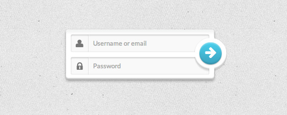
As I said earlier, I tried to make every form different from the others with its own particularity. This one relies on its submit button, kind of “out of the screen”, and rounded.
就像我之前说的,我试图使每种形式都有自己的特殊性。 这依赖于它的“提交”按钮,有点像“屏幕外”,并且四舍五入。
标记 (The Markup)
<form class="form-1">
	<p class="field">
		<input type="text" name="login" placeholder="Username or email">
		<i class="icon-user icon-large"></i>
	</p>
		<p class="field">
  		<input type="password" name="password" placeholder="Password">
  		<i class="icon-lock icon-large"></i>
	</p>
	<p class="submit">
    	<button type="submit" name="submit"><i class="icon-arrow-right icon-large"></i></button>
	</p>
</form>
Okay, so this first example is pretty minimal, meaning we won’t use any labels. But, we of course need to tell our user what they have to write in those fields, so we use … icons. Those are the little <i/> tags. Note: as usual, I will not cover here how to use an icon font like FontAwesome. If you’d like to learn more about it, you can check out the examples on their website. Basically, we have two containers wrapping an input and an icon. The submit button is in its own container, and we use a <button/> instead of an <input/> with an icon inside. We will also employ placeholders to make things even more clear for supported browsers. More information on the browser support for the placeholder attribute can be found on CanIUse.com.
好的,因此第一个示例非常少,这意味着我们将不使用任何标签。 但是,我们当然需要告诉我们的用户他们在这些字段中必须写什么,因此我们使用…图标。 这些是小<i/>标签。 注意:和往常一样,我不会在这里介绍如何使用诸如FontAwesome之类的图标字体。 如果您想了解更多信息,可以在其网站上查看示例。 基本上,我们有两个包装输入和图标的容器。 提交按钮位于其自己的容器中,我们使用<button/>而不是带有图标的<input/> 。 我们还将聘用占位符,以使支持的浏览器更加清晰。 可以在CanIUse.com上找到有关占位符属性的浏览器支持的更多信息。
CSS (The CSS)
We will start by giving some styles to the form element itself. The form is the main wrapper for our demos, so we give it a width and center it with the margin declaration.
我们将从为表单元素本身提供一些样式开始。 表单是演示的主要包装器,因此我们给它一个宽度,并用margin声明居中。
.form-1 {
    /* Size & position */
    width: 300px;
    margin: 60px auto 30px;
    padding: 10px;
    position: relative; /* For the submit button positioning */

    /* Styles */
    box-shadow:
        0 0 1px rgba(0, 0, 0, 0.3),
        0 3px 7px rgba(0, 0, 0, 0.3),
        inset 0 1px rgba(255,255,255,1),
        inset 0 -3px 2px rgba(0,0,0,0.25);
    border-radius: 5px;
    background: linear-gradient(#eeefef, #ffffff 10%);
}

.form-1 .field {
    position: relative; /* For the icon positioning */
}
Important: we set it to position relative in order to place the submit button absolutely. We do the same for the .field containers to place the icons absolutely as well. Speaking of icons, let’s deal with it now.
重要提示:我们将其设置为相对位置,以便绝对放置“提交”按钮。 我们对.field容器也进行同样的操作,以完全放置图标。 说到图标,让我们现在处理它。
.form-1 .field i {
    /* Size and position */
    left: 0px;
    top: 0px;
    position: absolute;
    height: 36px;
    width: 36px;

    /* Line */
    border-right: 1px solid rgba(0, 0, 0, 0.1);
    box-shadow: 1px 0 0 rgba(255, 255, 255, 0.7);

    /* Styles */
    color: #777777;
    text-align: center;
    line-height: 42px;
    transition: all 0.3s ease-out;
    pointer-events: none;
}
We add a subtle line on the right side of the icon by setting a right border and a box shadow. Since we are going to play with their color for the :hover and :focus states, we give them a smooth transition. Adding “pointer-events: none” will allow to actually click on the area of the icon and focus the input that lies beneath (we are actually clicking on the input).
通过设置右边框和框阴影,我们在图标的右侧添加了一条细线。 由于我们将在:hover和:focus状态下使用它们的颜色,因此我们为它们提供了平滑的过渡。 添加“指针事件:无”将允许实际单击图标区域并集中位于其下方的输入(实际上是单击输入)。
Now we need to give some styles to the inputs:
现在我们需要给输入一些样式:
.form-1 input[type=text],
.form-1 input[type=password] {
    font-family: 'Lato', Calibri, Arial, sans-serif;
    font-size: 13px;
    font-weight: 400;
    text-shadow: 0 1px 0 rgba(255,255,255,0.8);

    /* Size and position */
    width: 100%;
    padding: 10px 18px 10px 45px;

    /* Styles */
    border: none; /* Remove the default border */
    box-shadow:
        inset 0 0 5px rgba(0,0,0,0.1),
        inset 0 3px 2px rgba(0,0,0,0.1);
    border-radius: 3px;
    background: #f9f9f9;
    color: #777;
    transition: color 0.3s ease-out;
}

.form-1 input[type=text] {
    margin-bottom: 10px;
}
We make sure that neither the icon nor the input button overlap the text by giving the inputs a decent padding. And we set a bottom margin to the first input to prevent the second one to collapse.
通过为输入提供适当的填充,我们确保图标和输入按钮都不会与文本重叠。 并且我们为第一个输入设置了下边距,以防止第二个输入崩溃。
Before going any further, let’s not forget to set some styles for both, the hover and the focus state.
在继续之前,请不要忘记为悬停和焦点状态设置一些样式。
.form-1 input[type=text]:hover ~ i,
.form-1 input[type=password]:hover ~ i {
    color: #52cfeb;
}

.form-1 input[type=text]:focus ~ i,
.form-1 input[type=password]:focus ~ i {
    color: #42A2BC;
}

.form-1 input[type=text]:focus,
.form-1 input[type=password]:focus,
.form-1 button[type=submit]:focus {
    outline: none;
}
Two things here: we use the sibling selector (~) to change the color of the icons when interacting with the inputs: light blue for hover, darker blue for focus. And we remove the outline for Chrome.
这里有两件事:当与输入交互时,我们使用同级选择器( ~ )来更改图标的颜色:浅蓝色表示悬停,深蓝色表示焦点。 并且我们删除了Chrome的轮廓。
The last thing we have to style is the submit button. For some ugly overlapping reasons (what an awful property z-index is), I had to wrap it into a container to make things work. We could probably remove this container but it would require some annoying CSS trickery, and this is not the point.
我们要做的最后一件事是提交按钮。 由于某些丑陋的重叠原因(可怕的z-index属性是什么),我不得不将其包装到一个容器中以使工作正常。 我们可能会删除此容器,但是这将需要一些烦人CSS技巧,而这并不是重点。
.form-1 .submit {
    /* Size and position */
    width: 65px;
    height: 65px;
    position: absolute;
    top: 17px;
    right: -25px;
    padding: 10px;
    z-index: 2;

    /* Styles */
    background: #ffffff;
    border-radius: 50%;
    box-shadow:
        0 0 2px rgba(0,0,0,0.1),
        0 3px 2px rgba(0,0,0,0.1),
        inset 0 -3px 2px rgba(0,0,0,0.2);
}
Things are fairly simple here: we create a circle element and put it on top of our form, slightly out of it on the right side. Box shadows accentuate this overlapping effect.
事情在这里很简单:我们创建一个circle元素,并将其放在窗体的顶部,稍稍在右侧。 盒子阴影会加剧这种重叠效果。
Problem: box shadows accentuate this overlapping effect, but they can also destroy it. Indeed, we can see the shadow on the frame of the form (the spacing between the fields and the right padding of the form).
问题:盒子阴影会加重这种重叠效果,但它们也会破坏它。 确实,我们可以看到表单框架上的阴影(字段之间的间距和表单的右填充)。
Basically, we can hide those shadows with some kind of masks with the same background color of the form. This is a job for a pseudo-element!
基本上,我们可以使用与表单背景颜色相同的某种遮罩来隐藏这些阴影。 这是伪元素的工作!
.form-1 .submit:after {
    /* Size and position */
    content: "";
    width: 10px;
    height: 10px;
    position: absolute;
    top: -2px;
    left: 30px;

    /* Styles */
    background: #ffffff;

    /* Other masks trick */
    box-shadow: 0 62px white, -32px 31px white;
}
There are three shadows to cover since our circular element is at the intersection of the spacing between the fields and the right padding of the form. We place the first one on the top of the circular element. And with the box-shadow property, we can fake the two other masks. I think, this is something pretty hard to explain, so I suggest you open your developer tool and disable the box-shadow line on .submit:after to see what’s going on. Last but not least, our actual submit button:
由于我们的圆形元素位于字段与表单的右填充之间的交集处,因此要覆盖三个阴影。 我们将第一个放置在圆形元素的顶部。 使用box-shadow属性,我们可以伪造其他两个蒙版。 我认为,这很难解释,因此建议您打开开发人员工具,并禁用.submit:after上的阴影框.submit:after以查看发生了什么。 最后但并非最不重要的一点是,我们的实际提交按钮:
.form-1 button {
    /* Size and position */
    width: 100%;
    height: 100%;
    margin-top: -1px;

    /* Icon styles */
    font-size: 1.4em;
    line-height: 1.75;
    color: white;

    /* Styles */
    border: none; /* Remove the default border */
    border-radius: inherit;
    background: linear-gradient(#52cfeb, #42A2BC);
    box-shadow:
        inset 0 1px 0 rgba(255,255,255,0.3),
        0 1px 2px rgba(0,0,0,0.35),
        inset 0 3px 2px rgba(255,255,255,0.2),
        inset 0 -3px 2px rgba(0,0,0,0.1);

    cursor: pointer;
}
Finally, the style for the hover, focus (e.g. when tabbing through) and active (pressed) state of the button:
最后,悬停的样式,按钮的焦点(例如,在跳格时)和活动(按下)状态:
.form-1 button:hover,
.form-1 button[type=submit]:focus {
    background: #52cfeb;
    transition: all 0.3s ease-out;
}

.form-1 button:active {
    background: #42A2BC;
    box-shadow:
        inset 0 0 5px rgba(0,0,0,0.3),
        inset 0 3px 4px rgba(0,0,0,0.3);
}
Fairly simple: a plain color for hover and focus. But wait, there’s more! Since we use a gradient on the default state, and gradients can’t be transitioned to, the browser first disables the gradient then applies the background color. This particular behavior causes a white flash when you hover over or focus the button, which, in my opinion, is pretty cool. It looks like a brief light reflection!
非常简单:一种用于悬停和聚焦的纯色。 但是,等等,还有更多! 由于我们在默认状态下使用渐变,并且渐变无法过渡到,因此浏览器首先禁用渐变,然后应用背景色。 当您将鼠标悬停或聚焦在按钮上时,这种特殊行为会引起白色闪烁,我认为这非常酷。 看起来像是短暂的光反射!
例子2 (Example 2)
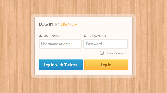
This one is far less minimal and provides some new options: a “Sign in with Twitter” button and a “Show password” toggle. This will involve some JavaScript.
这是最小的,它提供了一些新选项:“使用Twitter登录”按钮和“显示密码”切换。 这将涉及一些JavaScript。
标记 (The Markup)
<form class="form-2">
    <h1><span class="log-in">Log in</span> or <span class="sign-up">sign up</span></h1>
    <p class="float">
        <label for="login"><i class="icon-user"></i>Username</label>
        <input type="text" name="login" placeholder="Username or email">
    </p>
    <p class="float">
        <label for="password"><i class="icon-lock"></i>Password</label>
        <input type="password" name="password" placeholder="Password" class="showpassword">
    </p>
    <p class="clearfix">
        <a href="#" class="log-twitter">Log in with Twitter</a>
        <input type="submit" name="submit" value="Log in">
    </p>
</form>??
Here we will use a title. I went for a h1 but you could basically use whatever you want. We also use labels, connected to their inputs with a for attribute.
在这里,我们将使用标题。 我去了h1但您基本上可以使用任何您想要的东西。 我们还使用带有for属性将标签连接到其输入的标签。
CSS (The CSS)
Let’s start by giving some general styles to the whole form:
首先,为整个表单提供一些通用样式:
.form-2 {
    /* Size and position */
    width: 340px;
    margin: 60px auto 30px;
    padding: 15px;
    position: relative;

    /* Styles */
    background: #fffaf6;
    border-radius: 4px;
    color: #7e7975;
    box-shadow:
        0 2px 2px rgba(0,0,0,0.2),
        0 1px 5px rgba(0,0,0,0.2),
        0 0 0 12px rgba(255,255,255,0.4);
}
We will create a semi-transparent border by applying some box shadows.
我们将通过应用一些框阴影来创建半透明的边框。
Now that we gave some basic styles to our form, let’s deal with the title. There are 3 different font styles in the title: bold, caps and dark grey; bold, caps and orange; light, low and light grey. So basic styles + 2 spans:
现在我们为表单提供了一些基本样式,让我们处理标题。 标题中有3种不同的字体样式:粗体,大写和深灰; 粗体,大写和橙色; 浅,低和浅灰色。 因此,基本样式+ 2个跨度:
.form-2 h1 {
    font-size: 15px;
    font-weight: bold;
    color: #bdb5aa;
    padding-bottom: 8px;
    border-bottom: 1px solid #EBE6E2;
    text-shadow: 0 2px 0 rgba(255,255,255,0.8);
    box-shadow: 0 1px 0 rgba(255,255,255,0.8);
}

.form-2 h1 .log-in,
.form-2 h1 .sign-up {
    display: inline-block;
    text-transform: uppercase;
}

.form-2 h1 .log-in {
    color: #6c6763;
    padding-right: 2px;
}

.form-2 h1 .sign-up {
    color: #ffb347;
    padding-left: 2px;
}
Next, we use two paragraphs that will be placed side by side. Each one takes 50% of the available space in the form element, and thanks to the “border-box” box-sizing, the padding is calculated inside those 50%. That’s why we can make spacing between those two.
接下来,我们将使用两个段落并排放置。 每个人占据表单元素中50%的可用空间,并且由于“边框”框的大小,因此在这50%的内部计算了填充。 这就是为什么我们可以在两者之间留出间隔。
.form-2 .float {
    width: 50%;
    float: left;
    padding-top: 15px;
    border-top: 1px solid rgba(255,255,255,1);
}

.form-2 .float:first-of-type {
    padding-right: 5px;
}

.form-2 .float:last-of-type {
    padding-left: 5px;
}
Our wrappers are set. Let’s style the elements inside them! So we have a label and an input. The icon is inside the label in this example:
我们的包装纸已经准备好了。 让我们对其中的元素进行样式设置! 因此,我们有一个标签和一个输入。 在此示例中,图标位于标签内:
.form-2 label {
    display: block;
    padding: 0 0 5px 2px;
    cursor: pointer;
    text-transform: uppercase;
    font-weight: 400;
    text-shadow: 0 1px 0 rgba(255,255,255,0.8);
    font-size: 11px;
}

.form-2 label i {
    margin-right: 5px; /* Gap between icon and text */
    display: inline-block;
    width: 10px;
}
Note: using cursor: pointer on labels helps users understand they can click on it to focus the according input. This is an important detail.
注意:使用cursor: pointer标签上的cursor: pointer可帮助用户理解他们可以单击它来聚焦相应的输入。 这是一个重要的细节。
.form-2 input[type=text],
.form-2 input[type=password] {
    font-family: 'Lato', Calibri, Arial, sans-serif;
    font-size: 13px;
    font-weight: 400;
    display: block;
    width: 100%;
    padding: 5px;
    margin-bottom: 5px;
    border: 3px solid #ebe6e2;
    border-radius: 5px;
    transition: all 0.3s ease-out;
}
Don’t forget the hover and the focus states:
不要忘记悬停和焦点状态:
.form-2 input[type=text]:hover,
.form-2 input[type=password]:hover {
    border-color: #CCC;
}

.form-2 label:hover ~ input {
    border-color: #CCC;
}

.form-2 input[type=text]:focus,
.form-2 input[type=password]:focus {
    border-color: #BBB;
    outline: none; /* Remove Chrome's outline */
}
Check out how we use the sibling selector (~) to trigger the hover state on the inputs when we hover the labels. Isn’t that super cool?
了解当我们悬停标签时如何使用同级选择器( ~ )触发输入的悬停状态。 那不是很酷吗?
Now, the submit buttons. But wait, since they are both floated in their container, we have to apply a clearfix to it. Remember how we do it?
现在,提交按钮。 但是,等等,由于它们都漂浮在容器中,因此我们必须对其应用clearfix。 还记得我们是怎么做的吗?
.clearfix:after {
	content: "";
	display: table;
	clear: both;
}

.form-2 input[type=submit],
.form-2 .log-twitter {
    /* Size and position */
    width: 49%;
    height: 38px;
    float: left;
    position: relative;

    /* Styles */
    box-shadow: inset 0 1px rgba(255,255,255,0.3);
    border-radius: 3px;
    cursor: pointer;

    /* Font styles */
    font-family: 'Lato', Calibri, Arial, sans-serif;
    font-size: 14px;
    line-height: 38px; /* Same as height */
    text-align: center;
    font-weight: bold;
}

.form-2 input[type=submit] {
    margin-left: 1%;
    background: linear-gradient(#fbd568, #ffb347);
    border: 1px solid #f4ab4c;
    color: #996319;
    text-shadow: 0 1px rgba(255,255,255,0.3);
}

.form-2 .log-twitter {
    margin-right: 1%;
    background: linear-gradient(#34a5cf, #2a8ac4);
    border: 1px solid #2b8bc7;
    color: #ffffff;
    text-shadow: 0 -1px rgba(0,0,0,0.3);
    text-decoration: none;
}
Both buttons are 49% wide, and they have a left/right margin to make a small gap between them. Now we give them a hover, and -it doesn’t harm just this once- an active state.
两个按钮的宽度均为49%,左/右边缘的间距很小。 现在,我们给他们一个悬停,并且-不仅对这一次有害-处于活动状态。
.form-2 input[type=submit]:hover,
.form-2 .log-twitter:hover {
    box-shadow:
        inset 0 1px rgba(255,255,255,0.3),
        inset 0 20px 40px rgba(255,255,255,0.15);
}

.form-2 input[type=submit]:active,
.form-2 .log-twitter:active{
    top: 1px;
}
Thanks to the position relative, we can apply top: 1px to the buttons on the active state to make them look like they are being pushed down.
由于位置相对,我们可以将top: 1px应用于活动状态上的按钮,以使其看起来像被按下了。
Important: for browsers that don’t support box-shadow (still exist, right?), we use a background-color change instead. The no-boxshadow class is applied to the HTML with Modernizr in case a browser does not support box shadows. This is a nice example of how you can create a simple “fallback” for older browsers:
重要提示:对于不支持盒形阴影(仍然存在,对吗?)的浏览器,我们改用背景颜色更改。 如果浏览器不支持框阴影,则no-boxshadow类将应用于ModernizrHTML。 这是一个很好的示例,说明如何为较旧的浏览器创建简单的“后备”:
.no-boxshadow .form-2 input[type=submit]:hover {
    background: #ffb347;
}

.no-boxshadow .form-2 .log-twitter:hover {
    background: #2a8ac4;
}
JavaScript(The JavaScript)
Hey, didn’t we forgot our little “show password” thing? We’re getting into it! First, did you know we can’t change the type attribute on an input? IMPOSSIBRU! To make a “show password” toggle, we have to delete the actual password input and create a text input instead. I’m not very good at jQuery, so I found a little snippet by Aaron Saray to manage it. Let’s have a look:
嘿,我们不是忘记了“显示密码”这个小东西吗? 我们正在进入它! 首先,您知道我们无法更改输入的type属性吗? IMPOSSIBRU! 要进行“显示密码”切换,我们必须删除实际的密码输入,而是创建文本输入。 我不太擅长jQuery,所以我找到了Aaron Saray的一些代码片段来管理它。 我们来看一下:
$(function(){
	$(".showpassword").each(function(index,input) {
		var $input = $(input);
		$("<p class='opt'/>").append(
			$("<input type='checkbox' class='showpasswordcheckbox' id='showPassword' />").click(function() {
				var change = $(this).is(":checked") ? "text" : "password";
				var rep = $("<input placeholder='Password' type='" + change + "' />")
					.attr("id", $input.attr("id"))
					.attr("name", $input.attr("name"))
					.attr('class', $input.attr('class'))
					.val($input.val())
					.insertBefore($input);
				$input.remove();
				$input = rep;
			 })
		).append($("<label for='showPassword'/>").text("Show password")).insertAfter($input.parent());
	});
});
?
So what does this script do exactly? A few things:
那么,该脚本到底能做什么? 一些东西:
It spots every input with the
.showpasswordclass.它使用
.showpassword类.showpassword每个输入。It creates a new container (
.opt).它创建一个新的容器(
.opt)。- Inside this container, it creates a checkbox with a label linked to it. 在此容器内,它会创建一个带有链接标签的复选框。
It inserts this container after the
.showpasswordinput’s parent.它将在
.showpassword输入的父项之后插入此容器。When the checkbox in clicked, it removes the
.showpasswordinput and creates another one instead with the according type attribute.单击该复选框后,它将删除
.showpassword输入,并创建另一个具有.showpasswordtype属性的输入。
Let’s not forget to give some styles to our checkbox and new label.
我们不要忘记为复选框和新标签添加一些样式。
.form-2 p:last-of-type {
    clear: both;
}

.form-2 .opt {
    text-align: right;
    margin-right: 3px;
}

.form-2 label[for=showPassword] {
    display: inline-block;
    margin-bottom: 10px;
    font-size: 11px;
    font-weight: 400;
    text-transform: capitalize;
}

.form-2 input[type=checkbox] {
    vertical-align: middle;
    margin: -1px 5px 0 1px;
}
Last but not least, we add a few lines of jQuery to change the icon when the checkbox is checked! Fairly simple but quite effective!
最后但并非最不重要的一点是,当选中复选框时,我们添加了几行jQuery来更改图标! 相当简单但是很有效!
$('#showPassword').click(function(){
	if($("#showPassword").is(":checked")) {
		$('.icon-lock').addClass('icon-unlock');
		$('.icon-unlock').removeClass('icon-lock');
	} else {
		$('.icon-unlock').addClass('icon-lock');
		$('.icon-lock').removeClass('icon-unlock');
	}
});
例子3(Example 3)
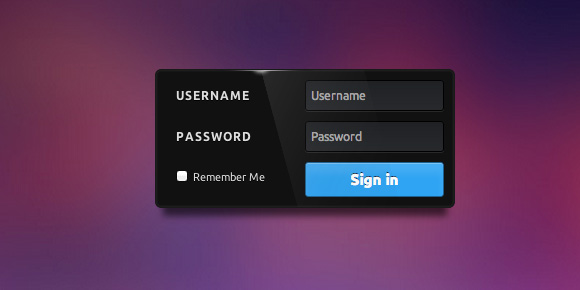
This one is inspired by an old work from Virgil Pana on Dribbble. Sadly, it looks like he removed it from Dribbble so I can’t show you the original concept. Anyway, you’ve probably understood the point that it’s for showing you how to create this awesome light effect with pure CSS!
此作品的灵感来自维吉尔·帕纳(Virgil Pana)在Dribbble上的一件古老作品。 可悲的是,看起来他将其从Dribbble中删除了,所以我无法向您展示原始概念。 无论如何,您可能已经了解了它的关键,它向您展示了如何使用纯CSS创建这种超酷的灯光效果!
标记 (The Markup)
<form class="form-3">
    <p class="clearfix">
        <label for="login">Username</label>
        <input type="text" name="login" id="login" placeholder="Username">
    </p>
    <p class="clearfix">
        <label for="password">Password</label>
        <input type="password" name="password" id="password" placeholder="Password">
    </p>
    <p class="clearfix">
        <input type="checkbox" name="remember" id="remember">
        <label for="remember">Remember me</label>
    </p>
    <p class="clearfix">
        <input type="submit" name="submit" value="Sign in">
    </p>
</form>?
Look how we introduce a new feature in this form: the “Remember me” option. This is something very specific to login forms since it allows the application to remember that you’re authenticated.
看看我们如何以这种形式引入新功能:“记住我”选项。 这是登录表单所特有的,因为它允许应用程序记住您已通过身份验证。
CSS (The CSS)
.form-3 {
    font-family: 'Ubuntu', 'Lato', sans-serif;
    font-weight: 400;
    /* Size and position */
    width: 300px;
    position: relative;
    margin: 60px auto 30px;
    padding: 10px;
    overflow: hidden;

    /* Styles */
    background: #111;
    border-radius: 0.4em;
    border: 1px solid #191919;
    box-shadow:
        inset 0 0 2px 1px rgba(255,255,255,0.08),
        0 16px 10px -8px rgba(0, 0, 0, 0.6);
}
The shadow under the login form will look special because of the negative spread radius. We can actually compress the shadow like that. Let’s dig a little bit into the structure of our form, shall we? For the fields, we use two p tags wrapping a label and an input, both floated. This means we have to clearfix our containers (see previous examples).
由于展开半径为负,因此登录表单下的阴影看起来会很特殊。 实际上,我们可以像这样压缩阴影。 让我们深入研究一下表单的结构,对吧? 对于字段,我们使用包裹标签和输入的两个p标签,它们都浮动。 这意味着我们必须清除容器(请参见前面的示例)。
Let’s add some style to the labels and text/password inputs plus their hovered and focused states, of course:
当然,让我们为标签和文本/密码输入以及它们的悬浮和集中状态添加一些样式:
.form-3 label {
    /* Size and position */
    width: 50%;
    float: left;
    padding-top: 9px;

    /* Styles */
    color: #ddd;
    font-size: 12px;
    text-transform: uppercase;
    letter-spacing: 1px;
    text-shadow: 0 1px 0 #000;
    text-indent: 10px;
    font-weight: 700;
    cursor: pointer;
}

.form-3 input[type=text],
.form-3 input[type=password] {
    /* Size and position */
    width: 50%;
    float: left;
    padding: 8px 5px;
    margin-bottom: 10px;
    font-size: 12px;

    /* Styles */
    background: linear-gradient(#1f2124, #27292c);
    border: 1px solid #000;
    box-shadow:
        0 1px 0 rgba(255,255,255,0.1);
    border-radius: 3px;

    /* Font styles */
    font-family: 'Ubuntu', 'Lato', sans-serif;
    color: #fff;

}

.form-3 input[type=text]:hover,
.form-3 input[type=password]:hover,
.form-3 label:hover ~ input[type=text],
.form-3 label:hover ~ input[type=password] {
    background: #27292c;
}

.form-3 input[type=text]:focus,
.form-3 input[type=password]:focus {
    box-shadow: inset 0 0 2px #000;
    background: #494d54;
    border-color: #51cbee;
    outline: none; /* Remove Chrome outline */
}
Now that we have some beautiful inputs, we have to create our little checkbox for the “Remember me” feature, and the submit button. Those two things are floated side by side:
现在我们有了一些漂亮的输入,我们必须为“记住我”功能和提交按钮创建一个小复选框。 这两件事并排浮动:
.form-3 p:nth-child(3),
.form-3 p:nth-child(4) {
    float: left;
    width: 50%;
}
We use advanced CSS selectors to target them, but you could use a class if you want (or if you have to, for legacy browser coverage). Anyway, let’s start with the checkbox and its label:
我们使用高级CSS选择器来定位它们,但是您可以根据需要使用一个类(或者,如果有必要,则可以使用旧版浏览器)。 无论如何,让我们从复选框及其标签开始:
.form-3 label[for=remember] {
    width: auto;
    float: none;
    display: inline-block;
    text-transform: capitalize;
    font-size: 11px;
    font-weight: 400;
    letter-spacing: 0px;
    text-indent: 2px;
}

.form-3 input[type=checkbox] {
    margin-left: 10px;
    vertical-align: middle;
}
Since this label is quite different from the others, we have to tweak a few things to make it right: so it’s pretty much removing previously set styles. As for the checkbox, we add a little margin to its right to prevent the label to stick to it, and the vertical align fix some weird, well, vertical align (!).
由于此标签与其他标签完全不同,因此我们必须进行一些调整以使其正确:因此,它几乎删除了先前设置的样式。 至于复选框,我们在其右边添加了一点空白,以防止标签粘附到其上,并且垂直对齐可修复一些奇怪的垂直对齐(!)。
Last, our submit button with its hovered state:
最后,我们的提交按钮处于悬停状态:
.form-3 input[type=submit] {
    /* Width and position */
    width: 100%;
    padding: 8px 5px;

    /* Styles */
    border: 1px solid #0273dd; /* Fallback */
    border: 1px solid rgba(0,0,0,0.4);
    box-shadow:
        inset 0 1px 0 rgba(255,255,255,0.3),
        inset 0 10px 10px rgba(255,255,255,0.1);
    border-radius: 3px;
    background: #38a6f0;
    cursor:pointer;

    /* Font styles */
    font-family: 'Ubuntu', 'Lato', sans-serif;
    color: white;
    font-weight: 700;
    font-size: 15px;
    text-shadow: 0 -1px 0 rgba(0,0,0,0.8);
}

.form-3 input[type=submit]:hover {
    box-shadow: inset 0 1px 0 rgba(255,255,255,0.6);
}

.form-3 input[type=submit]:active {
    background: #287db5;
    box-shadow: inset 0 0 3px rgba(0,0,0,0.6);
    border-color: #000; /* Fallback */
    border-color: rgba(0,0,0,0.9);
}

.no-boxshadow .form-3 input[type=submit]:hover {
    background: #2a92d8;
}
But where the hell is our promised light effect? Okay guys, let’s go for it. To achieve this, we need three elements:
但是我们承诺的灯光效果到底在哪里呢? 好的,让我们开始吧。 为此,我们需要三个要素:
- One for the gradient line from the top of the form 一个从表单顶部开始的渐变线
- One for the small flash on the previous line一个用于上一行的小闪光灯
- One for the large reflection on the right part the form一种用于右侧部分的大反射
We will start with the first two elements with pseudo-elements on the form tag.
我们将从form标签上带有伪元素的前两个元素开始。
/* Gradient line */
.form-3:after {
    /* Size and position */
    content: "";
    height: 1px;
    width: 33%;
    position: absolute;
    left: 20%;
    top: 0;

    /* Styles */
    background: linear-gradient(left, transparent, #444, #b6b6b8, #444, transparent);
}

/* Small flash */
.form-3:before {
    /* Size and position */
    content: "";
    width: 8px;
    height: 5px;
    position: absolute;
    left: 34%;
    top: -7px;

    /* Styles */
    border-radius: 50%;
    box-shadow: 0 0 6px 4px #fff;
}
Finally, our light reflection. But wait, we don’t have enough pseudo-elements! Don’t worry, we will use our first paragraph for it.
最后,我们的光反射。 但是,等等,我们没有足够的伪元素! 不用担心,我们将使用我们的第一段。
.form-3 p:nth-child(1):before{
    /* Size and position */
    content: "";
    width: 250px;
    height: 100px;
    position: absolute;
    top: 0;
    left: 45px;

    /* Styles */
    transform: rotate(75deg);
    background: linear-gradient(50deg, rgba(255,255,255,0.15), rgba(0,0,0,0));
    pointer-events: none;
}
Important: you have to disable click events on it with the pointer-events property. If you don’t, you won’t be able to click on inputs anymore since there will be a layer on top of them. We will have to remove the reflection for browsers that don’t support the pointer-events (we’ve added this none-core detect to our Modernizr build):
重要提示:您必须使用pointer-events property禁用其点击事件。 如果您不这样做,您将无法再单击输入,因为在它们上面会有一层。 对于不支持指针事件的浏览器,我们将必须删除反射(我们在Modernizr构建中添加了此无核检测):
.no-pointerevents .form-3 p:nth-child(1):before {
    display: none;
}
例子4(Example 4)
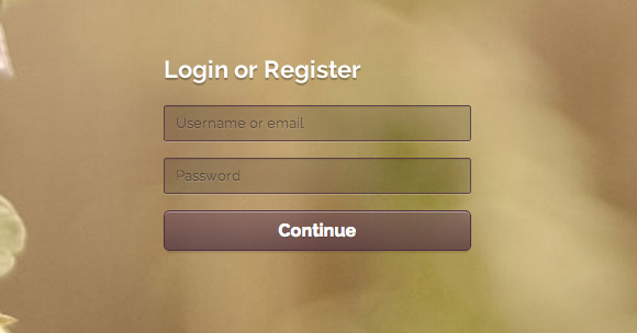
This one’s particularity is the absence of labels. Or icons. Yes, I know, I said earlier we absolutely need to have something to tell users what to do. And we have! We have placeholders. And for browsers that don’t support them, we will make labels visible!
这个人的特殊性是没有标签。 或图标。 是的,我知道,我之前说过,我们绝对需要告诉用户该怎么做。 我们有! 我们有占位符。 对于不支持它们的浏览器,我们将使标签可见!
标记 (The Markup)
<form class="form-4">
    <h1>Login or Register</h1>
    <p>
        <label for="login">Username or email</label>
        <input type="text" name="login" placeholder="Username or email" required>
    </p>
    <p>
        <label for="password">Password</label>
        <input type="password" name='password' placeholder="Password" required>
    </p>

    <p>
        <input type="submit" name="submit" value="Continue">
    </p>
</form>?
Let me introduce the required attribute to you. When supported, it allows the browser to check if the field is empty or not, and submit the form accordingly.
让我向您介绍required属性。 受支持时,它允许浏览器检查该字段是否为空,并相应地提交表单。
Important: you should always build a server-side verification for submitting your forms. With a web inspector, it is very easy to remove an attribute, and JavaScript can be disabled as well, so don’t rely on client-side verification only.
重要提示:您应始终构建服务器端验证以提交表单。 使用Web检查器,删除属性非常容易,并且也可以禁用JavaScript,因此不要仅依赖于客户端验证。
CSS (The CSS)
As always, we start with the form and the title since it’s fairly simple.
与往常一样,我们从表单和标题开始,因为它非常简单。
.form-4 {
    /* Size and position */
    width: 300px;
    margin: 60px auto 30px;
    padding: 10px;
    position: relative;

    /* Font styles */
    font-family: 'Raleway', 'Lato', Arial, sans-serif;
    color: white;
    text-shadow: 0 2px 1px rgba(0,0,0,0.3);
}

.form-4 h1 {
    font-size: 22px;
    padding-bottom: 20px;
}
Let’s move on to the inputs:
让我们继续输入:
.form-4 input[type=text],
.form-4 input[type=password] {
    /* Size and position */
    width: 100%;
    padding: 8px 4px 8px 10px;
    margin-bottom: 15px;

    /* Styles */
    border: 1px solid #4e3043; /* Fallback */
    border: 1px solid rgba(78,48,67, 0.8);
    background: rgba(0,0,0,0.15);
    border-radius: 2px;
    box-shadow:
        0 1px 0 rgba(255,255,255,0.2),
        inset 0 1px 1px rgba(0,0,0,0.1);
    -webkit-transition: all 0.3s ease-out;
    -moz-transition: all 0.3s ease-out;
    -ms-transition: all 0.3s ease-out;
    -o-transition: all 0.3s ease-out;
    transition: all 0.3s ease-out;

    /* Font styles */
    font-family: 'Raleway', 'Lato', Arial, sans-serif;
    color: #fff;
    font-size: 13px;
}
Let’s change the style for the placeholders (where it’s possible):
让我们更改占位符的样式(如果可能):
.form-4 input::-webkit-input-placeholder {
    color: rgba(37,21,26,0.5);
    text-shadow: 0 1px 0 rgba(255,255,255,0.15);
}

.form-4 input:-moz-placeholder {
    color: rgba(37,21,26,0.5);
    text-shadow: 0 1px 0 rgba(255,255,255,0.15);
}

.form-4 input:-ms-input-placeholder {
    color: rgba(37,21,26,0.5);
    text-shadow: 0 1px 0 rgba(255,255,255,0.15);
}
Next, let’s add the hover and focus styles:
接下来,让我们添加悬停和焦点样式:
.form-4 input[type=text]:hover,
.form-4 input[type=password]:hover {
    border-color: #333;
}

.form-4 input[type=text]:focus,
.form-4 input[type=password]:focus,
.form-4 input[type=submit]:focus {
    box-shadow:
        0 1px 0 rgba(255,255,255,0.2),
        inset 0 1px 1px rgba(0,0,0,0.1),
        0 0 0 3px rgba(255,255,255,0.15);
    outline: none;
}

/* Fallback */
.no-boxshadow .form-4 input[type=text]:focus,
.no-boxshadow .form-4 input[type=password]:focus {
    outline: 1px solid white;
}
And the submit button:
和提交按钮:
.form-4 input[type=submit] {
    /* Size and position */
    width: 100%;
    padding: 8px 5px;

    /* Styles */
    background: linear-gradient(rgba(99,64,86,0.5), rgba(76,49,65,0.7));
    border-radius: 5px;
    border: 1px solid #4e3043;
    box-shadow:
    	inset 0 1px rgba(255,255,255,0.4),
    	0 2px 1px rgba(0,0,0,0.1);
    cursor: pointer;
    transition: all 0.3s ease-out;

    /* Font styles */
    color: white;
    text-shadow: 0 1px 0 rgba(0,0,0,0.3);
    font-size: 16px;
    font-weight: bold;
    font-family: 'Raleway', 'Lato', Arial, sans-serif;
}

.form-4 input[type=submit]:hover {
    box-shadow:
        inset 0 1px rgba(255,255,255,0.2),
        inset 0 20px 30px rgba(99,64,86,0.5);
}

/* Fallback */
.no-boxshadow .form-4 input[type=submit]:hover {
    background: #594642;
}
And now, let’s deal with our no-placeholder fallback. Placeholder is not a vital feature I know, unless you exclusively rely on it to tell user what are the inputs for. In this case, you have to provide a fallback.
现在,让我们来解决无占位符回退的问题。 除非您完全依靠占位符来告诉用户输入的内容,否则占位符并不是我所知道的重要功能。 在这种情况下,您必须提供一个备用。
.form-4 label {
    display: none;
    padding: 0 0 5px 2px;
    cursor: pointer;
}

.form-4 label:hover ~ input {
    border-color: #333;
}

.no-placeholder .form-4 label {
    display: block;
}
This is very simple: if placeholders are not supported, labels turn visible. End of story.
这非常简单:如果不支持占位符,则标签变为可见。 故事结局。
例子5 (Example 5)
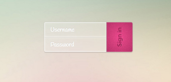
This last example is a glass-like, minimal form with a subtle twist. We won’t use labels, and everything looks very compact. We’ll rotate the text of the submit button and make an arrow appear on hover.
最后一个示例是类似玻璃的最小形式,带有细微的扭曲。 我们不会使用标签,并且所有内容看起来都很紧凑。 我们将旋转“提交”按钮的文本,并在悬停时显示一个箭头。
标记 (The Markup)
<form class="form-5 clearfix">
    <p>
        <input type="text" id="login" name="login" placeholder="Username">
        <input type="password" name="password" id="password" placeholder="Password">
    </p>
    <button type="submit" name="submit">
    	<i class="icon-arrow-right"></i>
    	<span>Sign in</span>
    </button>
</form>????
A minimalistic markup for a minimalistic form. 😉
简约形式的简约标记。 😉
CSS (The CSS)
.form-5 {
    /* Size and position */
    width: 300px;
    margin: 60px auto 30px;
    position: relative;

    /* Styles */
    border-radius: 5px;
    box-shadow: 0 0 5px rgba(0,0,0,0.1), 0 3px 2px rgba(0,0,0,0.1);
}
Let’s style the paragraphs and the inputs:
让我们设置段落和输入的样式:
.form-5 p {
    width: 70%;
    float: left;
    border-radius: 5px 0 0 5px;
    border: 1px solid #fff;
    border-right: none;
}

.form-5 input[type=text],
.form-5 input[type=password] {
    /* Size and position */
    width: 100%;
    height: 50px;
    padding: 0 10px;

    /* Styles */
    border: none; /* Remove the default border */
    background: white; /* Fallback */
    background: rgba(255,255,255,0.2);
    box-shadow:
        inset 0 0 10px rgba(255,255,255,0.5);

    /* Font styles */
    font-family: 'Montserrat', sans-serif;
    text-indent: 10px;
    color: #ee4c8d;
    text-shadow: 0 1px 2px rgba(0,0,0,0.3);
    font-size: 20px;
}

.form-5 input[type=text] {
    border-bottom: 1px solid #fff; /* Fallback */
    border-bottom: 1px solid rgba(255,255,255,0.7);
    border-radius: 5px 0 0 0;
}

.form-5 input[type=password] {
    border-top: 1px solid #CCC; /* Fallback */
    border-top: 1px solid rgba(0,0,0,0.1);
    border-radius: 0 0 0 5px;
}
Let’s apply some hover styles and style the placeholders:
让我们应用一些悬停样式并设置占位符的样式:
.form-5 input[type=text]:hover,
.form-5 input[type=password]:hover,
.form-5 input[type=text]:focus,
.form-5 input[type=password]:focus {
    background: #f7def7; /* Fallback */
    background: rgba(255,255,255,0.4);
    outline: none;
}

.form-5 input::-webkit-input-placeholder {
    color: #fff;
    text-shadow: 0 -1px 1px rgba(0,0,0,0.4);
    font-family: 'Handlee', cursive;
}

.form-5 input:-moz-placeholder {
    color: #fff;
    text-shadow: 0 -1px 1px rgba(0,0,0,0.4);
    font-family: 'Handlee', cursive;
}

.form-5 input:-ms-input-placeholder {
    color: #fff;
    text-shadow: 0 -1px 1px rgba(0,0,0,0.4);
    font-family: 'Handlee', cursive;
}
And now, the submit button. The little i will contain an arrow icon but we will not make it visible for now, just on hover. Note that we use a span inside the button to turn the text without turning the button.
现在,提交按钮。 小小的我将包含一个箭头图标,但我们暂时不会将其显示,只是悬停时。 请注意,我们在按钮内部使用了一个跨度来旋转文本而不旋转按钮。
.form-5 button {
    /* Size and position */
    width: 30%;
    height: 102px;
    float: left;
    position: relative;
    overflow: hidden;

    /* Styles */
    background:
    	url(../images/noise.png),
    	radial-gradient(ellipse at center, #ee4c8d 0%,#b53467 100%);
    border-radius: 0 5px 5px 0;
    box-shadow:
        inset 0 0 4px rgba(255, 255, 255, 0.7),
        inset 0 0 0 1px rgba(0, 0, 0, 0.2);
    border: none;
    border-left: 1px solid silver;
    cursor: pointer;
    line-height: 102px; /* Same as height */
}

.form-5 button i {
    position: absolute;
    width: 100%;
    height: 100%;
    top: 0;
    left: -20px;
    font-size: 64px;
    line-height: 109px;
    color: #8d1645;
    opacity: 0;
    text-shadow: 0 1px 0 rgba(255,255,255,0.4);
    transition: all 0.2s ease-out;
}

.form-5 button span {
    display: block;

    /* Font styles */
    color: #8d1645;
    font-family: 'Montserrat', Arial, sans-serif;
    font-size: 20px;
    text-shadow: 0 1px 0 rgba(255,255,255,0.4);
    transform: rotate(-90deg);
    transition: all 0.2s linear;
}
In case the browser doesn’t support the transform property, the text is simply not rotated. No big deal. We’ve added a subtle texture to the button by applying two backgrounds: the texture and the radial gradient that lies beneath.
如果浏览器不支持transform属性,则不会旋转文本。 没什么大不了的。 我们通过应用两个背景为按钮添加了微妙的纹理:纹理和下方的径向渐变。
Now, let’s add the hover, focus and active state styles. On hover, we will make the span move to the left and fade out and the arrow will appear:
现在,让我们添加悬停,焦点和活动状态样式。 悬停时,我们将使跨度向左移动并淡出,并出现箭头:
.form-5 button:focus {
    outline: none;
}

.form-5 button:hover span,
.form-5 button:focus span {
    opacity: 0;
    transform: rotate(-90deg) translateY(-20px);
}

.form-5 button:hover i,
.form-5 button:focus i {
    opacity: 0.5;
    left: 0;
    transition-delay: 0.2s;
}

/* Click on button */

.form-5 button:active span,
.form-5 button:active i {
    transition: none;
}

.form-5 button:active span {
    opacity: 0;
}

.form-5 button:active i {
    opacity: 0.5;
    left: 0;
    color: #fff;
}
When we click on the button, we don’t want any transitions so that it doesn’t look to messy.
当我们单击按钮时,我们不希望有任何过渡,因此看起来不会很杂乱。
JavaScript (The JavaScript)
Let’s use a little bit of JavaScript here for adding HTML5 placeholder behavior to the browsers that don’t support it. We are going to use a jQuery plugin by Mathias Bynens. Check out the GitHub repo for details.
让我们在这里使用一些JavaScript,将HTML5占位符行为添加到不支持HTML5的浏览器中。 我们将使用Mathias Bynens的jQuery插件。 查看GitHub存储库以获取详细信息。
After including jQuery and the script, we simply call it like this:
包含jQuery和脚本之后,我们简单地这样称呼它:
$(function(){
	$('input, textarea').placeholder();
});
And this will add placeholder behavior to older browsers.
这会将占位符行为添加到较旧的浏览器中。
最后的话 (Final words)
Now that you have read this, the only thing you have to do is to create your own forms. This is something which can be very creative, so please let yourself go and show us what you can do! Dribbble is a wonderful source of inspiration for such things, so I’d suggest you have a little ride over there to see what’s going on. You may find beautiful forms like these:
既然您已经阅读了此书,那么您唯一要做的就是创建自己的表单。 这可能很有创意,所以请放手告诉我们您可以做什么! Dribbble是此类事情的绝佳灵感来源,因此,我建议您在那儿走一小段路,看看发生了什么。 您可能会发现类似以下的漂亮形式:
As further readings, I recommend:
作为进一步阅读,我建议:
A screencast from Chris Coyier about advanced form styling and functionality
An article by Luke Wroblewski on Smashing Magazine about forms on mobile devices
Thanks a lot for reading this tutorial, and as always if you have any question, just ask, or if you have related work to show, just do!
非常感谢您阅读本教程,并且一如既往地有任何疑问,只问一下,或者如果您有相关的工作要展示,就去做吧!
翻译自: https://tympanus.net/codrops/2012/10/16/custom-login-form-styling/


 扫一扫
扫一扫
 393
393

 被折叠的 条评论
为什么被折叠?
被折叠的 条评论
为什么被折叠?
 到【灌水乐园】发言


