


css svg使用
An SVG can be embedded on a web page in many ways; one of which is embedding it inline in an HTML5 page using the <svg> tag. The other commonly used techniques include embedding it as an image using the <img> tag, embedding it using the <object> tag, using an iframe, and as a CSS background image.
SVG可以通过多种方式嵌入到网页中。 其中之一是使用<svg>标记将其内嵌在HTML5页面中。 其他常用的技术包括使用<img>标签将其嵌入为图像,使用<object>标签,使用iframe嵌入为图像以及CSS背景图像。
Conceptually, making an SVG scale as its container scales should be as simple as removing any fixed height and/or width, and specifying a viewBox attribute value. However, due to different browser implementations and inconsistencies, the web isn’t all ponies and rainbows, and making SVGs fluid isn’t quite that straightforward, because the way browsers determine the dimensions of an SVG when embedded in different ways isn’t consistent across all of them.
从概念上讲,制作SVG缩放比例及其容器缩放比例应与删除任何固定的高度和/或宽度并指定viewBox属性值一样简单。 但是,由于不同的浏览器实现方式和不一致之处,网络并不仅是所有的小马和彩虹,而且使SVG流畅起来并不是那么简单,因为以不同方式嵌入时,浏览器确定SVG尺寸的方式不一致遍及所有人。
That said, there are certain “fixes” and hacks that we can use to get the expected behavior in all browsers. In this article, we’re going to explore these techniques, going over when to use each one, in order to make SVGs fluid and/or adaptive.
就是说,我们可以使用某些“修复”和黑客手段来在所有浏览器中获得预期的行为。 在本文中,我们将探讨这些技术,并探讨何时使用每种技术,以使SVG变得流畅和/或自适应。
使用CSS使SVG流畅 (Making SVGs Fluid Using CSS)
In order to make an SVG fluid, the first logical thing to do is to remove the height and width attributes. When a fixed height and/or width is specified, the SVG is going to maintain that height/or width, thus restricting it from being fully responsive. You should, however, leave the viewBox attribute present. After removing the height and width, you can embed the SVG in one of several ways on the page.
为了使SVG流畅,要做的第一件事就是删除height和width属性。 当指定了固定的高度和/或宽度时,SVG将保持该高度/或宽度,从而限制了它的完全响应性。 但是,您应该保留viewBox属性存在。 删除高度和宽度后,您可以通过以下几种方式之一将SVG嵌入页面。
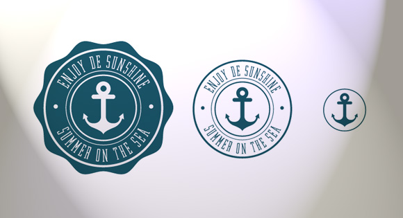
We’ll be using the following SVG nautical logo in the demos. It’s from a freebie designed by Freepik.
在演示中,我们将使用以下SVG航海徽标。 它来自Freepik设计的免费赠品。

使用<img>嵌入的SVG (SVG embedded using <img>)
When an SVG is embedded as an image in an <img> tag, the height and width specified on the <img> tag are used by the browser as a viewport to render the SVG into. The contents of the SVG are then positioned inside the viewport depending on the value of the viewBox specified on the <svg>.
当SVG被嵌入作为在图像<img>标记,高度和宽度上的指定<img>标记被用于由浏览器作为视口以使SVG成。 然后,根据<svg>上指定的viewBox的值,将SVG的内容放置在视口中。
<img src="my_SVG_file.svg" alt="Image description." />
Normally, browsers are smart enough to determine the width and height of the SVG even if you don’t specify a width and height for the <img> element. For example, if you were to wrap the img in a div, without specifying the height and width of the img, Chrome and Firefox will both assume the img has width: 100%; the SVG is then stretched to fill the containing div, and its height is adjusted accordingly so that it preserves its aspect ratio. As the containing div is then resized, the img SVG responds in an expected way. This behavior is different from an img referencing a raster graphic such as a PNG image, for example; in the latter case, you’d have to explicitly set the width of the img to 100% using CSS to make it fluid.
通常,即使您没有为<img>元素指定宽度和高度,浏览器也足够聪明地确定SVG的宽度和高度。 例如,如果你要包裹img在div ,而不指定的高度和宽度img ,Chrome和Firefox都将假定img具有width: 100% ; 然后将SVG拉伸以填充包含的div ,并对其高度进行相应的调整,以保留其宽高比。 然后,在调整包含div的大小时, img SVG将以预期的方式响应。 例如,此行为与引用栅格图形(例如PNG图像)的img不同; 在后一种情况下,您必须使用CSS将img的宽度显式设置为100%,以使其流畅。
In Internet Explorer, things are different. If you don’t specify a width for the img, it will assume the height is equal to 150px, which is the default height for replaced elements as specified in CSS—the default width is 300px. The SVG is then positioned inside the containing div such that its height is equal to 150px; the width is assumed to be 100%, though, making the SVG always 150px in height no matter how wide the container gets, resulting in extra white spaces on both sides. In order to work around this issue in IE, it is enough to explicitly set the width on the img to 100%. These results were obtained from tests made in Internet Explorer 9 and 11.
在Internet Explorer中,情况有所不同。 如果您未为img指定宽度,它将假定高度等于150px,这是CSS中指定的替换元素的默认高度-默认宽度为300px。 然后,将SVG放置在包含div内部,使其高度等于150px; 但是,假定宽度为100%,无论容器有多宽,SVG的高度始终为150px,从而在两侧都留有额外的空白。 为了解决IE中的此问题,只需将img的宽度显式设置为100%就足够了。 这些结果是从Internet Explorer 9和11中进行的测试获得的。
So, making an SVG embedded as an img fluid is doable by removing the explicit height and width set on the <svg>, and then adding one line of CSS for Internet Explorer:
因此,通过删除<svg>上的显式高度和宽度,然后为Internet Explorer添加一行CSS,可以使SVG嵌入为img流体。
/* fix for IE */
img {
    width: 100%;
}
Check the demo out in different browsers to see how the SVG behaves.
在不同的浏览器中查看演示,以了解SVG的行为。
Note that if you choose to set a width and height on the <img> tag other than 100%, the SVG viewBox is going to fit inside the viewport created by these dimensions just like it would if the width and height were set on the <svg> element. This is due to the fact that the dimensions of the img establish the viewport for the SVG it references.
请注意,如果您选择在<img>标记上设置100%以外的宽度和高度,则SVG viewBox将适合这些尺寸创建的视口,就像在<svg>元素。 这是因为img的尺寸为它引用的SVG建立了视口。
使用<object>嵌入的SVG (SVG embedded using <object>)
An SVG embedded using an <object> tag
 最低0.47元/天 解锁文章


 675
675


 被折叠的 条评论
为什么被折叠?
被折叠的 条评论
为什么被折叠?
 到【灌水乐园】发言


