


Microsoft SQL Server 2016 introduces several significant new features, and enhances some existing ones in reporting services. We have summarised these new features in the previous article. We’ve also explored how to configure the SQL Server Mobile reports in my earlier article.
Microsoft SQL Server 2016引入了几个重要的新功能,并增强了报表服务中的某些现有功能。 我们在上一篇文章中总结了这些新功能。 在之前的文章中,我们还探讨了如何配置SQL Server Mobile报告 。
SQL Server 2016 reporting services adds new chart types to show hierarchical data. Below are two new chart types:
SQL Server 2016报表服务添加了新的图表类型以显示层次结构数据。 以下是两种新的图表类型:
- Sunburst chart 朝阳图
- Tree Map chart 树状图
In this article, we are going to explore how to create and configure the Sunburst chart in SQL Server 2016 reporting services.
在本文中,我们将探索如何在SQL Server 2016报告服务中创建和配置Sunburst图表。
朝阳图 (The Sunburst Chart)
The Sunburst chart is a way of presenting relational datasets together in a compact form. Displaying both balanced and unbalanced hierarchical data can be done using this chart. It is a multi-level pie chart or a ring chart. The Sunburst chart consists of rays or beams radiating out from a central disk in the manner of a sunbeam; that is why it is called a Sunburst chart. This chart shows hierarchy through series of rings. Each level of ring displays the category. The inner ring represents the root node while each ring corresponds to a level defined in the hierarchy. There can be multiple hierarchies, rings in a Sunburst chart.
Sunburst图表是一种以紧凑的形式一起显示关系数据集的方法。 使用此图表可以显示平衡和不平衡的层次数据。 它是一个多级饼图或环形图。 森伯斯特图由以阳光形式从中央圆盘辐射出来的射线或光束组成; 这就是为什么它称为森伯斯特图。 该图显示了一系列环的层次结构。 每个级别的铃声都会显示类别。 内环代表根节点,而每个环都对应于层次结构中定义的级别。 森伯斯特图表中可以有多个层次结构和环。
The rings are sliced and divided based on their hierarchical relationship to the parent slice. The width of each portion is dependent on the value specified. The Sunburst chart has different color ranges to show the relative weight of a category group. These colors can be red, yellow, orange, and green.
根据环与父级切片的层次关系对其进行切片和分割。 每个部分的宽度取决于指定的值。 森伯斯特图表具有不同的颜色范围,以显示类别组的相对权重。 这些颜色可以是红色,黄色,橙色和绿色。
As the below image shows, the hierarchical data having a root node, node, and leaf nodes and corresponding sunburst chart.
如下图所示,分层数据具有根节点,节点和叶节点以及相应的旭日形图。
We can see a Sunburst chart below, having multiple hierarchies.
我们可以在下面看到具有多个层次结构的森伯斯特图表。
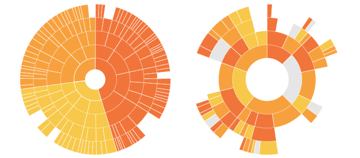
As we can see here, the chart looks like the sun with its rays coming out. Therefore, it is referred to as a Sunburst chart. It can also have an unbalanced hierarchy where some leaf nodes may have a child node as well.
就像我们在这里看到的那样,这张图表看起来像是太阳发出的光线。 因此,它称为森伯斯特图。 它还可能具有不平衡的层次结构,其中某些叶节点可能也具有子节点。
在SQL Server 2016 Reporting Services中创建森伯斯特图 (Creating a Sunburst Chart in SQL Server 2016 Reporting Services)
For demonstration purpose, I have created a sample table and inserted some data into it:
为了演示,我创建了一个示例表并将一些数据插入其中:
USE [Test]
GO
/****** Object:  Table [dbo].[Car_Sales]   Script Date: 9/27/2016 4:30:48 PM ******/
SET ANSI_NULLS ON
GO
SET QUOTED_IDENTIFIER ON
GO
CREATE TABLE [dbo].[Car_Sales](
[Organization] [nvarchar](50) NULL,
[Make] [nvarchar](50) NULL,
[Model] [nvarchar](50) NULL,
[Selling Price] [int] NULL,
[colour] [nvarchar](50) NULL
) ON [PRIMARY]

GO
INSERT [dbo].[Car_Sales]([Organization], [Make], [Model], [Selling Price], [colour]) VALUES (N'APD Automobile', N'Buick', N'Century', 112155, N'RED')
GO
INSERT [dbo].[Car_Sales]([Organization], [Make], [Model], [Selling Price], [colour]) VALUES (N'APD Automobile', N'Buick', N'LeSabre', 332989, N'BLUE')
GO
INSERT [dbo].[Car_Sales]([Organization], [Make], [Model], [Selling Price], [colour]) VALUES (N'APD Automobile', N'Buick', N'ParkAvenue', 268983, N'BLACK')
GO
INSERT [dbo].[Car_Sales]([Organization], [Make], [Model], [Selling Price], [colour]) VALUES (N'APD Automobile', N'Buick', N'Regal', 219058, N'WHITE')
GO
INSERT [dbo].[Car_Sales]([Organization], [Make], [Model], [Selling Price], [colour]) VALUES (N'APD Automobile', N'Buick', N'Rivera', 227554, N'GREY')
GO
INSERT [dbo].[Car_Sales]([Organization], [Make], [Model], [Selling Price], [colour]) VALUES (N'CDB Automobile', N'Cadillac', N'Catera', 447301, N'BLUE')
GO
INSERT [dbo].[Car_Sales]([Organization], [Make], [Model], [Selling Price], [colour]) VALUES (N'CDB Automobile', N'Cadillac', N'DeVile', 929204, N'RED')
GO
INSERT [dbo].[Car_Sales]([Organization], [Make], [Model], [Selling Price], [colour]) VALUES (N'CDB Automobile', N'Cadillac', N'Eldorado', 746974, N'YELLOW')
GO
INSERT [dbo].[Car_Sales]([Organization], [Make], [Model], [Selling Price], [colour]) VALUES (N'CDB Automobile', N'Cadillac', N'Escalade', 211260, N'SKYBLUE')
GO
INSERT [dbo].[Car_Sales]([Organization], [Make], [Model], [Selling Price], [colour]) VALUES (N'CDB Automobile', N'Cadillac', N'Saville', 809847, N'BLACK')
GO
INSERT [dbo].[Car_Sales]([Organization], [Make], [Model], [Selling Price], [colour]) VALUES (N'DRH Automobile', N'Chevrolet', N'1500 Pickup', 86134, NULL)
GO
INSERT [dbo].[Car_Sales]([Organization], [Make], [Model], [Selling Price], [colour]) VALUES (N'DRH Automobile', N'Chevrolet', N'2500 Pickup', 32495, NULL)

INSERT [dbo].[Car_Sales]([Organization], [Make], [Model], [Selling Price], [colour]) VALUES (N'DRH Automobile', N'Chevrolet', N'3500 Pickup', 25877, NULL)
GO
INSERT [dbo].[Car_Sales]([Organization], [Make], [Model], [Selling Price], [colour]) VALUES (N'DRH Automobile', N'Chevrolet', N'Astro', 75861, NULL)
GO
INSERT [dbo].[Car_Sales]([Organization], [Make], [Model], [Selling Price], [colour]) VALUES (N'DRH Automobile', N'Chevrolet', N'Blazer', 173738, NULL)
GO
INSERT [dbo].[Car_Sales]([Organization], [Make], [Model], [Selling Price], [colour]) VALUES (N'DRH Automobile', N'Chevrolet', N'Camaro', 52691, NULL)
GO
INSERT [dbo].[Car_Sales]([Organization], [Make], [Model], [Selling Price], [colour]) VALUES (N'DRH Automobile', N'Chevrolet', N'Cavalier', 132694, NULL)
GO
INSERT [dbo].[Car_Sales]([Organization], [Make], [Model], [Selling Price], [colour]) VALUES (N'DRH Automobile', N'Chevrolet', N'Corvette', 198928, NULL)
GO
INSERT [dbo].[Car_Sales]([Organization], [Make], [Model], [Selling Price], [colour]) VALUES (N'DRH Automobile', N'Chevrolet', N'Express 1500', 114035, NULL)
GO
INSERT [dbo].[Car_Sales]([Organization], [Make], [Model], [Selling Price], [colour]) VALUES (N'DRH Automobile', N'Chevrolet', N'Express 2500', 171146, NULL)
GO
INSERT [dbo].[Car_Sales]([Organization], [Make], [Model], [Selling Price], [colour]) VALUES (N'DRH Automobile', N'Chevrolet', N'Express 3500', 610843, NULL)
GO
ALTER TABLE [dbo].[Car_Sales]ADD  DEFAULT ('APD Automobile') FOR [Organization]
GO
So, my sample table data looks like below:
因此,我的样本表数据如下所示:
In this sample data, we show different organizations having different make, model, and price of cars. Some of the car colors have been specified as well.
在此样本数据中,我们显示了具有不同品牌,型号和价格的不同组织。 还指定了一些汽车颜色。
To create the Sunburst chart, we can use SQL Server data tools 2015 or Microsoft SQL Server 2016 Report Builder.
若要创建森伯斯特图表,我们可以使用SQL Server数据工具2015或Microsoft SQL Server 2016报表生成器。
SQL Server data tools allow managing reporting, integration and analysis service development in a single place while if we want only reports development we can go for report builder as well. In this article, I have used SQL Server data tools 2015.
SQL Server数据工具允许在一个地方管理报告,集成和分析服务开发,而如果我们仅希望进行报告开发,那么我们也可以选择报告构建器。 在本文中,我使用了SQL Server数据工具2015。
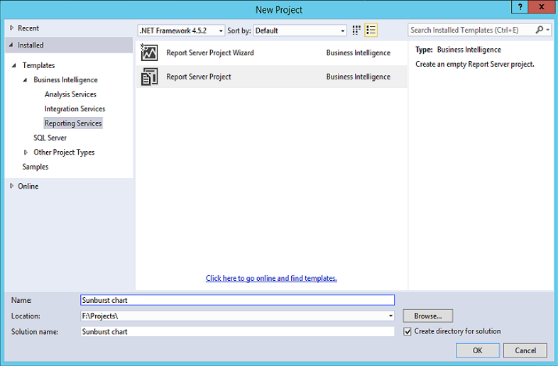
We will open Visual Studio 2015 and Click on Blank Report. Select Report Server Project
我们将打开Visual Studio 2015,然后单击空白报表。 选择报表服务器项目
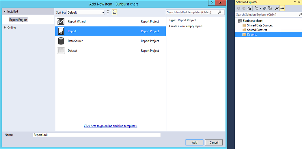
In the Solution Explorer, we right-click on reports and then add a new item:
在解决方案资源管理器中,我们右键单击报告,然后添加一个新项目:
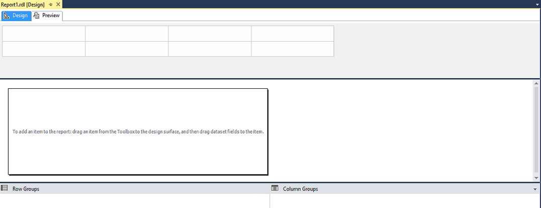
The new report window looks like below:
新的报告窗口如下所示:
创建一个新的数据源 (Create a New Data Source)
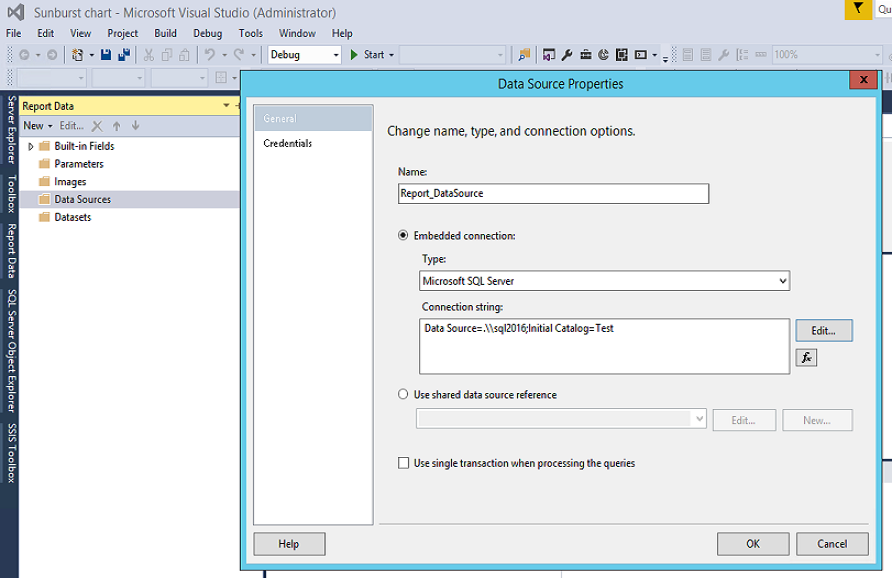
To create a Sunburst chart report, we’ll need to create the data source first. In the report data, we will right-click on data source -> new data source. It opens the data source properties.
要创建森伯斯特图表报告,我们需要首先创建数据源。 在报告数据中,我们将右键单击数据源->新数据源。 它打开数据源属性。
Now, we’ll enter the below details in data source properties:
现在,我们将在数据源属性中输入以下详细信息:
Name: We will enter the name of the data source.
Embedded connection: we’ll select the type as Microsoft SQL Server and enter the connection string.
名称:我们将输入数据源的名称。
嵌入式连接:我们将选择类型为Microsoft SQL Server并输入连接字符串。
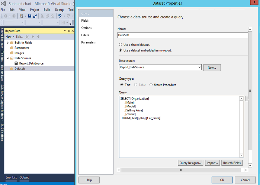
创建新数据集 (Create New Datasets)
A dataset specifies a query that returns the data for the report. To create a dataset, we can Right click on the dataset -> New dataset. It will open the dataset properties.
数据集指定一个查询,该查询返回报告的数据。 要创建数据集,我们可以右键单击数据集->新数据集。 它将打开数据集属性。
We will select the name of the data source created above, and enter the query to select from the table which is also created above.
我们将选择上面创建的数据源的名称,然后输入查询以从上面也创建的表中进行选择。
SELECT  [Organization]
      ,[Make]
      ,[Model]
      ,[Selling Price]
      ,[colour]
  FROM [Test].[dbo].[Car_Sales]
We can see the data source and the dataset below in the report data panel:
我们可以在报告数据面板中看到以下数据源和数据集:
Once the dataset is created, we will right-click on the blank report area and click on the chart:
创建数据集后,我们将右键单击空白报告区域,然后单击图表:
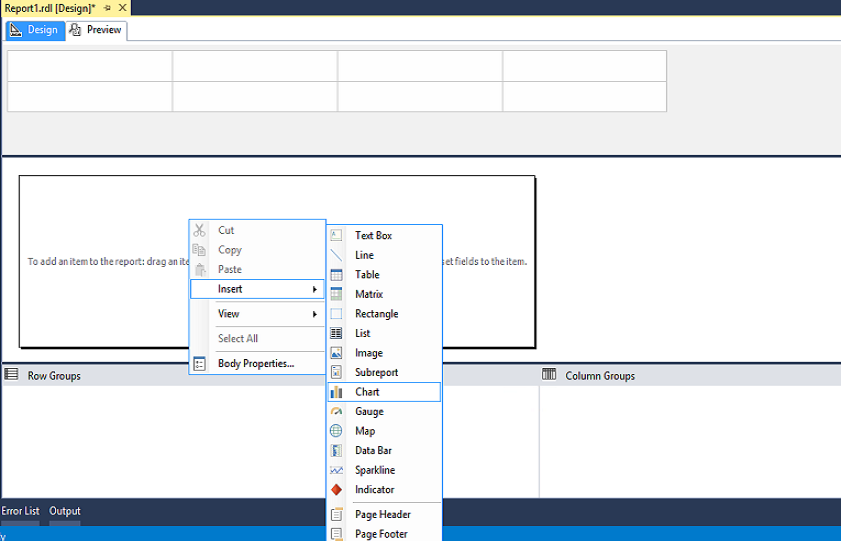
It opens the chart window from where we can select the sunburst chart:
它会打开图表窗口,从中可以选择朝阳图表:
By clicking on the Sunburst chart, we’ve inserted the sunburst chart in the report window. Now, we can click on it and open the chart data window:
通过单击森伯斯特图,我们已将森伯斯特图插入了报告窗口。 现在,我们可以单击它并打开图表数据窗口:
We’ll need to adjust the height of the sunburst chart to display it correctly. To do this, we’ll drag the chart window towards the legend:
我们需要调整森伯斯特图表的高度以正确显示它。 为此,我们将图表窗口拖向图例:
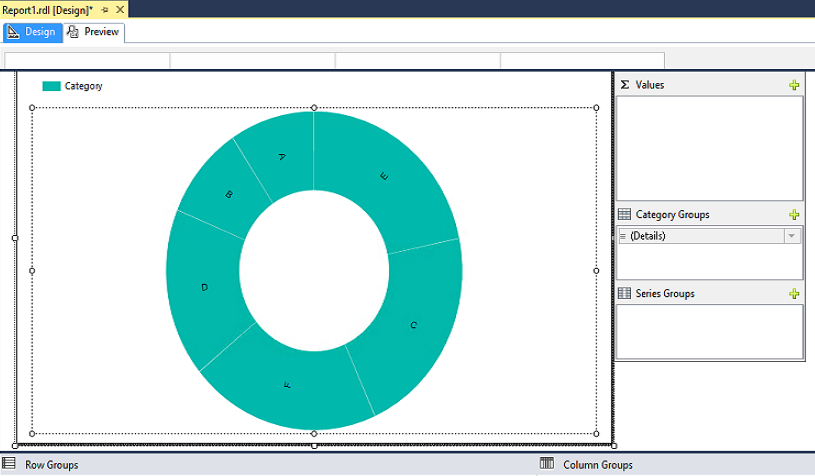
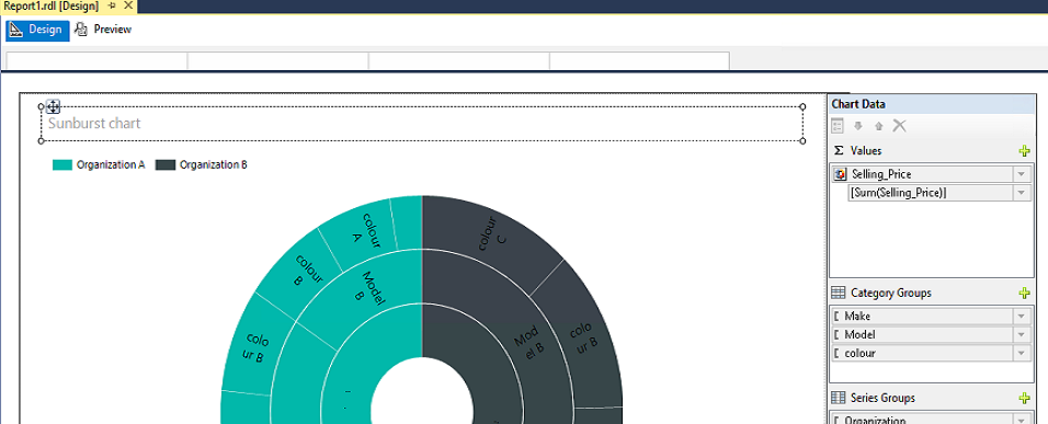
Chart data window has three sections: values, category groups, and series groups. We’ll use this to add the hierarchical data in the sunburst chart.
图表数据窗口包含三个部分:值,类别组和系列组。 我们将使用它在森伯斯特图表中添加层次结构数据。
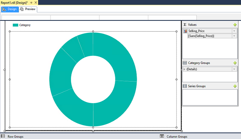
In our example, we want to show car sales values in the sunburst chart, so we’ll click on ‘+’ icon in Values and add the selling price column. The report looks like below:
在我们的示例中,我们希望在森伯斯特图表中显示汽车销售价值,因此我们将在“价值”中单击“ +”图标并添加销售价格列。 该报告如下所示:
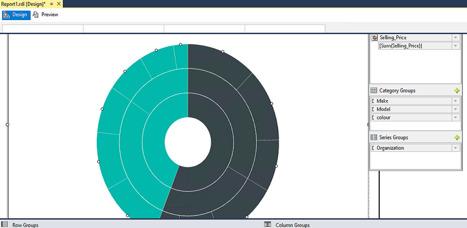
In the category group, we will add make, model and color columns from the dataset, and select the Series group as an organization.
在类别组中,我们将从数据集中添加品牌,型号和颜色列,然后选择系列组作为组织。
Now we can see the following Sunburst chart hierarchy:
现在,我们可以看到以下森伯斯特图表层次结构:
Car Make – First Ring
Model – Second Ring
Colour – Third Ring
汽车制造–第一环
模型–第二环
颜色–三环
If we click on the Preview, the Sunburst chart looks like below:
如果单击“预览”,则森伯斯特图如下所示:
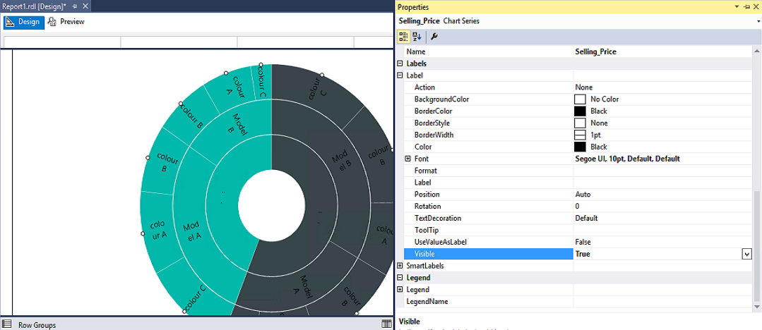
As we can see, there are no any details in the Sunburst chart at this point. So, to show the category values in the chart, we’ll click on the selling price values and open Properties.
如我们所见,森伯斯特图表中目前没有任何细节。 因此,要在图表中显示类别值,我们将单击售价值并打开“属性”。
In the Property section, we’ll expand labels and set the value to True for the visible column:
在“属性”部分中,我们将展开标签并将可见列的值设置为True:
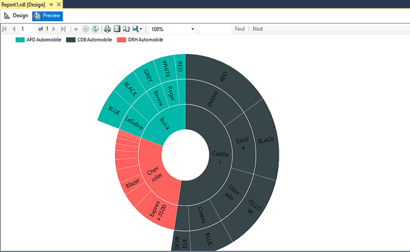
Now, if we preview the chart, it shows the group value in the chart:
现在,如果我们预览图表,它将在图表中显示组值:
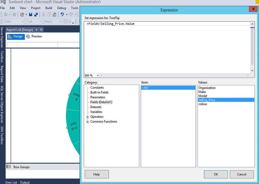
If we want the tooltip to show the value of the sales, we’ll go to the Tooltip, in the property section and click on the Expression:
如果我们希望工具提示显示销售价值,我们将转到“工具提示”中的“属性”部分,然后单击“表达式”:
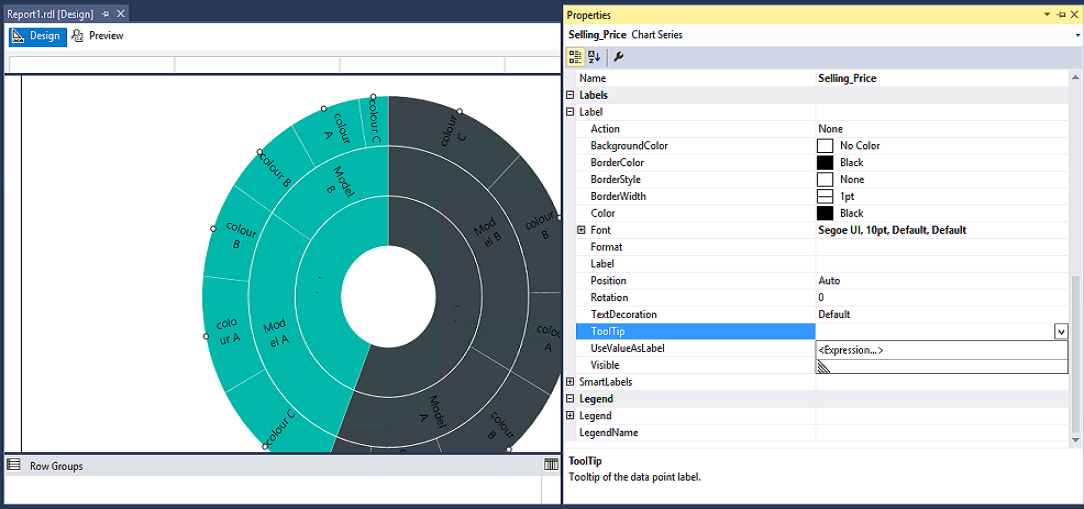
In the Tooltip, we’ll click on the dataset, from the category, and double click on the selling price. It sets the expression for the tooltip:
在工具提示中,我们将单击类别中的数据集,然后双击售价。 它为工具提示设置表达式:
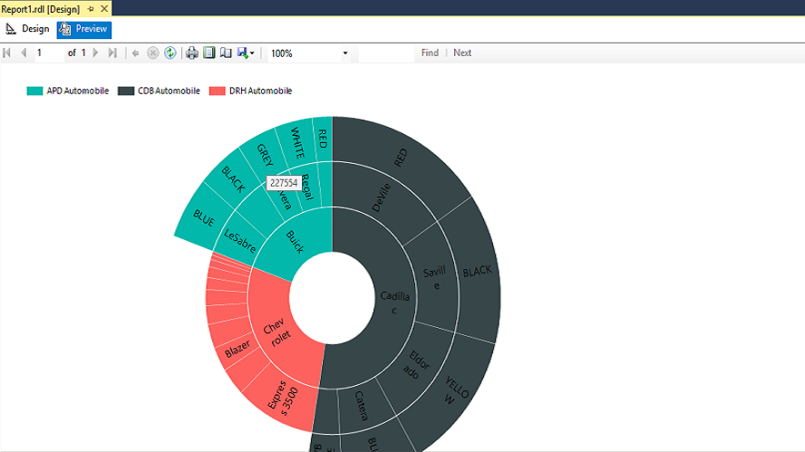
Now, if we hover to the outer ring of the chart, we can see the selling price as shown below.
现在,如果我们将鼠标悬停在图表的外圈,可以看到如下所示的卖价。
The label values are displayed according to the font size, chart area and the size of the rectangle. To change the font size, we can go to the chart series properties. We can set the font colour, style, size, font family, etc. inside labels group of the properties.
标签值根据字体大小,图表区域和矩形大小显示。 要更改字体大小,我们可以转到图表系列属性。 我们可以在属性的标签组内设置字体颜色,样式,大小,字体系列等。
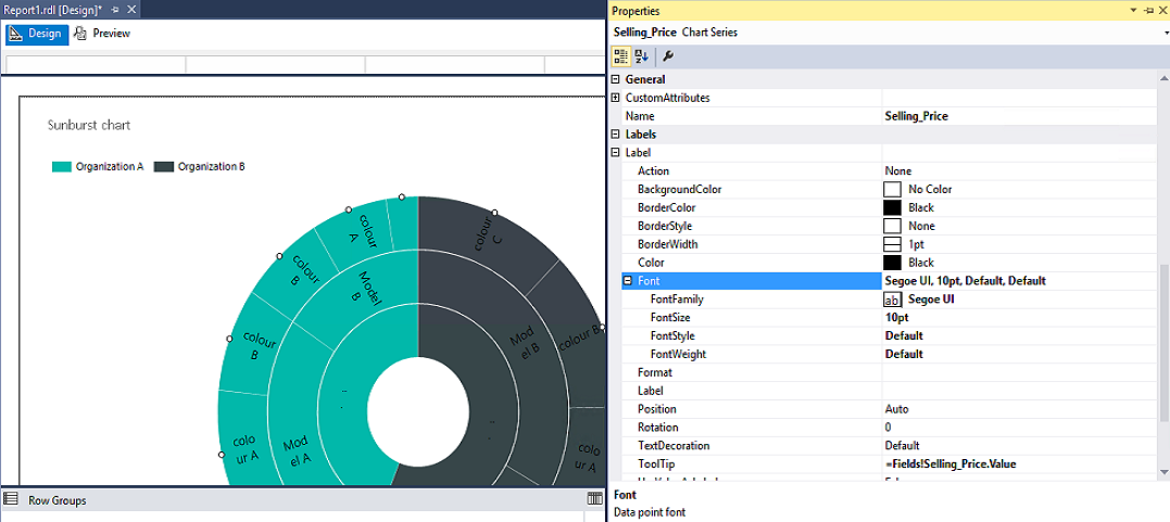
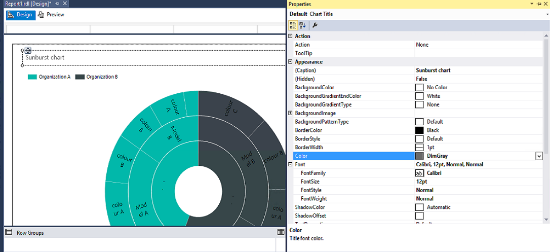
Now, we’ll add the chart title as ‘Sunburst chart’:
现在,我们将图表标题添加为“森伯斯特图表”:
We will select the property of the chart title and set the color, font size, decoration, etc.:
我们将选择图表标题的属性,并设置颜色,字体大小,装饰等:
森伯斯特图的缺点 (Disadvantage of the Sunburst chart)
One significant problem with a Sunburst chart is that it is tough to view the hierarchy or data when the data becomes more granular or we have a large number of a child \ leaf levels.
森伯斯特(Sunburst)图表的一个重要问题是,当数据变得更加精细或我们有大量子级/叶级时,很难查看层次结构或数据。
Next Steps: In the next article, we will explore the Tree Map chart along with its comparison to the Sunburst chart.
后续步骤:在下一篇文章中,我们将探索“树形图”图表以及与“森伯斯特”图表的比较。
参考文献: (References:)
- SQL Server Data Tools GA update for June 2016SQL Server数据工具GA更新于2016年6月
- SQL Server 2016 RC1: What’s new in Reporting Services?SQL Server 2016 RC1:Reporting Services的新增功能是什么?
- What’s New in Reporting Services in SQL Server 2016 CTP 2.3SQL Server 2016 CTP 2.3中Reporting Services的新增功能
- Tree Map and Sunburst Charts in Reporting Services Reporting Services中的树形图和森伯斯特图
翻译自: https://www.sqlshack.com/create-configure-sunburst-chart-sql-server-2016-reporting-services/


 915
915


 被折叠的 条评论
为什么被折叠?
被折叠的 条评论
为什么被折叠?
 到【灌水乐园】发言


