


excel重命名图片

A data series in Microsoft Excel is a set of data, shown in a row or a column, which is presented using a graph or chart. To help analyze your data, you might prefer to rename your data series.
Microsoft Excel中的数据系列是一组数据,以行或列显示,使用图形或图表显示。 为了帮助分析数据,您可能希望重命名数据系列。
Rather than renaming the individual column or row labels, you can rename a data series in Excel by editing the graph or chart. You might want to do this if your data labels are opaque and difficult to immediately understand.
您可以通过编辑图形或图表来重命名Excel中的数据系列,而不必重命名各个列或行标签。 如果您的数据标签不透明并且难以立即理解,则可能需要这样做。
You can rename any data series presented in a chart or graph, including a basic Excel bar chart.
您可以重命名图表或图形中显示的任何数据系列,包括基本的Excel条形图。
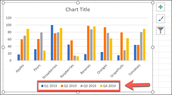
To demonstrate, we have a basic bar chart showing a list of fruit sales on a quarterly basis. The chart shows four bars for each product, with the bars labeled at the bottom—these are your data series.
为了演示,我们有一个基本的条形图,其中显示了每个季度的水果销售清单。 图表显示每种产品的四个条形,底部标有条形-这些是您的数据系列。
In this example, the data series are labeled alphabetically from A to D.
在此示例中,数据序列按字母顺序从A到D进行标记。
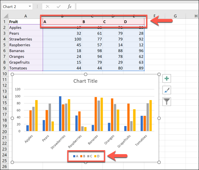
Labels such as these wouldn’t be hugely helpful for this example purpose, as you wouldn’t be able to determine the periods of time.
诸如此类的标签对于此示例目的不会有太大帮助,因为您将无法确定时间段。
This is where you’d look to rename the data series. To do this, right-click your graph or chart and click the “Select Data” option.
这是您要重命名数据系列的地方。 为此,请右键单击您的图形或图表,然后单击“选择数据”选项。
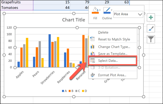
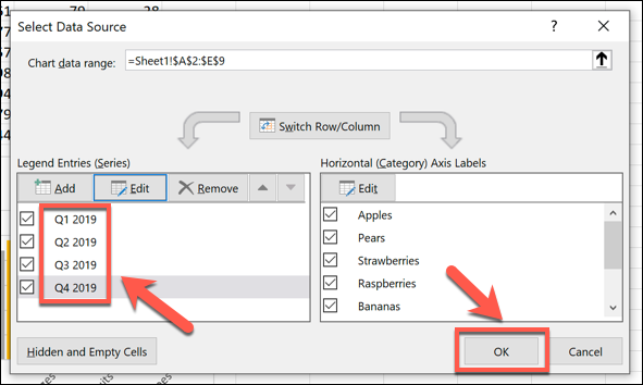
This will open the “Select Data Source” options window. Your multiple data series will be listed under the “Legend Entries (Series)” column.
这将打开“选择数据源”选项窗口。 您的多个数据系列将列在“传奇条目(系列)”列下。
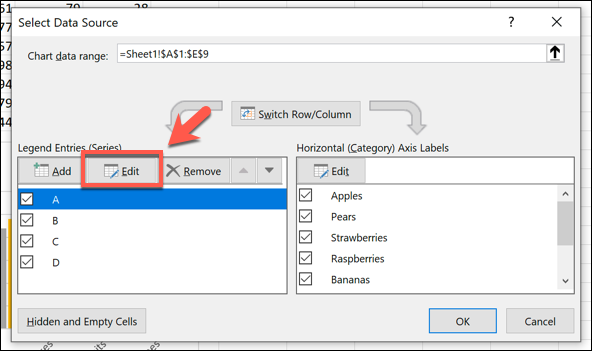
To begin renaming your data series, select one from the list and then click the “Edit” button.
要开始重命名数据系列,请从列表中选择一个,然后单击“编辑”按钮。
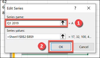
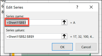
In the “Edit Series” box, you can begin to rename your data series labels. By default, Excel will use the column or row label, using the cell reference to determine this.
在“编辑系列”框中,您可以开始重命名数据系列标签。 默认情况下,Excel将使用单元格引用来确定列或行标签。
Replace the cell reference with a static name of your choice. For this example, our data series labels will reflect yearly quarters (Q1 2019, Q2 2019, etc).
用您选择的静态名称替换单元格引用。 在此示例中,我们的数据系列标签将反映年度季度(2019年第一季度,2019年第二季度等)。
You could also replace this with another cell reference if you prefer to use labels that are separate from your data. This will ensure that your chart updates automatically if you decide to change the labels shown in those cells at a later date.
如果您希望使用与数据分开的标签,也可以用另一个单元格引用替换它。 如果您决定以后更改这些单元格中显示的标签,这将确保图表自动更新。
Once you’ve renamed your data series label, click “OK” to confirm.
重命名数据系列标签后,请单击“确定”进行确认。
This will take you back to the “Select Data Source” window, where you can repeat the steps for each data series label.
这将带您返回“选择数据源”窗口,您可以在其中重复每个数据系列标签的步骤。
If you want to restore your labels to the same as your column or row labels, repeat the steps above, replacing the static labels with the cell reference for each column or row label.
如果要将标签恢复为与列或行标签相同的标签,请重复上述步骤,将静态标签替换为每个列或行标签的单元格引用。
You will need to name the worksheet containing the label when you do this. For instance, using =Sheet1!$B$1 here would show the label in cell B1.
执行此操作时,您将需要命名包含标签的工作表。 例如,在此处使用=Sheet1!$B$1将在单元格B1中显示标签。
For this example, this would show the letter A.
在此示例中,将显示字母A。
This will mean that any changes to your column or row labels will also update the data series labels in your chart or graph.
这意味着对列或行标签的任何更改也会更新图表或图形中的数据系列标签。
Once you’ve renamed all of the data labels, click “OK” to save the changes.
重命名所有数据标签后,单击“确定”以保存更改。
Your graph or chart will show your updated data series labels.
您的图形或图表将显示更新的数据系列标签。
These are shown at the bottom of your chart, and are color-coded to match your data.
这些显示在图表的底部,并用颜色编码以匹配您的数据。
You can make further changes to the formatting of your graph or chart at this point. For instance, you could add a trendline to your Microsoft Excel chart to help you see further patterns in your data.
此时,您可以进一步更改图形或图表的格式。 例如,您可以在Microsoft Excel图表中添加趋势线,以帮助您查看数据中的其他模式。
翻译自: https://www.howtogeek.com/682077/how-to-rename-a-data-series-in-microsoft-excel/
excel重命名图片


 3万+
3万+


 被折叠的 条评论
为什么被折叠?
被折叠的 条评论
为什么被折叠?
 到【灌水乐园】发言


