


快速教程,可帮助您快速掌握最新版本的Bootstrap。 (A quick tutorial to get you up to speed with the latest version of Bootstrap.)
In my opinion, the best way to learn a new technology is often to start building stuff from day one. This gives a sense of meaning to the learning process. Plus, it’s satisfying to see a product appear before you as you struggle your way through the material.
我认为,学习新技术的最好方法通常是从第一天开始就开始学习。 这给学习过程带来了意义。 另外,当您在材料中苦苦挣扎时,很高兴看到产品出现在您面前。
So in this article, I’ll walk you through building a simple website using Bootstrap 4.0 while highlighting the most important new features of the library.
因此,在本文中,我将引导您使用Bootstrap 4.0建立一个简单的网站,同时重点介绍该库的最重要的新功能。
If you want to learn Bootstrap 4.0 properly, check out this free course on Scrimba!
如果您想正确学习Bootstrap 4.0,请在Scrimba上查看此免费课程!
Now let’s get started.
现在开始吧。
我们将建立什么 (What we’ll build)
We’re going to build a basic portfolio website. Even though it’s simple, it contains several core concepts you’ll need to learn in order to use Bootstrap 4.0 properly.
我们将建立一个基本的投资组合网站。 即使很简单,它也包含一些核心概念,您需要学习这些概念才能正确使用Bootstrap 4.0。
If you want to play around with the code, check out this Scrimba playground. Feel free to use it as a reference if you don’t understand something in the article and need to experiment for yourself.
如果您想使用该代码,请访问此Scrimba游乐场 。 如果您不了解本文中的内容并且需要自己进行实验,请随时将其用作参考。
导航栏 (The navbar)
Let’s start with the navbar. In Bootstrap 4.0 they’ve made navbars easier, as they require a bit less markup now. Here’s what we need to create the simplest navbar possible:
让我们从导航栏开始。 在Bootstrap 4.0中,它们使导航栏更容易了,因为它们现在需要的标记要少一些。 这是我们创建尽可能简单的导航栏所需的内容:
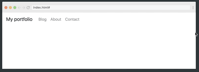
My portfolio
我的投资组合
Which results in the following:
结果如下:
The bg-light class makes the background light grey while the navbar-light class gives the text a dark colour. By default, the text colour in navbars is blue, however, I think it looks better with the navbar-light class.
bg-light类使背景navbar-light灰色,而navbar-light类使文本navbar-light深色。 默认情况下, navbar-light的文本颜色是蓝色,但是,我认为使用navbar-light类看起来更好。
Let’s add some content to our navbar, at the same level as the brand anchor tag:
让我们在导航栏上添加一些与品牌锚标签相同的内容:
<ul class="navbar-nav">
  <li class="navbar-item">
    <a href="#" class="nav-link">Homepage</a>
  </li>
  <li class="navbar-item">
    <a href="#" class="nav-link">Blog</a>
  </li>
  <li class="navbar-item">
    <a href="#" class="nav-link">About</a>
  </li>
  <li class="navbar-item">
    <a href="#" class="nav-link">Contact Us</a>
  </li>
</ul>
The three classes to take notice of here are the navbar-nav,navbar-link and navbar-item. Together they construct the navigation options the way you want them.
这里需要注意的三个类是navbar-nav , navbar-link和navbar-item 。 它们一起以您想要的方式构造导航选项。
Here’s how that looks:
看起来是这样的:
However, now we’ll need to make it responsive, as we want our navigation options to collapse into a hamburger icon on smaller screens. To achieve this, we need to do two things:
但是,现在我们需要使其具有响应性,因为我们希望导航选项在较小的屏幕上折叠成一个汉堡包图标。 为此,我们需要做两件事:
- Tell Bootstrap at which point the navigation options should break to collapse into a hamburger 告诉Bootstrap,此时导航选项应该会破裂以折叠成汉堡包
- Create the markup for the hamburger 为汉堡包创建标记
To make it collapse, we’ll add the navbar-expand-md class to the nav element itself:
为了使其折叠,我们将navbar-expand-md类添加到nav元素本身:
<nav class="navbar navbar-light bg-light `**navbar-expand-md**`">
...
</nav
This tells Bootstrap that we want the navbar options to toggle between expanded and collapsed states at the md breakpoint, which is at768px.
这告诉Bootstrap我们希望navbar选项在md断点(即768px处在展开状态和折叠状态之间切换。
We also need to wrap our navigation options in a div (with the two classes collapse and navbar-collapse) which tells Bootstrap that this is the part we want to collapse.
我们还需要将导航选项包装在div中(两个类分别是collapse和navbar-collapse ),这将告诉Bootstrap这是我们要折叠的部分。
<div class="collapse navbar-collapse" id="navbarNav">
  <ul class="navbar-nav">
  ...
  </ul>
</div>
The id of navbarNav is to connect this item with the data-target attribute in the hamburger icon, which we’ll create like this:
navbarNav的ID是将此项与汉堡图标中的data-target属性相关联,我们将如下创建:
<button class="navbar-toggler" type="button" data-toggle="collapse" data-target="#navbarNav">
<span class="navbar-toggler-icon"></span>
</button>
```html
We now have a great looking navbar, which collapses and expands at our chosen breakpoint:
### Jumbotron
The next step is to create something that welcomes our users to the website below the navbar. To do that, we’ll use the [jumbotron](https://getbootstrap.com/docs/4.0/components/jumbotron/) component. It’s super simple:
```html
<div class="jumbotron jumbotron-fluid">
<div class="container">
<h1 class="display-3">Welcome to my website</h1>
<p class="lead">I'm a developer and designer. Check my portfolio below</p>
</div>Which results in the following:
结果如下:
The display-3 and lead classes are typography classes, which make the text a bit more opinionated and better looking in my view. You can read more about typography in Bootstrap 4.0 here.
display-3和lead类是印刷类,在我看来,它们使文本更具自省感和外观。 您可以在此处阅读有关Bootstrap 4.0的排版的更多信息。
主要内容-网格和卡片 (The Main Content — Grid and Cards)
Below our jumbotron we’re going to add the main content of our website, which will consist of four cards. A card is a whole new component of Bootstrap 4.0, and it’s replacing panels, wells, and thumbnails from Bootstrap 3.0.
在巨无霸下面,我们将添加网站的主要内容,该内容包括四张卡片。 卡是Bootstrap 4.0的全新组件,它取代了Bootstrap 3.0中的面板,Kong和缩略图。
Let’s first have a look at what we want to build:
首先让我们看一下我们要构建的内容:
创建网格 (Creating the grid)
In order to make them appear nicely like this, and to also make sure they work well responsively, we’ll need to wrap the cards in a grid. The grid is one of the core pieces of Bootstrap, and many developers use the library solely because of the grid.
为了使它们看起来像这样漂亮,并确保它们能很好地响应,我们需要将卡包装成网格。 网格是Bootstrap的核心部分之一,许多开发人员仅由于网格而使用该库。
We’ll start off by creating a very simple grid with no content. In Bootstrap, you always create rows first and then wrap columns inside the rows. By default, the grid can be divided into 12 columns in the width.
我们将从创建一个没有内容的非常简单的网格开始。 在引导,你总是先创建行,然后换行内列。 默认情况下,网格的宽度可以分为12列。
Above the sm breakpoint, we want each of the cards to take up half the width, so we’ll give the columns a col-sm-6 class. When the screen reaches the lg breakpoint though, we want four cards in the width, so we’ll do col-lg-3.
在sm断点之上,我们希望每张卡占用一半的宽度,因此我们将为列提供col-sm-6类。 当屏幕到达lg断点时,我们需要四张卡片的宽度,因此我们将执行col-lg-3 。
<div class="container">
  <div class="row">
    <div class="col-sm-6 col-lg-3">column</div>
    <div class="col-sm-6 col-lg-3">column</div>
    <div class="col-sm-6 col-lg-3">column</div>
    <div class="col-sm-6 col-lg-3">column</div>
  </div>
</div>
This gives the following responsive layout:
这给出了以下响应式布局:
创建卡 (Creating the cards)
Now we simply need to replace the column text with a card component. Here’s the markup for our card:
现在,我们只需要用card组件替换列文本。 这是我们卡的标记:
<div class="card">
  <img class="card-img-top" alt="Card header image" src="img1.png">
  <div class="card-body">
    <h5 class="card-title">Project 1</h5>
    <p class="card-text">An awesome project</p>
    <a href="#" class="btn btn-info">See project</a>
  </div>
</div>
To turn a div into a card we’ll simply add the class card. If we want an image to appear in the header of the card, we’ll add the card-img-top. As for the rest of the content, we’ll use the classes card-body, card-title , and card-text.
要将div变成卡片,我们只需添加类card 。 如果我们希望图像出现在卡片的标题中,我们将添加card-img-top 。 至于其余的内容,我们将使用card-body , card-title和card-text 。
One problem, though, is that this layout won’t look good when the grid gets multiple rows. As you can see, we’ll need to add some spacing in-between the rows.
但是,一个问题是,当网格获得多行时,这种布局看起来不会很好。 如您所见,我们需要在行之间添加一些间距。
This will introduce you to a new spacing concept in Bootstrap 4.0, where you can add classes to set the padding and margin. We’ll simply add the class mt-3 to the card divs.
这将为您介绍Bootstrap 4.0中的新间距概念,您可以在其中添加类来设置填充和边距。 我们将简单地将mt-3类添加到card div中。
<div class="card mt-3">
...
</div>
The mt stands for margin-top, and the 3 is a number on a scale from 1 to 5, where 5 is the most. You can also do for example pb-4, which would set thepadding-bootom to 4. You probably get the point by now. Once we’ve added this, we have a nice grid with cards on our website.
mt代表margin-top ,而3表示从1到5的数字,其中5表示最大。 例如,您也可以使用pb-4 ,它将padding-bootom设置为4。您现在可能已经明白了。 添加完之后,我们的网站上就会出现一个带有卡片的漂亮网格。
联系表 (Contact form)
Finally, let’s also add a contact form. It’ll simply be a new row in our grid. This time we’ll also use the offset class, as we don’t want it to be full-width, at least not above the md breakpoint.
最后,我们还要添加一个联系表。 这将只是我们网格中的新行。 这次我们还将使用offset类,因为我们不希望它为全角,至少不超过md断点。
So from md and upwards we’ll give it a width of six columns, and an offset of three:
因此,从md ,我们将为它提供六列的宽度,以及三列的偏移量:
<div class="row mt-5">
  <div class="col-sm-12 **col-md-6 offset-md-3**">
    <h3>Reach out!</h3>
    _...form goes here..._
  </div>
</div>
Now let’s look at the code for the form itself:
现在让我们看一下表单本身的代码:
<form>
  <div class="form-group">
    <input type="text" class="form-control" id="email" placeholder="Your email..">
  </div>
  <div class="form-group">
    <textarea class="form-control" placeholder="Your message..">
    </textarea>
  </div>
  <button type="submit" class="btn btn-primary">Submit</button></form>
The controls — like the <input> and <textarea>—are styled with the form-control class. They make it look like a classical Boostrap form:
控件(如<input>和<textarea> )使用form-control类设置样式。 它们使它看起来像经典的Boostrap形式:
And that’s it! You’ve now created your very first Bootstrap 4.0 website. If you want to learn the library properly, be sure to check out our free course on Scrimba.
就是这样! 现在,您已经创建了第一个Bootstrap 4.0网站。 如果您想正确地学习图书馆,请务必查看有关Scrimba的免费课程。
Thanks for reading! My name is Per Borgen, I'm the co-founder of Scrimba – the easiest way to learn to code. You should check out our responsive web design bootcamp if want to learn to build modern website on a professional level.
谢谢阅读! 我叫Per Borgen,我是Scrimba的共同创始人–学习编码的最简单方法。 如果要学习以专业水平构建现代网站,则应查看我们的响应式Web设计新手训练营 。
翻译自: https://www.freecodecamp.org/news/building-your-first-bootstrap-4-0-site-b54bbff6bc55/


 1449
1449


 被折叠的 条评论
为什么被折叠?
被折叠的 条评论
为什么被折叠?
 到【灌水乐园】发言


