


three.js基本概念
You may have already heard about d3.js, the dazzling JavaScript library that lets you create beautiful charts and graphics with just a few lines of code. You might have seen some of the fantastic examples of D3 in action, or you may have heard that the New York Times uses it to create its interactive visual stories.
您可能已经听说过d3.js ,这是一个令人眼花JavaScript 乱JavaScript库,可让您仅用几行代码即可创建精美的图表和图形。 您可能已经看到了D3实际应用中的一些奇妙示例 ,或者您可能听说过《纽约时报》使用它来创建其交互式视觉故事 。
If you’ve ever tried to dip your feet into the world of D3, then you’ll already be familiar with its famously steep learning curve.
如果您曾经尝试过踏入D3的世界,那么您将已经熟悉其著名的陡峭学习曲线 。
You just don’t get to build things right out of the box with D3.
您只是无法立即使用D3进行构建。
With its confusing method chains, alien syntax, and black-box functions that seem to work by magic, D3 can quickly seem like more hassle than it’s worth. But fear not, because D3 gets substantially easier if you understand just a few key concepts.
凭借其令人困惑的方法链,外来语法和黑匣子功能似乎可以神奇地发挥作用,D3很快看起来比其价值更麻烦。 但是请不要担心,因为如果您仅了解一些关键概念,D3就会变得非常容易。
I want to take you through a simple tutorial, explaining 5 of the most common areas of confusion that beginners face when starting out with D3.
我想通过一个简单的教程,向您解释初学者从D3开始时会遇到的最常见的5个困惑领域。
We’re going to create a dynamic scatter plot, which updates every second between two different sets of data:
我们将创建一个动态散点图,该散点图在两组不同的数据之间每秒更新一次:
Take a moment to appreciate the little details here. Check out how smoothly these dots are sliding across the screen. Look at how they fade gently in and out of view. Behold the calm sway of our axes between their different values.
花点时间欣赏这里的小细节。 检查这些点在屏幕上滑动的平滑程度。 看一下它们如何淡入淡出。 观察我们的轴在不同值之间的平稳摇摆。
These are actually some of the easiest features to implement in D3. Once you can get through the initial struggle of figuring out the basic building blocks of the library, adding in this kind of stuff is a piece of cake.
这些实际上是D3中最容易实现的功能。 一旦您可以初步弄清图书馆的基本组成部分,那么添加此类内容就轻松了。
Before we get ahead of ourselves, let’s talk about what D3 actually is.
在我们超越自己之前,让我们谈谈D3的实际含义。
D3 stands for Data Driven Documents.
D3代表数据驱动文档 。
The data can be absolutely anything, which is part of what makes D3 so powerful. Most of the time in D3, you’ll want to read in this data from a file, but for this example we’ll just be using two arrays stored as variables:
数据绝对可以是任何东西,这是使D3如此强大的部分原因。 在D3中,大多数时候,您都希望从文件中读取此数据,但是在本示例中,我们仅使用两个存储为变量的数组:
var data0 = [
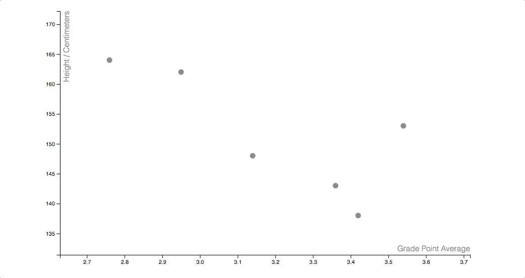
{ gpa: 3.42, height: 138 },
{ gpa: 3.54, height: 153 },
{ gpa: 3.14, height: 148 },
{ gpa: 2.76, height: 164 },
{ gpa: 2.95, height: 162 },
{ gpa: 3.36, height: 143 }
]
var data1 = [
{ gpa: 3.15, height: 157 },
{ gpa: 3.12, height: 175 },
{ gpa: 3.67, height: 167 },
{ gpa: 3.85, height: 149 },
{ gpa: 2.32, height: 165 },
{ gpa: 3.01, height: 171 },
{ gpa: 3.54, height: 168 },
{ gpa: 2.89, height: 180 },
{ gpa: 3.75, height: 153 }
]
The documents part in D3 refers to the Document Object Model (DOM). D3 is all about moving elements on the page around, based on what the data is saying. Specifically, we’re working with special shape elements called SVGs.
D3中的文档部分引用文档对象模型(DOM)。 D3就是根据数据所说的来移动页面上的元素。 具体来说,我们正在使用称为SVG的特殊形状元素。
关键概念1 –使用SVG (Crucial Concept #1 — Working with SVGs)
So here we come to the first challenging concept that every D3 newbie has to deal with. You immediately need to get a good grasp on a special type of markup which you might not have seen before.
因此,在这里,我们提出了每个D3新手都必须应对的第一个具有挑战性的概念。 您立即需要很好地掌握以前可能从未见过的特殊类型的标记。
Here’s what SVG markup might look like:
SVG标记如下所示:
<svg width="400" height="60">
  <rect x="0" y="0" width="50" height="50" fill="green"></rect>
  <circle cx="90" cy="25" r="25" fill="red"></circle>
  <ellipse cx="145" cy="25" rx="15" ry="25" fill="grey"></ellipse>
  <line x1="185" y1="5" x2="230" y2="40" stroke="blue" stroke-width="5"></line>
  <text x="260" y="25" font-size="20px" fill="orange">Hello World</text>
</svg>
If we place this snippet into an HTML document, then our browser will interpret it like this:
如果我们将此代码段放入HTML文档中,则我们的浏览器将按以下方式对其进行解释:

Basically, each of these SVGs has a set of attributes which our browser uses to place these shapes on the screen. A few things to know about SVGs:
基本上,每个SVG都有一组属性,我们的浏览器使用这些属性将这些形状放置在屏幕上。 有关SVG的几点注意事项:
- There’s a distinction between the SVG canvas (drawn with the <canvas> tags) and the SVGs shapes themselves. SVG画布(用<canvas>标记绘制)和SVG形状本身之间有区别。
- There’s a fairly unintuitive coordinate system that you’ll need to understand, since the (0, 0) point of an SVG grid is at the top-left, rather than the bottom-left. 您需要了解一个相当不直观的坐标系,因为SVG网格的(0,0)点位于左上角,而不是左下角。
- You might come across some pretty weird behavior if you don’t understand what’s going on under the hood. 如果您不了解幕后情况,则可能会遇到一些非常奇怪的行为。
It can be tempting to gloss over this subject, opting instead to dive head-first into the titillating business of laying down some D3 code right away, but things will seem a lot clearer later on if you know how these shapes are working.
可能会想掩盖这个主题,而是选择直接涉足繁琐的工作,立即编写一些D3代码,但是如果您知道这些形状的工作原理,以后情况会更加清楚。
Resources for understanding SVGs…
了解SVG的资源…
As a first step to building our scatter plot, we’ll want to add a small circle SVG for each item of data that we want to display. We add SVGs in D3 like this:
作为构建散点图的第一步,我们要为要显示的每一项数据添加一个小圆圈SVG。 我们在D3中添加SVG,如下所示:
d3.select("#canvas")
    .append("circle")
        .attr("cx", 50)
        .attr("cy", 50)
        .attr("r", 5)
        .attr("fill", "grey");
Writing d3.select(“#canvas”) here is analogous to writing $(“#canvas”) in jQuery, as it grabs hold of the element with the ID of “canvas”. d3.select goes one step further, adding a few special methods to this selection that we’ll be using later on.
在这里写d3.select(“#canvas”)类似于在jQuery中写$(“#canvas”) ,因为它抓住了ID为“ canvas”的元素。 d3.select更进一步,为该选择添加了一些特殊方法,我们将在稍后使用。
We’re using the d3.append method to add a circle SVG to that element, and we’re setting each of the circle’s attributes with the d3.attr method.
我们使用的d3.append方法一圈SVG添加到该元素,我们设置每个与d3.attr方法圆的属性。
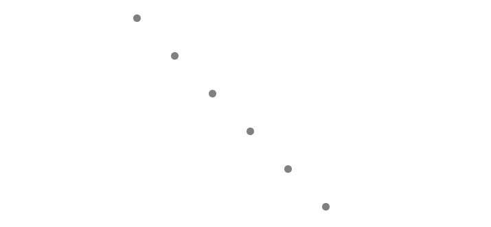
Since we want to add a circle for every item in our array, you might think that we’d want to use a for loop:
由于我们想为数组中的每个项目添加一个圆,因此您可能会认为我们想使用一个for循环:
for(var i = 0; i < data0.length; i++) {
    d3.select("#canvas")
        .append("circle")
            .attr("cx", data0[i].gpa)
            .attr("cy", data0[i].height)
            .attr("r", 5)
            .attr("fill", "grey");
}
However, since this is D3, we’ll be doing something slightly more complicated, and slightly more powerful…
但是,由于这是D3,所以我们将做一些更复杂,更强大的事情……
关键概念2-数据绑定 (Crucial Concept #2 — Data Binding)
The next hurdle that every new D3 developer needs to overcome is the D3 data join. D3 has its own special way of binding data to our SVGs.
每个新的D3开发人员都需要克服的下一个障碍是D3数据联接。 D3具有将数据绑定到我们的SVG的独特方法。
Here’s how we add a circle for every item in our array with D3:
这是我们如何使用D3为数组中的每个项目添加一个圆圈:
var circles = d3.select("#canvas").selectAll("circle")
    .data(data0);

circles.enter().append("circle")
    .attr("cx", function(d, i){ return 25 + (50 * i); })
    .attr("cy", function(d, i){ return 25 + (50 * i); })
    .attr("r", 5)
    .attr("fill", "grey");
For a developer who is just starting off with D3, this can seem confusing. Actually, for many seasoned developers with years of experience in D3, this can still seem confusing…
对于刚开始使用D3的开发人员来说,这似乎令人困惑。 实际上,对于许多在D3中具有多年经验的经验丰富的开发人员而言,这似乎仍然令人困惑……
You would think that calling selectAll(“circle”) on a page devoid of circles would return a selection of nothing. We’re then calling the data() method on this selection of nothing, passing in our array. We have a mysterious call to the enter() method, and then we have a similar setup as before.
您可能会认为,在没有圆圈的页面上调用selectAll(“ circle”)会返回未选择的内容。 然后,我们在没有选择的情况下调用data()方法,并传入数组。 我们对enter()方法进行了神秘的调用,然后我们进行了与以前类似的设置。
This block of code adds a circle for each item in our array, allowing us to set our attributes with anonymous functions. The first argument to these functions gives us access to the item in our data that we’re looking at, and the second argument gives us the item’s index in our array.
此代码块为数组中的每个项目添加一个圆圈,使我们可以使用匿名函数设置属性。 这些函数的第一个参数使我们可以访问正在查看的数据中的项目,第二个参数使我们可以访问数组中该项目的索引。
Creating a “data join” like this marks the first step to doing something useful with our data, so it’s an important step to understand. This strange syntax can be daunting when you first encounter it, but it’s a handy tool to know how to use.
像这样创建“数据联接”标志着对数据进行有用操作的第一步,因此这是理解的重要一步。 初次遇到这种奇怪的语法时,可能会令人生畏,但这是知道如何使用的便捷工具。
Resources for understanding data binding in D3:
了解D3中数据绑定的资源:
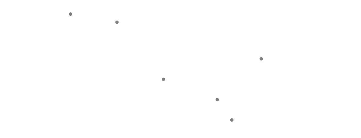
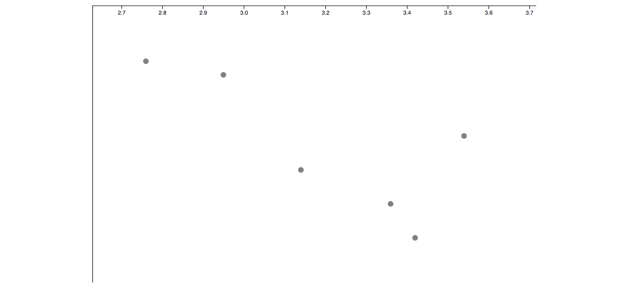
Once we run the code that we’ve written so far, we end up with something that looks like this:
一旦运行了到目前为止编写的代码,我们将得到如下所示的内容:
We attached the right number of circles to the screen and spaced them out a little, but what we have so far isn’t particularly helpful. For a scatter plot, the coordinates of these circles should correspond to two different values.
我们在屏幕上附加了正确数量的圆圈,并把它们隔开了一些距离,但是到目前为止,这并不是特别有用。 对于散点图,这些圆的坐标应对应于两个不同的值。
The GPA and height values that we have in our arrays aren’t much use to us at the moment. Our GPA values range from 2.32 to 3.85, and our height values range from 138 to 180. When positioning our circles, we want to work with x-values between 0 and 800 (the width of our SVG), and y-values between 0 and 500 (the height of our SVG).
目前,数组中的GPA和高度值对我们没有太大用处。 我们的GPA值范围为2.32至3.85,高度值范围为138至180。在定位圆时,我们希望使用0到800(SVG的宽度)之间的x值,以及0之间的y值和500(SVG的高度)。
We’ll need to apply some kind of transformation to our raw data, to convert these values into a format that we can use.
我们需要对原始数据进行某种转换,以将这些值转换为我们可以使用的格式。
In D3, we do this by using scales.
在D3中,我们通过使用刻度来实现。
关键概念#3 —体重秤 (Crucial Concept #3 — Scales)
Here comes our next major challenge to picking up D3.
这是我们接听D3的下一个主要挑战。
Scales are confusing to talk about when you’re first getting started. They need to be set with a domain and a range, which can be pretty easy to confuse. The domain represents the interval that our input values will run between, and the range represents the interval that our output values will run between.
体重秤令人困惑,难以置信。 它们需要设置一个域和一个范围 ,这很容易造成混淆。 域表示输入值将在其之间运行的时间间隔, 范围表示输出值将在其之间运行的时间间隔。
A scale is a function in D3 that will take in a value as an input, and spit out a different value as an output. In this example, we’ll need an x-scale that converts a GPA to a pixel value, and a y-scale that converts a person’s height to a pixel value, so that we can use our data to set the attributes of our circles.
比例尺是D3中的一个函数,它将一个值作为输入,并吐出另一个值作为输出。 在此示例中,我们需要一个将GPA转换为像素值的x比例尺,以及将一个人的身高转换为像素值的y比例尺,以便我们可以使用我们的数据来设置圆的属性。
Here’s a diagram to show you what our x-scale should be doing:
这是一张图表,向您展示我们的x比例尺应该做什么:
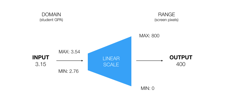
We need to initialize our domain and range with some minimum and maximum values. We’re saying that a value of 3.54 should translate to a pixel value of 800, and a GPA of 2.76 should translate to a pixel value of 0. So, if we pass in a value of 3.15 to our scale, then the output would be 400, since 3.15 is half way between the min and max of our domain.
我们需要使用一些最小值和最大值来初始化域和范围。 我们说3.54的值应转换为800的像素值,而GPA 2.76的应转换为0的像素值。因此,如果将3.15的值传递给比例尺,则输出将为等于400,因为3.15介于我们域的最小值和最大值之间。
In this example, we’re using a linear scale, meaning that values should be scaled proportionally between the two extremes that we’re looking at. However, there are a few different types of scales that you’ll want to get your head around.
在此示例中,我们使用线性比例尺,这意味着值应在要查看的两个极端之间按比例缩放。 但是,您需要了解几种不同类型的秤。
If you’re working with data that increases exponentially over time, then you might want to use a logarithmic scale.
如果您要处理随时间呈指数增长的数据,则可能需要使用对数刻度 。
If you’re working with date values, then you’ll use a time scale.
如果使用日期值,则将使用时间刻度 。
If you want to assign colors between different categories, you can use an ordinal scale.
如果要在不同类别之间分配颜色,则可以使用序数标度 。
If you’re spacing out rectangles in a bar chart, then you’ll use a band scale.
如果要在条形图中隔开矩形,则将使用带刻度 。
For each of these scales, the syntax is slightly different, but it’ll still follow the same general format as our linear scale.
对于这些比例尺,其语法略有不同,但仍将遵循与线性比例尺相同的通用格式。
Resources for understanding scales in D3…
了解D3中的量表的资源…
A walkthrough of the different types of scales — D3 in depth
So now, we can add in two linear scales to use for our x and y axes.
因此,现在,我们可以添加两个线性比例以用于我们的x和y轴。
var x = d3.scaleLinear()
    .domain([d3.min(data0, function(d){ return d.gpa; }) / 1.05,
        d3.max(data0, function(d){ return d.gpa; }) * 1.05])
    .range([0, 800]);

var y = d3.scaleLinear()
    .domain([d3.min(data0, function(d){ return d.height; }) / 1.05,
        d3.max(data0, function(d){ return d.height; }) * 1.05])
    .range([500, 0]);
Each of our scales will take in a value somewhere between the minimum and maximum of each variable in our data, and spit out a pixel value that we can use for our SVGs. I’m using the d3.min() and d3.max() functions here so that D3 will automatically automatically adjust if our dataset changes. I’m also giving our domains a 5% buffer both ways, so that all of our dots will fit on the screen.
我们的每个比例尺都将取一个介于我们数据中每个变量的最小值和最大值之间的值,并吐出一个可用于SVG的像素值。 我在这里使用d3.min()和d3.max()函数,以便如果我们的数据集发生更改,D3将自动进行调整。 我还同时为我们的域提供了5%的缓冲区,以便我们所有的点都适合屏幕。
We’re also reversing the range values for our y-scale, since an input of 0 should spit out an output of 500px (the bottom of a cartesian grid in the SVG coordinate system).
我们还反转了y比例尺的范围值,因为输入0应该吐出500px(SVG坐标系中笛卡尔网格的底部)的输出。
Next, we can make a few edits to our code from earlier, so that the values for our circles come from our scales.
接下来,我们可以对代码进行一些较早的编辑,以使圆的值来自比例尺。
var circles = d3.select("#canvas").selectAll("circle")
    .data(data0);

circles.enter()
    .append("circle")
        .attr("cx", function(d){ return x(d.gpa) })
        .attr("cy", function(d){ return y(d.height) })
        .attr("r", 5)
        .attr("fill", "grey");
At this point, we have something that looks like a real visualization!
至此,我们有了看起来像是真实可视化的东西!
The next step is to add in some axes, so that we can tell what these dots are meant to represent. We can do this by using D3’s axis generator functions, but we’ll soon run into some problems…
下一步是添加一些轴,以便我们可以分辨出这些点代表什么。 我们可以通过使用D3的轴生成器函数来完成此操作,但很快就会遇到一些问题……
关键概念4 –边距和轴 (Crucial Concept #4 — Margins and Axes)
D3’s axis generators work by attaching an axis onto whichever element they’re called on. The problem is that, if we try attaching axes straight onto our SVG canvas, then we’ll end up with something like this:
D3的轴生成器通过将轴附加到调用它们的任何元素上来工作。 问题是,如果我们尝试将轴直接附加到SVG画布上,那么最终将得到如下所示:
Our first problem is that the axes are always positioned at the top-left hand corner of the grid. That’s fine for our y-axis in this case, but it’s not okay for our x-axis, which we want to place at the bottom.
我们的第一个问题是轴始终位于网格的左上角。 在这种情况下,这对于我们的y轴来说很好,但是对于我们想要放置在底部的x轴来说则不合适。
Another issue here is that, since our axes are sticking out over the edge of our SVG canvas, our axis tick marks don’t show up for our y-axis.
这里的另一个问题是,由于我们的轴伸出到SVG画布的边缘上,因此我们的y轴没有显示轴刻度线。
We can fix this by making use of a few SVG groups — invisible elements for adding structure to our pages.
我们可以通过使用一些SVG组(用于在页面上添加结构的不可见元素)来解决此问题。
In D3, we need to get used to the “margin convention” that all of our projects should follow:
在D3中,我们需要习惯所有项目都应遵循的“保证金惯例”:
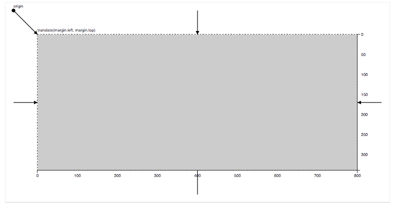
The idea is that we want to give ourselves a buffer around the edge of our visualization area, giving us some space for our axes to live. We need to set some width, height, and margin variables at the top of our file, allowing us to simulate this effect:
我们的想法是,我们希望在可视化区域的边缘提供一个缓冲区,为我们的轴留出一些空间。 我们需要在文件顶部设置一些宽度,高度和边距变量,以便我们模拟这种效果:
ar svg = d3.select("#canvas");

var margin = {top: 10, right: 10, bottom: 50, left: 50};
var width = +svg.attr("width") - margin.left - margin.right;
var height = +svg.attr("height") - margin.top - margin.bottom;

var g = svg.append("g")
    .attr("transform", "translate(" + margin.left + "," + margin.top + ")");
We now need to use these width and height variables to set the range for our scales, and we’ll be attaching our circles onto this g variable, which represents our main visualization area.
现在,我们需要使用这些宽度和高度变量来设置比例尺的范围,并将圆附加到该g变量上,该g变量表示我们的主要可视化区域。
If we also attach our axes to SVG groups, then we can shift them into the right position using the transform attribute that comes with the group element. Here’s the code we’ll be using to add our axes onto our graph:
如果我们还将轴附加到SVG组,则可以使用group元素随附的transform属性将其移至正确的位置。 这是我们用来将坐标轴添加到图形中的代码:
// Axes
var xAxisCall = d3.axisBottom(x)
var xAxis = g.append("g")
    .attr("class", "x-axis")
    .attr("transform", "translate(" + 0 + "," + height + ")")
    .call(xAxisCall);

var yAxisCall = d3.axisLeft(y)
var yAxis = g.append("g")
    .attr("class", "y-axis")
    .call(yAxisCall)

// Labels
xAxis.append("text")
    .attr("class", "axis-title")
    .attr("transform", "translate(" + width + ", 0)")
    .attr("y", -6)
    .text("Grade Point Average")
yAxis.append("text")
    .attr("class", "axis-title")
    .attr("transform", "rotate(-90)")
    .attr("y", 16)
    .text("Height / Centimeters");
I’m also adding some text SVGs as labels, which will tell us what each of the axes is showing.
我还添加了一些文本SVG作为标签,这将告诉我们每个轴所显示的内容。
The margin convention can seem a little random for newcomers to D3, and there are a wide range of methods that we can use to edit how our tick marks should look.
对于D3的新手来说,保证金惯例似乎有些随机,我们可以使用多种方法来编辑刻度线的外观。
Resources for understanding margins and axes in D3…
了解D3中的边距和轴的资源…
Now that we can see what our chart is showing, I want to take it to the next level by adding in an update to our data. To do this, we’ll use the D3 interval method to run some code continuously:
现在我们可以看到图表显示的内容,我想通过对数据进行更新来将其提升到一个新的水平。 为此,我们将使用D3 interval方法连续运行一些代码:
var flag = true;

// Run this code every second...
d3.interval(function(){
    // Flick between our two data arrays
    data = flag ? data0 : data1;

    // Update our chart with new data
    update(data);

    // Update our flag variable
    flag = !flag;
}, 1000)
Every 1000ms, this function is going to execute an update function, changing the data that we’re using between our two different arrays.
每1000ms,此函数将执行一个更新函数,以更改我们在两个不同数组之间使用的数据。
We need to make a few edits to our code to get everything to update like we want it to:
我们需要对代码进行一些编辑以使所有内容都可以更新,就像我们希望的那样:
// Scales
var x = d3.scaleLinear()
    .range([0, width]);
var y = d3.scaleLinear()
    .range([height, 0]);

// Axes
var xAxisCall = d3.axisBottom(x)
var xAxis = g.append("g")
    .attr("class", "x-axis")
    .attr("transform", "translate(" + 0 + "," + height + ")");

var yAxisCall = d3.axisLeft(y)
var yAxis = g.append("g")
    .attr("class", "y-axis");

// Labels
xAxis.append("text")
    .attr("class", "axis-title")
    .attr("transform", "translate(" + width + ", 0)")
    .attr("y", -6)
    .text("Grade Point Average")
yAxis.append("text")
    .attr("class", "axis-title")
    .attr("transform", "rotate(-90)")
    .attr("y", 16)
    .text("Height / Centimeters");

var flag = true;

// Run this code every second...
d3.interval(function(){
    // Flick between our two data arrays
    data = flag ? data0 : data1;

    // Update our chart with new data
    update(data);

    // Update our flag variable
    flag = !flag;
}, 1000)

// Run for the first time
update(data0);

function update(data){
    // Update our scales
    x.domain([d3.min(data, function(d){ return d.gpa; }) / 1.05,
        d3.max(data, function(d){ return d.gpa; }) * 1.05])
    y.domain([d3.min(data, function(d){ return d.height; }) / 1.05,
        d3.max(data, function(d){ return d.height; }) * 1.05])

    // Update our axes
    xAxis.call(xAxisCall);
    yAxis.call(yAxisCall);

    // Update our circles
    var circles = g.selectAll("circle")
        .data(data);

    circles.exit().remove()

    circles
        .attr("cx", function(d){ return x(d.gpa) })
        .attr("cy", function(d){ return y(d.height) })

    circles.enter()
        .append("circle")
            .attr("cx", function(d){ return x(d.gpa) })
            .attr("cy", function(d){ return y(d.height) })
            .attr("r", 5)
            .attr("fill", "grey");
}
We’re setting our scale domains inside our update function, so that they adjust to the data that we’re working with. We’re then calling our axis generators here too, which will update them accordingly. We then have a confusing block of code, which handles how we want our circles to update.
我们在我们的更新函数中设置了比例域,以便它们可以根据我们正在使用的数据进行调整。 然后,我们也在这里调用我们的轴生成器,它将相应地更新它们。 然后,我们得到了一个令人困惑的代码块,该代码块处理了我们如何更新圈子。
关键概念5-总体更新模式 (Crucial Concept #5 — The General Update Pattern)
The general update pattern is used in pretty much every visualization that you’ll want to build with D3. It defines the behavior of elements in our data that should enter, update, or exit the screen. As a beginner, all of this code can seem a little overwhelming.
常规更新模式几乎用在要使用D3构建的每个可视化文件中。 它定义了数据中应该进入,更新或退出屏幕的元素的行为。 作为一个初学者,所有这些代码似乎都让人有些不知所措。
Let’s take a closer look at what each of these lines are doing.
让我们仔细看看这些行中的每一个。
First, we’re binding our new array of data to our D3 selection:
首先,我们将新的数据数组绑定到D3选择中:
// JOIN new data with old elements.
var circles = g.selectAll("circle")
    .data(data);
Next, this block of code will remove all the dots that no longer exist in our new array of data:
接下来,此代码块将删除新数据数组中不再存在的所有点:
// EXIT old elements not present in new data.
circles.exit().remove()
Here, we’re updating the position of all the dots on the screen that still exist in our new data array.
在这里,我们将更新屏幕上所有仍存在于新数据数组中的点的位置。
// UPDATE old elements present in new data.
circles
    .attr("cx", function(d){ return x(d.gpa) })
    .attr("cy", function(d){ return y(d.height) })
Finally, we’re adding a dot for every item in our new data array that doesn’t have a corresponding circle on the screen.
最后,我们为新数据数组中的每个项目添加一个点,该点在屏幕上没有相应的圆圈。
// ENTER new elements present in new data.
circles.enter().append("circle")
    .attr("cx", function(d){ return x(d.gpa) })
    .attr("cy", function(d){ return y(d.height) })
    .attr("r", 5)
    .attr("fill", "grey");
The tricky thing about understanding the general update pattern is figuring out exactly what selectAll(), enter(), and exit() are doing. D3 works by using a set of “virtual selectors”, which we can use to keep track of which elements need to be updated.
了解常规更新模式的棘手事情是准确地确定selectAll(),enter()和exit()的功能。 D3通过使用一组“虚拟选择器”来工作,我们可以用来跟踪需要更新哪些元素。
Although you can get away with having only a surface understanding of the update pattern with many charts that you’d want to create, the whole library becomes a lot clearer once you can figure out what each of these selectors are doing.
尽管您只想对要创建的许多图表仅具有对更新模式的表面理解,但是一旦弄清了每个选择器的作用,整个库就会变得更加清晰。
Resources for understanding the general update pattern in D3…
了解D3中一般更新模式的资源…
A walkthrough of the general update pattern — Quinton Louis Aiken
An interactive exploration of the general update pattern — Chris Given
Once we’ve added in our updates, here’s what our chart looks like:
添加更新后,图表如下所示:
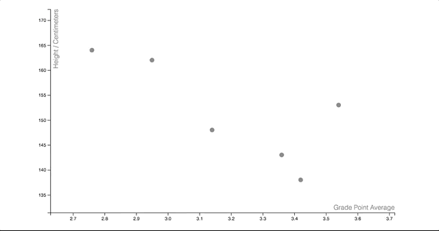
Our visualization is now flicking between the two arrays of data that we want to display. I’m going to add one more final flourish to make our graph look a little neater.
现在,我们的可视化在我们要显示的两个数据阵列之间滑动。 我将再添加一个最终的华丽效果,以使我们的图形看起来更整洁。
We can add in some beautiful transitions by making use of the superb D3 transition suite. First, we’re defining a transition variable at the top of our update function, which is spreading each of our transitions out over a duration of 750ms.
通过使用精湛的D3过渡套件,我们可以添加一些漂亮的过渡。 首先,我们在更新函数的顶部定义一个转换变量,该变量将每个转换分散到750ms的持续时间内。
// Standard transition for our visualization
var t = d3.transition().duration(750);
Any attributes that we set before calling the transition method on a D3 selection will be set straight away, and any attributes that we set after this transition method will be applied gradually.
在D3选择上调用过渡方法之前设置的所有属性都将立即设置,并且在此过渡方法之后设置的所有属性将逐渐应用。
We can add transitions to our axes like this:
我们可以像这样向轴添加过渡:
// Update our axes
xAxis.transition(t).call(xAxisCall);
yAxis.transition(t).call(yAxisCall);
And we can add transitions to our circles like this:
我们可以像这样向我们的圈子添加过渡效果:
// Update our circles
var circles = g.selectAll("circle")
    .data(data);

circles.exit().transition(t)
    .attr("fill-opacity", 0.1)
    .attr("cy", y(0))
    .remove()

circles.transition(t)
    .attr("cx", function(d){ return x(d.gpa) })
    .attr("cy", function(d){ return y(d.height) })

circles.enter().append("circle")
    .attr("cx", function(d){ return x(d.gpa) })
    .attr("cy", y(0))
    .attr("r", 5)
    .attr("fill", "grey")
    .attr("fill-opacity", 0.1)
.transition(t)
    .attr("fill-opacity", 1)
    .attr("cy", function(d){ return y(d.height) });
We’re transitioning between a fill-opacity of 0 and 1 to make our dots gently fade in and out of existence, and we’re smoothly shifting the updating circles to their new positions.
我们正在0和1的填充不透明度之间过渡,以使我们的点逐渐淡入和淡出,并且我们正在平滑地将更新圆移到其新位置。
So there we have it. We now have a beautiful scatter plot which is updating between different sources of data. You can find the finished product of all this code on my GitHub page here.
因此,我们有它。 现在,我们有了一个漂亮的散点图,该散点图正在不同的数据源之间进行更新。 你可以在我的GitHub的网页上找到的所有代码成品这里 。
Although mastering the concepts in this article might seem like a huge step to take just to get started with D3, the code gets easier and easier to understand with practice.
尽管掌握本文中的概念似乎只是开始D3迈出的巨大一步,但是通过实践,代码变得越来越容易理解。
You’ll soon find that the same key concepts underpin every D3 visualization, and that once you know how one visualization works in D3, you can quickly learn to build almost anything that you can imagine.
您很快就会发现,相同的关键概念构成了每个D3可视化的基础,而且一旦您知道一种可视化在D3中的工作原理,您就可以快速学习构建几乎可以想象的任何东西。
Check out the examples on bl.ocks.org and blockbuilder.org to see some ready-made implementations of so many interesting projects. Like D3 itself, all of this code is open source, meaning that you can copy any of this code onto your local machine, and use it for your own projects.
检查出的例子bl.ocks.org和blockbuilder.org看到这么多有趣的项目的一些现成的实现。 与D3本身一样,所有这些代码都是开源的,这意味着您可以将任何这些代码复制到本地计算机上,并用于自己的项目。
一种简单的D3入门方法... (An easy way to get started with D3…)
If you’re looking for the fastest and easiest way to learn D3, then I teach a course on Udemy which offers a comprehensive introduction to the library. The course includes:
如果您正在寻找最快,最简单的学习D3的方法,那么我会在Udemy上教授一门课程,其中提供了对该库的全面介绍。 该课程包括:
- 7 hours of quality video content. 7小时的优质视频内容。
- A step-by-step introduction to the foundational concepts in D3, covering all of the topics covered in this article and more. D3中的基础概念的分步介绍,涵盖了本文中介绍的所有主题以及更多内容。
- Four awesome class projects to practice the skills that you’re learning with real-world data. 四个很棒的课堂项目,可用来练习您在实际数据中学习的技能。
- A strong emphasis on data visualization design, helping you to create custom visualizations for your own data. 高度重视数据可视化设计,可帮助您为自己的数据创建自定义可视化。
- Walkthroughs of 12 of the most commonly used visualizations, teaching you how to understand and adapt pre-written community code for your own purposes. 演练12种最常用的可视化内容,教您如何理解和改编预写的社区代码以实现自己的目的。
- An introduction to an object-orientated approach for creating complex web apps, where multiple visualizations on the page are updating at once. 介绍了用于创建复杂的Web应用程序的面向对象的方法,该方法可一次更新页面上的多个可视化文件。
You can get the course at a discounted price of only $20.99 by signing up through this link here.
您可以通过此链接在此处注册,以仅$ 20.99的折扣价获得该课程。
three.js基本概念


 4105
4105


 被折叠的 条评论
为什么被折叠?
被折叠的 条评论
为什么被折叠?
 到【灌水乐园】发言


