


1.前言
QT自绘技术系列文章链接如下:
- 《QStyle类用法总结(一)》。对Qt自定义风格简单描述,对QStyle及其相关类作了概念性的描述。
- 《QStyle类用法总结(二)》。对QStyle及其相关类作了详细描述。
- 《QStyle类用法总结(三)》。对QStyle中的各widget元素的层次继承树做了详细描述。
- 《QProxyStyle用法简述》。通过一个简单的例子,演示了QProxyStyle类用法。
- 《QStyle实现自绘界面项目实战(一)》通过项目实战来理解前几篇提到的内容,理解QStyle及其子类在自绘时的工作机制。
- 《QStyle实现自绘界面项目实战(二)》通过项目实战来理解前几篇提到的内容,理解QStyle及其子类在自绘时的工作机制。
在阅读本文章之前,请先阅读上述列出的相关文章,否则没有自绘基础,很难读懂本文章。
2. 工程说明
Qt自带的例子affine中的ArthurStyle类继承自QCommonStyle,实现了绘制自定义窗体部件的功能,是学习自定义控件的好例子。
工程存放的路径在:Examples\Qt-XX.XX.XX\widgets\painting\affine
其中XX.XX.XX为Qt的版本号,如:5.14.1。关于该工程和自绘、QStyle无关的有关技术知识点分析参见《Qt Examples之affine工程难点、亮点汇总》博文,本篇博文只讲该工程和自绘、QStyle有关的技术点。
3.工程分析
本工程自绘在arthurstyle.cpp文件通过ArthurStyle类实现的。ArthurStyle类的成员函数用到PE_、CC_、SE_、PM_、CT_、SC_、CE_、开头的标识符,这些标识符分别表示什么意思,及绘制这些标识符表示的部件元素的函数drawPrimitive、drawComplexControl、drawControl用法含义,请参考:《QStyle类用法总结(二)》、《QStyle类用法总结(三)》及Qt Assist,如果不理解这些标识符含义,很难理解自绘是怎么实现的。
3.1.drawPrimitive函数
drawPrimitive函数用于绘制图形元素,即某个widget的某一部分,如:spin box中的上下箭头元素。以PE_开头的标识符表示的图形元素都是该函数绘制的。
3.1.1.case语句之PE_IndicatorRadioButton
Qt Assist对PE_IndicatorRadioButton解释如下:

可以理解为:该标识符表示单选按钮左边用于勾选的小圆圈及小圆圈外包围矩形。该标识所在case语句如下:
case PE_IndicatorRadioButton:
        if (const QStyleOptionButton *button = qstyleoption_cast<const QStyleOptionButton *>(option)) {
            bool hover = (button->state & State_Enabled) && (button->state & State_MouseOver);
            painter->save();
            QPixmap radio;
            if (hover)
                drawHoverRect(painter, widget->rect());

            if (button->state & State_Sunken)
                radio = cached(":res/images/radiobutton-on.png");
            else if (button->state & State_On)
                radio = cached(":res/images/radiobutton_on.png");
            else
                radio = cached(":res/images/radiobutton_off.png");
            painter->drawPixmap(button->rect.topLeft(), radio);

            painter->restore();
        }
        break;
第2行:程序能进入到PE_IndicatorRadioButton所在的case语句,则窗体部件必定是QRadioButton类型按钮。接下来将option通过qstyleoption_cast强制转换为QStyleOptionButton,因为此时的窗体部件肯定是一个按钮类型,这种转化肯定能成功。
第3行:如果单选按钮处于可用状态且鼠标在单选按钮上,则调用drawHoverRect函数。drawHoverRect函数绘制出鼠标在单选按钮上时呈现的圆角矩形,以便用户能从视觉感知鼠标是真的悬浮在单选框上,即如下红色框效果:
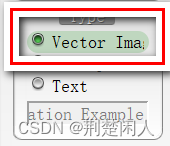
图1
注意:传递给drawHoverRect函数的第2个参数应该是widget->rect()即整个单选按钮占据的矩形,而不是button->rect或option->rect,后者仅仅表示单选按钮左边用于勾选的小圆圈及小圆圈外包围矩形,即下面红色方框表示的矩形而不是整个单选按钮占据的矩形:
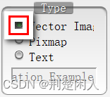
图2
如果给drawHoverRect函数的第2个参数的矩形不对,则不会出现图1的鼠标悬浮视觉冲击效果。
第9~10行:鼠标在单选按钮上按下时,用radiobutton-on.png图片构成的QPixmap对象通过drawPixmap函数绘制到图2所示的矩形上,以呈现单选按钮被按下的视觉冲击感。
第11~12行:单选按钮被勾选时,用radiobutton_on.png图片构成的QPixmap对象通过drawPixmap函数绘制到图2所示的矩形上,以呈现单选按钮被勾选的视觉冲击感。
第13~14行:单选按钮既没被勾选又没被按下时,用radiobutton_off图片构成的QPixmap对象通过drawPixmap函数绘制到图2所示的矩形上,以呈现单选按钮既没被勾选又没被按下的视觉冲击感。
3.1.2.case语句之PE_PanelButtonCommand
Qt Assist对PE_PanelButtonCommand解释如下:

图3
再结合 《QStyle类用法总结(三)》博文2.2.1节对push button的描述,其实PE_PanelButtonCommand可以简单理解为就时一个QPushButton类型按钮,该标识所在case语句如下:
 if (const QStyleOptionButton *button = qstyleoption_cast<const QStyleOptionButton *>(option)) {
            bool hover = (button->state & State_Enabled) && (button->state & State_MouseOver);

            painter->save();
            const QPushButton *pushButton = qobject_cast<const QPushButton *>(widget);
            Q_ASSERT(pushButton);
            QWidget *parent = pushButton->parentWidget();
            if (parent && qobject_cast<QGroupBox *>(parent)) {
                QLinearGradient lg(0, 0, 0, parent->height());
                lg.setColorAt(0, QColor(224,224,224));
                lg.setColorAt(1, QColor(255,255,255));
                painter->setPen(Qt::NoPen);
                painter->setBrush(lg);
                painter->setBrushOrigin(-widget->mapToParent(QPoint(0,0)));
                painter->drawRect(button->rect);
                painter->setBrushOrigin(0,0);
            }

            bool down = (button->state & State_Sunken) || (button->state & State_On);

            QPixmap left, right, mid;
            if (down) {
                left = cached(":res/images/button_pressed_cap_left.png");
                right = cached(":res/images/button_pressed_cap_right.png");
                mid = cached(":res/images/button_pressed_stretch.png");
            } else {
                left = cached(":res/images/button_normal_cap_left.png");
                right = cached(":res/images/button_normal_cap_right.png");
                mid = cached(":res/images/button_normal_stretch.png");
            }
            painter->drawPixmap(button->rect.topLeft(), left);
            painter->drawTiledPixmap(QRect(button->rect.x() + left.width(),
                                           button->rect.y(),
                                           button->rect.width() - left.width() - right.width(),
                                           left.height()),
                                     mid);
            painter->drawPixmap(button->rect.x() + button->rect.width() - right.width(),
                                button->rect.y(),
                                right);
            if (hover)
                painter->fillRect(widget->rect().adjusted(3,5,-3,-5), QColor(31,127,31,63));
            painter->restore();
        }
        break;
第1行:程序能进入到PE_PanelButtonCommand所在的case语句,则窗体部件必定是QPushButton类型按钮。接下来将option通过qstyleoption_cast强制转换为QStyleOptionButton,因为此时的窗体部件肯定是一个按钮类型,这种转化肯定能成功。
第2行:如果按钮处于可用状态且鼠标在按钮上,则hover为true,否则为false。
第5~16行:通过按钮找到按钮的父控件,即按钮外面的QGroupBox,再创建一个渐变画刷来填充按钮外包围矩形button->rect。注意:button->rect坐标是相对其父QGroupBox来说的,即
button->rect是以QGroupBox的坐标系为基准的,故需要通过下句代码:
painter->setBrushOrigin(-widget->mapToParent(QPoint(0,0)));将画刷默认坐标原点(默认值是以按钮坐标系为基准,且在按钮的左上顶点(0,0)处)转为以QGroupBox的坐标系下的画刷坐标原点。
第19~39行:先判断按钮是否按下或勾选,根据按下或没按下,设置不同的按钮贴图。然后调用drawPixmap在按钮左边和右边把贴图贴到按钮左部分和右部分,调用drawTiledPixmap函数给按钮中间部分贴图。
第40~41行:根据第2行判断的鼠标是否在按钮上方悬浮,如果是悬浮,则调用fillRect函数,传入 QColor(31,127,31,63)画刷绘制矩形,因为颜色和没悬浮时的颜色不同,这样就可以让用户产生视觉冲击感。
3.1.3.case语句之PE_FrameGroupBox
Qt Assist对PE_FrameGroupBox解释如下:
 图4
图4
再结合 《QStyle类用法总结(三)》博文2.2.9节对Group Box的描述,其实 PE_FrameGroupBox就是Group Box面板最外面的边框。该标识所在case语句如下:
if (const QStyleOptionFrame *group
                = qstyleoption_cast<const QStyleOptionFrame *>(option)) {
            const QRect &r = group->rect;

            painter->save();
            int radius = 14;
            int radius2 = radius*2;
            QPainterPath clipPath;
            clipPath.moveTo(radius, 0);
            clipPath.arcTo(r.right() - radius2, 0, radius2, radius2, 90, -90);
            clipPath.arcTo(r.right() - radius2, r.bottom() - radius2, radius2, radius2, 0, -90);
            clipPath.arcTo(r.left(), r.bottom() - radius2, radius2, radius2, 270, -90);
            clipPath.arcTo(r.left(), r.top(), radius2, radius2, 180, -90);
            painter->setClipPath(clipPath);
            QPixmap titleStretch = cached(":res/images/title_stretch.png");
            QPixmap topLeft = cached(":res/images/groupframe_topleft.png");
            QPixmap topRight = cached(":res/images/groupframe_topright.png");
            QPixmap bottomLeft = cached(":res/images/groupframe_bottom_left.png");
            QPixmap bottomRight = cached(":res/images/groupframe_bottom_right.png");
            QPixmap leftStretch = cached(":res/images/groupframe_left_stretch.png");
            QPixmap topStretch = cached(":res/images/groupframe_top_stretch.png");
            QPixmap rightStretch = cached(":res/images/groupframe_right_stretch.png");
            QPixmap bottomStretch = cached(":res/images/groupframe_bottom_stretch.png");
            QLinearGradient lg(0, 0, 0, r.height());
            lg.setColorAt(0, QColor(224,224,224));
            lg.setColorAt(1, QColor(255,255,255));
            painter->setPen(Qt::NoPen);
            painter->setBrush(lg);
            painter->drawRect(r.adjusted(0, titleStretch.height()/2, 0, 0));
            painter->setClipping(false);

            int topFrameOffset = titleStretch.height()/2 - 2;
            painter->drawPixmap(r.topLeft() + QPoint(0, topFrameOffset), topLeft);
            painter->drawPixmap(r.topRight() - QPoint(topRight.width()-1, 0)
                                + QPoint(0, topFrameOffset), topRight);
            painter->drawPixmap(r.bottomLeft() - QPoint(0, bottomLeft.height()-1), bottomLeft);
            painter->drawPixmap(r.bottomRight() - QPoint(bottomRight.width()-1,
                                bottomRight.height()-1), bottomRight);

            QRect left = r;
            left.setY(r.y() + topLeft.height() + topFrameOffset);
            left.setWidth(leftStretch.width());
            left.setHeight(r.height() - topLeft.height() - bottomLeft.height() - topFrameOffset);
            painter->drawTiledPixmap(left, leftStretch);

            QRect top = r;
            top.setX(r.x() + topLeft.width());
            top.setY(r.y() + topFrameOffset);
            top.setWidth(r.width() - topLeft.width() - topRight.width());
            top.setHeight(topLeft.height());
            painter->drawTiledPixmap(top, topStretch);

            QRect right = r;
            right.setX(r.right() - rightStretch.width()+1);
            right.setY(r.y() + topRight.height() + topFrameOffset);
            right.setWidth(rightStretch.width());
            right.setHeight(r.height() - topRight.height()
                            - bottomRight.height() - topFrameOffset);
            painter->drawTiledPixmap(right, rightStretch);

            QRect bottom = r;
            bottom.setX(r.x() + bottomLeft.width());
            bottom.setY(r.bottom() - bottomStretch.height()+1);
            bottom.setWidth(r.width() - bottomLeft.width() - bottomRight.width());
            bottom.setHeight(bottomLeft.height());
            painter->drawTiledPixmap(bottom, bottomStretch);
            painter->restore();
第1行:程序能进入到PE_FrameGroupBox所在的case语句,则窗体部件必定是PE_FrameGroupBox类型的组框边框图元。接下来将option通过qstyleoption_cast强制转换为QStyleOptionFrame,因为组框有边框,这种转化肯定能成功。
第6~14行:构建了一个类似圆角矩形的QPainterPath画图路径类对象clipPath,并将裁剪区域设置为clipPath,这样GroupBox外边框看起来就是一个圆角矩形。
第24~29行: 将GroupBox占据的包围矩形用一个渐变画刷lg绘制填充。
第32~38行: 将GroupBox占据的包围矩形四个端点所在的角用pixmap图片填充、贴图。即填充图5中的数字1部分所示区域。
第40~66行: 将GroupBox占据的包围矩形非四个端点形成的角的区域,且不是矩形主体用pixmap图片填充、贴图。即填充图5中的数字2部分所示区域。
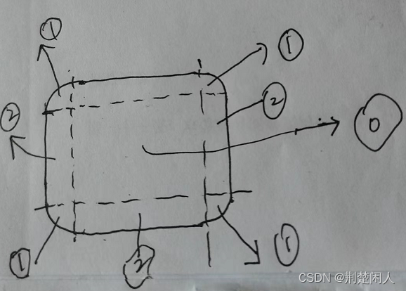
图5
3.2.drawComplexControl函数
drawComplexControl函数用于绘制复杂控件,以CC开头表示的元素都是该函数绘制的。
3.2.1.case语句之CC_Slider
Qt Assist对CC_Slider解释如下:

图6
再结合 《QStyle类用法总结(三)》博文2.2.5节对Slider的描述,其实 CC_Slider就是Group 整个QSlider控件。该标识所在case语句如下:
case CC_Slider:
        if (const QStyleOptionSlider *slider = qstyleoption_cast<const QStyleOptionSlider *>(option)) {
            QRect groove = subControlRect(CC_Slider, option, SC_SliderGroove, widget);
            QRect handle = subControlRect(CC_Slider, option, SC_SliderHandle, widget);

            painter->save();

            bool hover = (slider->state & State_Enabled) && (slider->state & State_MouseOver);
            if (hover) {
                QRect moderated = widget->rect().adjusted(0, 4, 0, -4);
                drawHoverRect(painter, moderated);
            }

            if ((option->subControls & SC_SliderGroove) && groove.isValid()) {
                QPixmap grv = cached(":res/images/slider_bar.png");
                painter->drawPixmap(QRect(groove.x() + 5, groove.y(),
                                          groove.width() - 10, grv.height()),
                                    grv);
            }
            if ((option->subControls & SC_SliderHandle) && handle.isValid()) {
                QPixmap hndl = cached(":res/images/slider_thumb_on.png");
                painter->drawPixmap(handle.topLeft(), hndl);
            }

            painter->restore();
        }
        break;
第2行:程序能进入到CC_Slider所在的case语句,则窗体部件必定是CC_Slider类型的复合控件。接下来将option通过qstyleoption_cast强制转换为QStyleOptionSlider,这种转化肯定能成功。
第3~4行: 通过调用subControlRect函数,获取QSlider控件中的SC_SliderGroove、SC_SliderHandle表示的子控件即沟槽、手柄占据的外包围矩形。关于SC_SliderGroove、SC_SliderHandle表示的子控件具体是什么、含义请查看 《QStyle类用法总结(三)》博文2.2.5节对Slider的描述及Qt Assist。
第8~12行:检测鼠标是否悬浮在QSlider控件上方。如果是则调用drawHoverRect函数绘制一个圆角浅绿色的矩形,这样就会有视觉冲击感。
第14~19行:如果子控件是SC_SliderGroove即QSlider复合控件的沟槽子控件,则将slider_bar.png贴在SC_SliderGroove外包围矩形适当缩小后的矩形上。
第20~23行:如果子控件是SC_SliderHandle即QSlider复合控件的手柄子控件,则将slider_thumb_on.png贴在SC_SliderHandle外包围矩形上。
3.2.2 case语句之CC_GroupBox
Qt Assist对CC_GroupBox解释如下:

再结合 《QStyle类用法总结(三)》博文2.2.9节对GroupBox的描述,其实 CC_GroupBox就是Group 整个QSlider控件。该标识所在case语句如下:
  if (const QStyleOptionGroupBox *groupBox
                = qstyleoption_cast<const QStyleOptionGroupBox *>(option)) {
            QStyleOptionGroupBox groupBoxCopy(*groupBox);
            groupBoxCopy.subControls &= ~SC_GroupBoxLabel;
            QCommonStyle::drawComplexControl(control, &groupBoxCopy, painter, widget);

            if (groupBox->subControls & SC_GroupBoxLabel) {
                const QRect &r = groupBox->rect;
                QPixmap titleLeft = cached(":res/images/title_cap_left.png");
                QPixmap titleRight = cached(":res/images/title_cap_right.png");
                QPixmap titleStretch = cached(":res/images/title_stretch.png");
                int txt_width = groupBox->fontMetrics.horizontalAdvance(groupBox->text) + 20;
                painter->drawPixmap(r.center().x() - txt_width/2, 0, titleLeft);
                QRect tileRect = subControlRect(control, groupBox, SC_GroupBoxLabel, widget);
                painter->drawTiledPixmap(tileRect, titleStretch);
                painter->drawPixmap(tileRect.x() + tileRect.width(), 0, titleRight);
                int opacity = 31;
                painter->setPen(QColor(0, 0, 0, opacity));
                painter->drawText(tileRect.translated(0, 1),
                                  Qt::AlignVCenter | Qt::AlignHCenter, groupBox->text);
                painter->drawText(tileRect.translated(2, 1),
                                  Qt::AlignVCenter | Qt::AlignHCenter, groupBox->text);
                painter->setPen(QColor(0, 0, 0, opacity * 2));
                painter->drawText(tileRect.translated(1, 1),
                                  Qt::AlignVCenter | Qt::AlignHCenter, groupBox->text);
                painter->setPen(Qt::white);
                painter->drawText(tileRect, Qt::AlignVCenter | Qt::AlignHCenter, groupBox->text);
            }
        }
        break;
第3~5行:除了Group box的标题(SC_GroupBoxLabel)外,Group box的其它子控件都采用默认值绘制,即调用该父类QCommonStyle的drawComplexControl函数绘制。
第12~16行:根据Group box标题文本占据的水平方向上的长度和Group box外包围矩形尺寸信息,在Group box占据的矩形中间、左边、右边贴图。
第17~27行:设置不同画笔颜色透明度且多次微调绘制标题文本的矩形位置绘制标题文本,最终用白色画笔绘制了标题文本。
3.3.drawControl函数
这个函数很简单。基本意思是:如果绘制的是单选按钮、pushbutton按钮文本,且按钮文本为空,则调用默认值绘制,也即调用父类QCommonStyle的drawControl函数。如果单选按钮文本不为空,则以垂直方向居中对齐绘制文本;如果是pushbutton按钮文本,则以垂直且水平都居中对齐绘制文本。


 2万+
2万+


 被折叠的 条评论
为什么被折叠?
被折叠的 条评论
为什么被折叠?
 到【灌水乐园】发言


