


 本文围绕Python的matplotlib库展开,介绍了如何绘制具有科研风格的点线图、散点图、网络图和条形图。涵盖个人常用的绘图设置,如风格、字体、图例位置等,还提及面向对象绘图方式、pylab.rcParams.update()属性设置及各类图形的绘制方法。
Python matplotlib绘图 如何科研风?点线图、散点图、网络图、条形图
dpiccolo,个人绘图笔记
个人常用的内容:绘图风格、字体类型、大小、marker、图例位置
官网最直接、全面:Pyplot function overview
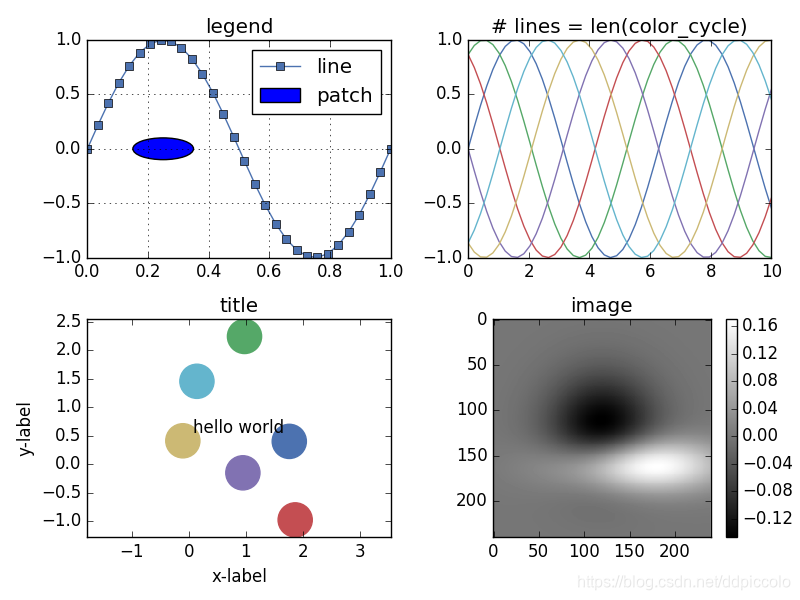
1.绘图风格
matplotlib自带的风格课参考Matplotlib Style Gallery
和Customizing plots with style sheets
另外还有seaborn库可以更好地学习。
线型和marker类型等,可参考plt 绘图 知识点整理
plt.style.use("seaborn-deep")
个人常用:
ggplot
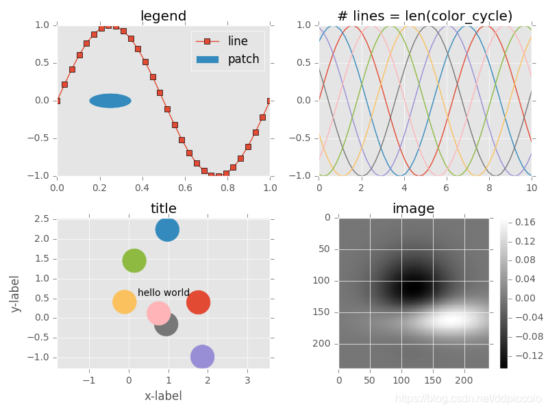
bmh
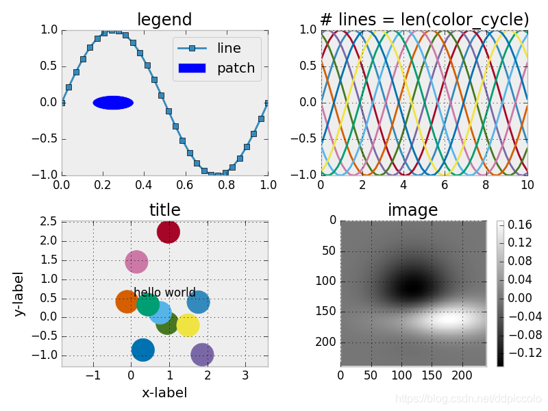
grayscale
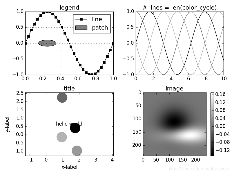
seaborn-deep
2.面向对象的基本绘图方式
快速绘图中必须要考虑操作对象,面向对象绘图中加坐标名字和标题等要加set_。
__date__ = '2019/4/1 23:13'
__author__ = 'dpiccolo'
import numpy as np
import matplotlib.pyplot as plt

from pylab import mpl
mpl.rcParams['font.sans-serif'] = ['Times New Roman'] # 指定默认字体
mpl.rcParams['axes.unicode_minus'] = False # 解决保存图像是负号'-'显示为方块的问题

samplenum1=np.arange(25,500+2,25)
x25 = samplenum1
samplenum2=np.arange(10,200+2,10)
x10 = samplenum2
samplenum3=np.arange(2,40+2,2)
x2 = samplenum3

accuracy10sigmoid_test=[0.863, 0.898, 0.964, 0.985, 0.975, 0.985, 0.989, 0.992, 0.992, 0.99, 0.989, 0.991, 0.988, 0.995, 0.994, 0.995, 1.0, 0.999, 0.996, 0.995]
accuracy10tanh_test=[0.88, 0.968, 0.99, 0.985, 0.987, 0.988, 0.979, 0.986, 0.989, 0.988, 0.99, 0.987, 0.985, 0.993, 0.992, 0.993, 0.989, 0.99, 0.981, 0.991]
accuracy10relu_test=[0.931, 0.9, 0.933, 0.947, 0.953, 0.967, 0.98, 0.985, 0.973, 0.981, 0.985, 0.985, 0.986, 0.979, 0.985, 0.984, 0.984, 0.982, 0.978, 0.976]
#面向对象的绘图方式
rect1 = [0.14, 0.35, 0.77, 0.6]
fig,ax = plt.subplots()
ax.figsize=(48,48)
plt.rcParams['figure.figsize'] = (6.0, 4.0)
plt.rcParams['image.interpolation'] = 'nearest' # 设置 interpolation style
plt.rcParams['image.cmap'] = 'gray' # 设置 颜色 style
plt.rcParams['savefig.dpi'] = 300 #图片像素
plt.rcParams['figure.dpi'] = 300 #分辨率

ins0=ax.plot(x10,accuracy10tanh_test, label = 'tanh',marker='o')
ins1=ax.plot(x10,accuracy10relu_test, label = 'relu',marker='s')
ins2=ax.plot(x10,accuracy10sigmoid_test, label = 'sigmoid',marker='v')
lns = ins0+ins1+ins2
labs = [l.get_label() for l in lns]
ax.legend(lns, labs, loc="lower right")#loc="lower right" 图例右下角
ax.set_xlabel("Iteration")
ax.set_ylabel("Accuracy")
#ax.set_title("xxx0-10")
ax.set_xticks(x10)
ax.set_yticks([0.7,0.9,0.95,1.0])
#ax.grid()
plt.savefig('xxx0-10-0.png')
结果图:

3.pylab神技——pylab.rcParams.update()
一个比较全面的绘图属性设置,包括字号、字体类型、颜色、线宽等等。
具体使用请参照Customizing matplotlib,十分推荐。
下面是一个实例。字号设置均为10,字体选用Times New Roman,figsize为7x3,dpi为1000,最后保存绘图分辨率(未裁多余白边时)为7000x3000,剪裁多余白边后为6147x2909.
保存时裁多余白边
bbox_inches='tight'plt.savefig('kdd-iteration.eps', dpi=1000, bbox_inches='tight')
__date__ = '2019/4/3 22:34'
__author__ = 'dpiccolo'
import matplotlib.pyplot as plt
import matplotlib.pylab as pylab
import numpy as np
from PIL import Image

myparams = {

   'axes.labelsize': '10',

   'xtick.labelsize': '10',

   'ytick.labelsize': '10',

   'lines.linewidth': 1,

   'legend.fontsize': '10',

   'font.family': 'Times New Roman',

   'figure.figsize': '7, 3'  #图片尺寸

}

pylab.rcParams.update(myparams)  #更新自己的设置
# line_styles=['ro-','b^-','gs-','ro--','b^--','gs--']  #线型设置
samplenum2=np.arange(10,200+2,10)
x10 = samplenum2
samplenum3=np.arange(2,40+2,2)
x2 = samplenum3
#原始数据0
accuracy10sigmoid_test=[0.595,0.564,0.556,0.6,0.563,0.547,0.81,0.874,0.895,0.923,0.93,0.936,0.953,0.95,0.96,0.955,0.966,0.964,0.973,0.979]
accuracy10tanh_test=[0.879,0.967,0.98,0.986,0.982,0.987,0.988,0.987,0.991,0.994,0.994,0.992,0.995,0.985,0.987,0.985,0.987,0.992,0.988,0.992]
accuracy10relu_test=[0.788,0.804,0.786,0.809,0.791,0.796,0.82,0.812,0.816,0.801,0.798,0.808,0.844,0.994,0.991,0.991,0.993,0.995,0.995,0.984]
#原始数据1
accuracy2relu_test=[0.207,0.198,0.678,0.665,0.78,0.78,0.79,0.783,0.779,0.779,0.786,0.776,0.801,0.788,0.793,0.79,0.786,0.776,0.791,0.8]
accuracy2tanh_test=[0.241,0.618,0.588,0.579,0.577,0.614,0.741,0.852,0.903,0.933,0.961,0.974,0.981,0.979,0.984,0.984,0.981,0.98,0.981,0.987]
accuracy2sigmoid_test=[0.001,0.002,0.572,0.568,0.564,0.601,0.587,0.568,0.536,0.58,0.557,0.567,0.601,0.575,0.584,0.559,0.565,0.583,0.58,0.561]
#
fig1 = plt.figure(1)
axes1 = plt.subplot(121)#figure1的子图1为axes1
plt.plot(x2,accuracy2tanh_test, label = 'tanh',marker='o',
        markersize=5)
plt.plot(x2,accuracy2relu_test, label = 'relu',marker='s',
        markersize=5)
plt.plot(x2,accuracy2sigmoid_test, label = 'sigmoid',marker='v',
        markersize=5)
axes1.set_yticks([0.7, 0.9, 0.95, 1.0])
#axes1 = plt.gca()
#axes1.grid(True)  # add grid
plt.legend(loc="lower right")  #图例位置 右下角
plt.ylabel('Accuracy')
plt.xlabel('(a)Iteration:40 ')

axes2 = plt.subplot(122)
plt.plot(x10,accuracy10tanh_test, label = 'tanh',marker='o',
        markersize=5)
plt.plot(x10,accuracy10relu_test, label = 'relu',marker='s',
        markersize=5)
plt.plot(x10,accuracy10sigmoid_test, label = 'sigmoid',marker='v',
        markersize=5)
axes2.set_yticks([0.7, 0.9, 0.95, 1.0])
#axes2 = plt.gca()
#axes2.grid(True)  # add grid
plt.legend(loc="lower right")
#plt.ylabel('Accuracy')
plt.xlabel('(b)Iteration:200 ')
plt.savefig('kdd-iteration.eps', dpi=1000, bbox_inches='tight')#bbox_inches='tight'会裁掉多余的白边
#注意.show()操作后会默认打开一个空白fig,此时保存,容易出现保存的为纯白背景,所以请在show()操作前保存fig.
plt.show()
结果图:

4.条形图、网络图、散点图的绘制
画散点图,主要用到scatter。
画网络图,主要用到networkx库。
下面有几个,来自Python科学画图小结的例子。
条形图绘制
import scipy.io
import numpy as np
import matplotlib.pylab as pylab
import matplotlib.pyplot as plt
import matplotlib.ticker as mtick
params={
   'axes.labelsize': '35',
   'xtick.labelsize':'27',
   'ytick.labelsize':'27',
   'lines.linewidth':2 ,
   'legend.fontsize': '27',
   'figure.figsize'   : '24, 9'
}
pylab.rcParams.update(params)

y1 = [9.79,7.25,7.24,4.78,4.20]
y2 = [5.88,4.55,4.25,3.78,3.92]
y3 = [4.69,4.04,3.84,3.85,4.0]
y4 = [4.45,3.96,3.82,3.80,3.79]
y5 = [3.82,3.89,3.89,3.78,3.77]

ind = np.arange(5)                # the x locations for the groups
width = 0.15
plt.bar(ind,y1,width,color = 'blue',label = 'm=2')
plt.bar(ind+width,y2,width,color = 'g',label = 'm=4') # ind+width adjusts the left start location of the bar.
plt.bar(ind+2*width,y3,width,color = 'c',label = 'm=6')
plt.bar(ind+3*width,y4,width,color = 'r',label = 'm=8')
plt.bar(ind+4*width,y5,width,color = 'm',label = 'm=10')
plt.xticks(np.arange(5) + 2.5*width, ('10%','15%','20%','25%','30%'))

plt.xlabel('Sample percentage')
plt.ylabel('Error rate')

fmt = '%.0f%%' # Format you want the ticks, e.g. '40%'
xticks = mtick.FormatStrFormatter(fmt)
# Set the formatter
axes = plt.gca()   # get current axes
axes.yaxis.set_major_formatter(xticks) # set % format to ystick.
axes.grid(True)
plt.legend(loc="upper right")
#plt.savefig('errorRate.eps', format='eps',dpi = 1000,bbox_inches='tight')
plt.savefig('errorRate.png',dpi = 1000,bbox_inches='tight')
plt.show()
网络图绘制
import networkx as nx
import pylab as plt

g = nx.Graph()
g.add_edge(1,2,weight = 4)
g.add_edge(1,3,weight = 7)
g.add_edge(1,4,weight = 8)
g.add_edge(1,5,weight = 3)
g.add_edge(1,9,weight = 3)
g.add_edge(1,6,weight = 6)
g.add_edge(6,7,weight = 7)
g.add_edge(6,8,weight = 7)
g.add_edge(6,9,weight = 6)
g.add_edge(9,10,weight = 7)
g.add_edge(9,11,weight = 6)

fixed_pos = {1:(1,1),2:(0.7,2.2),3:(0,1.8),4:(1.6,2.3),5:(2,0.8),6:(-0.6,-0.6),7:(-1.3,0.8), 8:(-1.5,-1), 9:(0.5,-1.5), 10:(1.7,-0.8), 11:(1.5,-2.3)} #set fixed layout location
#pos=nx.spring_layout(g) # or you can use other layout set in the module
nx.draw_networkx_nodes(g,pos = fixed_pos,nodelist=[1,2,3,4,5],
node_color = 'g',node_size = 600)
nx.draw_networkx_edges(g,pos = fixed_pos,edgelist=[(1,2),(1,3),(1,4),(1,5),(1,9)],edge_color='g',width = [4.0,4.0,4.0,4.0,4.0],label = [1,2,3,4,5],node_size = 600)
nx.draw_networkx_nodes(g,pos = fixed_pos,nodelist=[6,7,8],
node_color = 'r',node_size = 600)
nx.draw_networkx_edges(g,pos = fixed_pos,edgelist=[(6,7),(6,8),(1,6)],width = [4.0,4.0,4.0],edge_color='r',node_size = 600)
nx.draw_networkx_nodes(g,pos = fixed_pos,nodelist=[9,10,11],
node_color = 'b',node_size = 600)
nx.draw_networkx_edges(g,pos = fixed_pos,edgelist=[(6,9),(9,10),(9,11)],width = [4.0,4.0,4.0],edge_color='b',node_size = 600)

plt.text(fixed_pos[1][0],fixed_pos[1][1]+0.2, s = '1',fontsize = 40)
plt.text(fixed_pos[2][0],fixed_pos[2][1]+0.2, s = '2',fontsize = 40)
plt.text(fixed_pos[3][0],fixed_pos[3][1]+0.2, s = '3',fontsize = 40)
plt.text(fixed_pos[4][0],fixed_pos[4][1]+0.2, s = '4',fontsize = 40)
plt.text(fixed_pos[5][0],fixed_pos[5][1]+0.2, s = '5',fontsize = 40)
plt.text(fixed_pos[6][0],fixed_pos[6][1]+0.2, s = '6',fontsize = 40)
plt.text(fixed_pos[7][0],fixed_pos[7][1]+0.2, s = '7',fontsize = 40)
plt.text(fixed_pos[8][0],fixed_pos[8][1]+0.2, s = '8',fontsize = 40)
plt.text(fixed_pos[9][0],fixed_pos[9][1]+0.2, s = '9',fontsize = 40)
plt.text(fixed_pos[10][0],fixed_pos[10][1]+0.2, s = '10',fontsize = 40)
plt.text(fixed_pos[11][0],fixed_pos[11][1]+0.2, s = '11',fontsize = 40)
plt.show()


 3488
3488

 被折叠的 条评论
为什么被折叠?
被折叠的 条评论
为什么被折叠?
 到【灌水乐园】发言


