


这个案例只实现了半边效果,要实现完整的选项卡把其他圆角补充完即可。
主要思路
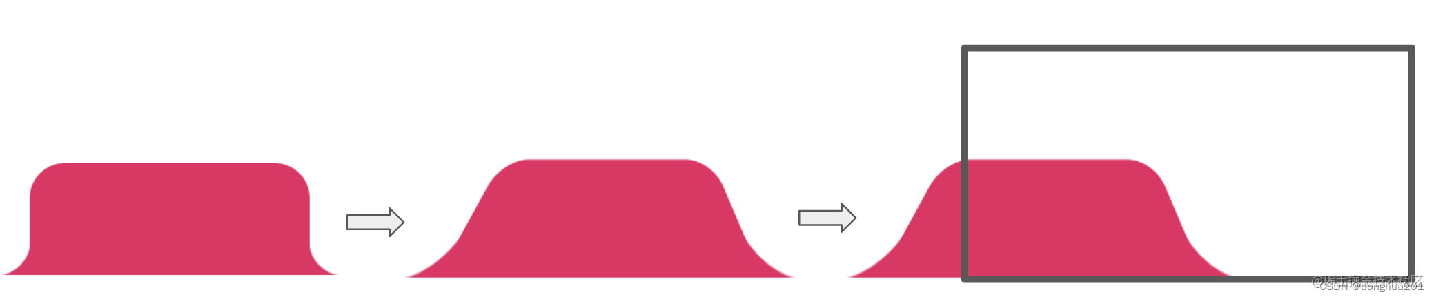
矩形要实现某个角的弧形,可以将图案拆分为3块:
- 顶部的弧度区域:弧度转角区域+底部选项卡矩形
- 顶部内容区域:普通的圆角矩形

弧形转角区域利用借助径向渐变

只需要把黑色部分替换为透明即可,使用两个伪元素就能画出弧度。
然后通过超出隐藏和旋转得到想要的效果。
完整代码
<!DOCTYPE html>
<html lang="en">
  <head>
    <meta charset="UTF-8">
    <meta http-equiv="X-UA-Compatible" content="IE=edge">
    <meta name="viewport" content="width=device-width, initial-scale=1.0">
    <title>Document</title>
  </head>
  <style>
    .g-container {
      position: relative;
      width: 300px;
      height: 49px;
      background: ;
      overflow: hidden;
      box-sizing: border-box;
    }
    .g-inner {
      position: absolute;
      width: 150px;
      height: 50px;
      background: #fee6e0;
      bottom: 0;
      border-radius: 0 20px 0 20px;
      transform: perspective(40px) scaleX(1.4) scaleY(1.5) rotateX(20deg) translate(-10px, 0);
      transform-origin: 50% 100%;
      z-index:2;
    }
    .g-inner::before {
      content: "";
      position: absolute;
      right: -10px;
      width: 10px;
      height: 10px;
      top: 40px;
      background: radial-gradient(circle at 100% 0, transparent, transparent 9.5px, #fee6e0 10px, #fee6e0);
    }
    .g-after {
      position: absolute;
      top:10px;
      right: 10px;
      width: 200px;
      height: 50px;
      background: #6ecb15;
      border-top-right-radius: 10px;
    }

    .g-after-text {
      position: absolute;
      top:10px;
      right: 10px;
    }

    .g-bottom{
      width: 300px;
      height: 49px;
      background: #fee6e0;
      border-top-right-radius: 10px;
    }
  </style>
  <body>
    <div class="g-container">
      <div class="g-inner"></div>
      <div class="g-after"><span class="g-after-text">选项卡</span></div>

    </div>
    <div class="g-bottom"></div>
  </body>
</html>


 598
598


 被折叠的 条评论
为什么被折叠?
被折叠的 条评论
为什么被折叠?
 到【灌水乐园】发言


