


单选框
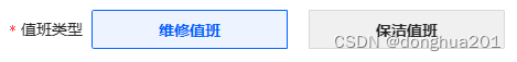
使用a-radio-button组件实现按钮样式。
<template>
  <a-radio-group v-model:value="type">
    <a-radio-button style="margin-right: 20px;" :value=1>维修值班</a-radio-button>
    <a-radio-button :value=2>保洁值班</a-radio-button>
  </a-radio-group>
</template>

<script lang="ts">
  import { ref } from 'vue';
  export default defineComponent({
    setup(_, { emit }) {
      let type = ref(1);
      return {
        type
      };
    }
  })
</script>

<style lang="less" scoped>
  .ant-radio-button-wrapper {
  padding: 0 60px;
  line-height: 36px;
  height: 36px;
  font-weight: 600;
  // border-radius: 5px;
  background-color: #F0F0F0;
  }

  .ant-radio-button-wrapper-checked:not(.ant-radio-button-wrapper-disabled) {
  background-color: #EEF4FF;
  }
</style>
多选框
原样式:
目标样式:
先把选择区域的方块去掉,给选中的值的内容区域添加样式。
<template>
  <a-checkbox-group v-model:value="date" :options="options">
    <template #label="{ value }">
      <span>{{ value }}</span>
    </template>
  </a-checkbox-group>
</template>

<script lang="ts">
  import { ref } from 'vue';
  export default defineComponent({
    setup(_, { emit }) {
      let date=ref('1')
      const options = [
        { label: '一', value: '1' },
        { label: '二', value: '2' },
        { label: '三', value: '3' },
        { label: '四', value: '4' },
        { label: '五', value: '5' },
        { label: '六', value: '6' },
        { label: '日', value: '7' },
      ]
      return {
        date,
        options
      };
    }
  })
</script>

<style lang="less" scoped>
  .ant-radio-button-wrapper-checked:not(.ant-radio-button-wrapper-disabled) {
    background-color: #EEF4FF;
  }

  :deep(.ant-checkbox) {
    display: none;
  }

  :deep(.ant-checkbox-group-item) {
    width: 36px;
    height: 36px;
    background: #f0f0f0;
    border-radius: 50%;
    margin-right: 18px;

    span {
      line-height: 36px;
      padding: 0 12px;
    }
  }

  :deep(.ant-checkbox-wrapper-checked) {
    width: 36px;
    height: 36px;
    background: #eef4ff;
    border: 1px solid #0062ff;
    color: #0062FF;

    span {
      line-height: 34px;
      padding: 0 11px;
    }
  }
</style>


 扫一扫
扫一扫


 3104
3104

 被折叠的 条评论
为什么被折叠?
被折叠的 条评论
为什么被折叠?
 到【灌水乐园】发言


