


 本文详述如何利用Bootstrap框架创建响应式网页。主要内容包括:利用navbar组件制作导航栏,实现小标栏和弹出文字功能;使用carousel组件创建图片滚动效果;借助Bootstrap的grid系统实现屏幕尺寸变化时元素的自适应布局;使用tab特征构建表单;并提供了基本的引用代码和操作步骤。
Bootstrap在开发响应式移动页面方面是最流行的HTML,CSS,和JS框架。在官方网站上分别展示在CSS,Componts,还有JS的相关组件。本文详细介绍通过bootstrap框架制作一个精美的网页(内容方面参考慕课网的相关资料)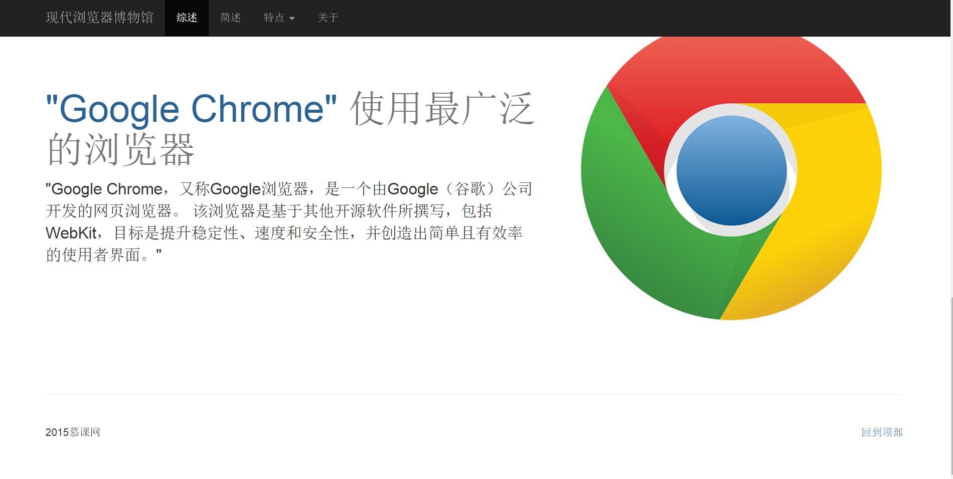
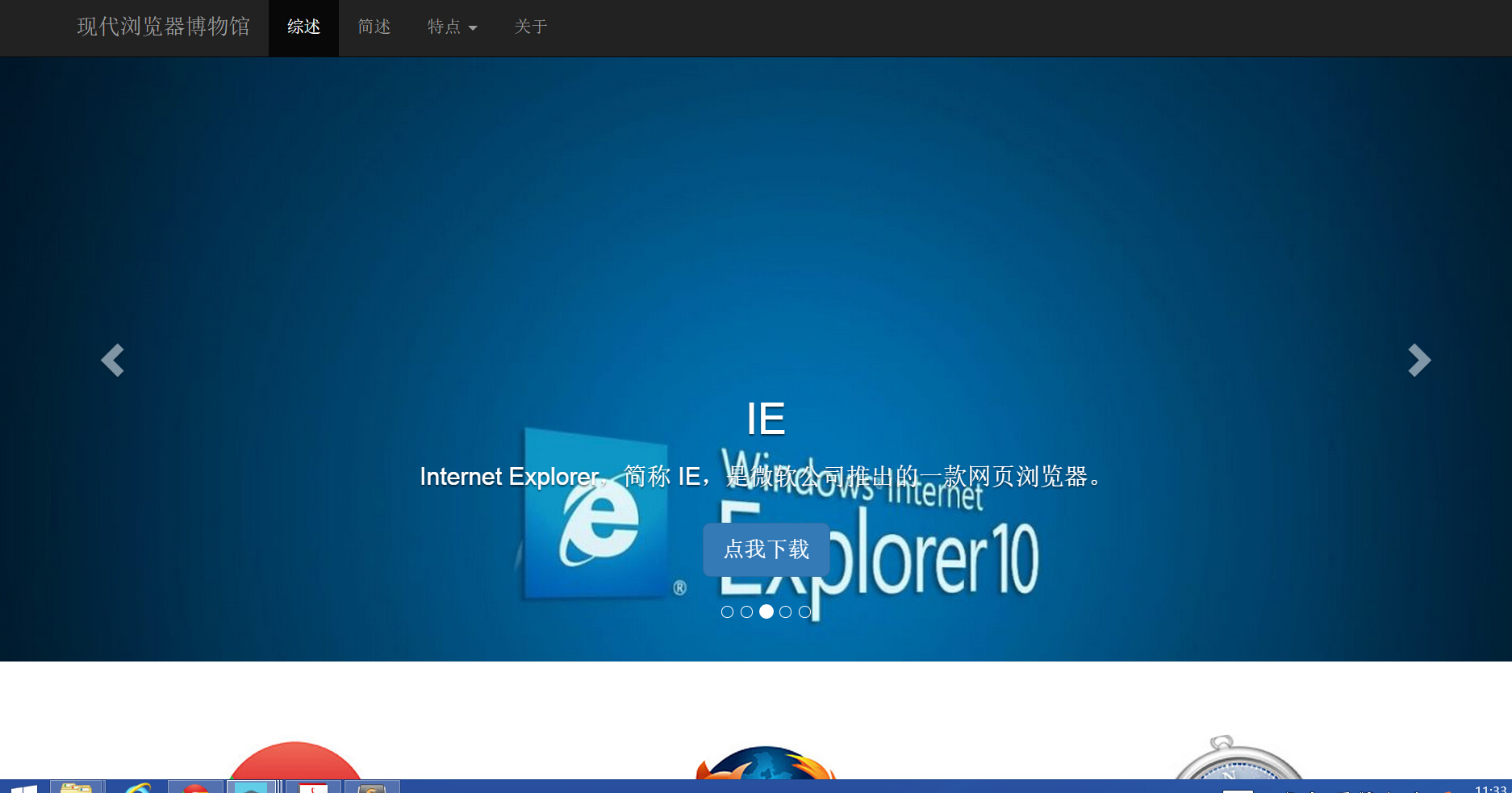
其中顶部页面的导航栏部分点击“特点”可以实现小标兰,点击“关于可以弹出介绍性的文字”图片可以实现滚动效果。最主要的功能是当页面缩放时,网页中所有的元素都能自适应其屏幕大小的变化,在bootstrap 中的components中的navbar中提供了template 代码,可以参考使用,而滑动的图片显示可以参考Javascript中的carousel特征
<div id="carousel-example-generic" class="carousel slide" data-ride="carousel">
<!-- Indicators -->
<ol class="carousel-indicators">
<li data-target="#carousel-example-generic" data-slide-to="0" class="active"></li>
<li data-target="#carousel-example-generic" data-slide-to="1"></li>
<li data-target="#carousel-example-generic" data-slide-to="2"></li>
</ol>
<!-- Wrapper for slides -->
<div class="carousel-inner" role="listbox">
<div class="item active">
<img src="..." alt="...">
<div class="carousel-caption">
...
</div>
</div>
<div class="item">
<img src="..." alt="...">
<div class="carousel-caption">
...
</div>
</div>
...
</div>
<!-- Controls -->
<a class="left carousel-control" href="#carousel-example-generic" role="button" data-slide="prev">
<span class="glyphicon glyphicon-chevron-left" aria-hidden="true"></span>
<span class="sr-only">Previous</span>
</a>
<a class="right carousel-control" href="#carousel-example-generic" role="button" data-slide="next">
<span class="glyphicon glyphicon-chevron-right" aria-hidden="true"></span>
<span class="sr-only">Next</span>
</a>
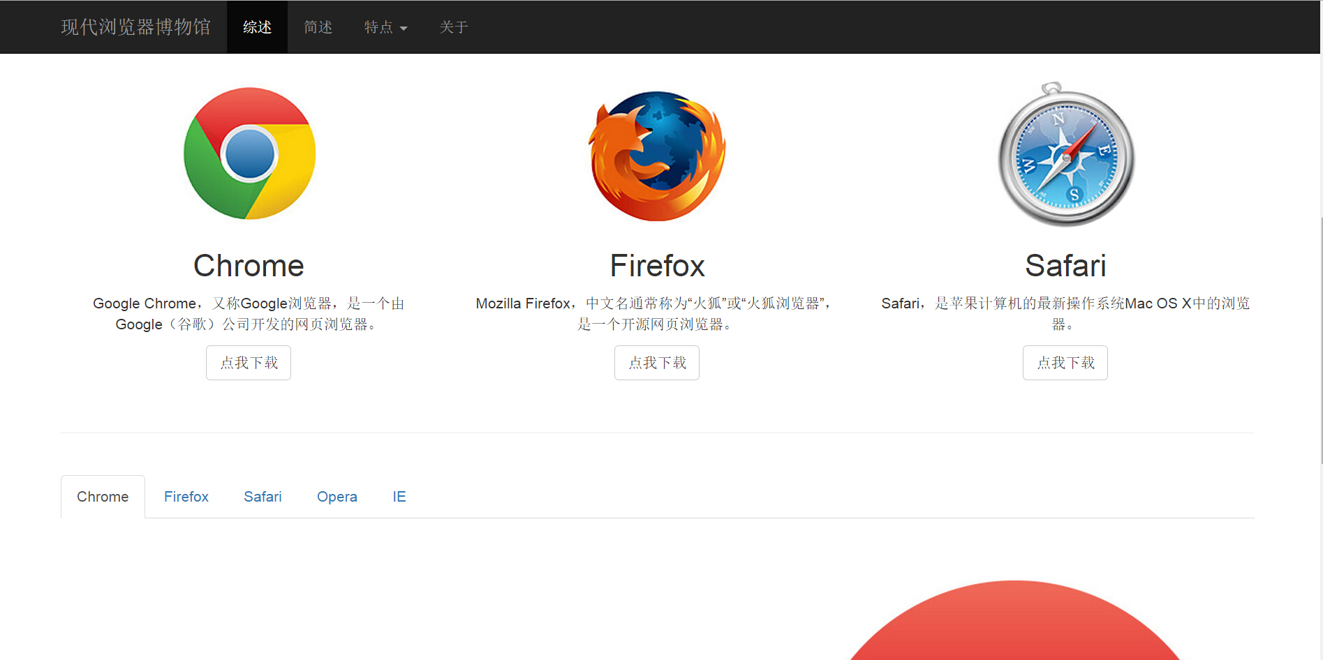
</div>中部可以实现三个对象在一行中排列,当屏幕宽度变窄时,此时三个浏览器图标和内容可以在分为三行一列排列。在bootstrap中CSS部件中提供了grid system,所有的元素对象包裹在container中,通过设定row行和col-md-4(保证总和在12)
      <div class="container" id="summary-container">
        <div class="row">
          <div class="col-md-4">
            <img class="img-circle" src="images/chrome-logo-small.jpg" alt="chrome">
            <h2>Chrome</h2>
            <p>Google Chrome,又称Google浏览器,是一个由Google(谷歌)公司开发的网页浏览器。</p>
            <p>
              <a class="btn btn-default" href="#" role="button">点我下载</a>
            </p>
          </div>
          <div class="col-md-4">
            <img class="img-circle" src="images/firefox-logo-small.jpg" alt="firefox">
            <h2>Firefox</h2>
            <p>Mozilla Firefox,中文名通常称为“火狐”或“火狐浏览器”,是一个开源网页浏览器。</p>
            <p>
              <a class="btn btn-default" href="#" role="button">点我下载</a>
            </p>
          </div>
          <div class="col-md-4">
           <img class="img-circle" src="images/safari-logo-small.jpg" alt="safari">
            <h2>Safari</h2>
            <p>Safari,是苹果计算机的最新操作系统Mac OS X中的浏览器。</p>
            <p>
              <a class="btn btn-default" href="#" role="button">点我下载</a>
            </p>
          </div>
        </div>
底部部分当鼠标点开导航栏“特点”下拉的各个浏览器链接时,底部的内容可以自动变化。包括表单的生成使用tab特征(该段的代码也也包裹在container 中)
底部包括脚本的书写
            <div class="row feature">
              <div class="col-md-7">
                <h2 class="feature-heading">
                  "Google Chrome"
                  <span class="text-muted">使用最广泛的浏览器</span>

                </h2>
                <p class="lead">"Google Chrome,又称Google浏览器,是一个由Google(谷歌)公司开发的网页浏览器。
                          该浏览器是基于其他开源软件所撰写,包括WebKit,目标是提升稳定性、速度和安全性,并创造出简单且有效率的使用者界面。"</p>
              </div>
操作部分:
进入bootstrap的官方网站,在getting started 中的basic template 中找到以下代码
<!DOCTYPE html>
<html lang="en">
  <head>
    <meta charset="utf-8">
    <meta http-equiv="X-UA-Compatible" content="IE=edge">
    <meta name="viewport" content="width=device-width, initial-scale=1">
    <!-- The above 3 meta tags *must* come first in the head; any other head content must come *after* these tags -->
    <title>Bootstrap 101 Template
最低0.47元/天 解锁文章


 1781
1781

 被折叠的 条评论
为什么被折叠?
被折叠的 条评论
为什么被折叠?
 到【灌水乐园】发言


