


Seaborn
一、Seaborn和Matplotlib对比
Seaborn是matplotlib的强大的一个扩展。
一个例子
要求画出花萼和花瓣的长度的散点图,并且颜色要区分花的种类

花的品种一共三种:

根据花的种类定义好每种花的颜色
color_map = dict(zip(iris.Name.unique(), ['blue','green','red']))
使用matplotlib画图
for species, group in iris.groupby('Name'):
    plt.scatter(group['PetalLength'], group['SepalLength'],
                color=color_map[species],
                alpha=0.3, edgecolor=None,
                label=species)
plt.legend(frameon=True, title='Name')
plt.xlabel('petalLength')
plt.ylabel('sepalLength')

使用seaborn画图
seaborn比matplotlib画散点图简单的多,只需要一行代码就搞定。
sns.lmplot('PetalLength', 'SepalLength', iris, hue='Name', fit_reg=False)

二、Seaborn实现直方图和密度图
0x1 回顾matplotlib方法
s1 = Series(np.random.randn(1000))
plt.hist(s1)
s1.plot(kind='kde')
0x2 绘制直方图
Seaborn有一个强大的方法:distplot,它支持一些参数:
bins:直方图的分块
hist:True表示绘制直方图,默认为True
kde:True表示绘制密度图,默认为True
rug:显示分布情况,默认为False不显示
sns.distplot(s1, hist=True, kde=True)


可以在下面看出数据分布情况
0x3 绘制密度图
直接传入数据就可以画出密度图:

也可以通过color参数指定颜色:
sns.kdeplot(s1, shade=True, color='r')

小技巧
通过sns.plt可以直接调用plt函数

三、Seaborn实现柱状图和热力图
0x1 数据准备
seaborn提供了一个load_dataset方法可以在线的下载数据作为实验,这里就用这个方法生成实验数据:
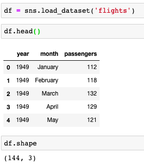
load_dataset实现的源码在https://github.com/mwaskom/seaborn/blob/master/seaborn/utils.py
数据透视表
df = df.pivot(index='month', columns='year', values='passengers')

0x2 绘制热力图
seaborn提供了heatmap方法用于绘制热力图:

参数annot=True,fmt='d'可以在热力图中让每一个方块显示具体的值:

0x2 绘制柱状图
柱状图横坐标为年份,纵坐标为这一年所有月份乘客的和:
首先使用sum方法计算出每一年乘客的和:

其中index为年份,values为这一年乘客的和
seaborn提供了barplot方法华柱状图,只需要在参数中指定x和y坐标即可:
sns.barplot(x=s.index, y=s.values)


 8909
8909

 被折叠的 条评论
为什么被折叠?
被折叠的 条评论
为什么被折叠?
 到【灌水乐园】发言


