


一、简介
Echarts 是一个由百度开源的数据可视化,凭借着良好的交互性,精巧的图表设计,得到了众多开发者的认可。而 Python 是一门富有表达力的语言,很适合用于数据处理。当数据分析遇上数据可视化时,pyecharts 诞生了。
中文文档网址:https://pyecharts.org/#/zh-cn/intro
开源网址:https://github.com/pyecharts/pyecharts
实例网址:https://gallery.pyecharts.org/#/README
注意:pyecharts 分为 v0.5.X 和 v1 两个大版本
v0.5.X支持 Python2.7,3.4+,不再进行维护
v1.x仅支持 Python3.6+,新接触的建议使用这个版本。
二、安装
安装方式如下(V1.x):
pip install pytcharts -U
三、使用
1.库的引用
本文主要针对K线绘制用到的库,其它类型请看官方文档说明。
from pyecharts.charts import *
from pyecharts import options as opts
from pyecharts.globals import ThemeType
2.配置属性
(1)使用方式有两种:链式调用和单独调用。
单独调用:
bar = Bar()
bar.add_xaxis(["衬衫", "羊毛衫", "雪纺衫", "裤子", "高跟鞋", "袜子"])
bar.add_yaxis("商家A", [5, 20, 36, 10, 75, 90])
bar.set_global_opts(title_opts=opts.TitleOpts(title="商品价格比较图", subtitle="价格"))
# 也可以直接使用字典参数
# bar.set_global_opts(title_opts={"text": "商品价格", "subtext": "价格"})
链式调用:
bar = (
Bar()
.add_xaxis(["衬衫", "羊毛衫", "雪纺衫", "裤子", "高跟鞋", "袜子"])
.add_yaxis("商家A", [5, 20, 36, 10, 75, 90])
.set_global_opts(title_opts=opts.TitleOpts(title="商品价格比较图", subtitle="价格"))
)
(2)全局配置项
全局配置项用于设置图表的属性,包的标题、图例、坐标轴、工具、缩放等等,可通过set_global_opts()方法设置。
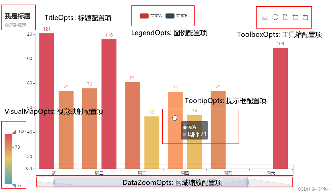
设置标题和图例属性代码如下:
bar.set_global_opts( # 设置全局项
title_opts=opts.TitleOpts( # 设置标题配置项
title="商品价格比较图", # 设置标题名称
pos_left="center" # 设置标题居中
),
legend_opts=opts.LegendOpts( # 设置图例配置项
pos_right="right", # 设置为水平居右
pos_top="top" # 设置为顶部对齐
)
设置缩放属性代码如下:
datazoom_opts=opts.DataZoomOpts(
is_show=True, # 是否显示组件
xaxis_index=[0,1], #可缩放的x轴坐标编号
type_="slider", # 组件类型,可选 "slider", "inside"
pos_top="85%",
range_start=98, # 数据窗口范围的起始百分比
range_end=100, # 数据窗口范围的结束百分比
)
其他属性和更详细的设置参考:https://pyecharts.org/#/zh-cn/global_options
(3)系列配置
系列配置用于配置图表中曲线的样式、文字、标签、标记等,并可进行显示区域分割。
常见的设置有ItemStyleOpts、TextStyleOpts、LabelOpts等。
kline.set_series_opts(label_opts=opts.LabelOpts(is_show=False))
3.生成文件
图表的render()函数会生成本地HTML文件,默认会在当前目录生成render.html文件。可以传入路径或者名称参数来指定文件名称和存储位置,例如:
bar.render("商品价格比较图.html")
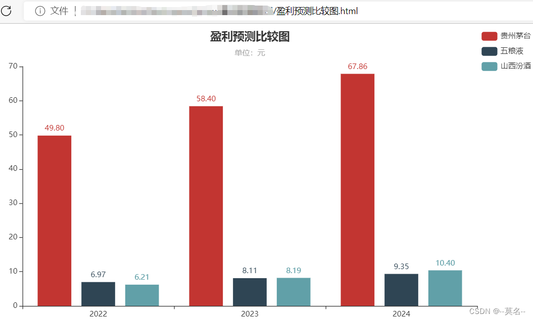
综合示例:
import pandas as pd
import akshare as ak
from pyecharts.charts import Bar
from pyecharts import options as opts
df = ak.stock_profit_forecast()
#df.to_excel('example.xlsx', sheet_name='盈利预测', index=False)
#df = pd.read_excel('example.xlsx', sheet_name='盈利预测')
data=df.iloc[0:9,[2,10,11,12]]
bar = Bar()
bar.add_xaxis(["2022", "2023", "2024"])
bar.add_yaxis('贵州茅台',data.iloc[0,1:4].apply(lambda x:"%.2f" % x).tolist())
bar.add_yaxis('五粮液',data.iloc[4,1:4].apply(lambda x:"%.2f" % x).tolist())
bar.add_yaxis('山西汾酒',data.iloc[7,1:4].apply(lambda x:"%.2f" % x).tolist())
bar.set_global_opts(
title_opts=opts.TitleOpts( # 设置标题配置项
title="盈利预测比较图", # 设置标题名称
pos_left="center", # 设置标题居中
subtitle="单位:元" # 副标题
),
legend_opts=opts.LegendOpts( # 设置图例配置项
pos_right="right", # 设置为水平居右
pos_top="top" # 设置为垂直居下
),
)
bar.render("盈利预测比较图.html")示例如下图所示:
四、绘制K线和成交量
K线绘制主要用到Kline()和Line()两个功能。
1.K线建立
Kline(init_opts=opts.InitOpts(width="1200px",height="600px")) #指定图形长宽
.add_xaxis(xaxis_data=list(df.index))
.add_yaxis(
series_name="klines",
y_axis=df[["open","close","low","high"]].values.tolist(),
itemstyle_opts=opts.ItemStyleOpts(color="#ec0000", color0="#00da3c"),
)
2.均线建立
line=Line() #均线绘制
line.add_xaxis( df.index.tolist() ) #x轴数据
line.add_yaxis( 'MA5',df.sma.round(2).tolist(),is_smooth=True ) #y轴数据
K线和均线的全局设置参考前面讲的全局配置和系列配置部分内容。
3.绘制实例
完整的代码如下:
import akshare as ak
import pandas as pd
from pyecharts.charts import *
from pyecharts import options as opts
from pyecharts.globals import ThemeType
df = ak.stock_zh_a_hist(symbol="600036", start_date='20220101',end_date='20220916', adjust="qfq").iloc[:, :6]
df.columns = [
'date',
'open',
'close',
'high',
'low',
'volume',
]
# 把 date 作为日期索引
df.index = pd.to_datetime(df.date)
df['date']=df.index.year #将日期转换为年份
df=df.sort_index()
#data_price=data_price.copy()
#data_price.index=data_price.index.strftime('%Y%m%d')
df['sma']=df.close.rolling(5).mean()
df['lma']=df.close.rolling(10).mean()
df['lma20']=df.close.rolling(20).mean()
df['lma30']=df.close.rolling(30).mean()
df['lma60']=df.close.rolling(60).mean()
kline = (
Kline(init_opts=opts.InitOpts(width="1200px",height="600px")) #指定图形长宽
.add_xaxis(xaxis_data=list(df.index)) #x轴数据
.add_yaxis( #y轴数据
series_name="klines", #名称
y_axis=df[["open","close","low","high"]].values.tolist(), #数据源
itemstyle_opts=opts.ItemStyleOpts(color="#ec0000", color0="#00da3c"), #颜色设置
)
.set_global_opts( #图表全局设置
title_opts=opts.TitleOpts(title="K线及均线",pos_left='45%'), #标题位置
legend_opts=opts.LegendOpts(pos_right="35%",pos_top="5%"), #图例位置
yaxis_opts=opts.AxisOpts( is_scale=True,
splitarea_opts=opts.SplitAreaOpts( is_show=True, areastyle_opts=opts.AreaStyleOpts(opacity=1) ), ),
datazoom_opts=[opts.DataZoomOpts(type_='inside')], #K线缩放-内部滑动
tooltip_opts=opts.TooltipOpts( #鼠标提示设置
trigger="axis", axis_pointer_type="cross", #趋势线
background_color="rgba(245, 245, 245, 0.8)", #背景颜色
border_width=1, border_color="#ccc",
textstyle_opts=opts.TextStyleOpts(color="#000"), ),
visualmap_opts=opts.VisualMapOpts( is_show=False, dimension=2, series_index=5, is_piecewise=True,
pieces=[ {"value": 1, "color": "#00da3c"}, {"value": -1, "color": "#ec0000"}, ], ),
axispointer_opts=opts.AxisPointerOpts( is_show=True,
link=[{"xAxisIndex": "all"}], label=opts.LabelOpts(background_color="#777"), ),
brush_opts=opts.BrushOpts( x_axis_index="all", brush_link="all",
out_of_brush={"colorAlpha": 0.1}, brush_type="lineX", ),
)
)
line=Line() #均线绘制
line.add_xaxis( df.index.tolist() ) #x轴数据
line.add_yaxis( 'MA5',df.sma.round(2).tolist(),is_smooth=True ) #y轴数据
line.add_yaxis( 'MA10',df.lma.round(2).tolist(),is_smooth=True )
line.add_yaxis( 'MA20',df.lma20.round(2).tolist(),is_smooth=True )
line.add_yaxis( 'MA30',df.lma30.round(2).tolist(),is_smooth=True )
line.add_yaxis( 'MA60',df.lma60.round(2).tolist(),is_smooth=True )
line.set_series_opts(label_opts=opts.LabelOpts(is_show=False)) #是否显示数据标签
line.set_global_opts( #均线全局设置
datazoom_opts=[opts.DataZoomOpts(type_='inside')], #内部滑动
legend_opts=opts.LegendOpts(pos_right="20%",pos_top="5%"), #图例位置
tooltip_opts=opts.TooltipOpts(trigger="axis", axis_pointer_type="cross") #添加趋势线
)
kline.overlap(line) #将均线叠加到K线上
kline.render("K线.html") #保存到文件
绘制的K线图如下图所示:

4.注意事项
(1)以上绘制的数据是采用AKShare接口从东方财富获取的指定时间范围的日K线数据,具体请参考文章《AKShare量化接口简介》
(2)均线数据计算使用的是DataFrame的rolling公式,以后有机会在介绍。
(3)Kline和Line的数据为List格式,DataFrame的行列数据需要转换为List才行。
(4)均线Line和KLine叠加需要调用Kline.overlap(Line),不要漏了。
(5)K先绘制的其它示例说明请参考官方说明文档:
https://gallery.pyecharts.org/#/Candlestick/README
-----------------------------------------------------------------------------------
对Python、量化和投资感兴趣请关注公众号:IntInvestor


 1万+
1万+


 被折叠的 条评论
为什么被折叠?
被折叠的 条评论
为什么被折叠?
 到【灌水乐园】发言


