


可缩放矢量图像
简单认识
用于描述二维的矢量图形,基于XML的标记语言.
什么是矢量图形
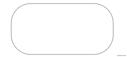
使用直线和曲线来描述的图形,构成这些图形的元素是一些点、线、矩形、多边形、圆和弧线等,它们都是通过数学公式计算获得的,具有编辑后不失真的特点。
优势
- 优雅而简洁的渲染不同大小的图形.
- 可以和CSS、DOM、JS等其他网络标准无缝衔接.
- 可以进行搜索、索引、编写脚本、压缩.
- 可以使用文本编辑器或者图形编辑器编辑.
- 无限放大而不失真,不降低质量 .
小试牛刀
定义我们常见的几种图形:圆形、矩形、直线或曲线等复杂图形 , 支持渐变、旋转、动画、滤镜等效果.
SVG基本要素svg 根元素和其他图形元素 , 分组元素g , 元素和属性必须严格按规范书写,区分大小写 .
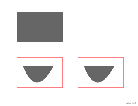
绘制矩形、圆、文本
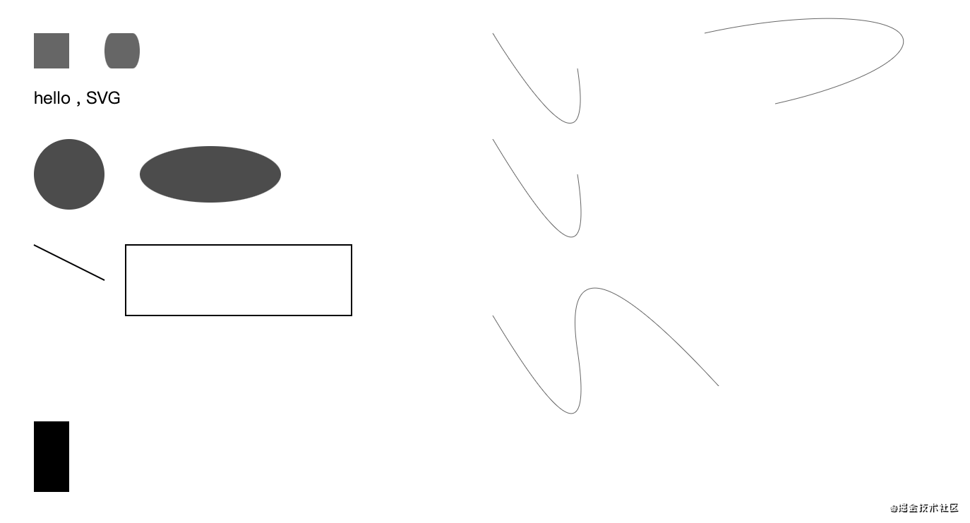
简单实例:
<svg xmlns="http://www.w3.org/2000/svg">
    <rect x="50" y="50" width="50" height="50" fill="rgba(0,0,0,.6)"></rect>
    <circle cx="100" cy="250" r="50" fill="rgba(0,0,0,.7)"></circle>
    <text x="50" y="150" font-size="24" fill="#000">hello , SVG </text>
</svg>
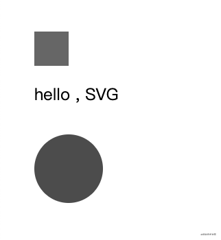
xmlns为空间声明, 必须存在 绑定值为http://www.w3.org/2000/svgrect- 矩形、circle- 圆、text- 文本 ;fill属性为填充的颜色值x\y\width\hegiht绘制的坐标点 , 默认左上角为起始点(0,0)
可直接嵌入HTML中使用
也可通过object 元素嵌入 或 iframe 嵌入
<object data="icon.svg" type="image/svg+xml">

</object>
可以通过JS动态创建并注入到HTML中 .
基本图形说明
所有复杂的图形都可拆分, 并由基础的图形元素组成 . 掌握基本的 图形构成, 就可以创建更为复杂的图形元素.
实例中已经基本展示矩形、圆、文本的绘制. 下面详细说明图形元素及属性.
矩形 - rect
x- 左上角y- 右上角width- 宽度height- 高度rx- 圆角x方位的半径ry- 圆角y方位的半径
<svg xmlns="http://www.w3.org/2000/svg">
    <rect x="50" y="50" width="50" height="50" fill="rgba(0,0,0,.6)"></rect>
    <rect x="150" y="50" width="50" height="50" rx="10" ry="10" fill="rgba(0,0,0,.6)"></rect>
</svg>

如果rx\ry 设置一样,则可以仅设置rx或ry
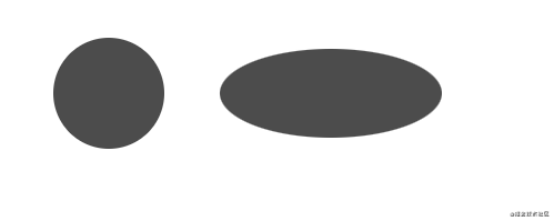
圆形 - circle
r- 圆半径cx- 圆形x位置cy- 圆形y的位置
椭圆 - ellipse
rx- 椭圆x半径ry- 椭圆y半径cx- 椭圆中心x位置cy- 椭圆中心y位置
<svg xmlns="http://www.w3.org/2000/svg">
    <circle cx="100" cy="250" r="50" fill="rgba(0,0,0,.7)"></circle>
    <ellipse cx="300" cy="250" rx="100" ry="40" fill="rgba(0,0,0,.7)"/>
</svg>
线条 - line
x1- 起点x位置y1- 起点y位置x2- 终点x位置y2- 终点y位置
折线 - polyline
points- 点集数列 , 空白分割数字;逗号、换行符、空格分隔点 . 例:2 3, 23 3,1 2
<svg xmlns="http://www.w3.org/2000/svg">
    <line x1="50" y1="350" x2="150" y2="400" stroke="rgba(0,0,0.6)" stroke-width="2"/>
    <polyline points="180 350,500 350,500 450,180 450,180 350" fill="transparent" stroke="rgba(0,0,0.6)" stroke-width="2"/>
</svg>
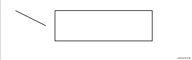
polyline 绘制了矩形 , 其他属性譬如stroke \ stroke-width 定义绘制的颜色、绘制的宽度
多边形 - polygon
points- 点集数列 , 空白分割数字、逗号分隔点 . 例:2 3, 23 3,1 2
不同于折线的是,它会自动合并,即最后一个点回连接到第一个点.
<svg xmlns="http://www.w3.org/2000/svg">
    <line x1="50" y1="350" x2="150" y2="400" stroke="rgba(0,0,0.6)" stroke-width="2"/>
    <!-- <polyline points="180 350,500 350,500 450,180 450,180 350" fill="transparent" stroke="rgba(0,0,0.6)" stroke-width="2"/> -->
    <polygon points="180 350,500 350,500 450,180 450" fill="transparent" stroke="rgba(0,0,0.6)" stroke-width="2"/>
</svg>
可以看到points 点集中最后一个点不需要起点 .
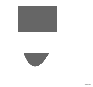
路径 - path
d- 点集数列 , 是一个命令+参数的序列合集.
可以绘制任何图形,包括矩形、圆、椭圆、折线、多边形、贝塞尔曲线、二次曲线等,
绘制这些图形有许多可用的命令 , 来表示绘制意图 . 可分直线、曲线 . 这些命令大写表示绝对定位,小写表示相对定位 .
直线绘制
M\m移动到某个位置L\l从当前位置绘制线条到指定点.H\h表示在x轴移动距离, 参数只有一个.V\v表示在y轴移动距离,参数只有一个.
使用上面的命令,绘制一个矩形:
解释一下:移动起点到(50,100) - 水平移动x到 100(宽度为50) - 垂直移动到700(高度为100) - 水平移动到50 - 绘制线条(50,600) . 闭合起点.
<svg xmlns="http://www.w3.org/2000/svg">
    <path d="M 50 600 H 100 V 700 H 50 L 50 600" />
</svg>
通过命令可简化闭合路经点:
Z\z闭合路径
<svg xmlns="http://www.w3.org/2000/svg">
    <!-- <path d="M 50 600 H 100 V 700 H 50 L 50 600" /> -->
         <path d="M 50 600 H 100 V 700 H 50 Z" />
</svg>
上面都使用的大写指令,为绝对定位, 即相对于原点(0,0)绘制, 通过相对定位 , 使用小写命令简化计算.
<svg xmlns="http://www.w3.org/2000/svg">
    <!-- <path d="M 50 600 H 100 V 700 H 50 L 50 600" /> -->
    <!-- <path d="M 50 600 H 100 V 700 H 50 Z" /> -->
    <path d="M 50 600 h 50 v 100 h -50 z" />
</svg>
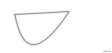
曲线绘制
有三种绘制平滑曲线的命令, 两个用来绘制贝塞尔曲线,另一个用来绘制弧线 .
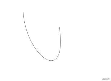
C\c来创建三次贝塞尔曲线C , 定义一个点和两个控制点.
<svg xmlns="http://www.w3.org/2000/svg">
    <path d="M 700 50 c 10 150,150 250,120 50" fill="none" stroke="rgba(0,0,0,.6)" />
</svg>
去掉了填充fill="none", 采用了绘制stroke="rgba(0,0,0,.6)" , 采用了小写相对定位, 简化点坐标运算.
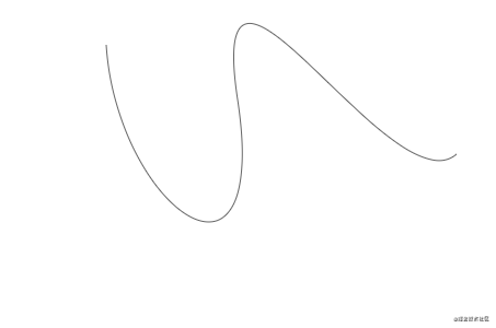
如果需要将多个贝塞尔曲线链接起来, 则使用一下命令:
S\s, 以前一个点为控制点,保持斜率一致,参数为两个点. 以第二个点到终点的方向结束.
<svg xmlns="http://www.w3.org/2000/svg">
    <path d="M 700 50 c 10 150,150 250,120 50 s 140 100,200 50"
        fill="none"
        stroke="rgba(0,0,0,.6)" />
</svg>
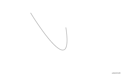
如果S 前面不跟C 或者 S , 则以当前点为启动绘制一个曲线. 达到贝塞尔曲线的绘制效果
<svg xmlns="http://www.w3.org/2000/svg">
    <!-- <path d="M 700 50 c 10 150,150 250,120 50 s 140 100,200 50" fill="none" stroke="rgba(0,0,0,.6)" /> -->
    <path d="M 700 50 s 150 250,120 50" fill="none" stroke="rgba(0,0,0,.6)" />
</svg>
Q\s绘制二次贝塞尔曲线Q , 只需要一个控制点和终点坐标.
<svg xmlns="http://www.w3.org/2000/svg">
    <!-- <path d="M 700 50 c 10 150,150 250,120 50 s 140 100,200 50" fill="none" stroke="rgba(0,0,0,.6)" /> -->
    <path d="M 700 50 s 150 250,120 50" fill="none" stroke="rgba(0,0,0,.6)" />
    <path d="M 700 200 q 150 250,120 50" fill="none" stroke="rgba(0,0,0,.6)" />
</svg>
可以得到和上面示例同样的曲线.
T\T二次曲线的延伸命令, 通过前一个控制点,可以只定义终点 , 绘制曲线
T命令的前面必须是Q或者T命令. 如果单独使用,则绘制出来的是一条直线.
<svg xmlns="http://www.w3.org/2000/svg">
    <!-- <path d="M 700 200 q 150 250,120 50" fill="none" stroke="rgba(0,0,0,.6)" /> -->
    <path d="M 700 450 q 150 250,120 50 t 200 50" fill="none" stroke="rgba(0,0,0,.6)" />
</svg>
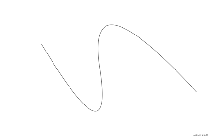
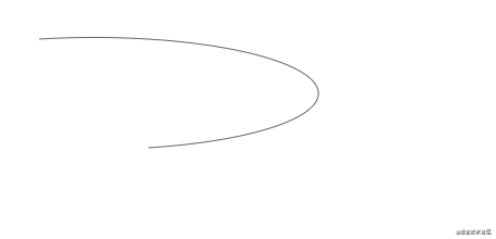
通过观察几个效果图 ,可以看到三次贝塞尔曲线和二次贝塞尔曲线差别于起终点的弧度 .
弧形
A\a绘制弧形 ,
a rx ry x-axis-rotation large-arc-flag sweep-flag x y
参数说明:
rx ryx 轴半径、y轴半径x-axis-rotation弧形的旋转角度.large-arc-flag角度大小 , 0 表示小角度小于180度; 1 表示大角度大于180度;sweep-flag表示弧线方向, 0 表示逆时针画弧 ;1 表示顺时针画弧;x y弧形的终点 .
<svg xmlns="http://www.w3.org/2000/svg">
    <path d="M 1000 50 a 10 40,90,0,1,100 100" fill="none" stroke="rgba(0,0,0,.6)" />
</svg>
说明:定位(1000,50) - 以x轴半径为10,y轴半径为40 - 顺时针旋转 90 度 - 终点为(100,100) 画弧线 .
但是角度大小large-arc-flag 这个值,测了好多次, 都没有设置什么效果 .
此处为以上测试的 图形全图 :
其他标签说明
还有一些辅助设计的元素标签 .
defs
- 定义需要重复使用的图形元素, 在其他地方使用
use元素呈现. - 可以定义样式
style - 定义动画、渐变元素 .
- 定义脚本
script - …
use
可以获取到目标节点,在其他地方复制并展现 .
<svg xmlns="http://www.w3.org/2000/svg" xmlns:xlink="http://www.w3.org/1999/xlink">
    <path id="path" d="M 250 50 c 10 10,25 225,180 -10" fill="rgba(0,0,0,.5)" />
    <use xlink:href="#path" x="100" y="0" />
</svg>
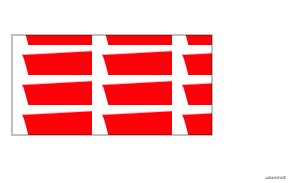
pattern
图样模版,定义在defs 中 , 可以使用fill或者stroke 填充或描边图案 .
x\y- 定义开始的位置.width\height- 定义当前模版站父元素的大小
<svg xmlns="http://www.w3.org/2000/svg" xmlns:xlink="http://www.w3.org/1999/xlink">
    <defs>
        <pattern id="pattern" x="0" y="10" width=".4" height=".3">
            <path d="m 10 10 c 10 10,25 225,180 -10 z" fill="red" />
        </pattern>
     </defs>
     <rect x="550" y="50" width="200"
         height="100"
         fill="url(#pattern)"
         stroke="rgba(0,0,0,.5)"
         stroke-width="1" />
</svg>
g
组合对象的容器 . 添加到g元素上的变换会应用到所有子元素上 .
desc
为每个元素提供描述性字符串.提升可访问性. 在元素呈现时 它不会作为视图的一部分展示.
animate
动画元素, 定义元素的某个属性在制定时间内变化.
<svg xmlns="http://www.w3.org/2000/svg" xmlns:xlink="http://www.w3.org/1999/xlink">
    <rect x="550" y="200" width="200" height="100" fill="none" stroke="rgba(0,0,0,.5)">
       <animate attributeName="rx" values="0;40;0" dur="5s" repeatCount="indefinite" />
    </rect>
</svg>
感觉动画还挺好玩的, 还是比较自然丝滑的. 可以定义一些复杂的图形的动画.
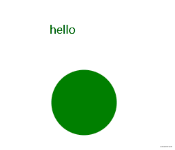
script
JS 脚本, 可以处理DOM元素 ,比如一些点击、鼠标事件.
<svg xmlns="http://www.w3.org/2000/svg" xmlns:xlink="http://www.w3.org/1999/xlink" viewbox="0 0 100 100">
    <script type="text/javascript">
        // <![CDATA[
        function change(evt) {
            var target = evt.target;
            var radius = target.getAttribute("r");

            // 获取到的半径数据插入到属于文本中显示
            document.querySelector("#text").innerHTML = radius;
        }
        // ]]>
    </script>
    <text id="text" x="500" y="300" fill="#000">hello</text>
    <circle cx="550" cy="400" r="45" fill="green" onclick="change(evt)">
        <animate attributeName="r" values="45;50;45" dur="5s" repeatCount="indefinite" />
    </circle>
</svg>
元素属性说明
设置style样式等,包括颜色、宽度、高度等等 .
可以直接设置元素的属性 , 值需要引号包裹 .
引用属性 - xlink:href
可以已经定义的元素 , 包括文本、动画、样板、渐变等.
引用都必须加命名空间xmlns:xlink :
<linearGradient id="linear-copy-reflect" xmlns:xlink="http://www.w3.org/1999/xlink" xlink:href="#radial-copy" />
也可以直接加到跟元素svg 上,不需要每次都引入 .
<svg xmlns="http://www.w3.org/2000/svg" xmlns:xlink="http://www.w3.org/1999/xlink"></svg>
viewbox - 定义容器伸缩
x\y- 定义位置坐标.width \ height- 定义宽度、高度 ,为0或小于时不展示元素.
色彩
fill- 填充色stroke- 绘制线条颜色fill-opacity- 填充透明度stroke-opacity- 绘制色透明度
边框
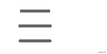
stroke-width- 边框宽度stroke-linecap- 控制边框终点形状butt- 直边square- 也是直边, 不同的事由超出实际路径的范围,大小为 stroke-width.round- 圆角形状
<svg xmlns="http://www.w3.org/2000/svg">
    <line x1="1000" y1="200" x2="1100" y2="200" stroke="rgba(0,0,0,.6)" stroke-width="10" stroke-linecap="butt" />
    <line x1="1000" y1="250" x2="1100" y2="250" stroke="rgba(0,0,0,.6)" stroke-width="10" stroke-linecap="square" />
    <line x1="1000" y1="300" x2="1100" y2="300" stroke="rgba(0,0,0,.6)" stroke-width="10" stroke-linecap="round" />
</svg>
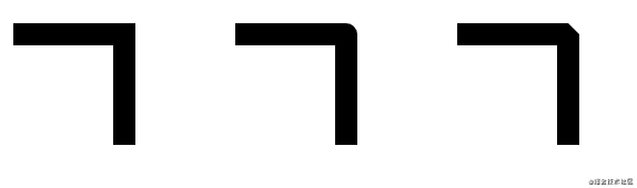
stroke-linejoin- 控制两条线段之间 , 使用方式连接.miter- 方形 ,形成尖角 .round- 圆角bevel- 斜切 .
<svg xmlns="http://www.w3.org/2000/svg">
    <polyline points="1000 350,1100,350,1100 450" fill="none" stroke="rgba(0,0,0.6)" stroke-width="20" stroke-linejoin="miter"/>
    <polyline points="1200 350,1300,350,1300 450" fill="none" stroke="rgba(0,0,0.6)" stroke-width="20" stroke-linejoin="round"/>
    <polyline points="1400 350,1500,350,1500 450" fill="none" stroke="rgba(0,0,0.6)" stroke-width="20" stroke-linejoin="bevel"/>
</svg>
-
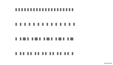
stroke-dasharray- 表示虚线边 , 参数为数字序列, 必须用逗号分隔. 如:4,5,6定义三组数字时,以一种循环模式重复创建虚线连接边 . 填-空-填-空-填-空
<svg xmlns="http://www.w3.org/2000/svg">
    <line x1="1100" y1="500" x2="1300" y2="500" stroke="rgba(0,0,0,.6)" stroke-width="10" stroke-dasharray="5" />
    <line x1="1100" y1="550" x2="1300" y2="550" stroke="rgba(0,0,0,.6)" stroke-width="10" stroke-dasharray="5,10" />
    <line x1="1100" y1="600" x2="1300" y2="600" stroke="rgba(0,0,0,.6)" stroke-width="10" stroke-dasharray="5,10,5" />
    <line x1="1100" y1="650" x2="1300" y2="650" stroke="rgba(0,0,0,.6)" stroke-width="10" stroke-dasharray="5,10,5,5" />
</svg>
fill-rule- 定义如何给图形重叠的区域上色.stroke-miterlimit- 定义什么情况下绘制或不绘制边框连接的miter效果 .stroke-dashoffset- 定义虚线开始的地方 .
文本属性
在文本中也可以使用fill 给文本填充颜色; stroke 给文本描边
text-anchor- 定义文本的方向 , 可选值有start\middle\end\inheritfont-weight、font-family、font-style、font-variant、font-stretch、font-size、font-size-adjust、kerning、letter-spacing、word-spacing、text-decoration
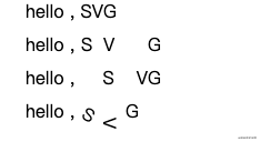
tspan
标记文本的部分 , 必须是text或tspan 的字元素.
x\y- 设置绝对定位坐标, 包含数字序列, 一次应用到每一个字符上.dx\dy- 偏移量,包含数值序列, 每次累积偏移 .rotate- 定义旋转角度 . 可以是一个数列,textLength- 字符串的计算长度 .
<svg xmlns="http://www.w3.org/2000/svg">
    <text x="250" y="20" font-size="16" fill="#000">
        hello ,
        <tspan>SVG</tspan>
    </text>
    <text x="250" y="50" font-size="16" fill="#000">
        hello ,
        <tspan x="300,320,340">SVG</tspan>
    </text>
    <text x="250" y="80" font-size="16" fill="#000">
        hello ,
        <tspan dx="20,20">SVG</tspan>
    </text>
    <text x="250" y="110" font-size="16" fill="#000">
        hello ,
        <tspan dx="0,10,10" rotate="30,90,0">SVG</tspan>
    </text>
</svg>
tref
引用已经定义的文本 . 使用xlink:href 属性,指向一个元素
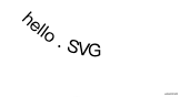
textPath
定义属性xlink:href 指向任意路径 , 字体环绕路径 .
<svg xmlns="http://www.w3.org/2000/svg">
    <defs>
        <path id="my_path" d="M 250,140 c 40,40 80,40 100,20" />
        <text font-size="16" fill="#000">hello</text>
    </defs>
    <text>
        <textPath xmlns:xlink="http://www.w3.org/1999/xlink" xlink:href="#my_path">
            hello . SVG
        </textPath>
    </text>
</svg>
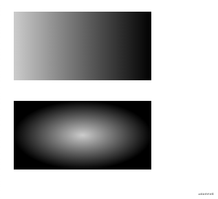
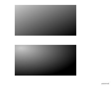
渐变、动画
定义在defs 元素中, 并赋予ID , 通过 url(#**) 作为fill \ stroke的值的方式引用 ,
线性渐变、径向渐变
linearGradient- 线性渐变x1\y1\x2\y2可以定义渐变的走向 .
radialGradient- 径向渐变cx\cy定义渐变结束所围绕的圆环 , 设置r半径r定义圆环半径.fx/fy定义渐变的中心 .
通过stop 元素 , 设置中断值属性 ,
offset- 渐变偏移量*stop-color- 渐变颜色*stop-opacity- 渐变色透明度
<svg xmlns="http://www.w3.org/2000/svg">
    <defs>
        <linearGradient id="linear">
            <stop offset="0%" stop-color="rgba(0,0,0,.2)" />
            <stop offset="100%" stop-color="rgba(0,0,0,1)" />
        </linearGradient>
        <radialGradient id="radial">
            <stop offset="0%" stop-color="rgba(0,0,0,.2)" />
            <stop offset="100%" stop-color="rgba(0,0,0,1)" />
        </radialGradient>
    </defs>
    <rect x="20" y="20" width="200" height="100" fill="url(#linear)" />
    <rect x="20" y="150" width="200" height="100" fill="url(#radial)" />
</svg>
下面的示例则展示了线性渐变、径向渐变的属性设置.
<svg xmlns="http://www.w3.org/2000/svg">
    <defs>
        <linearGradient id="linear-copy" x1="0" y1="0" x2="1" y2="1">
            <stop offset="0%" stop-color="rgba(0,0,0,.2)" />
            <stop offset="100%" stop-color="rgba(0,0,0,1)" />
        </linearGradient>
        <radialGradient id="radial-copy" cx=".1" cy=".1" r="1" fx=".1" fy=".1">
            <stop offset="0%" stop-color="rgba(0,0,0,.2)" />
            <stop offset="100%" stop-color="rgba(0,0,0,1)" />
        </radialGradient>
    </defs>
    <rect x="300" y="20" width="200" height="100" fill="url(#linear-copy)" />
    <rect x="300" y="150" width="200" height="100" fill="url(#radial-copy)" />
</svg>
其他属性定义
-
spreadMethod- 描述渐变过程pad- 默认效果refelct- 让渐变一直持续下去 .repeat- 重复之前的渐变过程继续渐变 .
-
gradientUnits渐变单元属性 , 描述渐变的大小和方向uesrSpaceOnUse- 使用绝对单元, 计算对象的位置.objectBoundingBox- 默认 , 相对定位 ,指定0 - 1的坐标值 .
平移、旋转、斜切、缩放
使用transform 属性定义
translate(x,y)- 平移 , 向x、y 移动元素.rotate(num,x,y)- 旋转 , 可以定义以(x,y)为原点进行旋转. 默认为当前元素坐标系(左上角)skewX()\skewY()- 倾斜变换.scale(x\y)- 缩放 . 等比例缩放
<svg xmlns="http://www.w3.org/2000/svg">
    <rect x="20" y="300" width="150" height="100" fill="rgba(0,0,0,.4)" />
    <rect x="200" y="300" width="150" height="100" fill="rgba(0,0,0,.4)" transform="translate(0,20)" />
    <rect x="400" y="300" width="150" height="100" fill="rgba(0,0,0,.4)" transform="rotate(5)" />
    <rect x="20" y="480" width="150" height="100" fill="rgba(0,0,0,.4)" transform="skewX(5)" />
    <rect x="240" y="480" width="150" height="100" fill="rgba(0,0,0,.4)" transform="scale(.5)" />

    <text x="90" y="350" fill="red">1</text>
    <text x="275" y="380" fill="red">2</text>
    <text x="440" y="400" fill="red">3</text>
    <text x="130" y="530" fill="red">4</text>
    <text x="150" y="270" fill="red">5</text>
</svg>
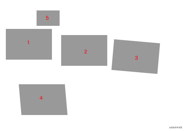
文字标识一下每一块的位置 , 的中心点为左上角(0,0) .
matrix 复杂变形
matrix(a b c d e f) 参数为六个值的变换矩阵定义 .

<svg xmlns="http://www.w3.org/2000/svg">
    <path d="M 600 400 c 10 10,20 200,200 0 z" fill="none" stroke="rgba(0,0,0,.6)" />
    <path d="M 600 400 c 10 10,20 200,200 0 z" fill="none" stroke="rgba(0,0,0,.6)" transform="matrix(1 1 0 -1 10 1)" />
</svg>
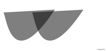
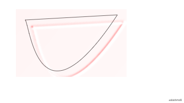
剪切、遮罩
擦除已经创建的元素的部分内容.
剪切 - clipPath
移除其他元素的部分内容 . 通常定义在defs 元素中, 通过属性clip-path 引用.
<svg xmlns="http://www.w3.org/2000/svg">
    <defs>
        <clipPath id="clip">
            <path d="M 920 580 c 20 50,50 90,100 0" />
        </clipPath>
    </defs>
    <rect x="900" y="400" width="150" height="100" fill="rgba(0,0,0,.6)" />
    <rect x="900" y="550" width="150" height="100" fill="none" stroke="red" />
    <rect x="900" y="550" width="150" height="100" fill="rgba(0,0,0,.6)" clip-path="url(#clip)" />
</svg>
展示被剪切元素覆盖住的部分 .
遮罩 - mask
通过属性mask 引用
<svg xmlns="http://www.w3.org/2000/svg">
    <defs>
        <clipPath id="clip">
            <path d="M 920 580 c 20 50,50 90,100 0" />
        </clipPath>
        <mask id="mask">
            <path d="M 1120 580 c 20 50,50 90,100 0" fill="#fff" />
        </mask>
    </defs>
    <rect x="900" y="400" width="150" height="100" fill="rgba(0,0,0,.6)" />
    <rect x="900" y="550" width="150" height="100" fill="none" stroke="red" />
    <rect x="900" y="550" width="150" height="100" fill="rgba(0,0,0,.6)" clip-path="url(#clip)" />
    <rect x="1100" y="550" width="150" height="100" fill="none" stroke="red" />
    <rect x="1100" y="550" width="150" height="100" fill="rgba(0,0,0,.6)" mask="url(#mask)" />
</svg>
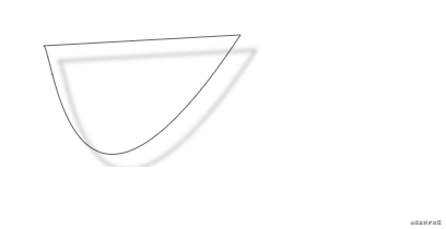
滤镜
实现阴影效果、模糊渐变 .
通过filter 元素定义在defs 中, 使用属性filter 引用 .
通过字元素定义模糊属性:
feGaussianBlur- 定义图像模糊in指向前面元素定义的result 属性 , 可选固定属性值有:SourceGraphic\SourceAlpha\BackgroundImage等 .stdDeviation- 定义模糊度result- 定义临时缓存区, 后需元素可以指向引用.
<svg xmlns="http://www.w3.org/2000/svg">
    <filter id="filter">
        <feGaussianBlur in="SourceGraphic" stdDeviation="5" result="blur" />
    </filter>
    <path d="M 50 50 c 10 10,25 225,180 -10 z" fill="none" stroke="rgba(0,0,0,1)" />
    <path d="M 50 50 c 10 10,25 225,180 -10 z" fill="none" stroke="rgba(0,0,0,1)" filter="url(#filter)" />
</svg>
feOffset- 这是模糊偏移量in- 指向前面元素定义的result 属性 , 自定义属性值同上.dx\dy- 相对偏移量result- 定义临时缓存区, 后需元素可以指向引用.
<svg xmlns="http://www.w3.org/2000/svg">
    <filter id="filter-offset">
        <feGaussianBlur in="SourceGraphic" stdDeviation="2" result="blur" />
        <feOffset in="blur" dx="14" dy="14" />
    </filter>
    <path d="M 50 200 c 10 10,25 225,180 -10 z" fill="none" stroke="rgba(0,0,0,.6)" />
    <path d="M 50 200 c 10 10,25 225,180 -10 z" fill="none" stroke="rgba(0,0,0,.6)" filter="url(#filter-offset)" />
</svg>
feSpecularLighting- 设置输入源 ,光照效果 , 通过子元素fePointLight设置偏移量in定义surfaceScale-specularConstant-specularExponent-lighting-color-result- 定义临时缓存区, 后需元素可以指向引用.
<svg xmlns="http://www.w3.org/2000/svg">
    <filter id="filter-light">
        <feGaussianBlur in="SourceGraphic" stdDeviation="2" result="blur" />
        <feOffset in="blur" dx="14" dy="14" result="offset" />
        <feSpecularLighting surfaceScale="5" specularConstant=".4" specularExponent="20" lighting-color="red">
            <fePointLight x='-1000' y="-500" z="1000" />
        </feSpecularLighting>
    </filter>
    <path d="M 50 350 c 10 10,25 225,180 -10 z" fill="none" stroke="rgba(0,0,0,.6)" />
    <path d="M 50 350 c 10 10,25 225,180 -10 z" fill="none" stroke="rgba(0,0,0,.6)" filter="url(#filter-light)" />
</svg>
feComposite- 效果合成in\in2- 指向输入源operator- 定义合成模式k1\k2\k3\k4result- 定义临时缓存区, 后需元素可以指向引用.
<svg xmlns="http://www.w3.org/2000/svg">
    <filter id="filter-composite">
        <feGaussianBlur in="SourceGraphic" stdDeviation="2" result="blur" />
        <feOffset in="blur" dx="14" dy="14" result="offset" />
        <feSpecularLighting surfaceScale="5" specularConstant=".4" specularExponent="20" lighting-color="red"
            result="light">
            <fePointLight x='-1000' y="-500" z="1000" />
        </feSpecularLighting>
        <feComposite in2="light" in="SourceGraphic" operator="arithmetic" k1="10" k2="10" k3="10" k4="0" />
    </filter>
    <path d="M 50 500 c 10 10,25 225,180 -10 z" fill="none" stroke="rgba(0,0,0,.6)" />
    <path d="M 50 500 c 10 10,25 225,180 -10 z" fill="none" stroke="rgba(0,0,0,.6)" filter="url(#filter-composite)" />
</svg>
feMerge- 合并各个效果 , 通过子元素feMergeNode
<svg xmlns="http://www.w3.org/2000/svg">
    <filter id="filter-merge">
        <feGaussianBlur in="SourceGraphic" stdDeviation="2" result="blur" />
        <feOffset in="blur" dx="14" dy="14" result="offset" />
        <feSpecularLighting surfaceScale="5" specularConstant=".4" specularExponent="20" lighting-color="red"
            result="light">
            <fePointLight x='-1000' y="-500" z="1000" />
        </feSpecularLighting>
        <feComposite in2="light" in="SourceGraphic" operator="arithmetic" k1="10" k2="10" k3="10" k4="0"
            result="composite" />
        <feMerge>
            <feMergeNode in="blur" />
            <feMergeNode in="light" />
        </feMerge>
    </filter>
    <path d="M 300 500 c 10 10,25 225,180 -10 z" fill="none" stroke="rgba(0,0,0,.6)" />
    <path d="M 300 500 c 10 10,25 225,180 -10 z" fill="none" stroke="rgba(0,0,0,.6)" filter="url(#filter-merge)" />
</svg>
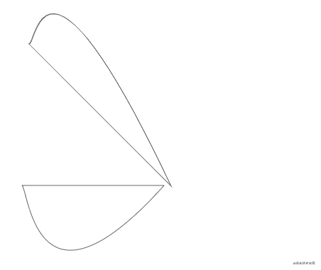
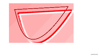
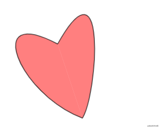
绘制一个心形状
<svg xmlns="http://www.w3.org/2000/svg" xmlns:xlink="http://www.w3.org/1999/xlink" viewbox="0 0 100 100">
    <defs>
        <pattern id="color" x="10" y="10" width=".1" height=".02">
            <rect x="0" y="0" width="5" height="15" fill="red" fill-opacity=".5" />
        </pattern>
    </defs>

    <g id="heart" fill="url(#color)">
        <path d="M 200 500 c -150 -80,-80 100,50 150" stroke="rgba(0,0,0,.6)" stroke-width="2" />
        <path d="M 200 500 c 100 -180,80 100,50 150" stroke="rgba(0,0,0,.6)" stroke-width="2" />
    </g>
</svg>
可太难了, 画了好半天 😭


 扫一扫
扫一扫


 4992
4992

 被折叠的 条评论
为什么被折叠?
被折叠的 条评论
为什么被折叠?
 到【灌水乐园】发言


