


目录
二. 组件-样式-基础
1. 基础入门
在 build里面写代码,预览器看效果。
2. ArkUI 基本语法
方舟开发框架(简称:ArkUI),是一套 构建HarmonyOS应用 界面 的框架。
构建页面的最小单位就是 "组件"。
组件名(参数) {
  内容
}
	.属性1()
	.属性2()
	.属性N()
3. 常用系统组件

3.1系统组件
| 组件 | 描述 |
| Text | 显示文本 |
| Image | 显示图片 |
| Column | 列,内容垂直排列 |
| Row | 行,内容水平排列 |
| Button | 按钮 |
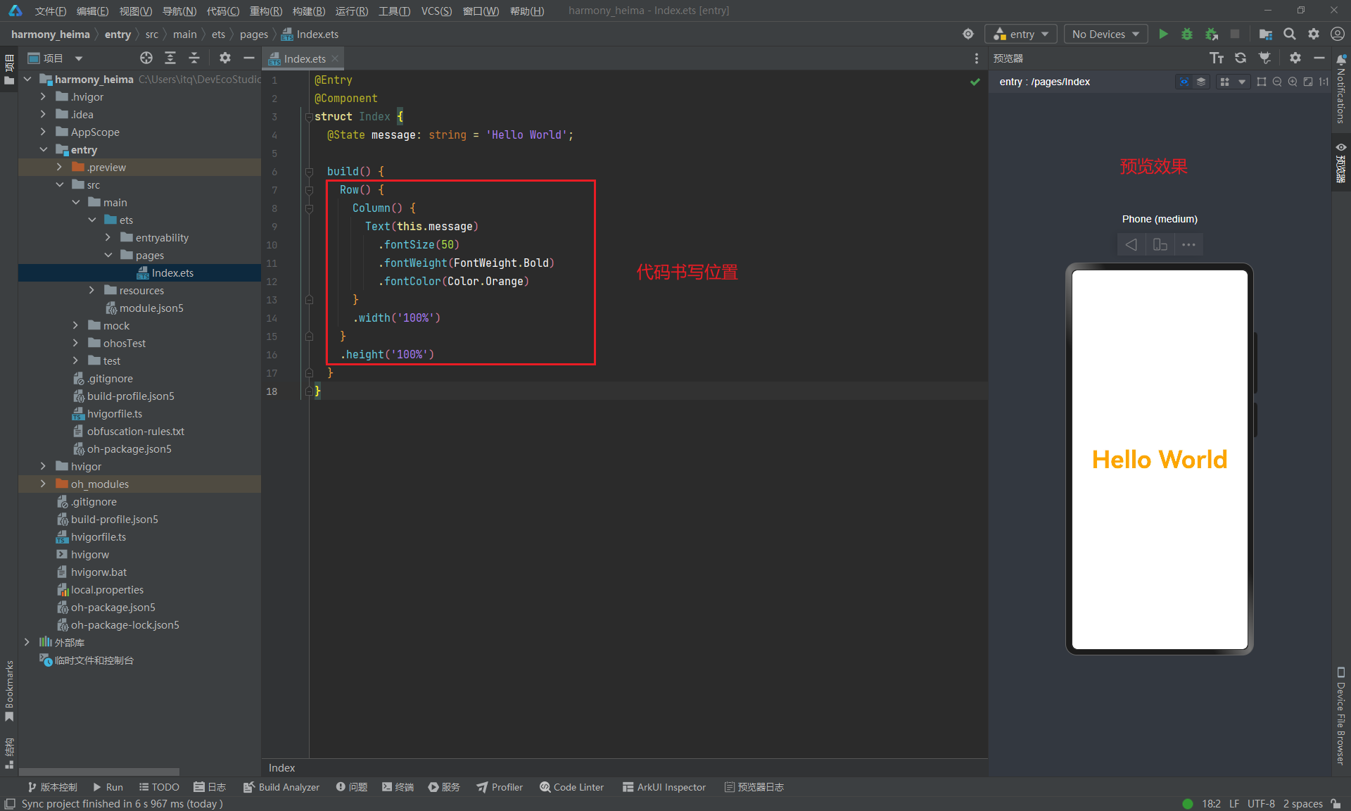
示例代码
@Entry
@Component
struct Index {
build() {
Column() {
Text('小说简介')
Row() {
Text('都市')
Text('生活')
Text('情感')
Text('男频')
}
}
}
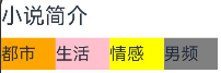
}3.2通用属性
| 属性 | 描述 |
| width | 宽度 |
| height | 高度 |
| backgroundColor | 背景色 |
@Entry
@Component
struct Index {
build() {
Column() {
Text('小说简介')
.width('100%')
.height(40)
Row() {
Text('都市')
.width(50)
.height(30)
.backgroundColor(Color.Orange)
Text('生活')
.width(50)
.height(30)
.backgroundColor(Color.Pink)
Text('情感')
.width(50)
.height(30)
.backgroundColor(Color.Yellow)
Text('男频')
.width(50)
.height(30)
.backgroundColor(Color.Gray)
}
// 宽度100%后, 内容居左对齐
.width('100%')
}
}
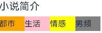
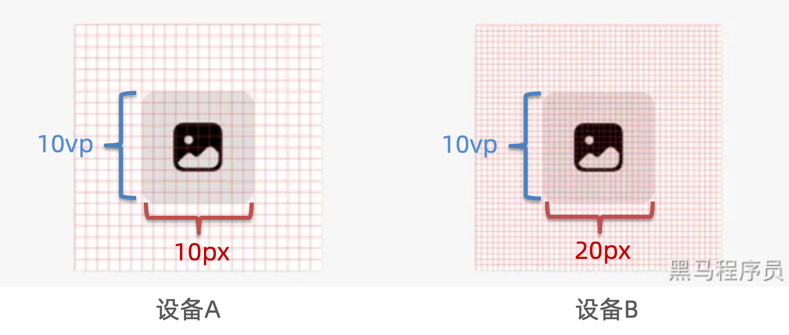
}3.3 尺寸单位
1.px :物理像素,也叫设备像素,设备实际拥有的像素点(出场设置、分辨率单位)
问题:如果用 px 作为宽高单位,又想保证不同显示能力的设备,视觉效果一样大,
就需要针对每个设备单独编码,设置尺寸,非常麻烦。
能不能有个单位,帮我们自动根据显示能力,来进行转换大小,保证多设备视觉效果一致呢?
2.vp :virtual pixel 虚拟像素 【推荐使用】
- 会根据不同设备的显示能力,自动进行转换成对应 px 物理像素,保证不同设备视觉一致
- 当数值不带单位时,默认单位
vp - 基于目前预览器和常规手机的显示能力,vp 和 px 的对应关系,大约为 3 倍,1vp ≈ 3px (超清屏手机)
示例代码
@Entry
@Component
struct Index {
  build() {
    Column() {
      Text('vp单位')
        .width(100)
        .height(100)
        .backgroundColor(Color.Pink)

      Text('px单位')
        .width('100px')
        .height('100px')
        .backgroundColor(Color.Orange)
    }
  }
}
界面效果
通常设计图,按照 1080px 设计,换算成 360 进行测量,写 vp 单位尺寸
4. 文本属性
| 属性 | 描述 |
| fontSize | 字体大小 |
| fontColor | 字体颜色 |
| fontStyle | 字体样式 |
| fontWeight | 字体粗细 |
| lineHeight | 文本行高 |
| decoration | 文本修饰线及颜色 |
| textAlign | 水平方向Text对齐方式 |
| align | 垂直方向对齐方式 |
| textIndent | 文本首行缩进 |
| textOverflow | 设置文本超长时的显示方式 |
| maxLines | 设置文本的最大行数 |
4.1 字体大小

属性:fontSize(数字)
提示:默认字体大小为 16,单位 fp(字体像素)
@Entry
@Component
struct Index {
  build() {
    Column() {
      Text('字体大小')
        .fontSize(30)
    }
  }
}
4.2.字体颜色
属性:fontColor(颜色色值)
色值:
- 颜色枚举值:
Color.xx,例如:Color.Pink - 十六进制(HEX)颜色
- 纯白色:'#ffffff’或“#fff”
- 纯黑色:'#000000' 或 '#000'

可以点这个小方块改变颜色(一般项目会给十六进制的颜色代码)
@Entry
@Component
struct Index {
  build() {
    Column() {
      Text('字体颜色1')
        .fontColor(Color.Pink)

      Text('字体颜色2')
        .fontColor('#ff0000')
    }
  }
}
4.3 字体样式
作用:设置字体是否倾斜
属性:fontStyle()
参数:枚举FontStyle
Normal:正常字体(不倾斜)Italic:斜体
@Entry
@Component
struct Index {
  build() {
    Column() {
      Text('倾斜字体')
        .fontStyle(FontStyle.Italic)
    }
  }
}
4.4字体粗细
作用:设置文字粗细

属性:fontWeight()
参数:
- [100, 900],取值越大,字体越粗,默认值为 400
- 枚举
FontWeight
-
- Lighter:字体较细
- Normal:字体粗细正常,默认值
- Regular:字体粗细正常
- Medium:字体粗细适中
- Bold:字体较粗
- Bolder:字体非常粗
@Entry
@Component
struct Index {
  build() {
    Column() {
      Text('周杰伦')
        .fontWeight(900)
        .fontSize(30)
      Text('字体粗细')
        .fontWeight(FontWeight.Bolder)
        .fontSize(30)
      Text('字体粗细')
        .fontWeight(FontWeight.Bold)
        .fontSize(30)
    }
  }
}
4.5文本行高

作用:设置文本行间距
属性:lineHeight()
@Entry
@Component
struct Index {
  build() {
    Column() {
      Text('HarmonyOS 是新一代的智能终端操作系统,为不同设备的智能化、互联与协同提供了统一的语言。带来简洁,流畅,连续,安全可靠的全场景交互体验。')
        .lineHeight(40)
    }
  }
}
4.6文本修饰
作用:设置文本装饰线样式及其颜色
属性:decoration()
参数:{}
- type:修饰线类型,
TextDecorationType(枚举)
-
- None:无
- Underline:下划线
- LineThrough:删除线
- Overline:顶划线
- color:修饰线颜色,可选,默认为黑色
@Entry
@Component
struct Index {
  build() {
    Column() {
      Text('文本修饰线-删除线')
        .decoration({
          type: TextDecorationType.LineThrough,
          color: '#888'
        })
        .fontColor('#999')

      Text('文本修饰线')
        .decoration({
          type: TextDecorationType.Underline
        })

      Text('文本修饰线')
        .decoration({
          type: TextDecorationType.Overline
        })
    }
  }
}
4.7文本水平对齐方式
作用:设置文本在水平方向的对齐方式

属性:textAlign()
参数:枚举 TextAlign
- Start:左对齐,默认值
- Center:居中
- End:右对齐
@Entry
@Component
struct Index {
  build() {
    Column() {
      Text('已显示最新内容')
        .width(200)
        .height(50)
        .backgroundColor('#d3f2e3')
        .textAlign(TextAlign.Center)

      Text('左对齐')
        .width(200)
        .height(50)
        .backgroundColor(Color.Orange)
        .textAlign(TextAlign.Start)

      Text('右对齐')
        .width(200)
        .height(50)
        .backgroundColor('#d3f2e3')
        .textAlign(TextAlign.End)
    }
  }
}
4.8文本垂直对齐方式
Text 组件内容默认垂直居中,效果如下:

可使用align属性调整Text组件垂直对齐方式。
属性: align()
参数: 枚举Alignment
| 参数 | 描述 |
| Top | 顶对齐 |
| Center | 垂直居中,默认值 |
| Bottom | 底对齐 |
@Entry
@Component
struct Index {
  build() {
    Column() {
      Text('顶对齐')
        .width(200)
        .height(100)
        .backgroundColor('#d3f2e3')
        .textAlign(TextAlign.Center)
        // 垂直对齐方式
        .align(Alignment.Top)

      Text('居中对齐')
        .width(200)
        .height(100)
        .backgroundColor(Color.Orange)
        .textAlign(TextAlign.Center)
          // 垂直对齐方式
        .align(Alignment.Center)

      Text('底对齐')
        .width(200)
        .height(100)
        .backgroundColor('#d3f2e3')
        .textAlign(TextAlign.Center)
          // 垂直对齐方式
        .align(Alignment.Bottom)
    }
  }
}
4.9文本首行缩进
属性:textIndent()
参数:数值
@Entry
@Component
struct Index {
  build() {
    Column() {
      Text('HarmonyOS 是新一代的智能终端操作系统,为不同设备的智能化、互联与协同提供了统一的语言。带来简洁,流畅,连续,安全可靠的全场景交互体验。')
        .fontSize(14)
        .textIndent(28)
    }
  }
}
4.10文本溢出

使用 textOverflow 配合 maxLines 实现文本溢出显示省略号效果
4.10.1. 文本超长显示方式
属性:textOverflow()
参数:{overflow: TextOverflow},TextOverflow 为枚举类型
- None:文本超长时裁剪显示
- Clip:文本超长时进行裁剪显示
- Ellipsis:文本超长时显示不下的文本用省略号代替
- MARQUEE:文本超长时以跑马灯的方式展示(滚动显示)
4.10.2. 最大行数
属性:maxLines()
参数:数字
@Entry
@Component
struct Index {
  build() {
    Column() {
      Text('HarmonyOS 是新一代的智能终端操作系统,为不同设备的智能化、互联与协同提供了统一的语言。带来简洁,流畅,连续,安全可靠的全场景交互体验。')
        .fontSize(14)
        .textIndent(28)
        .maxLines(2)
        // 超长文本使用省略号代替
        .textOverflow({overflow: TextOverflow.Ellipsis})
        // 裁剪超长文本
        .textOverflow({overflow: TextOverflow.Clip})
        // 超长文本滚动显示
        .textOverflow({overflow: TextOverflow.MARQUEE})
    }
  }
}
5. 显示图片

作用:在应用中显示图片,支持png、jpg、bmp、svg和gif类型的图片格式。
组件:Image('图片的数据源'),支持本地图片资源和网络图片资源。
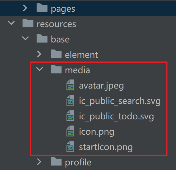
5.1. 图片数据源
图片数据源即图片存储位置,通常存储在resources/base/media
@Entry
@Component
struct Index {
  build() {
    Column() {
      // 本地图片
      Image($r('app.media.cat'))
        .width(200)

      // 网络图片
      Image('https://www.itheima.com/images/logo.png')
        .width(200)
    }
  }
}
6. 案例-百度-小说简介
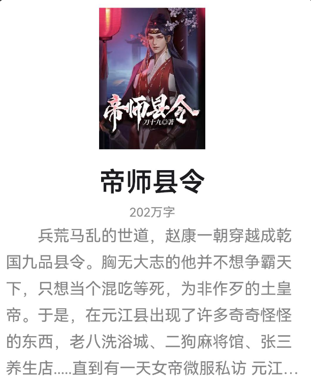
涵盖知识:Text 组件、Image组件、文本属性等
@Entry
@Component
struct Index {
  build() {
    Column() {
      Image($r('app.media.story'))
        .width(120)
      Text('帝师县令')
        .lineHeight(60)
        .fontSize(30)
        .fontColor('#1d1c21')
        .fontWeight(600)
      Text('202万字')
        .lineHeight(24)
        .fontSize(14)
        .fontColor('#999')
      Text('兵荒马乱的世道,赵康一朝穿越成乾国九品县令。胸无大志的他并不想争霸天下,只想当个混吃等死,为非作歹的土皇帝。于是,在元江县出现了许多奇奇怪怪的东西,老八洗浴城、二狗麻将馆、张三养生店.....直到有一天女帝微服私访 元江县.....')
        .lineHeight(30)
        .fontSize(18)
        .textIndent(36)
        .maxLines(4)
        .textOverflow({overflow: TextOverflow.Ellipsis})
        .fontColor('#777')
    }
  }
}
7. Image组件属性
| 属性 | 描述 |
| width | 宽度(通用属性) |
| height | 高度(通用属性) |
| aspectRatio | 宽高比(通用属性) |
| alt | 加载时显示的占位图,支持本地图片(png、jpg、bmp、svg和gif类型),不支持网络图片。 |
| objectFit | 设置图片的填充效果。 默认值:ImageFit.Cover |
小技巧:添加backgroundColor属性添加背景色,方便观察组件尺寸范围
7.1. 尺寸控制
width:组件宽度,取值数字或百分比height:组件高度,取值数字或百分比aspectRatio:组件宽高比,宽度/高度
@Entry
@Component
struct Index {
  build() {
    Column() {
      // 本地图片 正方形图添加 aspectRatio 属性,宽高比例为 1:1
      Image($r('app.media.cat'))
        .width(200)
        .aspectRatio(1)

      // 网络图片
      Image('https://www.itheima.com/images/logo.png')
        .width(200)

        // 长方形图片设置宽高比1:1, 会导致图片显示不全
        .aspectRatio(1)
    }
  }
}
7.2. 占位图 alt
作用:加载时显示的占位图片
属性:alt()
@Entry
@Component
struct Index {
  build() {
    Column() {
      Image('https://www.itheima.com/images/logo.png')
        .width(200)

        // 加载时显示的占位图
        .alt($r('app.media.startIcon'))
    }
  }
}
7.3. 图片填充 objectFit
属性:objectFit()
参数类型:枚举 ImageFit
- Contain:图片宽或高缩放到与组件尺寸相同则停止缩放,可能导致组件有空白(等比缩放)
- Cover:默认效果,图片缩放到完全覆盖组件范围,可能导致图片显示不完整(等比缩放)
- Fill:图片缩放至充满组件(不等比缩放)
@Entry
@Component
struct Index {
  build() {
    Column() {
      Image($r('app.media.cat'))
        .width(200)
        .height(100)
        .backgroundColor(Color.Pink)
          // 图片宽或高缩放到与组件尺寸相同则停止缩放,可能导致组件有空白(等比缩放)
        .objectFit(ImageFit.Contain)
          // 默认:图片缩放到完全覆盖组件范围,可能导致图片显示不完整(等比缩放)
        .objectFit(ImageFit.Cover)
          // 图片缩放至充满组件(不等比缩放)
        .objectFit(ImageFit.Fill)
    }
  }
}
8. 案例-QQ音乐-卡片

布局思路:Column > Text + Text + Image + Text
@Entry
@Component
struct Index {
  build() {
    Column() {
      Column() {
        Text('我的年度歌手榜')
          .lineHeight(40)
          .fontSize(14)
          .fontColor('#bdbdbd')
        Text('周杰伦')
          .lineHeight(50)
          .fontSize(24)
          .fontWeight(700)
        Image($r('app.media.zhoujielun'))
          .width(60)
        Text('真爱就是循环一千遍')
          .lineHeight(40)
          .fontSize(14)
          .fontColor('#999')
      }
        .width(200)
        .height(200)
        .backgroundColor('#fff')
    }
    .width('100%')
    .height('100%')
    .backgroundColor('#f5f7f8')
  }
}


 12万+
12万+

 被折叠的 条评论
为什么被折叠?
被折叠的 条评论
为什么被折叠?
 到【灌水乐园】发言


