


以下介绍数据的二维可视化。
一. 二维散点图
(源代码:scatter.m)我们用著名的Iris数据集(Fisher, 1936)作为绘图实例。Iris数据集包含3种鸢尾花的150个样本数据,每个数据都有4个属性(花萼和花瓣的长度及宽度)。
1) 基本散点图
我们用其中两个属性值作为X和Y轴,另一个属性值表示点的大小。(图1)
%%  加载数据集
[attrib className] = xlsread('iris.xlsx');

%% 绘制基本的散点图
figure('units','normalized','Position',[0.2359    0.3009    0.4094    0.6037]);
scatter(attrib(:,1),attrib(:,2),10*attrib(:,3),[0 1 0],'filled','Marker','^');
set(gca,'Fontsize',12);
title({'Iris数据集包含150个数据,每个数据含4个属性',...
    '第32个属性值扩大后用来决定标志的大小',...
    '标志使用自定义的大小和样式'});
xlabel('属性1'); ylabel('属性2');
box on;
set(gcf,'color',[1 1 1],'paperpositionmode','auto');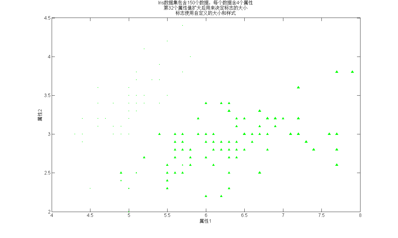
图 1
2) 散点矩阵图
plotmatrix可以将每两个属性组合的散点图以矩阵的形式绘制出来。通过观察如图2,我们知道,3个各类的花朵不能通过某两个属性就可以加以区分。
%% 绘制散点矩阵图
% The output parameters have
% A matrix of handles to the objects created in H,
% A matrix of handles to the individual subaxes in AX,
% A handle to a big (invisible) axes that frames the subaxes in BigAx,
% A matrix of handles for the histogram plots in P.
% BigAx is left as the current axes so that a subsequent title, xlabel, or ylabel command is centered with respect to the matrix of axes.
figure('units','normalized','Position',[ 0.2359    0.3009    0.4094    0.6037]);
[H,AX,BigAx,P] = plotmatrix(attrib,'r.');
attribName = {[char(10) '花萼长度'],[char(10) '花萼宽度'],[char(10) '花瓣长度'],[char(10) '花瓣宽度']};
% 添加标注
for i = 1:4
    set(get(AX(i,1),'ylabel'),'string',['属性' num2str(i) attribName{i}]);
    set(get(AX(4,i),'xlabel'),'string',['属性' num2str(i) attribName{i}]);
end
set(get(BigAx,'title'),'String',{'散点矩阵图 (数据含3类Iris花)', ...
    '如图所示这3类不能通过某2个属性进行区分'},'Fontsize',14);
set(gcf,'color',[1 1 1],'paperpositionmode','auto');
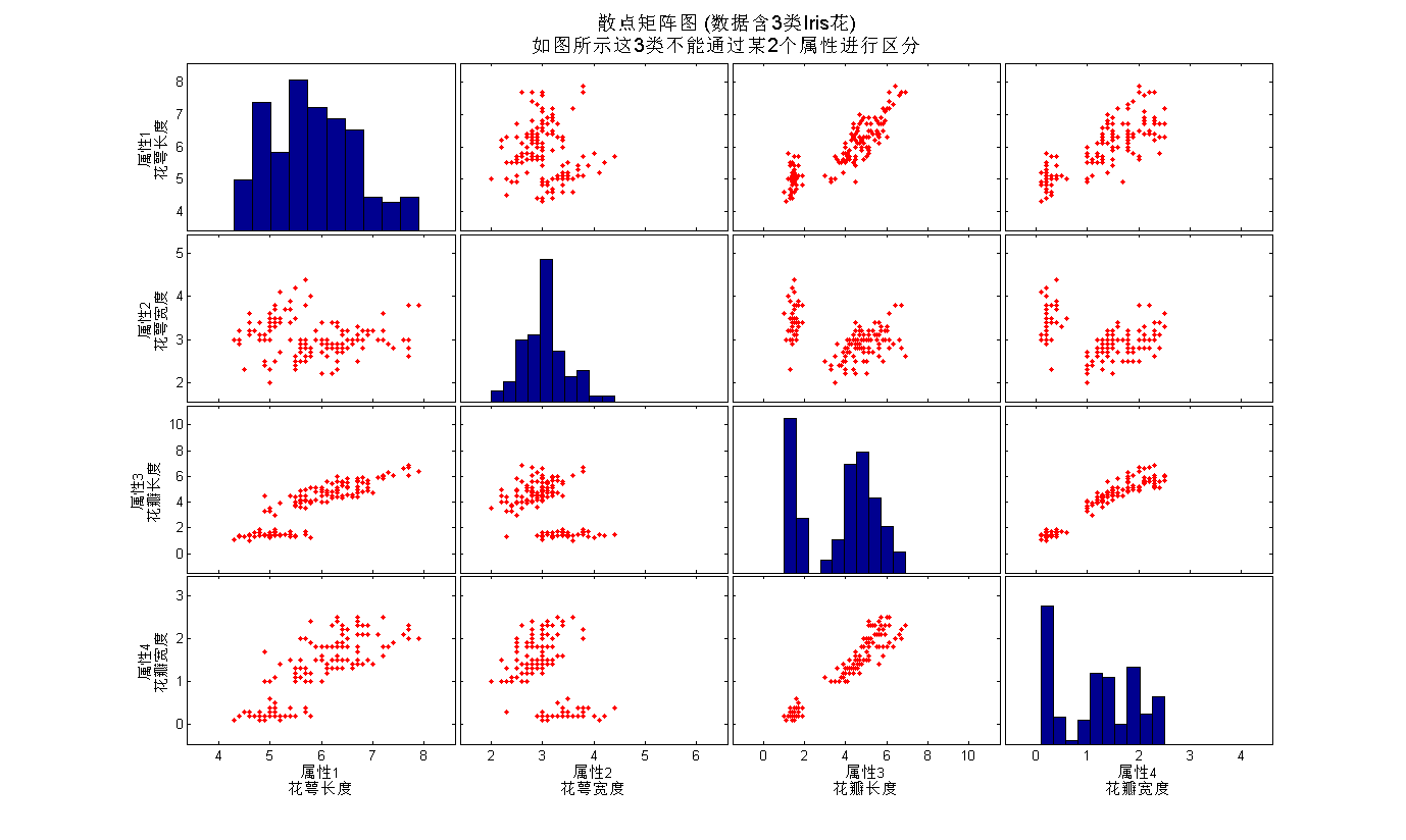
图 2
3) 带直方图的散点图
我们可以在绘制两个属性的散点图的同时,绘制出各属性分布的直方图。(图3)
%% 在轴线上画出分布图
figure('units','normalized','Position',[0.2589    0.3296    0.3859    0.5750]);
H = scatterhist(attrib(:,2),attrib(:,3),'nbins',50,'direction','out');
mainDataAxes = H(1);
xhistAxes = H(2);
yhistAxes = H(3);
set(get(mainDataAxes,'title'),'String','有一个类别基于如下2个属性是可分的','Fontsize',12);
set(get(mainDataAxes,'xlabel'),'String','x (属性2, 花萼宽度)','Fontsize',14);
set(get(mainDataAxes,'ylabel'),'String','y (属性3, 花瓣长度)','Fontsize',14);
set(gcf,'color',[1 1 1],'paperpositionmode','auto');
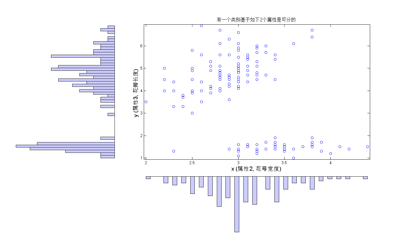
图 3
二. 用热图表示数据点分布的密度
(源代码:scattersmooth.m)
当数据量很大时,散点图之间会有显著的重叠,这时密度图往往能够更加清晰的反映出数据的分布情况。我们以用如下方法生成的1000个数据点为例进行说明。
%% 生成数据
z = [repmat([1 2],1000,1) + randn(1000,2)*[1 .5; 0 1.32];...
     repmat([9 1],1000,1) + randn(1000,2)*[1.4 .2; 0 0.98];...
     repmat([4 8],1000,1) + randn(1000,2)*[1 .7; 0  0.71];];
如果直接绘制散点图(如图4),我们会发现象非常严重的重叠问题。
%% 绘制原始数据
figure('units','normalized','position',[ 0.4458    0.6296    0.1995    0.2759]);
plot(z(:,1),z(:,2),'.');
title({'原始数据','散点视图有显著的重叠'});
set(gcf,'color',[1 1 1],'paperpositionmode','auto');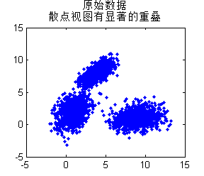
图 4
我们通过将数据进行抽象,绘制密度图来解决上述问题。之前,我们介绍过热图(heat map)的绘制,当时用到的是imagesc和pcolor,而这里我们利用绘制二维曲面的surf命令,接合适当的视角来完成。(图5)
xx = z(:,1);
yy = z(:,2);
gridSize = 100;
% 选择colormap
colormap(summer);

% 建立网格
x=linspace(min(xx),max(xx),gridSize);
y=linspace(min(yy),max(yy),gridSize);
gridEval = zeros(length(x)-1,length(y)-1);

% 计算每个网格中点的频数
for cnt_x=1:length(x)-1
    for cnt_y=1:length(y)-1
        x_ind=intersect(find(xx>x(cnt_x)),find(xx<=x(cnt_x+1)));
        xy_ind=intersect(find(yy(x_ind)>y(cnt_y)), find(yy(x_ind)<=y(cnt_y+1)));
        gridEval(cnt_y, cnt_x)=length(xy_ind);
    end
end

% surface函数绘制热图
surf((x(1:end-1)+ x(2:end))/2,(y(1:end-1)+y(2:end))/2,gridEval); view(2);
shading interp;  hold on;
axis([min(xx),max(xx) min(yy),max(yy)]);

% 添加标注
title(['密度图, 网格大小: ' num2str(gridSize) ' x ' num2str(gridSize) ' 个网格'],'Fontsize',14);
xlabel('x','Fontsize',14);
ylabel('y','Fontsize',14);
axis tight;
h1 = gca; % 保存句柄,以便后面添加边框

% 添加颜色条
h=colorbar;
axes(h);ylabel('密度, 每个网格的点数','Fontsize',14);
set(gcf,'color',[1 1 1],'paperpositionmode','auto');

% 添加黑色的边框
axes(h1);
line(get(gca,'xlim'),repmat(min(get(gca,'ylim')),1,2),'color',[0 0 0],'linewidth',1);
line(get(gca,'xlim'),repmat(max(get(gca,'ylim')),1,2),'color',[0 0 0],'linewidth',2);
line(repmat(min(get(gca,'xlim')),1,2),get(gca,'ylim'),'color',[0 0 0],'linewidth',2);
line(repmat(max(get(gca,'xlim')),1,2),get(gca,'ylim'),'color',[0 0 0],'linewidth',1);
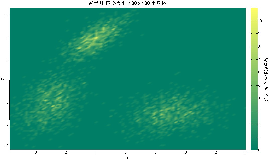
图 5
直接计算密度得到的密度可能会显得不太自然,我们可以第个网格点处对所有数据进行加权,这样便可以成到平滑的作用。(图6)
xx = z(:,1);
yy = z(:,2);
sigma = 0.1;
gridSize = 100;

% 选择colormap
colormap(summer);

x=linspace(min(xx),max(xx),gridSize);
y=linspace(min(yy),max(yy),gridSize);
gridEval = zeros(length(x)-1,length(y)-1);

% 计算每个点处的高斯函数
for i = 1:length(x)-1
    for j = 1:length(y)-1
    %calculate a Gaussian function on the grid with each point in the center and add them up
        gridEval(j,i) = gridEval(j,i) + sum(exp(-(((x(i)-xx).^2)./(2*sigma.^2) + ((y(j)-yy).^2)./(2*sigma.^2))));
    end
end

% 绘制热图
surf((x(1:end-1)+ x(2:end))/2,(y(1:end-1)+y(2:end))/2,gridEval); view(2); shading interp;
axis([min(xx),max(xx) min(yy),max(yy)]);
h1 = gca; % 保存句柄,以便后面添加边框

% 添加标注
title(['平滑散点图, \sigma = ' num2str(sigma) ', 网格数: ' num2str(gridSize) ' x' num2str(gridSize)],'Fontsize',14);
xlabel('x','Fontsize',14);
ylabel('y','Fontsize',14);

% 添加颜色条
h=colorbar;
axes(h);ylabel('Intensity','Fontsize',14);

% 添加黑色的边框
axes(h1);
line(get(gca,'xlim'),repmat(min(get(gca,'ylim')),1,2),'color',[0 0 0],'linewidth',1);
line(get(gca,'xlim'),repmat(max(get(gca,'ylim')),1,2),'color',[0 0 0],'linewidth',2);
line(repmat(min(get(gca,'xlim')),1,2),get(gca,'ylim'),'color',[0 0 0],'linewidth',2);
line(repmat(max(get(gca,'xlim')),1,2),get(gca,'ylim'),'color',[0 0 0],'linewidth',1);

set(gcf,'color',[1 1 1],'paperpositionmode','auto');

图 6
三. 双向误差图(bidirectional error bar)
(源代码:bidirerrorbars.m)
对某些数据而言,X轴和Y轴上的数据都有一定的波动(误差)范围,有时我们需要同时在图上反映出这些波动信息。这称为双向误差图。我们曾通过errorbar命令绘制过Y轴方向上的误差图,在此基础上,我们绘制双向误差图。
(图7)
%% 加载数据
load flatPlateBoundaryLayerData

xx = laminarFlow(:,2);
yy = laminarFlow(:,3);

% 划定网格
xg=linspace(min(xx),max(xx),6);
yg=linspace(min(yy),max(yy),6);

% 计算各个网格中点的频数,以及它们的均值和方差
for cnt_x=1:length(xg)-1
    x_ind=intersect(find(xx>xg(cnt_x)),find(xx<=xg(cnt_x+1)));
    x(cnt_x)=mean(xx(x_ind));
    e_x(cnt_x)=std(xx(x_ind));
end
for cnt_y=1:length(yg)-1
    y_ind=intersect(find(yy>yg(cnt_y)),find(yy<=yg(cnt_y+1)));
    y(cnt_y)=mean(yy(y_ind));
    e_y(cnt_y)=std(yy(y_ind));
end


figure('units','normalized','Position',[0.0750    0.5157    0.5703    0.3889]);
axes('Position',[0.0676    0.1100    0.8803    0.8150]);

%% 绘制双向误差图
h = biDirErrBar(x,y,e_x,e_y);

%% 标注
set(get(h,'title'),'string','Laminar Flow的双向误差图','Fontsize',15);
set(get(h,'xlabel'),'string','位置测度','Fontsize',15);
set(get(h,'ylabel'),'string','速度测度','Fontsize',15);
set(gcf,'color',[1 1 1],'paperpositionmode','auto');
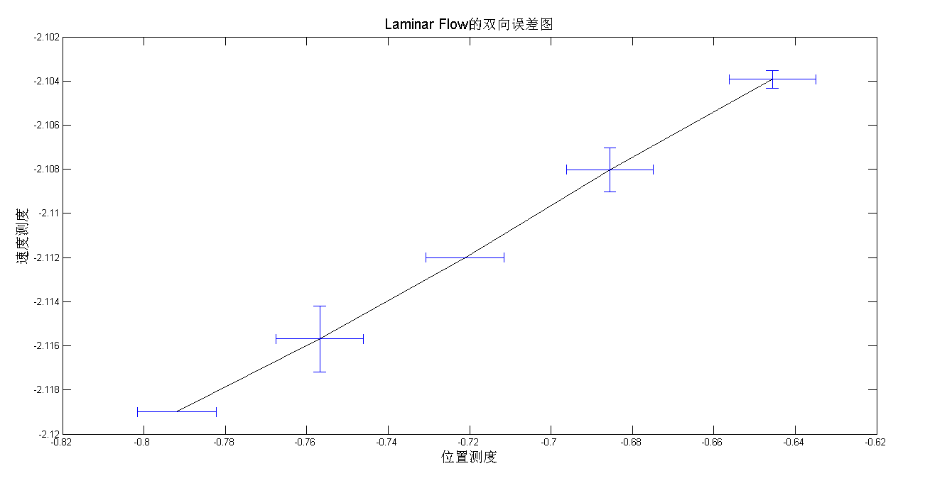
图 7
其中,自定义函数biDirErrBar在Matlab命令errorbar基础上,添加X轴方向上的误差。定义
如下:
function h = biDirErrBar(x,y,e_x,e_y)

% bidirErrBar(x,y,e_x,e_y) plots bi directional error bars and returns the
% handle to the axes for annotation
% x, y are the data vectors with n elements each. e_x and e_y are the error bars to be
% positioned at each point in xi,yi,

errorbar(x,y,e_y); hold on;
plot(x,y,'Color',[0 0 0]);
x_lower=x-e_x; x_upper=x+e_x;
y_lower=y-.0001*y; y_upper=y+.0001*y;
line([x_lower; x_upper],[y; y],'Color',[0 0 1]);

hold on; line([x_lower; x_lower], [y_lower; y_upper],'Color',[0 0 1]);
hold on; line([x_upper; x_upper], [y_lower; y_upper],'Color',[0 0 1]);

h = gca;
四. 二维关系图
我们知道,在关系矩阵中,1表示连接,0表示非去接。进一步,非零整数可以表示两个结点间的连接数。我们可以利用热图表示出这种扩展的关系。以维克多·雨果《悲剧世界》中人物同时登场的次数数量为实例,我们绘制二维的关系图。(图8)
%% 加载数据
load characterCoOccurences

%% 设置图像和坐标轴
figure('units','normalized','Position',[ 0.1990    0.1324    0.4854    0.7731]);
mainAx = axes('position',[ 0.1361    0.0143    0.8042    0.8038]);

% 设置colormap。由于关系图是稀疏的,因此这里我们反转colormap的顺序
m = colormap(copper);
m = m(end:-1:1,:);
colormap(m);

% 用surf创建热图
r=surf(lesMiserables);view(2);
% 将edgecolor设置为半透明
set(r,'edgealpha',0.2);
set(gca,'clim',[min(lesMiserables(:)) max(lesMiserables(:))]);

% 在上方添加颜色条
h=colorbar('northoutside');

% 添加刻度标签
set(mainAx,'xAxisLocation','top','xtick',0:78,'xticklabel',{' ' LABELS{:} ' '},...
         'ytick',0:78,'yticklabel',{' ' LABELS{:} ' '},'ticklength',[0 0],'fontsize',8);
axis tight;
rotateXLabels(gca,90);

% 调整颜色条和坐标轴的位置,因为他们会受琶刻度标签旋转的影响
set(h,'position',[0.1006    0.9409    0.8047    0.0128]);
set(get(h,'title'),'String','维克多·雨果《悲剧世界》中人物同时出场次数','Fontsize',14);
set(mainAx,'position',[ 0.1361    0.0143    0.8042    0.8038]);

set(gcf,'color',[1 1 1],'paperpositionmode','auto');
box on;
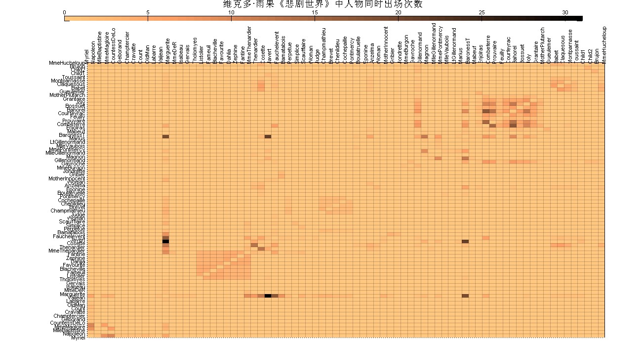
图 8
五. 绘制系统树图(dendrogram)
(源代码:dendrocluster.m)

图 9
我们首先利用pdist命令得到基因之间的两两距离。然后,linkage命令通过聚类的方法,得到层级树形层级结构。层级结构的可视化则由dendrogram命令完成。
%% 加载数据
load 14cancer.mat
data = [Xtrain(find(ytrainLabels==9),genesSet); Xtest(find(ytestLabels==9),genesSet)];

%% 癌症样本及100个感兴趣的基因绘制系统树图
Z_genes =   linkage(pdist(data'));
Z_samples = linkage(pdist(data));

%% 设定图像位置
figure('units','normalized','Position',[0.5641    0.2407    0.3807    0.6426]);
mainPanel = axes('Position',[.25 .08 .69 .69]);
leftPanel = axes('Position',[.08 .08 .17 .69]);
topPanel =  axes('Position',[.25 .77 .69 .21]);

%% 较低的值颜色较浅
m = colormap(pink); m = m(end:-1:1,:);
colormap(m);

%% 绘制系统树图 - 展示所有基因的节点(如果没有参数“0”,则默认值为最多30个节点)
axes(leftPanel);h = dendrogram(Z_samples,'orient','left'); set(h,'color',[0.1179         0         0],'linewidth',2);
axes(topPanel); h = dendrogram(Z_genes,0);set(h,'color',[0.1179         0         0],'linewidth',2);

%% 获取系统树图和热图数据生成的次序
Z_samples_order = str2num(get(leftPanel,'yticklabel'));
Z_genes_order = str2num(get(topPanel,'xticklabel'));
axes(mainPanel);
surf(data(Z_samples_order,Z_genes_order),'edgecolor',[.8 .8 .8]);view(2);
set(mainPanel,'Xticklabel',[],'yticklabel',[]);

%% 对齐X轴和Y轴
set(leftPanel,'ylim',[1 size(data,1)],'Visible','Off');
set(topPanel,'xlim',[1 size(data,2)],'Visible','Off');
axes(mainPanel);axis([1 size(data,2) 1 size(data,1)]);

%% 添加标注
axes(mainPanel); xlabel('30个不同的基因','Fontsize',14);
colorbar('Location','northoutside','Position',[ 0.0584    0.8761    0.3082    0.0238]);
annotation('textbox',[.5 .87 .4 .1],'String',{'基因表达水平', '白血病'},'Linestyle','none','fontsize',14);

%% 在坐标轴不可见的情况下,显示标签
set(leftPanel,'yaxislocation','left');
set(get(leftPanel,'ylabel'),'string','样本','Fontsize',14);
set(findall(leftPanel, 'type', 'text'), 'visible', 'on');

set(gcf,'color',[1 1 1],'paperpositionmode','auto');


 1万+
1万+


 被折叠的 条评论
为什么被折叠?
被折叠的 条评论
为什么被折叠?
 到【灌水乐园】发言


