


Titanic数据集是kaggle中的一份经典数据集,之所以把它作为实践项目1,是因为它非常适合作为数据分析入门的练习数据,同时,作为经典数据集,网上也有许多对此进行分析的案例。
由于是新手数据(再加上博主也是新手),博主只对Titanic数据进行探索性分析,如果有小伙伴们向学习预测性分析(即数据挖掘),可以移步kaggle了解其他人的代码。
1.首先进入kaggle Titanic dataset | Kaggle下载数据集Tested.csv。
2.打开jupter,开始编写代码
#导入分析需要用到的包
import numpy as np
import pandas as pd
from matplotlib import pyplot as plt

#导入数据
passengers = pd.read_csv("E:/Kaggle/tested.csv")
到这里就已经成功的导入了数据,那么拿到一份数据后,我们应该怎样去进行一个开始呢?
passengers.head() #查看前五行数据
Survived=1表示存活;Pclass代表船票等级;Cabin是所登录的救生艇编号;Embarked代表是从哪个港口登上的船
passengers.nunique() #查看不同值的个数(不包含null)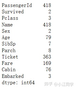
当我们对这份数据有了一个大概的了解后,就可以开始我们的分析了
passengers[passengers['Survived']==1][0:5] #查看前五行存活的人
了解一下keys,values,更好的理解后面的图表参数
survived = passengers[passengers['Survived']==1]
survived['Pclass'].value_counts().keys()
survived['Pclass'].value_counts().values
plt.figure(figsize=(7,7)) #设置幕布
plt.xlabel('Passenger Class') #x轴标签
plt.ylabel('There many Passengers Survived') #y轴标签
plt.yticks() #y轴坐标刻度
plt.grid() #添加网格线
plt.title('Class of Passengers survived')
#bar(x,y)柱形图
plt.bar(survived['Pclass'].value_counts().keys(),survived['Pclass'].value_counts().values, color=['red','green','yellow'])
plt.show()
passengers[['Name','Age']]
(passengers['Age'] < 18).sum()
41
passengers[passengers['PassengerId'] == 940]
#分组
bins = [-np.inf,17,39,59,np.inf]
labels = ['Children','Youth','MiddleAged','SeniorCitizens']
passengers['AgeGrp'] = pd.cut(passengers['Age'], bins=bins, labels = labels)
passengers['AgeGrp'].value_counts().keys()
passengers['AgeGrp'].value_counts().values
plt.figure(figsize=(7,7))
plt.xlabel('Age Groups')
plt.ylabel('Passengers')
plt.yticks()
plt.grid()
plt.title('Passengers & their Age Groups')
plt.bar(passengers['AgeGrp'].value_counts().keys(),passengers['AgeGrp'].value_counts(),color=['purple','blue','orange','magenta'])
plt.show()
plt.figure(figsize=(7,7))
plt.xlabel('Age Groups')
plt.ylabel('Survived Passengers')
plt.yticks()
plt.grid()
plt.title('Survived Passenger & their Age Groups')
plt.bar(survived['AgeGrp'].value_counts().keys(),survived['AgeGrp'].value_counts(),color=['purple','blue','orange','magenta'])
plt.show()
dead = passengers[passengers['Survived'] == 0]
bins = [-np.inf,17,39,59,np.inf]
labels = ['Children','Youth','MiddleAged','SeniorCitizens']
dead['AgeGrp'] = pd.cut(dead['Age'], bins = bins, labels=labels)

plt.figure(figsize=(7,7))
plt.xlabel('Age Groups')
plt.ylabel('Dead Passengers')
plt.yticks()
plt.grid()
plt.title('Dead Passenger & their Age Groups')
plt.bar(dead['AgeGrp'].value_counts().keys(), dead['AgeGrp'].value_counts(),color=['red','blue','magenta','green'])
plt.show()
已经绘画完几幅柱状图的你,相信已经学习到柱状图是怎样画的了吧,下面我们加大难度,新学习一个函数——subplot(),如果画完下面两幅图还不够了解的小伙伴们可以去网上搜一下subplot的用法。
plt.figure(figsize=(10,8))
plt.grid()

plt.subplot(1,2,1) #创建子图
plt.xlabel('Age Groups')
plt.ylabel('Survived Passengers')
plt.title('Survived Passengers & their Age Groups')
plt.bar(survived['AgeGrp'].value_counts().keys(), survived['AgeGrp'].value_counts(),color=['purple','blue','orange','magenta'])

plt.subplot(1,2,2)
plt.xlabel('Age Groups')
plt.ylabel('Dead Passengers')
plt.title('Dead Passengers & their Age Groups')
plt.bar(dead['AgeGrp'].value_counts().keys(),dead['AgeGrp'].value_counts(),color=['red','blue','magenta','green'])
plt.show()
plt.figure(figsize=(10,10))
plt.grid()

plt.subplot(2,1,1)
plt.xlabel('Age Groups')
plt.ylabel('Survived Passengers')
plt.title('Survived Passengers & their Age Groups')
plt.bar(survived['AgeGrp'].value_counts().keys(), survived['AgeGrp'].value_counts(), color=['purple','blue','orange','magenta'])

plt.subplot(2,1,2)
plt.xlabel('Age Groups')
plt.ylabel('Dead  Passengers')
plt.title('Dead Passengers & their Age Groups')
plt.bar(dead['AgeGrp'].value_counts().keys(),dead['AgeGrp'].value_counts(),color=['red','blue','magenta','green'])
plt.show()
柱状图的绘画我们就告一段落了,下面我们来学习折线图吧。但在此之前,我们不妨换一换绘图风格
#查看绘图风格
print(plt.style.available)
plt.style.use("Solarize_Light2")#切换绘图风格
plt.figure(figsize=(6,6))
plt.plot(survived['AgeGrp'].value_counts().keys(),survived['AgeGrp'].value_counts(), label="Survived",linewidth=4)
plt.plot(dead['AgeGrp'].value_counts().keys(),dead['AgeGrp'].value_counts(),label="Dead",linewidth=10)

plt.xlabel('Age Groups')
plt.ylabel('Dead & Survived Passengers')
plt.title("Dead & Survived Passengers & their Age Groups", pad=15)
plt.legend()
plt.show()
怎么样,绘画完折线图再结合前面所画的柱状图,是不是有那么一点感觉了呢?
passengers.head(5)
passengers[['Name','Cabin']]

plt.figure(figsize=(6,6))
plt.title('Passenger and their Towns')
plt.pie(passengers['Embarked'].value_counts(),labels=['Southampton','Cherbourg','Queemstown'], autopct='%1.02f%%',colors=['blue','yellow','green'])
plt.show()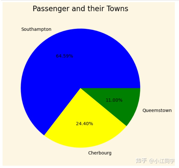
passengers[passengers['Embarked']=='S']
dead[dead['Embarked']=='S']
plt.figure(figsize=(6,6))
plt.title('Dead Passenger and their Towns')
explode = (0, 0.1, 0)

plt.pie(dead['Embarked'].value_counts(), labels=['Southampton','Cherbourg','Queenstown'],autopct='%1.02f%%',colors=['pink','red','yellow'],explode=explode,shadow=True,startangle=90,labeldistance=0.6,pctdistance=0.9)
plt.show()
plt.figure(figsize=(3,3))
plt.title('Survived Passengers and their Towns')
explode = (0, 0.1, 0)

plt.pie(survived['Embarked'].value_counts(),labels=['Southampton','Cherbourg','Queenstown'],autopct='%1.02f%%', colors=['orange','green','magenta'],wedgeprops={'width':0.6},explode=explode,shadow=True)
plt.show()
plt.figure(figsize=(5,5))

plt.pie(dead['Embarked'].value_counts(),
       radius = 1,
       colors = ['blue', 'yellow', 'red'],
       labels = ['Southampton','Cherbourg','Queenstown'],
       textprops = {'color':'black'},
       startangle = 90,
       wedgeprops = dict(width = 0.6, edgecolor = 'w'),
       autopct = '%1.02f%%',
       labeldistance = 0.4,
       shadow = True)
plt.pie(survived['Embarked'].value_counts(),
       radius = 1.5,
       colors = ['green','maroon', 'purple'],
       textprops = {'color':'white'},
       startangle = 90,
       wedgeprops = dict(width=0.6,edgecolor='w'),
       labels = ['Southampton','Cherbourg','Queenstown'],
       shadow = True,labeldistance = 0.7,
       autopct = '%1.02f%%',
       pctdistance = 1)
plt.show()
plt.figure(figsize=(6,6))
plt.hist(passengers['Fare'],color = 'maroon',)
plt.show()
分析到这里就结束了,不得不说对Titanic数据集进行探索性分析实在不能分析出什么结论来,它更适合用来作预测性分析,但是作为新手练习数据,确确确确实好用,对于我们这样的新手来说,掌握python编写代码的能力更为重要,若是不会利用python进行数据分析,那你脑子里的各种分析思路或者想法,都不能呈现出来,可以说这是我们最重要的基础。
因为面向新手的原因,博主的代码写的非常细,并且很多不必要的参数博主也添加了上去,导致图的配色、风格等因素有点过于辣眼,有兴趣的小伙伴们可以尝试着做一下美化,例如去除网格线、修改配色、风格等等。
最后,一定要亲自写一遍代码,掌握柱状图、折线图、饼图的绘制方法。


 1万+
1万+


 被折叠的 条评论
为什么被折叠?
被折叠的 条评论
为什么被折叠?
 到【灌水乐园】发言


