


<template>
  <div class="loading" v-if="isLoading">
    <div class="loadEffect">
      <div class="circle" v-for="i in 15" :key="i"></div>
      <div class="text">
        <div>{{ percentage }}%</div>
        <div>loading</div>
      </div>
    </div>
  </div>
</template>
<script setup>
import { ref, onMounted, defineEmits } from 'vue'

const emit = defineEmits(['completedLoading'])
const isLoading = ref(true)
const percentage = ref(0)
let time
onMounted(() => {
  if (percentage.value < 100) {
    time = setInterval(() => {
      percentage.value = (percentage.value % 100) + 10
      if (percentage.value >= 100) {
        clearInterval(time)
        completedLoading()
      }
    }, 500)
  }
})

const completedLoading = () => {
  emit('changeIsLoading', false)
}
</script>
<style scoped lang="scss">
.loading {
  z-index: 2;
  width: 100%;
  // position: absolute;
  // left: 0;
  // bottom: 0;
  // right: 0;
  // top: 0;
  // background: #e6e6e1;
  color: #fff;
  text-align: center;
  // display: flex;
  // justify-content: center;
  // align-items: center;
  font-size: 14px;
  font-family: HuaweiSans-Regular;
  .loadEffect {
    width: 120px;
    height: 120px;
    position: relative;
    // background: #605BFF;
    .text {
      position: absolute;
      top: 25%;
      left: 18%;
      color: #333;
      // background: pink;
    }
  }
  @keyframes loaded {
    100% {
      opacity: 0.2;
    }
    0% {
      opacity: 1;
    }
  }
  .circle {
    display: flex;
    width: 8px;
    height: 8px;
    border-radius: 50%;
    background: #ffffff;
    position: absolute;
    animation: loaded 1.5s ease infinite;
  }
  .circle:nth-child(1) {
    left: -4px;
    top: 27%;
    margin-top: -4px;
    animation-delay: 0.1s;
    background: #605bff;
  }
  .circle:nth-child(2) {
    left: 5px;
    top: 10%;
    animation-delay: 0.2s;
    background: #605bff;
  }
  .circle:nth-child(3) {
    left: 25px;
    top: 0;
    margin-left: -4px;
    animation-delay: 0.3s;
    background: #605bff;
  }
  .circle:nth-child(4) {
    top: 0px;
    left: 40px;
    margin-top: -4px;
    animation-delay: 0.4s;
    background: #605bff;
  }
  .circle:nth-child(5) {
    left: 58px;
    top: 0;
    animation-delay: 0.5s;
    background: #605bff;
  }
  .circle:nth-child(6) {
    left: 72px;
    top: 11px;
    animation-delay: 0.6s;
    background: #605bff;
  }
  .circle:nth-child(7) {
    top: 27px;
    left: 88px;
    margin-left: -4px;
    animation-delay: 0.7s;
    background: #605bff;
  }
  .circle:nth-child(8) {
    top: 46px;
    left: 88px;
    animation-delay: 0.8s;
    background: #605bff;
  }
  .circle:nth-child(9) {
    top: 54%;
    right: 27px;
    animation-delay: 0.9s;
    background: #605bff;
  }
  .circle:nth-child(10) {
    bottom: 27%;
    right: 40px;
    animation-delay: 1s;
    background: #605bff;
  }
  .circle:nth-child(11) {
    bottom: 20%;
    left: 55px;
    animation-delay: 1.1s;
    background: #605bff;
  }
  .circle:nth-child(12) {
    bottom: 18%;
    left: 35px;
    animation-delay: 1.2s;
    background: #605bff;
  }
  .circle:nth-child(13) {
    bottom: 22%;
    left: 17px;
    animation-delay: 1.3s;
    background: #605bff;
  }
  .circle:nth-child(14) {
    bottom: 34%;
    left: 2px;
    animation-delay: 1.4s;
    background: #605bff;
  }
  .circle:nth-child(15) {
    bottom: 51%;
    left: -5px;
    animation-delay: 1.5s;
    background: #605bff;
  }
  // .circle:nth-child(16) {
  //   bottom: 63%;
  //   left: -7px;
  //   animation-delay: 0.8s;
  //   background: #605BFF;
  // }
}
</style>
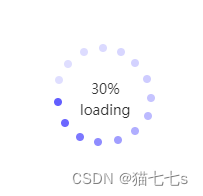
这段代码是一个 Vue 组件,用于显示一个加载动画。下面是代码的主要功能和结构的解释:
模板部分
这部分定义了加载动画的 HTML 结构:
- 使用
v-if="isLoading"指令,只有当isLoading为true时,才会显示加载动画。 - 加载动画由多个圆形元素 (
.circle) 组成,这些圆形元素通过v-for循环生成,每个圆形元素都有一个唯一的key。 - 还有一个文本区域 (
.text),显示加载百分比 (percentage) 和文本 "loading"。
脚本部分
这部分定义了组件的逻辑:
- 引入
ref,onMounted, 和defineEmits从 Vue。 - 定义了一个事件发射器
emit,用于在加载完成时发出completedLoading事件。 - 定义了两个响应式变量
isLoading和percentage,分别用来控制加载动画的显示和记录加载进度。 - 在组件挂载后 (
onMounted),设置一个定时器,每隔 500 毫秒增加percentage的值,直到达到或超过 100%,然后清除定时器,并调用completedLoading函数。 completedLoading函数触发一个自定义事件changeIsLoading,并将false作为参数传递,这通常用于通知父组件加载已完成。
样式部分
这部分定义了加载动画的样式:
- 使用 SCSS 语法,为加载动画添加样式,包括定位、尺寸、颜色、动画效果等。
- 定义了一个关键帧动画
loaded,使圆形元素有淡入淡出的效果。 - 每个圆形元素都有不同的位置和动画延迟,创建了一个连续的加载效果。
总结来说,这个组件在加载过程中展示一个动态的圆形加载动画,并在加载进度达到 100% 时,通过自定义事件通知父组件加载已完成。
效果图:
第二种 loading图
<template>
  <div class="spinner">
    <div class="spinner-container container1">
      <div class="circle1"></div>
      <div class="circle2"></div>
      <div class="circle3"></div>
      <div class="circle4"></div>
    </div>
    <div class="spinner-container container2">
      <div class="circle1"></div>
      <div class="circle2"></div>
      <div class="circle3"></div>
      <div class="circle4"></div>
    </div>
    <div class="spinner-container container3">
      <div class="circle1"></div>
      <div class="circle2"></div>
      <div class="circle3"></div>
      <div class="circle4"></div>
    </div>
  </div>
</template>

<script setup>
import { onMounted } from 'vue'
onMounted(() => {})
</script>

<style lang="scss" scoped>
.spinner {
  width: 20px;
  height: 20px;
  margin-top: 6px;
  position: relative;
}

.container1 > div,
.container2 > div,
.container3 > div {
  width: 6px;
  height: 6px;
  background: #605bff;
  border-radius: 100%;
  position: absolute;
  -webkit-animation: bouncedelay 1.2s infinite ease-in-out;
  animation: bouncedelay 1.2s infinite ease-in-out;
  -webkit-animation-fill-mode: both;
  animation-fill-mode: both;
}

.spinner .spinner-container {
  position: absolute;
  width: 100%;
  height: 100%;
}

.container2 {
  -webkit-transform: rotateZ(45deg);
  transform: rotateZ(45deg);
}

.container3 {
  -webkit-transform: rotateZ(90deg);
  transform: rotateZ(90deg);
}

.circle1 {
  top: 0;
  left: 0;
}
.circle2 {
  top: 0;
  right: 0;
}
.circle3 {
  right: 0;
  bottom: 0;
}
.circle4 {
  left: 0;
  bottom: 0;
}

.container2 .circle1 {
  -webkit-animation-delay: -1.1s;
  animation-delay: -1.1s;
}

.container3 .circle1 {
  -webkit-animation-delay: -1s;
  animation-delay: -1s;
}

.container1 .circle2 {
  -webkit-animation-delay: -0.9s;
  animation-delay: -0.9s;
}

.container2 .circle2 {
  -webkit-animation-delay: -0.8s;
  animation-delay: -0.8s;
}

.container3 .circle2 {
  -webkit-animation-delay: -0.7s;
  animation-delay: -0.7s;
}

.container1 .circle3 {
  -webkit-animation-delay: -0.6s;
  animation-delay: -0.6s;
}

.container2 .circle3 {
  -webkit-animation-delay: -0.5s;
  animation-delay: -0.5s;
}

.container3 .circle3 {
  -webkit-animation-delay: -0.4s;
  animation-delay: -0.4s;
}

.container1 .circle4 {
  -webkit-animation-delay: -0.3s;
  animation-delay: -0.3s;
}

.container2 .circle4 {
  -webkit-animation-delay: -0.2s;
  animation-delay: -0.2s;
}

.container3 .circle4 {
  -webkit-animation-delay: -0.1s;
  animation-delay: -0.1s;
}

@-webkit-keyframes bouncedelay {
  0%,
  80%,
  100% {
    -webkit-transform: scale(0);
  }
  40% {
    -webkit-transform: scale(1);
  }
}

@keyframes bouncedelay {
  0%,
  80%,
  100% {
    transform: scale(0);
    -webkit-transform: scale(0);
  }
  40% {
    transform: scale(1);
    -webkit-transform: scale(1);
  }
}
</style>
这段代码是一个 Vue 组件,用于显示一个旋转的加载动画(通常称为 spinner)。下面是代码的主要功能和结构的解释:
模板部分
这部分定义了加载动画的 HTML 结构:
- 外层
div类名为spinner,作为动画的容器。 - 内部有三个
div类名为spinner-container(分别为container1、container2、container3),每个容器内包含四个圆形元素 (circle1、circle2、circle3、circle4)。
脚本部分
这部分定义了组件的逻辑:
- 引入
onMounted从 Vue。 onMounted生命周期钩子目前为空,但可用于执行组件挂载后的初始化操作。
样式部分
这部分定义了加载动画的样式:
- 使用 SCSS 语法,为加载动画添加样式,包括尺寸、边距、背景色、圆角、定位等。
- 定义了三个容器,每个容器通过不同的旋转角度 (
rotateZ) 来实现整体的旋转效果。 - 每个圆形元素都有动画效果,通过
bouncedelay关键帧动画实现缩放效果,模拟弹跳。 - 动画延迟 (
animation-delay) 不同,使得圆形元素在不同时间开始动画,创造出连续的动态效果。
总结来说,这个组件展示了一个由多个圆形元素组成的旋转加载动画,每个圆形元素都有缩放动画,整体效果看起来像是圆形元素在不断跳动。
效果图:
第三种这种是最常用的一个loading图
一、template部分
<div class="loading-spinner"></div>二、css部分
//加载动画
.loading-spinner {
  border: 3px solid #d9d9d9;
  border-radius: 50%;
  width: 22px;
  height: 22px;
  position: relative;
  border-top: 3px solid #605bff;
  border-right: 3px solid #605bff;
  animation: spin 1s linear infinite;
}

@keyframes spin {
  25% {
    transform: rotate(90deg);
  }
  75% {
    border-bottom: 3px solid #605bff;
    // border-left: 3px solid #605BFF;
    transform: rotate(270deg);
  }
  100% {
    transform: rotate(360deg);
  }
}
效果图:


 2438
2438


 被折叠的 条评论
为什么被折叠?
被折叠的 条评论
为什么被折叠?
 到【灌水乐园】发言


