


作者:路遥马亡 R语言中文社区专栏作者
知乎ID:
https://zhuanlan.zhihu.com/c_135409797
00
布局参数
先介绍一个布局参数:
#par(mfrow=c(a,b))
#表示在PLOTS区域显示a行b列张图
par(mfrow=c(3,1))
x <- rnorm(100)
y <- rnorm(100)
plot(x, y, xlim=c(-5,5), ylim=c(-5,5))
boxplot(x, y, xlim=c(-5,5), ylim=c(-5,5))
hist(x)
01
VIOLIN PLOT(小提琴图)
下面进入正题,第一个要讲解的是VIOLIN PLOT,中文名为小提琴图。
它用于可视化数值型变量,与箱线图十分类似,但加入了密度分布这个属性,更能够显示数据的数据的数字特征。
# Library
library(ggplot2)

# mtcars data
head(mtcars)

# First type of color
ggplot(mtcars, aes(factor(cyl), mpg)) +
  geom_violin(aes(fill = cyl))

# Second type
ggplot(mtcars, aes(factor(cyl), mpg)) +
  geom_violin(aes(fill = factor(cyl)))
02
DENSITY PLOT(核密度图)
第二个分享的是DENSITY PLOT,中文名为核密度图,与直方图类似,但是可以在图中反映多组数据的分布情况:
# For the weatherAUS dataset.
library(rattle)

# To generate a density plot.
library(ggplot2) ,
cities <- c("Canberra", "Darwin", "Melbourne", "Sydney")
ds <- subset(weatherAUS, Location %in% cities & ! is.na(Temp3pm))
#subset函数和select函数类似,%in%表示是否包含
p <- ggplot(ds, aes(Temp3pm, colour=Location, fill=Location))
#color表示线的颜色,fill表示区域填充色,可以用具体的颜色参数,也可以用x变量,让系统自动生成颜色
p <- p + geom_density(alpha=0.55)
#alpha表示透明度
p
# plot 1: Density of price for each type of cut of the diamond:
ggplot(data=diamonds,aes(x=price, group=cut, fill=cut)) +
  geom_density(adjust=1.5)
#adjust起到了调节曲线拟合程度的一个作用,默认参数为1

# plot 2: 归一化后的叠加图:
ggplot(data=diamonds,aes(x=price, group=cut, fill=cut)) +
    geom_density(adjust=1.5, position="fill")
# plot 3
ggplot(diamonds, aes(x=depth, y=..density..)) +
  geom_density(aes(fill=cut), position="stack") +
  xlim(50,75) +
  theme(legend.position="none")#去掉图例
03
geom_boxplot()
第三个跟大家分享的是箱线图,geom_boxplot(),可以清晰地表现数据的极大值和极小值以及中位数:
library(ggplot2)
head(mtcars)
# A really basic boxplot.
ggplot(mtcars, aes(x=as.factor(cyl), y=mpg)) +
geom_boxplot(fill="slateblue", alpha=0.2) +
xlab("cyl")+
ylab("mpg")
# Set a unique color with fill, colour, and alpha
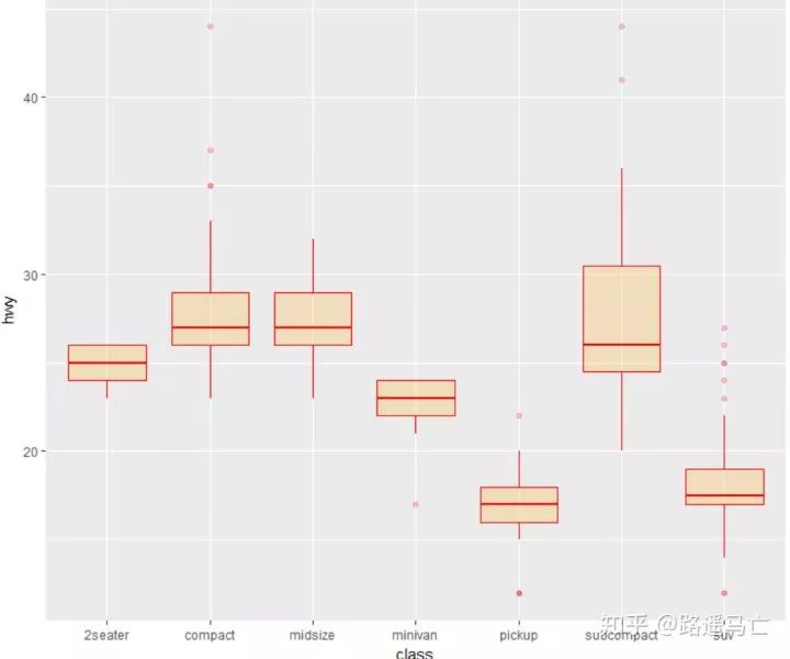
ggplot(mpg, aes(x=class, y=hwy)) +
geom_boxplot(color="red", fill="orange", alpha=0.2)
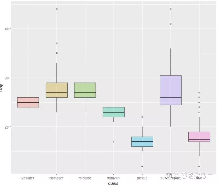
# Set a different color for each group
ggplot(mpg, aes(x=class, y=hwy, fill=class)) +
geom_boxplot(alpha=0.3) +
theme(legend.position="none")
#配合scale_fill_brewer()使用,方便调颜色
library(RColorBrewer)
display.brewer.all()
ggplot(mpg, aes(x=class, y=hwy, fill=class)) +
   geom_boxplot(alpha=0.3) +
   theme(legend.position="none") +
  scale_fill_brewer(palette="BuPu")
ggplot(mpg, aes(x=class, y=hwy, fill=class)) +
   geom_boxplot(alpha=0.3) +
   theme(legend.position="none") +
  scale_fill_brewer(palette="Dark2")
如果你想单独强调某一组数据或者某几组数据:
# Create a new column, telling if you want to highlight or not
mpg$type=factor(ifelse(mpg$class=="subcompact","Highlighted","Normal"))

# control appearance of groups 1 and 2
ggplot(mpg, aes(x=factor(class), y=hwy, fill=type, alpha=type)) +
  geom_boxplot() +
  #手动设置透明度,取决于你赋值给fill的变量个数
  scale_alpha_manual(values=c(0.1,1)) +
  #手动设置颜色,取决与你赋值给fill的变量个数
  scale_fill_manual(values=c("forestgreen","red"))
有时候我们也需要通过调整一些参数,使一些极端值更加清晰地展现出来:
ggplot(mpg, aes(x=class, y=hwy)) +
   geom_boxplot(
     # custom boxes
     color="blue",
     fill="blue",
     alpha=0.2,

     # Notch?
     notch=TRUE,
     notchwidth = 0.8,

     # custom outliers
     outlier.colour="red",
     outlier.fill="red",
     outlier.size=3
   )
04
构造词云
第四个分享的是如何用R语言构造词云:
library(wordcloud2)
wordcloud2(demoFreq,size=0.8,color=rep_len(c("blue","yellow"),nrow(demoFreq)),backgroundColor = "pink",shape="star")
词的角度也可以更改:
#minRontatin与maxRontatin:字体旋转角度范围的最小值以及最大值,选定后,字体会在该范围内随机旋转;
#rotationRation:字体旋转比例,如设定为1,则全部词语都会发生旋转;

wordcloud2(demoFreq,size=0.8,color=rep_len(c("blue","yellow"),nrow(demoFreq)),backgroundColor = "pink",minRotation = -pi/6, maxRotation = -pi/6, = 1) 以上只是简单的讲解下词云构造,关于更详细的可以看这篇:如何用R语言做词云图,以某部网络小说为例
05
直方图
第五个讲讲直方图的画法,只需要输入一个数值型变量:
library(ggplot2)
data<-data.frame(rnorm(1000))


ggplot(data,aes(data))+
  geom_histogram(aes(fill=..count..),binwidth = 0.1)
#..count..表示根据计数表示颜色变化
我们也可以自己设置不同的主题的背景:
# library
library(ggplot2)


# create data
set.seed(123)
var=rnorm(1000)

# Without theme
plot1 <- qplot(var , fill=I(rgb(0.1,0.2,0.4,0.6)) )

# With themes
plot2 = plot1+theme_bw()+annotate("text", x = -1.9, y = 75, label = "bw()" , col="orange" , size=4)
plot3 = plot1+theme_classic()+annotate("text", x = -1.9, y = 75, label = "classic()" , col="orange" , size=4)
plot4 = plot1+theme_gray()+annotate("text", x = -1.9, y = 75, label = "gray()" , col="orange" , size=4)
plot5 = plot1+theme_linedraw()+annotate("text", x = -1.9, y = 75, label = "linedraw()" , col="orange" , size=4)
plot6 = plot1+theme_dark()+annotate("text", x = -1.9, y = 75, label = "dark()" , col="orange" , size=4)
plot7 = plot1+theme_get()+annotate("text", x = -1.9, y = 75, label = "get()" , col="orange" , size=4)
plot8 = plot1+theme_minimal()+annotate("text", x = -1.9, y = 75, label = "minimal()" , col="orange" , size=4)

 #annotate 做注释作用
# Arrange and display the plots into a 2x1 grid
grid.arrange(plot1,plot2,plot3,plot4, ncol=2)
grid.arrange(plot5,plot6,plot7,plot8, ncol=2)

06
散点图
第六个讲讲一个非常简单实用的图——散点图。
先看看最简单的,不加任何修饰的画法:
# library
library(ggplot2)

# The iris dataset is proposed by R
head(iris)

# basic scatterplot
ggplot(iris, aes(x=Sepal.Length, y=Sepal.Width)) +
   geom_point()
   # use options!
#注意stroke表示散点外线的粗细
ggplot(iris, aes(x=Sepal.Length, y=Sepal.Width)) +
  geom_point(
    color="red",
    fill="blue",
    shape=21,
    alpha=0.5,
    size=6,
    stroke = 2
  )
#用shape和fill参数,把不同类别的length和width区分开来。
ggplot(iris, aes(x=Sepal.Length, y=Sepal.Width, color=Species, shape=Species)) +
  geom_point(size=6, alpha=0.6)

#此处并不能理解为什么color又负责填充色了,fill加了之后反而没有用。先死记吧。
ggplot(iris, aes(x=Sepal.Length, y=Sepal.Width, color=Petal.Length, size=Petal.Length)) +
   geom_point(alpha=0.6)
也可以通过一些函数给散点添加标签:
data=head(mtcars, 30)
#nudge_x,nudge_y分别表示标签距离散点距离,check_overlap表示标签出现覆盖,是否去掉被覆盖的那个标签。
# 1/ add text with geom_text, use nudge to nudge the text
ggplot(data, aes(x=wt, y=mpg)) +
  geom_point() +
  geom_text(label=rownames(data), nudge_x = 0.25, nudge_y = 0.25, check_overlap = T)
ggplot(data, aes(x=wt, y=mpg)) +
  geom_point() +
  geom_label(label=rownames(data), nudge_x = 0.25, nudge_y = 0.2)

# 3/ custom geom_label like any other geom.
ggplot(data, aes(x=wt, y=mpg, fill=cyl)) +
  geom_label(label=rownames(data),color="white", size=5)
散点图是两个变量的值沿着两个轴绘制的图,所得到的点的模式揭示了存在的任何相关性。你可以很容易地在X轴和Y轴上添加rug,来说明点的分布:
ggplot(data=iris, aes(x=Sepal.Length, Petal.Length)) +
  geom_point() +
  geom_rug(col="skyblue",alpha=0.1, size=1.5)
当然,也可以通过增加折线图,直方图,箱线图来表示数据分布情况:
# library
library(ggplot2)
library(ggExtra)
library(gridExtra)

# The mtcars dataset is proposed in R
head(mtcars)

# classic plot :
p=ggplot(mtcars, aes(x=wt, y=mpg, color=cyl, size=cyl)) +
  geom_point() +
  theme(legend.position="none")

# with marginal histogram
a=ggMarginal(p, type="histogram")

# marginal density
b=ggMarginal(p, type="density")

# marginal boxplot
c=ggMarginal(p, type="boxplot")

grid.arrange(p,a,b,c,ncol=2)
最后讲讲线性拟合:
library(ggployt2)
data<-data.frame(rep(c("a","b"),50),my_x=1:100+rnorm(100,sd=9),my_y=1:100+rnorm(100,sd=16))
ggplot(data,aes(my_x,my_y)+geom(shape=1)

ggplot(data,aes(my_x,my_y)+geom(shape=1)+geom_smooth(method=lm,color="red",se=T)
07
热力图
最后分享一下热力图的画法:
# Lattice package
require(lattice)

#The lattice package provides a dataset named volcano. It's a square matrix looking like that :
head(volcano)

# The use of levelplot is really easy then :
levelplot(volcano)

#注意输入数据为矩阵,行列表示坐标,数值表示显色深浅。
## Example data
x <- seq(1,10, length.out=20)
y <- seq(1,10, length.out=20)
data <- expand.grid(X=x, Y=y)#expnad.grid 用于生成表格式的数据框,对应每个y,都会把所有的x都重复一遍
data$Z <- runif(400, 0, 5)


# Levelplot with ggplot2
library(ggplot2)
ggplot(data, aes(X, Y, z= Z)) + geom_tile(aes(fill = Z)) + theme_bw()

# To change the color of the gradation :
ggplot(data, aes(X, Y, z= Z)) + geom_tile(aes(fill = Z)) +
  theme_bw() +
  scale_fill_gradient(low="white", high="red") #自定义颜色深浅的种类
- END -
小编语:
本篇是根据作者在知乎分享的R语言数据可视化周计划的内容整理而来。最后祝大家圣诞节快乐!


公众号后台回复关键字即可学习
回复 爬虫 爬虫三大案例实战
回复 Python 1小时破冰入门回复 数据挖掘 R语言入门及数据挖掘
回复 人工智能 三个月入门人工智能
回复 数据分析师 数据分析师成长之路
回复 机器学习 机器学习的商业应用
回复 数据科学 数据科学实战
回复 常用算法 常用数据挖掘算法


 529
529

 被折叠的 条评论
为什么被折叠?
被折叠的 条评论
为什么被折叠?
 到【灌水乐园】发言


