


Part 1 :散点图+变量边缘分布图形
公众号原文点我,感谢支持
许多文章的散点图中,在散点图的周围还会有额外的单变量边缘分布统计图形(如下图)。前面几期我们介绍过,散点图主要反映的是两个变量之间的关系,而额外的边缘分布图则能直观反映每个变量的分布情况。本期就来介绍实现这类图形的常见方法。
示例:
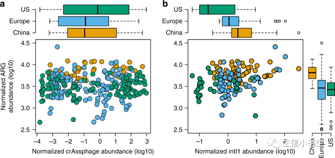
Abundance of antibiotic resistance genes, intI1 gene and crAssphage in human fecal metagenomes.
[1]示例图中散点图的做法参见一起学画图:散点图(1)— 基础散点图 — R-ggplot2复现Nature文章散点图
Part 2 :图像与代码
方法一:ggExtra::ggMarginal() :在ggplot2散点图基础上快速添加
ggExtra包可以通过常规的install.packages(“ggExtra”)语句安装,相关参数见下:
ggMarginal (p, data, x, y,
  type = c("density", "histogram", "boxplot", "violin", "densigram"),
  margins = c("both", "x", "y"), size = 5,
  ..., xparams = list(), yparams = list(),
  groupColour = FALSE,
  groupFill = FALSE)
| 参数 | 作用 |
|---|---|
| p | ggplot2绘制的图像对象 |
| data | 如果没有传入p的话,则可以使用此参数传入数据 |
| x | 如果没有传入p的话,指定在data中用作x轴的数据 |
| y | 如果没有传入p的话,指定在data中用作y轴的数据 |
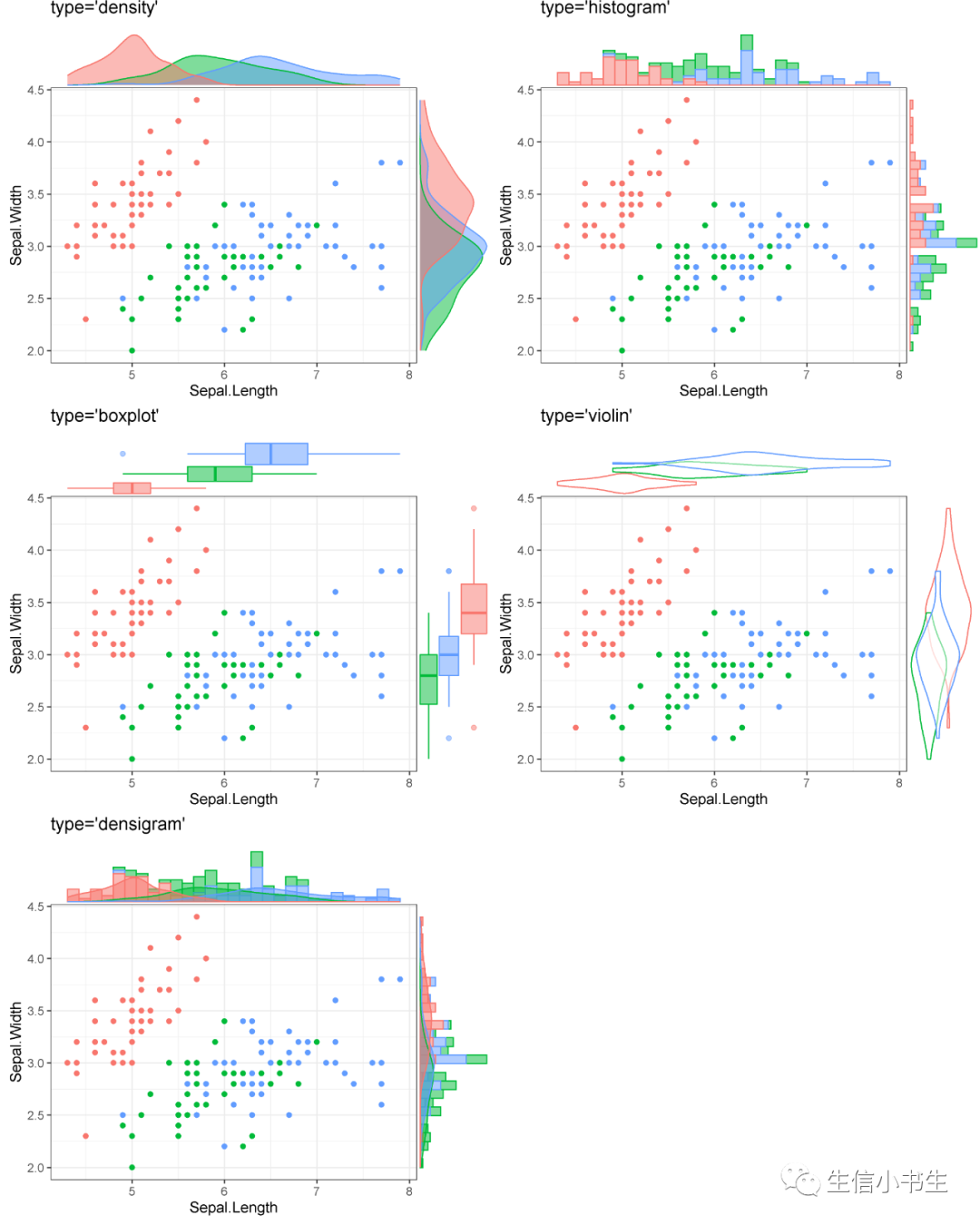
| type | 边缘分布图形类型:密度图density、直方图histogram、箱型图boxplot、小提琴图violin、密度直方图densigram |
| margins | 指定添加哪个变量的分布图形:both/x/y,默认both |
| size | 散点图 : 边缘图的比例。size=1即表示边缘分布图和主散点图一样大 |
| fill | 指定边缘分布图形的填充颜色 |
| color | 指定边缘分布图形的边界线条颜色 |
| xparams | 指定x轴的分布图型的颜色 |
| yparams | 指定y轴的分布图型的颜色 |
| groupFill | 分布图的填充颜色按组别指定 |
| groupColour | 分布图的边界线条颜色按组别指定 |
基础使用示例
#导入包
library(ggplot2)
library(ggExtra)
#常规使用ggplot2作图
p <- ggplot(`iris`, aes_string('Sepal.Length', 'Sepal.Width')) +
aes_string(colour = 'Species') +
geom_point() +
theme_bw()+
theme(legend.position = "bottom")
#使用ggMarginal添加边缘分布图形,ggplot2绘制的图p作为变量传入(如果没有使用ggplot2绘制图形,则此处也可以自行传入数据绘制)
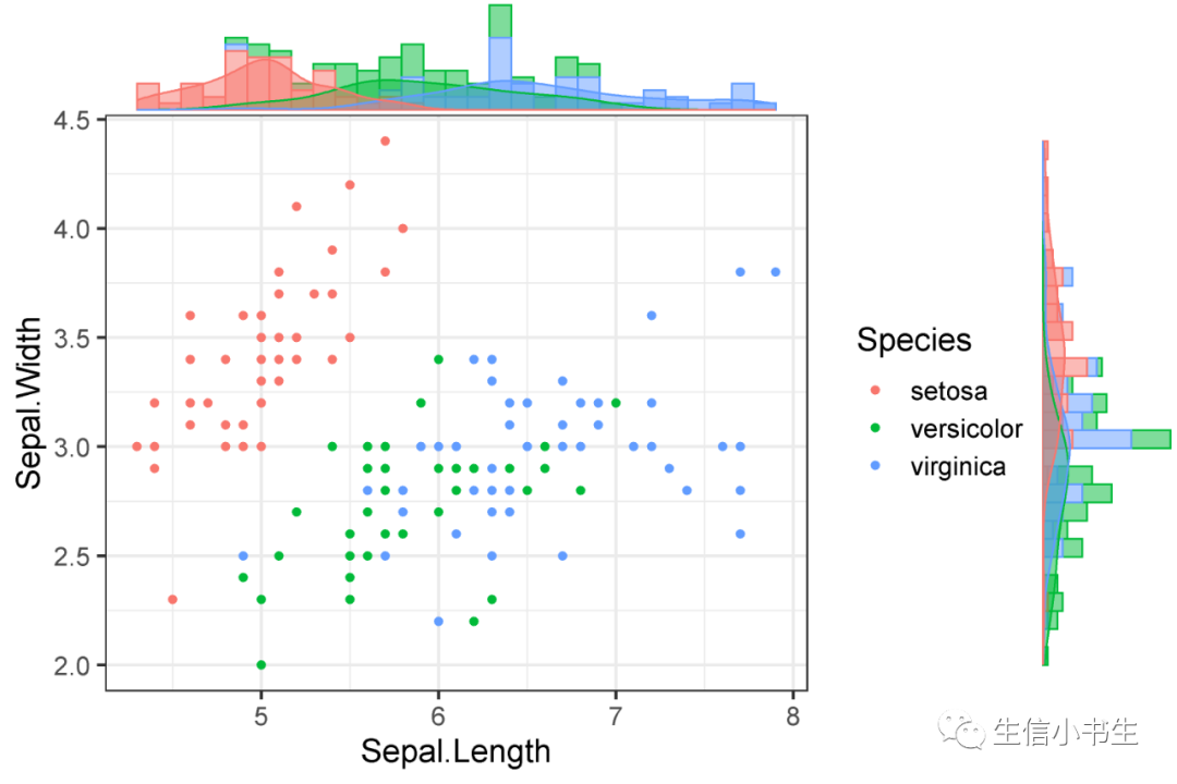
p1 <- ggMarginal(p+ggtitle("type='histogram'"), type="histogram")
p1
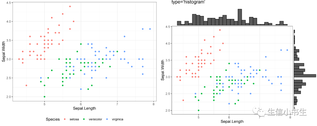
参数表中提出到的5种不同的统计图形示例如下:
在此基础上,我们可以通过调整相关参数优化图形。幸运的是,该包的作者团队同时也开发了支持实时制作并可导出R代码的网页版工具:https://daattali.com/shiny/ggExtra-ggMarginal-demo/
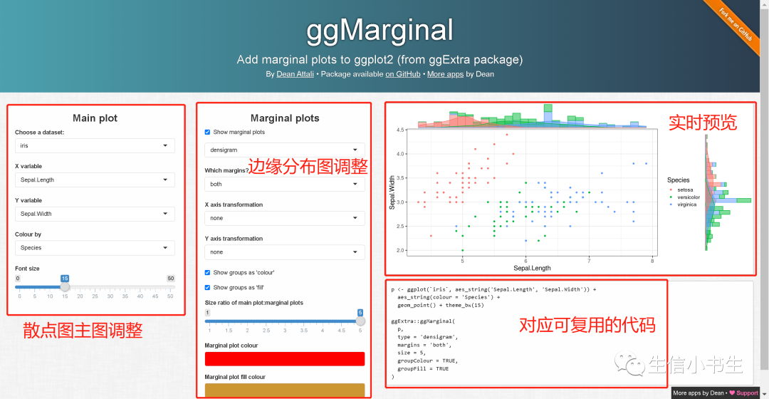
这样一来我们可以预先在网页上调整好所需要的样式,然后利用生成的R代码在本地生成所需格式和尺寸的图像
使用上图网页工具自动生成的代码在本地运行得到的结果如下:
方法二:ggPubr::ggscatterhist( )
ggPubr是一个基于ggplot2开发的面向出版级绘图的R包,ggscatterhist()中的参数 margin.* 可以为散点图进一步配置边缘分布统计图形,其语法与ggplot2类似,目前支持:密度图density,直方图histogram,箱型图boxplot三种边缘分布图形相关参数及作用见官方文档:http://rpkgs.datanovia.com/ggpubr/reference/ggscatterhist.html
# 函数声明
ggscatterhist(data, x, y, group = NULL, color = "black", fill = NA,
  palette = NULL, shape = 19, size = 2, linetype = "solid",
  bins = 30, margin.plot = c("density", "histogram", "boxplot"),
  margin.params = list(), margin.ggtheme = theme_void(), margin.space = FALSE,
  main.plot.size = 2, margin.plot.size = 1, title = NULL,
  xlab = NULL, ylab = NULL, legend = "top", ggtheme = theme_pubr(),
  print = TRUE, ...)
基础示例:
#导入包
library(ggpubr)
#作图
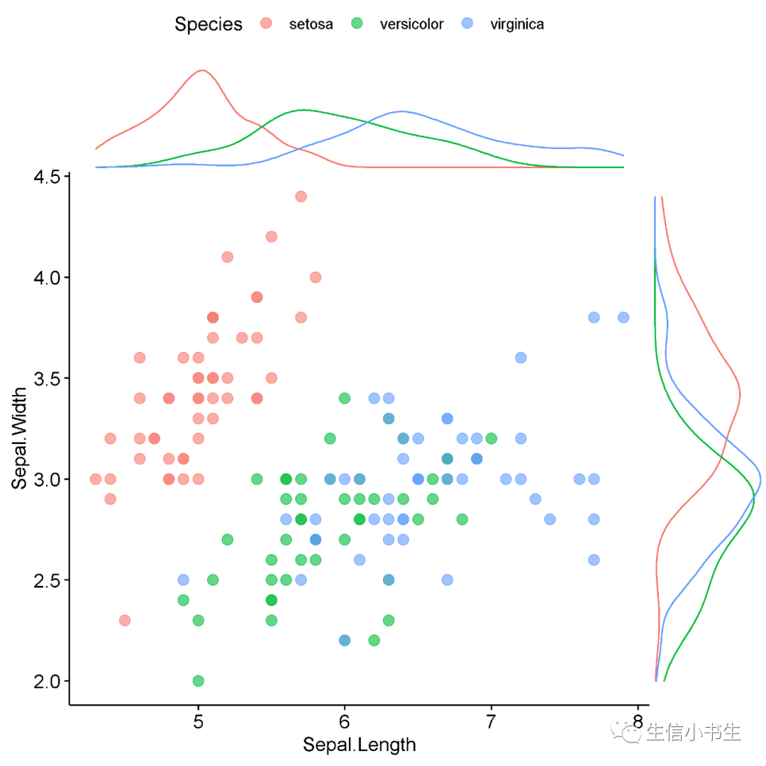
gp1<-ggscatterhist(
iris, x = "Sepal.Length", y = "Sepal.Width",
color = "Species", size = 3, alpha = 0.6)
gp1
在此基础上,可以对参数进行调整来绘制更为符合需求的图片
#导入包
library(ggpubr)
#作图
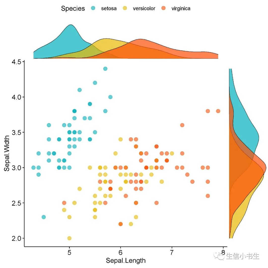
gpDensity <- ggscatterhist(
iris, x = "Sepal.Length", y = "Sepal.Width",
color = "Species", size = 3, alpha = 0.6,
palette = c("#00AFBB", "#E7B800", "#FC4E07"),
margin.params = list(fill = "Species", color = "black", size = 0.3)
)
gp1p
# 此图并没有指定margin.plot = "density",只是在上图gp1的基础行进行了填充
# 实际上,如果指定margin.plot = "density" 得到的图形是一样的
#导入包
library(ggpubr)
#作图
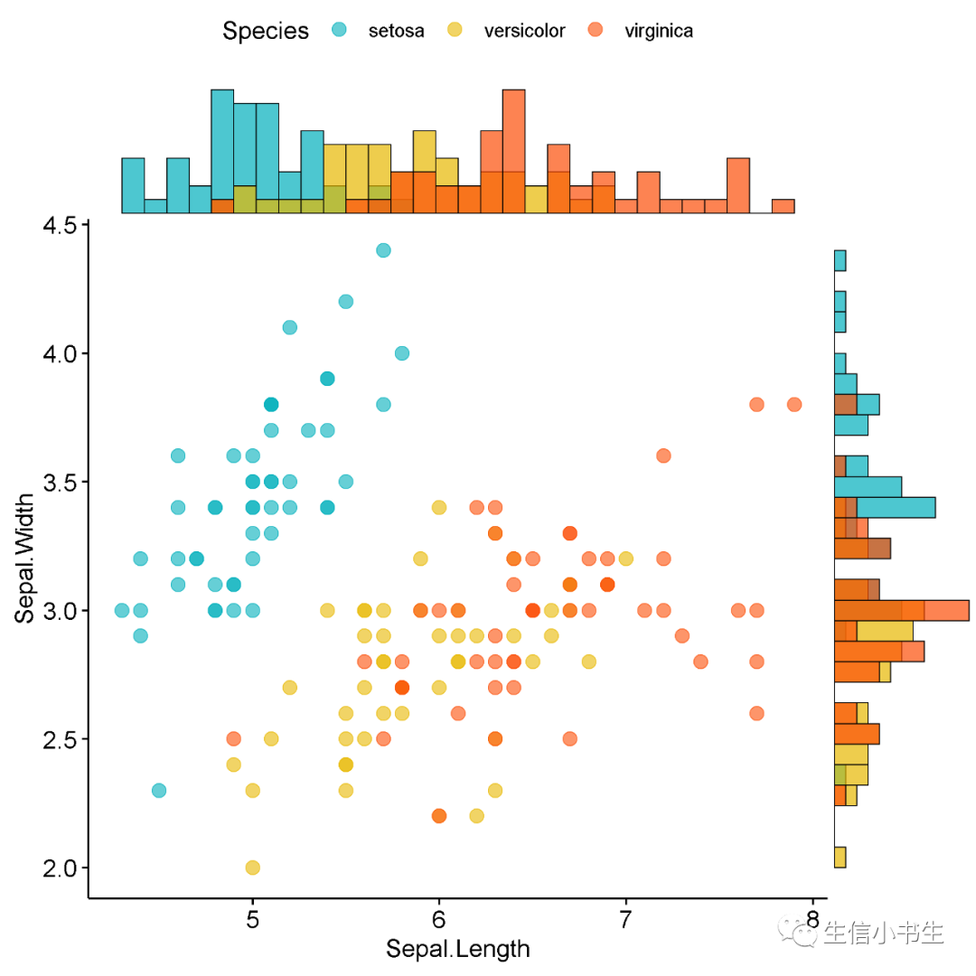
gp4 <- ggscatterhist(
iris, x = "Sepal.Length", y = "Sepal.Width",
color = "Species", size = 3, alpha = 0.6,
palette = c("#00AFBB", "#E7B800", "#FC4E07"),
margin.plot = "histogram", #指定类型为histogram
margin.params = list(fill = "Species", color = "black", size = 0.3))
gp4
方法三:分别作图最后利用grid.arrange()进行拼接
文中Part 1的示例图像应该就是用此方法组合而成的,此方法不作更多介绍,感兴趣的朋友可以参考使用grid.arrange()排列图形的方法:https://cran.rproject.org/web/packages/egg/vignettes/Ecosystem.html
Part 3 :地毯图
以上我们介绍了在散点图周围添加单变量边缘分布统计图的方法,边缘分布图的目的是直观反映单变量的分布情况,而地毯图也可以达到类似的目的 相关参数及作用以及更高级的用法可参考官方文档:https://ggplot2.tidyverse.org/reference/geom_rug.html
geom_rug(
  mapping = NULL,
  data = NULL,
  stat = "identity",
  position = "identity",
  ...,
  outside = FALSE,
  sides = "bl",
  length = unit(0.03, "npc"),
  na.rm = FALSE,
  show.legend = NA,
  inherit.aes = TRUE
)
示例图像:
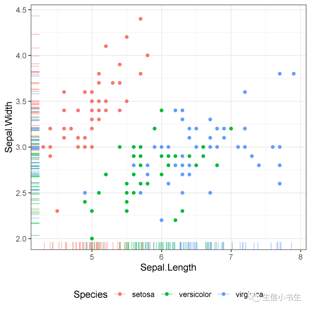
#导入包
library(ggplot2)
#常规使用ggplot2作图
prug <- ggplot(`iris`, aes_string('Sepal.Length', 'Sepal.Width')) +
  aes_string(colour = 'Species') +
  geom_point() +
  theme_bw()+
  theme(legend.position = "bottom")+
  geom_rug(alpha = 0.5, position = "jitter")
prug
参考:
-
[1] Karkman A, Pärnänen K, Larsson DGJ. Fecal pollution can explain antibiotic resistance gene abundances in anthropogenically impacted environments. Nat Commun. 2019 Jan 8;10(1):80. doi: 10.1038/s41467-018-07992-3. PMID: 30622259; PMCID: PMC6325112.
-
https://github.com/daattali/ggExtra
-
https://daattali.com/shiny/ggExtra-ggMarginal-demo/
-
http://rpkgs.datanovia.com/ggpubr/index.html
-
http://rpkgs.datanovia.com/ggpubr/reference/ggscatterhist.html
-
https://cran.rproject.org/web/packages/egg/vignettes/Ecosystem.html


 1905
1905


 被折叠的 条评论
为什么被折叠?
被折叠的 条评论
为什么被折叠?
 到【灌水乐园】发言


