


一、描述
Popup 是弹出式界面控件的基本类型。它可以与 Window 或 ApplicationWindow 一起使用。
import QtQuick.Window
import QtQuick.Controls

ApplicationWindow {
    id: window
    width: 400
    height: 400
    visible: true

    Button {
        text: "Open"
        onClicked: popup.open()
    }

    Popup {
        id: popup
        x: 100
        y: 100
        width: 200
        height: 300
        modal: true
        focus: true
        closePolicy: Popup.CloseOnEscape | Popup.CloseOnPressOutsideParent
    }
}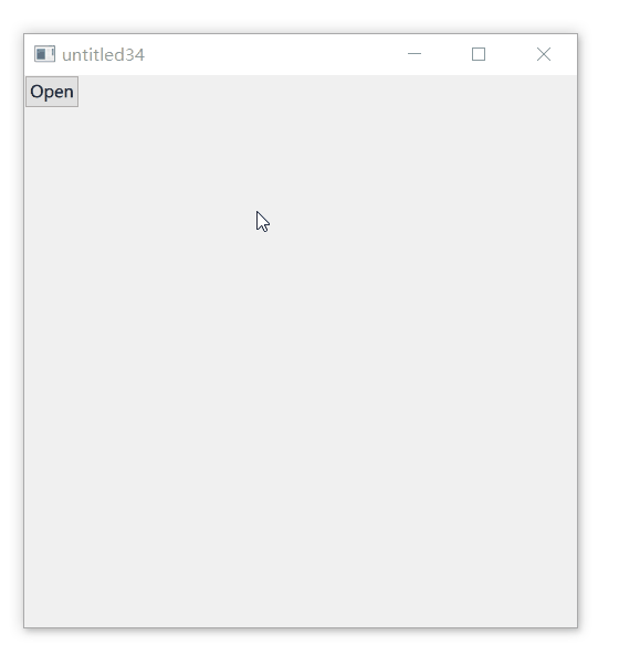
为了确保弹出窗口显示在场景中其他项目的上方,建议使用 ApplicationWindow。ApplicationWindow 还提供背景调光效果,如上图,弹出后窗口颜色变了。
Popup 不提供自己的布局,需要用户定位其内容,例如通过创建 RowLayout 或 ColumnLayout。
声明为 Popup 的子项的项自动成为 Popup 的 contentItem 的父项。动态创建的项目需要明确地作为 contentItem 的父级。
1.1、Popup 布局
下图说明了窗口中 Popup 的布局:
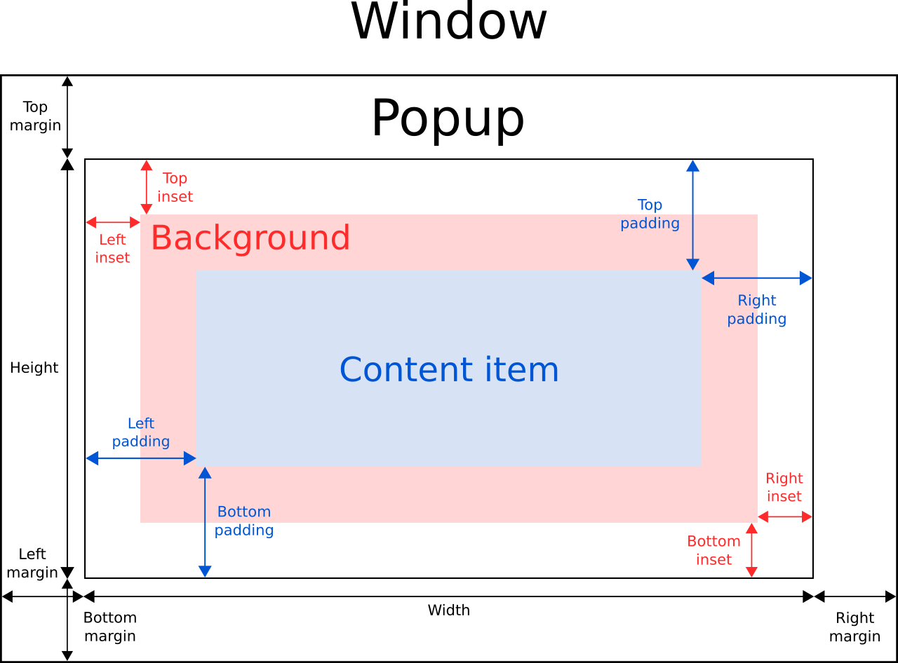
Popup 的 implicitWidth 和 implicitHeight 通常基于 background 和 contentItem 的隐式大小以及 insets 插入和 paddings。这些属性决定了在没有明确指定 width 或 height 时 Popup 的大小。
contentItem 的几何形状由 padding 确定。在 Popup 的边界与其内容之间保留 10 像素的填充:
Popup {
    padding: 10

    contentItem: Text {
        text: "Content"
    }
}
background 填充 Popup 的整个宽度和高度,除非已为其指定了 insets 或明确的大小。
负 insets 可用于使背景大于 Popup 。 以下示例使用负 insets 在 Popup 边界之外放置阴影:
Popup {
    topInset: -2
    leftInset: -2
    rightInset: -6
    bottomInset: -6

    background: BorderImage {
        source: ":/images/shadowed-background.png"
    }
}
1.2、Popup 大小
如果在 Popup 中仅使用单个项目,它将调整大小以适应其包含项目的隐式大小。这使得它特别适合与布局一起使用。
Popup {
    ColumnLayout {
        anchors.fill: parent
        CheckBox { text: qsTr("E-mail") }
        CheckBox { text: qsTr("Calendar") }
        CheckBox { text: qsTr("Contacts") }
    }
}
有时 Popup 中可能有两个项目:
Popup {
    SwipeView {
        // ...
    }
    PageIndicator {
        anchors.horizontalCenter: parent.horizontalCenter
        anchors.bottom: parent.bottom
    }
}在这种情况下,Popup 无法计算出合理的隐式大小。可以将 PageIndicator 锚定在 SwipeView 上,可以简单地将内容大小设置为视图的隐式大小:
Popup {
    contentWidth: view.implicitWidth
    contentHeight: view.implicitHeight

    SwipeView {
        id: view
        // ...
    }
    PageIndicator {
        anchors.horizontalCenter: parent.horizontalCenter
        anchors.bottom: parent.bottom
    }
 }
1.3、弹出定位
Popup 的 x 和 y 坐标是相对于其父级的。例如,打开作为 Button 子级的弹出窗口将导致弹出窗口相对于按钮定位。
以下示例使用附加的 Overlay.overlay 属性将 Popup 定位在窗口的中心:
Button {
    onClicked: popup.open()

    Popup {
        id: popup

        parent: Overlay.overlay

        x: Math.round((parent.width - width) / 2)
        y: Math.round((parent.height - height) / 2)
        width: 100
        height: 100
    }
}
另一种在窗口中居中 Popup 而不考虑其父项的方法是使用 anchors.centerIn:
ApplicationWindow {
    id: window
    // ...

    Pane {
        // ...

        Popup {
            anchors.centerIn: Overlay.overlay
        }
    }
}
为了确保 Popup 位于封闭窗口的边界内,可以将 margins 属性设置为非负值。
1.4、Popup 过渡(Transitions)
在退出转换完成后,以下属性从进入转换之前恢复为其原始值:
- opacity
- scale
这允许内置样式在这些属性上进行动画处理,而不会丢失任何明确定义的值。
1.5、Back / Escape 事件处理
默认情况下,如果按下 Escape 或 Back 键,Popup 将关闭。这对于包含想要自己处理这些事件的项目的 Popup 来说可能是有问题的。有两种解决方案:
- 将 Popup 的 closePolicy 设置为不包括 Popup.CloseOnEscape 的值。
- 处理 Keys 的 shortcutOverride 信号并在 Popup 之前接受事件。
二、属性成员
1、【只读】activeFocus : bool
是否具有活动焦点。
2、anchors.centerIn : Object
锚点。使得从组件在窗口中居中弹出一个窗口变得容易。
注意:Popup 只能在其直接父级或窗口叠加层中居中;试图以其他项目为中心会产生警告。
3、【只读】availableHeight : real
在从 Popup 的高度中扣除垂直填充(padding )后的值,即 contentItem 可用的高度。
【只读】availableWidth : real
在从 Popup 的宽度中扣除水平填充(padding )后的值,即 contentItem 可用的宽度。
4、background : Item
背景项目。
如果背景项目没有明确指定大小,它会自动跟随 Popup 的大小。在大多数情况下,不需要为背景项目指定宽度或高度。
注意:大多数 Popup 使用背景项的隐式大小来计算 Popup 本身的隐式大小。如果将背景项目替换为自定义项目,还应该考虑为其提供一个合理的隐式大小(除非它是像 Image 这样的项目,它有自己的隐式大小)。
5、bottomInset : real、leftInset : real、rightInset : real、topInset : real
见上图。
6、bottomMargin : real、leftMargin : real、rightMargin : real、topMargin : real
见上图。
margins : real
默认为 -1。
7、bottomPadding : real、leftPadding : real、rightPadding : real、topPadding : real
见上图。
padding : real
默认填充。
horizontalPadding : real / verticalPadding : real
水平 / 垂直填充。除非明确设置,否则该值等于 padding。
8、clip : bool
是否启用裁剪。默认为 false。
9、closePolicy : enumeration
此属性确定弹出窗口关闭的情况。可以组合这些标志以允许关闭弹出窗口的多种方式。
默认值为 Popup.CloseOnEscape | Popup.CloseOnPressOutside。
- Popup.NoAutoClose: Popup 只会在手动指示时关闭。
- Popup.CloseOnPressOutside:当鼠标在其外部按下时, Popup 将关闭。
- Popup.CloseOnPressOutsideParent:当鼠标在其父级之外按下时, Popup 将关闭。
- Popup.CloseOnReleaseOutside:当鼠标离开 Popup 时, Popup 将关闭。
- Popup.CloseOnReleaseOutsideParent:当鼠标在其父级之外释放时, Popup 将关闭。
- Popup.CloseOnEscape:当 Popup 具有活动焦点时按下退出键, Popup 将关闭。
注意:Popup.CloseOnReleaseOutside 和 Popup.CloseOnReleaseOutsideParent 策略仅适用于模态(modal) Popup 。
10、contentChildren : list<Item>
内容子项的列表。该列表包含已在 QML 中声明为 Popup 子项的所有项目。
与 contentData 不同,contentChildren 不包含非可视 QML 对象。
11、【default】contentData : list<Object>
内容数据列表。该列表包含已在 QML 中声明为 Popup 子项的所有对象。
与 contentChildren 不同,contentData 包含非可视 QML 对象。
12、contentHeight : real / contentWidth : real
见上图。
13、contentItem : Item
Popup 的内容项。
内容项是 Popup 的可视化实现。当 Popup 可见时,内容项将自动重新设置为覆盖项。
内容项会自动调整大小以适应 Popup 的填充。
14、dim : bool
是否使背景变暗。
除非明确设置,否则此属性遵循 modal 的值。要重设为默认值,则将此属性设为 undefined。
15、enabled : bool
是否可用。
16、enter : Transition
在 Popup 打开并进入屏幕时应用于弹出项目的转换。
以下示例在 Popup 进入屏幕时为它的不透明度设置动画:
Popup {
    enter: Transition {
        NumberAnimation { property: "opacity"; from: 0.0; to: 1.0 }
    }
}
exit : Transition
当 Popup 关闭并退出屏幕时应用于弹出项目的转换。
17、focus : bool
Popup 是否需要焦点。默认为 false。
当 Popup 实际获得焦点时,activeFocus 将为真。
18、font : font
字体。
Popup 将明确的字体属性传播给其子项。如果更改 Popup 字体的特定属性,该属性将传播到 Popup 的所有子项,覆盖该属性的任何系统默认值。
19、height : real、width : real
见上图。
20、【只读】implicitBackgroundHeight : real
隐式背景高度。等于 background ? background.implicitHeight : 0。
【只读】implicitBackgroundWidth : real
隐式背景宽度。等于 background ? background.implicitWidth : 0。
【只读】implicitContentHeight : real / 【只读】implicitContentWidth : real
隐式内容高度 / 宽度。根据 contentChildren 计算得出的。
implicitHeight : real / implicitWidth : real
Popup 的隐式高度 / 宽度。
21、locale : Locale
语言环境。
22、【只读】mirrored : bool
是否被镜像。
当 Popup 的视觉布局方向是从右到左时,它被认为是镜像的,一般是当使用从右到左的语言环境时。
23、modal : bool
是否是模态的。默认为 false。
模态 Popup 通常具有在 Overlay.modal 中定义的独特背景变暗效果,并且不允许按下或释放事件通过它们下方的项目。例如,如果用户点击了 Popup 之外,则该 Popup 下方位于点击位置的任何项目都不会收到该事件。
在桌面平台上,模态 Popup 通常仅在按下退出键时关闭。要实现此行为,将 closePolicy 设置为 Popup.CloseOnEscape。默认情况下,closePolicy 设置为 Popup.CloseOnEscape | Popup.CloseOnPressOutside,这意味着在模态 Popup 外部单击将关闭它。
24、opacity : real
不透明度。默认为 1.0。
25、opened : bool
Popup 是否完全打开。当 Popup 可见且 enter 和 exit 转换都没有运行时即认为是打开的。
26、palette : Palette
调色板。
Popup 将显式调色板属性传播给其子级。如果更改弹出窗口选项板上的特定属性,该属性将传播到弹出窗口的所有子项,覆盖该属性的任何系统默认值。
Popup {
    palette.text: "red"

    Column {
        Label {
            text: qsTr("This will use red color...")
        }

        Switch {
            text: qsTr("... and so will this")
        }
    }
}27、parent : Item
父项。
28、scale : real
比例因子。默认为 1.0。不支持负比例。
29、spacing : real
间距。
30、transformOrigin : enumeration
enter 和 exit 转换中转换的原点。
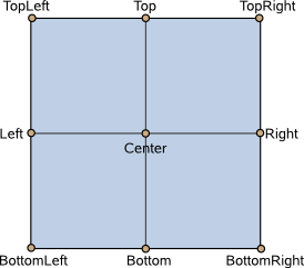
有九个变换原点可用,如下图所示。默认变换原点是 Popup.Center。
31、visible : bool
是否可见。默认为 false。
32、x、y
坐标位置。
32、z
z 值。z 值确定 Popup 的堆叠顺序。默认 z 值为 0。
如果两个可见 Popup 具有相同的 z 值,则最后打开的 Popup 将位于顶部。
三、信号成员
1、void aboutToHide()
即将隐藏时,会发出此信号。
2、void aboutToShow()
即将显示时,会发出此信号。
3、void closed()
关闭时发出此信号。
4、void opened()
打开时发出此信号。
四、成员函数
1、void close()
关闭 Popup 。
2、forceActiveFocus(enumeration reason = Qt.OtherFocusReason)
以给定的原因强制将注意力集中在 Popup 上。
此方法将焦点设置在弹出窗口上,并确保对象层次结构中的所有祖先 FocusScope 对象也获得焦点。
enum Qt::FocusReason:此枚举指定焦点更改的原因。
- Qt::MouseFocusReason:发生鼠标操作。
- Qt::TabFocusReason:Tab 键被按下。
- Qt::BacktabFocusReason:发生了 Backtab。 对此的输入可能包括 Shift 或 Control 键; 例如 Shift+Tab。
- Qt::ActiveWindowFocusReason:窗口系统使该窗口处于活动或非活动状态。
- Qt::PopupFocusReason:应用程序打开/关闭了一个抓取/释放键盘焦点的弹出窗口。
- Qt::ShortcutFocusReason:用户输入了标签的好友快捷方式
- Qt::MenuBarFocusReason:菜单栏获得焦点。
- Qt::OtherFocusReason:其他原因,通常是特定于应用程序的。
3、void open()
打开 Popup 。


 301
301


 被折叠的 条评论
为什么被折叠?
被折叠的 条评论
为什么被折叠?
 到【灌水乐园】发言


