


目录
1.hello Seaborn
import pandas as pd
pd.plotting.register_matplotlib_converters()
import matplotlib.pyplot as plt
%matplotlib inline
import seaborn as sns
print("Setup Complete")
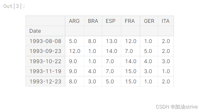
fifa_filepath 数据集的文件路径。
index_col=“Date” 我们将index_col的值设置为第一列的名称
(“Date”,在Excel中打开时在文件的单元格A1中找到)。
parse_dates=True将每行标签理解为日期
(而不是数字或其他具有不同含义的文本)。
# Path of the file to read
fifa_filepath = "../input/fifa.csv"

# Read the file into a variable fifa_data
fifa_data = pd.read_csv(fifa_filepath, index_col="Date", parse_dates=True)
Examine the data
# Print the first 5 rows of the data
fifa_data.head()
Plot the data
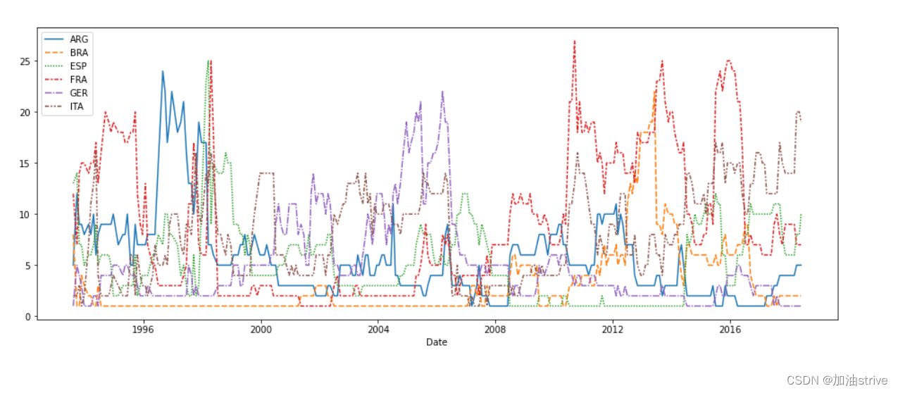
# Set the width and height of the figure
plt.figure(figsize=(16,6))

# Line chart showing how FIFA rankings evolved over time
sns.lineplot(data=fifa_data)
2.Line Charts
展示一段时间内的数据趋势
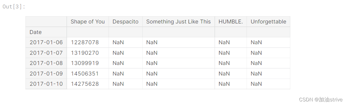
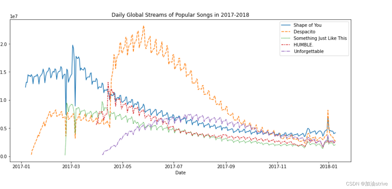
本教程的数据集跟踪音乐流服务Spotify上的全球每日流。我们专注于2017年和2018年的五首流行歌曲:


Load the data
# Path of the file to read
spotify_filepath = "../input/spotify.csv"

# Read the file into a variable spotify_data
spotify_data = pd.read_csv(spotify_filepath, index_col="Date", parse_dates=True)
Examine the data
# Print the first 5 rows of the data
spotify_data.head()
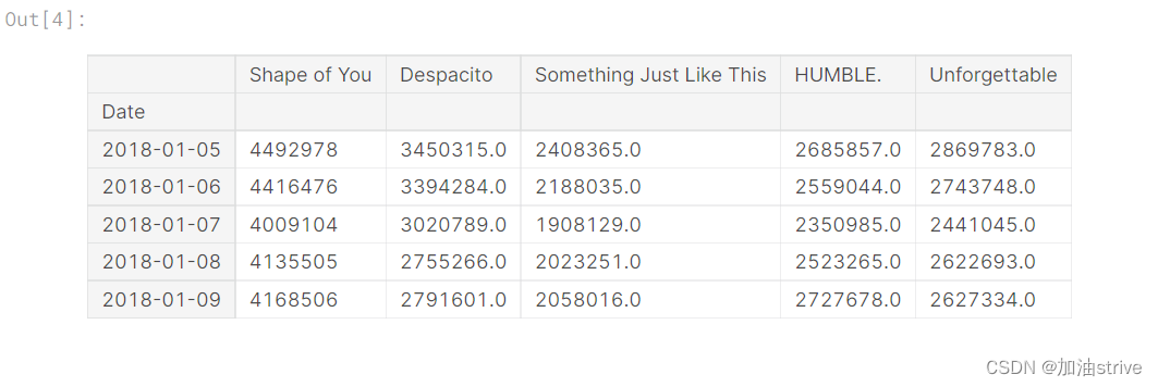
# Print the last five rows of the data
spotify_data.tail()
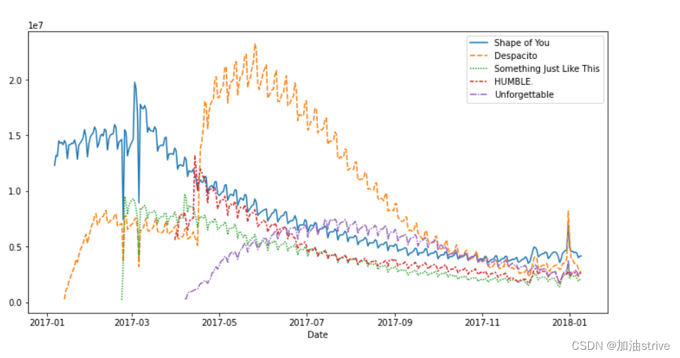
# Line chart showing daily global streams of each song
sns.lineplot(data=spotify_data)

如上所述,代码行相对较短,有两个主要部分:
sns.lineplot 创建折线图。
在本课程中学习的每个命令都将以sns开头,这表示该命令来自seaborn包。例如,我们使用sns.lineplot制作折线图。很快,您将了解到我们使用sns.barplot和sns.heatmap分别制作条形图和热图。
data=spotify_data选择将用于创建图表的数据。
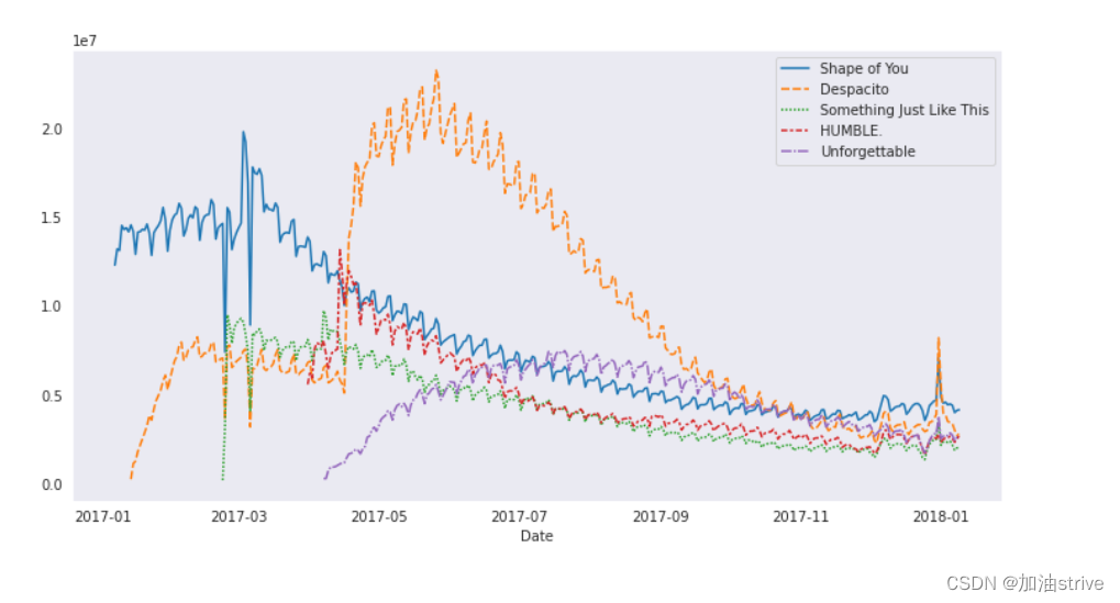
在创建折线图时,您将始终使用相同的格式,而随着新数据集的变化,唯一的变化就是数据集的名称。因此,例如,如果使用名为financial_data的不同数据集,代码行将显示如下:
# Set the width and height of the figure
plt.figure(figsize=(14,6))

# Add title
plt.title("Daily Global Streams of Popular Songs in 2017-2018")

# Line chart showing daily global streams of each song
sns.lineplot(data=spotify_data)
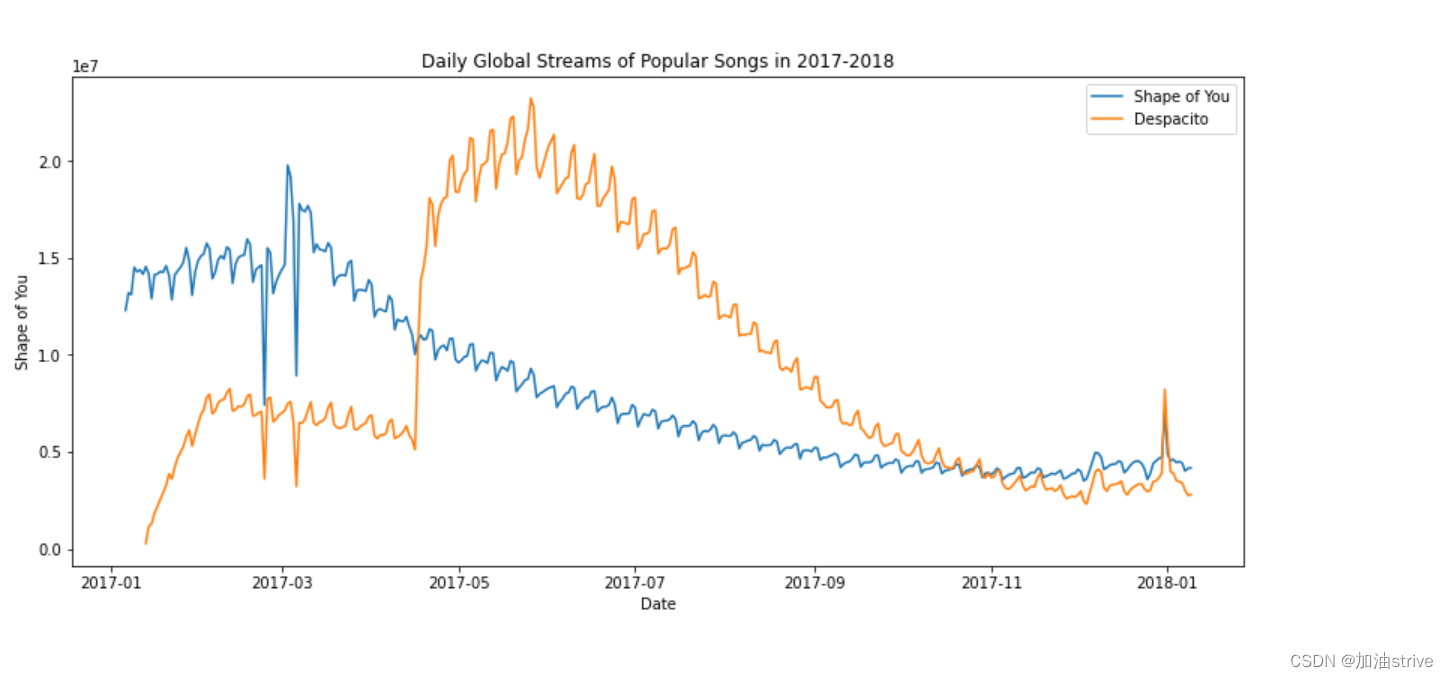
到目前为止,您已经学习了如何为数据集中的每一列绘制一条线。在本节中,您将学习如何绘制列的子集。
我们将首先打印所有列的名称。这只需一行代码就可以完成,只需交换数据集的名称(在本例中为spotify_data),即可适用于任何数据集
list(spotify_data.columns)

# Set the width and height of the figure
plt.figure(figsize=(14,6))

# Add title
plt.title("Daily Global Streams of Popular Songs in 2017-2018")

# Line chart showing daily global streams of 'Shape of You'
sns.lineplot(data=spotify_data['Shape of You'], label="Shape of You")

# Line chart showing daily global streams of 'Despacito'
sns.lineplot(data=spotify_data['Despacito'], label="Despacito")

# Add label for horizontal axis
plt.xlabel("Date")
3.Bar Charts and Heatmaps
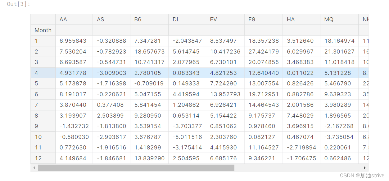
在本教程中,我们将使用美国交通部的数据集来跟踪航班延误。
Load the data
# Path of the file to read
flight_filepath = "../input/flight_delays.csv"

# Read the file into a variable flight_data
flight_data = pd.read_csv(flight_filepath, index_col="Month")
Examine the data
# Print the data
flight_data
Bar chart
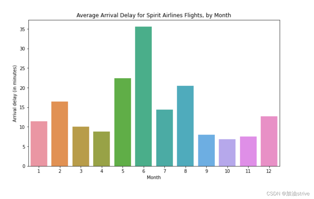
显示每月Spirit Airlines航班平均到达延误的条形图
# Set the width and height of the figure
plt.figure(figsize=(10,6))

# Add title
plt.title("Average Arrival Delay for Spirit Airlines Flights, by Month")

# Bar chart showing average arrival delay for Spirit Airlines flights by month
sns.barplot(x=flight_data.index, y=flight_data['NK'])

# Add label for vertical axis
plt.ylabel("Arrival delay (in minutes)")
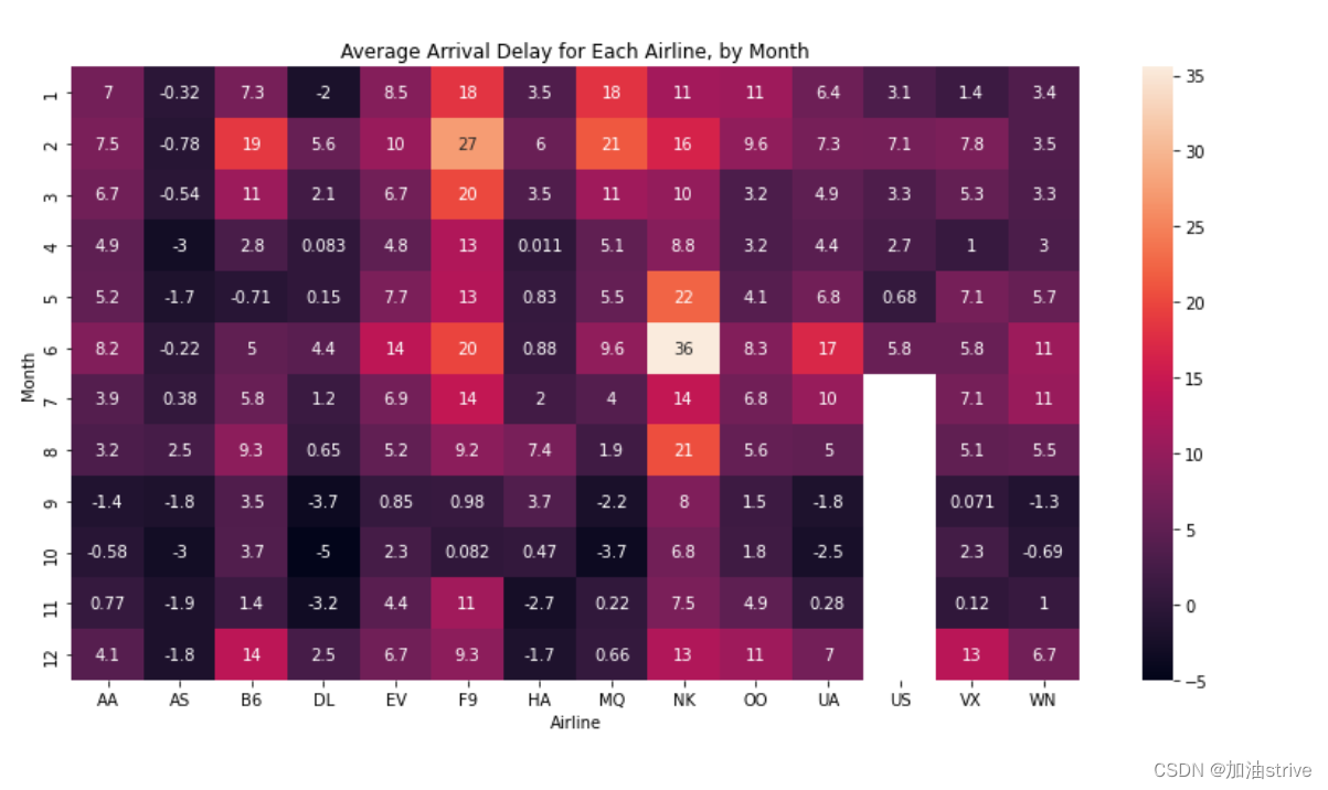
Heatmap 热力图
# Set the width and height of the figure
plt.figure(figsize=(14,7))

# Add title
plt.title("Average Arrival Delay for Each Airline, by Month")

# 显示各航空公司每月平均到达延误的热力图
sns.heatmap(data=flight_data, annot=True)

# Add label for horizontal axis
plt.xlabel("Airline")
annot=True
这确保每个单元格的值显示在图表上。
(省略此项将删除每个单元格中的数字!)
4.Scatter Plots
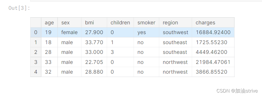
Load and examine the data
我们将使用一个(合成的)保险费用数据集,看看我们是否能够理解为什么一些客户比其他客户支付更多
# Path of the file to read
insurance_filepath = "../input/insurance.csv"

# Read the file into a variable insurance_data
insurance_data = pd.read_csv(insurance_filepath)
insurance_data.head()
Scatter plots
sns.scatterplot(x=insurance_data['bmi'], y=insurance_data['charges'])
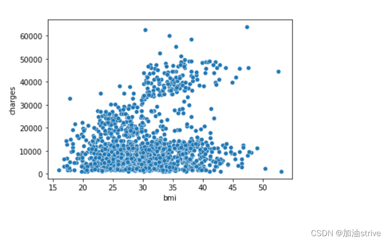
上述散点图表明,体重指数(BMI)与保险费用呈正相关,BMI较高的客户通常也会支付更多的保险费用。(这种模式是有道理的,因为高BMI通常与慢性病风险较高相关。)
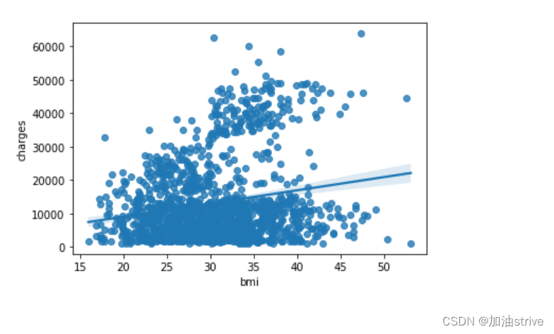
要再次检查这种关系的强度,您可能需要添加一条回归线,或最适合数据的线。为此,我们将命令更改为sns.regplot。
sns.regplot(x=insurance_data['bmi'], y=insurance_data['charges'])
Color-coded scatter plots
我们可以使用散点图来显示(不是两个,而是…)三个变量之间的关系!一种方法是对点进行颜色编码。
例如,为了了解吸烟如何影响BMI和保险费用之间的关系,我们可以用“吸烟者”对分数进行颜色编码,并在轴上绘制其他两列(“bmi”、“charges”)
sns.scatterplot(x=insurance_data['bmi'], y=insurance_data['charges'], hue=insurance_data['smoker'])
# hue字段根据smoker是否吸烟进行颜色区分
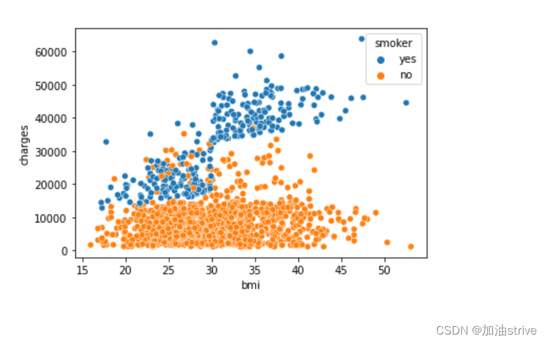
这一散点图显示,尽管不吸烟者倾向于随着BMI的增加而支付更多的钱,但吸烟者支付的钱更多。
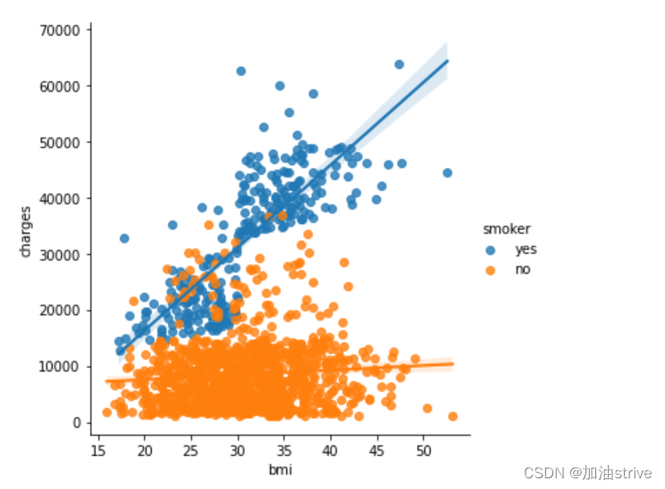
为了进一步强调这一事实,我们可以使用sns.lmplot命令添加两条回归线,分别对应于吸烟者和非吸烟者。(你会注意到,相对于不吸烟者的回归线,吸烟者的回归曲线斜率要大得多!)
sns.lmplot(x="bmi", y="charges", hue="smoker", data=insurance_data)
Distributions
创建直方图和密度图
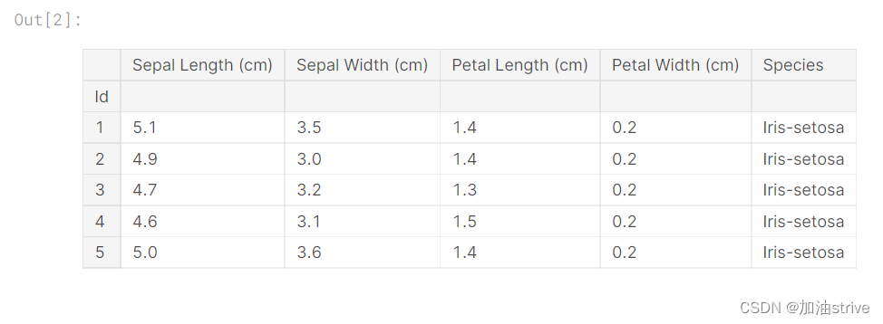
Select a dataset
我们将使用一个由150种不同花朵组成的数据集,或三种不同种类的鸢尾(刚毛鸢尾、花斑鸢尾和处女鸢尾)中的50种

Load and examine the data
# Path of the file to read
iris_filepath = "../input/iris.csv"

# Read the file into a variable iris_data
iris_data = pd.read_csv(iris_filepath, index_col="Id")

# Print the first 5 rows of the data
iris_data.head()
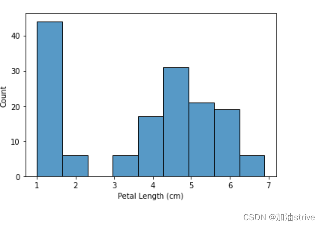
假设我们想创建一个直方图,看看鸢尾花的花瓣长度如何变化。我们可以使用sns.histplot命令执行此操作。
# Histogram
sns.histplot(iris_data['Petal Length (cm)'])
xlabel=‘Petal Length (cm)’, ylabel=‘Count’
Density plots
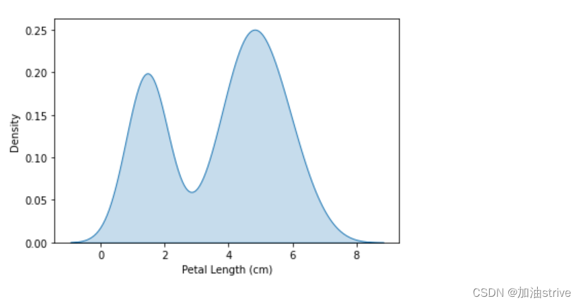
下一种类型的图是核密度估计(KDE)图。如果您不熟悉KDE图,可以将其视为平滑的直方图。
要绘制KDE图,我们使用sns.kdeplot命令。设置shade=True为曲线下方的区域上色(data=选择要绘制的列)。
# KDE plot
sns.kdeplot(data=iris_data['Petal Length (cm)'], shade=True)
Color-coded plots
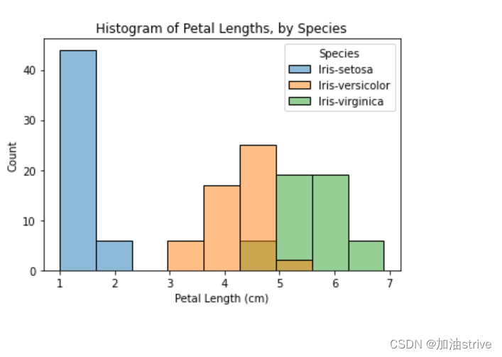
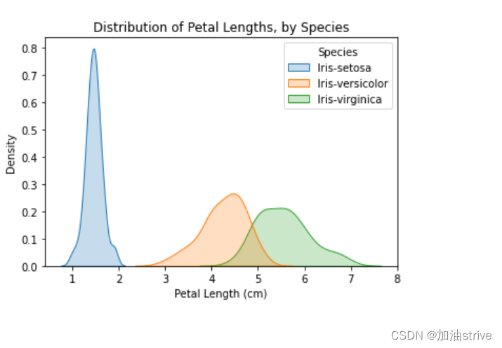
在本教程的下一部分,我们将创建图来了解物种之间的差异。
# Histograms for each species
sns.histplot(data=iris_data, x='Petal Length (cm)', hue='Species')

# Add title
plt.title("Histogram of Petal Lengths, by Species")
# KDE plots for each species
sns.kdeplot(data=iris_data, x='Petal Length (cm)', hue='Species', shade=True)

# Add title
plt.title("Distribution of Petal Lengths, by Species")
5.Choosing Plot Types and Custom Styles
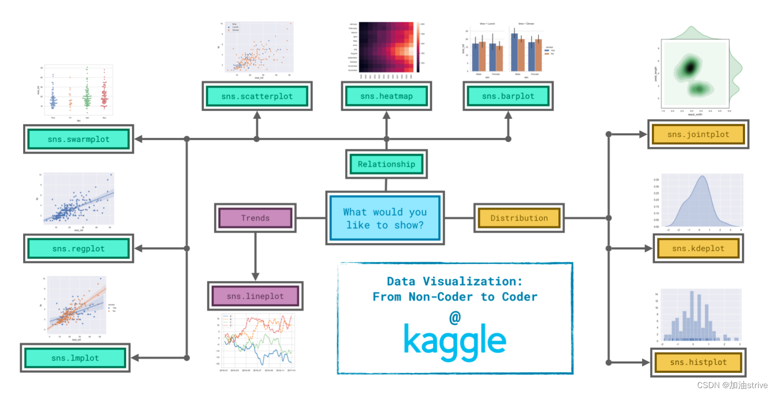
由于决定如何最好地讲述数据背后的故事并不总是容易的,因此我们将图表类型分为三大类来帮助解决这一问题。
Trends
被定义为一种变化模式。
sns.lineplot-折线图最适合显示一段时间内的趋势,可以使用多条线显示多个组中的趋势。
Relationship
有许多不同的图表类型可用于了解数据中变量之间的关系。
sns.barplot-条形图用于比较不同组对应的数量。
sns.heatmap-heatmap可用于查找数字表中的颜色编码模式。
sns.scatterplot-散点图显示两个连续变量之间的关系;如果用颜色编码,我们还可以显示与第三个分类变量的关系。
sns.regplot-在散点图中包含回归线可以更容易地看到两个变量之间的任何线性关系。
sns.lmplot-如果散点图包含多个颜色编码的组,则此命令对于绘制多条回归线非常有用。
sns.swarm图-类别散点图显示了连续变量和分类变量之间的关系。
Distribution
分布-我们将分布可视化,以显示我们期望在变量中看到的可能值,以及它们的可能性。
sns.histplot-直方图显示单个数值变量的分布。
sns.kdeplot-KDE图(或2D KDE图)显示单个数值变量(或两个数值变量)的估计平滑分布。
sns.jointplot-该命令用于同时显示2D KDE图和每个单独变量的相应KDE图。
我们将使用上一教程中用于创建折线图的相同代码。下面的代码加载数据集并创建图表。
# Path of the file to read
spotify_filepath = "../input/spotify.csv"

# Read the file into a variable spotify_data
spotify_data = pd.read_csv(spotify_filepath, index_col="Date", parse_dates=True)

# Line chart
plt.figure(figsize=(12,6))
sns.lineplot(data=spotify_data)
我们只需一行代码就可以将图形的样式快速更改为不同的主题。
# Change the style of the figure to the "dark" theme
sns.set_style("dark")

# Line chart
plt.figure(figsize=(12,6))
sns.lineplot(data=spotify_data)


 939
939


 被折叠的 条评论
为什么被折叠?
被折叠的 条评论
为什么被折叠?
 到【灌水乐园】发言


