


文章目录
一、简介和Setup
seaborn 是 python 数据可视化中重要的库,它是基于 matplotlib 的一个拓展,相较于 matplotlib, seaborn 更加更加方便快捷的做出复杂、美观的图。
你可以通过以下方式导入 seaborn:
import matplotlib.pyplot as plt
import seaborn as sns
二、seaborn作图的一些特点
- 函数传入一个DataFrame对象作为
data参数。 - 字符串应传入到
x和y参数中,表示在data中需要展示的列;如果不传入DataFrame对象作为data时,x和y可以像 matplotlib 一样传入数据。 hue作为一个很有特色的参数,可以根据hue中类别对数据进行分类展示,从而在图表中用不同的颜色展示它们。(也就是seaborn里面的FacetGrid绘图方式)
三、分类
1. 趋势
(1) sns.lineplot
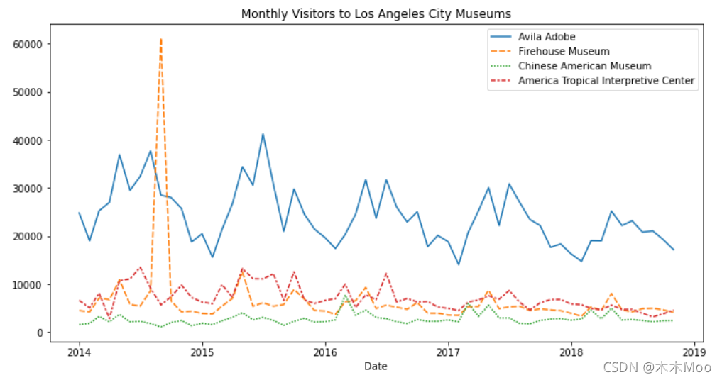
sns.lineplot将DataFrame中的每一列的数据随index的变化趋势展示出来。
# Line chart showing the number of visitors to each museum over time
plt.figure(figsize=(12,6))
sns.lineplot(data = museum_data)
plt.title("Monthly Visitors to Los Angeles City Museums")
2. 关系
(2) sns.barplot
sns.barplot以柱状图的形式展示x,y之间统计关系,会对作为横坐标的一方进行合并。
# Bar chart showing average score for racing games by platform
plt.figure(figsize=(12,6))
sns.barplot(
    y
最低0.47元/天 解锁文章


 470
470


 被折叠的 条评论
为什么被折叠?
被折叠的 条评论
为什么被折叠?
 到【灌水乐园】发言


