


画出上述横坐标为时间的图片代码:
#先把df的索引设置为时间序列
# 创建一个日期范围(时间序列)
start_date = '1950-01-01'
end_date = '2023-12-31'
dates = pd.date_range(start=start_date, end=end_date, freq='M')

# 提取年份和月份
formatted_dates = dates.strftime("%Y-%m")

result_df.index = formatted_dates

#画图
plt.plot(result_df.index, result_df.iloc[:, 0],  label='中美关系')
# 添加坐标标签
plt.title('国家关系分值折线图')
plt.xlabel('年份')
plt.ylabel('分值')
plt.legend()
plt.show()
一点关于折线描述的方法:
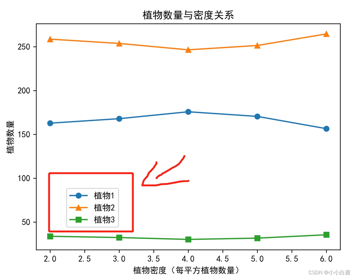 上图中,每个点是一个有横纵坐标信息的点 如下图所示:
如果想画出上图那样的效果,特别是指定图例位置(如红色框图),可以用下面这段代码:
# 将第一列设置为横坐标
x = df1.iloc[:, 0]

# 纵坐标(去除第一列)
y = df.iloc[:, 1:]

# 绘制其他三列数据的图形
plt.plot(x, df1.iloc[:, 1], label='植物1', marker='o')
plt.plot(x, df1.iloc[:, 2], label='植物2', marker='^')
plt.plot(x, df1.iloc[:, 3], label='植物3', marker='s')

# 调整图例位置
plt.legend(loc=(0.1, 0.1))#小数是图例位置,0~1的数字,表示横纵坐标
plt.title('植物数量与温度关系')
plt.xlabel('温度T')
plt.ylabel('植物数量')
plt.show()


 786
786


 被折叠的 条评论
为什么被折叠?
被折叠的 条评论
为什么被折叠?
 到【灌水乐园】发言


