


前言
提示:这里可以添加本文要记录的大概内容:
例如:随着人工智能的不断发展,机器学习这门技术也越来越重要,很多人都开启了学习机器学习,本文就介绍了机器学习的基础内容。
一、视图容器组件
1、view视图容器是WXML界面布局的基础组件,它的使用和HTML里的DIV功能类似,主要用于界面的布局。view视图容器也有自己的属性。
在这里插入代码片view class="section">
<view class="section__title">水平方向布局:</view>
<view class="flex-wrp" style="display: flex;flex-direction: row;">
<view class="flex-item bc_green" style="width:100px;height:100px;
 background-color: green;color: #ffffff;text-align:center;line-height:100px;">1</view>
<view class="flex-item bc_red" style="width: 100px;height: 100px;background-color: red;
color: #ffffff;text-align: center;line-height: 100px;">2</view>
<view class="flex-item bc_blue" style="width: 100px;height: 100px;background-color: blue;
color: #ffffff;text-align: center;line-height: 100px;">3</view>
</view>
</view>
<view class="section">
<view class="section__title">垂直方向布局:</view>
<view class="flex-wrp" style="display: flex;height: 300px;flex-direction: column;">
<view class="flex-item bc_green" style="width: 100px;height: 100px;
background-color: green;color: #ffffff;text-align: center;line-height: 100px;">1</view>
<view class="flex-item bc_red" style="width: 100px;height: 100px;background-color: red;
color: #ffffff;text-align: center;line-height: 100px;">2</view>
<view class="flex-item bc_blue" style="width: 100px;height: 100px;background-color: blue;
color: #ffffff;text-align: center;line-height: 100px;">3</view>
</view>
</view>
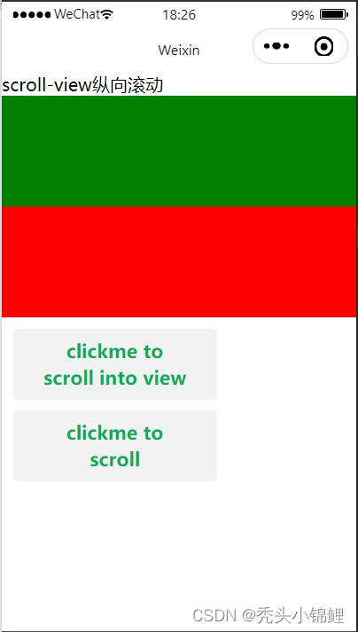
2、纵向滚动
<view class="section">
<view class="section__title">scroll-view纵向滚动</view>
<scroll-view scroll-y="true" style="height: 200px;" bindscrolltoupper="upper"
bindscrolltoupper="lower" bindscroll="scroll" scroll-into-view="{{toView}}"
scroll-top="{{scrollTop}}">
<view id="green" style="width: 100%;height: 100px;background-color: green;"></view>
<view id="red" style="width: 100%;height: 100px;background-color:red;"></view>
<view id="yellow" style="width: 100%;height: 100px;background-color:yellow;"></view>
<view id="blue" style="width: 100%;height: 100px;background-color:blue;"></view>
</scroll-view>
<view class="btn-area">
<button type="default" style="margin: 10px;" bindtap="tap">clickme to scroll into view</button>
<button type="default" style="margin: 10px;" bindtap="tapMove">clickme to scroll</button>
</view>
</view>
var order=['red','yellow','blue','green','red']
Page({
    data:{
        toView:"red",
        scrollTop:100
    },
    upper:function(e){console.log(e)},
    lower:function(e){console.log(e)},
    scroll:function(e){console.log(e)},
    tap:function(e){
        for(var i=0;i<order.length;i++){
            if(order[i]===this.data.toView){
                this.setData({toView:order[i+1]})
                break }}
    },
    tapMove:function(e){this.setData({scrollTop:this.data.scrollTop+10})}
})
Page({
    data:{
        indicatorDots:true,
        autoplay:true,
        interval:5000,
        duration:1000,
        imgUrls:[
            "../images/4.jpg","../images/5.jpg","../images/6.jpg"]}
})
3、横向滚动
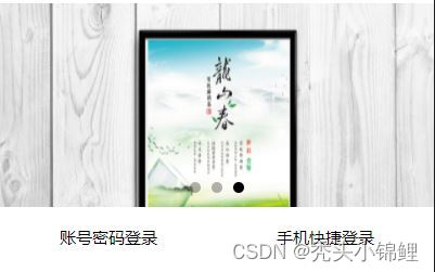
4、海报轮播效果和页面切换效果
<view class="haibao">
<swiper indicator-dots="{{indicatorDots}}" autoplay="{{autoplay}}"
interval="{{interval}}" duration="{{duration}}">
<block wx:for="{{imgUrls}}">
<swiper-item>
<image src="{{item}}" class="silde-image"
style="width: 100%"></image>
</swiper-item>
</block>
</swiper>
</view>
Page({
    data:{
        indicatorDots:true,
        autoplay:true,
        interval:5000,
        duration:1000,
        imgUrls:[
            "../images/4.jpg","../images/5.jpg","../images/6.jpg"]}
})
5、页签切换效果
.loginTitle{
    display:flex;
    flex-direction: row;
    width: 100%;
}
.select{
    font-size:12px;
    color:red;
    width:50%;
    text-align: center;
    height: 45px;
    line-height: 45px;
    border-bottom: 5rexsolidred;
}
.default{
    font-size: 12px;
    margin:0 auto;
    padding: 15px;
}
.hr{
    border:1px solid #cccccc;
    opacity: 0.2;
}
Page({
    data:{
        currentTab:0,
        winWidth:0,
        widHeight:0
    },
    onLoad:function(options){
        var page=this;
        wx.getSystemInfo({
            success:function(res){
                console.log(res);
                page.setData({winWidth:res.windowWidth});
                page.setData({winHeight:res.windowHeight});}})
        },
        sweitchNav:function(e){
        var page=this;
        if(this.data.currentTab==e.target.dataset.current){return false;}
        else{page.setData({setData({currentTab:e,target,dataset,current});})
    }
}})
二、基础内容组件
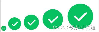
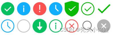
1、icon图标
<view class="group">
<icon type="success" size="20"/>
<icon type="success" size="50"/>
<icon type="success" size="60"/>
<icon type="success" size="80"/>
<icon type="success" size="100"/>
</view>
<view class="group">
<icon type="success" size="45"/>
<icon type="info" size="45"/>
<icon type="warn" size="45"/>
<icon type="waiting" size="45"/>
<icon type="safe_success" size="45"/>
<icon type="success_circle" size="45"/>
<icon type="success_no_circle" size="45"/>
<icon type="waiting_circle" size="45"/>
<icon type="circle" size="45"/>
<icon type="download" size="45"/>
<icon type="info_circle" size="45"/>
<icon type="cancel" size="45"/>
<icon type="search" size="45"/>
<icon type="clear" size="45"/>
</view>
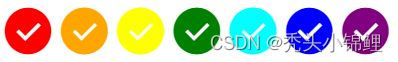
<view class="group">
<icon type="success" size="45" color="red"/>
<icon type="success" size="45" color="orange"/>
<icon type="success" size="45" color="yellow"/>
<icon type="success" size="45" color="green"/>
<icon type="success" size="45" color="rgb(0,255,255)"/>
<icon type="success" size="45" color="blue"/>
<icon type="success" size="45" color="purple"/>
</view>
2、text文本
<view class="btn-area">
<view class="body-view">
<text>我爱北京\t我爱中国</text>
<text>我爱北京\t我爱中国</text>
</view>
</view>
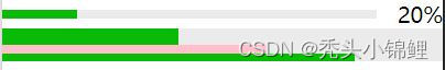
3、progress进度条
<progress percent="20" show-info/>
<progress percent="40" stroke-width="12"/>
<progress percent="60" color="pink"/>
<progress percent="80" active/>
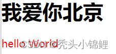
4、rich-text富文本
<rich-text nodes="<h10>我爱你中国</h10><h1>我爱你北京</h1>"></rich-text>
<rich-text nodes="{{nodes}}"
bindtap="tap"></rich-text>
Page({
    data:{
        nodes:[{
            name:'div',
            attrs:{
            class:'div_class',
            style:'line-height:60px;color:red;'
            },
            children:[{
                type:'text',
                text:'hello World'
            }]
        }]
    },
    tap(){console.log('tap')}
})
三、表单组件
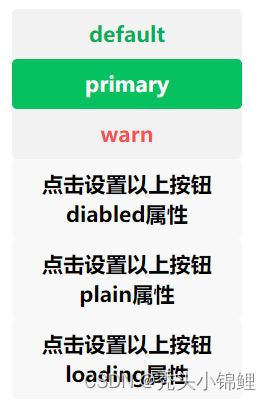
1、button按钮
<button type="default" size="{{defaultSize}}" loading="{{loading}}"
 plain="{{plain}}" disabled="{{disabled}}" bindtap="default">default</button>
 <button type="primary" size="{{primarySize}}" loading="{{loading}}"
 plain="{{plain}}" disabled="{{disabled}}" bindtap="primary">primary</button>
<button type="warn" size="{{warnSize}}" loading="{{loading}}" plain="{{plain}}"
 disabled="{{disabled}}" bindtap="warn">warn</button>
 <button bindtap="setDisabled">点击设置以上按钮diabled属性</button>
 <button bindtap="setPlain">点击设置以上按钮plain属性</button>
 <button bindtap="setLoading">点击设置以上按钮loading属性</button>
var types=['default','primary','warn']
Page({
    data:{
        defaultSize:'default',
        primarySize:'default',
        warnSize:'default',
        disabled:false,
        plain:false,
        loading:false
    },
    setDisabled:function(e){
        this.setData({disabled:!this.data.disabled})
    },
    setPlain:function(e){
        this.setData({plain:!this.data.plain})
    },
    setLoading:function(e){
        this.setData({loading:!this.data.loading})
    }
})
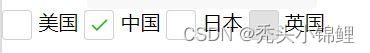
2、checkbox多项选择器
<checkbox-group bindchange="checkboxChange">
 <checkbox value="USA"/>美国
 <checkbox value="CHN" checked="true"/>中国
 <checkbox value="JPN"/>日本
 <checkbox value="ENG" disabled/>英国
 </checkbox-group>
Page({
    checkChange:function(e){
        console.log(e.detail.value)
    }
})
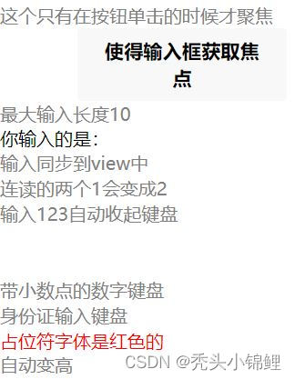
3.input单行输入框
<view class="section">
<input placeholder="这个只有在按钮单击的时候才聚焦" focus="{{focus}}"/>
<view class="btn-area"><button bindtap="bindButtonTap">使得输入框获取焦点</button></view>
</view>
<view class="section">
<input maxlength="10" placeholder="最大输入长度10"/>
</view>
<view class="section">
<view class="section__title">你输入的是:{{inputValue}}</view>
<input bindinput="bindKeyInput" placeholder="输入同步到view中"/>
</view>
<view class="section">
<input bindinput="bindPlaceInput" placeholder="连读的两个1会变成2"/>
</view>
<view class="section">
<input bindinput="bindHideKeyboard" placeholder="输入123自动收起键盘"/>
</view>
<view class="section"><input password type="number"/></view>
<view class="section"><input password type="text"/></view>
<view class="section"><input type="digit" placeholder="带小数点的数字键盘"/></view>
<view class="section"><input type="idcard" placeholder="身份证输入键盘"/></view>
<view class="section"><input placeholder-style="color:red" placeholder="占位符字体是红色的"/></view>
<view class="section">
<textarea auto-height placeholder="自动变高"/>
</view>
<view class="section">
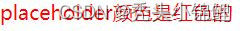
<textarea placeholder="placeholder颜色是红色的" placeholder-style="color:red"/>
</view>
Page({
    data:{
        focus:false,
        inputValue:''
    },
    bindButtonTap:function(){
        this.setData({
            focus:true
        })
    },
    bindKeyInput:function(e){
        this.setData({
            inpputValue:e.detail.value
        })
    },
    bindReplaceInput:function(e){
        var value=e.detail.value
        var pos=e.detail.cursor
        if(pos !=-1){
            //光标在中间
            var left=e.detail.value.slice(0,pos)
            //计算光标的位置
            pos=left.replace(/11/g,'2').length
        }
        //直接返回对象,可以对输入进行过滤处理,同时可以控制光标的位置
        return{
            value:value.replace(/11/g,'2'),
            cursor:pos
        }
        //或者直接返回字符串,光标在最后
        //return value.replace(/11/g,'2'),
    },
    bindHideKeyboard:function(e){
        if(e.detail.value==='123'){
            //收起键盘
            wx.hideKeyboard()
        }
    }
})
4、textarea多行输入框
view class="section">
<textarea placeholder="placeholder颜色是红色的" placeholder-style="color:red"/>
</view>
5、label改进表单可用性
Page({
    clickBtn:function(){
        console.log("单击了按钮组件");
    },
    checkboxChange:function(){
        console.log("单击了多项选择器组件");
    },
    redioChange:function(){
        console.log("单击了单选选择器组件");
    }
})
<label for="man">
<button id="btn" bindtap="clickBtn" hidden>我是button按钮</button>
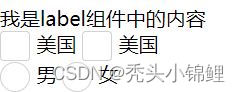
<view>我是label组件中的内容</view>
<checkbox-group bindchange="checkboxChange">
<checkbox value="中国"/>美国
<checkbox value="美国"/>美国
</checkbox-group>
<radio-group bindchange="redioChange">
<radio id="man" value="男"/>男
<radio id="women" value="女"/>女
</radio-group>
</label>
6、picker滚动选择器
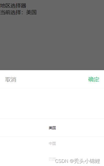
<view class="section">
<view class="section__title">地区选择器</view>
<picker bindchange="bindPickerChange" value="{{index}}" range="{{array}}">
<view class="picker">当前选择:{{array[index]}}</view>
</picker>
</view>
Page({
    data:{
        array:['美国','中国','巴西','日本'],
        index:0
    },
    bindPickerChange:function(e){
        console.log('picker发送选择改变,携带值为',e.detail.value)
        this.setData({
            index:e.detail.value
        })
    }
})
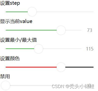
7、slider滑动选择器
<view class="section section_gap">
<text class="section__title">设置step</text>
<view class="body-view">
<slider bindchange="sliderchange" step="5"></slider>
</view>
</view>
<view class="section section_gap">
<text class="section__title">显示当前value</text>
<view class="body-view">
<slider bindchange="sliderchange" show-value/>
</view>
</view>
<view class="sectionn section_gap">
<text class="section__title">设置最小/最大值</text>
<view class="body-view">
<slider bindchange="slidercheng" min="50" max="200" show-value/>
</view>
</view>
<view class="section section_gap">
<text class="section__title">设置颜色</text>
<view class="body-view">
<slider bindchange="slidercheng" color="black" selected-color="red"/>
</view>
</view>
<view class="section section_gap">
<text class="section__title">禁用</text>
<view class="body-view">
<slider bindcheng="sliderchange" disabled show-value/>
</view>
</view>
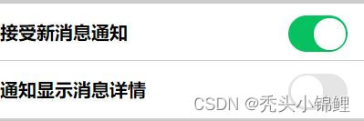
8、switch开关选择器
<view style="background-color: #cccccc;height: 600px;">
<view style="padding-top:10px"></view>
<view style="display: flex;flex-direction: row;background-color: #ffffff;height: 50px;line-height: 50px;">
<view style="font-weight: bold;">接受新消息通知</view>
<view style="position: absolute;right: 10px;">
<switch type="switch" checked/>
</view>
</view>
<view style="height: 1px;background-color: #f2f2f2;opacity: 0.2;"></view>
<view style="display: flex;flex-direction: row;background-color: #ffffff;height: 50px;line-height: 50px;">
<view style="font-weight: bold;">通知显示消息详情</view>
<view style="position: absolute;right: 10px;">
<switch type="switch"/>
</view>
</view>
<view style="height: 1px;background-color: #f2f2f2;opacity: 0.2;"></view>
</view>
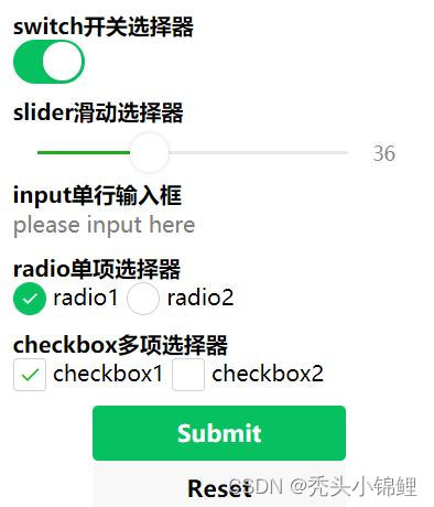
9、form表单
<form bindsubmit="formSubmit" bindreset="formReset">
<view style="margin: 10px;">
<view style="font-weight: bold;">switch开关选择器</view>
<switch name="switch"/>
</view>
<view style="margin: 10px;">
<view style="font-weight: bold;">slider滑动选择器</view>
<slider name="s;ider"show-value></slider>
</view>
<view style="margin: 10px;">
<view style="font-weight: bold;">input单行输入框</view>
<input name="input" placeholder="please input here"/>
</view>
<view style="margin: 10px;">
<view style="font-weight: bold;">radio单项选择器</view>
<radio-group name="radio-group">
<label>
<radio value="radio1"/>radio1
</label>
<label>
<radio value="radio2"/>radio2
</label>
</radio-group>
</view>
</form>
<view style="margin: 10px;">
<view style="font-weight: bold;">checkbox多项选择器</view>
<checkbox-group name="checkbox">
<label>
<checkbox value="checkbox1"/>checkbox1
</label>
<label>
<checkbox value="checkbox2"/>checkbox2
</label>
</checkbox-group>


</view>
<view class="btn-area">
<button formType="submit" type="primary">Submit</button>
<button formType="reset">Reset</button>
</view>
🌈本篇博客的内容【微信小程序天气制作】已经结束。
🌈若对你有些许帮助,可以点赞、关注、评论支持下博主,你的支持将是我前进路上最大的动力。


 扫一扫
扫一扫


 3249
3249

 被折叠的 条评论
为什么被折叠?
被折叠的 条评论
为什么被折叠?
 到【灌水乐园】发言


