


一、 CSS3 的现状
- 新增的CSS3特性有兼容性问题,ie9+才支持
- 移动端支持优于 PC 端
- 不断改进中
- 应用相对广泛
- 现阶段主要学习:
新增选择器、盒子模型、2D转换、动画、3D转换和浏览器私有前缀等。
二、 新增选择器
2.1 属性选择器
属性选择器可以根据元素特定属性的来选择元素。 这样就可以不用借助于类或者id选择器。
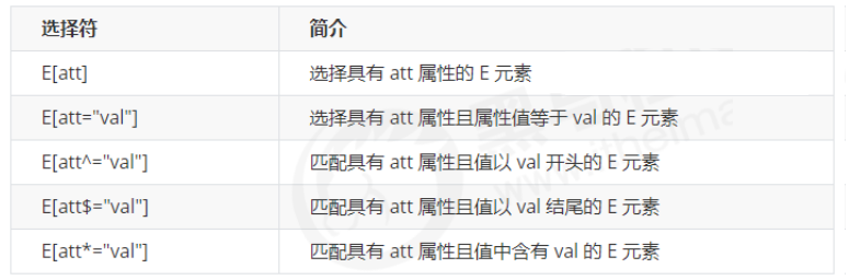
注意:类选择器、属性选择器、伪类选择器,权重为 10。
示例:
<!DOCTYPE html>
<html lang="en">
<head>
    <meta charset="UTF-8">
    <meta name="viewport" content="width=device-width, initial-scale=1.0">
    <meta http-equiv="X-UA-Compatible" content="ie=edge">
    <title>CSS3新增属性选择器</title>
    <style>
        /* 必须是input 但是同时具有 value这个属性 选择这个元素  [] */
        /* input[value] {
            color:pink;
        } */
        /* 只选择 type =text 文本框的input 选取出来 */
        input[type=text] {
            color: pink;
        }

        /* 选择首先是div 然后 具有class属性 并且属性值 必须是 icon开头的这些元素 */
        /*权重为11*/
        div[class^=icon] {
            color: red;
        }

        section[class$=data] {
            color: blue;
        }

        /*使用交集选择器提高权重*/
        div.icon1 {
            color: purple;
        }


        /* 类选择器和属性选择器 伪类选择器 权重都是 10 */
    </style>
</head>
<body>
    <!-- 1. 利用属性选择器就可以不用借助于类或者id选择器 -->
    <!-- <input type="text" value="请输入用户名">
    <input type="text"> -->
    <!-- 2. 属性选择器还可以选择属性=值的某些元素 重点务必掌握的 -->
    <input type="text" name="" id="">
    <input type="password" name="" id="">
    <!-- 3. 属性选择器可以选择属性值开头的某些元素 -->
    <div class="icon1">小图标1</div>
    <div class="icon2">小图标2</div>
    <div class="icon3">小图标3</div>
    <div>我是打酱油的</div>
    <!-- 4. 属性选择器可以选择属性值结尾的某些元素 -->
    <section class="icon1-data">我是安其拉</section>
    <section class="icon2-data">我是哥斯拉</section>
</body>
</html>
2.3 结构伪类选择器
结构伪类选择器主要根据文档结构来选择器元素, 常用于根据父级选择器里面的子元素。
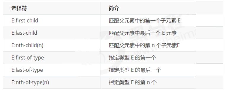
2.3.1 E:first-child和E:last-child
示例:
<!DOCTYPE html>
<html lang="en">
<head>
    <meta charset="UTF-8">
    <meta name="viewport" content="width=device-width, initial-scale=1.0">
    <meta http-equiv="X-UA-Compatible" content="ie=edge">
    <title>CSS3新增结构伪类选择器</title>
    <style>
        /* 1. 选择ul里面的第一个孩子 小li */
        ul li:first-child {
            background-color: pink;
        }

        /* 2. 选择ul里面的最后一个孩子 小li */
        ul li:last-child {
            background-color: pink;
        }
    </style>
</head>

<body>
    <ul>
        <li>我是第1个孩子</li>
        <li>我是第2个孩子</li>
        <li>我是第3个孩子</li>
        <li>我是第4个孩子</li>
    </ul>
</body>
</html>
2.3.2 nth-child(n)
nth-child(n):选择某个父元素的一个或多个特定的子元素(重点)。
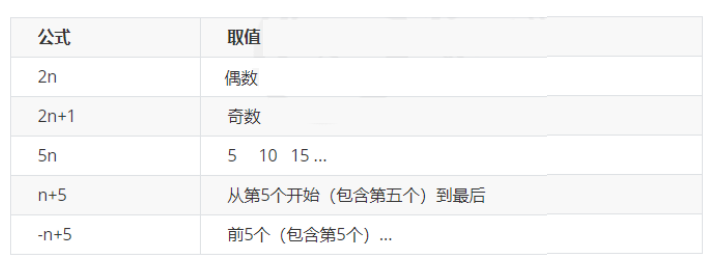
n 可以是数字,关键字和公式- n 如果是数字,就是选择第 n 个子元素, 里面数字从1开始…
- n 可以是关键字:even 偶数,odd 奇数
- n 可以是公式:常见的公式如下 ( 如果n是公式,则从0开始计算,但是第 0 个元素或者超出了元素的个数会被忽略 )
可用于表格的不同行变色。
示例:
<!DOCTYPE html>
<html lang="en">
<head>
    <meta charset="UTF-8">
    <meta name="viewport" content="width=device-width, initial-scale=1.0">
    <meta http-equiv="X-UA-Compatible" content="ie=edge">
    <title>CSS3新增结构伪类选择器-nth-child</title>
    <style>
        /* 1.把所有的偶数 even的孩子选出来 */
        ul li:nth-child(even) {
            background-color: #ccc;
        }

        /* 2.把所有的奇数 odd的孩子选出来 */
        ul li:nth-child(odd) {
            background-color: gray;
        }

        /* 3.nth-child(n) 从0开始 每次加1 往后面计算  这里面必须是n 不能是其他的字母 选择了所有的孩子*/
        /* ol li:nth-child(n) {
            background-color: pink;
        } */
        /* 4.nth-child(2n)母选择了所有的偶数孩子 等价于 even*/
        /* ol li:nth-child(2n) {
            background-color: pink;
        }

    </style>
</head>

<body>
    <ul>
        <li>我是第1个孩子</li>
        <li>我是第2个孩子</li>
        <li>我是第3个孩子</li>
        <li>我是第4个孩子</li>
        <li>我是第5个孩子</li>
        <li>我是第6个孩子</li>
    </ul>
    <ol>
        <li>我是第1个孩子</li>
        <li>我是第2个孩子</li>
        <li>我是第3个孩子</li>
        <li>我是第4个孩子</li>
        <li>我是第5个孩子</li>
        <li>我是第6个孩子</li>
    </ol>
</body>
</html>
2.3.3 nth-child和nth-of-type区别
- nth-child 对父元素里面所有孩子排序选择(序号是固定的)
先找到第n个孩子,然后看看是否和E匹配。 - nth-of-type 对父元素里面指定子元素进行排序选择。
先去匹配E ,然后再根据E 找第n个孩子。
2.3.4 小结
- 结构伪类选择器一般用于选择父级里面的第几个孩子
- nth-child 对父元素里面所有孩子排序选择(序号是固定的) 先找到第n个孩子,然后看看是否和E匹配
- nth-of-type 对父元素里面指定子元素进行排序选择。 先去匹配E ,然后再根据E 找第n个孩子
- 关于
nth-child(n)我们要知道n 是从 0 开始计算的,要记住常用的公式 - 如果是无序列表,我们肯定用 nth-child 更多
- 类选择器、属性选择器、伪类选择器,权重为 10。
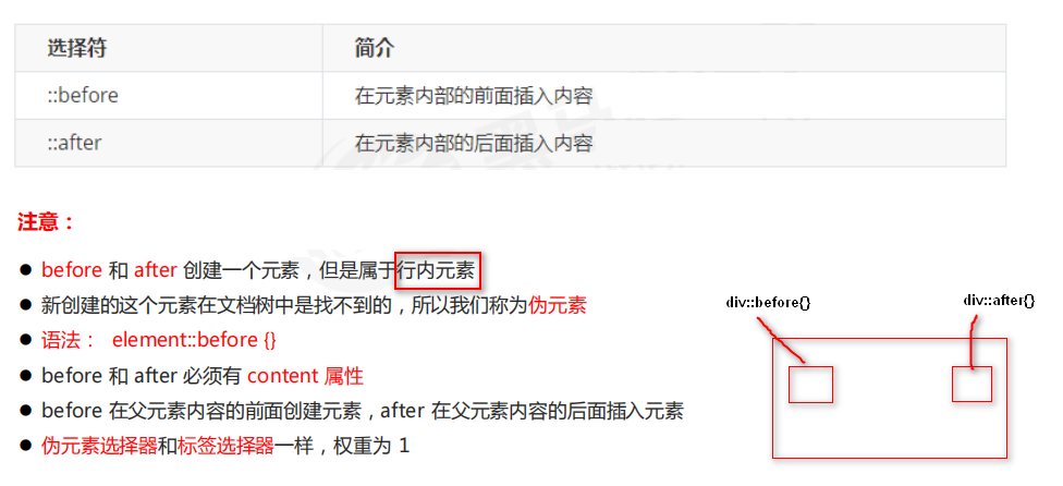
2.4 伪元素选择器(重点)
伪元素选择器可以帮助我们利用CSS创建新标签元素,而不需要HTML标签,从而简化HTML结构。
示例:
<!DOCTYPE html>
<html lang="en">
<head>
    <meta charset="UTF-8">
    <meta name="viewport" content="width=device-width, initial-scale=1.0">
    <meta http-equiv="X-UA-Compatible" content="ie=edge">
    <title>伪元素选择器before和after</title>
    <style>
        div {
            width: 200px;
            height: 200px;
            background-color: pink;
        }
        /* div::before 权重是2 */
        div::before {
            /* 这个content是必须要写的 */
            /* display: inline-block; */
            content: '我';
            /* width: 30px;
            height: 40px;
            background-color: purple; */
        }
        div::after {
            content: '小猪佩奇';
        }
    </style>
</head>
<body>
    <div>
        是
    </div>
</body>
</html>
2.4.1 伪元素选择器使用场景1:伪元素字体图标
<!DOCTYPE html>
<html lang="en">
<head>
<meta charset="UTF-8">
<meta name="viewport" content="width=device-width, initial-scale=1.0">
<meta http-equiv="X-UA-Compatible" content="ie=edge">
<title>伪元素选择器使用场景-字体图标</title>
<style>
@font-face {
font-family: 'icomoon';
src: url('fonts/icomoon.eot?1lv3na');
src: url('fonts/icomoon.eot?1lv3na#iefix') format('embedded-opentype'),
url('fonts/icomoon.ttf?1lv3na') format('truetype'),
url('fonts/icomoon.woff?1lv3na') format('woff'),
url('fonts/icomoon.svg?1lv3na#icomoon') format('svg');
font-weight: normal;
font-style: normal;
font-display: block;
}
div {
position: relative;
width: 200px;
height: 35px;
border: 1px solid red;
}
div::after {
position: absolute;
top: 10px;
right: 10px;
font-family: 'icomoon';
/* content: ''; */
content: '\e91e';
color: red;
font-size: 18px;
}
</style>
</head>
<body>
<div></div>
</body>
</html>
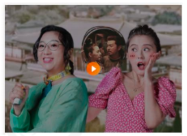
2.4.2 伪元素选择器使用场景2:仿土豆效果
<!DOCTYPE html>
<html lang="en">
<head>
    <meta charset="UTF-8">
    <meta name="viewport" content="width=device-width, initial-scale=1.0">
    <meta http-equiv="X-UA-Compatible" content="ie=edge">
    <title>伪元素选择器使用场景2-仿土豆网显示隐藏遮罩案例</title>
    <style>
        .tudou {
            position: relative;
            width: 444px;
            height: 320px;
            background-color: pink;
            margin: 30px auto;
        }

        .tudou img {
            width: 100%;
            height: 100%;
        }

        .tudou::before {
            content: '';
            /* 隐藏遮罩层 */
            display: none;
            position: absolute;
            top: 0;
            left: 0;
            width: 100%;
            height: 100%;
            background: rgba(0, 0, 0, .4) url(images/arr.png) no-repeat center;
        }

        /* 当我们鼠标经过了 土豆这个盒子,就让里面before遮罩层显示出来 */
        .tudou:hover::before {
            /* 而是显示元素 */
            display: block;
        }
    </style>
</head>

<body>
    <div class="tudou">
        <img src="images/tudou.jpg" alt="">
    </div>
</body>
</html>
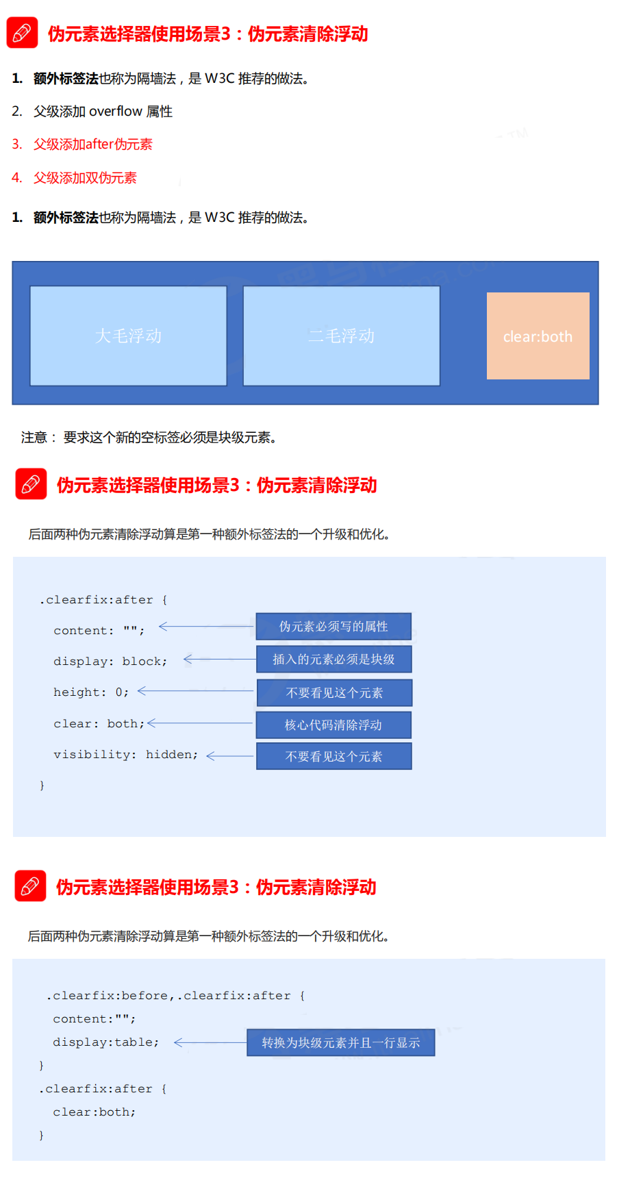
2.4.3 伪元素选择器使用场景3:伪元素清除浮动
- 额外标签法也称为隔墙法,是 W3C 推荐的做法。
- 父级添加 overflow 属性
父级添加after伪元素父级添加双伪元素
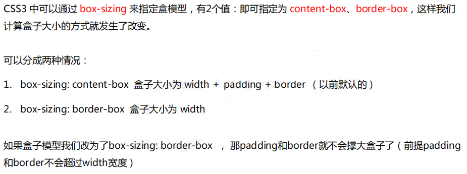
三、CSS3 盒子模型
四、CSS3 其他特性(了解)
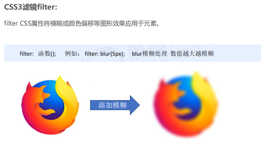
- 图片变模糊
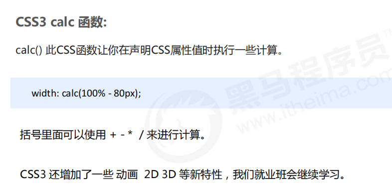
- 计算盒子宽度 width: calc 函数
4.1 CSS3 滤镜filter
示例:
<!DOCTYPE html>
<html lang="en">
<head>
    <meta charset="UTF-8">
    <meta name="viewport" content="width=device-width, initial-scale=1.0">
    <meta http-equiv="X-UA-Compatible" content="ie=edge">
    <title>图片模糊处理filter</title>
    <style>
        img {
            /* blur是一个函数 小括号里面数值越大,图片越模糊 注意数值要加px单位 */
            filter: blur(15px);
        }
        img:hover {
            filter: blur(0);
        }
    </style>
</head>
<body>
   <img src="images/pink.jpg" alt="">
</body>
</html>
4.2 CSS3 calc 函数
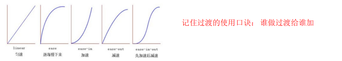
五、CSS3 过渡(重点)
过渡(transition)是CSS3中具有颠覆性的特征之一,我们可以在不使用 Flash 动画或
JavaScript 的情况下,当元素从一种样式变换为另一种样式时为元素添加效果。
过渡动画: 是从一个状态 渐渐的过渡到另外一个状态
可以让我们页面更好看,更动感十足,虽然 低版本浏览器不支持(ie9以下版本) 但是不会影响页面布局。
我们现在经常和 :hover 一起 搭配使用。
transition: 要过渡的属性 花费时间 运动曲线 何时开始;
- 属性 : 想要变化的 css 属性, 宽度高度 背景颜色 内外边距都可以 。如果想要所有的属性都变化过渡, 写一个all 就可以。
- 花费时间: 单位是 秒(必须写单位) 比如 0.5s
- 运动曲线: 默认是 ease (可以省略)
- 何时开始 :单位是 秒(必须写单位)可以设置延迟触发时间 默认是 0s (可以省略)

六、2D转换
转换(transform)是CSS3中具有颠覆性的特征之一,可以实现元素的位移、旋转、缩放等效果。转换(transform)你可以简单理解为变形。
- 移动:translate
- 旋转:rotate
- 缩放:scale
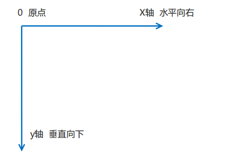
6.1 二维坐标系
2D转换是改变标签在二维平面上的位置和形状的一种技术,先来学习二维坐标系。
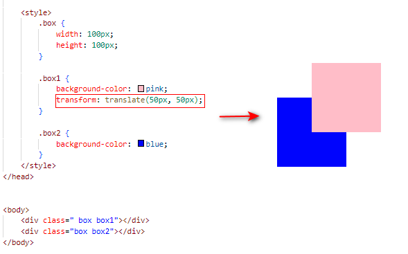
6.2 2D 转换之移动 translate
2D移动是2D转换里面的一种功能,可以改变元素在页面中的位置,类似定位。
1. 语法
transform: translate(x,y); 或者分开写
transform: translateX(n);
transform: translateY(n);
2. 重点
- 定义 2D 转换中的移动,沿着 X 和 Y 轴移动元素
- translate最大的优点:
不会影响到其他元素的位置 - translate中的百分比单位是
相对于自身元素的 translate:(50%,50%); 对行内标签没有效果
3. 示例
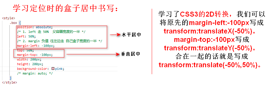
4. 让一个盒子水平垂直居中
6.3 2D 转换之旋转 rotate
2D旋转指的是让元素在2维平面内顺时针旋转或者逆时针旋转。
1. 语法
transform:rotate(度数)
2. 重点
- rotate里面跟度数, 单位是 deg 比如 rotate(45deg)
角度为正时,顺时针,负时,为逆时针- 默认旋转的中心点是元素的中心点
3. 案例:三角形
  div::after {
        /*使用::after 或者 ::before。一定要有content属性才生效!*/
         content: "";
         position: absolute;
         width: 10px;
         height: 10px;
         top: 8px;
         right: 14px;
         border-right: 1px solid #666;
         border-bottom: 1px solid #666;
         transform: rotate(45deg);
    }
6.4 2D 转换中心点 transform-origin
我们可以设置元素转换的中心点。
1. 语法
transform-origin: x y;
2. 重点
- 注意后面的参数
x 和 y 用空格隔开 - x y 默认转换的中心点是元素的中心点 (50% 50%)
- 还可以给x y 设置 像素 或者 方位名词 (top bottom left right center)
3. 案例:旋转案例
要求:鼠标放上去有如下效果。
<!DOCTYPE html>
<html lang="en">
<head>
    <meta charset="UTF-8">
    <meta http-equiv="X-UA-Compatible" content="IE=edge">
    <meta name="viewport" content="width=device-width, initial-scale=1.0">
    <title>Document</title>

    <style>
        div {
            width: 200px;
            height: 200px;
            margin: 100px auto;
            border: 1px solid pink;
            overflow: hidden;
        }

        div::after {
            content: "";
            display: block;
            width: 200px;
            height: 200px;
            background-color: hotpink;
            transform-origin: left bottom;
            transform: rotate(180deg);
            transition: all .5s;
        }

        div:hover::after {
            transform: rotate(0);
        }
    </style>
</head>
<body>
    <div></div>
</body>
</html>
6.5 2D 转换之缩放scale
缩放,顾名思义,可以放大和缩小。 只要给元素添加上了这个属性就能控制它放大还是缩小。
1. 语法
transform:scale(x,y);
2. 注意
- 注意其中的
x和y用逗号分隔 - transform:scale(1,1) :宽和高都放大一倍,相对于没有放大
- transform:scale(2,2) :宽和高都放大了2倍
- transform:scale(2) :只写一个参数,第二个参数则和第一个参数一样,相当于 scale(2,2)
- transform:scale(0.5,0.5):缩小
sacle缩放最大的优势:可以设置转换中心点缩放,默认以中心点缩放的,而且不影响其他盒子。(设置width height也可以放大缩小盒子,但是它会影响其他盒子)
3. 案例
要求:鼠标放到图上有个放大的效果,要注意使用overflow:hidden隐藏扩大后溢出盒子的部分。
<!DOCTYPE html>
<html lang="en">
<head>
    <meta charset="UTF-8">
    <meta http-equiv="X-UA-Compatible" content="IE=edge">
    <meta name="viewport" content="width=device-width, initial-scale=1.0">
    <title>Document</title>

    <style>
        div {
            width: 260px;
            height: 190px;
            margin: 100px auto;
            overflow: hidden;
        }

        img {
            width: 100%;
            height: 100%;
            transition: all .3s;  /*加个过渡,能看到渐变的过程*/
        }

        img:hover {
            transform: scale(1.2);
        }
    </style>
</head>
<body>
    <div><img src="images/pic.png" alt=""></div>
</body>
</html>
6.6 2D 转换总结
- 同时使用多个转换,其格式为:transform: translate() rotate() scale() …等
其顺序会影响转换的效果。(先旋转会改变坐标轴方向)- 转换transform 我们简单理解就是变形 有2D 和 3D 之分
- 我们暂且学了三个 分别是 位移 旋转 和 缩放
- 2D 移动 translate(x, y) 最大的优势是
不影响其他盒子, 里面参数用%,是相对于自身宽度和高度来计算的 - 可以分开写比如 translateX(x) 和 translateY(y)
- 2D 旋转 rotate(度数) 可以实现旋转元素 度数的单位是deg
- 2D 缩放 sacle(x,y) 里面参数是数字 不跟单位 可以是小数 最大的优势
不影响其他盒子 - 设置转换中心点 transform-origin : x y
x 和 y 用空格隔开。参数可以百分比、像素或者是方位名词 当我们进行综合写法,同时有位移和其他属性的时候,记得要将位移放到最前(一般是这样)
七、动画
动画(animation)是CSS3中具有颠覆性的特征之一,可通过设置多个节点来精确控制一个或一组动画,常用来实现复杂的动画效果。
相比较过渡,动画可以实现更多变化,更多控制,连续自动播放等效果。
7.1 动画的基本使用
制作动画分为两步:
1.先定义动画
2.再使用(调用)动画
Step 1:用keyframes 定义动画(类似定义类选择器)
/*动画序列*/
@keyframes 动画名称 {
 0%{
 width:100px;
 }
 100%{
 width:200px;
 }
}
- 0% 是动画的
开始,100% 是动画的完成。这样的规则就是动画序列。 - 在
@keyframes中规定某项 CSS 样式,就能创建由当前样式逐渐改为新样式的动画效果。 - 动画是使元素从一种样式逐渐变化为另一种样式的效果。您可以改变任意多的样式任意多的次数。
- 请用百分比来规定变化发生的时间,或用
关键词 "from" 和 "to",等同于 0% 和 100%。
Step 2:元素使用动画
div {
 width: 200px;
 height: 200px;
 background-color: aqua;
 margin: 100px auto;
 /* 调用动画 */
 animation-name: 动画名称;
 /* 持续时间 */
 animation-duration: 持续时间;
 }
案例:
要求:在打开页面时就有如下动画。

<!DOCTYPE html>
<html lang="en">
<head>
    <meta charset="UTF-8">
    <meta http-equiv="X-UA-Compatible" content="IE=edge">
    <meta name="viewport" content="width=device-width, initial-scale=1.0">
    <title>Document</title>

    <style>
        /* 动画序列*/
        /* 1.可以做多个状态的变化 */
        /* 2.里面的百分比要是整数 */
        /* 3.里面的百分比就是 总的时间(我们这个案例10s)的划分 */
        @keyframes move {
            0% {
                transform: translate(0, 0);
            }
            25% {
                transform: translate(1000px, 0);
            }
            50% {
                transform: translate(1000px, 500px);
            }
            75% {
                transform: translate(0, 500px);
            }
            100% {
                transform: translate(0, 0);
            }
        }

        div {
            width: 100px;
            height: 100px;
            background-color: pink;
            /* 调用动画 */
            animation-name: move;
            /* 持续时间 */
            animation-duration: 10s;
        }
    </style>
</head>
<body>
    <div></div>
</body>
</html>
7.2 动画常用属性
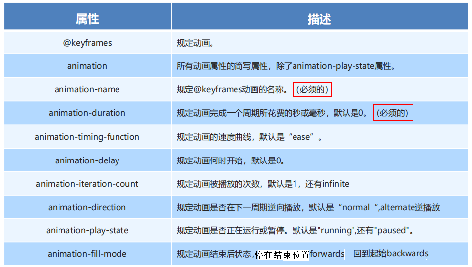
7.3 动画简写属性
animation:动画名称 持续时间 运动曲线 何时开始 播放次数 是否反方向 动画起始或者结束的状态;
animation: myfirst 5s linear 2s infinite alternate;
- 简写属性里面不包含 animation-play-state
- 暂停动画:animation-play-state: puased;
经常和鼠标经过等其他配合使用 - 想要动画走回来 ,而不是直接跳回来:
animation-direction: alternate - 盒子动画结束后,停在结束位置:
animation-fill-mode: forwards
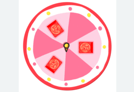
7.3.1 案例:热点图
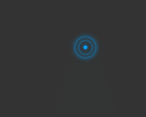
<!DOCTYPE html>
<html lang="en">
<head>
    <meta charset="UTF-8">
    <meta name="viewport" content="width=device-width, initial-scale=1.0">
    <meta http-equiv="X-UA-Compatible" content="ie=edge">
    <title>Document</title>
    <style>
        .map {
            position: relative;
            width: 297px;
            height: 237px;
            background-color: #333;
            margin: 100px auto;
        }


        .dotted {
            position: absolute;
            top: 89px;
            right: 110px;
            width: 8px;
            height: 8px;
            background-color: #09f;
            border-radius: 50%;
        }

        /*权重21*/
        .city div[class^="pulse"] {
            /* 保证我们小波纹在父盒子里面水平垂直居中 放大之后就会中心向四周发散 */
            position: absolute;
            top: 50%;
            left: 50%;
            transform: translate(-50%, -50%);
            width: 8px;
            height: 8px;
            box-shadow: 0 0 12px #009dfd;
            border-radius: 50%;
            animation: pulse 1.2s linear infinite;
        }

        /*原本写成div.pulse2,此时权重11,那么就执行上面的animation-delay:0(默认的)了,因此要写成.city div.pulse2 提高权重*/
        /*权重21*/
        .city div.pulse2 {
            animation-delay: 0.4s;
        }

        .city div.pulse3 {
            animation-delay: 0.8s;
        }

        @keyframes pulse {
            0% {}

            70% {
                /* transform: scale(5);  我们不要用scale 因为他会让 阴影变大*/
                width: 40px;
                height: 40px;
                opacity: 1;
            }

            100% {
                width: 70px;
                height: 70px;
                opacity: 0;
            }
        }
    </style>
</head>

<body>
    <div class="map">
        <div class="city">
            <div class="dotted">
                <div class="pulse1"></div>
                <div class="pulse2"></div>
                <div class="pulse3"></div>
            </div>
        </div>
    </div>
</body>
</html>
7.4 速度曲线细节
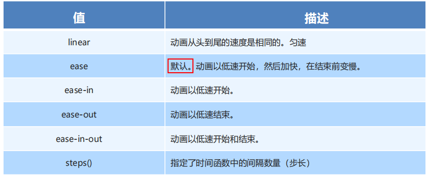
animation-timing-function:规定动画的速度曲线,默认是“ease”。
7.4.1 案例:奔跑的熊大
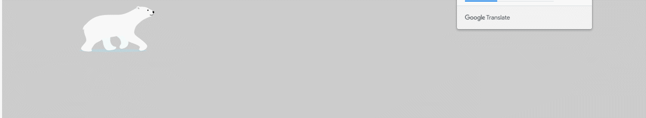
提供的图如下:

<!DOCTYPE html>
<html lang="en">
<head>
    <meta charset="UTF-8">
    <meta name="viewport" content="width=device-width, initial-scale=1.0">
    <meta http-equiv="X-UA-Compatible" content="ie=edge">
    <title>Document</title>
    <style>
        body {
            background-color: #ccc;
        }

        div {
            position: absolute;
            width: 200px;
            height: 100px;
            background: url(images/bear.png) no-repeat;
            /* 我们元素可以添加多个动画, 用逗号分隔 */
            animation: bear .4s steps(8) infinite, move 3s forwards;
        }

        @keyframes bear {
            0% {
                background-position: 0 0;
            }

            100% {
                background-position: -1600px 0;
            }
        }

        @keyframes move {
            0% {
                left: 0;
            }

            100% {
                left: 50%;
                /* margin-left: -100px; */
                transform: translateX(-50%);
            }
        }
    </style>
</head>
<body>
    <div></div>
</body>
</html>
八、3D转换
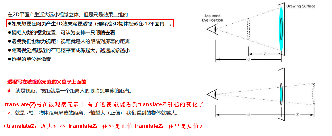
我们生活的环境是3D的,照片就是3D物体在2D平面呈现的例子。
有什么特点
- 近大远小。
- 物体后面遮挡不可见
当我们在网页上构建3D效果的时候参考这些特点就能产出3D效果。
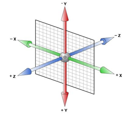
8.1 三维坐标系
三维坐标系其实就是指立体空间,立体空间是由3个轴共同组成的。
- x轴:水平向右 注意: x 右边是正值,左边是负值
- y轴:垂直向下 注意:
y 下面是正值,上面是负值 - z轴:垂直屏幕 注意: 往外面是正值,往里面是负值
8.2 3D移动 translate3d
3D移动在2D移动的基础上多加了一个可以移动的方向,就是z轴方向。
- translform:translateX(100px):仅仅是在x轴上移动
- translform:translateY(100px):仅仅是在Y轴上移动
- translform:translateZ(100px):仅仅是在Z轴上移动(注意:translateZ一般用px单位)
- transform:
translate3d(x,y,z):其中 x、y、z 分别指要移动的轴的方向的距离 因为z轴是垂直屏幕,由里指向外面,所以默认是看不到元素在z轴的方向上移动。
注:transform:translate3d(x,y,z)中x y z不能省略,没有的话就写0。
8.3 透视 perspective
8.4 3D旋转 rotate3d
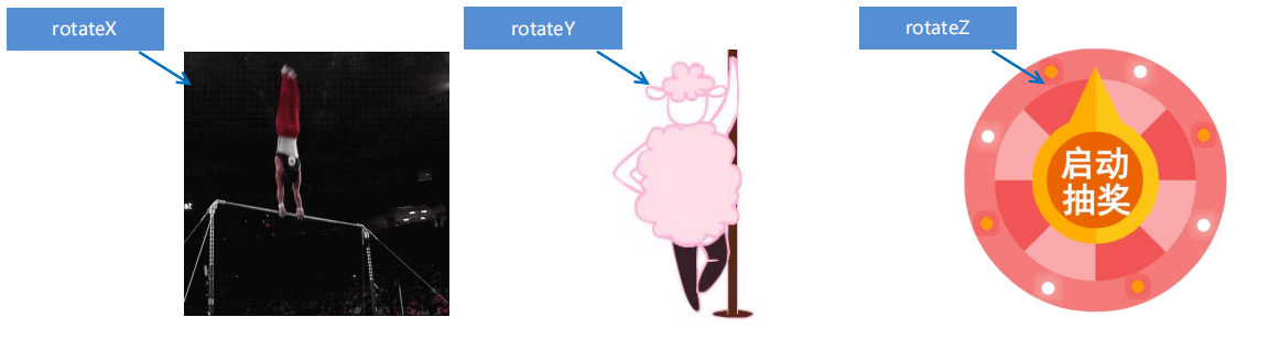
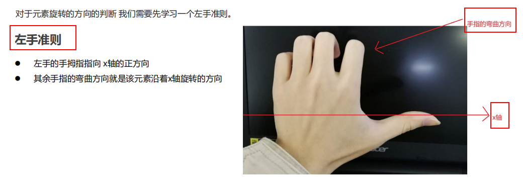
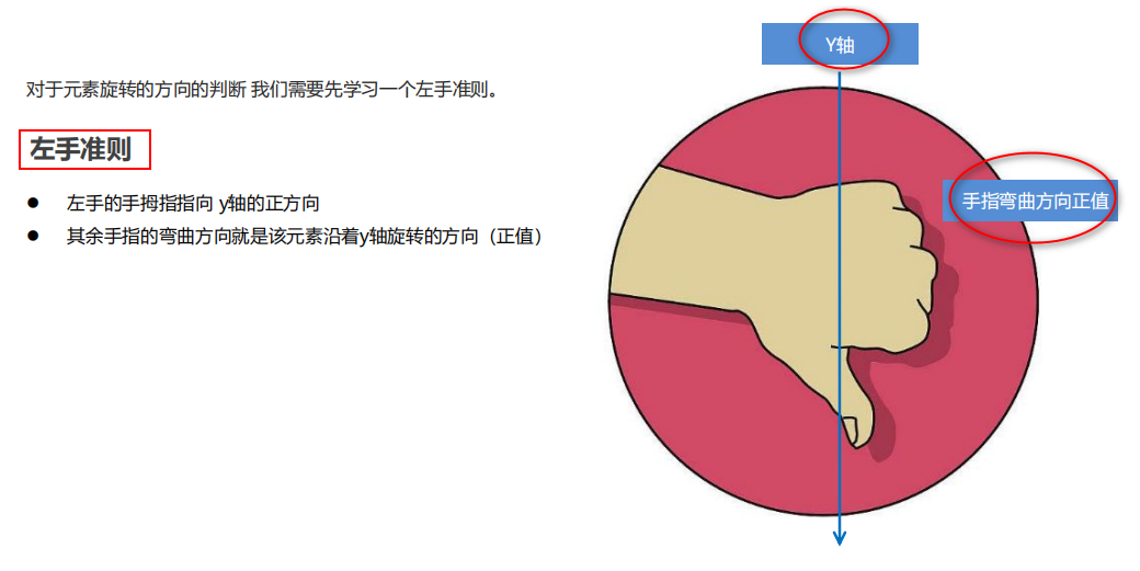
3D旋转指可以让元素在三维平面内沿着 x轴,y轴,z轴或者自定义轴进行旋转。
语法:
- transform:rotateX(45deg):沿着x轴正方向旋转 45度
- transform:rotateY(45deg) :沿着y轴正方向旋转 45deg
- transform:rotateZ(45deg) :沿着Z轴正方向旋转 45deg
- transform:rotate3d(x,y,z,deg): 沿着自定义轴旋转 deg为角度(了解即可)
8.4.1 3D旋转 rotateX
示例:
<!DOCTYPE html>
<html lang="en">

<head>
    <meta charset="UTF-8">
    <meta name="viewport" content="width=device-width, initial-scale=1.0">
    <meta http-equiv="X-UA-Compatible" content="ie=edge">
    <title>Document</title>
    <style>
        body {
            perspective: 500px;
        }

        img {
            display: block;
            margin: 100px auto;
            transition: all 1s;
        }

        img:hover {
            transform: rotateX(45deg);
        }
    </style>
</head>

<body>
    <img src="media/pig.jpg" alt="">
</body>

</html>
8.4.2 3D旋转 rotateY
8.4.3 3D旋转 rotateZ
8.4.4 3D旋转 rotate3d
transform:rotate3d(x,y,z,deg): 沿着自定义轴旋转 deg为角度(了解即可)
xyz是表示旋转轴的矢量,是标示你是否希望沿着该轴旋转,最后一个标示旋转的角度。
- transform:rotate3d(1,0,0,45deg) 就是沿着x轴旋转 45deg
- transform:rotate3d(1,1,0,45deg) 就是沿着对角线旋转 45deg
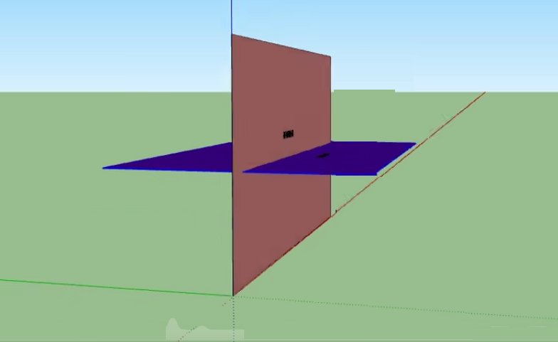
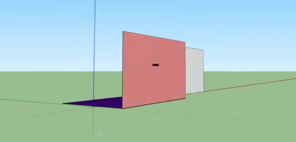
8.5 3D呈现 transfrom-style(重要)
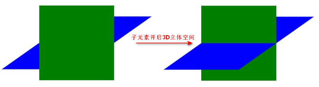
问:前面讲的都是给一个盒子加3D效果,那么如果一个父盒子有3D效果,那它的子盒子们是3D效果吗?
答:子元素默认不开启3d立体空间,需要transfrom-style开启。
- 控制子元素是否开启三维立体环境。
- transform-style: flat 子元素不开启3d立体空间
默认的 transform-style: preserve-3d;子元素开启立体空间代码写给父级,但是影响的是子盒子
8.5.1 案例:两面翻转的盒子
要求:鼠标放上去会翻转。
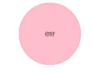
1. 理论分析
Step1:搭建HTML结构
<div class="box">
    <div class="front">你好</div>
    <div class=“back">中国</div>
</div>
- box父盒子里面包含前后两个子盒子
- box 是翻转的盒子 front是前面盒子 back是后面盒子
Step2:CSS样式
① box指定大小,切记要添加3d呈现
② back盒子要沿着Y轴翻转180度
③ 最后鼠标经过box 沿着Y旋转180deg
2. 代码书写
<!DOCTYPE html>
<html lang="en">
<head>
    <meta charset="UTF-8">
    <meta name="viewport" content="width=device-width, initial-scale=1.0">
    <meta http-equiv="X-UA-Compatible" content="ie=edge">
    <title>Document</title>
    <style>
        body {
            /*设置透视*/
            perspective: 400px;
        }
        .box {
            position: relative;
            width: 200px;
            height: 200px;
            margin: 100px auto;
            transition: all 2s;
            /* 让子元素(背面的紫盒子)保留立体空间 所以给父级添加transform-style */
            transform-style: preserve-3d;
            /*backface-visibility 属性定义当元素背面向屏幕时是否可见*/
            backface-visibility: hidden;
        }

        .front,
        .back {
            position: absolute;
            left: 0;
            top: 0;
            width: 200px;
            height: 200px;
            border-radius: 50%;
            text-align: center;
            line-height: 200px;
        }

        .front {
            background-color: pink;
            z-index: 1;
        }

        .back {
            background-color: purple;
            /* 先让紫盒子翻转,这样字就会正常显示。就像手机一样 背靠背 旋转 才能看到正常的页面*/
            transform: rotateY(180deg);
        }

        .box:hover {
            transform: rotateY(180deg);
        }
    </style>
</head>

<body>
    <div class="box">
        <div class="front">你好</div>
        <div class="back">中国</div>
    </div>
</body>
</html>
8.5.2 案例:3D导航栏
要求:鼠标放上去有如下效果。
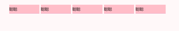
1. 理论分析
Step1: 搭建HTML结构
<ul>
 <li>
 <div class="box">
 <div class="front">聪聪</div>
 <div class="bottom">我想你</div>
 </div>
 </li>
</ul>
- li做导航栏
- .box 是翻转的盒子 front是前面盒子 bottom是底下盒子
Step2:CSS样式
① li设置大小,加透视和 3d呈现
② bottom 沿着x轴翻转 负90度,下移 17.5像素(盒子高的一半)
③ front 需要前移 17.5像素(盒子高的一半)
④ 鼠标放到box 让盒子旋转90度

2. 代码书写
<!DOCTYPE html>
<html lang="en">

<head>
    <meta charset="UTF-8">
    <meta http-equiv="X-UA-Compatible" content="IE=edge">
    <meta name="viewport" content="width=device-width, initial-scale=1.0">
    <title>Document</title>
</head>
<style>
    * {
        margin: 0;
        padding: 0;
    }

    ul {
        margin: 50px;
    }

    ul li {
        float: left;
        margin: 0 5px;
        width: 120px;
        height: 35px;
        list-style: none;
        /* 一会我们需要给box 旋转 也需要透视 干脆给li加 里面的子盒子都有透视效果 */
        perspective: 500px;
    }

    .box {
        position: relative;
        width: 100%;
        height: 100%;
        transform-style: preserve-3d;
        transition: all .4s;
    }

    .box:hover {
        transform: rotateX(90deg);
    }

    .front,
    .bottom {
        position: absolute;
        top: 0;
        left: 0;
        width: 100%;
        height: 100%;
        line-height: 35px;
    }

    .front {
        background-color: pink;
        z-index: 1;
        transform: translateZ(17.5px);

    }

    .bottom {
            background-color: purple;
            /* 这个x轴一定是负值 */
            /* 我们如果有移动 或者其他样式,必须先写我们的移动 */
            transform: translateY(17.5px) rotateX(-90deg);
       }

    .box:hover {
        transform: rotateX(90deg);
    }
</style>

<body>
    <ul>
        <li>
            <div class="box">
                <div class="front">聪聪</div>
                <div class="bottom">我想你</div>
            </div>
        </li>
        <li>
            <div class="box">
                <div class="front">聪聪</div>
                <div class="bottom">我想你</div>
            </div>
        </li>
    </ul>
</body>

</html>
8.5.3 案例:旋转木马

1. 理论分析
Step 1:搭建HTML结构
<section>
 	<div></div>
 	<div></div>
 	<div></div>
 	<div></div>
 	<div></div>
	<div></div>
</section>
里面的6个div 分别是 6个狗狗图片- 注意最终旋转是section标签 旋转
Step 2:CSS样式
① 给body添加 透视效果 perspective: 1000px;
② 给section 添加 大小,一定不要忘记添加 3d呈现效果控制里面的6个div
- 别忘记子绝父相,section要加相对定位
③ 里面6个div 全部绝对定位叠到一起,然后移动不同角度旋转和距离
- 注意:旋转角度用rotateY 距离肯定用 translateZ来控制
④ 给section 添加动画animation ,让它可以自动旋转即可
2. 代码书写
<!DOCTYPE html>
<html lang="en">
<head>
    <meta charset="UTF-8">
    <meta name="viewport" content="width=device-width, initial-scale=1.0">
    <meta http-equiv="X-UA-Compatible" content="ie=edge">
    <title>Document</title>
    <style>
        body {
            perspective: 1000px;
        }

        section {
            position: relative;
            width: 300px;
            height: 200px;
            margin: 150px auto;
            transform-style: preserve-3d;
            /* 添加动画效果 */
            animation: rotate 10s linear infinite;
        }

        section:hover {
            /* 鼠标放入section 停止动画 */
            animation-play-state: paused;
        }

        @keyframes rotate {
            0% {
                transform: rotateY(0);
            }

            100% {
                transform: rotateY(360deg);
            }
        }

        section div {
            position: absolute;
            top: 0;
            left: 0;
            width: 100%;
            height: 100%;
            background: url(images/dog.jpg) no-repeat;
        }

        section div:nth-child(1) {
            transform: rotateY(0) translateZ(300px);
        }

        section div:nth-child(2) {
            /* 先旋转好了再 移动距离 */
            transform: rotateY(60deg) translateZ(300px);
        }

        section div:nth-child(3) {
            /* 先旋转好了再 移动距离 */
            transform: rotateY(120deg) translateZ(300px);
        }

        section div:nth-child(4) {
            /* 先旋转好了再 移动距离 */
            transform: rotateY(180deg) translateZ(300px);
        }

        section div:nth-child(5) {
            /* 先旋转好了再 移动距离 */
            transform: rotateY(240deg) translateZ(300px);
        }

        section div:nth-child(6) {
            /* 先旋转好了再 移动距离 */
            transform: rotateY(300deg) translateZ(300px);
        }
    </style>
</head>

<body>
    <section>
        <div></div>
        <div></div>
        <div></div>
        <div></div>
        <div></div>
        <div></div>
    </section>
</body>
</html>
九、浏览器私有前缀
浏览器私有前缀是为了兼容老版本的写法,比较新版本的浏览器无须添加。
1. 私有前缀
- -moz-:代表 firefox 浏览器私有属性
- -ms-:代表 ie 浏览器私有属性
- -webkit-:代表 safari、chrome 私有属性
- -o-:代表 Opera 私有属性
2. 提倡的写法
-moz-border-radius: 10px;
-webkit-border-radius: 10px;
-o-border-radius: 10px;
border-radius: 10px;


 353
353


 被折叠的 条评论
为什么被折叠?
被折叠的 条评论
为什么被折叠?
 到【灌水乐园】发言


