


提示:以下是本篇文章正文内容,下面案例可供参考
一、CSS是什么?
CSS是层叠样式表(Cascading Style Sheets)
CSS 能够对网页中元素位置的排版进行像素级精确控制,
实现美化页面的效果. 能够做到页面的样式和结构分离.
说句人话就是:css就是化妆
如果说HTML只是表示页面的结构和内容,那么CSS描述的就是页面的样式
具体来说,就是描述了任意一个网页的元素:大小/位置/字体/颜色/背景/边框…
二、基本语法
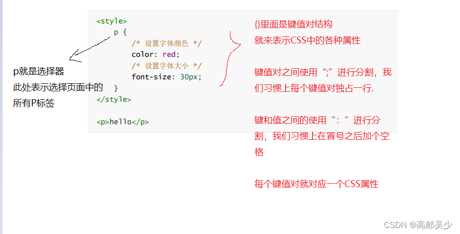
选择器 +引用的属性:
1)选择器决定针对谁修改 (找谁)
2)声明决定修改啥. (干啥)
3)声明的属性是键值对. 使用 ; 区分键值对, 使用 : 区分键和值.
<style>
    p {
        /* 设置字体颜色 */
        color: red;
        /* 设置字体大小 */
        font-size: 30px;
   }
</style>
<p>hello</p>
ps:
CSS 要写到 style 标签中(后面还会介绍其他写法)
style 标签可以放到页面任意位置. 一般放到 head 标签内.
CSS 使用 /* */ 作为注释. (使用 ctrl + / 快速切换) .
三、引入方式
3.1内部样式表
通过style标签来写CSS
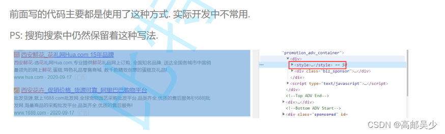
这种方式并不常见,但是如果仅仅是写一些简单的CSS也没毛病
写法:写在 style 标签中. 嵌入到 html 内部
优点: 这样做能够让样式和页面结构分离.
缺点: 分离的还不够彻底. 尤其是 css 内容多的时候.
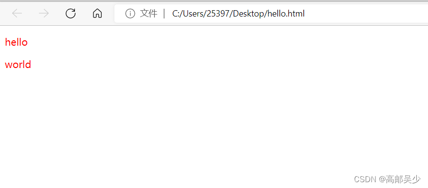
比如我们现在让hello字体变成红色
<style>
        p{
            color: red;
        }
</style>
<p>
        hello
</p>
嵌入到html中
<!DOCTYPE html>
<html lang="en">
<head>
    <meta charset="UTF-8">
    <meta http-equiv="X-UA-Compatible" content="IE=edge">
    <meta name="viewport" content="width=device-width, initial-scale=1.0">
    <title>Document</title>
</head>
<body>
    <style>
        p{
            color: red;
        }
    </style>
    <p>
        hello
    </p>
     <p>
        world
    </p>
</body>
</html>
注: p 是选择器,会针对所有带p标签的
实际网页效果如下:
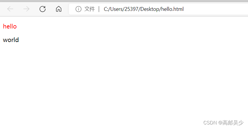
3.2内联样式
通过html标签中的style属性来应用
我们这里同样的让hello字体变成红色
示例如下:
<p style="color: red;">hello</p>
这种内联样式,是属于一种比较特殊的用法(通常会搭配JS使用),
这种写法只适用于比较简单的情况(如果样式比较复杂,就会显的很乱)
举个例子
<p style="color: red;">hello</p>
<p>
      world
</p>
内联样式,我们style里面只放了hello,所以字体颜色变红只会针对hello生效,world并不会改变
这和3.1说的内部样式(针对所有选择器)有着很大区别
3.3外部样式
外部样式是实际开发用的最多的
把CSS代码单独抽出来,放到一个.css文件中,然后在html代码中,通过link标签来引入该CSS文件。
这种方式,可以让多个html复用同一个样式
比如写一个网站,这个网站里可能有很多页面,这些页面样式都是相似的
这种写法类似于java中定义一个方法,不光要定义,还要调用
调用方法就是,在head里面加上link标签
link标签中,默认ret=“stylesheet” 表示样式表的意思,然后你在href后面加上你要引入哪个css文件
<!DOCTYPE html>
<html lang="en">
<head>
    <meta charset="UTF-8">
    <meta http-equiv="X-UA-Compatible" content="IE=edge">
    <meta name="viewport" content="width=device-width, initial-scale=1.0">
    <title>Document</title>
    <link rel="stylesheet" href="test.css">
</head>
<body>
    <p>
        hello
    </p>
    <p>
        world
    </p>
</body>
</html>
四、代码风格
4.1样式格式
1.紧凑风格
p { color: red; font-size: 30px;}
2.展开风格(推荐)
p {
    color: red;
    font-size: 30px;
}
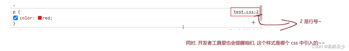
如果多了一下换行,虽然对程序员友好了,但是整体的css文件就会变大,由于css文件都是通过网络传输给浏览器,然后由浏览器来进行解析的,如果css文件变大了,也就更吃网络带宽,从而影响效率
因此通过开发者工具,你去看一些网站,你会发现网站的CSS一般都是紧凑风格,然而我们在开发代码阶段一般用的是宽松的换行风格
实际上我们是通过第三方工具自动进行风格转换的(前端的打包工具)
ps:不光css如此,js更加丧心病狂,js不仅会把你的换行给弄掉,并且你的变量名都会变成a、b、c这种短名字
4.2样式大小写
HTML和CSS都是不区分大小写的,我们习惯上使用小写
而正因为同一使用小写,所以就不存在“驼峰命名法”,eg:numCount
如果写numcount就很难看出是两个词语了,那怎么写呢?
我们CSS中会通常用“脊柱命名法”,也就是用“-”来分割两个单词,eg:font-size
脊柱命名法在日常开发中并不常见,因为大部分编程语言都不允许使用“-”,防止与减号混淆。而css中并没有运算,所以“-”可以使用
4.3空格规范
冒号后面带空格
选择器和 { 之间也有一个空格.
五、选择器
5.1选择器的功能
选中页面中指定的标签元素.
要先选中元素, 才能设置元素的属性.
就好比 SC2, War3 这样的游戏, 需要先选中单位, 再指挥该单位行动.
5.2选择器的种类
- 基础选择器: 单个选择器构成的
标签选择器
类选择器
id 选择器
通配符选择器 - 复合选择器: 把多种基础选择器综合运用起来.
后代选择器
子选择器
并集选择器
伪类选择器
参考文档: https://www.w3school.com.cn/cssref/css_selectors.asp>
5.3基础选择器
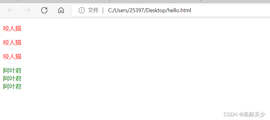
5.3.1标签选择器
这种选择器就是html的一个标签名
特点: 能快速为同一类型的标签都选择出来,但是不能差异化选择
<style>
p {
    color: red;
}
div {
    color: green;
}
</style>
<p>咬人猫</p>
<p>咬人猫</p>
<p>咬人猫</p>
<div>阿叶君</div>
<div>阿叶君</div>
<div>阿叶君</div>
网页效果如下:
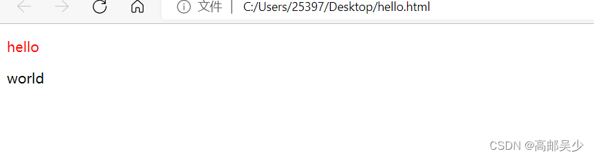
5.3.2类选择器
类选择器是最常用的,也是最灵活的
通过类选择器,我们可以随心所欲选择任意想要的元素,理论上来说只要这一种选择器就可以了
特点: 差异化表示不同的标签,可以让多个标签的都使用同一个标签.
使用方法:首先需要在CSS代码中,创建一个类名,在对应的html元素中,通过class属性来引用这个类名,此时具有该类名的元素,就都会应用上相关的CSS属性。
 <style>
            /* .开头的就是css中的类名 */
            .red{
                color: red;
            }
        </style>
        <p class="red">
            hello
        </p>
        <p>
            world
        </p>
网页效果如下:
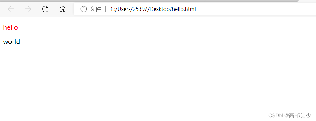
5.3.3id选择器
特点:CSS 中使用 # 开头表示 id 选择器
id 选择器的值和 html 中某个元素的 id 值相同
html 的元素 id 不必带 #
id 是唯一的, 不能被多个标签使用 (是和 类选择器 最大的区别
使用方法:给被选择的元素设一个id属性(id在一个页面中,不能重复)
因此id选择器只能选择一个元素,不能使用多个
<style>
            #red{
            color:red;
        }
        </style>
        <p id="red">
            hello
        </p>
        <p>
            world
        </p>
网页效果如下:
5.3.4通配符选择器
通配符选择器就是一个单纯的“ * ”
通配符是什么呢?
大家联想一下mysql模糊查询里的%和_
你想查询到李字开头的人,你就可以用like 李%,这个%就可以代表所有的字
而我们的*就是css里面的通配符
它是用来直接选择页面上所有元素的
*{
margin:0;
padding:0;
box-sizing:border-box;
}
这就表示对所有页面的html都应用上述的样式
5.3.5基础选择器后记
CSS中选择器非常多,我们这里只介绍最简单也最常见的,了解上述的4个基本上就够用了。
5.4复合选择器
5.4.1后代选择器
我们可以通过多个选择器的组合,能够选择某个元素里面的子孙元素(后代元素)
使用方法:
选择器1 选择器2 {样式声明}
选择器 1 和 选择器 2 要使用空格分割
选择器 1 是父级, 选择器 2 是子级, 只选选择器 2 , 不影响选择器 1
选择器1和2都可以是标签选择器/类选择器/id选择器
写法1
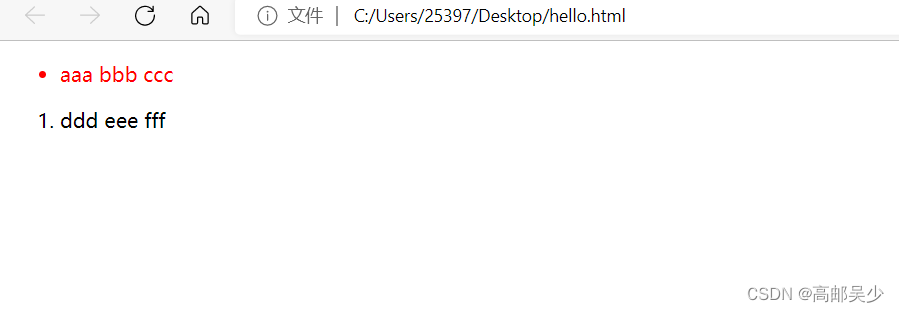
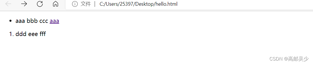
eg:将ul 中li字体变成红色,ol的不变
<style>
            ul li{
            color: red;
        }
        </style>
        <ul>
            <li>
                aaa
                bbb
                ccc
            </li>
        </ul>
        <ol>
            <li>
                ddd
                eee
                fff
            </li>
        </ol>
网页效果如下:
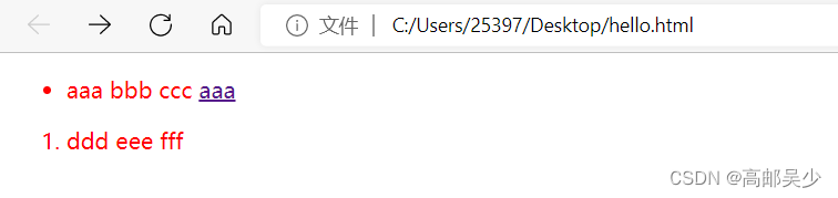
写法2
这里选择器1 .选择器2,两者必须有空格,如果你不加空格完全是两个意思,如下图
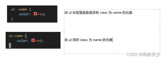
<style>
            ul .zimu{
            color: red;
        }
        </style>
        <ul>
            <li class="zimu">
                aaa
                bbb
                ccc
            </li>
        </ul>
        <ol>
            <li class="zimu">
                ddd
                eee
                fff
            </li>
        </ol>
网页效果如下:
5.4.2子选择器
我们可以通过多个选择器的组合,能够选择某个元素里面的子元素
使用方法:和后代选择器类似, 但是只能选择子标签.
选择器1>选择器2 { 样式声明 }
使用大于号分割
只选亲儿子, 不选孙子元素
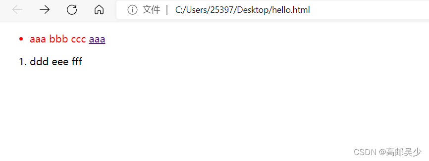
示例1
<style>
            ul>li{
            color: red;
        }
        </style>
        <ul>
            <li class="zimu">
                aaa
                bbb
                ccc
                <a href="#">aaa</a>
                <!-- a标签相对于ul是孙子辈标签 -->
            </li>
        </ul>
        <ol>
            <li class="zimu">
                ddd
                eee
                fff
            </li>
        </ol>
网页效果如下:
示例2:
<style>
            ul>a{
            color: red;
        }
        </style>
        <ul>
            <li class="zimu">
                aaa
                bbb
                ccc
                <a href="#">aaa</a>
                <!-- a标签相对于ul是孙子辈标签 -->
            </li>
        </ul>
        <ol>
            <li class="zimu">
                ddd
                eee
                fff
            </li>
        </ol>
这里由于a是ul的孙子辈标签,你要在ul里面找a,要找的这个a是儿子辈的,显然是没有啊,所以没有红色字体
5.4.3并集选择器
用于选择多组标签. (集体声明)
使用方法:
选择器1, 选择器2 { 样式声明 }
eg:将ul和ol里的li都变成红色
<style>
            ul>li, ol>li{
            color: red;
        }
        </style>
        <ul>
            <li class="zimu">
                aaa
                bbb
                ccc
                <a href="#">aaa</a>
                <!-- a标签相对于ul是孙子辈标签 -->
            </li>
        </ul>
        <ol>
            <li class="zimu">
                ddd
                eee
                fff
            </li>
        </ol>
网页效果如下:
第一行第二个aaa为什么没有变成红色?因为我们用的是ul>li,原因同5.4.2子选择器
5.4.4伪类选择器
1) 链接伪类选择器
a:link 选择未被访问过的链接
a:visited 选择已经被访问过的链接
a:hover 选择鼠标指针悬停上的链接
a:active 选择活动链接(鼠标按下了但是未弹起)
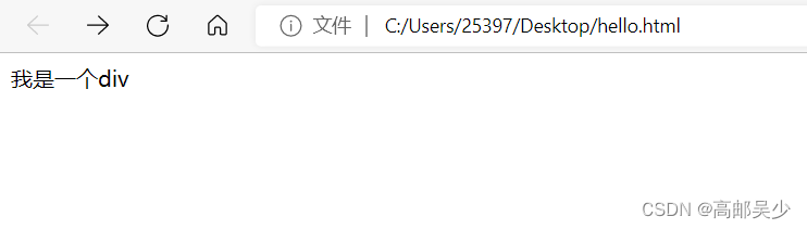
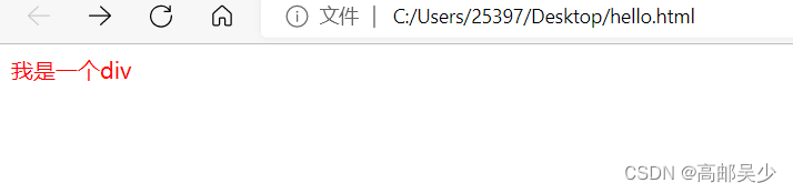
link和visited实际用的并不多,我们主要演示 hover和active
hover
<style>
            div{
                color: black;
            }
            div:hover{
                color: red;
            }
        </style>
        <div>
            我是一个div
        </div>
鼠标没放上去时,是黑色
鼠标放上去时,是红色
active
<style>
            div{
                color: black;
            }
            div:active{
                color: red;
            }
        </style>
        <div>
            我是一个div
        </div>
2) :force 伪类选择器
选取获取焦点的 input 表单元素
<div class="three">
    <input type="text">
    <input type="text">
    <input type="text">
    <input type="text">
</div>
.three>input:focus {
    color: red;
}
此时被选中的表单的字体就会变成红色
5.4.5复合选择器后记
六、常用元素属性
属性有很多,不要求全部背下来,在使用中进行学习
参考文档:https://www.w3school.com.cn/cssref/index.asp
6.1字体属性
6.1.1设置字体
font-family语言上看,字体家族,说白了就是字体种类
设置字体的时候,需要保证,你设置的字体,对方的电脑上存在,
系统是自己默认带一些字体的,但还会有一些额外的第三方字体。
如果你想用第三方字体,你需要确认别人的机器上有没有这个。
那怎么确认呢?也好办,我们可以通过html中的link属性来从网络上加载字体文件。
<style>
.one{
font-family: '微软雅黑';
}
.two{
font-family: '宋体';
}
</style>
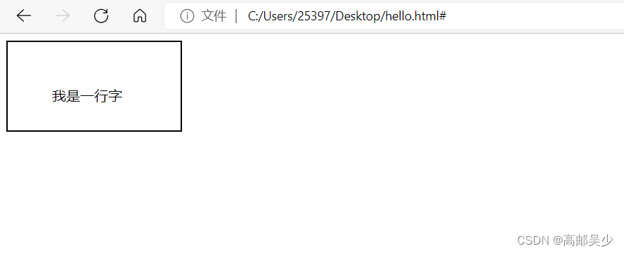
<div class="one">
我是第一行字
</div>
<div class="two">
我是第二行字
</div>
网页效果如下:
ps:font-family的值是可以设置多个的,如果设置多个,系统会依次检测第一个字体有没有,如果没有就往后检测第二个字体有没有…如果都没有,就会使用默认字体
6.1.2大小
font-size字体大小
 <style>
            .one{
                font-size: 50px;
            }
            .two{
                font-size: 20px;
            }
        </style>

        <div class="one">
            我是第一行字
        </div>
        <div class="two">
            我是第二行字
        </div>
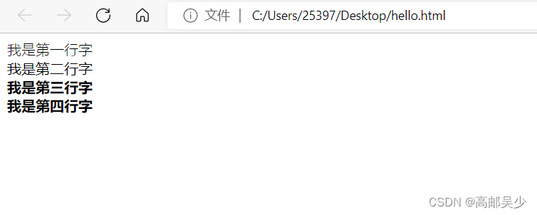
6.1.3粗细
font-weight字体粗细
<style>
            .one{
                font-weight: 900;
            }
            .two{
                font-weight: 300;
            }
        </style>

        <div class="one">
            我是第一行字
        </div>
        <div class="two">
            我是第二行字
        </div>
除了用数字来表示,还可以用lighter、normal、bold、bolder表示粗细
        <style>
            /* 更细 */
            .one{
                font-weight: lighter;
            }
            /* 正常 */
            .two{
                font-weight: normal;
            }
            /* 粗 */
            .three{
                font-weight: bold;
            }
            /* 更粗 */
            .four{
                font-weight: bolder;
            }
        </style>

        <div class="one">
            我是第一行字
        </div>
        <div class="two">
            我是第二行字
        </div>
        <div class="three">
            我是第三行字
        </div>
        <div class="four">
            我是第四行字
        </div>
网页效果如下:
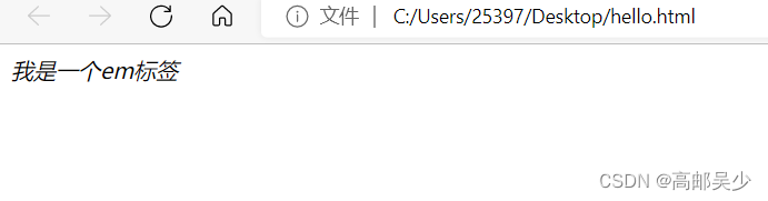
6.1.4样式
font-style字体样式,设置文字是不是倾斜的,是不是带下划线的
<em>我是一个em标签</em>
em标签本身是有一个倾斜的
如下图所示
如果想取消倾斜,你就用font-style: normal;
<style>
            em{
                font-style: normal;
            }
        </style>
        <em>我是一个em标签</em>
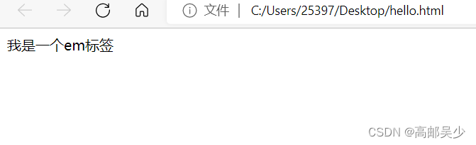
另外还有把普通的文本变成倾斜的
font-style: italic;
6.2文本属性
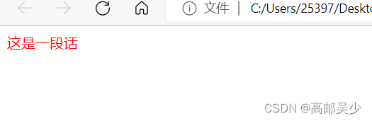
6.2.1颜色
认识 RGB
我们的显示器是由很多很多的 “像素” 构成的. 每个像素视为一个点, 这个点就能反映出一个具体的颜色.
我们使用 R (red), G (green), B (blue) 的方式表示颜色(色光三原色). 三种颜色按照不同的比例搭配, 就能
混合出各种五彩斑斓的效果.
计算机中针对 R, G, B 三个分量, 分别使用一个字节表示(8个比特位, 表示的范围是 0-255, 十六进制表示
为 00-FF).数值越大, 表示该分量的颜色就越浓. 255, 255, 255 就表示白色; 0, 0, 0 就表示黑色
设置文本颜色的三种写法
color: red;
color: #ff0000;
color: rgb(255, 0, 0);
color 属性值的写法:
预定义的颜色值(直接是单词)
[最常用] 十六进制形式
RGB 方式
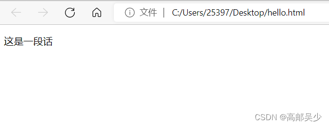
<style>
    .color {
        color: red;
        /* color: rgb(255, 0, 0); */
        /* color: #ff0000; */
   }
</style>
<div class="color">这是一段话</div>
ps:16进制可能会有缩写,比如#XXYYZZ=>#XYZ,00ff00=>0f0
还有一种写法是rgba,相对rgb多了一个透明度的分量,这里不多做介绍,感兴趣的小伙伴可自行百度
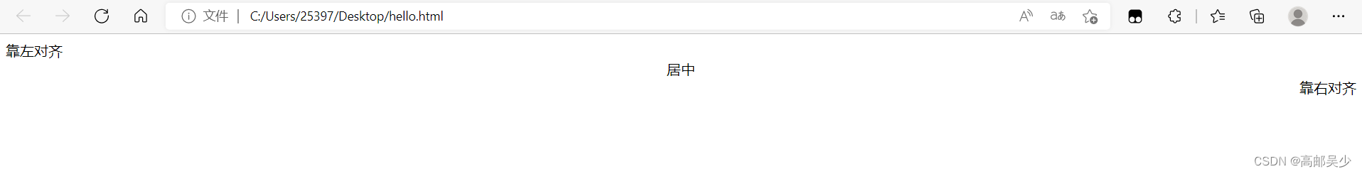
6.2.2文本对齐
文本对齐有3种:靠左、靠右、居中
我们用text=align来控制文本对齐
<style>
            .one{
                text-align: left;
            }
            .two{
                text-align: center;
            }
            .three{
                text-align: right;
            }
        </style>
        <div class="one">
            靠左对齐
        </div>
        <div class="two">
            居中
        </div>
        <div class="three">
            靠右对齐
        </div>
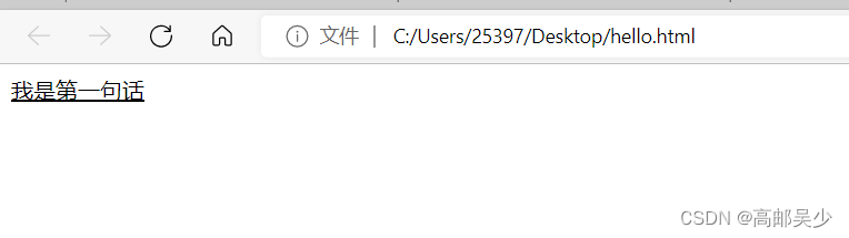
6.2.3文本装饰
text-decoration: [值];
常用取值:
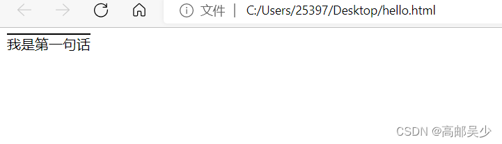
underline 下划线. [常用]
<style>
            div{
                text-decoration: underline;
            }
        </style>
        <div>
            我是第一句话
        </div>
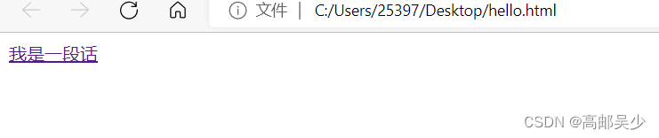
none 啥都没有. 可以给 a 标签去掉下划线.
单纯的a标签,里面放一段文字会产生下划线
<a href="">
            我是一段话
        </a>
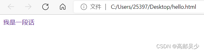
如果搭配text-decoration: none使用就会去除下划线
<style>
            a{
                text-decoration: none;
            }
        </style>
        <a href="">
            我是一段话
        </a>
overline 上划线. [不常用]
<style>
            div{
                text-decoration: overline;
            }
        </style>
        <div>
            我是第一句话
        </div>
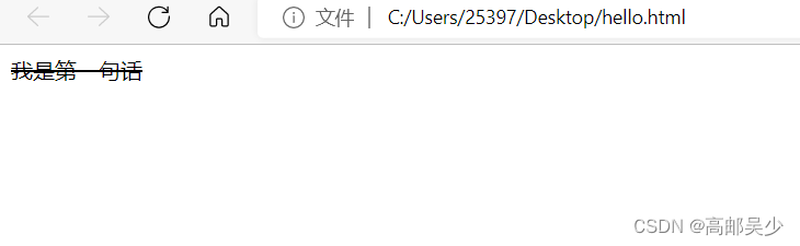
line-through 删除线 [不常用]
<style>
            div{
                text-decoration: line-through;
            }
        </style>
        <div>
            我是第一句话
        </div>
6.2.4文本缩进
text-indent: [值];
CSS中表示尺度的单位有:
1.px(最常用)
2.em,相对于当前元素的文字大小
em是相对的单位,比如现在p标签内文字大小为16px
那么1em=16px,2em=32px…
我们这里不用text-indent默认是不缩进的
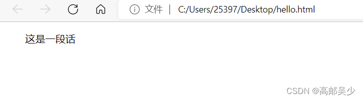
<style>
            p{
                font-size: 16px;
            }
        </style>
        <p>
            这是一段话
        </p>
如果想要缩进10个像素
<style>
            p{
                font-size: 16px;
                text-indent: 10px;
            }
        </style>
        <p>
            这是一段话
        </p>
缩进两字符(大部分情况都是要求缩进几个字符,而不是几个像素)
<style>
            p{
                font-size: 16px;
                text-indent: 2em;
            }
        </style>
        <p>
            这是一段话
        </p>
text-indent还可以取负数的值(反向缩进)
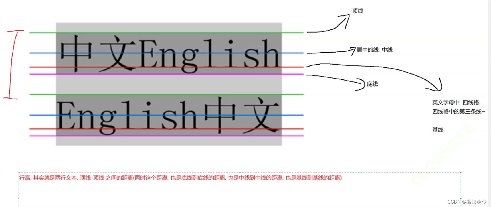
6.2.5行高
行高=字体大小+行间距
<div class="one">
            我是第一行
        </div>
        <div class="two">
            我是第二行
        </div>
        <div class="three">
            我是第三行
        </div>
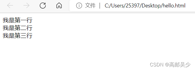
我们可以看到,不加处理的话,三句话是紧挨在一起的。
再来看看处理过行高的情况
 <style>
            .two{
                line-height: 50px;
            }
        </style>
        <div class="one">
            我是第一行
        </div>
        <div class="two">
            我是第二行
        </div>
        <div class="three">
            我是第三行
        </div>
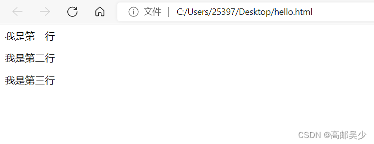
可以看到,设置行高的时候,会同时对上下两行产生影响
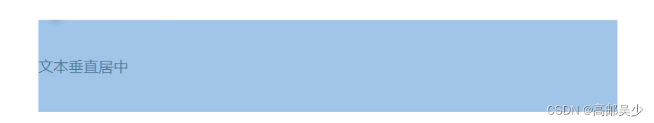
由于行高会对上下两个方向都产生影响,那么上下两个边距都是均等的,
而又因为行高是上下均等的,就可以基于行高来实现垂直方向的文本居中
<style>
    .line-height .two {
        height: 100px;
        line-height: 100px;
   }
</style>
<div class="line-height">
    <div class="two">
       文本垂直居中
    </div>
</div>
6.3背景属性
6.3.1背景颜色
background-color: [指定颜色]
ps:默认是 transparent (透明) 的. 可以通过设置颜色的方式修改.
设置背景颜色的用法和color非常相似
1.用表示颜色的英文单词,比如red红色
2.rgb
3.#十六进制数字
4.rgba
5.transparent 背景透明
<style>
            div{
                width: 200px;
                height: 200px;
                font-size: 20px;
                background-color: rgb(50,50,50);
                color:white;
                text-align: center;
                line-height: 150px;
            }
        </style>
        <div>
            这是一段话
        </div>
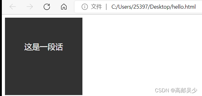
背景颜色和文本颜色不要设置太接近,否则容易看不清
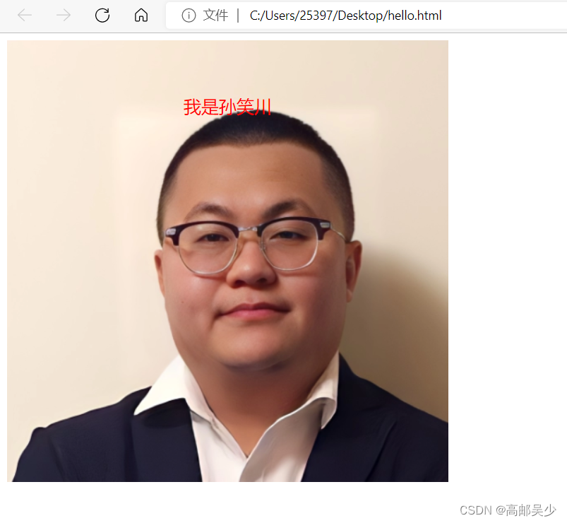
6.3.2背景图片
background-image: url(...);
比 image 更方便控制位置(图片在盒子中的位置)
注意:
- url 不要遗漏.
- url 可以是绝对路径, 也可以是相对路径
- url 上可以加引号, 也可以不加.
<style>
div{
width: 500px;
height: 500px;
font-size: 20px;
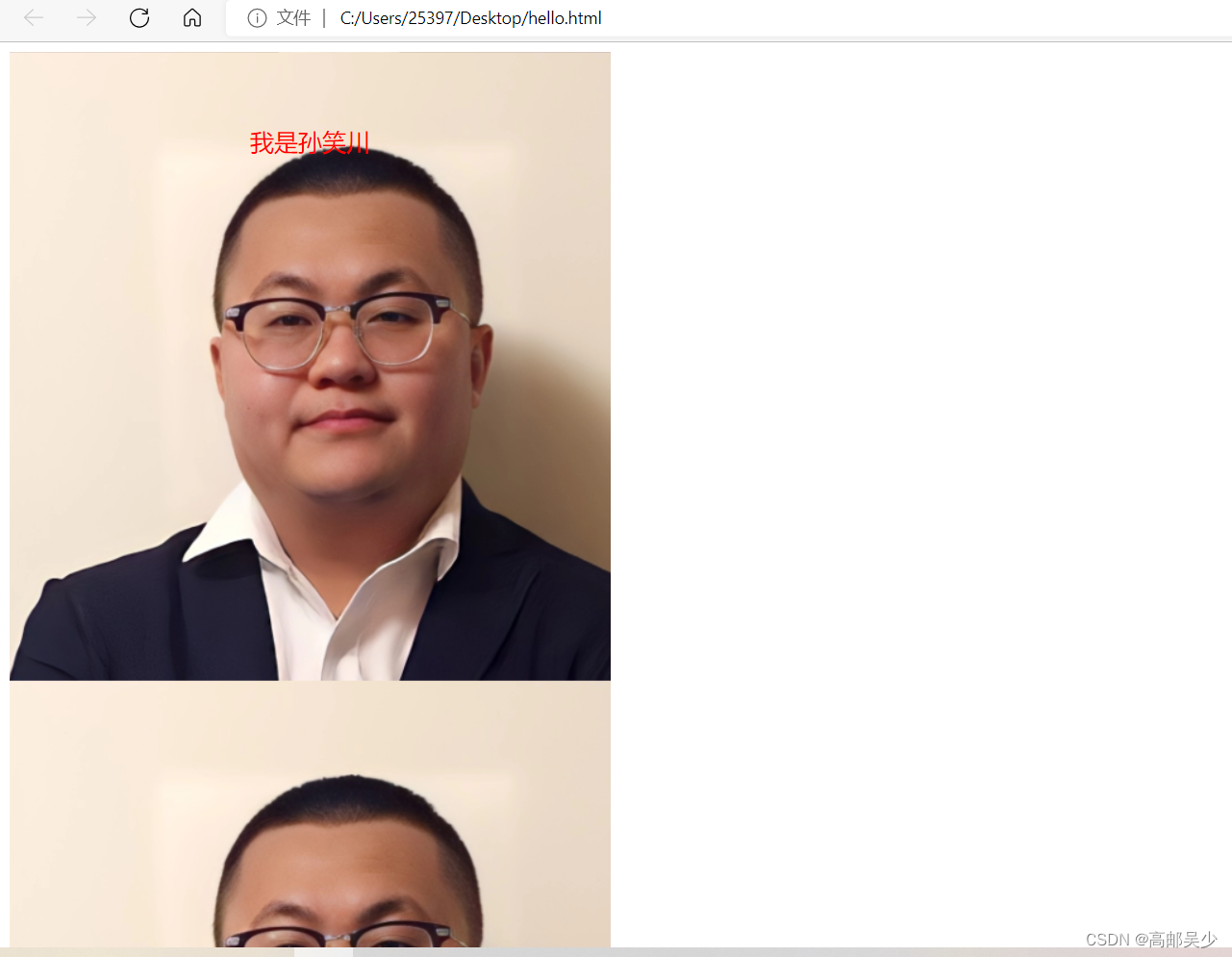
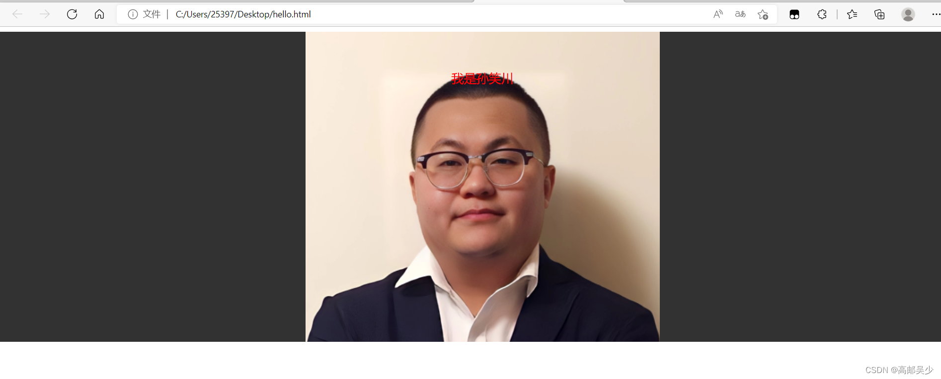
background-image: url(./sxc.jpg);
color:red;
text-align: center;
line-height: 150px;
}
</style>
<div>
我是孙笑川
</div>
6.3.3背景平铺
background-repeat: [平铺方式]
重要取值:
repeat: 平铺
no-repeat: 不平铺
repeat-x: 水平平铺
repeat-y: 垂直平铺
ps:默认是repeat
如果你把背景图片的宽度width设置的比较大,那就会出现多个图片在一行的情况
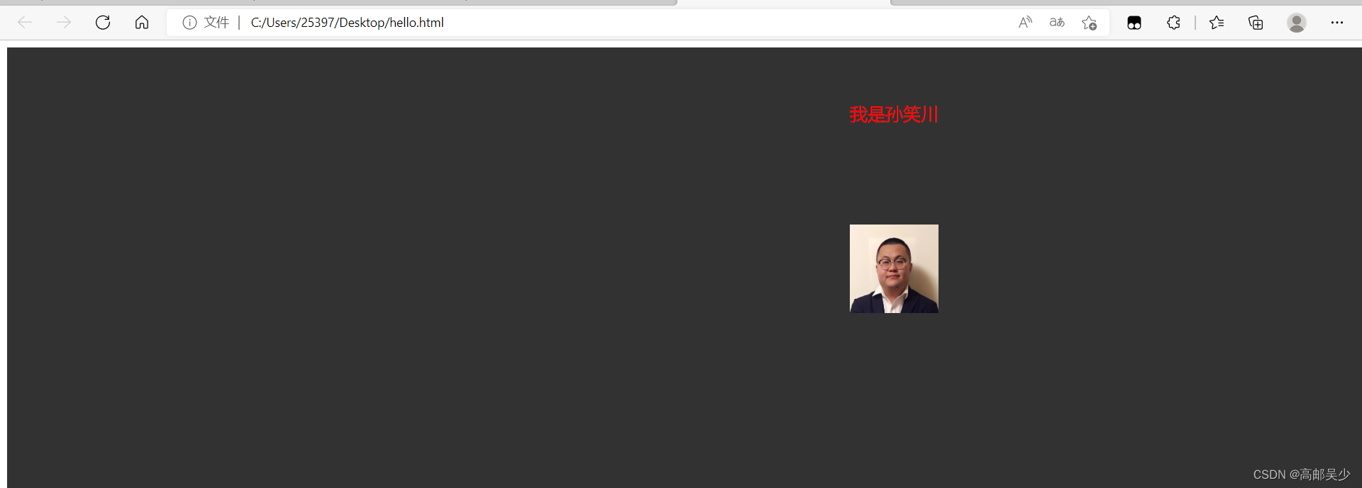
<style>
            div{
                width: 2000px;
                height: 500px;
                font-size: 20px;
                background-image: url(./sxc.jpg);
                color:red;
                text-align: center;
                line-height: 150px;
            }
        </style>
        <div>
            我是孙笑川
        </div>
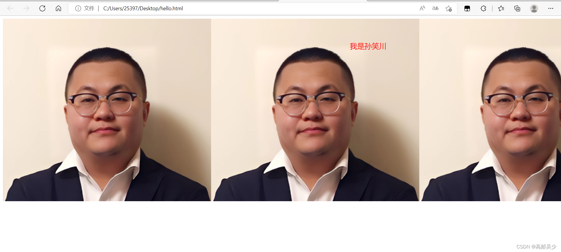
这种情况就称作“平铺”(这种情况也是repeat和repeat-x水平平铺产生的效果)
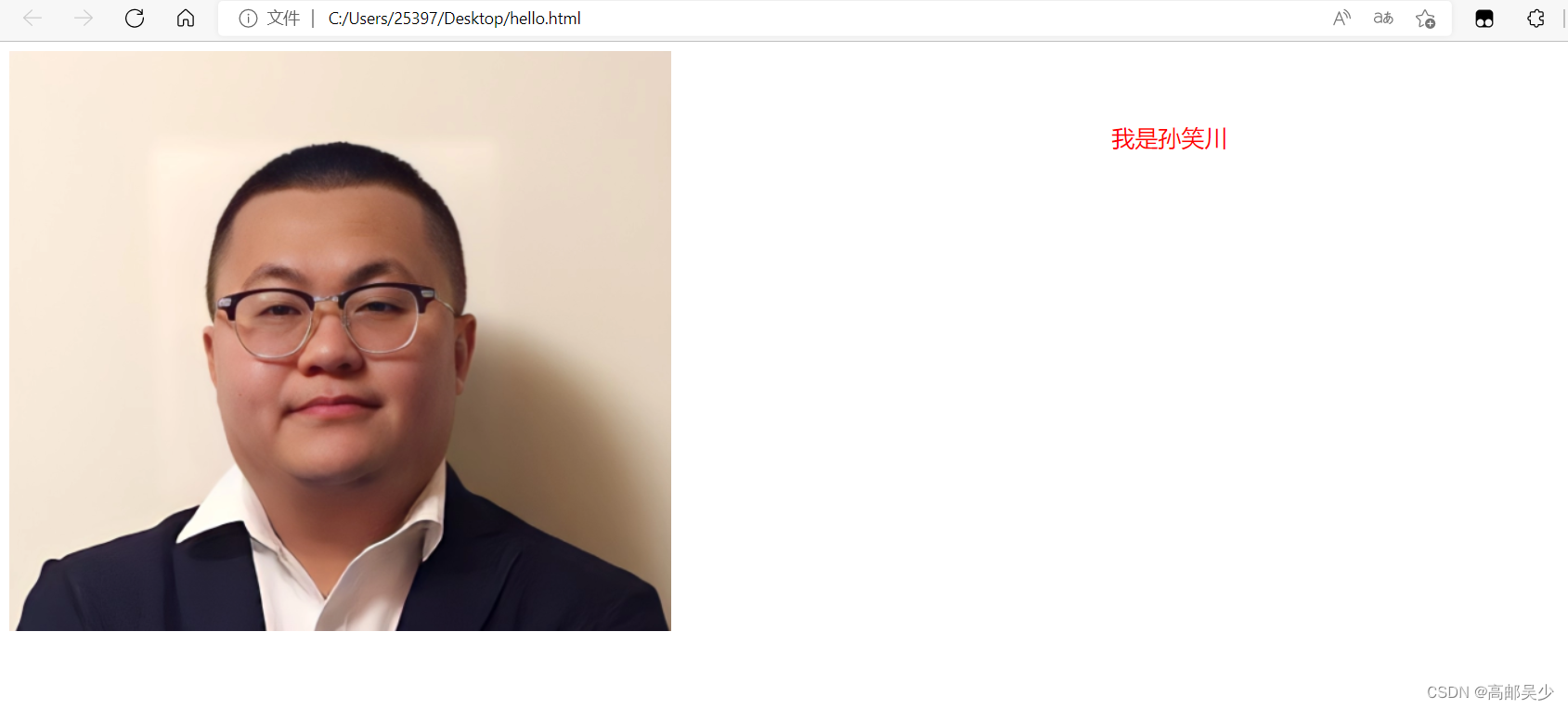
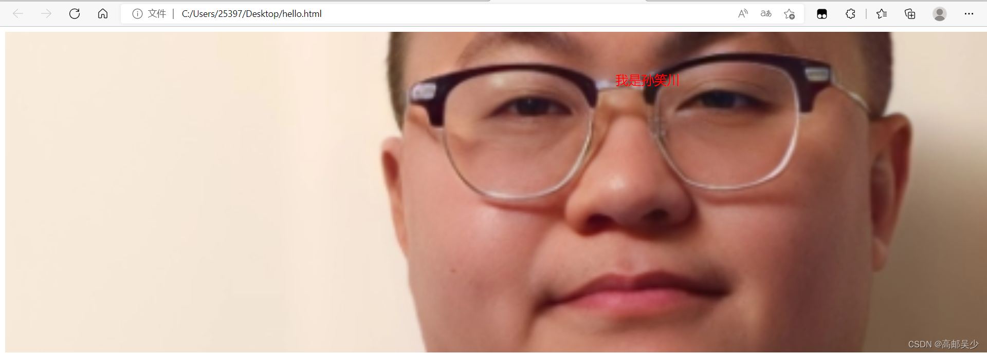
我们现在再设置不平铺看看是什么效果
<style>
            div{
                width: 2000px;
                height: 500px;
                font-size: 20px;
                background-image: url(./sxc.jpg);
                color:red;
                text-align: center;
                line-height: 150px;
                background-repeat: no-repeat;
            }
        </style>
        <div>
            我是孙笑川
        </div>
我们再来看看垂直平铺
<style>
            div{
                width: 500px;
                height: 2000px;
                font-size: 20px;
                background-image: url(./sxc.jpg);
                color:red;
                text-align: center;
                line-height: 150px;
                background-repeat: repeat-y;
            }
        </style>
        <div>
            我是孙笑川
        </div>
6.3.4背景位置
设置背景图的位置
background-position: x y;
比如我们现在给原先的添加了一个背景颜色(默认背景图片在背景颜色上面,也就是不会被颜色覆盖)
<style>
            div{
                width: 2000px;
                height: 500px;
                font-size: 20px;
                background-color: rgb(50,50,50);
                background-image: url(./sxc.jpg);
                color:red;
                text-align: center;
                line-height: 150px;
                background-repeat: repeat-y;
            }
        </style>
        <div>
            我是孙笑川
        </div>
在计算机中位置的表示也经常会用到平面直角坐标系(笛卡尔坐标系)
我们平时用的坐标系是右手系
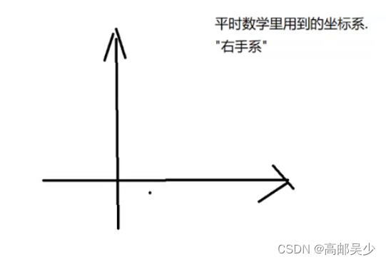
而计算机中常用的是左手系
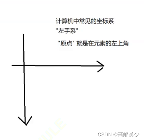
如果只是使用px为单位,并不好实现让背景图“居中”这样的效果
所以我们还有三种参数写法
- 方位名词: (top, left, right, bottom,center)
- 精确单位: 坐标或者百分比(以左上角为原点)
- 混合单位: 同时包含方位名词和精确单位
比如我们这里用center center让背景图片水平居中、垂直居中
<style>
            div{
                width: 2000px;
                height: 500px;
                font-size: 20px;
                background-color: rgb(50,50,50);
                background-image: url(./sxc.jpg);
                color:red;
                text-align: center;
                line-height: 150px;
                background-repeat: no-repeat;
                background-position: center center;
            }
        </style>
        <div>
            我是孙笑川
        </div>
6.3.5背景图片尺寸
background-size: length|percentage|cover|contain;
可以填具体的数值: 如 40px 60px 表示宽度为 40px, 高度为 60px
比如我们现在把图片调小一点,变成100px,100px
<style>
            div{
                width: 2000px;
                height: 500px;
                font-size: 20px;
                background-color: rgb(50,50,50);
                background-image: url(./sxc.jpg);
                color:red;
                text-align: center;
                line-height: 150px;
                background-repeat: no-repeat;
                background-position: center center;
                background-size: 100px 100px;
            }
        </style>
        <div>
            我是孙笑川
        </div>
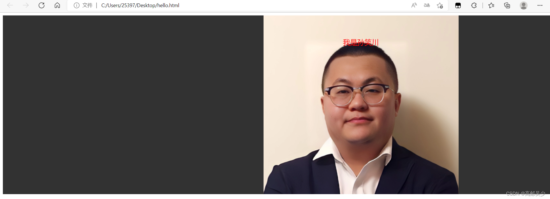
也可以填cover: 把背景图像扩展至足够大,以使背景图像完全覆盖背景区域。
背景图像的某些部分也许无法显示在背景定位区域中。
 <style>
            div{
                width: 2000px;
                height: 500px;
                font-size: 20px;
                background-color: rgb(50,50,50);
                background-image: url(./sxc.jpg);
                color:red;
                text-align: center;
                line-height: 150px;
                background-repeat: no-repeat;
                background-position: center center;
                background-size: cover;
            }
        </style>
        <div>
            我是孙笑川
        </div>
也可以填contain,可能会露出一部分背景颜色,把图片拉伸为元素大小就结束了
<style>
            div{
                width: 2000px;
                height: 500px;
                font-size: 20px;
                background-color: rgb(50,50,50);
                background-image: url(./sxc.jpg);
                color:red;
                text-align: center;
                line-height: 150px;
                background-repeat: no-repeat;
                background-position: center center;
                background-size: contain;
            }
        </style>
        <div>
            我是孙笑川
        </div>
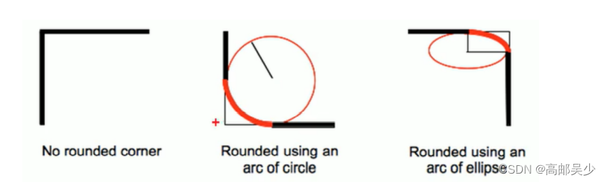
6.3.6圆角矩形
通过 border-radius 使边框带圆角效果.
border-radius: length;
length 是内切圆的半径. 数值越大, 弧线越强烈
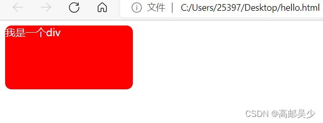
<style>
            div{
                width:200px;
                height: 100px;
                background-color: red;
                color: white;
                border-radius: 10px;
            }
        </style>
        <div>
            我是一个div
        </div>
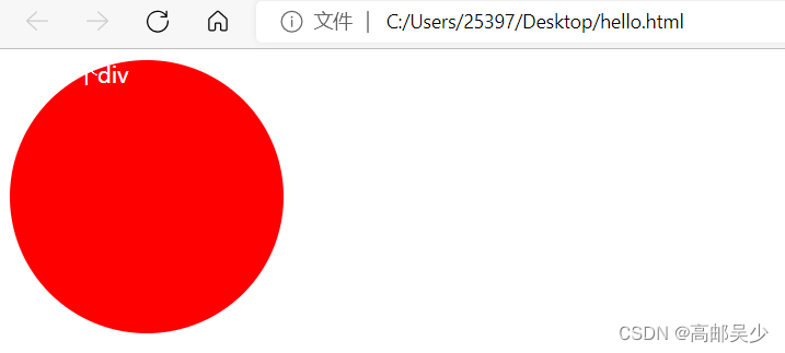
如果想得到一个圆形,也可以通过同样的属性来设置
我们从正方形变成圆,也就是内切圆半径=1/2的正方形宽度
所以我们这里如果宽度是200px,你设置100px为半径即可,也可以直接设置50%
 <style>
            div{
                width:200px;
                height: 200px;
                background-color: red;
                color: white;
                border-radius: 100px;
                /* border-radius: 50%; */
            }
        </style>
        <div>
            我是一个div
        </div>
七、元素的显示模式
什么是显示模式?主要是下面三种:块级元素、行内元素、行内块元素。
而这些只是默认属性,我们可以通过css中的display属性来修改元素的显示模式
display: block 改成块级元素 [常用]
display: inline 改成行内元素 [很少用]
display: inline-block 改成行内块元素
7.1块级元素
独占一行,可以设置宽度高度
比如div,h1-h6,p,ul,li,table…
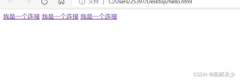
7.2行内元素
不独占一行,不可以设置宽度高度
比如span,a,em,i…
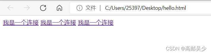
<a href="#">我是一个连接</a>
<a href="#">我是一个连接</a>
<a href="#">我是一个连接</a>
如下图,即使你在代码中进行了换行,网页上也是没有换行的
我们来验证一下行内元素不可以设置宽度高度
<style>
    a{
        width: 500px;
        height: 300px;
    }
</style>
<a href="#">我是一个连接</a>
<a href="#">我是一个连接</a>
<a href="#">我是一个连接</a>
如下图,即使你设置它的宽高,网页上也没有任何效果
为什么不能设置宽高呢?
行内元素,与其说是一个元素,不如你把它想象成一个文本,
最终尺寸的大小取决于你文本内容的多少
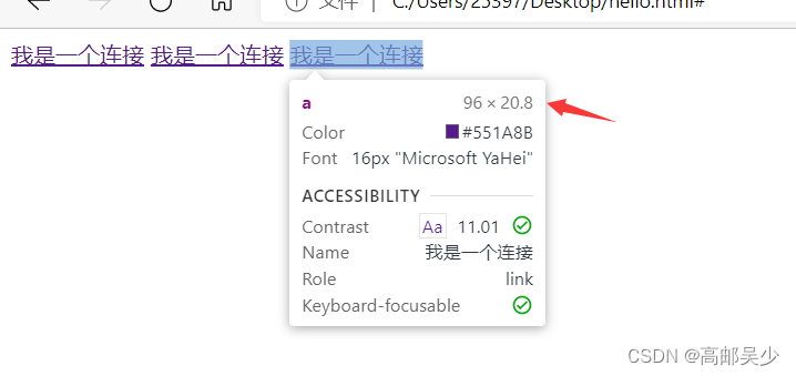
比如我这里的a标签是96*20.8,如果我a标签的字多一些或者少一些,尺寸都会变化。
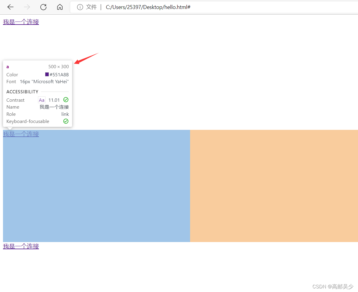
那如果我想要自己设置一个尺寸,然后可以影响到a怎么办?
我们之前说过,可以通过display来改变元素的显示模式,比如我们现在把a变成块级元素
<style>
    a{
        width: 500px;
        height: 300px;
        display: block;
    }
</style>
<a href="#">我是一个连接</a>
<a href="#">我是一个连接</a>
<a href="#">我是一个连接</a>
转成块级元素后,每个a标签都独占一行,并且尺寸变成了我们设置的500*300
ps:一般都是行内元素切换成块级元素,没有说是块级切换成行内的
注:display还有一个特殊用法,display:none;这个用法可以把元素隐藏起来
<style>
    a{
        width: 500px;
        height: 300px;
        display: none;
    }
</style>
<a href="#">我是一个连接</a>
<a href="#">我是一个连接</a>
<a href="#">我是一个连接</a>
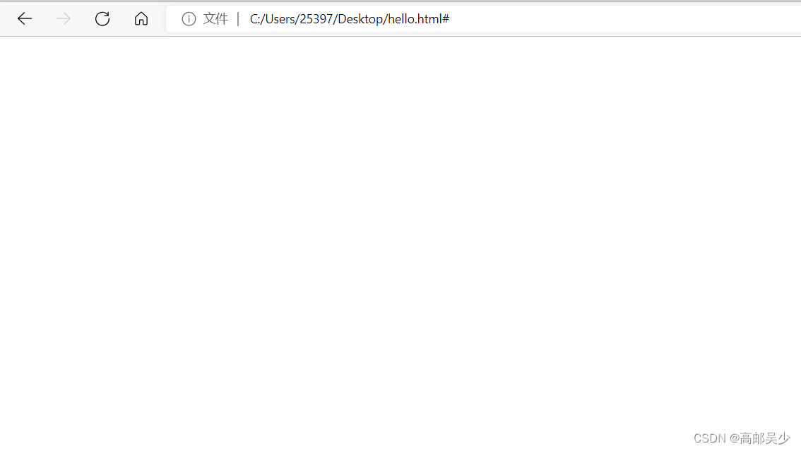
你在网页上看不见那个元素,但是你点那个元素还是可以显示相关信息的
7.3行内块元素
不独占一行,可以设置宽度高度
比如input,img…
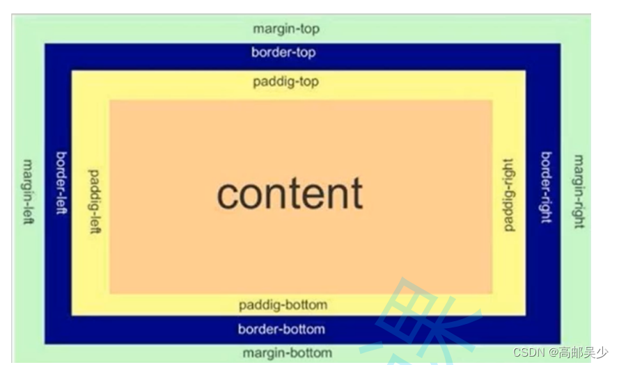
八、盒子模型
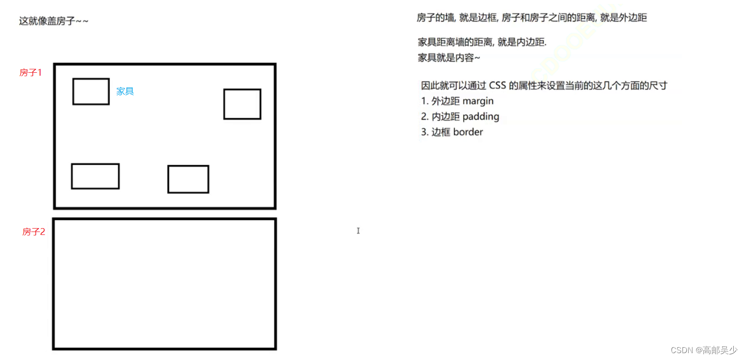
盒子模型描述了HTML的元素其实是一个矩形,这个矩形由以下几个部分构成
边框 border
内容 content
内边距 padding
外边距 margin
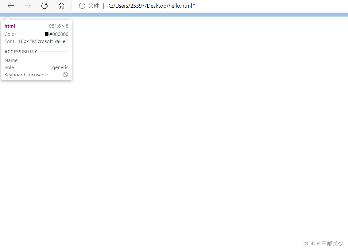
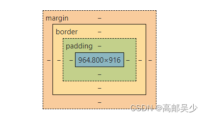
你在开发者工具里也可以看到类似的,如下图
8.1边框
基础属性
1.粗细: border-width
2.样式: border-style, 默认没边框. solid 实线边框 dashed 虚线边框 dotted 点线边框
3.颜色: border-color
<style>
    div{
        width: 200px;
        height: 100px;
        border: 2px black solid;
    }
</style>
<div>
    我是一行字
</div>
边框是会撑大“盒子”的,可以看到,我们设置的width: 200px; height: 100px;,但实际由于边框的存在,最终大小是204*104
在实际开发中,最常用的操作是设置box-sizing属性,为border-box,这个时候设置的边框会挤压内容,而不是撑大元素
<style>
    div{
        width: 200px;
        height: 100px;
        border: 2px black solid;
        box-sizing: border-box;
    }
</style>
<div>
    我是一行字
</div>
8.2内边距
内边距就是边框和内容之间的距离
默认内容是顶着边框来放置的. 用 padding 来控制这个距离
也可以给四个方向都加上边距
padding-top
padding-bottom
padding-left
padding-right
我们8.1的例子,文字和边框是挨在一起显示的,我们来看看加了内边距是什么效果
<style>
    div{
        width: 200px;
        height: 100px;
        border: 2px black solid;
        box-sizing: border-box;
        padding:50px ;
    }
</style>
<div>
    我是一行字
</div>
padding默认情况下也会撑大元素,可以通过设置box-sizing为border-box就可以阻止盒子被撑大了
8.3外边距
控制盒子和盒子之间的距离.
可以给四个方向都加上边距
margin-top
margin-bottom
margin-left
margin-right
<style>
     div{
        width: 200px;
        height: 100px;
        border: 2px black solid;
        box-sizing: border-box;
        padding:5px ;
    }

    .one{
        margin-bottom: 10px;
        /* 给下方设置10px的间距 */
    }

    .two{
        margin-top: 15px;
        /* 给上方设置15px的间距 */
    }
</style>
<div class="one">
    我是第一个div
</div>
<div class="two">
    我是第二个div
</div>
网页效果如下
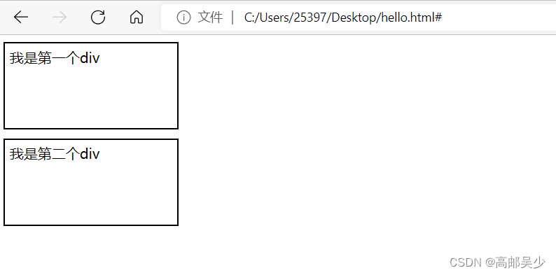
那最后是不是两者间距是10+15=25px呢?
外边距margin在垂直方向会存在“塌陷”的情况,两个元素都设置外边距的时候,实际外边距是两者的较大值,而不是相加
所以两者垂直的间距为15
如果是水平方向则不会出现塌陷情况,直接就是相加
基于margin可以实现一个元素的水平居中(不是文本的水平居中),
文本的水平居中:text-align:center
文本的垂直居中:line-height==height
元素的水平居中就可以使用margin(前提是块级元素)
ps:元素的垂直居中用margin行不通
<style>
.one{
width: 500px;
height: 200px;
background-color:red;
}
.two{
width: 200px;
height: 100px;
background-color: green;
}
</style>
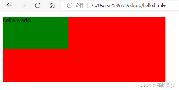
<div class="one">
<div class="two">
hello world
</div>
</div>
<style>
    .one{
        width: 500px;
        height: 200px;
        background-color:red;
    }

    .two{
        width: 200px;
        height: 100px;
        background-color: green;
        margin: 0 auto;
        /* 0表示上下外边距为0,auto是左右边距,浏览器自动适应,就会达到一个水平居中的效果 */
    }
</style>
<div class="one">
    <div class="two">
        hello world
    </div>
</div>
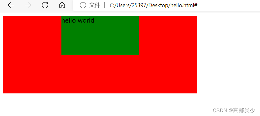
那会有人问,那你把margin:0 auto那个0也换成auto不就可以实现垂直居中了嘛?
不好意思,你换了也没用,不信你自己去试/doge
九、弹性布局
弹性布局主要是安排页面上元素的位置(排列方式)
我们前面介绍的属性,大部分是针对这一个元素本身来设置的
但是这里还有些元素是影响到元素和元素之间的。
其中盒子模型(外边距)就是一部分,但是还不够
我们接下来要讲的弹性布局就是进一步强化这一点
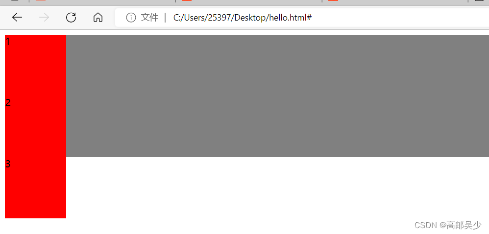
默认的网页布局,是从上到下的(块级元素独占一行)
而实际的网页不仅仅需要从上到下,也需要从左到右
<style>
    .parent{
        width: 100%;
        /* 表示当前元素和它的父元素一样宽 ,*/
        /* 我这里parent父元素就是body标签,也就是和整个窗口一样宽 */

        height: 200px;
        background-color: grey;

    }

    /* 并集选择器 */
    .one,.two,.three{
        width: 100px;
        height: 100px;
        background-color: red;
    }
</style>
<div class="parent">
    <div class="one">1</div>
    <div class="two">2</div>
    <div class="three">3</div>
</div>
9.1flex
如果想让这一竖的红色,变成横着的,就需要我们的弹性布局了
div默认作为块级元素是独占一行的,为了让这些div能够在一个横行中排列,就可以使用弹性布局,操作也很简单,给父元素设置一个属性:display:flex
<style>
    .parent{
        width: 100%;
        /* 表示当前元素和它的父元素一样宽 ,*/
        /* 我这里parent父元素就是body标签,也就是和整个窗口一样宽 */

        height: 200px;
        background-color: grey;
        display: flex;
    }

    /* 并集选择器 */
    .one,.two,.three{
        width: 100px;
        height: 100px;
        background-color: red;
    }
</style>
<div class="parent">
    <div class="one">1</div>
    <div class="two">2</div>
    <div class="three">3</div>
</div>
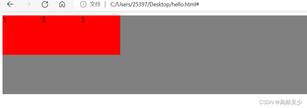
通过flex布局,就可以调整子元素排列的方式,默认这些元素都是挤在左上角的
如果不想让这些元素挤在左上角,我想让它们下来,怎么办?
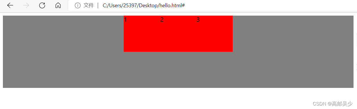
9.2水平方向的排列方式justify-content
justify-content
start靠左排列(默认的)
end靠右排列
center居中排列
space-between行与行之间留有间隙
space-around行之前、行之间、行之后都留有间隙
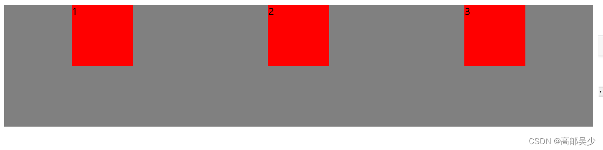
我们下面演示center、space-between、space-around的例子:
center
<style>
    .parent{
        width: 100%;
        /* 表示当前元素和它的父元素一样宽 ,*/
        /* 我这里parent父元素就是body标签,也就是和整个窗口一样宽 */

        height: 200px;
        background-color: grey;
        display: flex;
        justify-content: center;
    }

    /* 并集选择器 */
    .one,.two,.three{
        width: 100px;
        height: 100px;
        background-color: red;
    }
</style>
<div class="parent">
    <div class="one">1</div>
    <div class="two">2</div>
    <div class="three">3</div>
</div>
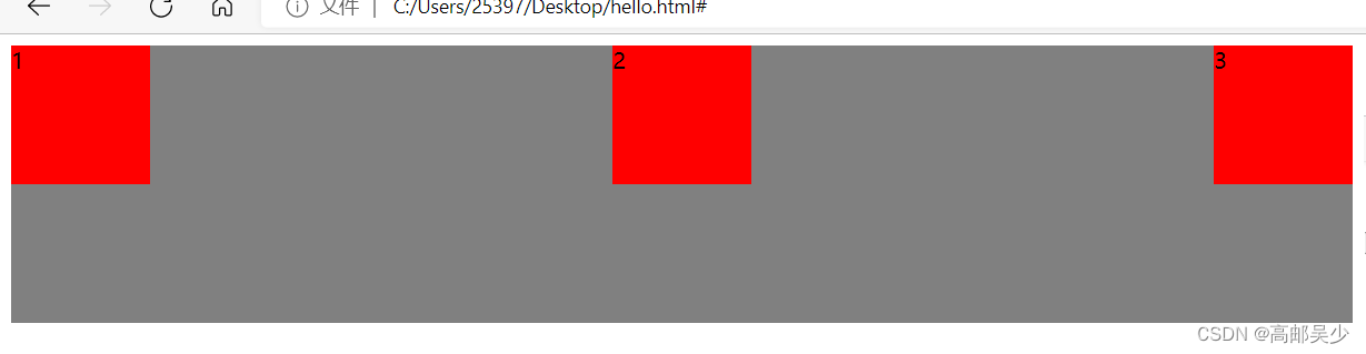
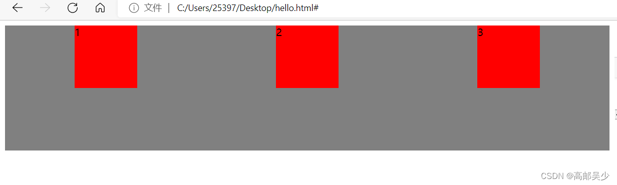
space-between
<style>
    .parent{
        width: 100%;
        /* 表示当前元素和它的父元素一样宽 ,*/
        /* 我这里parent父元素就是body标签,也就是和整个窗口一样宽 */

        height: 200px;
        background-color: grey;
        display: flex;
        justify-content: space-between;
    }

    /* 并集选择器 */
    .one,.two,.three{
        width: 100px;
        height: 100px;
        background-color: red;
    }
</style>
<div class="parent">
    <div class="one">1</div>
    <div class="two">2</div>
    <div class="three">3</div>
</div>
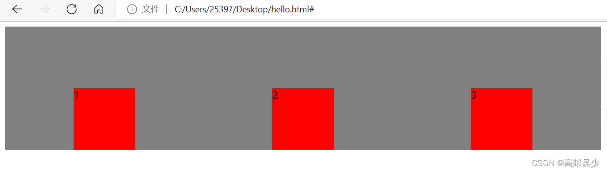
space-around
<style>
    .parent{
        width: 100%;
        /* 表示当前元素和它的父元素一样宽 ,*/
        /* 我这里parent父元素就是body标签,也就是和整个窗口一样宽 */

        height: 200px;
        background-color: grey;
        display: flex;
        justify-content: space-around;
    }

    /* 并集选择器 */
    .one,.two,.three{
        width: 100px;
        height: 100px;
        background-color: red;
    }
</style>
<div class="parent">
    <div class="one">1</div>
    <div class="two">2</div>
    <div class="three">3</div>
</div>
9.3垂直方向的排列方式align-item
比如这里设置 align-items: start;
<style>
    .parent{
        width: 100%;
        /* 表示当前元素和它的父元素一样宽 ,*/
        /* 我这里parent父元素就是body标签,也就是和整个窗口一样宽 */

        height: 200px;
        background-color: grey;
        display: flex;
        justify-content: space-around;
        align-items: start;
    }

    /* 并集选择器 */
    .one,.two,.three{
        width: 100px;
        height: 100px;
        background-color: red;
    }
</style>
<div class="parent">
    <div class="one">1</div>
    <div class="two">2</div>
    <div class="three">3</div>
</div>
网页效果好像和原先没有什么区别(因为默认就是start)
我们再来看看end是什么效果
<style>
    .parent{
        width: 100%;
        /* 表示当前元素和它的父元素一样宽 ,*/
        /* 我这里parent父元素就是body标签,也就是和整个窗口一样宽 */

        height: 200px;
        background-color: grey;
        display: flex;
        justify-content: space-around;
        align-items: end;
    }

    /* 并集选择器 */
    .one,.two,.three{
        width: 100px;
        height: 100px;
        background-color: red;
    }
</style>
<div class="parent">
    <div class="one">1</div>
    <div class="two">2</div>
    <div class="three">3</div>
</div>
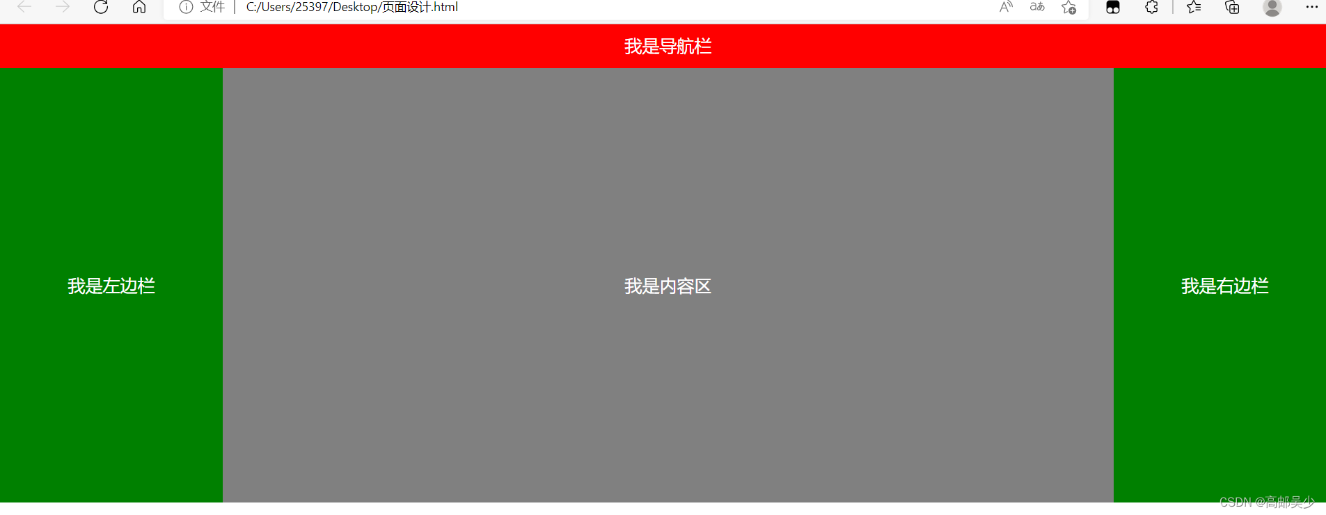
9.4实现一个典型的页面布局
<div class="parent">
            <div class="nav">我是导航栏</div>
            <div class="body">
                <div class="left">我是左边栏</div>
                <div class="content">我是内容区</div>
                <div class="right">我是右边栏</div>
            </div>
        </div>
        <style>
            * {
                margin: 0;
                padding: 0;
                box-sizing: border-box;
            }

            .parent {
                background-color: gray;
            }


            .nav {
                background-color: red;
                color: white;
                text-align: center;
                height: 50px;
                line-height: 50px;
                font-size: 20px;
            }


            .body {
                display: flex;
            }


            .left, .right {
                width: 20%;
                height: 500px;
                background-color: green;
                font-size: 20px;
                color:white;
                line-height: 500px;
                text-align: center;
            }

            .content {
                width: 80%;
                height: 500px;
                background-color: gray;
                font-size: 20px;
                color:white;
                line-height: 500px;
                text-align: center;
            }
        </style>


 574
574


 被折叠的 条评论
为什么被折叠?
被折叠的 条评论
为什么被折叠?
 到【灌水乐园】发言


