


大数据热点图案例

布局思路:首先把地图(大盒子)map放到页面中央,然后再定义个city用于实现热点图的效果,并利用把它定位到指定位置。可以看出我们的动画效果由一个小圆点(dotted)和三个阴影(pluse)实现,然后再将小圆点和阴影结合做出相应的动画效果即可。
代码如下:
<!DOCTYPE html>
<html lang="en">

<head>
    <meta charset="UTF-8">
    <meta name="viewport" content="width=device-width, initial-scale=1.0">
    <title>Document</title>
    <style>
        body {
            background-color: #333;
        }

        .map {
            position: relative;
            width: 747px;
            height: 617px;
            background: url(images/map.png) no-repeat;
            margin: 0 auto;
        }

        .city {
            position: absolute;
            top: 228px;
            right: 196px;
        }

        .tb {
            top: 267px;
            right: -113px;
        }

        .gz {
            top: 39px;
            right: 107px;
        }

        .dotted {
            width: 8px;
            height: 8px;
            background-color: #09f;
            border-radius: 50%;
        }

        .city div[class^='pulse'] {
            position: absolute;
            /* 这里让三个小波纹围绕父盒子水平垂直居中,父盒子无宽高所以默认就是围绕dotted水平垂直居中 */
            left: 50%;
            top: 50%;
            transform: translate(-50%, -50%);
            width: 8px;
            height: 8px;
            box-shadow: 0 0 12px #009dfd;
            border-radius: 50%;
            /* animation: name duration timing-function delay iteration-count direction fill-mode; */
            animation: pulse 1.5s linear 0s infinite;
        }

        /* 上面同时对三个波纹添加了属性,但我们想要让波纹呈层叠性变化,就要用到动画延迟 */
        .pulse2 {
            animation-delay: .5s !important;
        }

        .pulse3 {
            animation-delay: 1s !important;
        }

        @keyframes pulse {
            70% {
                width: 40px;
                height: 40px;
                /* 这里不用scale的原因是scale会让阴影的面积变大,这样并不好看 */
                /* transform: scale(5); */
                opacity: 1;
            }

            100% {
                width: 70px;
                height: 70px;
                /* transform: scale(10); */
                opacity: 0;
            }
        }
    </style>
</head>

<body>
    <div class="map">
        <div class="city">
            <div class="dotted"></div>
            <div class="pulse1"></div>
            <div class="pulse2"></div>
            <div class="pulse3"></div>
            <div class="city tb">
                <div class="dotted"></div>
                <div class="pulse1"></div>
                <div class="pulse2"></div>
                <div class="pulse3"></div>
                <div class="city gz">
                    <div class="dotted"></div>
                    <div class="pulse1"></div>
                    <div class="pulse2"></div>
                    <div class="pulse3"></div>
                </div>
            </div>
</body>

</html>
说几个需要注意的点吧:
- 因为盒子city无宽高,所以让pluse水平垂直居中实际上就是对dotted水平垂直居中
- 当我们给pluse添加动画后,发现三个pluse一起扩散了,这时就要用到animation-delay达到我们预期的效果
70% { width: 40px; height: 40px; opacity: 1; }
这个地方我们没有用到scale,原因是当我们用scale时,阴影的面积也会随之变大,这样并不好看,所以我们要指定宽高- 还有opacity也是指定透明度的,数值从0到1,数值越小越透明
奔跑的大熊案例

案例分析:这个案例就是使用步长的经典案例。首先我们定义个盒子div用于存放图片,这个图片实际上就是大熊奔跑时的几种形态

然后我们设置盒子的宽高(注意宽高是大熊一个姿态的宽高),然后设置动画(注意添加步长)我们就可以让大熊奔跑起来了

<!DOCTYPE html>
<html lang="en">

<head>
    <meta charset="UTF-8">
    <meta name="viewport" content="width=device-width, initial-scale=1.0">
    <title>Document</title>
    <style>
        body {
            background-color: #ccc;
        }

        div {
            position: absolute;
            width: 200px;
            height: 100px;
            background: url(images/bear.png) no-repeat;
            /* animation: name duration timing-function delay iteration-count direction fill-mode; */
            animation: bear 1s steps(8) infinite;
        }

        @keyframes bear {
            0% {
                background-position: 0 0;
            }

            100% {
                background-position: -1600px 0;
            }
        }

    </style>
</head>

<body>
    <div></div>
</body>

</html>
这样还没完,如果我们想让大熊跑到屏幕中间就停下来,我们还要再添加一种动画效果才能实现
代码如下:
<!DOCTYPE html>
<html lang="en">
<head>
<meta charset="UTF-8">
<meta name="viewport" content="width=device-width, initial-scale=1.0">
<title>Document</title>
<style>
body {
background-color: #ccc;
}
div {
position: absolute;
width: 200px;
height: 100px;
background: url(images/bear.png) no-repeat;
/* animation: name duration timing-function delay iteration-count direction fill-mode; */
animation: bear 1s steps(8) infinite,
move 3s forwards;
}
@keyframes bear {
0% {
background-position: 0 0;
}
100% {
background-position: -1600px 0;
}
}
@keyframes move {
0% {
left: 0;
}
100% {
left: 50%;
transform: translate(-50%);
}
}
</style>
</head>
<body>
<div></div>
</body>
</html>
这样就可以实现最上面图片的效果了
需要提醒的是:这里要注意两个动画的属性连写
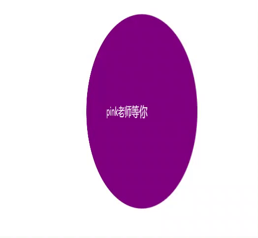
盒子两面反转案例

<!DOCTYPE html>
<html lang="en">

<head>
    <meta charset="UTF-8">
    <meta name="viewport" content="width=device-width, initial-scale=1.0">
    <title>Document</title>
    <style>
        body {
            perspective: 400px;
        }

        .box {
            position: relative;
            height: 300px;
            width: 300px;
            margin: 100px auto;
            transition: all .5s;
            /* 写完 transform-style: preserve-3d;
            之后不变化的原因是这个代码的兼容性较差(edge浏览器不支持),只需要加上 给front 加上backface-visibility: hidden;正面隐藏就可以了 */
            transform-style: preserve-3d;
        }

        .box:hover {
            transform: rotateY(180deg);
        }

        .front,
        .back {
            position: absolute;
            width: 100%;
            height: 100%;
            border-radius: 50%;
            font-size: 20px;
            text-align: center;
            line-height: 300px;
            color: #fff;
        }

        .front {
            background-color: pink;
            z-index: 1;
            backface-visibility: hidden;
        }

        .back {
            background-color: purple;
            transform: rotateY(180deg);
        }
    </style>
</head>

<body>
    <div class="box">
        <div class="front">黑马程序员</div>
        <div class="back">pink老师等你</div>
    </div>
</body>

</html>
这个案例不多做解释了
注:
- backface-visibility: hidden;这句话的意思是让front的背面隐藏,不至于反转过后两面都是front
- transform: rotateY(180deg);这句话一定要写,否则下面那个盒子的文字是反着来的(想象一下)
3D导航栏的反转效果

布局思路:先是有一个大盒子div,div里面放两个小盒子front和bottom(用定位),然后把front设为粉红,bottom紫色,把文字写进去并设置相关样式。重点是下面3D效果的实现,这个时候front压着bottom,我们让bottom旋转到下面(先沿x轴,是负值。然后沿y轴,是正值),之后让front沿z轴移动(是正值),因为物体的旋转是沿某个轴进行的,如果让bottom沿z轴移动(负值),就不会达到我们想要的效果。
代码:
<!DOCTYPE html>
<html lang="en">

<head>
    <meta charset="UTF-8">
    <meta name="viewport" content="width=device-width, initial-scale=1.0">
    <title>Document</title>
    <style>
        * {
            margin: 0;
            padding: 0;
        }

        ul {
            margin: 100px;
            list-style: none;
            perspective: 200px;
        }

        .box {
            position: relative;
            width: 120px;
            height: 35px;
            transform-style: preserve-3d;
            transition: all .4s;
        }

        .front,
        .bottom {
            position: absolute;
            left: 0;
            top: 0;
            width: 100%;
            height: 100%;
            font-size: 12px;
            text-align: center;
            line-height: 35px;
            color: #fff;
        }

        .box:hover {
            transform: rotateX(90deg);
        }

        .front {
            background-color: pink;
            z-index: 1;
            transform: translateZ(17.5px);
        }

        .bottom {
            background-color: purple;
            /* 注意这里一定要注意先后顺序问题 */
            /* 这里重点理解三维空间,先是bottom沿盒子中心转动-90度(-90刚好文字趴在地上),然后再向下(y轴)移动粉盒子的一半刚好到最底部,这个时候不要让紫色盒子向后移动 (z轴),应该粉色盒子向前移动(z轴),这样才以一个立体盒子的正中心反转*/
            transform: translateY(17.5px) rotateX(-90deg);
        }
    </style>
</head>

<body>
    <ul>
        <li>
            <div class="box">
                <div class="front">黑马程序员</div>
                <div class="bottom">pink老师欢迎您</div>
            </div>
        </li>
    </ul>
</body>

</html>
这里重要理解z轴方向上谁移动的问题
旋转木马案例

布局分析:我们应该在一个大盒子里面section里面放置六个小盒子div,div中放图片,然后利用图片在3D中的旋转先摆放好位置,然后进行动画效果的制作即可
<!DOCTYPE html>
<html lang="en">

<head>
    <meta charset="UTF-8">
    <meta name="viewport" content="width=device-width, initial-scale=1.0">
    <title>Document</title>
    <style>
        body {
            perspective: 1000px;
        }

        section {
            /* section里面还是不能加perspection否则图片会因为视距变大缩小 */
            position: relative;
            width: 300px;
            height: 200px;
            margin: 150px auto;
            transform-style: preserve-3d;
            /* 添加动画效果 */
            animation: rotate 5s linear infinite;
        }

        section:hover {
            animation-play-state: paused;
        }

        @keyframes rotate {
            0% {
                transform: rotateY(0);
            }

            100% {
                transform: rotateY(360deg);
            }
        }

        section div {
            position: absolute;
            top: 0;
            left: 0;
            width: 100%;
            height: 100%;
            background: url(images/dog.jpg) no-repeat;
        }

        section div:nth-child(1) {
            transform: translateZ(300px);
        }

        section div:nth-child(2) {
            transform: rotateY(60deg) translateZ(300px);
        }

        section div:nth-child(3) {
            transform: rotateY(120deg) translateZ(300px);
        }

        section div:nth-child(4) {
            transform: rotateY(180deg) translateZ(300px);
        }

        section div:nth-child(5) {
            transform: rotateY(240deg) translateZ(300px);
        }

        section div:nth-child(6) {
            transform: rotateY(300deg) translateZ(300px);
        }
    </style>
</head>

<body>
    <section>
        <div></div>
        <div></div>
        <div></div>
        <div></div>
        <div></div>
        <div></div>
    </section>
</body>

</html>


 2907
2907


 被折叠的 条评论
为什么被折叠?
被折叠的 条评论
为什么被折叠?
 到【灌水乐园】发言


