


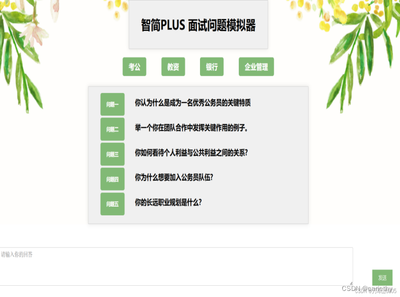
这一篇主要是对面试问答系统UI界面的优化
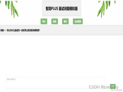
先是选择后显示问题
.text-container{
  display: flex;
  border: 1px solid #ccc;
  padding: 4px;
  background-color: #f0f0f0;
  margin: 10px auto;
  box-shadow: 0 0 10px rgba(0, 0, 0, 0.1);
}
.text-container p{
  display: flex;
  text-align: left; /* 左对齐 */
  vertical-align: top; /* 顶部对齐 */
  font-size: 1.2em;
  font-weight: bold;
}
未选择时显示问题
.civilQuestion,
.educationalQuestion,
.bankQuestion,
.enterpriseQuestion{
  border: 1px solid #ccc;
  padding: 15px;
  background-color: #f0f0f0;
  max-width:700px;
  margin:25px auto;
  box-shadow: 0 0 10px rgba(0, 0, 0, 0.1);
  text-align: left; /* 让.title组件内的文本居中 */
}
.question {
  display: flex; /* 使用 Flexbox 布局 */
  align-items: left; /* 垂直居中按钮和文字 */
  justify-content: left; /* 水平居中按钮和文字 */
  margin-bottom: 5px; /* 控制每个问题块之间的下边距 */
}
.educationalQuestion button,
.bankQuestion button,
.enterpriseQuestion button,
.civilQuestion button{
  padding: 10px 20px;
  background-color: #81b975;
  color: white;
  border: none;
  cursor: pointer;
  font-weight: bold;
  border-radius: 5px;
}
.educationalQuestion button:hover,
.bankQuestion button:hover,
.enterpriseQuestion button:hover,
.civilQuestion button:hover{
  background-color: #4a6a43e4; /* Slightly darker shade */
}
.educationalQuestion p,
.bankQuestion p,
.enterpriseQuestion p,
.civilQuestion p {
  font-size: 1.2em;
  margin-left:0; /* 清除按钮和段落默认的外边距 */
  margin: 10px; /* 清除段落默认的外边距 */
  margin-bottom: 20px; /* 控制每个问题块之间的下边距 */
}
然后是对按钮布局的设置
.container{
  display: flex;
  justify-content: center; /* 居中按钮 */
}
button {
  margin-left: 25px;
  margin-right: 25px;
}
.civilService-button,
.educationalResources-button,
.bank-button,
.enterprise-button {
  background-color: #81b975;
  color: white;
  padding: 10px 20px;
  font-size: 1.2em;
  font-weight: bold;
  border: none;
  border-radius: 5px;
  cursor: pointer;
}
.civilService-button:hover,
.educationalResources-button:hover,
.bank-button:hover,
.enterprise-button:hover {
  background-color: #4a6a43e4; /* Slightly darker shade */
}
然后再是发送框,要使发送框不遮挡发送内容,设置z-index值
.response-area {
  margin-top: 20px;
  position: relative; /* 确保 z-index 生效 */
}
.response-area p {
  margin-bottom: 5px;
}
标题设置的优化
.title {
  border: 1px solid #ccc;
  padding: 5px;
  background-color: #f0f0f0;
  max-width: 450px;
  margin: 20px auto;
  box-shadow: 0 0 10px rgba(0, 0, 0, 0.1);
  text-align: center; /* 让.title组件内的文本居中 */
}
.title p {
  font-size: 2rem;
  text-align: center; /* 修改为居中对齐 */
  font-weight: bold; /* 加粗 */
}
提示的优化
.tip {
  border: 1px solid #ccc;
  padding: 20px;
  background-color: #f0f0f0;
  max-width: 500px;
  margin: 20px auto;
  box-shadow: 0 0 10px rgba(0, 0, 0, 0.1);
}
.tip h2 {
  font-size: 1.5rem;
  margin-bottom: 10px;
}
.tip p {
  line-height: 1.6;
}
.tip button {
  padding: 10px 20px;
  background-color: #81b975;
  color: white;
  border: none;
  cursor: pointer;
  margin-top: 10px;
  margin-left: 400px;
}
.tip button:hover {
  background-color: #4a6a43e4;
}
输入设置
#userInput {
  position: fixed;
  bottom: 5%;
  left: 5%;
  width: calc(80% - 30px);
  height: 10%;
  padding: 8px;

  font-size: 15px;
  border: 1px solid #ccc;
  border-radius: 3px;
  margin-left: 5px;
  margin-top: 5%;

  /* 将输入框内文本左上对齐 */
  text-align: left; /* 左对齐 */
}
.inputDialog-button {
  position: fixed;
  bottom: 5%;
  right: 5%;
  padding: 10px 20px;
  background-color: #81b975;
  color: white;
  border: none;
  cursor: pointer;
}
.inputDialog-button:hover {
  background-color: #4a6a43e4;
}
最终界面效果:


 623
623

 被折叠的 条评论
为什么被折叠?
被折叠的 条评论
为什么被折叠?
 到【灌水乐园】发言


