


目录
练习题 7:3D 图形(需要 mpl_toolkits.mplot3d 库)
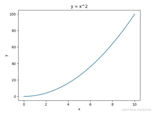
练习题 1:简单折线图
绘制一条简单的折线图,展示 y = x^2 的数据。
import matplotlib.pyplot as plt
import numpy as np

# 生成数据
x = np.linspace(0, 10, 100)  # 在 0 到 10 之间生成 100 个等间距的数据点
y = x ** 2  # 计算 y = x^2

# 打印数据集前几行基本信息
print("x 数据集前 5 行:", x[:5])
print("y 数据集前 5 行:", y[:5])

# 绘制折线图
plt.plot(x, y)

# 添加标题和标签
plt.title('y = x^2')
plt.xlabel('x')
plt.ylabel('y')

# 显示图形
plt.show()
运行结果:
x 数据集前 5 行: [0.         0.1010101  0.2020202  0.3030303  0.4040404]
y 数据集前 5 行: [0.         0.01020305 0.04081217 0.09182737 0.16324865]
并弹出一个窗口显示 y = x^2 的折线图。
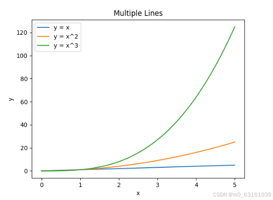
练习题 2:多条折线图
绘制 y = x,y = x^2 和 y = x^3 在同一坐标系中的折线图。
import matplotlib.pyplot as plt
import numpy as np

# 生成数据
x = np.linspace(0, 5, 100)
y1 = x
y2 = x ** 2
y3 = x ** 3

# 打印数据集前几行基本信息
print("x 数据集前 5 行:", x[:5])
print("y1 数据集前 5 行:", y1[:5])
print("y2 数据集前 5 行:", y2[:5])
print("y3 数据集前 5 行:", y3[:5])

# 绘制折线图
plt.plot(x, y1, label='y = x')
plt.plot(x, y2, label='y = x^2')
plt.plot(x, y3, label='y = x^3')

# 添加标题和标签
plt.title('Multiple Lines')
plt.xlabel('x')
plt.ylabel('y')

# 添加图例
plt.legend()

# 显示图形
plt.show()
运行结果:
x 数据集前 5 行: [0.         0.05050505 0.1010101  0.15151515 0.2020202 ]
y1 数据集前 5 行: [0.         0.05050505 0.1010101  0.15151515 0.2020202 ]
y2 数据集前 5 行: [0.         0.00255051 0.01020305 0.0229576  0.04081217]
y3 数据集前 5 行: [0.         0.0001308  0.00103061 0.00343604 0.00824287]
并弹出一个窗口显示三条折线图。
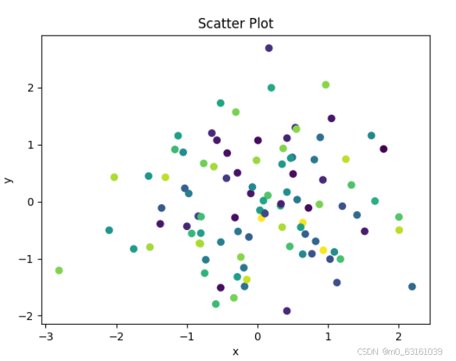
练习题 3:散点图
生成两组随机数据,绘制散点图,并根据点的位置设置不同颜色。
import matplotlib.pyplot as plt
import numpy as np

# 生成随机数据
x = np.random.randn(100)
y = np.random.randn(100)

# 生成颜色数据
colors = np.random.rand(100)

# 打印数据集前几行基本信息
print("x 数据集前 5 行:", x[:5])
print("y 数据集前 5 行:", y[:5])
print("colors 数据集前 5 行:", colors[:5])

# 绘制散点图
plt.scatter(x, y, c=colors)

# 添加标题和标签
plt.title('Scatter Plot')
plt.xlabel('x')
plt.ylabel('y')

# 显示图形
plt.show()
运行结果:
x 数据集前 5 行: [-0.46044693 -0.79263246  1.43990712 -0.53339343  0.30711077]
y 数据集前 5 行: [ 1.20322655 -0.16630992  0.17149945 -0.62693335 -0.02677256]
colors 数据集前 5 行: [0.34363258 0.37242915 0.27960714 0.07970359 0.66036499]
并弹出一个窗口显示散点图,点的颜色随机分布。
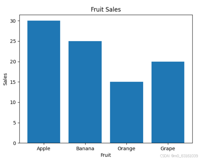
练习题 4:柱状图
统计不同水果的销量,绘制柱状图。
import matplotlib.pyplot as plt

# 水果名称
fruits = ['Apple', 'Banana', 'Orange', 'Grape']
# 销量
sales = [30, 25, 15, 20]

# 打印数据集基本信息
print("Fruits:", fruits)
print("Sales:", sales)

# 绘制柱状图
plt.bar(fruits, sales)

# 添加标题和标签
plt.title('Fruit Sales')
plt.xlabel('Fruit')
plt.ylabel('Sales')

# 显示图形
plt.show()
运行结果:
Fruits: ['Apple', 'Banana', 'Orange', 'Grape']
Sales: [30, 25, 15, 20]
并弹出一个窗口显示水果销量的柱状图。
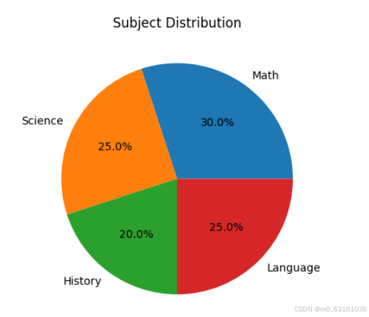
练习题 5:饼图
展示不同学科在总课程中的占比。
import matplotlib.pyplot as plt

# 学科名称
subjects = ['Math', 'Science', 'History', 'Language']
# 占比
percentages = [30, 25, 20, 25]

# 打印数据集基本信息
print("Subjects:", subjects)
print("Percentages:", percentages)

# 绘制饼图
plt.pie(percentages, labels=subjects, autopct='%1.1f%%')

# 添加标题
plt.title('Subject Distribution')

# 显示图形
plt.show()
运行结果:
Subjects: ['Math', 'Science', 'History', 'Language']
Percentages: [30, 25, 20, 25]
并弹出一个窗口显示学科占比的饼图。
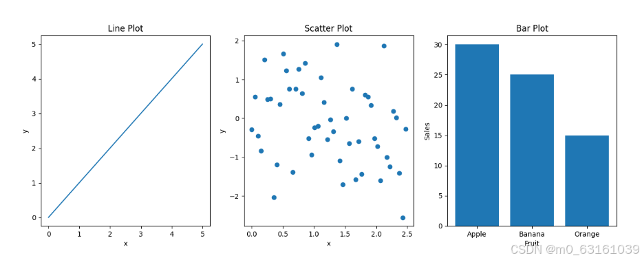
练习题 6:子图
在一个图形中绘制折线图、散点图和柱状图。
import matplotlib.pyplot as plt
import numpy as np

# 生成数据
x = np.linspace(0, 5, 100)
y1 = x
y2 = np.random.randn(100)
fruits = ['Apple', 'Banana', 'Orange']
sales = [30, 25, 15]

# 打印数据集前几行基本信息
print("x 数据集前 5 行:", x[:5])
print("y1 数据集前 5 行:", y1[:5])
print("y2 数据集前 5 行:", y2[:5])
print("Fruits:", fruits)
print("Sales:", sales)

# 创建子图
fig, axes = plt.subplots(1, 3, figsize=(15, 5))

# 绘制折线图
axes[0].plot(x, y1)
axes[0].set_title('Line Plot')
axes[0].set_xlabel('x')
axes[0].set_ylabel('y')

# 绘制散点图
axes[1].scatter(x[:50], y2[:50])
axes[1].set_title('Scatter Plot')
axes[1].set_xlabel('x')
axes[1].set_ylabel('y')

# 绘制柱状图
axes[2].bar(fruits, sales)
axes[2].set_title('Bar Plot')
axes[2].set_xlabel('Fruit')
axes[2].set_ylabel('Sales')

# 显示图形
plt.show()
运行结果:
x 数据集前 5 行: [0.         0.05050505 0.1010101  0.15151515 0.2020202 ]
y1 数据集前 5 行: [0.         0.05050505 0.1010101  0.15151515 0.2020202 ]
y2 数据集前 5 行: [-0.76303351  0.32730616 -1.30262923  1.22721434  0.03462093]
Fruits: ['Apple', 'Banana', 'Orange']
Sales: [30, 25, 15]
并弹出一个窗口,包含三个子图,分别是折线图、散点图和柱状图。
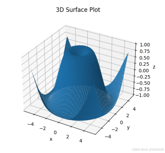
练习题 7:3D 图形(需要 mpl_toolkits.mplot3d 库)
绘制一个简单的 3D 曲面图。
import matplotlib.pyplot as plt
from mpl_toolkits.mplot3d import Axes3D
import numpy as np

# 生成数据
x = np.linspace(-5, 5, 100)
y = np.linspace(-5, 5, 100)
X, Y = np.meshgrid(x, y)
Z = np.sin(np.sqrt(X ** 2 + Y ** 2))

# 打印数据集前几行基本信息
print("X 数据集前 5 行:", X[:5, :5])
print("Y 数据集前 5 行:", Y[:5, :5])
print("Z 数据集前 5 行:", Z[:5, :5])

# 创建 3D 图形
fig = plt.figure()
ax = fig.add_subplot(111, projection='3d')

# 绘制 3D 曲面
ax.plot_surface(X, Y, Z)

# 添加标题和标签
ax.set_title('3D Surface Plot')
ax.set_xlabel('x')
ax.set_ylabel('y')
ax.set_zlabel('z')

# 显示图形
plt.show()
运行结果:
X 数据集前 5 行: [[-5.         -4.8989899  -4.7979798  -4.6969697  -4.5959596 ]
 [-5.         -4.8989899  -4.7979798  -4.6969697  -4.5959596 ]
 [-5.         -4.8989899  -4.7979798  -4.6969697  -4.5959596 ]
 [-5.         -4.8989899  -4.7979798  -4.6969697  -4.5959596 ]
 [-5.         -4.8989899  -4.7979798  -4.6969697  -4.5959596 ]]
Y 数据集前 5 行: [[-5.         -5.         -5.         -5.         -5.        ]
 [-4.94949495 -4.94949495 -4.94949495 -4.94949495 -4.94949495]
 [-4.8989899  -4.8989899  -4.8989899  -4.8989899  -4.8989899 ]
 [-4.84848485 -4.84848485 -4.84848485 -4.84848485 -4.84848485]
 [-4.7979798  -4.7979798  -4.7979798  -4.7979798  -4.7979798 ]]
Z 数据集前 5 行: [[-0.08743139 -0.08961621 -0.09177445 -0.0939061  -0.09601117]
 [-0.08961621 -0.09179249 -0.09394035 -0.09605979 -0.09815082]
 [-0.09177445 -0.09394035 -0.09606705 -0.0981545  -0.10021271]
 [-0.0939061  -0.09605979 -0.0981545  -0.10021271 -0.10224247]
 [-0.09601117 -0.09815082 -0.10021271 -0.10224247 -0.10424008]]
并弹出一个窗口显示 3D 曲面图。
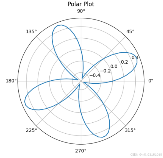
练习题 8:极坐标图
绘制一个简单的极坐标图。
import matplotlib.pyplot as plt
import numpy as np

# 生成数据
theta = np.linspace(0, 2 * np.pi, 100)
r = np.sin(2 * theta) * np.cos(2 * theta)

# 打印数据集前几行基本信息
print("theta 数据集前 5 行:", theta[:5])
print("r 数据集前 5 行:", r[:5])

# 创建极坐标图
ax = plt.subplot(111, projection='polar')

# 绘制极坐标图
ax.plot(theta, r)

# 添加标题
ax.set_title('Polar Plot')

# 显示图形
plt.show()
运行结果:
theta 数据集前 5 行: [0.         0.06283185 0.12566371 0.18849556 0.25132741]
r 数据集前 5 行: [0.         0.03139983 0.06271417 0.09376115 0.12433793]
并弹出一个窗口显示极坐标图。
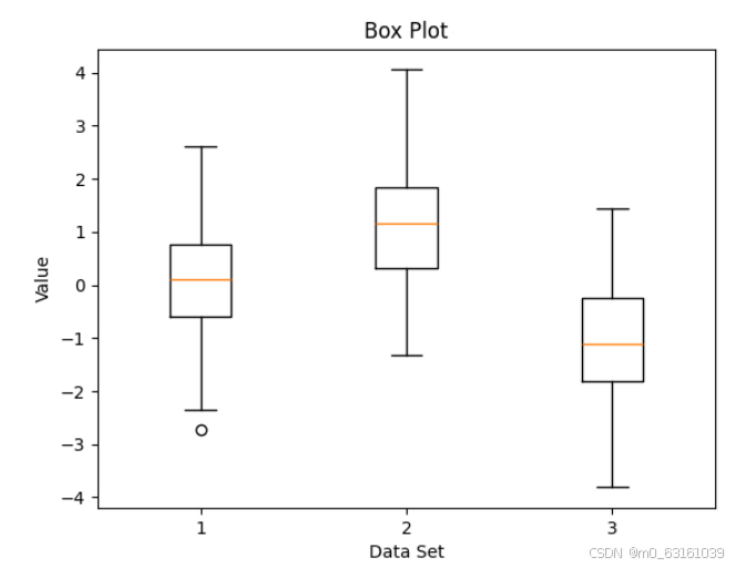
练习题 9:箱线图
生成多组随机数据,绘制箱线图展示数据分布。
import matplotlib.pyplot as plt
import numpy as np

# 生成随机数据
data1 = np.random.randn(100)
data2 = np.random.randn(100) + 1
data3 = np.random.randn(100) - 1

# 合并数据
data = [data1, data2, data3]

# 打印数据集前几行基本信息
print("data1 数据集前 5 行:", data1[:5])
print("data2 数据集前 5 行:", data2[:5])
print("data3 数据集前 5 行:", data3[:5])

# 绘制箱线图
plt.boxplot(data)

# 添加标题和标签
plt.title('Box Plot')
plt.xlabel('Data Set')
plt.ylabel('Value')

# 显示图形
plt.show()
运行结果:
data1 数据集前 5 行: [-0.41339606 -0.73112035 -0.25692131  0.26697566 -1.06717641]
data2 数据集前 5 行: [1.45903029 1.07911126 1.43500742 1.13337357 1.44330325]
data3 数据集前 5 行: [-1.63252225 -0.86916614 -1.51109095 -0.76673759 -1.50131652]
会弹出一个窗口,展示包含三组数据分布的箱线图,x 轴表示数据集编号(1 - 3),y 轴表示数据值。箱线图展示了数据的四分位数范围、中位数、异常值等分布特征。
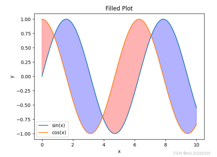
练习题 10:填充图
绘制两条曲线,并填充两条曲线之间的区域。
import matplotlib.pyplot as plt
import numpy as np

# 生成数据
x = np.linspace(0, 10, 100)
y1 = np.sin(x)
y2 = np.cos(x)

# 打印数据集前几行基本信息
print("x 数据集前 5 行:", x[:5])
print("y1 数据集前 5 行:", y1[:5])
print("y2 数据集前 5 行:", y2[:5])

# 绘制曲线
plt.plot(x, y1, label='sin(x)')
plt.plot(x, y2, label='cos(x)')

# 填充两条曲线之间的区域
plt.fill_between(x, y1, y2, where=y1 >= y2, interpolate=True, color='blue', alpha=0.3)
plt.fill_between(x, y1, y2, where=y1 < y2, interpolate=True, color='red', alpha=0.3)

# 添加标题和标签
plt.title('Filled Plot')
plt.xlabel('x')
plt.ylabel('y')

# 添加图例
plt.legend()

# 显示图形
plt.show()
运行结果:
x 数据集前 5 行: [0.         0.1010101  0.2020202  0.3030303  0.4040404]
y1 数据集前 5 行: [0.         0.10067175 0.2013404  0.30199394 0.40262836]
y2 数据集前 5 行: [1.         0.99486762 0.97974584 0.95466773 0.91967141]
弹出的窗口中展示了 sin(x) 和 cos(x) 的曲线,并且两条曲线之间的区域根据上下关系分别用蓝色和红色半透明区域填充。


 1289
1289

 被折叠的 条评论
为什么被折叠?
被折叠的 条评论
为什么被折叠?
 到【灌水乐园】发言


