


目录
作业要求
编写程序实现从文件中读取数据,数据处理,可视化。
注意:在统计各城市站点总数时,线路间的换乘站不要重复计算。
含支线的合并为一条线路,比如上海10号线支线(XX-XX),合并统计为10号线(需要排除重复量、换乘站)
1.绘制每个城市站点数量柱状图(降序排列)
先统计每个城市的站点数量,再绘制柱状图。
2.绘制上海市地铁线路站点数饼状图(不需要去除换乘站)
先统计每条线路的站点数量,再绘制饼状图。
3.绘制各城市地铁线路数量分布地图(支线需要统一为一条,geo/map)
先统计每个城市的线路数量,再绘制地图。
4.绘制站点数量排在前5的5个城市地铁站名的词云图(5个城市合在一起绘制1个词云图)(在第一问的基础上)
5.绘制上海、南昌、杭州、广州、深圳、成都、长沙、郑州线路站点数最多的站点数量折线图(横轴城市名-线路名,纵轴站点数量)
统计以上城市站点数量最多的线路的线路名和站点数,绘制折线图。
6.各个城市的大学数量与站点数量的线性回归拟合图(seaborn绘制,需要使用两个表格的重复部分)
7.统计各个城市的大学数量和站点数量,绘制线性回归拟合图
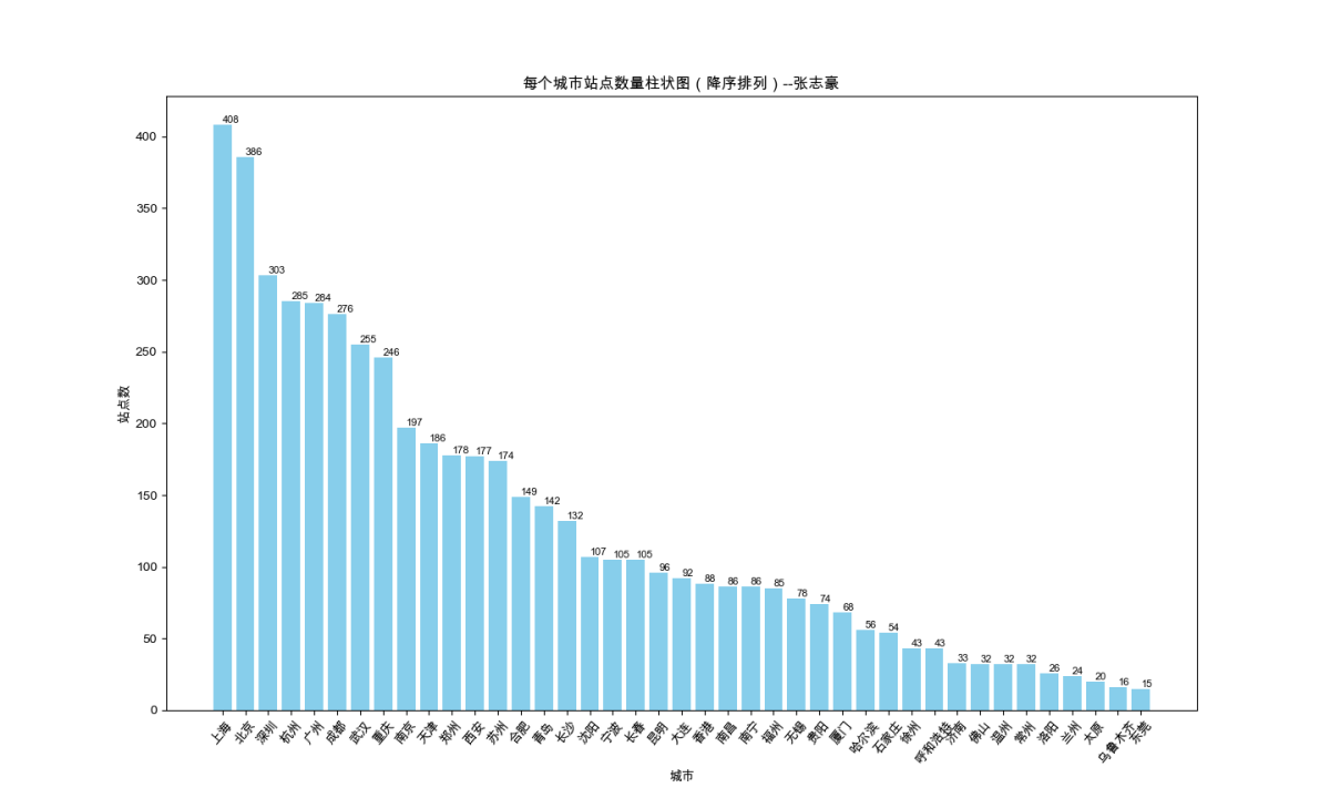
一、绘制每个城市站点数量柱状图(降序排列)
1.1 每个城市站点数量统计
1.1.1 代码展示
在站点数量进行统计前,对数据表格进行处理,给每一列加上列名

更方便对数据进行处理。
import pandas as pd

# 读取数据
data = pd.read_excel('subway.xlsx')

# 创建一个集合用于存储已经统计过的站点
counted_stations = set()

# 创建一个字典用于存储每个城市的站点数量
city_station_count = {}

# 遍历数据,计算每个城市的站点总数
for index, row in data.iterrows():
    city = row['城市']
    station = row['地铁站名']
    # 城市 地铁线路 地铁站名
    # 北京 S1线 苹果园
    # 北京 S1线 金安桥
    # 北京 S1线 四道桥
    # 北京 S1线 桥户营
    # 北京 S1线 上岸
    # 北京 S1线 栗园庄
    # 北京 S1线 小园
    # 北京 S1线 石厂
    # 检查是否已经统计过该站点
    if station not in counted_stations:
        # 将站点加入已统计集合中
        counted_stations.add(station)

        # 检查该城市是否已经有站点数量记录
        if city in city_station_count:
            city_station_count[city] += 1
        else:
            city_station_count[city] = 1

# 打印每个城市的站点总数
for city, count in city_station_count.items():
    print(f"{city}: {count}")
1.1.2 统计结果展示
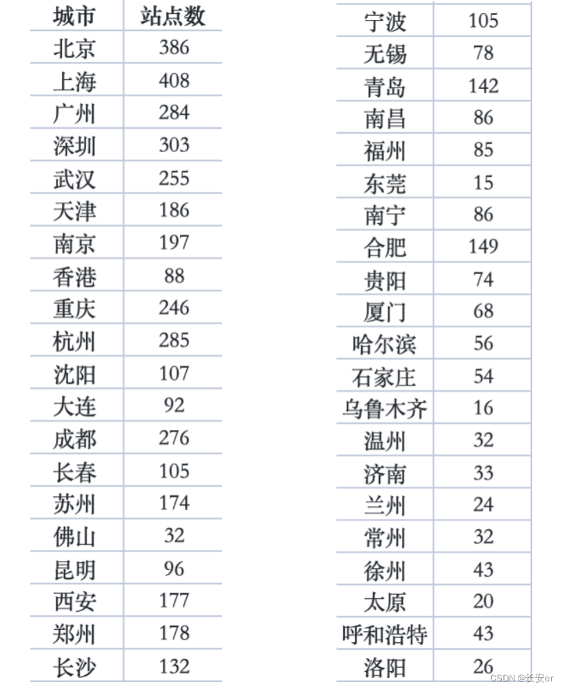 统计结果保存在city_sub.xlsx中
1.2 柱状图绘制
1.2.1 代码实现
import pandas as pd
import matplotlib.pyplot as plt

# 设置中文字体
plt.rcParams['font.family'] = ['Arial Unicode Ms']
# 从 Excel 文件中读取数据
df = pd.read_excel("city_sub.xlsx")

# 按站点数降序排列
df_sorted = df.sort_values(by="站点数", ascending=False)

# 绘制柱状图
plt.figure(figsize=(12, 8))  # 设置大小
bars = plt.bar(df_sorted["城市"], df_sorted["站点数"], color='skyblue', width=0.8)  # 调整每个柱体的宽度为0.6
plt.xlabel('城市')
plt.ylabel('站点数')
plt.title('每个城市站点数量柱状图(降序排列)--张志豪')

# 在每个柱体上添加具体的数字标签,更加美观
for bar in bars:
    yval = bar.get_height()
    plt.text(bar.get_x() + bar.get_width()/2, yval, round(yval), va='bottom', fontsize=8)

# x轴标签倾斜50度比较适合
plt.xticks(rotation=50)
plt.show()
1.2.2 绘制结果
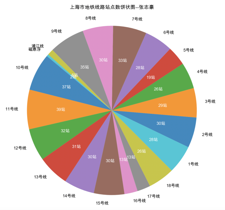
二、绘制上海市地铁线路站点数饼状图
2.1 数据处理
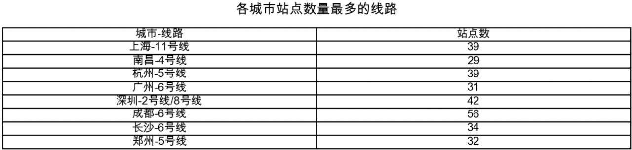
使用2.2中的代码对subway.xlsx中的数据进行处理,得到上海市地铁各线路站点数。统计结果如下: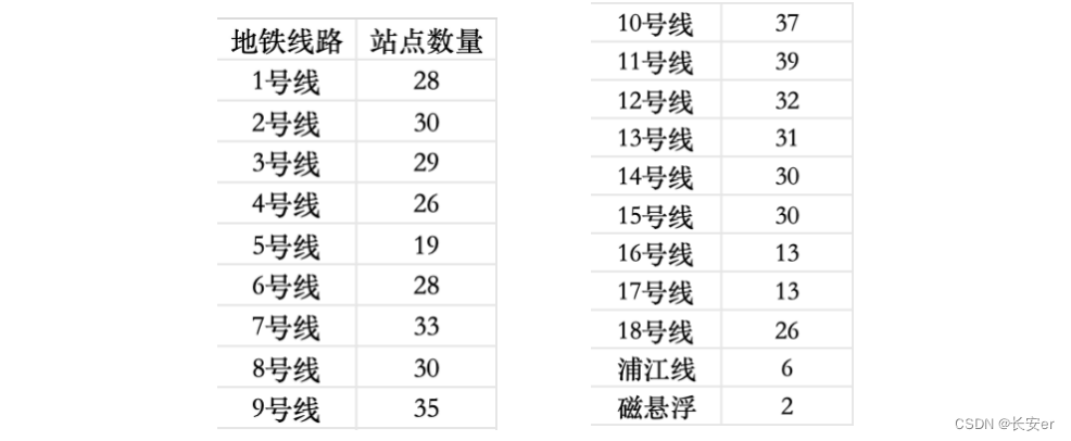
然后根据此数据绘制饼状图。
2.2 代码实现
import pandas as pd
import matplotlib.pyplot as plt
# 设置中文字体
plt.rcParams['font.family'] = ['Arial Unicode Ms']
# 从 Excel 文件中读取数据
df = pd.read_excel("subway.xlsx")
# 筛选出上海市的数据
shanghai_df = df[df['城市'] == '上海']
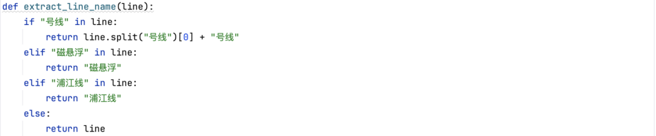
# 根据不同线路名称的格式来提取线路名称
def extract_line_name(line):
if "号线" in line:
return line.split("号线")[0] + "号线"
elif "磁悬浮" in line:
return "磁悬浮"
elif "浦江线" in line:
return "浦江线"
else:
return line
shanghai_df['地铁线路'] = shanghai_df['地铁线路'].apply(extract_line_name)
# 按线路分组并统计每条线路的站点数量
line_station_count = shanghai_df.groupby('地铁线路')['地铁站名'].count()
# 绘制饼状图
plt.figure(figsize=(10, 8))
patches, texts, autotexts = plt.pie(line_station_count, labels=line_station_count.index, autopct='%1.1f%%', startangle=140)
plt.axis('equal') # 使饼状图比例相等
plt.title('上海市地铁线路站点数饼状图--张志豪' ,pad=20) # 调整标题位置
# 在饼状图上添加站点数量注释
for i, (text, autotext) in enumerate(zip(texts, autotexts)):
autotext.set_color('white') # 设置注释文本颜色为白色
autotext.set_fontsize(10) # 设置注释文本字体大小
autotext.set_text(f"{line_station_count[i]}站") # 设置注释文本内容为站点数量
plt.show()2.3 关于如何对支线进行统一的思考和处理
通过设计函数extract_line_name(line),对多种地铁线路不同的名称进行处理,包括支线、特殊线路如浦江线、磁悬浮等。后续第五题可以使用类似的思路进行处理。
2.4 绘制结果
三、绘制各城市地铁线路数量分布地图
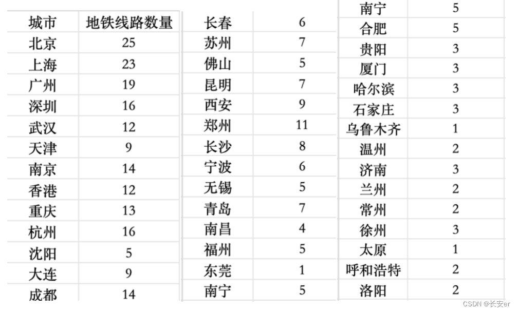
3.1 数据预处理
首先根据subway.xlsx得到各个城市线路数量,将结果保存在了subway_data.csv中。统计结果如下展示:
3.2 代码实现
import pandas as pd
from pyecharts import options as opts
from pyecharts.charts import Geo
from pyecharts.globals import ChartType
# 从 Excel 文件中读取数据
subway_data = pd.read_excel("subway.xlsx")
# 提取城市名称和地铁线路数量
cities = subway_data["城市"].tolist()
line_counts = subway_data["地铁线路数量"].tolist()
# 计算最大值和最小值
max_count = max(line_counts)
min_count = min(line_counts)
# 绘制地图
geo = (
Geo()
# 选择中国地图
.add_schema(maptype="china")
.add(
"",
[list(z) for z in zip(cities, line_counts)],
type_=ChartType.EFFECT_SCATTER,
)
.set_series_opts(label_opts=opts.LabelOpts(is_show=False))
.set_global_opts(
# 对左下角的颜色条范围进行设置
visualmap_opts=opts.VisualMapOpts(
min_=float(min_count), # 将最小值转换为浮点数
max_=float(max_count), # 将最大值转换为浮点数
range_color=["#FFFFFF", "#FF0000"] # 设置颜色范围
),
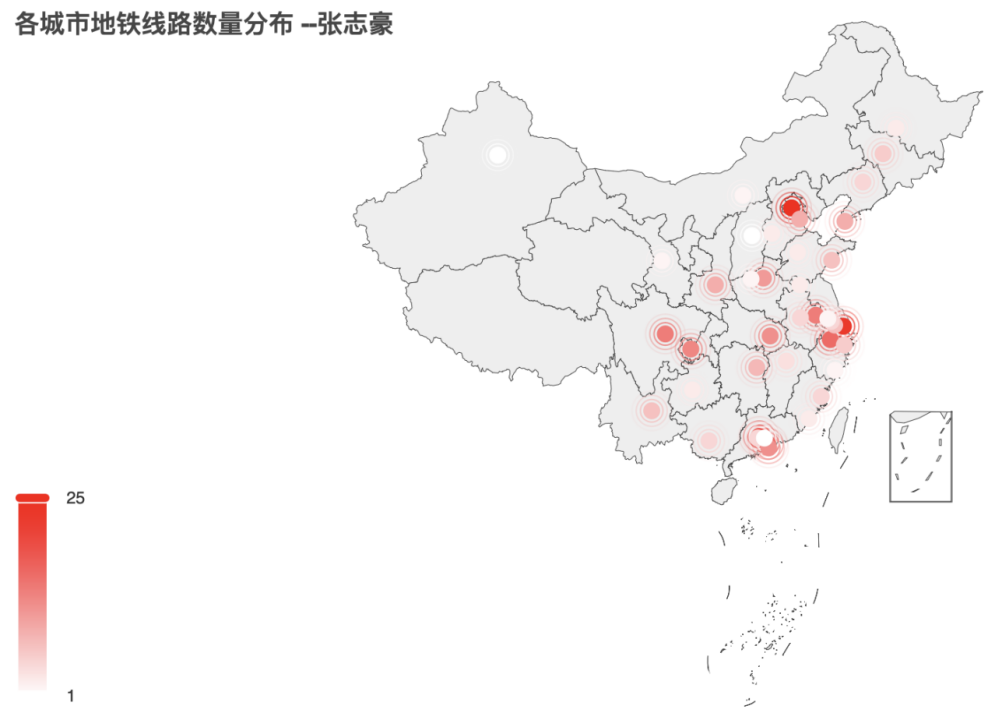
title_opts=opts.TitleOpts(title="各城市地铁线路数量分布 --张志豪"),
)
)
# 生成html文件
geo.render("subway_map.html")3.3 绘制结果
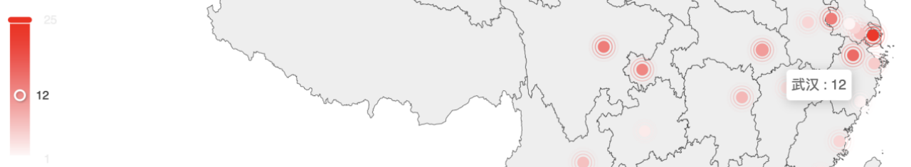
注:对于下图,我在左下角设置了颜色条显示,并对其范围进行了框定。在地图中可以很明显地看出北上广深、武汉、成都等地域,地铁线路数占据全国前列;也可以看出乌鲁木齐等城市地铁线路较少,为1条左右。由于最终地图以html文件的形式呈现,因此使用鼠标放置在具体城市点位上可查看具体线路数。
如下所示(查看武汉市的地铁线路数):
完整地图如下:
四、绘制站点数量排在前5的5个城市地铁站名的词云图
4.1 代码实现
代码设计思路与实验课的词云图设计思路类似,首先将排名前五的城市的地铁站名全部筛选出来并存入列表;然后保存为txt文件,txt文件部分内容如下;最后根据该文件绘制词云图。

import pandas as pd
from pyecharts import options as opts
from pyecharts.charts import WordCloud
import matplotlib.pyplot as plt


# 读取Excel文件
df = pd.read_excel('subway.xlsx')

# 筛选出北京、上海、广州、深圳和武汉的地铁站名
beijing_stations = df[df['城市'] == '北京']['地铁站名'].drop_duplicates().tolist()
shanghai_stations = df[df['城市'] == '上海']['地铁站名'].drop_duplicates().tolist()
guangzhou_stations = df[df['城市'] == '广州']['地铁站名'].drop_duplicates().tolist()
shenzhen_stations = df[df['城市'] == '深圳']['地铁站名'].drop_duplicates().tolist()
wuhan_stations = df[df['城市'] == '武汉']['地铁站名'].drop_duplicates().tolist()

# 将五个城市的地铁站名合并到一个列表中
all_stations = beijing_stations + shanghai_stations + guangzhou_stations + shenzhen_stations + wuhan_stations


# 创建文本文件
with open('地铁站名.txt', 'w', encoding='utf-8') as file:
    for name in all_stations:
        file.write(name + '\n')

# 读取文本文件并创建词云图
with open("地铁站名.txt", "r", encoding="utf-8") as file:
    text = file.read()

# 绘制词云图
wordcloud = (
    WordCloud()
    .add("", [(word, text.count(word)) for word in set(text.split())], word_size_range=[20, 100])
    .set_global_opts(title_opts=opts.TitleOpts(title="地铁站名词云图 --张志豪"))
)
# 保存词云图
wordcloud.render("wordcloud.html")
4.2 绘制结果

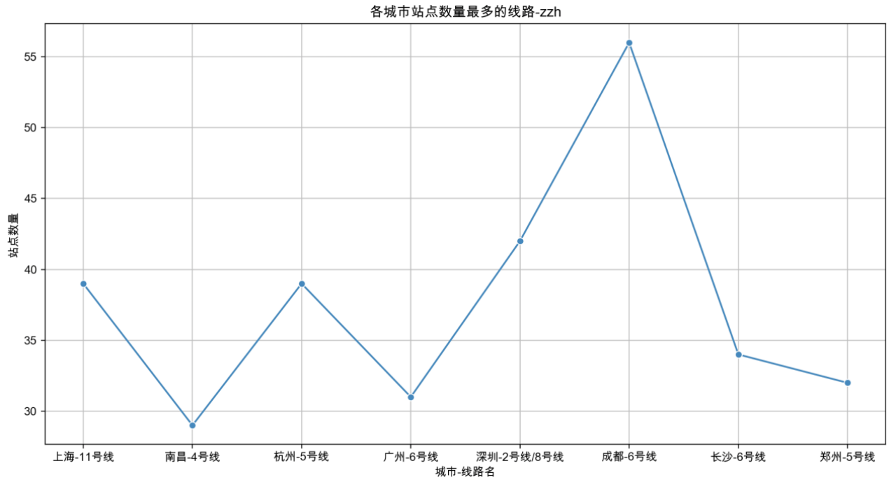
五、绘制上海等城市线路站点数最多的站点数量折线图
(注:上海、南昌、杭州、广州、深圳、成都、长沙、郑州)
5.1 数据处理
在对本题代码进行编写的过程中发现,最后得到的线路站点数有些超过50甚至60,在对数据集进行整体查看后发现,数据在后半部分出现了重复,因此对数据集进行去重处理,得到了新表格:subway_without_duplicates.xlsx。然后在新表格的基础上进行统计和绘图。
统计结果展示:
5.2 代码实现
5.2.1 数据处理代码
import pandas as pd

# 读取Excel文件
df = pd.read_excel('subway.xlsx')
# 去重处理
df.drop_duplicates(inplace=True)

# 将去重后的数据保存到新的Excel文件中
df.to_excel('subway_without_duplicates.xlsx', index=False)
5.2.2 折线图绘制代码
import pandas as pd
import matplotlib.pyplot as plt
import seaborn as sns

# 设置中文字体
plt.rcParams['font.family'] = ['Arial Unicode Ms']
# 从 Excel 文件中读取数据
df = pd.read_excel("subway.xlsx")

# 合并支线
def merge_branch(line):
    if "(" in line:
        return line.split("(")[0]
    else:
        return line


df['地铁线路'] = df['地铁线路'].apply(merge_branch)


# 按城市分组并去重
def remove_duplicates(city_df):
    city_df = city_df.drop_duplicates(subset=['地铁线路', '地铁站名'])
    return city_df


cities = ['上海', '南昌', '杭州', '广州', '深圳', '成都', '长沙', '郑州']

# 提取每个城市最大站点数量对应的地铁线路和站点数量
max_lines = []
max_station_counts = []
for city in cities:
    city_df = df[df['城市'] == city]
    city_df = remove_duplicates(city_df)
    line_station_count = city_df.groupby('地铁线路')['地铁站名'].count()
    max_line = line_station_count.idxmax()
    max_station_count = line_station_count.max()
    max_lines.append(city + '-' + max_line)
    max_station_counts.append(max_station_count)
print(max_lines, max_station_counts)
# 使用Seaborn绘制折线图
plt.figure(figsize=(10, 6))
sns.lineplot(x=max_lines, y=max_station_counts, marker='o')
plt.title('各城市站点数量最多的线路')
plt.xlabel('城市-线路名')
plt.ylabel('站点数量')
plt.xticks(rotation=0)
plt.grid(True)
plt.tight_layout()
plt.show()
5.3 绘制结果
注:最开始绘制的折线图中上海11号线的站点数超过了60,后面查看数据集后发现11号线的两条支线的很多站点都重复列出了(如下图所示),因此需要先合并支线再进行去重。
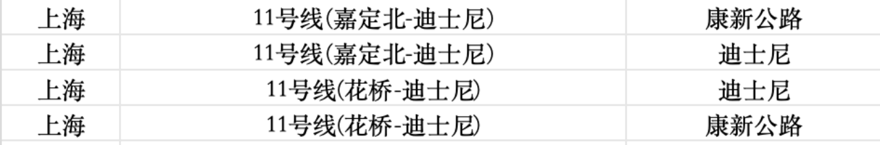
经过去重操作后,站点数量恢复正常。而站点数最多的成都六号线则是实际的站点数。
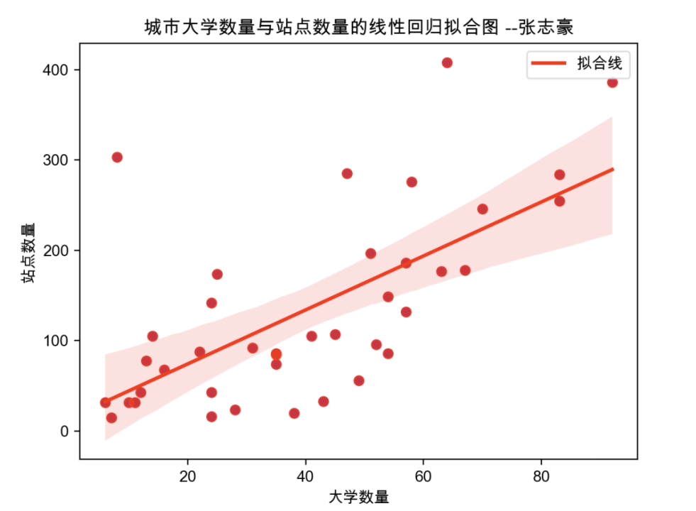
六、绘制各个城市的大学数量与站点数量的线性回归拟合图
6.1 数据处理与获取
·各个城市的大学数量从university.csv中获取
·各个城市的站点数量从city_sub.xlsx中获取,该表格是在第一题的基础上对subway.xlsx进行处理筛选后得到的表格,使用该数据集更有利于此图形的绘制
(表格分为两列:城市、站点数)
·本题采用seaborn进行绘制,因此需要使用两个表格的重复部分。
6.2 代码实现
本题代码的一个很简单的设计思路,即先将两个表格进行合并,找出重复的城市名称;然后创建一个新的DataFrame来存储重复城市的大学数量和站点数量。最后进行遍历和线性回归拟合图的绘制(使用seaborn)。
import pandas as pd
import seaborn as sns
import matplotlib.pyplot as plt
import numpy as np

# 读取两个表格的数据
university_data = pd.read_excel('university.xlsx')
city_sub_data = pd.read_excel('city_sub.xlsx')

# 设置中文字体
plt.rcParams['font.family'] = ['Arial Unicode Ms']

# 找出两个表格中重复的城市名称
common_cities = set(university_data['城市']).intersection(set(city_sub_data['城市']))

# 创建一个新的DataFrame来存储重复城市的大学数量和站点数量
merged_data = pd.DataFrame(columns=['城市', '大学数量', '站点数量'])

# 遍历重复的城市,并将数据添加到merged_data DataFrame中
for city in common_cities:
    university_count = university_data.loc[university_data['城市'] == city, '大学数量'].values[0]
    station_count = city_sub_data.loc[city_sub_data['城市'] == city, '站点数'].values[0]
    merged_data = pd.concat([merged_data, pd.DataFrame({'城市': [city], '大学数量': [university_count], '站点数量': [station_count]})], ignore_index=True)

# 确保数据类型为数值类型
merged_data['大学数量'] = pd.to_numeric(merged_data['大学数量'], errors='coerce')
merged_data['站点数量'] = pd.to_numeric(merged_data['站点数量'], errors='coerce')

# 检查是否有 NaN 或无穷大的值
if merged_data.isnull().values.any():
    merged_data = merged_data.dropna()

# 从DataFrame中提取大学数量和站点数量
university_counts = merged_data['大学数量'].values
station_counts = merged_data['站点数量'].values

# 计算线性回归拟合线的参数
slope, intercept = np.polyfit(university_counts, station_counts, 1)

# 绘制散点图
sns.scatterplot(x='大学数量', y='站点数量', data=merged_data, color='blue', s=50)

# 绘制线性回归拟合线
sns.regplot(x='大学数量', y='站点数量', data=merged_data, color='red', line_kws={'label': '拟合线'})
# 设置图表标题和坐标轴标签
plt.title('城市大学数量与站点数量的线性回归拟合图 --张志豪')
plt.xlabel('大学数量')
plt.ylabel('站点数量')
plt.legend()

# 显示图表
plt.show()
6.3 绘制结果
END~


 1126
1126

 被折叠的 条评论
为什么被折叠?
被折叠的 条评论
为什么被折叠?
 到【灌水乐园】发言


