


原文:https://www.w3cschool.cn/article/88229685.html
(本文非我原创,请标记为付费文章,也请勿将我标记为原创)
一、引言
生日是每个人一年中最特别的日子之一。在这个特别的日子里,我们都希望能够给亲朋好友送上最温馨、最独特的祝福。在互联网时代,一份电子生日祝福网页不仅能传达我们的心意,还能带来惊喜和新鲜感。今天,编程狮将手把手教你用简单的 HTML、CSS 和 JavaScript 制作一个精美的生日祝福网页。
二、基础 HTML 结构搭建
首先,我们需要搭建一个基本的 HTML 页面框架。这是后续所有元素和效果的基础。
<!DOCTYPE html>
<html lang="zh-CN">
<head>
    <meta charset="UTF-8">
    <meta name="viewport" content="width=device-width, initial-scale=1.0">
    <title>生日快乐祝福 - 编程狮教程</title>
    <style>
        /* 在这里添加 CSS 样式 */
    </style>
</head>
<body>
    <div class="container">
        <h1>生日快乐!</h1>
        <div class="card">
            <div class="message">祝你生日快乐,幸福永远!</div>
            <div class="signature">来自编程狮</div>
        </div>
    </div>
    <script>
        // 在这里添加 JavaScript 代码
    </script>
</body>
</html>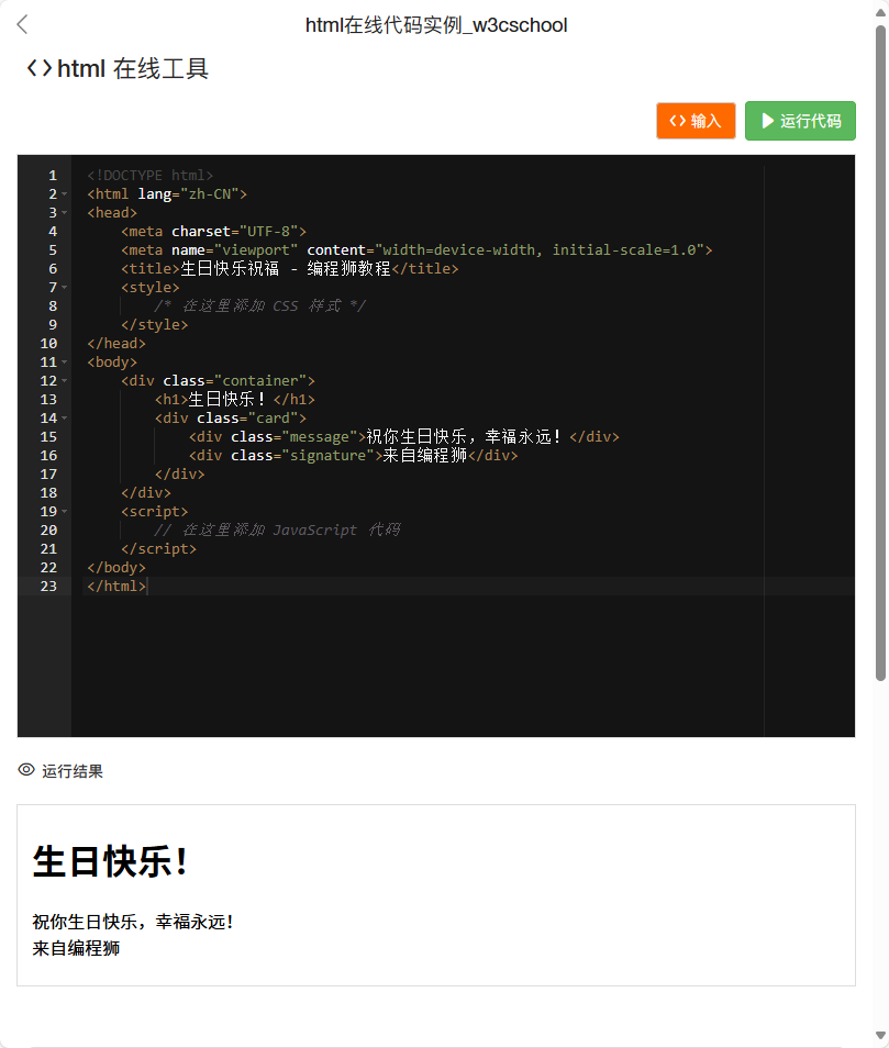
三、添加 CSS 样式美化页面
让我们的祝福网页更加美观和有吸引力是关键。我们使用 CSS 来设计一个漂亮的卡片样式,并添加一些氛围装饰元素。
<style>
    /* 设置页面基础样式 */
    body {
        font-family: 'Arial', sans-serif;
        background-color: #f8e8ff; /* 柔和的紫色背景 */
        margin: 0;
        padding: 0;
        display: flex;
        justify-content: center;
        align-items: center;
        min-height: 100vh;
        overflow: hidden; /* 隐藏溢出的装饰元素 */
        position: relative; /* 用于定位装饰元素 */
    }


    /* 添加背景渐变效果 */
    body::before {
        content: '';
        position: absolute;
        top: 0;
        left: 0;
        right: 0;
        bottom: 0;
        background: linear-gradient(135deg, #f8e8ff 0%, #e6f7ff 100%);
        z-index: -1; /* 确保渐变在最底层 */
    }


    /* 添加彩带装饰 */
    .ribbon {
        position: absolute;
        width: 200px;
        height: 20px;
        background-color: #ff6b6b;
        border-radius: 10px;
        animation: float 3s ease-in-out infinite;
    }


    .ribbon:nth-child(1) {
        top: 10%;
        left: 10%;
        animation-delay: 0s;
    }


    .ribbon:nth-child(2) {
        top: 30%;
        right: 15%;
        animation-delay: 0.5s;
        background-color: #4ecef7;
    }


    .ribbon:nth-child(3) {
        bottom: 20%;
        left: 20%;
        animation-delay: 1s;
        background-color: #ffd166;
    }


    .ribbon:nth-child(4) {
        bottom: 40%;
        right: 10%;
        animation-delay: 1.5s;
        background-color: #63f7c2;
    }


    /* 彩带飘动动画 */
    @keyframes float {
        0% {
            transform: translateY(0) rotate(0deg);
        }
        50% {
            transform: translateY(-20px) rotate(10deg);
        }
        100% {
            transform: translateY(0) rotate(0deg);
        }
    }


    /* 添加礼物装饰 */
    .gift {
        position: absolute;
        width: 40px;
        height: 40px;
        background-color: #ffd166;
        border-radius: 5px;
        display: flex;
        justify-content: center;
        align-items: center;
        font-weight: bold;
        color: white;
        animation: bounce 2s ease-in-out infinite;
    }


    .gift:nth-child(1) {
        top: 20%;
        left: 15%;
        animation-delay: 0s;
    }


    .gift:nth-child(2) {
        top: 60%;
        right: 20%;
        animation-delay: 0.5s;
        background-color: #4ecef7;
    }


    .gift:nth-child(3) {
        bottom: 25%;
        left: 25%;
        animation-delay: 1s;
        background-color: #ff6b6b;
    }


    /* 礼物弹跳动画 */
    @keyframes bounce {
        0% {
            transform: translateY(0);
        }
        50% {
            transform: translateY(-15px);
        }
        100% {
            transform: translateY(0);
        }
    }


    /* 添加生日蜡烛装饰 */
    .candle {
        position: absolute;
        width: 6px;
        height: 30px;
        background-color: #ff9e00;
        border-radius: 5px;
    }


    .candle::after {
        content: '';
        position: absolute;
        top: -8px;
        left: 50%;
        transform: translateX(-50%);
        width: 12px;
        height: 12px;
        background-color: #ffff00;
        border-radius: 50%;
        box-shadow: 0 0 10px #ffff00;
        animation: flicker 1.5s ease-in-out infinite;
    }


    .candle:nth-child(1) {
        top: 15%;
        left: 30%;
        animation-delay: 0s;
    }


    .candle:nth-child(2) {
        top: 25%;
        right: 25%;
        animation-delay: 0.2s;
    }


    .candle:nth-child(3) {
        bottom: 20%;
        left: 40%;
        animation-delay: 0.5s;
    }


    .candle:nth-child(4) {
        bottom: 35%;
        right: 30%;
        animation-delay: 0.7s;
    }


    /* 蜡烛火焰闪烁动画 */
    @keyframes flicker {
        0% {
            opacity: 0.8;
            transform: scale(1);
        }
        50% {
            opacity: 1;
            transform: scale(1.2);
        }
        100% {
            opacity: 0.8;
            transform: scale(1);
        }
    }


    /* 添加礼花装饰 */
    .firework {
        position: absolute;
        width: 10px;
        height: 10px;
        border-radius: 50%;
        box-shadow: 0 0 20px 5px currentColor;
        animation: explode 2s ease-out infinite;
    }


    .firework:nth-child(1) {
        top: 10%;
        left: 20%;
        color: #ff6b6b;
        animation-delay: 0s;
    }


    .firework:nth-child(2) {
        top: 20%;
        right: 30%;
        color: #4ecef7;
        animation-delay: 0.5s;
    }


    .firework:nth-child(3) {
        bottom: 15%;
        left: 25%;
        color: #ffd166;
        animation-delay: 1s;
    }


    .firework:nth-child(4) {
        bottom: 25%;
        right: 20%;
        color: #63f7c2;
        animation-delay: 1.5s;
    }


    /* 礼花爆炸动画 */
    @keyframes explode {
        0% {
            transform: scale(0);
            opacity: 1;
        }
        100% {
            transform: scale(2);
            opacity: 0;
        }
    }


    /* 设置容器样式 */
    .container {
        width: 100%;
        max-width: 600px;
        text-align: center;
        position: relative;
        z-index: 1; /* 确保内容在装饰元素之上 */
    }


    /* 设置卡片样式 */
    .card {
        background-color: white;
        border-radius: 10px;
        box-shadow: 0 4px 8px rgba(0, 0, 0, 0.1);
        padding: 30px;
        margin: 20px auto;
        transform: scale(0); /* 初始时卡片缩小 */
        animation: popIn 0.5s ease forwards; /* 使用动画让卡片弹出 */
        position: relative;
        overflow: hidden; /* 隐藏溢出的内容 */
    }


    /* 卡片弹出动画 */
    @keyframes popIn {
        to {
            transform: scale(1);
        }
    }


    /* 设置标题样式 */
    h1 {
        color: #ff6b6b;
        margin-bottom: 30px;
        font-size: 2.5rem;
        text-shadow: 2px 2px 4px rgba(0, 0, 0, 0.1);
    }


    /* 设置祝福语样式 */
    .message {
        font-size: 24px;
        color: #333;
        margin-bottom: 20px;
        line-height: 1.5;
    }


    /* 设置签名样式 */
    .signature {
        font-style: italic;
        color: #777;
        margin-top: 20px;
    }


    /* 添加生日蛋糕装饰 */
    .cake {
        width: 150px;
        height: 150px;
        margin: 20px auto;
        background-color: #ffd166;
        border-radius: 5px;
        position: relative;
        display: flex;
        justify-content: center;
        align-items: center;
        overflow: hidden;
    }


    .cake::before {
        content: ''; /* 使用蛋糕 emoji */
        font-size: 120px;
        position: absolute;
        z-index: 2;
    }


    .cake::after {
        content: '';
        position: absolute;
        width: 100%;
        height: 15px;
        background-color: #ff6b6b;
        bottom: 0;
        z-index: 3;
    }


    /* 添加按钮样式 */
    .btn {
        padding: 10px 20px;
        background-color: #ff6b6b;
        color: white;
        border: none;
        border-radius: 5px;
        cursor: pointer;
        margin-top: 20px;
        font-size: 16px;
        transition: background-color 0.3s;
    }


    .btn:hover {
        background-color: #ff5252;
    }


    /* 添加祝福语切换效果 */
    .message {
        transition: all 0.5s ease;
    }
</style>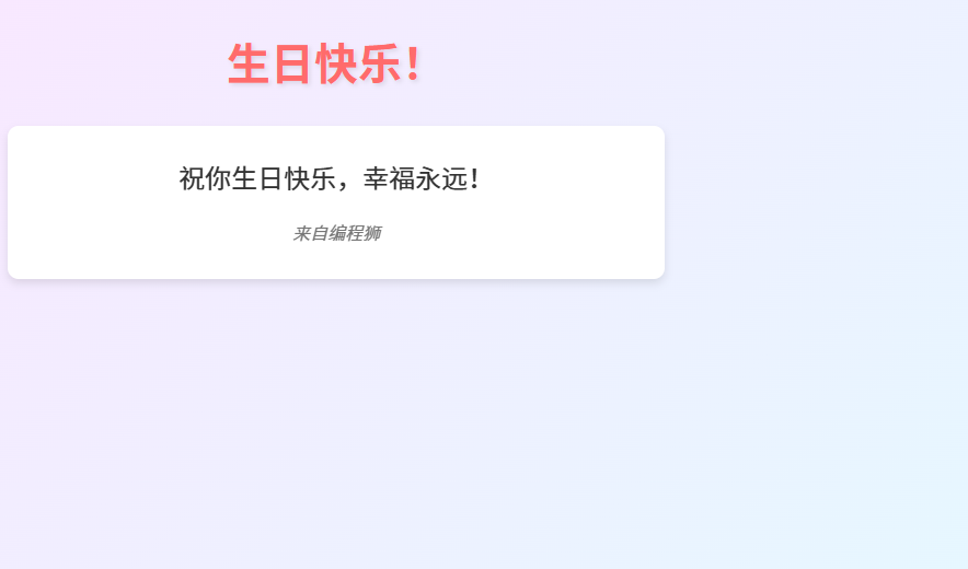
四、添加 JavaScript 动画效果
为了让祝福网页更具互动性和惊喜感,我们可以使用 JavaScript 来添加一些简单的动画效果。
<script>
    // 定义祝福语数组
    const messages = [
        "生日快乐!愿你笑口常开。",
        "祝你生日快乐,心想事成!",
        "生日快乐!愿你天天快乐。",
        "祝你生日快乐,万事如意!",
        "生日快乐!愿你青春永驻。"
    ];


    // 获取祝福语元素
    const messageElement = document.querySelector('.message');


    // 切换祝福语的函数
    function changeMessage() {
        // 随机选择一个祝福语
        const randomMessage = messages[Math.floor(Math.random() * messages.length)];
        // 更新祝福语内容
        messageElement.textContent = randomMessage;
    }


    // 页面加载完成后执行
    document.addEventListener('DOMContentLoaded', function() {
        // 每隔 3 秒自动切换祝福语
        setInterval(changeMessage, 3000);
        // 初始调用一次,确保页面加载时显示一个祝福语
        changeMessage();


        // 输出调试信息
        console.log('生日快乐网页加载完成 - 来自编程狮');
    });
</script>
五、使用编程狮的 HTML 在线工具进行实时预览
在制作过程中,你可以使用编程狮提供的 HTML 在线运行工具 进行实时预览和调试。这个工具可以帮助你快速看到代码修改后的效果,方便及时调整。
六、完整代码预览
以下是完整的代码,你可以直接复制到你的 HTML 文件中运行:
<!DOCTYPE html>
<html lang="zh-CN">
<head>
    <meta charset="UTF-8">
    <meta name="viewport" content="width=device-width, initial-scale=1.0">
    <title>生日快乐祝福 - 编程狮教程</title>
    <style>
        /* 设置页面基础样式 */
        body {
            font-family: 'Arial', sans-serif;
            background-color: #f8e8ff; /* 柔和的紫色背景 */
            margin: 0;
            padding: 0;
            display: flex;
            justify-content: center;
            align-items: center;
            min-height: 100vh;
            overflow: hidden; /* 隐藏溢出的装饰元素 */
            position: relative; /* 用于定位装饰元素 */
        }


        /* 添加背景渐变效果 */
        body::before {
            content: '';
            position: absolute;
            top: 0;
            left: 0;
            right: 0;
            bottom: 0;
            background: linear-gradient(135deg, #f8e8ff 0%, #e6f7ff 100%);
            z-index: -1; /* 确保渐变在最底层 */
        }


        /* 添加彩带装饰 */
        .ribbon {
            position: absolute;
            width: 200px;
            height: 20px;
            background-color: #ff6b6b;
            border-radius: 10px;
            animation: float 3s ease-in-out infinite;
        }


        .ribbon:nth-child(1) {
            top: 10%;
            left: 10%;
            animation-delay: 0s;
        }


        .ribbon:nth-child(2) {
            top: 30%;
            right: 15%;
            animation-delay: 0.5s;
            background-color: #4ecef7;
        }


        .ribbon:nth-child(3) {
            bottom: 20%;
            left: 20%;
            animation-delay: 1s;
            background-color: #ffd166;
        }


        .ribbon:nth-child(4) {
            bottom: 40%;
            right: 10%;
            animation-delay: 1.5s;
            background-color: #63f7c2;
        }


        /* 彩带飘动动画 */
        @keyframes float {
            0% {
                transform: translateY(0) rotate(0deg);
            }
            50% {
                transform: translateY(-20px) rotate(10deg);
            }
            100% {
                transform: translateY(0) rotate(0deg);
            }
        }


        /* 添加礼物装饰 */
        .gift {
            position: absolute;
            width: 40px;
            height: 40px;
            background-color: #ffd166;
            border-radius: 5px;
            display: flex;
            justify-content: center;
            align-items: center;
            font-weight: bold;
            color: white;
            animation: bounce 2s ease-in-out infinite;
        }


        .gift:nth-child(1) {
            top: 20%;
            left: 15%;
            animation-delay: 0s;
        }


        .gift:nth-child(2) {
            top: 60%;
            right: 20%;
            animation-delay: 0.5s;
            background-color: #4ecef7;
        }


        .gift:nth-child(3) {
            bottom: 25%;
            left: 25%;
            animation-delay: 1s;
            background-color: #ff6b6b;
        }


        /* 礼物弹跳动画 */
        @keyframes bounce {
            0% {
                transform: translateY(0);
            }
            50% {
                transform: translateY(-15px);
            }
            100% {
                transform: translateY(0);
            }
        }


        /* 添加生日蜡烛装饰 */
        .candle {
            position: absolute;
            width: 6px;
            height: 30px;
            background-color: #ff9e00;
            border-radius: 5px;
        }


        .candle::after {
            content: '';
            position: absolute;
            top: -8px;
            left: 50%;
            transform: translateX(-50%);
            width: 12px;
            height: 12px;
            background-color: #ffff00;
            border-radius: 50%;
            box-shadow: 0 0 10px #ffff00;
            animation: flicker 1.5s ease-in-out infinite;
        }


        .candle:nth-child(1) {
            top: 15%;
            left: 30%;
            animation-delay: 0s;
        }


        .candle:nth-child(2) {
            top: 25%;
            right: 25%;
            animation-delay: 0.2s;
        }


        .candle:nth-child(3) {
            bottom: 20%;
            left: 40%;
            animation-delay: 0.5s;
        }


        .candle:nth-child(4) {
            bottom: 35%;
            right: 30%;
            animation-delay: 0.7s;
        }


        /* 蜡烛火焰闪烁动画 */
        @keyframes flicker {
            0% {
                opacity: 0.8;
                transform: scale(1);
            }
            50% {
                opacity: 1;
                transform: scale(1.2);
            }
            100% {
                opacity: 0.8;
                transform: scale(1);
            }
        }


        /* 添加礼花装饰 */
        .firework {
            position: absolute;
            width: 10px;
            height: 10px;
            border-radius: 50%;
            box-shadow: 0 0 20px 5px currentColor;
            animation: explode 2s ease-out infinite;
        }


        .firework:nth-child(1) {
            top: 10%;
            left: 20%;
            color: #ff6b6b;
            animation-delay: 0s;
        }


        .firework:nth-child(2) {
            top: 20%;
            right: 30%;
            color: #4ecef7;
            animation-delay: 0.5s;
        }


        .firework:nth-child(3) {
            bottom: 15%;
            left: 25%;
            color: #ffd166;
            animation-delay: 1s;
        }


        .firework:nth-child(4) {
            bottom: 25%;
            right: 20%;
            color: #63f7c2;
            animation-delay: 1.5s;
        }


        /* 礼花爆炸动画 */
        @keyframes explode {
            0% {
                transform: scale(0);
                opacity: 1;
            }
            100% {
                transform: scale(2);
                opacity: 0;
            }
        }


        /* 设置容器样式 */
        .container {
            width: 100%;
            max-width: 600px;
            text-align: center;
            position: relative;
            z-index: 1; /* 确保内容在装饰元素之上 */
        }


        /* 设置卡片样式 */
        .card {
            background-color: white;
            border-radius: 10px;
            box-shadow: 0 4px 8px rgba(0, 0, 0, 0.1);
            padding: 30px;
            margin: 20px auto;
            transform: scale(0); /* 初始时卡片缩小 */
            animation: popIn 0.5s ease forwards; /* 使用动画让卡片弹出 */
            position: relative;
            overflow: hidden; /* 隐藏溢出的内容 */
        }


        /* 卡片弹出动画 */
        @keyframes popIn {
            to {
                transform: scale(1);
            }
        }


        /* 设置标题样式 */
        h1 {
            color: #ff6b6b;
            margin-bottom: 30px;
            font-size: 2.5rem;
            text-shadow: 2px 2px 4px rgba(0, 0, 0, 0.1);
        }


        /* 设置祝福语样式 */
        .message {
            font-size: 24px;
            color: #333;
            margin-bottom: 20px;
            line-height: 1.5;
            transition: all 0.5s ease;
        }


        /* 设置签名样式 */
        .signature {
            font-style: italic;
            color: #777;
            margin-top: 20px;
        }


        /* 添加生日蛋糕装饰 */
        .cake {
            width: 150px;
            height: 150px;
            margin: 20px auto;
            background-color: #ffd166;
            border-radius: 5px;
            position: relative;
            display: flex;
            justify-content: center;
            align-items: center;
            overflow: hidden;
        }


        .cake::before {
            content: ''; /* 使用蛋糕 emoji */
            font-size: 120px;
            position: absolute;
            z-index: 2;
        }


        .cake::after {
            content: '';
            position: absolute;
            width: 100%;
            height: 15px;
            background-color: #ff6b6b;
            bottom: 0;
            z-index: 3;
        }


        /* 添加按钮样式 */
        .btn {
            padding: 10px 20px;
            background-color: #ff6b6b;
            color: white;
            border: none;
            border-radius: 5px;
            cursor: pointer;
            margin-top: 20px;
            font-size: 16px;
            transition: background-color 0.3s;
        }


        .btn:hover {
            background-color: #ff5252;
        }
    </style>
</head>
<body>
    <!-- 彩带装饰 -->
    <div class="ribbon"></div>
    <div class="ribbon"></div>
    <div class="ribbon"></div>
    <div class="ribbon"></div>


    <!-- 礼物装饰 -->
    <div class="gift"></div>
    <div class="gift"></div>
    <div class="gift"></div>


    <!-- 生日蜡烛装饰 -->
    <div class="candle"></div>
    <div class="candle"></div>
    <div class="candle"></div>
    <div class="candle"></div>


    <!-- 礼花装饰 -->
    <div class="firework"></div>
    <div class="firework"></div>
    <div class="firework"></div>
    <div class="firework"></div>


    <div class="container">
        <h1>生日快乐!</h1>
        <div class="cake"></div>
        <div class="card">
            <div class="message">祝你生日快乐,幸福永远!</div>
            <div class="signature">来自编程狮</div>
        </div>
        <button class="btn" onclick="changeMessage()">切换祝福语</button>
    </div>


    <script>
        // 定义祝福语数组
        const messages = [
            "生日快乐!愿你笑口常开。",
            "祝你生日快乐,心想事成!",
            "生日快乐!愿你天天快乐。",
            "祝你生日快乐,万事如意!",
            "生日快乐!愿你青春永驻。"
        ];


        // 获取祝福语元素
        const messageElement = document.querySelector('.message');


        // 切换祝福语的函数
        function changeMessage() {
            // 随机选择一个祝福语
            const randomMessage = messages[Math.floor(Math.random() * messages.length)];
            // 更新祝福语内容
            messageElement.textContent = randomMessage;
        }


        // 页面加载完成后执行
        document.addEventListener('DOMContentLoaded', function() {
            // 每隔 3 秒自动切换祝福语
            setInterval(changeMessage, 3000);
            // 初始调用一次,确保页面加载时显示一个祝福语
            changeMessage();


            // 输出调试信息
            console.log('生日快乐网页加载完成 - 来自编程狮');
        });
    </script>
</body>
</html>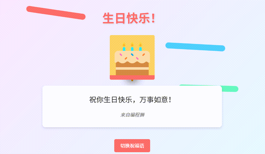
七、代码详细注释
HTML 部分
- 文档类型和基础标签 :使用标准的
<!DOCTYPE html>声明文档类型,并包含基本的html、head和body标签。 - 元信息 :在
head中设置字符编码和视口信息,确保页面正确显示。 - 标题设置 :设置页面标题为 "生日快乐祝福 - 编程狮教程"。
- 装饰元素 :在
body中添加彩带、礼物、蜡烛、礼花等装饰元素,使用 CSS 进行定位和动画效果设置。 - 内容容器 :创建一个内容容器,包含标题、生日蛋糕、卡片和按钮等元素。
CSS 部分
- 基础样式 :设置页面背景颜色、字体、布局等基础样式。
- 背景渐变 :为页面添加渐变背景效果,增加视觉吸引力。
- 装饰元素样式 :分别为彩带、礼物、蜡烛、礼花等装饰元素设置样式和动画效果。
- 内容样式 :为标题、卡片、祝福语、签名和按钮设置样式,确保内容美观且易于阅读。
- 动画效果 :定义多种动画效果,如彩带飘动、礼物弹跳、蜡烛火焰闪烁、礼花爆炸、卡片弹出等。
JavaScript 部分
- 祝福语数组 :定义一个包含多个祝福语的数组。
- 获取元素 :使用
document.querySelector获取祝福语元素。 - 切换祝福语函数 :定义一个函数,随机选择祝福语数组中的一个元素并更新祝福语内容。
- 页面加载事件 :在页面加载完成后,设置定时器每隔 3 秒自动切换祝福语,并初始化显示一个祝福语。
- 调试信息 :在控制台输出调试信息,帮助开发者了解页面加载状态。
八、推荐编程狮相关课程
如果你想学习更多关于 HTML、CSS 和 JavaScript 的知识,编程狮平台上有很多适合初学者的课程:
- HTML 基础入门:学习 HTML 的基本结构和常用标签。
- CSS 入门课程:掌握 CSS 的选择器、样式属性和页面布局技术。
- JavaScript 入门课程:了解如何使用 JavaScript 添加页面交互效果。
九、总结与拓展
通过以上详细的代码和注释,你可以轻松理解和修改这个生日祝福网页。希望这个教程能帮助你为亲朋好友制作一份特别的生日祝福。如果你有任何问题或需要进一步的帮助,欢迎访问编程狮平台,探索更多相关教程和资源。


 扫一扫
扫一扫


 1万+
1万+

 被折叠的 条评论
为什么被折叠?
被折叠的 条评论
为什么被折叠?
 到【灌水乐园】发言


