


前言
最近利用空闲时间在学习华为方舟开发框架(简称:ArkUI)的ets开发,发现在ets语言中装饰器的有着非常重要的作用,在写每一个自定义组件时都需要用到它,看到装饰器这个字眼,想起之前学过的设计模式里的装饰器模式(允许向一个现有的对象添加新的功能,同时又不改变其结构。这种类型的设计模式属于结构型模式,它是作为现有的类的一个包装),ets中的装饰器的作用就是类似这样的。华为官网中对装饰器的介绍也比较详细,参照官网的讲解,自己对其进行了汇总,方便后续理解与查阅。
装饰器
1、@Component
装饰内容为struct,@Component装饰的struct表示该结构体具有组件化能力,能够成为一个独立的组件,这种组件就是自定义组件
- 所有的UI都是由组件构成,组件的数据结构为struct
- 自定义组件可以调用其他自定义组件和内置组件
- 自定义组件内部必须实现build方法来描述UI结构
- 禁止自定义构造函数
@Component

struct MyComponent {

    build() {

        Column() {

            Text('my component')

                .fontColor(Color.Red)

        }.alignItems(HorizontalAlign.Center)

    }

}


@Component

struct ParentComponent {

    build() {

        Column() {

            MyComponent()

            Text('we use component')

                .fontSize(20)

        }

    }

}
2、@Entry
装饰内容为struct,用@Entry装饰的自定义组件用作页面的默认入口组件,加载页面时,将首先创建并呈现@Entry装饰的自定义组件。
- 在单个源文件中,最多可以使用@Entry装饰一个自定义组件。即一个页面有且仅有一个@Entry
// 只会渲染加载出 MyComponent 组件,显示hello world

@Entry

@Component

struct MyComponent {

    build() {

        Column() {

            Text('hello world')

                .fontColor(Color.Red)

        }

    }

}


@Component

struct HideComponent {

    build() {

        Column() {

            Text('goodbye')

                .fontColor(Color.Blue)

        }

    }

}
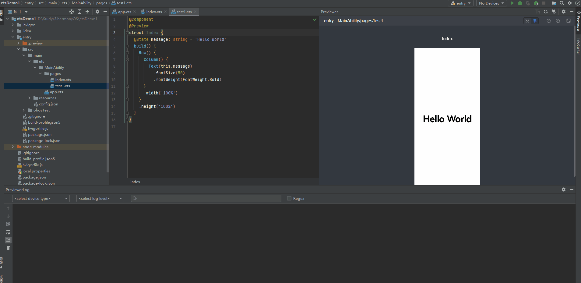
3、@Preview
装饰内容为struct,用@Preview装饰的自定义组件可以在DevEco Studio的预览器上进行预览。
-
单组件预览,仅预览被@Preview装饰的自定义组件
-
在单个源文件中,最多可以使用10个**@Preview**装饰一个自定义组件

多个组件预览
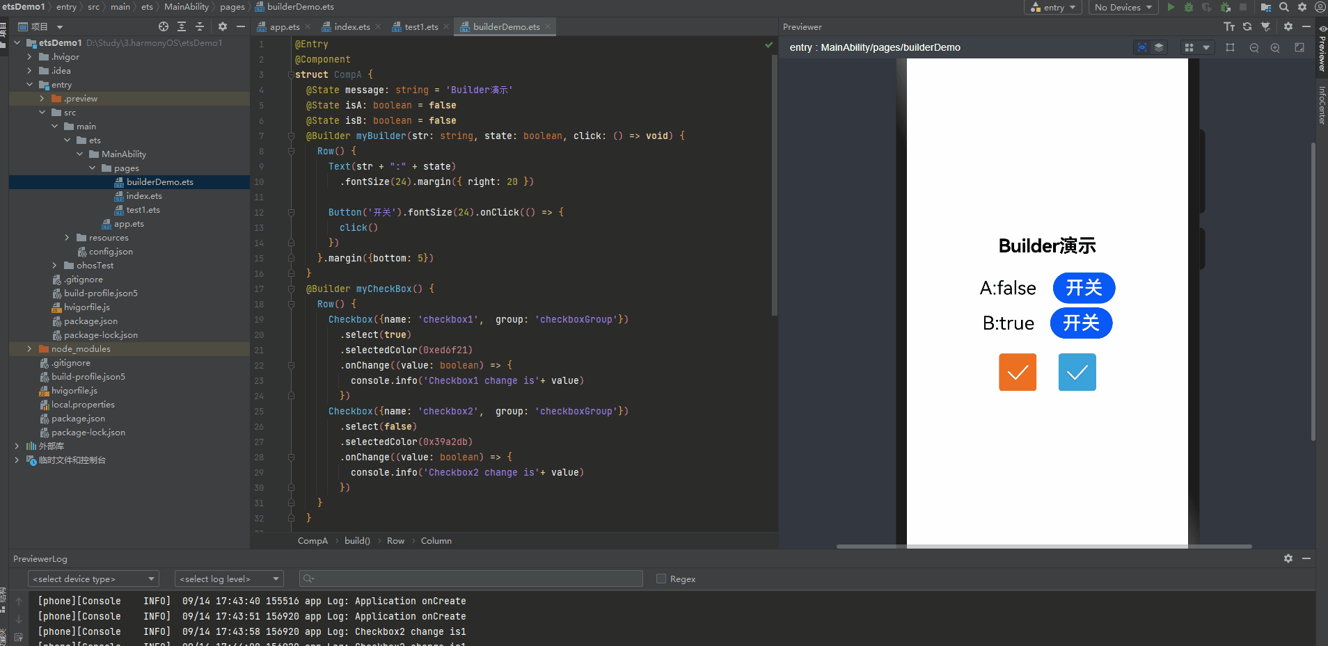
4、@Builder
装饰内容为方法, @Builder装饰的方法用于定义组件的声明式UI描述,在一个自定义组件内快速生成多个布局内容。
@Entry

@Component

struct CompA {

  @State message: string = 'Builder演示'

  @State isA: boolean = false

  @State isB: boolean = false

  @Builder myBuilder(str: string, state: boolean, click: () => void) {

    Row() {

      Text(str + ":" + state)

        .fontSize(24).margin({ right: 20 })


      Button('开关').fontSize(24).onClick(() => {

        click()

      })

    }.margin({bottom: 5})

  }

  @Builder myCheckBox() {

    Row() {

      Checkbox({name: 'checkbox1',  group: 'checkboxGroup'})

        .select(true)

        .selectedColor(0xed6f21)

        .onChange((value: boolean) => {

          console.info('Checkbox1 change is'+ value)

        })

      Checkbox({name: 'checkbox2',  group: 'checkboxGroup'})

        .select(false)

        .selectedColor(0x39a2db)

        .onChange((value: boolean) => {

          console.info('Checkbox2 change is'+ value)

        })

    }

  }


  build() {

    Row() {

      Column() {

        Text(this.message)

          .fontSize(24)

          .fontWeight(FontWeight.Bold).margin({ bottom: 20 })


        this.myBuilder('A', this.isA, () => {

          this.isA = !this.isA

        })


        this.myBuilder('B', this.isB, () => {

          this.isB = !this.isB

        })

        this.myCheckBox()

      }

      .width('100%')

    }

    .height('100%')

  }

}
5、@Extend
装饰内容为方法,@Extend装饰器将新的属性函数添加到内置组件上,如Text、Column、Button等。
-
通过@Extend装饰器可以快速定义并复用组件的自定义样式,即对内置组件进行封装,增强复用性
-
@Extend装饰器不能用在自定义组件struct定义框内。
  //给内置组件Text添加属性函数font 用于同时设置 字号,字体颜色,粗细

  @Extend(Text) function font (size: number, color: ResourceColor, weight: FontWeight) {

    .fontSize(size)

    .fontColor(color)

    .fontWeight(weight)

  }

  @Component

  @Entry

  struct Index {

    @State message: string = 'Hello World'

    build() {

      Row() {

        Column() {

          // 后面设置的样式会覆盖前面的,这里的最终字号为50

          Text(this.message)

            // 调用新增的属性函数 font

            .font(30, Color.Blue, FontWeight.Bold)

            .fontSize(50)

        }

        .width('100%')

      }

      .height('100%')

    }

  }
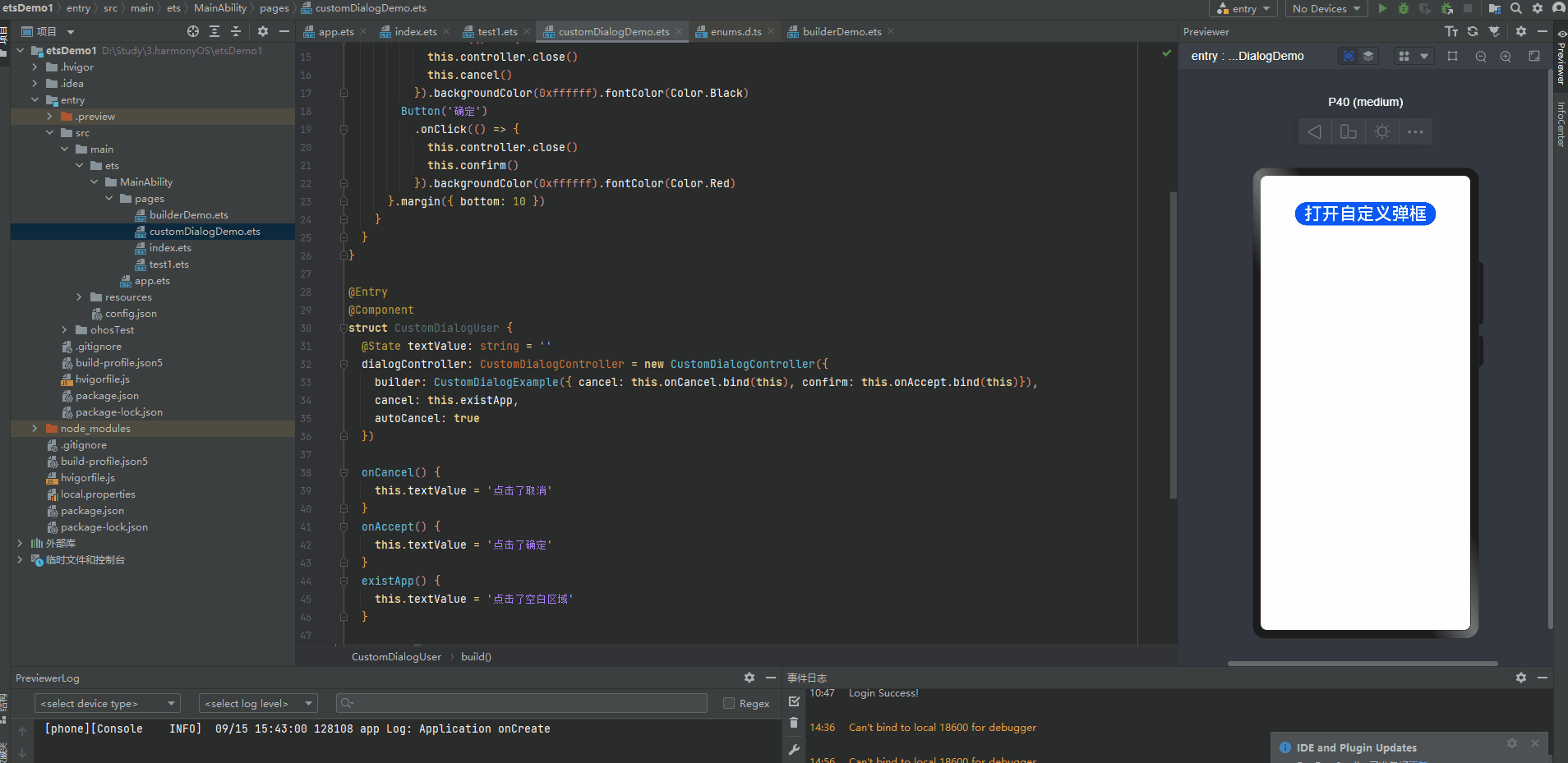
6、@CustomDialog
@CustomDialog装饰器用于装饰自定义弹窗
@CustomDialog

struct CustomDialogExample {

  controller: CustomDialogController

  cancel: () => void

  confirm: () => void


  build() {

    Column() {

      Text('自定义弹框标题').fontSize(20).margin({ top: 10, bottom: 10 })

      Text('这是自定义弹框内容,确定选择吗?').fontSize(16).margin({ bottom: 10 })

      Flex({ justifyContent: FlexAlign.SpaceAround }) {

        Button('取消')

          .onClick(() => {

            this.controller.close()

            this.cancel()

          }).backgroundColor(0xffffff).fontColor(Color.Black)

        Button('确定')

          .onClick(() => {

            this.controller.close()

            this.confirm()

          }).backgroundColor(0xffffff).fontColor(Color.Red)

      }.margin({ bottom: 10 })

    }

  }

}


@Entry

@Component

struct CustomDialogUser {

  @State textValue: string = ''

  dialogController: CustomDialogController = new CustomDialogController({

    builder: CustomDialogExample({ cancel: this.onCancel.bind(this), confirm: this.onAccept.bind(this)}),

    cancel: this.existApp,

    autoCancel: true

  })


  onCancel() {

    this.textValue = '点击了取消'

  }

  onAccept() {

    this.textValue = '点击了确定'

  }

  existApp() {

    this.textValue = '点击了空白区域'

  }


  build() {

    Column() {

      Text(this.textValue)

        .fontSize(30).margin({bottom: 20})

      Button('打开自定义弹框')

        .onClick(() => {

          this.dialogController.open()

        }).fontSize(30)

    }.width('100%').margin({ top: 20 })

  }

}
7、@BuilderParam
这是API8 提供的一个新的装饰器,@BuilderParam装饰器用于修饰自定义组件内函数类型的属性(例如:@BuilderParam content: () => any;)
-
@BuilderParam 是一个属性装饰器
-
初始化自定义组件时被@BuilderParam修饰的属性必须赋值。
-
可以在局部样式相同,局部样式不同时复用
-
类似于slot插槽一样,能在自定义组件中插入对应的UI结构
-
如果既有参数初始化组件和尾随闭包初始化组件,尾随闭包初始化组件优先级更高
参数初始化组件
通过参数初始化组件时,将@Builder装饰的方法赋值给@BuilderParam修饰的属性,并在自定义组件内调用content属性值。对@BuilderParam修饰的属性进行赋值时不带参数(如:content: this.specificParam),则此属性的类型需定义成无返回值的函数(如:@BuilderParam content: () => void)。若带参数(如:callContent: this.specificParam1(“111”)),则此属性的类型需定义成any(如:@BuilderParam callContent: any;)。
@Component

struct CustomContainer {

  header: string = "";

  @BuilderParam noParam: () => void;

  @BuilderParam withParam: any;

  footer: string = "";

  build() {

    Column() {

      Text(this.header)

        .fontSize(50)

      this.noParam()

      this.withParam()

      Text(this.footer)

        .fontSize(50)

    }

  }

}

@Entry

@Component

struct CustomContainerUser {

  @Builder specificNoParam() {

    Column() {

      Text("noParam").fontSize(50)

    }

  }

  @Builder SpecificWithParam(label: string) {

    Column() {

      Text(label).fontSize(50)

    }

  }


  build() {

    Column() {

      CustomContainer({

        header: "Header",

        noParam: this.specificNoParam,

        withParam: this.SpecificWithParam("WithParam"),

        footer: "Footer",

      })

    }

  }

}
参数初始化组件
在自定义组件中使用@BuilderParam修饰的属性接收尾随闭包(在初始化自定义组件时,组件名称紧跟一个大括号“{}”形成尾随闭包场景(CustomComponent(){})。开发者可把尾随闭包看做一个容器,向其填充内容,如在闭包内增加组件({Column(){Text(“content”)}),闭包内语法规范与build一致。此场景下自定义组件内有且仅有一个使用@BuilderParam修饰的属性。注意:一个组件内只允许有一个@BuilderParam装饰器
@Component

struct CustomContainer {

  header: string = "";

  @BuilderParam closer: () => void;

  build() {

    Column() {

      Text(this.header)

        .fontSize(50)

      this.closer()

    }

  }

}

@Builder function specificParam(label1: string, label2: string) {

  Column() {

    Text(label1)

      .fontSize(50)

    Text(label2)

      .fontSize(50)

  }

}

@Builder function specificNoParam() {

  Column() {

    Text('88888')

      .fontSize(50)

    Text('999999')

      .fontSize(50)

  }

}

@Entry

@Component

struct CustomContainerUser {

  @State text: string = "header"

  build() {

    Column() {

      CustomContainer({

        header: this.text,

        closer: specificNoParam

      })

      {

        Column(){

          specificParam("111", "22")

        }.onClick(()=>{

          this.text = "changeHeader"

        })

      }

    }

  }

}

8、@Styles
这是API8 提供的一个新的装饰器,我们知道@Extend装饰器不能写在组件内,但@Styles却能够定义在组件内。
@Styles和@Extend一样,也是提供方法将新的属性函数添加到内置组件。
有几个注意的点:
-
@Styles装饰的方法不能带参数
-
@Styles装饰的方法可以有多个
-
后面执行的属性函数优先级最高
-
当前@Styles仅支持通用属性
-
@Styles可以定义在组件内或组件外,在组件外定义时需带上function关键字,组件内定义时不需要
// 定义在组件外的 需要带function

@Styles function globalFancy() {

  .backgroundColor(Color.Red)

}


@Entry

@Component

struct FancyUse {

   // 定义在组件内的 不需要带function

  @Styles componentFancy() {

    .backgroundColor(Color.Blue)

  }

  build() {

    Column({ space: 10 }) {

      Text("Fancy")

        // 调用属性新增的函数

        .globalFancy()

        .width(100)

        .height(100)

        .fontSize(30)

      Text("Fancy")

        // 调用属性新增的函数

        .componentFancy()

        .width(100)

        .height(100)

        .fontSize(30)

    }

  }

}
9、@State
@State装饰的变量是组件内部的状态数据,当这些状态数据被修改时,将会调用所在组件的build方法进行UI刷新
-
支持多种类型:允许class、number、boolean、string强类型的按值和按引用类型。允许这些强类型构成的数组,即Array、Array、Array、Array。不允许object和any。
-
支持多实例:组件不同实例的内部状态数据独立。
-
内部私有:标记为@State的属性是私有变量,只能在组件内访问。
-
需要本地初始化:必须为所有@State变量分配初始值,将变量保持未初始化可能导致框架行为未定义。
-
创建自定义组件时支持通过状态变量名设置初始值:在创建组件实例时,可以通过变量名显式指定@State状态属性的初始值。
简单类型的状态属性示例
@Entry

@Component

struct StateDemo {

  @State count: number =0

  private toggleClick() {

    this.count += 1

  }

  build() {

    Column() {

      Button() {

        Text(`click times: ${this.count}`)

          .fontSize(20).padding(10)

      }.onClick(this.toggleClick.bind(this))

    }.margin(30)

  }

}
复杂类型的状态变量示例
// 自定义Model类

class Model {

  value: string

  constructor(value: string) {

    this.value = value

  }

}


@Entry

@Component

struct EntryComponent {

  build() {

    Column() {

      // 创建MyComponent实例时通过变量名给组件内的变量进行初始化 2个组件实例的内部状态互不影响

      MyComponent({count: 1, increaseBy: 2})

      MyComponent({title: {value: 'Hello, World 2'}, count: 7})

    }.margin(20)

  }

}


@Component

struct MyComponent {

  @State title: Model = {value: 'Hello World'}

  @State count: number = 0

  private toggle: string = 'Hello World'

  private increaseBy: number = 1


  build() {

    Column() {

      Text(`${this.title.value}`).fontSize(30)

      Button() {

        Text(`点击修改title`).fontSize(20).fontColor(Color.White).padding({left: 10, right: 10})

      }.onClick(() => {

        this.title.value = (this.toggle == this.title.value) ? 'Hello World' : 'Hello UI'

      }).margin({top: 10, bottom: 10})


      Button() {

        Text(`添加增加 count=${this.count}`).fontSize(20).fontColor(Color.White).padding({left: 10, right: 10})

      }.onClick(() => {

        this.count += this.increaseBy

      })

    }.margin(16)

  }

}
10、@Prop
@Prop用于修饰基本数据类型,修改后的状态数据用于在父组件和子组件之间建立单向数据依赖关系。修改父组件关联数据时,更新当前组件的UI。
@Prop与@State有相同的语义,但初始化方式不同。@Prop装饰的变量必须使用其父组件提供的@State变量进行初始化,允许组件内部修改@Prop变量,但更改不会通知给父组件,即@Prop属于单向数据绑定。类似于vue中的父子组件传值prop, 只是vue中的prop传递的属性值在子组件中不允许修改。
@Prop状态数据具有以下特征:
-
支持简单类型:仅支持number、string、boolean简单类型;
-
私有:仅在组件内访问;
-
支持多个实例:一个组件中可以定义多个标有@Prop的属性;
-
创建自定义组件时将值传递给@Prop变量进行初始化:在创建组件的新实例时,必须初始化所有@Prop变量,不支持在组件内部进行初始化。
@Entry

@Component

struct ParentComponent {

  @State countDownStartValue: number = 10 // 10 Nuggets default start value in a Game

  build() {

    Column() {

      Text(`这是子组件中显示的信息 count: ${this.countDownStartValue}`)

      Button() {

        Text('数字+1')

      }.onClick(() => {

        this.countDownStartValue += 1

      })

      Button() {

        Text('数字-1')

      }.onClick(() => {

        this.countDownStartValue -= 1

      })

      // 创建子组件时,必须在构造函数参数中提供其@Prop变量的初始值,同时初始化常规变量CostOfOneAttump(非Prop)

      CountDownComponent({ count: this.countDownStartValue, costOfOneAttempt: 2})

    }

  }

}


@Component

struct CountDownComponent {

  @Prop count: number

  private costOfOneAttempt: number


  build() {

    Column() {

      if (this.count > 0) {

        Text(`这是子组件中显示的信息 count: ${this.count}`)

      } else {

        Text('Game over!')

      }


      Button() {

        Text('Try again')

      }.onClick(() => {

        this.count -= this.costOfOneAttempt

      })

    }

  }

}
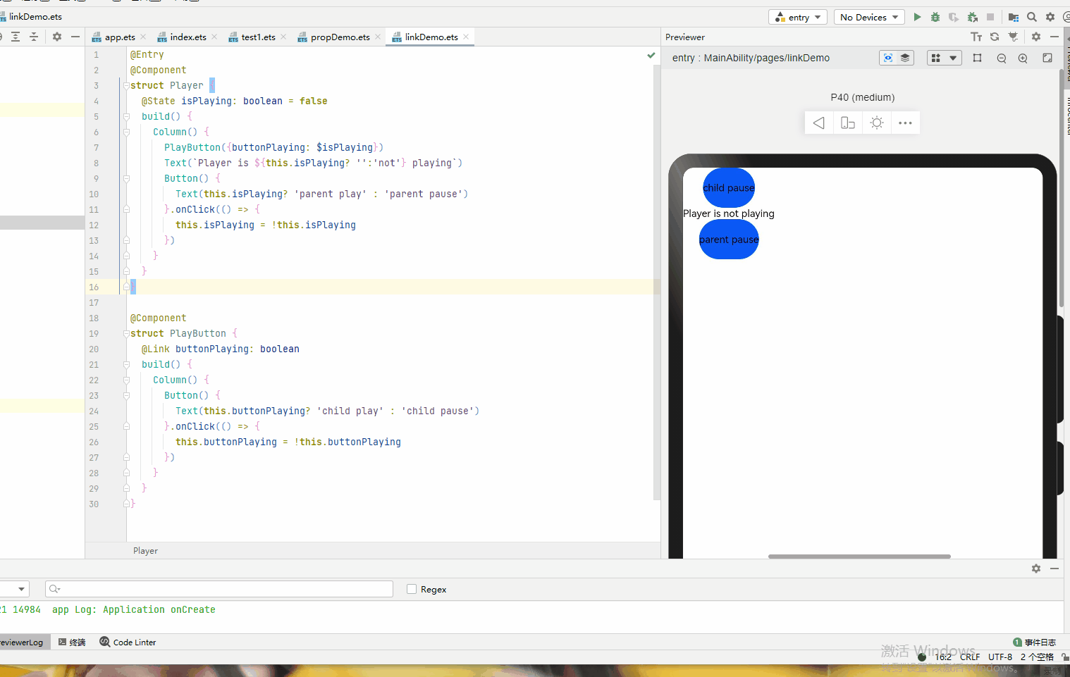
11、@Link
@Link用于修饰基本数据类型,类,数组,父子组件之间的双向数据绑定,父组件的内部状态数据作为数据源,任何一方所做的修改都会反映给另一方。
@Link装饰的变量可以和父组件的@State变量建立双向数据绑定:
-
支持多种类型:@Link变量的值与@State变量的类型相同,即class、number、string、boolean或这些类型的数组;
-
私有:仅在组件内访问;
-
单个数据源:初始化@Link变量的父组件的变量必须是@State变量;
-
双向通信:子组件对@Link变量的更改将同步修改父组件的@State变量;
-
创建自定义组件时需要将变量的引用传递给@Link变量,在创建组件的新实例时,必须使用命名参数初始化所有@Link变量。@Link变量可以使用@State变量或@Link变量的引用进行初始化,@State变量可以通过’$'操作符创建引用。
-
@Link变量不能在组件内部进行初始化。
  @Entry

  @Component

  struct Player {

    @State isPlaying: boolean = false

    build() {

      Column() {

        PlayButton({buttonPlaying: $isPlaying})

        Text(`Player is ${this.isPlaying? '':'not'} playing`)

        Button() {

          Text(this.isPlaying? 'parent play' : 'parent pause')

        }.onClick(() => {

          this.isPlaying = !this.isPlaying

        })

      }

    }

  }

  @Component

  struct PlayButton {

    @Link buttonPlaying: boolean

    build() {

      Column() {

        Button() {

          Text(this.buttonPlaying? 'child play' : 'child pause')

        }.onClick(() => {

          this.buttonPlaying = !this.buttonPlaying

        })

      }

    }

  }
12、@Observed 和 @ObjectLink
由于 @State无法监听到类嵌套类的属性,@ObjectLink可以监听到类嵌套@Observed修饰的类的属性
@Observed
用于修饰类,表示该类中的数据变更被UI页面管理。
@ObjectLink
-
用于修饰变量,并且不可以初始化
-
不能用在@entry修饰的组件中
-
装饰的变量类型必须为类(class type),并且该类要被@Observed装饰器所装饰。
-
@ObjectLink装饰的变量是不可变的(immutable)。
- 属性的改动是被允许的,当改动发生时,如果同一个对象被多个@ObjectLink变量所引用,那么所有拥有这些变量的自定义组件都会被通知去重新渲染。
- @ObjectLink装饰的变量不可设置默认值。
- 必须让父组件中有一个由@State、@Link、@StorageLink、@Provide或@Consume所装饰变量参与的TS表达式进行初始化。
- @ObjectLink装饰的变量是私有变量,只能在组件内访问。
@Observed class ClassA {
public numA: number
public classB: ClassB
constructor(cValue: ClassB, aValue: number = 0) {
this.classB = cValue;
this.numA = aValue;
}
}
@Observed
class ClassB {
public numB: number
constructor(aValue: number = 0) {
this.numB = aValue;
}
}
@Entry
@Component
struct Observer_page {
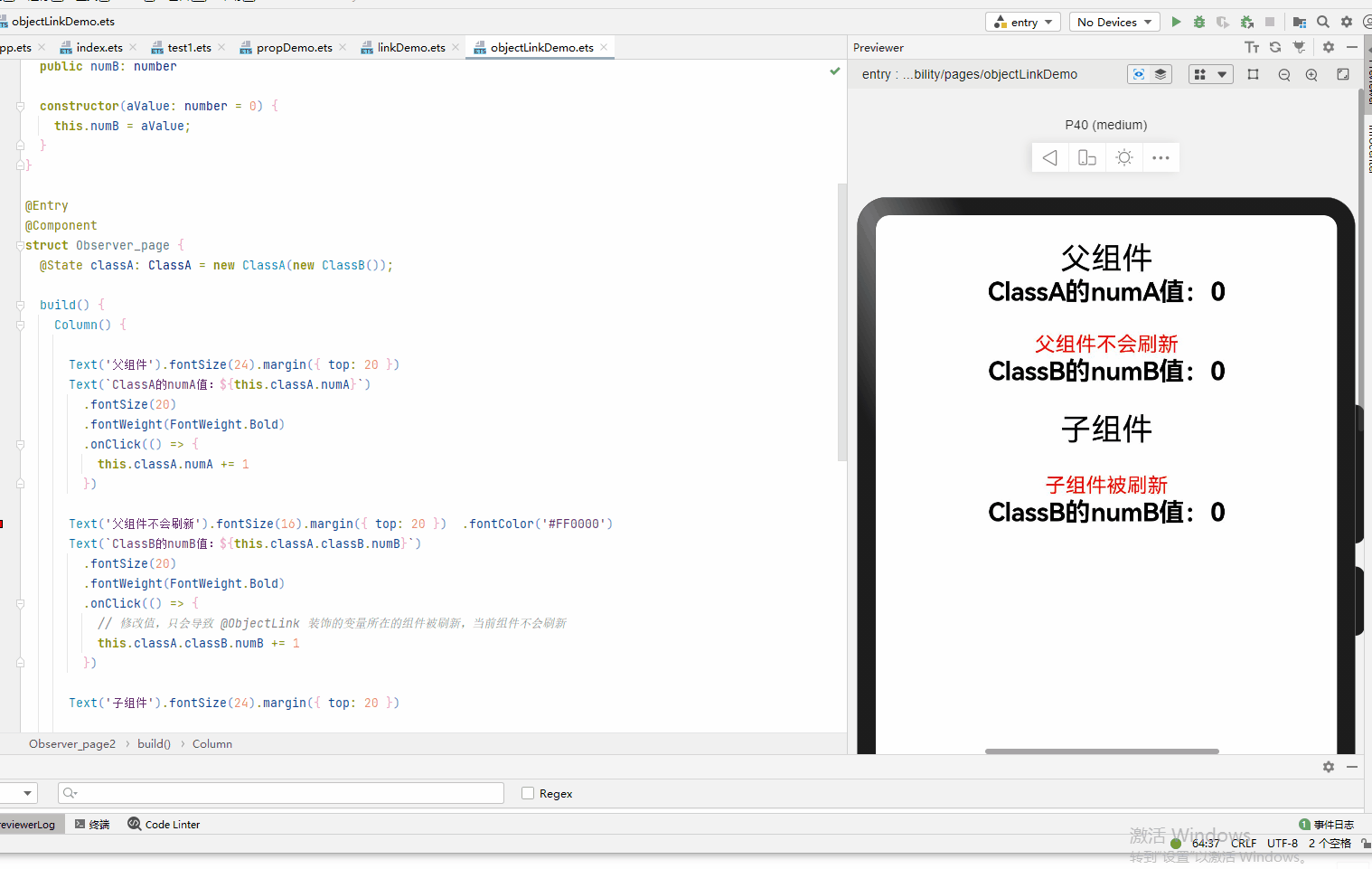
@State classA: ClassA = new ClassA(new ClassB());
build() {
Column() {
Text('父组件').fontSize(24).margin({ top: 20 })
Text(`ClassA的numA值:${this.classA.numA}`)
.fontSize(20)
.fontWeight(FontWeight.Bold)
.onClick(() => {
this.classA.numA += 1
})
Text('父组件不会刷新').fontSize(16).margin({ top: 20 }) .fontColor('#FF0000')
Text(`ClassB的numB值:${this.classA.classB.numB}`)
.fontSize(20)
.fontWeight(FontWeight.Bold)
.onClick(() => {
// 修改值,只会导致 @ObjectLink 装饰的变量所在的组件被刷新,当前组件不会刷新
this.classA.classB.numB += 1
})
Text('子组件').fontSize(24).margin({ top: 20 })
Observer_page2({ classB: this.classA.classB })
}
.width('100%')
.height('100%')
}
}
@Component
struct Observer_page2 {
@ObjectLink classB: ClassB
build() {
Column() {
Text('子组件被刷新').fontSize(16).margin({ top: 20 }) .fontColor('#FF0000')
Text(`ClassB的numB值:${this.classB.numB}`)
.fontSize(20)
.fontWeight(FontWeight.Bold)
.onClick(() => {
// 修改值,只会导致 @ObjectLink 装饰的变量所在的组件被刷新
this.classB.numB += 1
})
}.width('100%')
.height('100%')
}
}
13、@Consume和@Provide
都用于修饰基本数据类型,类,数组,Provide作为数据的提供方,可以更新其子孙节点的数据,并触发页面渲染。Consume在感知到Provide数据的更新后,会触发当前view的重新渲染。
表1 @Provide
装饰器参数: 是一个string类型的常量,用于给装饰的变量起别名。如果规定别名,则提供对应别名的数据更新。如果没有,则使用变量名作为别名。推荐使用@Provide(“alias”)这种形式。
同步机制|:@Provide的变量类似@state,可以修改对应变量进行页面重新渲染。也可以修改@Consume装饰的变量,反向修改@State变量。
初始值:必须制定初始值。
页面重渲染场景: 触发页面渲染的修改:- 基础类型(boolean,string,number)变量的改变;- @Observed class类型变量及其属性的修改;- 添加,删除,更新数组中的元素。
表2 @Consume
初始值 : 不可设置默认值。
其他属性说明与Provide一致。
@Entry

@Component

struct CompA {

  @Provide("reviewVote") reviewVotes : number = 0;


  build() {

    Column() {

      CompB()

      Button() {

        Text(`${this.reviewVotes}`)

          .fontSize(30)

      }.width(100)

      .onClick(() => {

        this.reviewVotes += 1;

      })

    }

  }

}


@Component

struct CompB {

  build() {

    Column() {

      CompC()

    }

  }

}


@Component

struct CompC {

  @Consume("reviewVote") reviewVotes : number;

  build() {

    Column() {

      Button() {

        Text(`${this.reviewVotes}`)

          .fontSize(30)

      }.width(100).margin(20)

      .onClick(() => {

        this.reviewVotes += 1;

      })

    }

  }

}

14、@StorageProp和@StorageLink
如何将组件变量与AppStorage同步,主要提供@StorageLink和@StorageProp装饰器
@StorageLink装饰器
组件通过使用@StorageLink(key)装饰的状态变量,与AppStorage建立双向数据绑定,key为AppStorage中的属性键值。当创建包含@StorageLink的状态变量的组件时,该状态变量的值将使用AppStorage中的值进行初始化。在UI组件中对@StorageLink的状态变量所做的更改将同步到AppStorage,并从AppStorage同步到任何其他绑定实例中。类似于@Link装饰器。
@StorageProp装饰器
组件通过使用@StorageProp(key)装饰的状态变量,将与AppStorage建立单向数据绑定,key标识AppStorage中的属性键值。当创建包含@StoageProp的状态变量的组件时,该状态变量的值将使用AppStorage中的值进行初始化。AppStorage中的属性值的更改会导致绑定的UI组件进行状态更新。类似于@Prop装饰器。
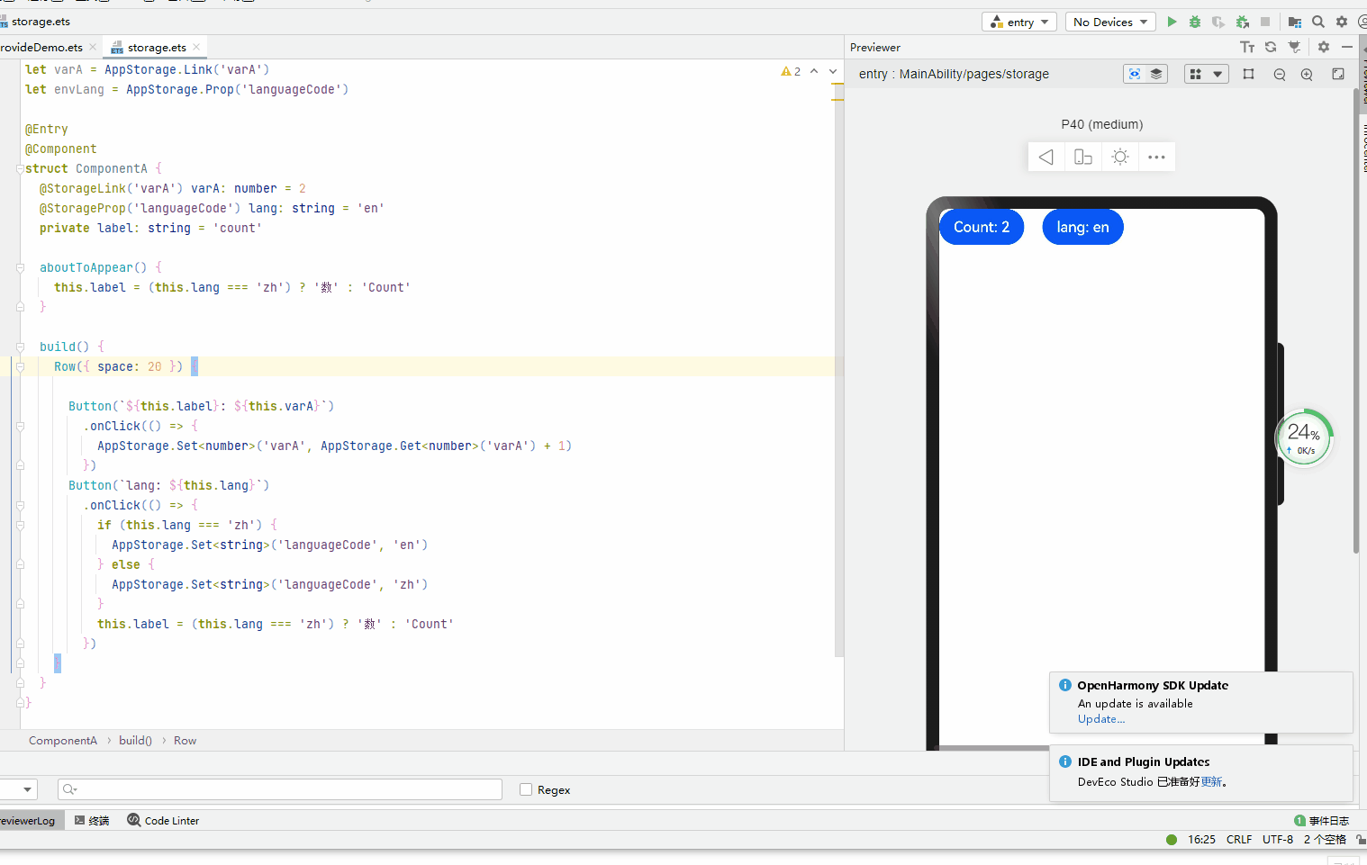
let varA = AppStorage.Link('varA')

let envLang = AppStorage.Prop('languageCode')


@Entry

@Component

struct ComponentA {

  @StorageLink('varA') varA: number = 2

  @StorageProp('languageCode') lang: string = 'en'

  private label: string = 'count'


  aboutToAppear() {

    this.label = (this.lang === 'zh') ? '数' : 'Count'

  }


  build() {

    Row({ space: 20 }) {


      Button(`${this.label}: ${this.varA}`)

        .onClick(() => {

          AppStorage.Set<number>('varA', AppStorage.Get<number>('varA') + 1)

        })

      Button(`lang: ${this.lang}`)

        .onClick(() => {

          if (this.lang === 'zh') {

            AppStorage.Set<string>('languageCode', 'en')

          } else {

            AppStorage.Set<string>('languageCode', 'zh')

          }

          this.label = (this.lang === 'zh') ? '数' : 'Count'

        })

    }

  }

}
16、@Watch
用于修饰 被@State, @Prop, @Link, @ObjectLink,@Provide, @Consume, @StorageProp, @StorageLink中任意一个装饰的变量,@Watch用于监听状态变量的变化,应用可以注册回调方法。
@Watch用于监听状态变量的变化,语法结构为:
@State @Watch("onChanged") count : number = 0
如上给状态变量增加一个@Watch装饰器,通过@Watch注册一个回调方法onChanged, 当状态变量count被改变时, 触发onChanged回调。
@Entry

@Component

struct CompWatch {

  @State @Watch("onBasketUpdated") shopBasket : Array<number> = [ 7, 12, 47, 3 ];

  @State totalPurchase : number = 0;


  updateTotal() : number {

    let sum = 0;

    this.shopBasket.forEach((i) => { sum += i; });

    // 计算新的购物篮总价值,如果超过100RMB,则适用折扣

    this.totalPurchase = (sum < 100) ? sum : 0.9 * sum;

    return this.totalPurchase;

  }


  // @Watch cb

  onBasketUpdated(propName: string) : void {

    this.updateTotal();

  }


  build() {

    Column() {

      Button("add to basket").onClick(() => { this.shopBasket.push(Math.round(100 * Math.random())) })

      Text(`${this.totalPurchase}`)

        .fontSize(30)

    }

  }

}
总结
ets中装饰器的作用非常重要,需要在项目中多实践才能更好的熟练应用,理解其中的原理和作用。
写在最后
- 如果你觉得这篇内容对你还蛮有帮助,我想邀请你帮我三个小忙:
- 点赞,转发,有你们的 『点赞和评论』,才是我创造的动力。
- 关注小编,同时可以期待后续文章ing🚀,不定期分享原创知识。
- 想要获取更多完整鸿蒙最新学习资源,请移步前往小编:
https://gitee.com/MNxiaona/733GH


 6962
6962

 被折叠的 条评论
为什么被折叠?
被折叠的 条评论
为什么被折叠?
 到【灌水乐园】发言


