


 本文介绍了如何在OpenHarmony环境中,利用Dialog和Button组件创建并实现警告弹窗、确认弹窗、加载弹窗、提示弹窗和进度条弹窗的自定义效果,包括代码示例和环境配置指南。
介绍
基于dialog和button组件,实现弹窗的几种自定义效果,具体效果有:
- 警告弹窗,点击确认按钮弹窗关闭。
- 确认弹窗,点击取消按钮或确认按钮,触发对应操作。
- 加载弹窗,展示加载中效果。
- 提示弹窗,支持用户输入内容,点击取消和确认按钮,触发对应操作。
- 进度条弹窗,展示进度条以及百分比。
相关概念
- [dialog组件]:自定义弹窗容器组件。
- [button组件]:按钮组件。
环境搭建
软件要求
- [DevEco Studio]版本:DevEco Studio 3.1 Release及以上版本。
- OpenHarmony SDK版本:API version 9及以上版本。
硬件要求
- 开发板类型:[润和RK3568开发板]。
- OpenHarmony系统:3.2 Release及以上版本。
环境搭建
完成本篇Codelab我们首先要完成开发环境的搭建,本示例以RK3568开发板为例,参照以下步骤进行:
-
[获取OpenHarmony系统版本]:标准系统解决方案(二进制)。以3.2 Release版本为例:
-
搭建烧录环境。
- [完成DevEco Device Tool的安装]
- [完成RK3568开发板的烧录]
-
搭建开发环境。
- 开始前请参考[工具准备],完成DevEco Studio的安装和开发环境配置。
- 开发环境配置完成后,请参考[使用工程向导]创建工程(模板选择“Empty Ability”)。
- 工程创建完成后,选择使用[真机进行调测]。
- 鸿蒙开发指导文档:
gitee.com/li-shizhen-skin/harmony-os/blob/master/README.md点击或者复制转到。
代码结构解读
本篇Codelab只对核心代码进行讲解,对于完整代码,我们会在gitee中提供。
├──entry/src/main/js         // 代码区
│  └──MainAbility
│     ├──common
│     │  └──images           // 图片资源
│     ├──i18n                // 国际化中英文
│     │  ├──en-US.json
│     │  └──zh-CN.json
│     ├──pages
│     │  └──index
│     │     ├──index.css     // 页面整体布局以及弹窗样式
│     │     ├──index.hml     // 自定义弹窗展示页面
│     │     └──index.js      // 弹窗显示关闭逻辑以及动画逻辑
│     └──app.js              // 程序入口
└──entry/src/main/resources  // 应用资源目录

`HarmonyOS与OpenHarmony鸿蒙文档籽料:mau123789是v直接拿`

构建界面
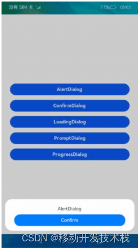
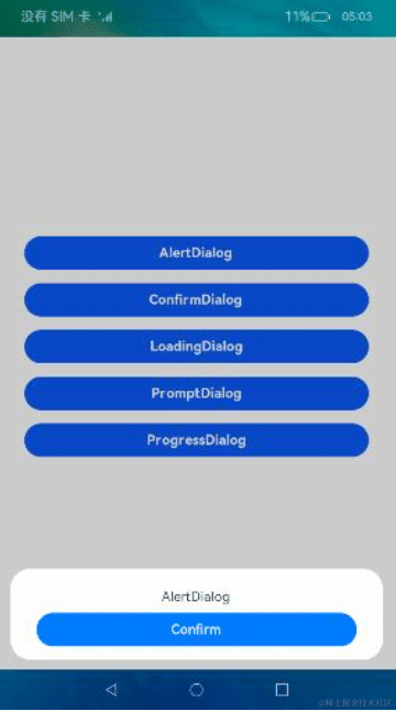
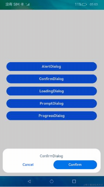
界面主要包括按钮列表页和自定义弹窗两部分,我们可以通过在dialog标签中添加自定义组件设置弹窗,具体效果如图所示:

首先搭建index.hml中的按钮页,主要包括5种常见的弹窗,分别为AlertDialog、ConfirmDialog、LoadingDialog、PromptDialog以及ProgressDialog。
<!--index.hml-->
<div class="btn-div">
    <button type="capsule" value="AlertDialog" class="btn" onclick="showAlert"></button>
    <button type="capsule" value="ConfirmDialog" class="btn" onclick="showConfirm"></button>
    <button type="capsule" value="LoadingDialog" class="btn" onclick="showLoading"></button>
    <button type="capsule" value="PromptDialog" class="btn" onclick="showPrompt"></button>
    <button type="capsule" value="ProgressDialog" class="btn" onclick="showProgress"></button>
</div>
警告弹窗(AlertDialog)
然后在index.hml中创建AlertDialog自定义弹窗,效果如图所示:
<!-- index.hml -->
<!-- AlertDialog自定义弹窗 -->
<dialog id="alertDialog" class="alert-dialog">
    <div class="dialog-div">
        <div class="alert-inner-txt">
            <text class="txt">AlertDialog</text>
        </div>
        <div class="alert-inner-btn">
            <button class="btn-single" type="capsule" value="Confirm" onclick="confirmClick('alertDialog')">
            </button>
        </div>
    </div>
</dialog>
确认弹窗(ConfirmDialog)
创建ConfirmDialog自定义弹窗,效果如图所示:
<!-- index.hml -->
<!-- ConfirmDialog自定义弹窗 -->
<dialog id="confirmDialog" class="dialog-main">
    <div class="dialog-div">
        <div class="inner-txt">
            <text class="txt">ConfirmDialog</text>
        </div>
        <div class="inner-btn">
            <button type="capsule" value="Cancel" class="btn-txt-left" onclick="cancelClick('confirmDialog')">
            </button>
            <button type="capsule" value="Confirm" class="btn-txt-right" onclick="confirmClick('confirmDialog')">
            </button>
        </div>
    </div>
</dialog>
加载弹窗(LoadingDialog)
创建LoadingDialog自定义弹窗,效果如图所示:
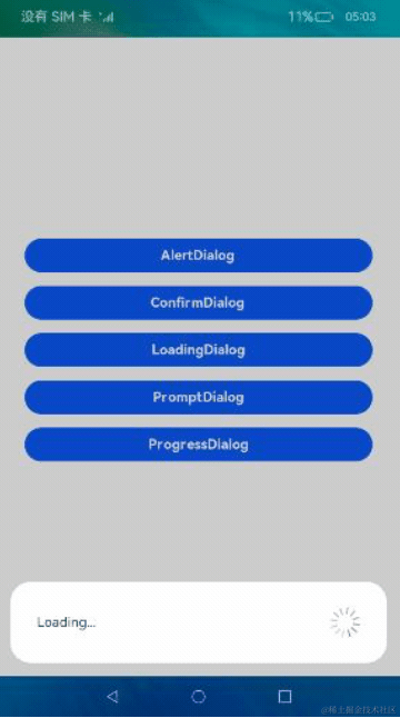
<!-- index.hml -->
<!-- LoadingDialog自定义弹窗 -->
<dialog id="loadingDialog" class="low-height-dialog">
    <div class="dialog-loading">
        <text>Loading...</text>
        <image class="loading-img img-rotate" id="loading-img" src="/common/images/ic_loading.svg"></image>
    </div>
</dialog>
提示弹窗(PromptDialog)
创建PromptDialog自定义弹窗,效果如图所示:
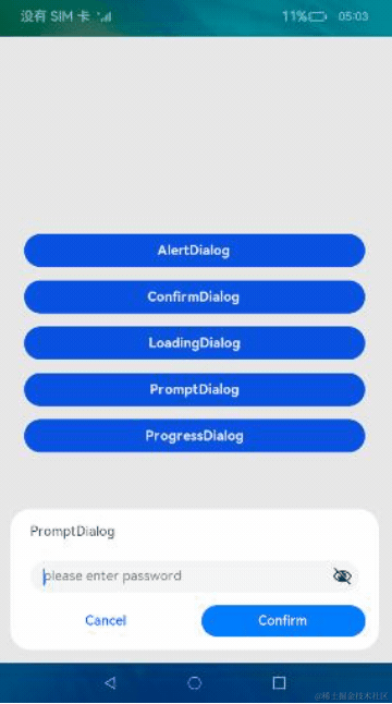
<!-- index.hml -->
<!-- PromptDialog自定义弹窗 -->
<dialog id="promptDialog" class="dialog-prompt">
    <div class="dialog-div-prompt">
        <div class="inner-txt-prompt">
            <text class="txt">PromptDialog</text>
        </div>
        <input class="prompt-input" type="password" placeholder="please enter password">
        </input>
        <div class="inner-btn">
            <button type="capsule" value="Cancel" class="btn-txt-left" onclick="cancelClick('promptDialog')">
            </button>
            <button type="capsule" value="Confirm" class="btn-txt-right" onclick="confirmClick('promptDialog')">
            </button>
        </div>
    </div>
</dialog>
进度条弹窗(ProgressDialog)
创建ProgressDialog自定义弹窗,效果如图所示:
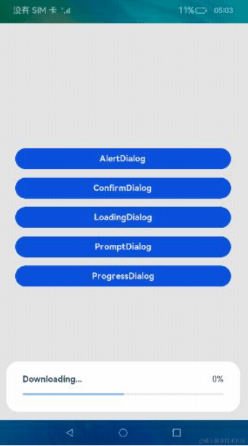
<!-- index.hml -->
<!-- ProgressDialog自定义弹窗 -->
<dialog id="progressDialog" class="low-height-dialog" oncancel="onCancel">
    <div class="dialog-progress-div">
        <div class="inner-txt-progress">
            <text class="download-txt">Downloading...</text>
            <text>{{ percent + '%' }}</text>
        </div>
        <div class="progress-div">
            <progress class="min-progress" type="horizontal" percent="{{ percent }}" secondarypercent="50">
            </progress>
        </div>
    </div>
</dialog>
然后在index.js中文件实现不同button的点击事件,展示对应弹窗:
// index.js
export default {
  data: {...},

  // 展示AlertDialog
  showAlert() {
    this.$element('alertDialog').show();
  },

  // 展示ConfirmDialog
  showConfirm() {
    this.$element('confirmDialog').show();
  },

  // 展示LoadingDialog
  showLoading() {
    ...
    this.animation = this.$element('loading-img').animate(frames, options);
    this.animation.play();
    this.$element('loadingDialog').show();
  },

  // 展示PromptDialog
  showPrompt() {
    this.$element('promptDialog').show();
  },

  // 展示ProgressDialog
  showProgress() {
    ...
  }
}


 扫一扫
扫一扫


 1153
1153

 被折叠的 条评论
为什么被折叠?
被折叠的 条评论
为什么被折叠?
 到【灌水乐园】发言


