


浮动

<!DOCTYPE html>
<html lang="en">
<head>
<meta charset="UTF-8">
<meta http-equiv="X-UA-Compatible" content="IE=edge">
<meta name="viewport" content="width=device-width, initial-scale=1.0">
<title>Document</title>
</head>
<style>
.div1 {
width: 100px;
height: 100px;
background-color: #6dc19c;
float: left;
}
.div2 {
width: 200px;
height: 200px;
background-color: #a06bbe;
float: right;
}
</style>
<body>
<div class="div1">one</div>
<div class="div2">two</div>
</body>
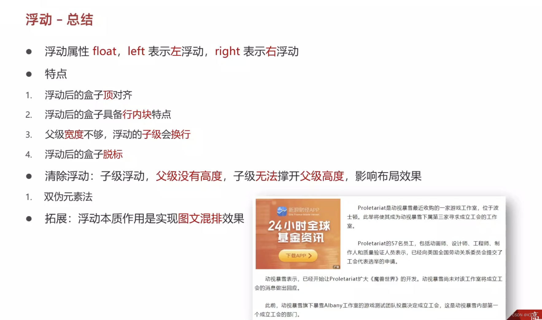
</html>特点
作用:让块元素水平排列。
属性名:float
属性值
left:左对齐
right:右对齐
特点:
浮动后的盒子顶对齐
浮动后的盒子具备行内块特点
浮动后的盒子脱标,不占用标准流的位置
产品区域布局 (应用)
效果一

总代码
<!DOCTYPE html>
<html lang="en">
<head>
    <meta charset="UTF-8">
    <meta http-equiv="X-UA-Compatible" content="IE=edge">
    <meta name="viewport" content="width=device-width, initial-scale=1.0">
    <title>Document</title>
</head>
<style>
    * {
        margin: 0;
        padding: 0;
        box-sizing: border-box;
    }
    li {
        list-style: none;
    }
    .type {
        width: 800px;
        height: 500px;
        margin: 40px auto;
        background-color: rgb(173, 227, 211);
    }
    .one {
        width: 200px;
        height: 500px;
        background-color: pink;
        border-radius: 10%;

        box-shadow: -1px -1px 10px 0 rgba(97, 131, 243, 0.5) inset;

        float: left;
    }
    div ul li {
        float: left;
        margin: 1px;
        width: 130px;
        height: 230px;
        background-color: #6ba5f1;

        margin-bottom: 10px;
        margin-right: 10px;
        margin-left: 10px;
        margin-top: 10px;

        box-shadow: -1px -1px 5px 0 rgba(200, 105, 227, 0.5) inset;

        border-radius: 15px;
    }
</style>
<body>
    <div class="type">
        <div class="one"></div>
        <ul>
            <li>123</li>
            <li>123</li>
            <li>213</li>
            <li></li>

            <li class="special"></li>
            <li></li>
            <li></li>
            <li></li>
        </ul>
    </div>
</body>
</html>
效果二
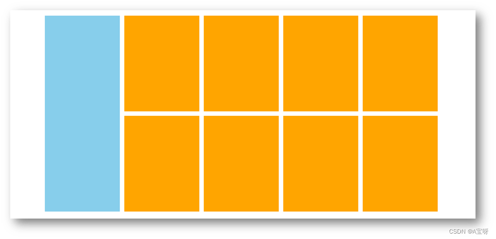
HTML代码
<!-- 版心:左右,右面:8个产品 → 8个 li -->
<div class="product">
  <div class="left"></div>
  <div class="right">
    <ul>
      <li></li>
      <li></li>
      <li></li>
      <li></li>
      <li></li>
      <li></li>
      <li></li>
      <li></li>
    </ul>
  </div>
</div>
CSS代码
<style>
* {
margin: 0;
padding: 0;
}
li {
list-style: none;
}
.product {
margin: 50px auto;
width: 1226px;
height: 628px;
background-color: pink;
}
.left {
float: left;
width: 234px;
height: 628px;
background-color: skyblue;
}
.right {
float: right;
width: 978px;
height: 628px;
background-color: brown;
}
.right li {
float: left;
margin-right: 14px;
margin-bottom: 14px;
width: 234px;
height: 300px;
background-color: orange;
}
/* 第四个li和第八个li 去掉右侧的margin */
.right li:nth-child(4n) {
margin-right: 0;
}
/* 细节:如果父级宽度不够,浮动的盒子会掉下来 */
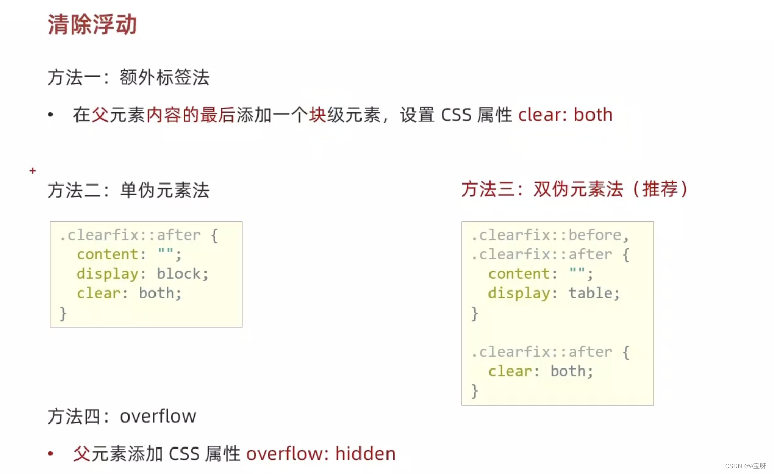
</style>消除浮动的效果
额外标签法


<!DOCTYPE html>
<html lang="en">
<head>
    <meta charset="UTF-8">
    <meta http-equiv="X-UA-Compatible" content="IE=edge">
    <meta name="viewport" content="width=device-width, initial-scale=1.0">
    <title>Document</title>
</head>
<style>
    .top {
        margin: 20px auto;
        width: 600px;
        /* height: 300px; */
        background-color: pink;
    }
    .bottom {
        width: 100%;
        height: 100px;
        background: blueviolet;
    }
    .left {
        float: left;
        width: 150px;
        height: 300px;
        background-color: #6ddbc0;
    }
    .right {
        float: right;
        width: 400px;
        height: 300px;
        background-color: #6ebbf1;
    }
    /*
        场景:浮动元素会脱标,如果父级没有高度,子级无法撑开父级高度(可能导致页面布局错乱)
        解决方法:清除浮动(清除浮动带来的影响)
    */
    .clearfix {
        clear: both;
    }
</style>
<body>
    <div class="top">
        <div class="left"></div>
        <div class="right"></div>
        <div class="clearfix"></div>
    </div>

    <div class="bottom"></div>
</body>
</html>
单伪元素法

双伪元素法

overflow法

总结
Flex布局
组成
设置方式:给父元素设置 display: flex,子元素可以自动挤压或拉伸
组成部分:
弹性容器
弹性盒子
主轴:默认在水平方向
侧轴 / 交叉轴:默认在垂直方向
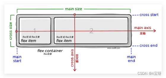
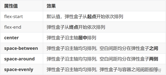
属性名:justify-content

<!DOCTYPE html>
<html lang="en">
<head>
    <meta charset="UTF-8">
    <meta http-equiv="X-UA-Compatible" content="IE=edge">
    <meta name="viewport" content="width=device-width, initial-scale=1.0">
    <title>Document</title>
</head>
<style>
    .div1 {
        display: flex;
        /*justify-content: center;*/
        justify-content: space-between;
        /*
            justify-content: space-around;
            justify-content: space-evenly;
        */
        margin: 40px auto;
        width: 600px;
        height: 300px;
        border: 1px dashed purple;
    }
    .div1 div {
        width: 100px;
        height: 100px;
        background-color: #6cddbb;
    }
</style>
<body>
    <div class="div1">
        <div>1</div>
        <div>2</div>
        <div>3</div>
    </div>
</body>
</html>
布局侧轴
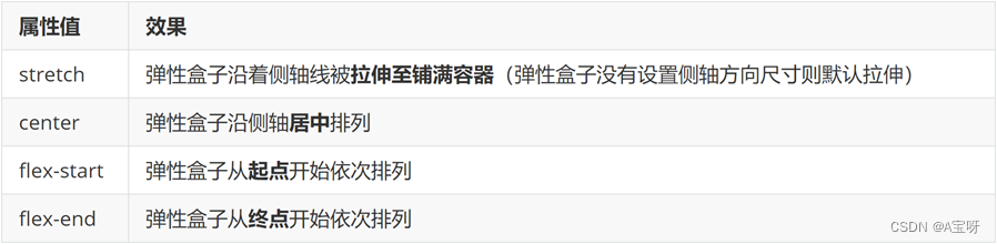
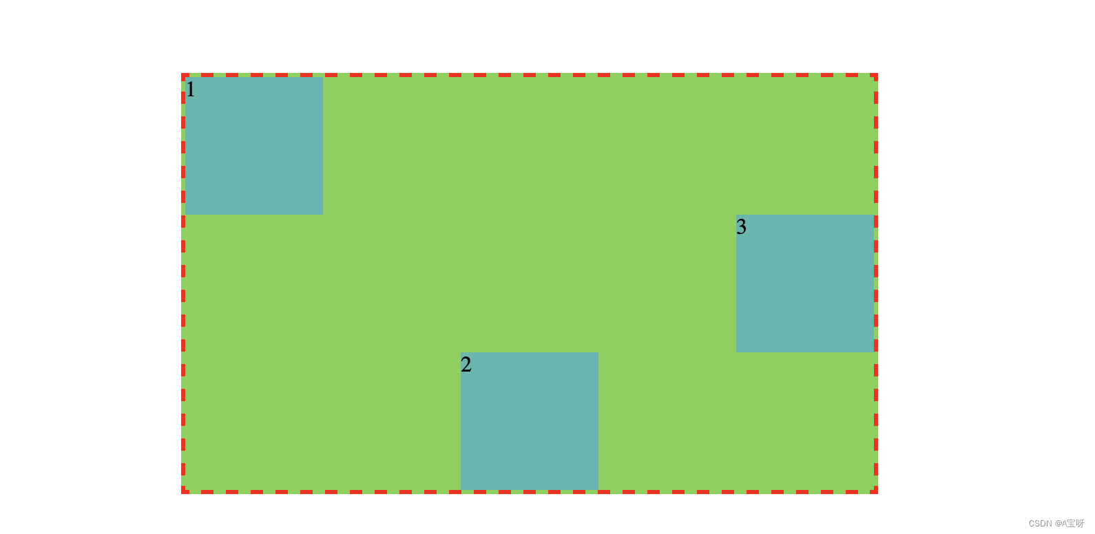
align-items:当前弹性容器内所有弹性盒子的侧轴对齐方式(给弹性容器设置)
align-self:单独控制某个弹性盒子的侧轴对齐方式(给弹性盒子设置)
<!DOCTYPE html>
<html lang="en">
<head>
    <meta charset="UTF-8">
    <meta http-equiv="X-UA-Compatible" content="IE=edge">
    <meta name="viewport" content="width=device-width, initial-scale=1.0">
    <title>Document</title>
</head>
<style>
    .box {
        display: flex;
        justify-content: space-between;

        margin: 50px auto;
        width: 500px;
        height: 300px;
        border: 3px dashed red;
        background-color: #7ad24e;

        align-items: center;
    }
    .box div {
        width: 100px;
        height: 100px;
        background-color: #4bb8af;
    }
    .box div:nth-child(1) {
        align-self: flex-start;
    }
    .box div:nth-child(2) {
        align-self: flex-end;
    }

</style>
<body>
    <div class="box">
        <div>1</div>
        <div>2</div>
        <div>3</div>
    </div>
</body>
</html>
修改主轴方向

<!DOCTYPE html>
<html lang="en">
<head>
    <meta charset="UTF-8">
    <meta http-equiv="X-UA-Compatible" content="IE=edge">
    <meta name="viewport" content="width=device-width, initial-scale=1.0">
    <title>Document</title>
</head>
<style>
    * {
        margin: 0;
        padding: 0;
    }
    .box {
        display: flex;
        flex-direction: column;
        align-items: center;
        justify-content: center;

        margin: 50px auto;
        width: 500px;
        height: 300px;
        background-color: #489ed3;
        border: 3px dashed purple;
    }
</style>
<body>
    <div class="box">
        <img src="../Day01/背景图.jpg" alt="" width="400px" height="200px">
        <span>A宝</span>
    </div>
</body>
</html>
弹性伸缩比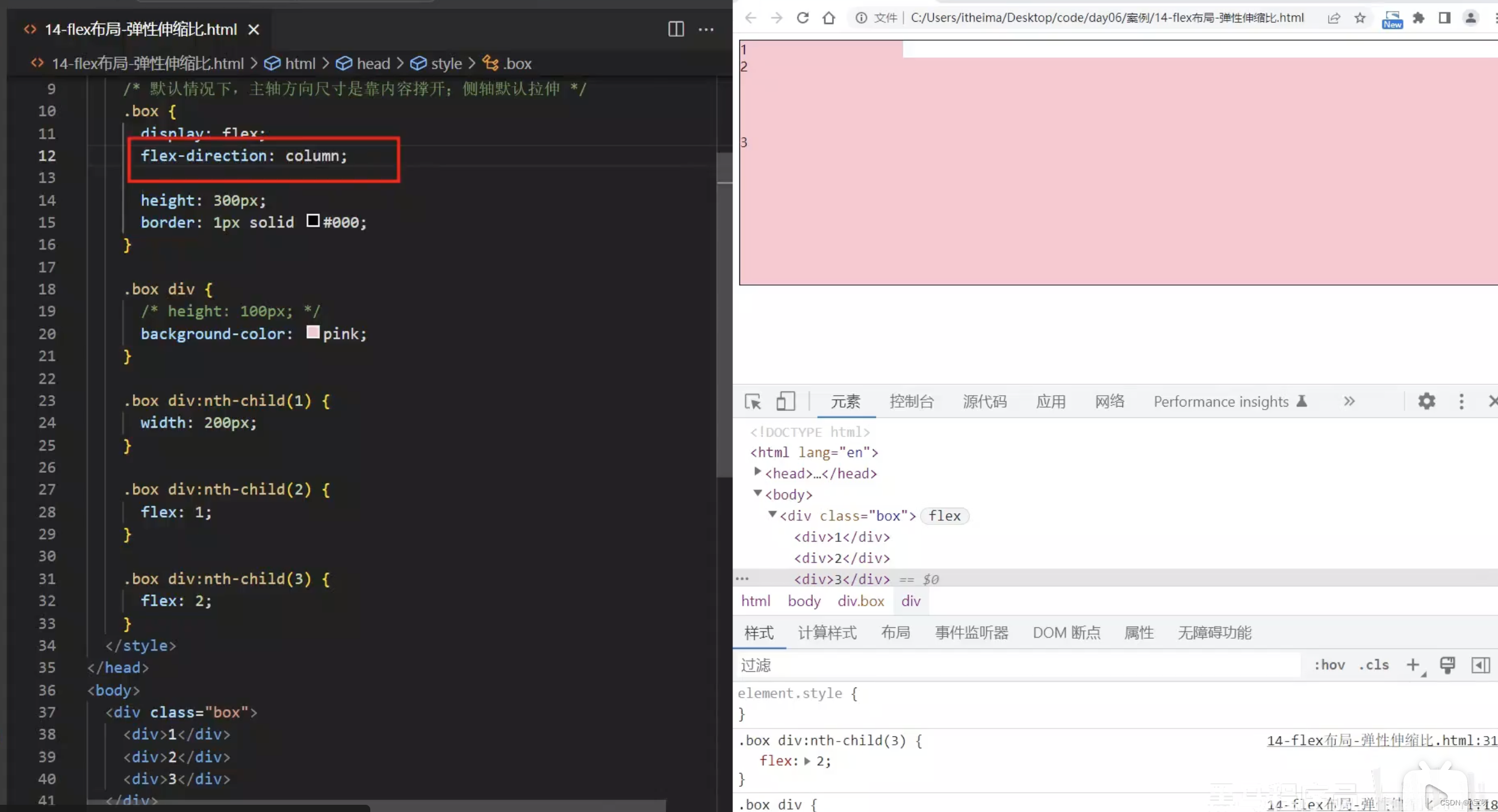
作用:控制弹性盒子的主轴方向的尺寸。
属性名:flex
属性值:整数数字,表示占用父级剩余尺寸的份数。
弹性盒子换行
弹性盒子可以自动挤压或拉伸,默认情况下,所有弹性盒子都在一行显示。
属性名:flex-wrap
属性值
wrap:换行
nowrap:不换行(默认)
行内对齐方式
属性名:align-content
注意:该属性对单行弹性盒子模型无效。
总结
align-content、justify-content、align-items
align-content: 作用:设置同一列子元素在Y轴的对齐方式
justidy-content: 作用:设置同一行子元素在X轴的对齐方式
align-items: 作用:设置同一行子元素在Y轴的对齐方式
解释参考:align-content、justify-content、align-items三个属性的作用和效果_ 初夏 ﻬ的博客-CSDN博客


 125
125


 被折叠的 条评论
为什么被折叠?
被折叠的 条评论
为什么被折叠?
 到【灌水乐园】发言


