container
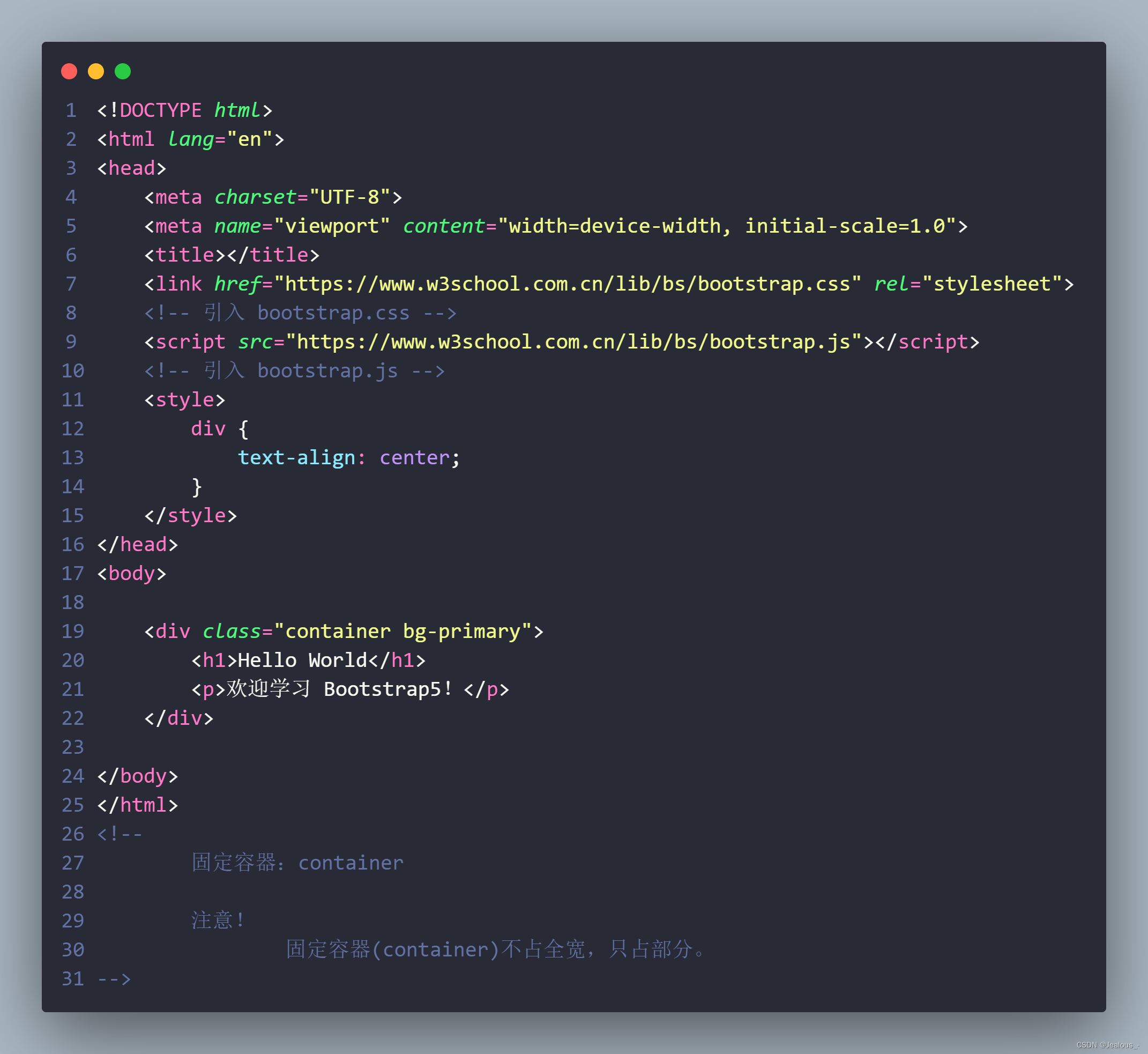
<!DOCTYPE html>
<html lang="en">
<head>
<meta charset="UTF-8">
<meta name="viewport" content="width=device-width, initial-scale=1.0">
<title></title>
<link href="https://www.w3school.com.cn/lib/bs/bootstrap.css" rel="stylesheet">
<!-- 引入 bootstrap.css -->
<script src="https://www.w3school.com.cn/lib/bs/bootstrap.js"></script>
<!-- 引入 bootstrap.js -->
<style>
div {
text-align: center;
}
</style>
</head>
<body>
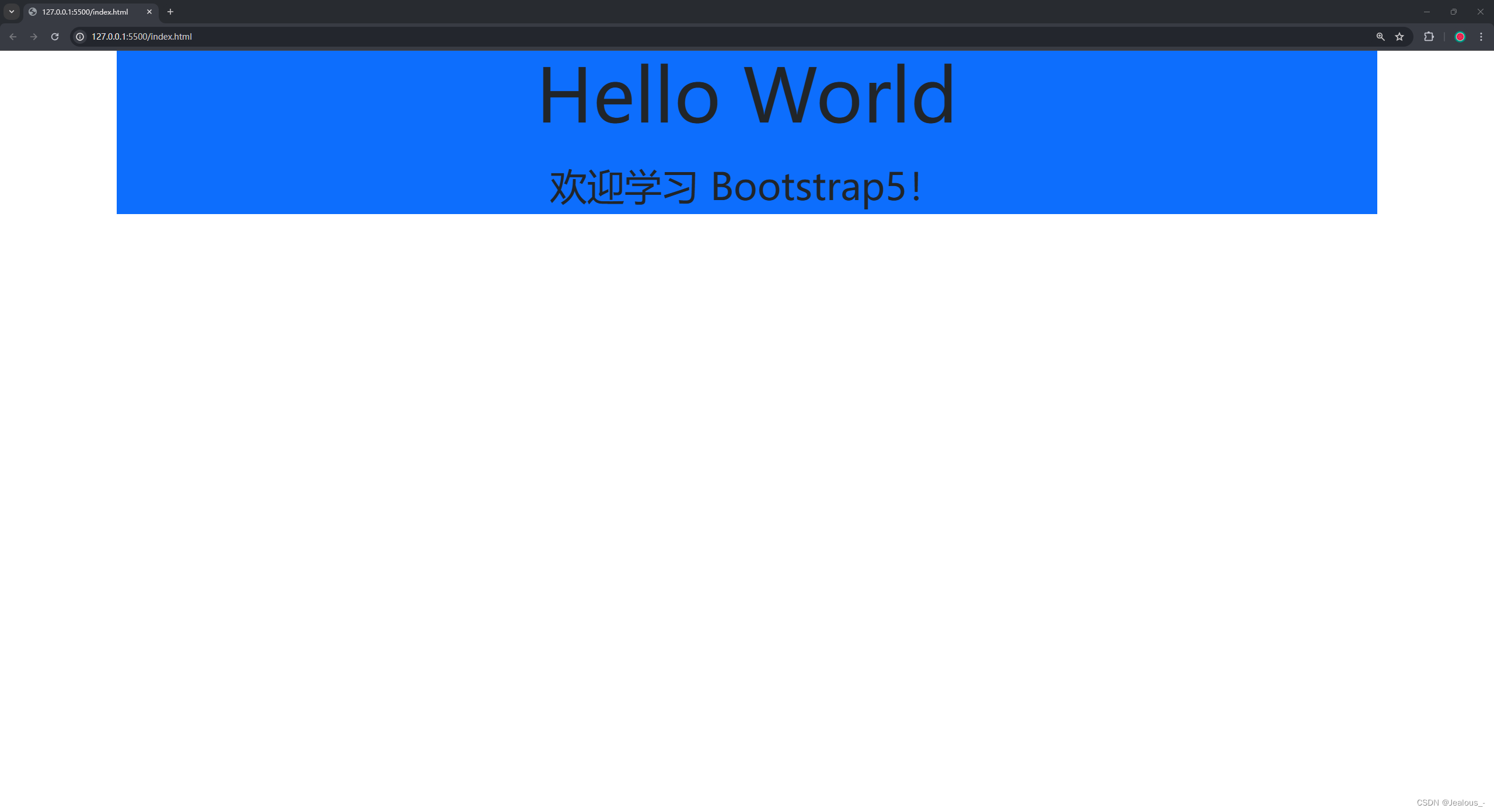
<div class="container bg-primary">
<h1>Hello World</h1>
<p>欢迎学习 Bootstrap5!</p>
</div>
</body>
</html>
<!--
固定容器:container
注意!
固定容器(container)不占全宽,只占部分。
-->


 2324
2324

 被折叠的 条评论
为什么被折叠?
被折叠的 条评论
为什么被折叠?
 到【灌水乐园】发言


