


使用matplotlib绘制简单的折线图
第一步在python中导入matplotlib模块和numpy模块:
导入步骤在python里面的终端就可以进行导入,然后在终端里面输入
pip install matplotlib -i https://pypi.tuna.tsinghua.edu.cn/simple然后回车进行安装,需要稍等一会让它安装(该过程不仅安装了 matplotlib ,还安装了依赖的 numpy、python-dateutil、kiwisolver 、 pillow 、pyparsing )
#添加数据
fig = plt.figure(figsize=(10,11))
ax = fig.add_subplot(111)
导入详细数据,绘制图表
ax.set_title('某市未来15天气温')

x = np.arange(4,19)
y_max = np.array([32, 33, 34, 34, 33, 31, 30, 29, 30, 29, 26, 23, 21, 25, 31])
y_min = np.array([19, 19, 20, 22, 22, 21, 22, 16, 18, 18, 17, 14, 15, 16, 16])
y_med = (y_max+y_min)/2

ax.plot(x, y_max)
ax.plot(x, y_med, 'r--')
ax.plot(x, y_min)
为了方便观看可以加个图列,更好的观看图表
ax.legend(['最高温度','中间温度', '最低温度'], shadow=True, fancybox=True)

plt.show()
效果图

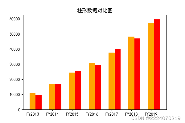
柱形图
import numpy as np
import matplotlib.pyplot as plt

plt.rcParams['font.sans-serif'] = ['SimHei']
plt.rcParams['axes.unicode_minus']=False

fig = plt.figure(figsize=(6,4))
ax = fig.add_subplot(111)

ax.set_title('柱形数据对比图')

x = np.arange(1, 8)
y = np.array([10770, 16780, 24440, 30920, 37670, 48200, 57270])
y2 = np.array([9780, 16581, 25535, 29440, 40030, 47046, 59615])

ax.bar(x, y, tick_label=["FY2013", "FY2014", "FY2015", "FY2016", "FY2017", "FY2018", "FY2019"], width=0.3, color='orange')
ax.bar(x+0.3, y2,width=0.3, color='red')

plt.show()
柱形图效果图


 7723
7723


 被折叠的 条评论
为什么被折叠?
被折叠的 条评论
为什么被折叠?
 到【灌水乐园】发言


