


一、ArkTS基础
一、入门
1.消息打印
console.log('xxx','xxxx')
2.快捷键
括号里面用:CTRL+P——>提示输入
CTRL+SHIFT+/——>多行注释
CTRL+/——>单行注释
3.链接
阿里图标资源:https://www.iconfont.cn/home/index?spm=a313x.7781069.1998910419.2
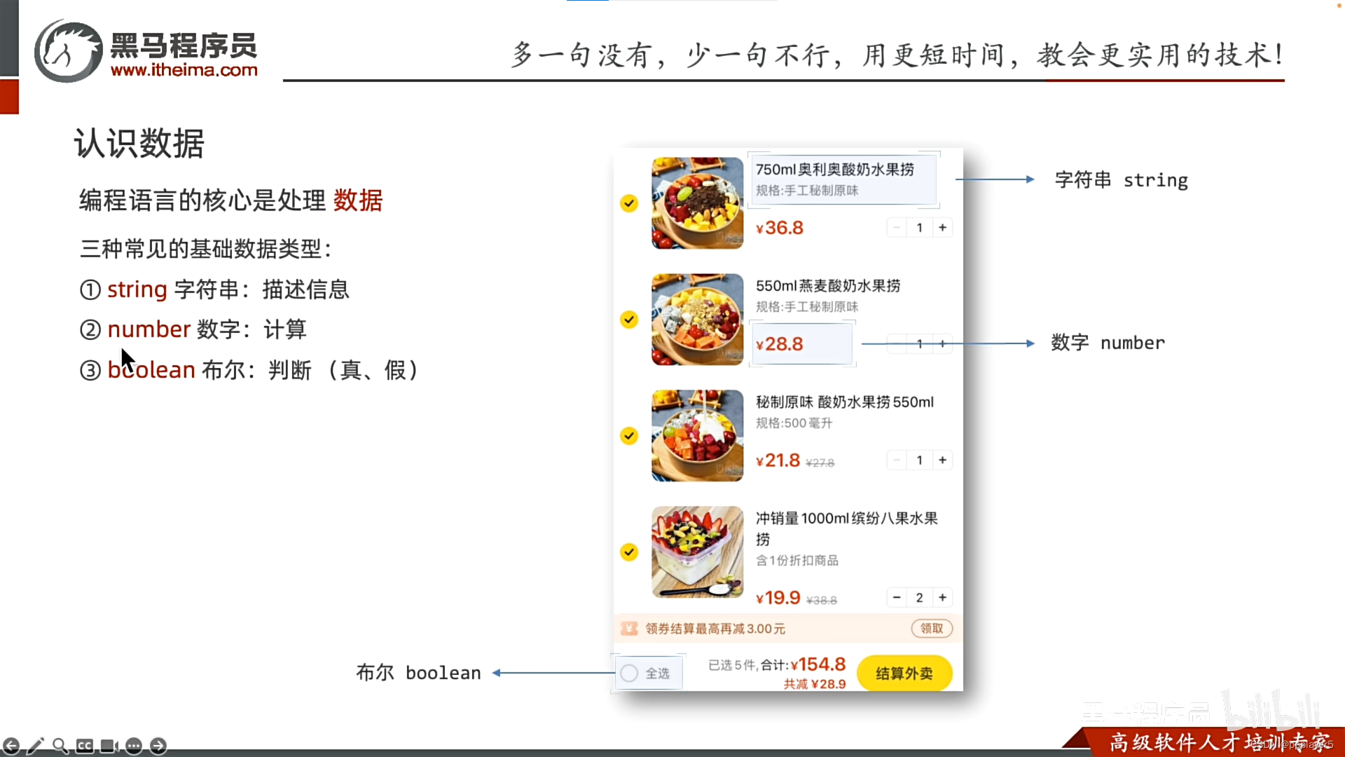
二、数据
1.认识数据:string、number、boolean
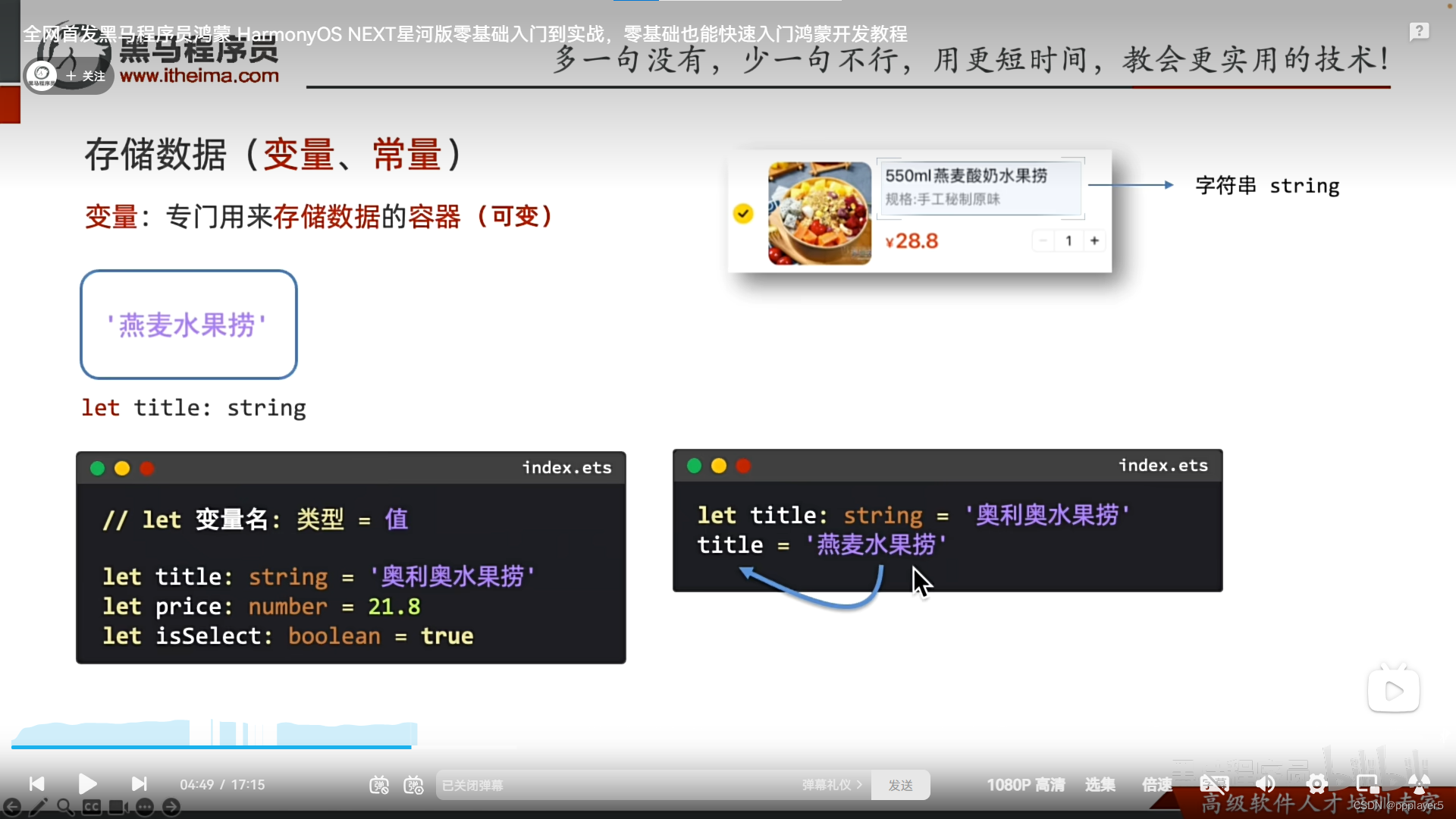
2.存储数据:变量(修改)与常量
变量: let title:string = 'xxx'
更新变量: title='new title'
注意1:字符串用单双引号都行
注意2:xxx与前面的类型相同
常量: 不可改变
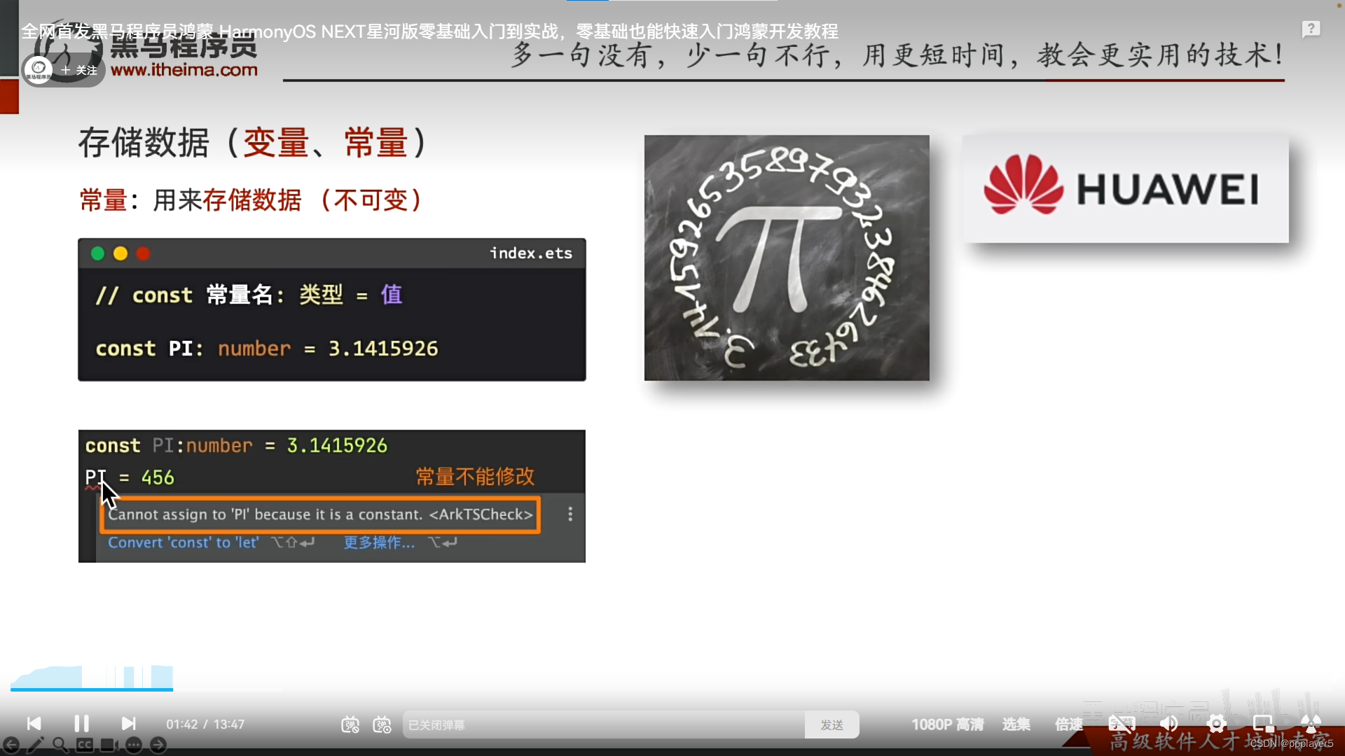
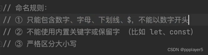
常量与变量的命规则:
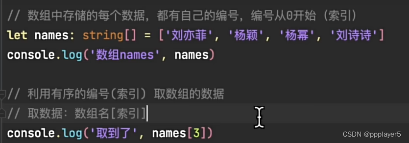
三、数组
1.数组的格式

2.数组的索引
数组名[索引]
四、函数-Fuction
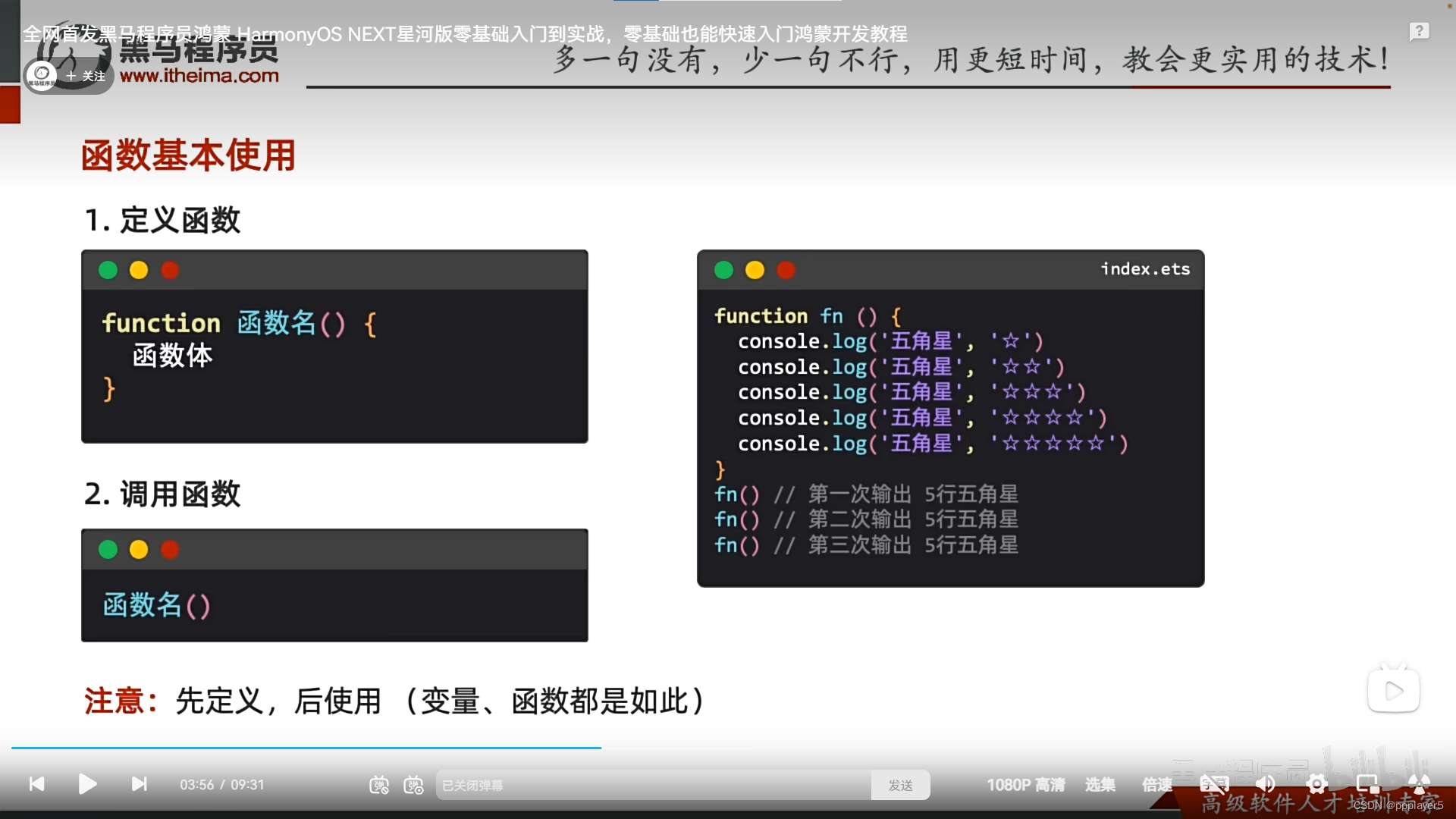
1.定义:重复使用的代码块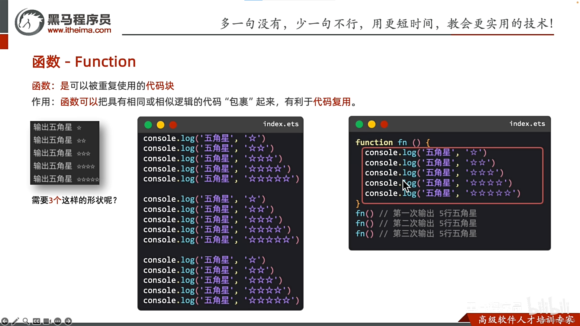
2.函数基本使用:先定义函数,再调用
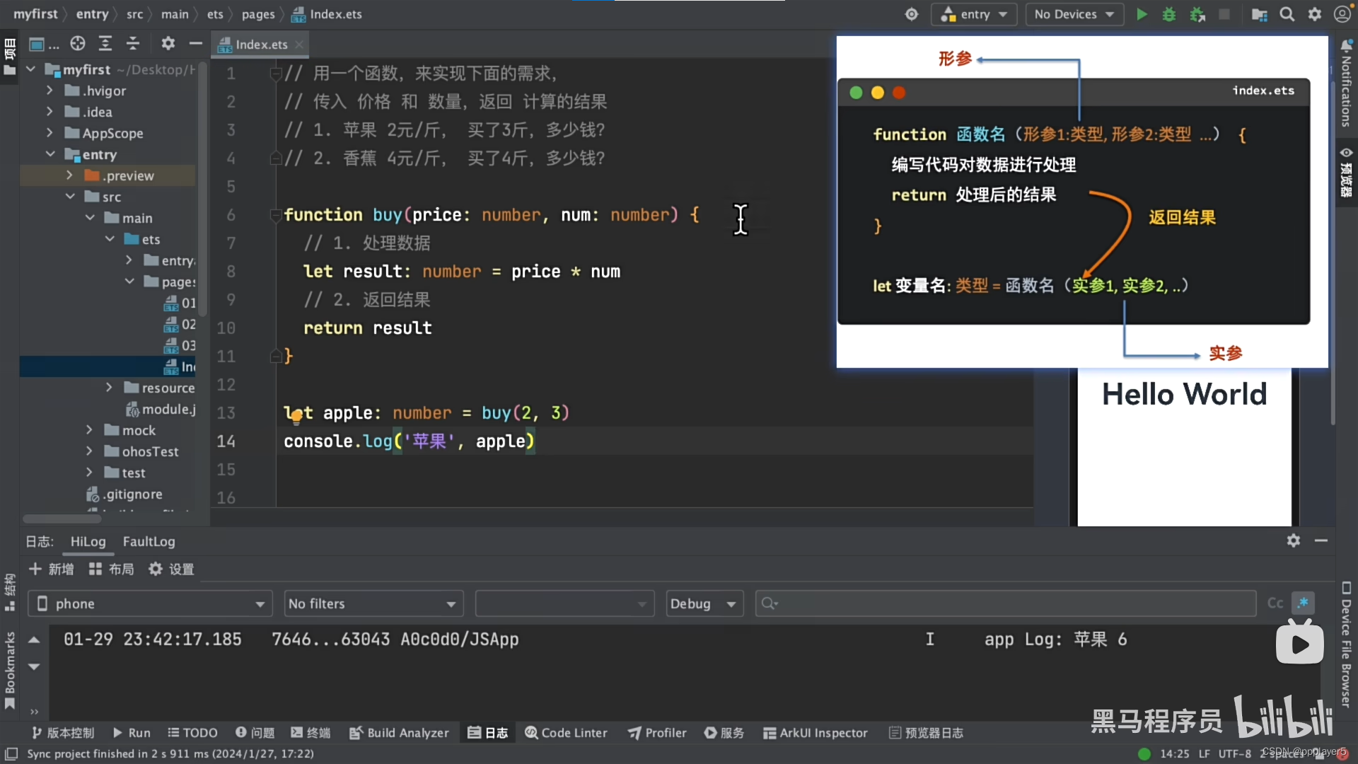
3.函数的完整用法:根据传入的不同数据,处理后,返回结果
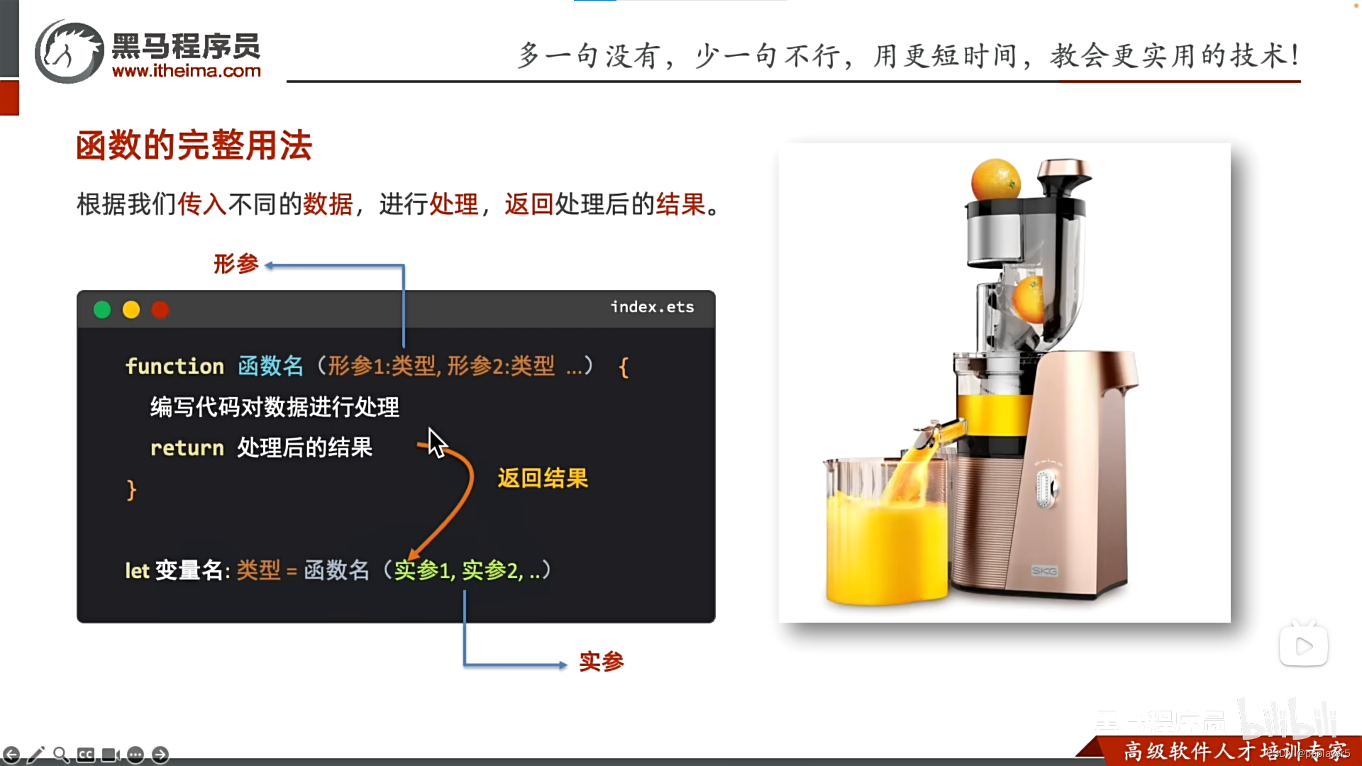
简单例子:
4.箭头函数:比普通函数更简介的函数写法
基础用法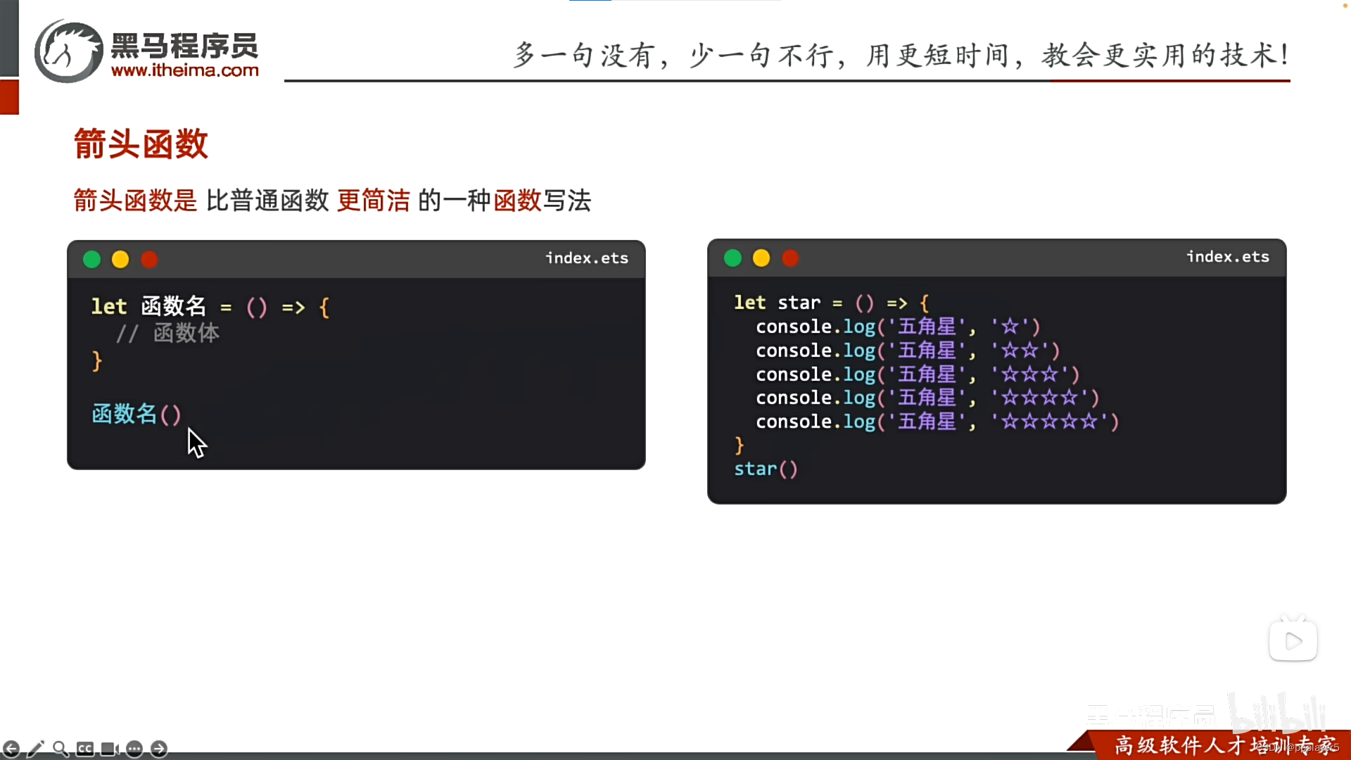
加参数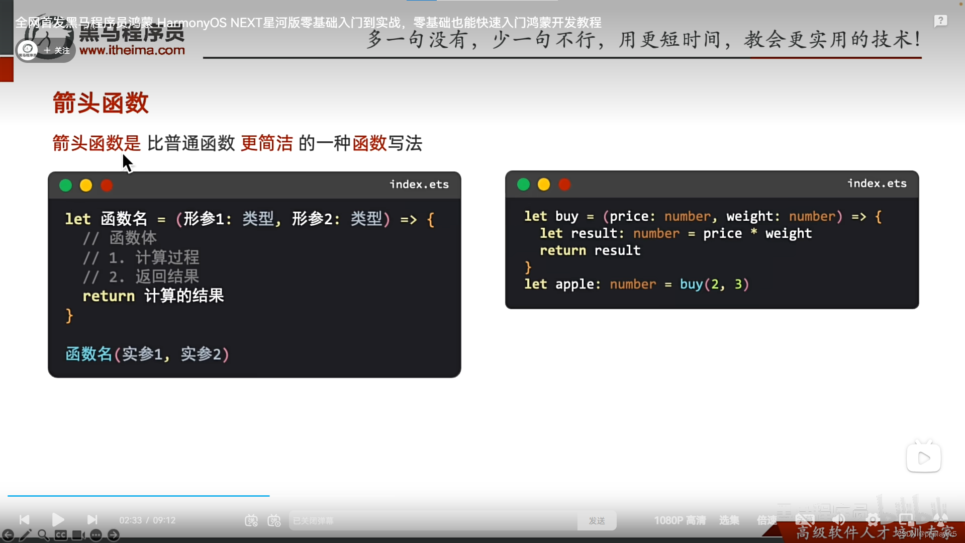
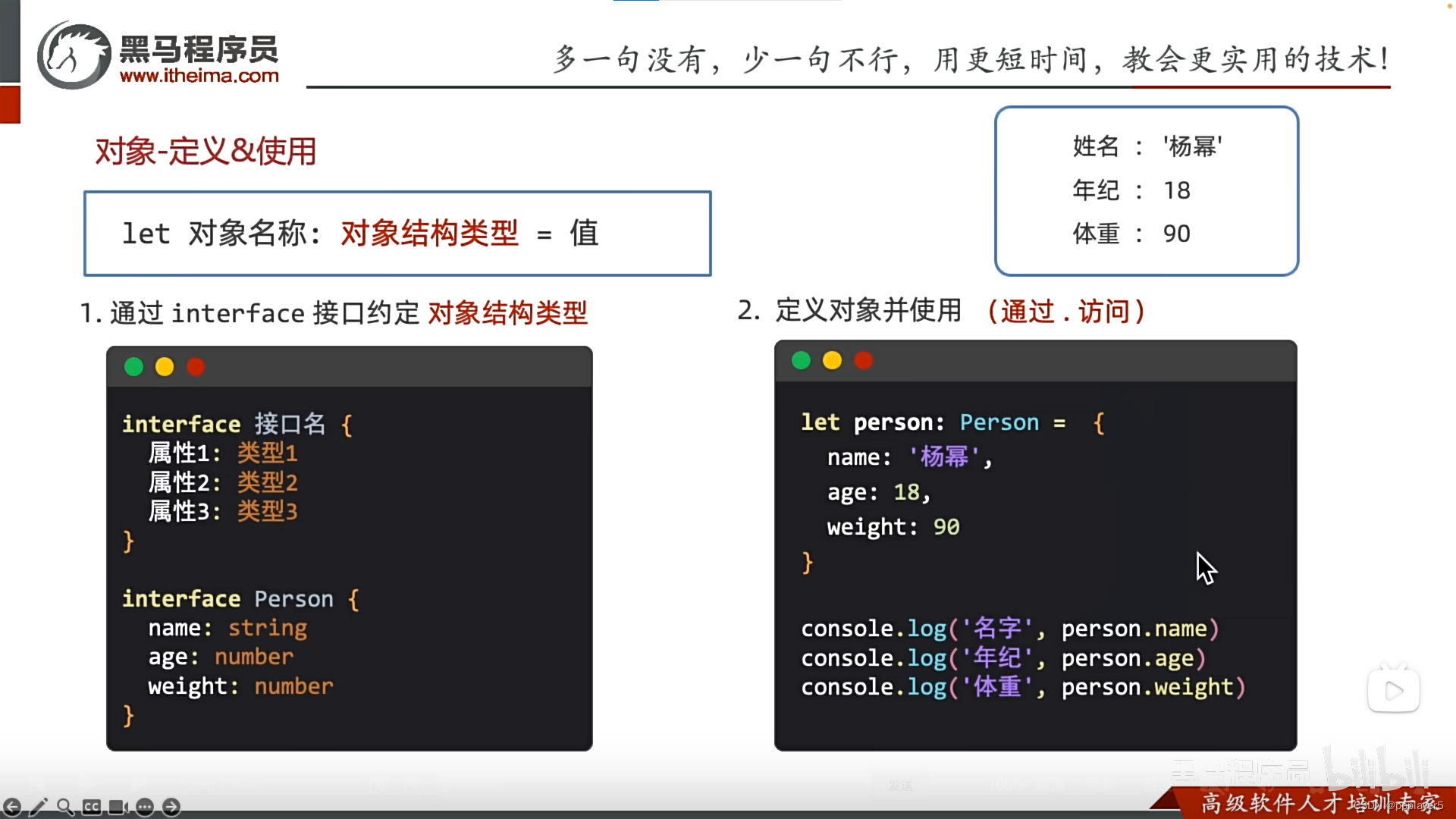
五、对象&接口
1.对象基本介绍
作用:描述一个对象的特征与行为
对象:是一个可以存储多个数据的容器
区别:数组要求同类型数据,对象则不做要求(string/number/boolean...都行)
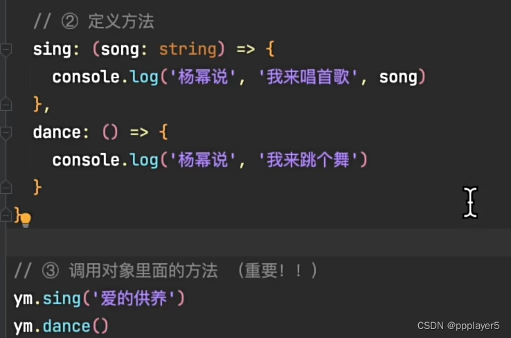
2.对象-方法
描述对象的行为
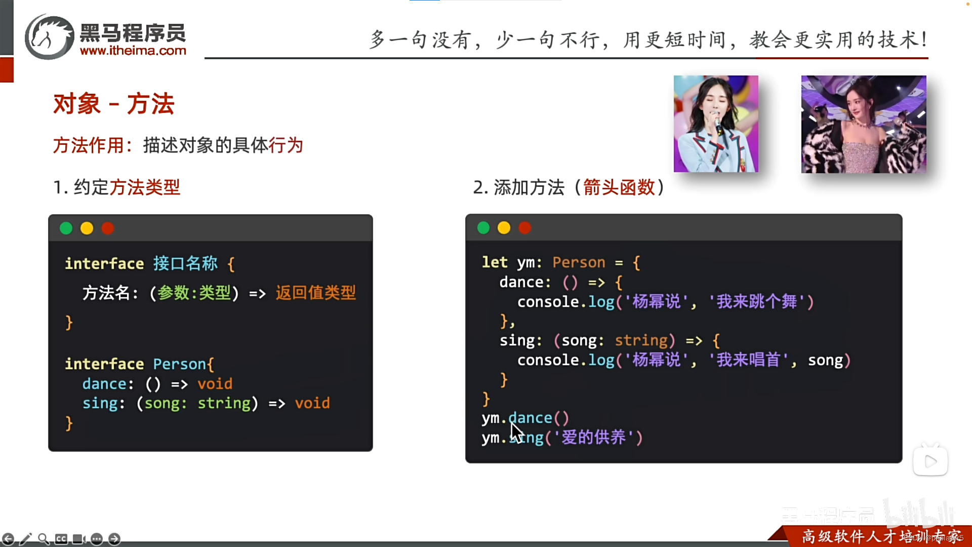
调用对象里面的方法(重要)
 六、联合类型
1.用于存储不同类型的数据
let 变量:类型1 | 类型2 | 类型3 = 类型1的值
类型2 = 值
类型3 = 值
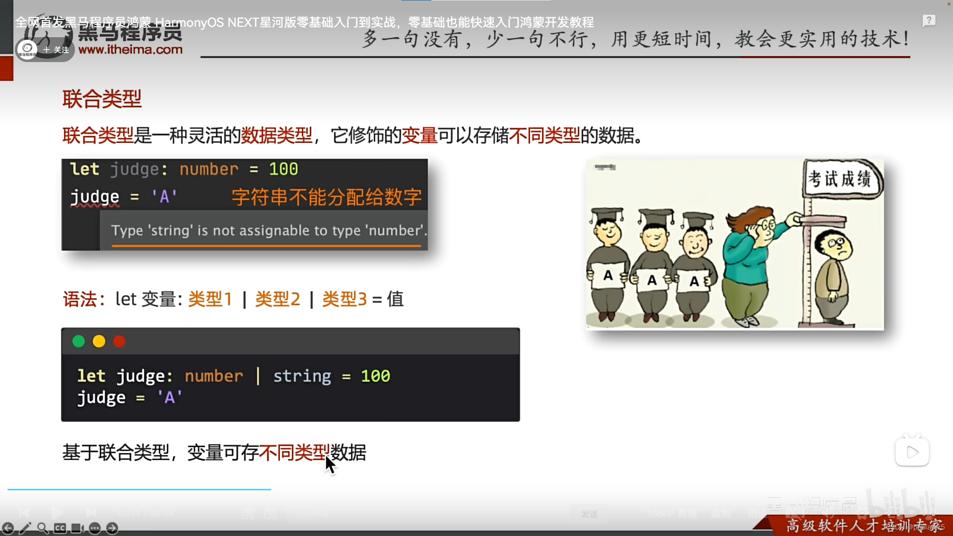
2.可以将变量值约定在一组数据范围内
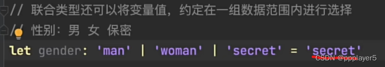 图中只能选择"man/women/secret"。
七、枚举类型
1.约定变量只能在一组数据范围内取值
红色:#ff0f29
橙色:#ff7100
绿色:#30b30e
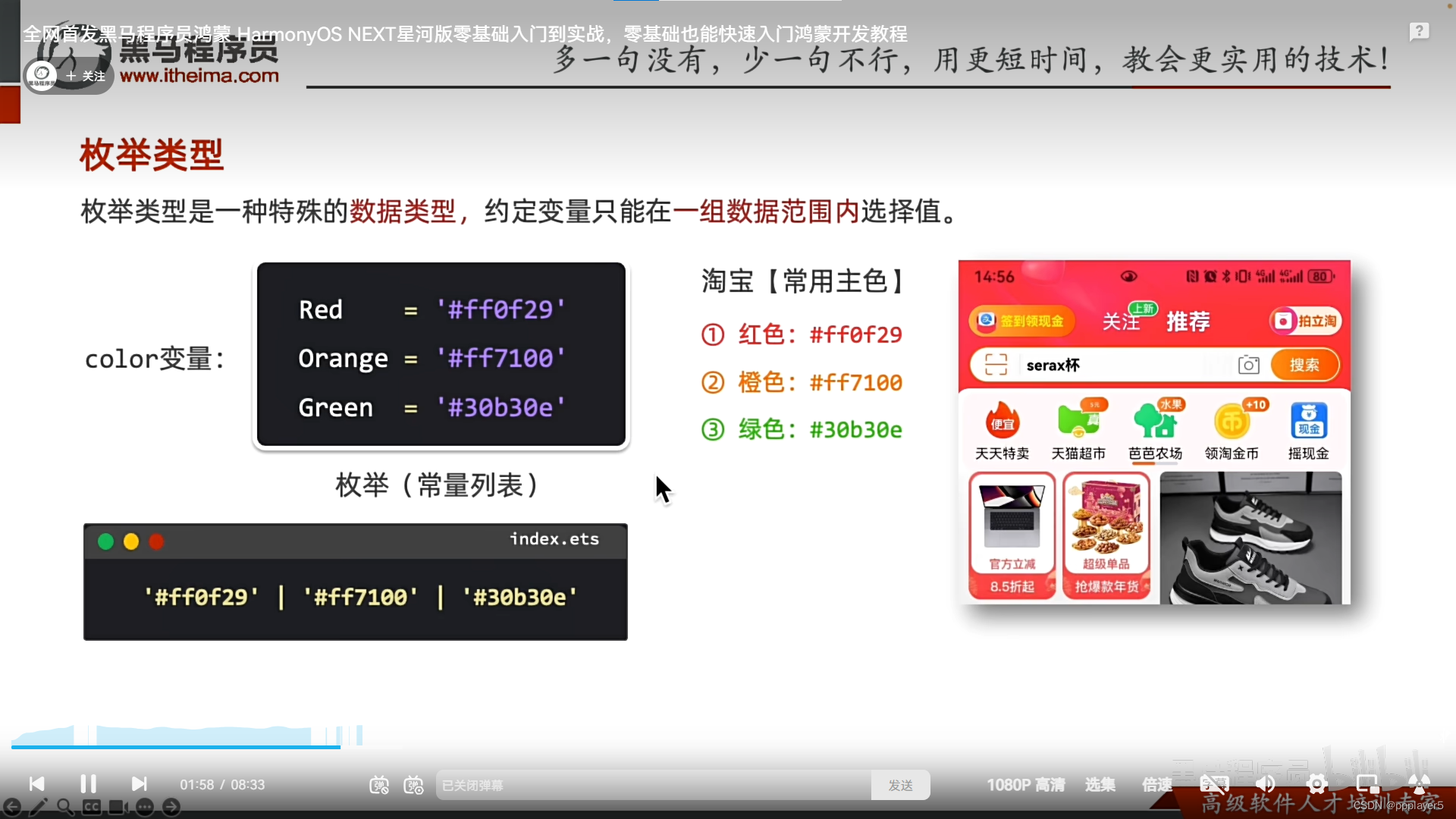
2.枚举的定义与使用
a.定义:
enum 枚举名{
常量1 = 值,
常量2 = 值,
...
}
b.使用:
let xxx:枚举名 = 枚举名.常量n
二、ArkUI基础
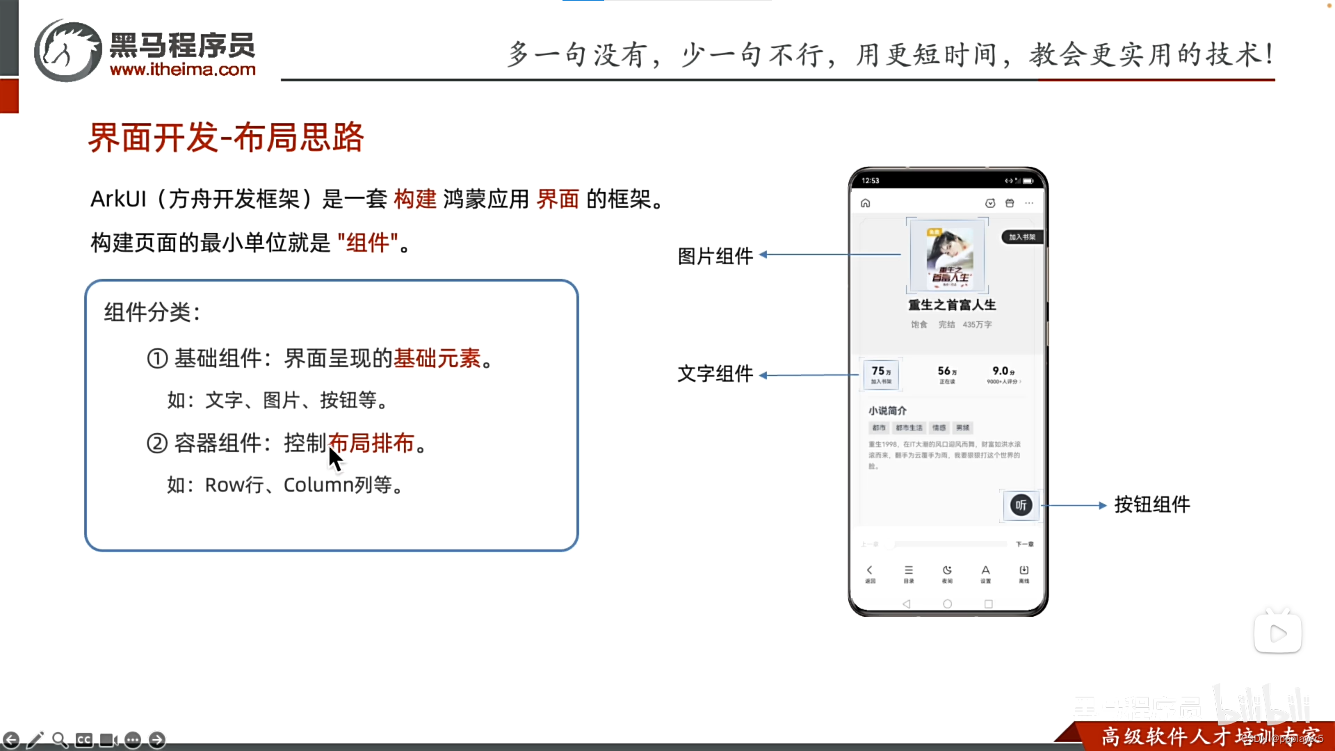
一、界面开发起步
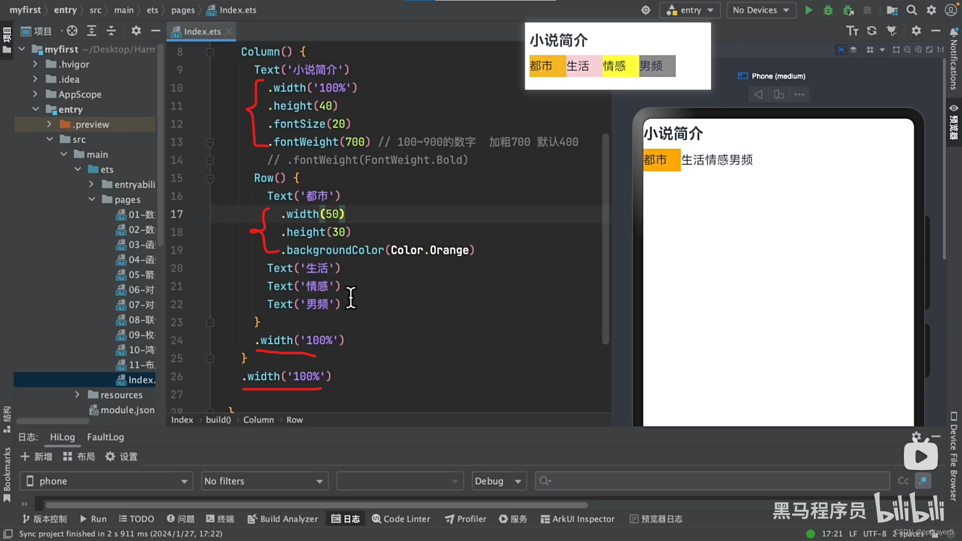
二、宽度、高度、背景色、字体大小、字体粗细、字体颜色
1.布局思路
2.组件分类
3.简单例子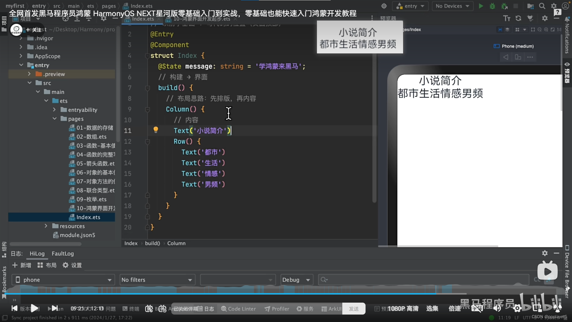
4.宽度、高度、背景色、字体大小、字体粗细、字体颜色
宽度还可以.width('100%')
字体颜色.FontColor(Color.xxx)
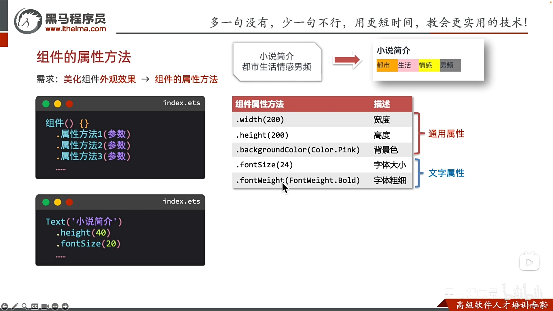
简单例子:
5.文本颜色
1.全部颜色改变:.fontcolor(Color.颜色)
2.部分颜色改变:Text(){span('内容').fontcolor}
6.文本居中
.textalign(textalign.center)
居左,居下等改枚举就行。
7.文本中加图片
text(){imagespan($r('app.media.xxx'))}
三、最大行数、行高
最大行数:.maxlines(行数)
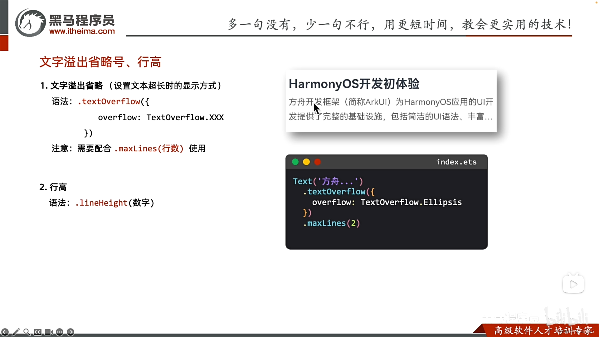
示例: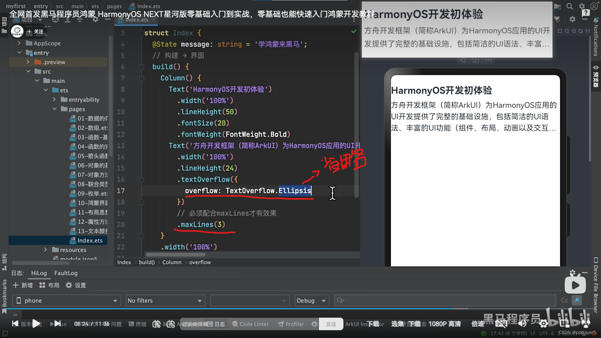
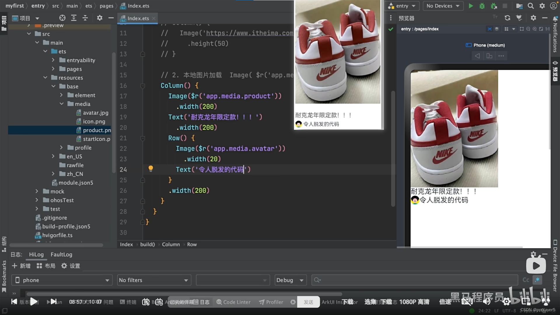
四、图片组件与填充组件
1.网络图片
填充组件:blank ()--像弹簧一样填充空白区域
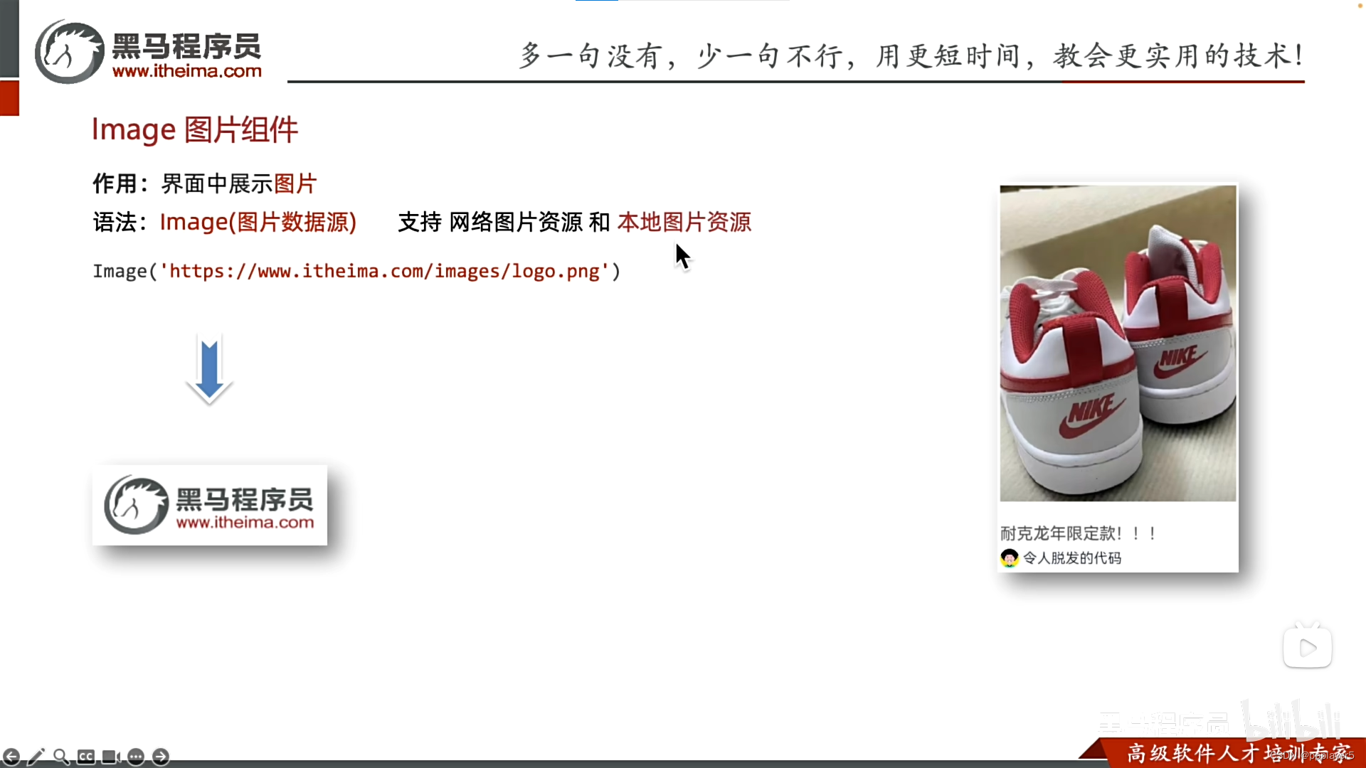
2.本地图片
图片所在文件位置
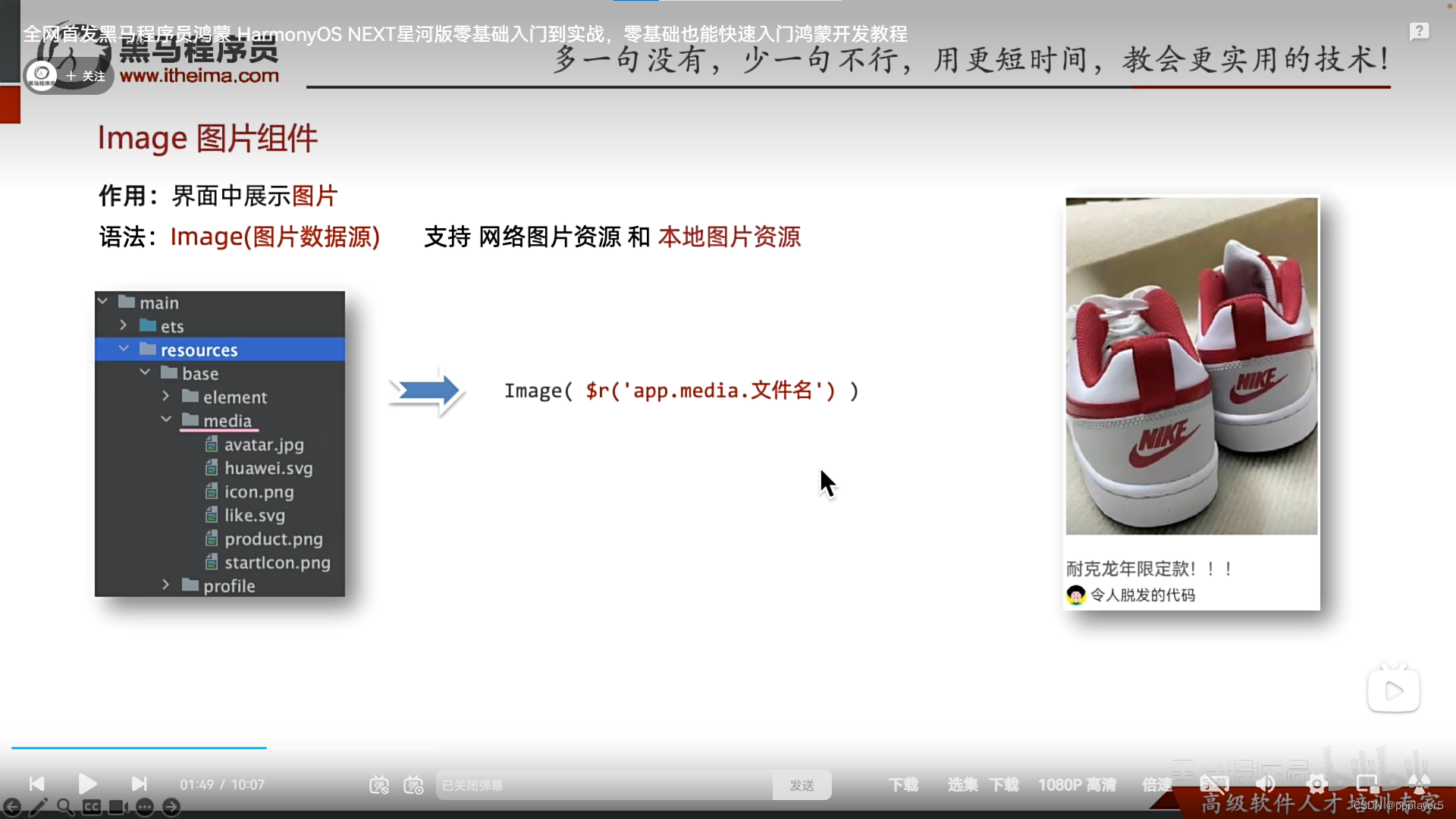
应用图片
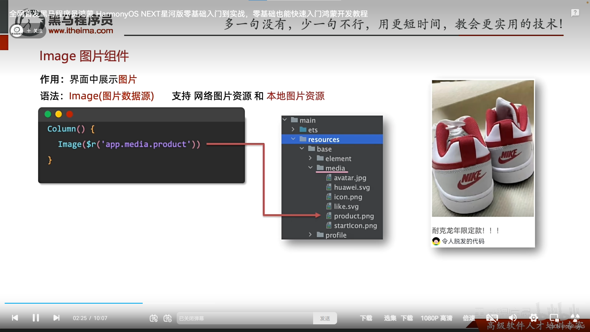
3.示例
将图片展开:.width('100%')
五、输入框(间隙)与按钮
1.输入框:TextInput(参数对象).属性方法()
输入框颜色:.placeholdercolor('#xxxx')
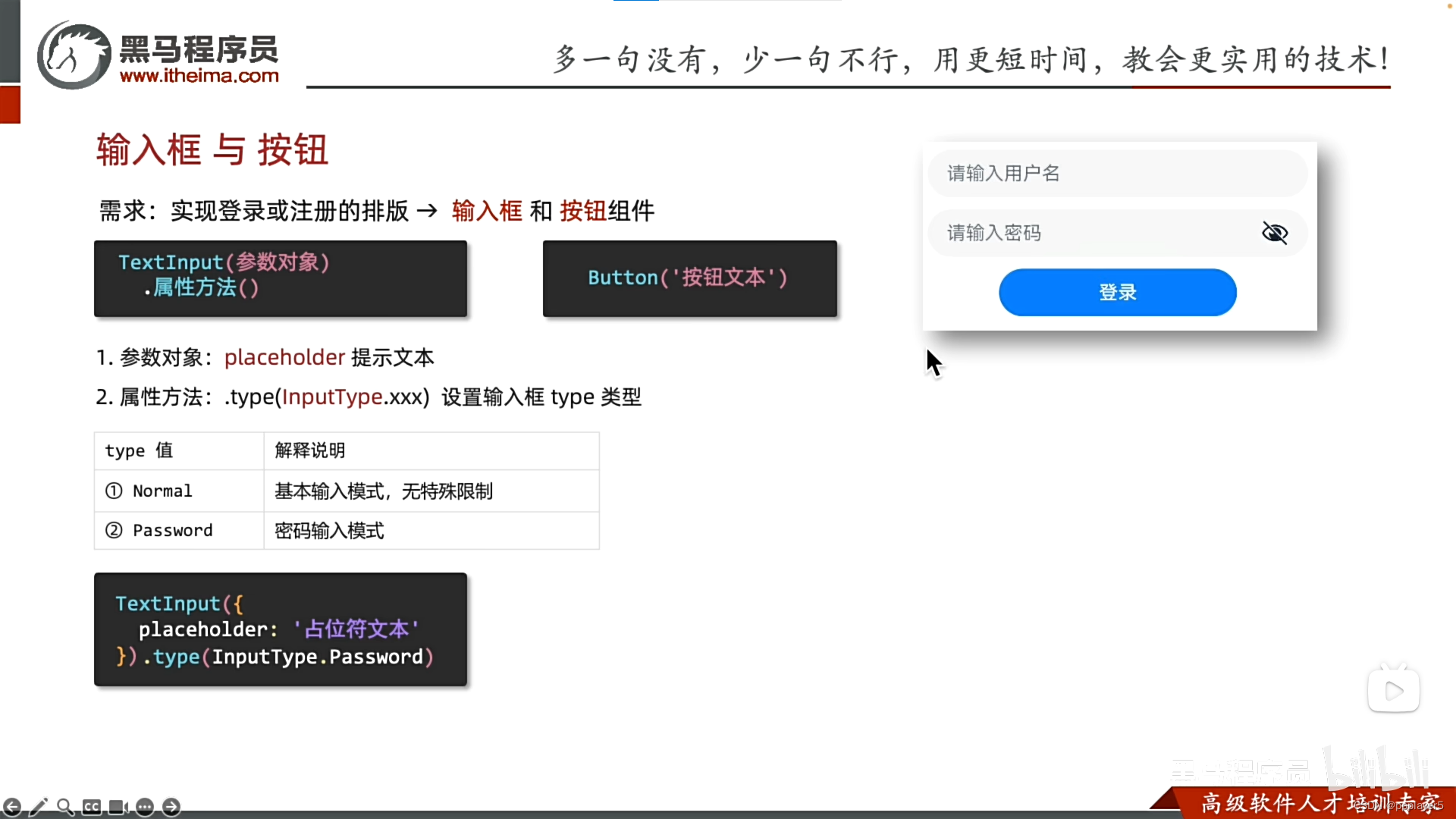
2.按键
Button('按键文本')
checkbox()
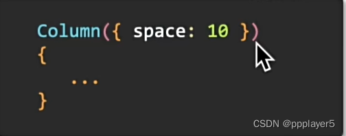
3.Column与Row内元素间隙,使用space
{space:xxx}
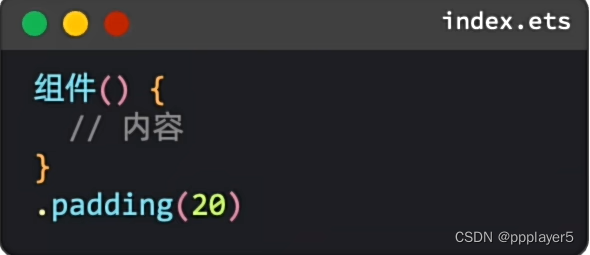
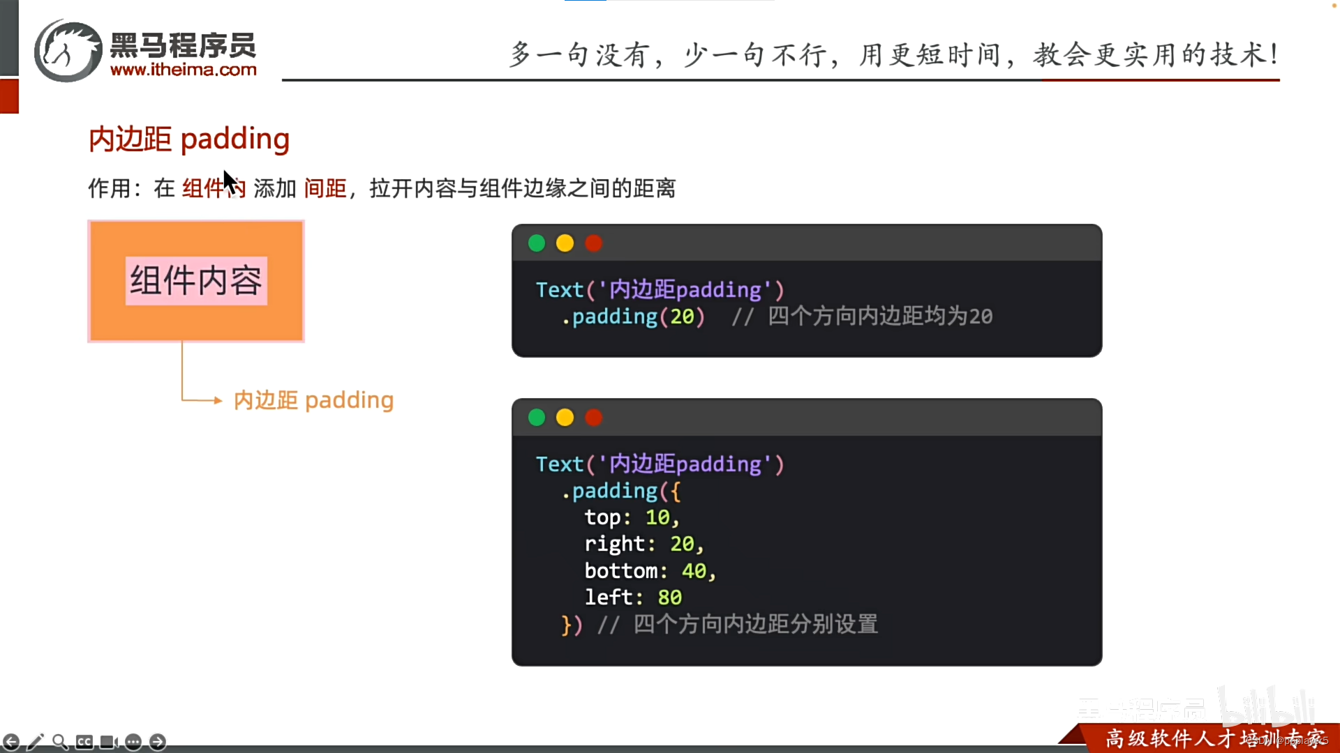
4.内边距padding
5.输入框与按键综合示例
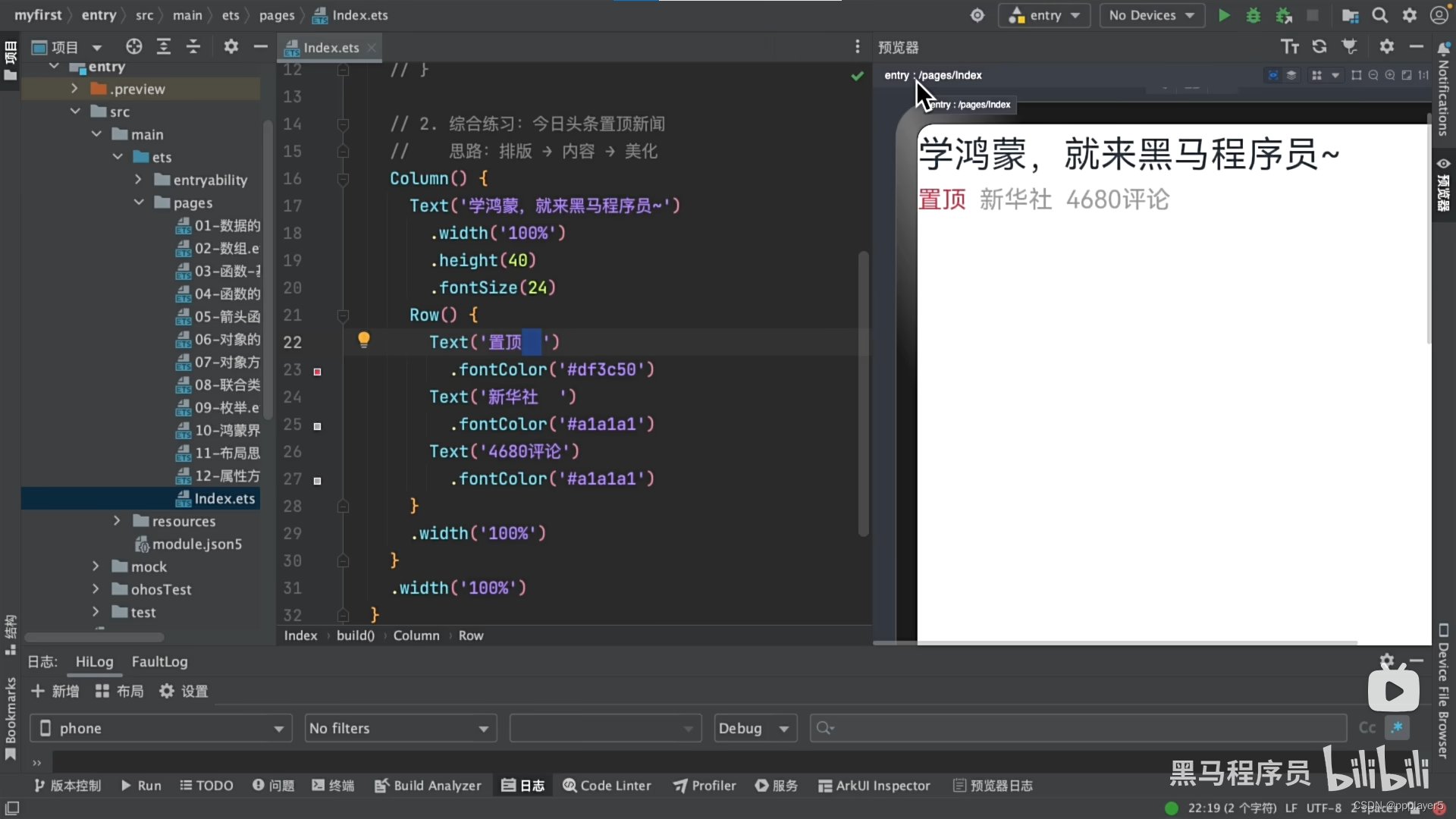
六、综合案例-华为登录
1.效果:
2.index代码:
@Entry
@Component
struct Index {
  @State message: string = 'Hello World';

  build() {
    Column({space:10}){
      Image($r('app.media.HuaweuLogin'))
        .width(100)
      Row()
      TextInput({
        placeholder:'请输入用户名'
      })
      TextInput({
        placeholder:'请输入密码'
      }).type(InputType.Password)
      Text("前往注册")
      Text("忘记密码")

    }
    .padding(20)
    .height('100%')
    .width('100%')
  }
}
3.图片:名字记得改为HuaweuLogin并且加到resources/base/media中

三、组件边距边框与圆角
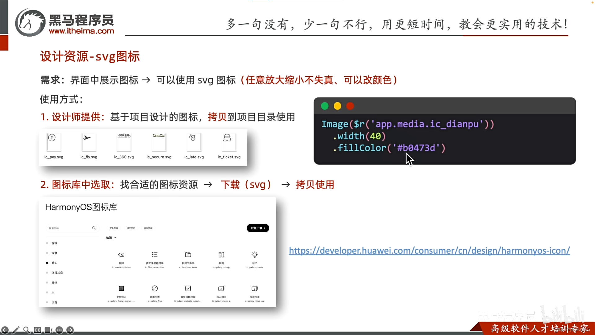
一、svg图标(ic_xxx.svg)
与图片相似,但可以改颜色:.fillColor('十六进制')
图标下载网:https://developer.huawei.com/consumer/cn/design/harmonyos-icon/
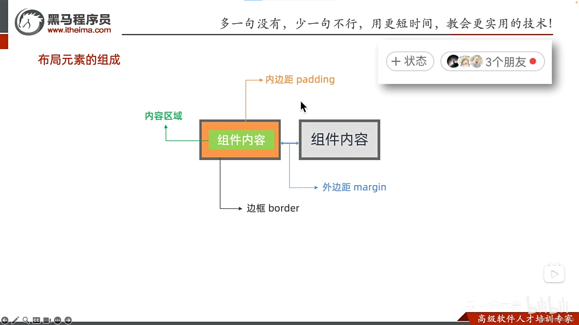
二、padding、border、margin
1.布局组成:内边距padding、边框border、外边距margin
2.padding
一般使用单个方向间隔:.padding({left:20})
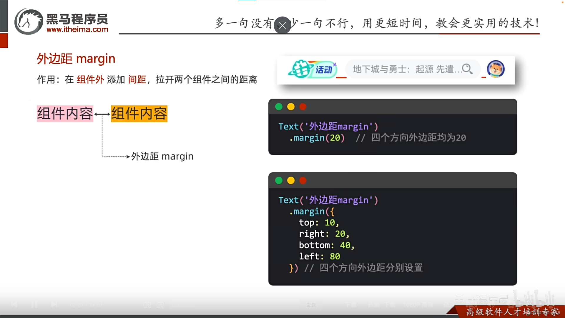
3.margin
一般使用单个方向间隔:.margin({left:20})
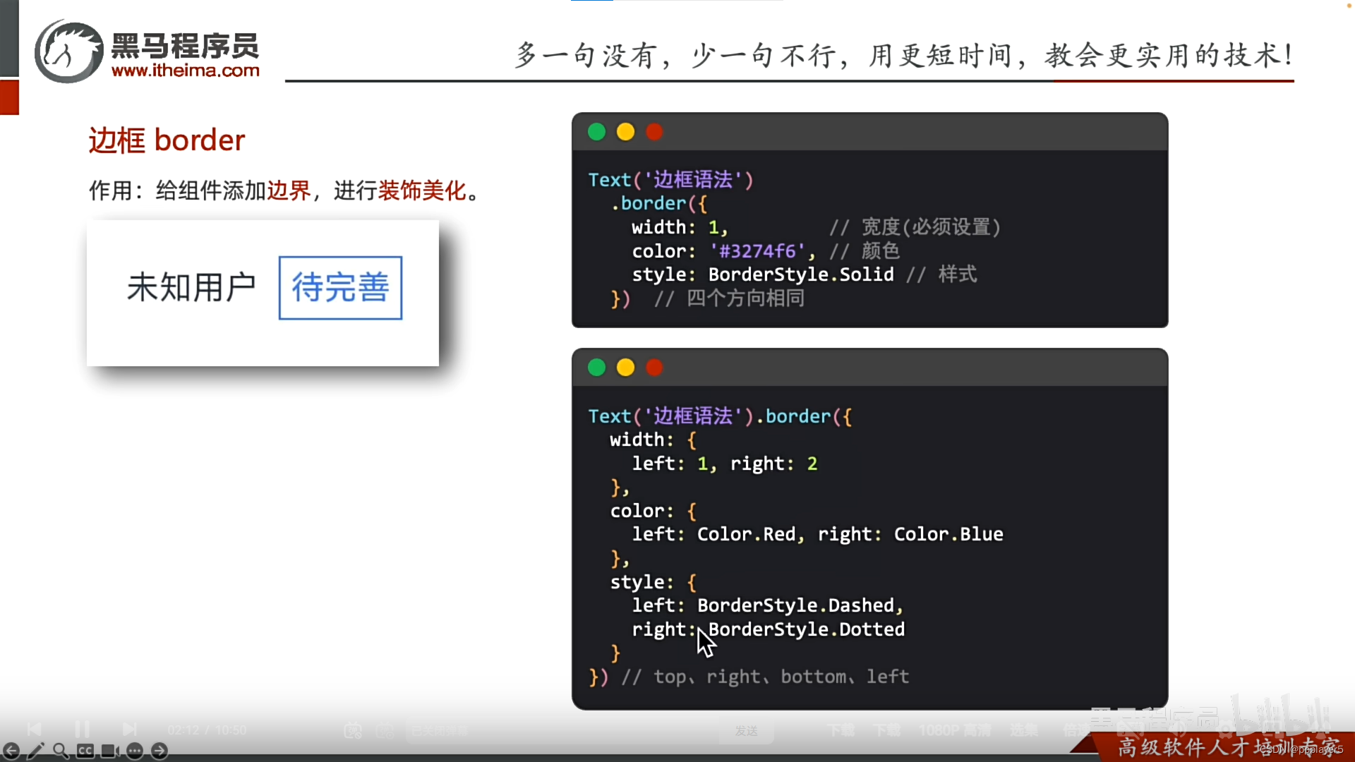
4.border
.border({
width:xxx,
color:Color.Red,
style:BorderStyle.Solid//实线(Dash虚线)
...
})
三、综合案例-QQ音乐登录
1.效果

2.index代码:
@Entry
@Component
struct Index {
  @State message: string = 'Hello World';

  build() {
    Column() {
      Image($r('app.media.QQmusic'))
        .width(100)
        .margin({bottom:20})

      Text("iiiyo")
        .fontWeight(700)
        .margin({bottom:5})

      Button("QQ登录")
        .padding({})
        .margin({
          top:5,
          bottom:10})
        .width('100%')
      Button("微信登录")
        .width('100%')
        .backgroundColor(Color.Grey)
    }
    .height('100%')
    .width('100%')
    .padding(20)
  }
}
3.QQ音乐图片
图片名:QQmusic
位置:resources/base/media

四、组件圆角
1.方形的圆角设置
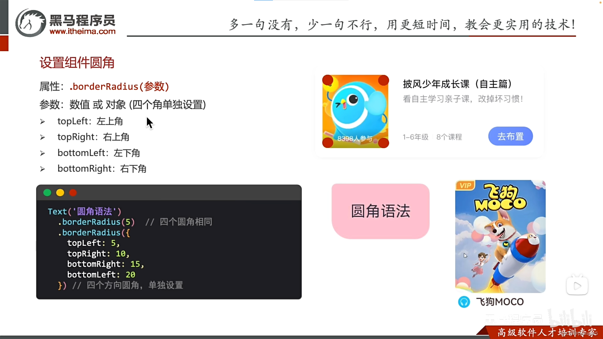
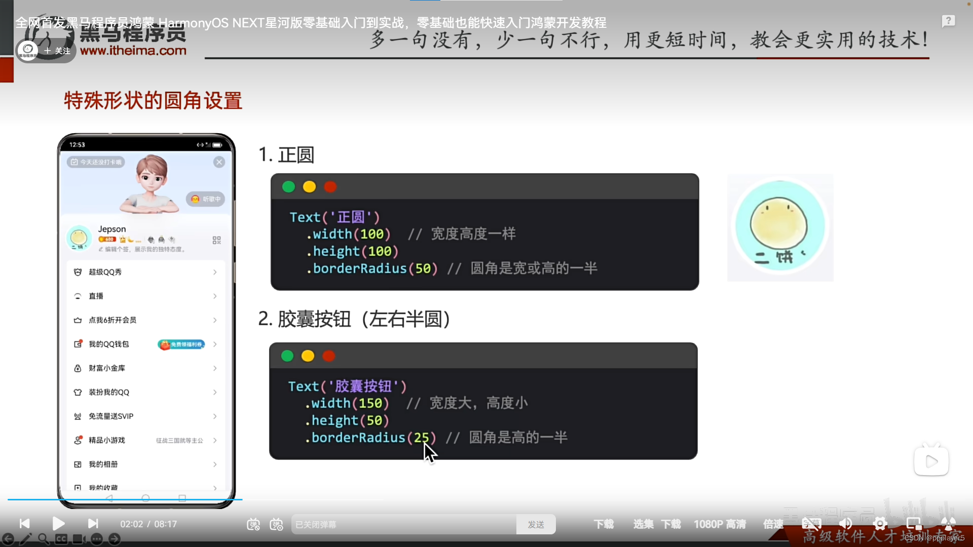
2.特殊形状的圆角设置
正圆:圆角值是宽或者高的一般
胶囊按键(左右半圆):圆角值是高度的一般
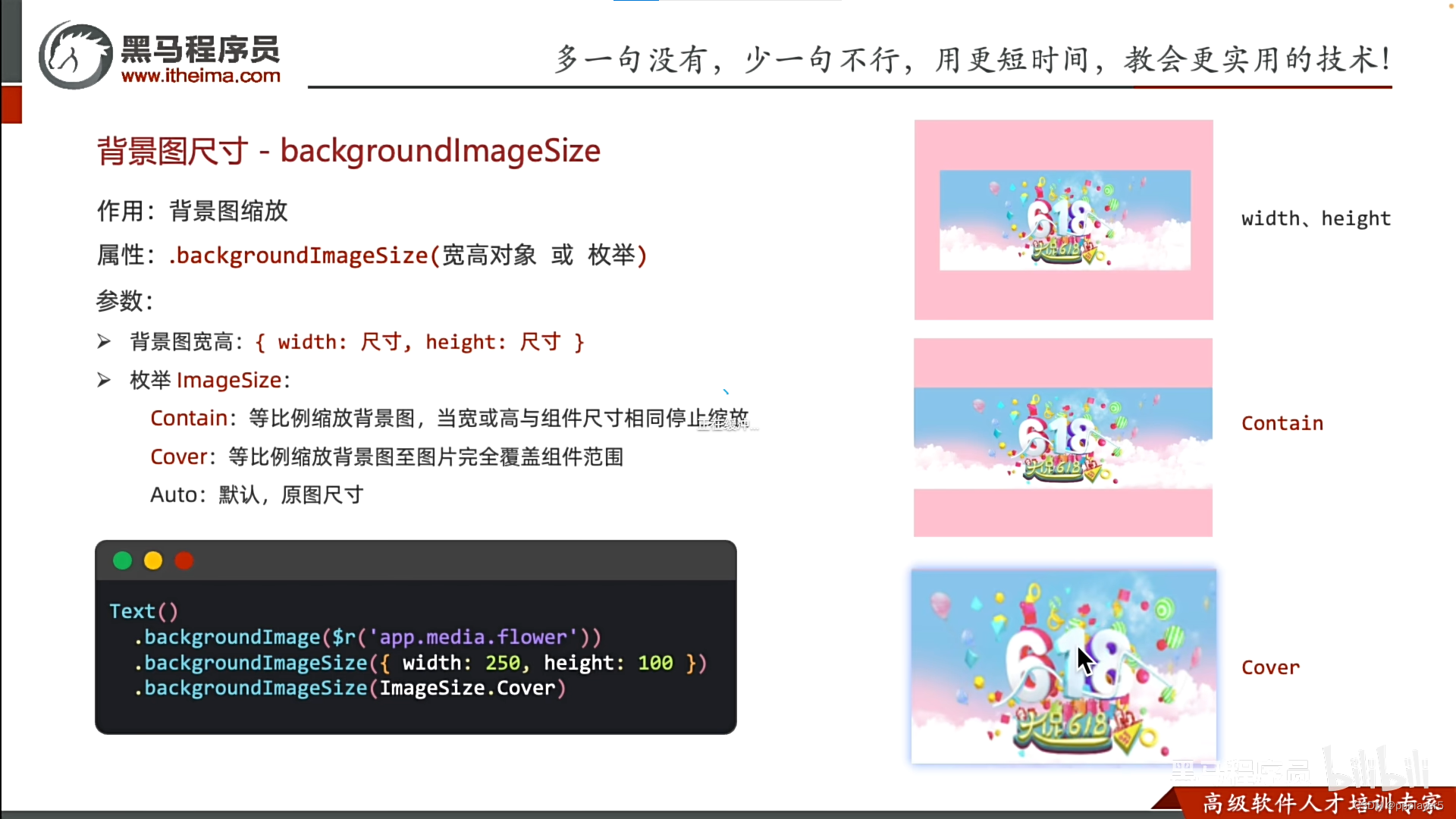
四、背景
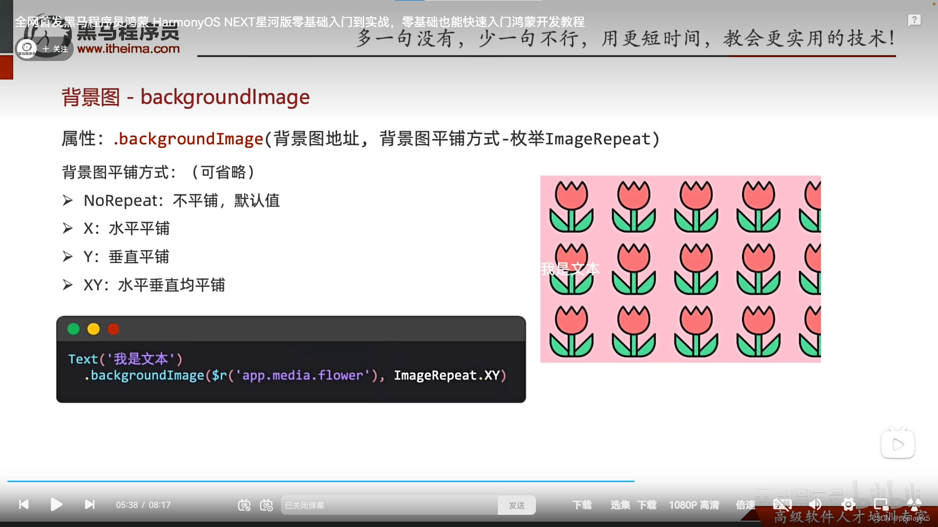
一、添加背景图
1.属性

2.背景图引用与图片相似
默认不平铺:
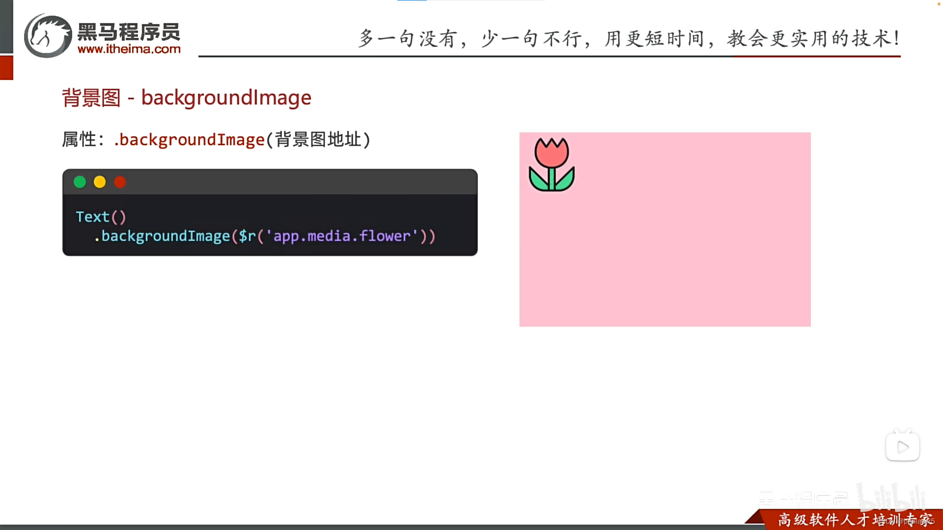
加平铺效果:
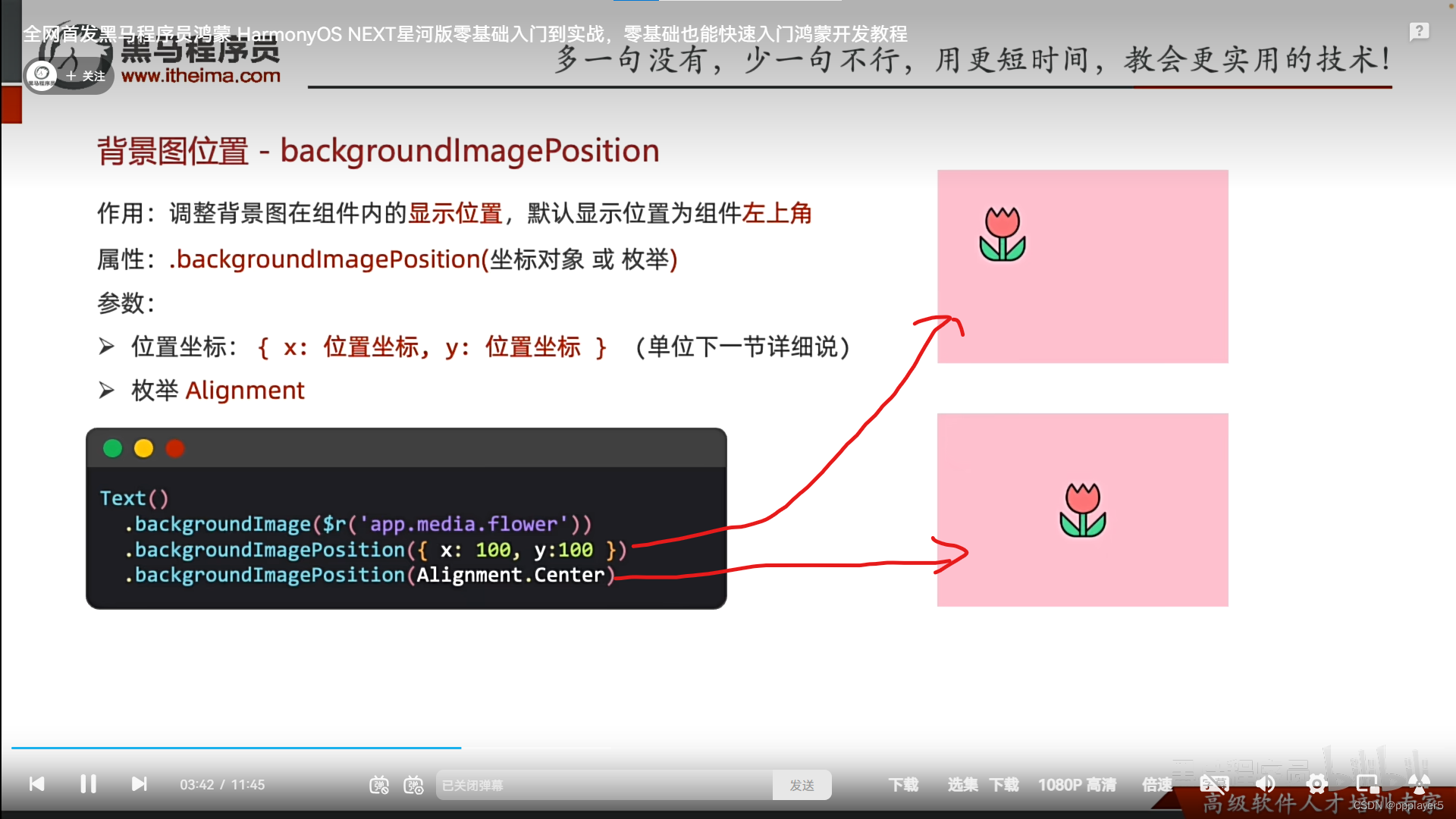
二、背景图位置
方法一:写图片左上角坐标{x:100,y:100}
方法二:枚举中心点Alignment.Center或者左上角、右下角之类的
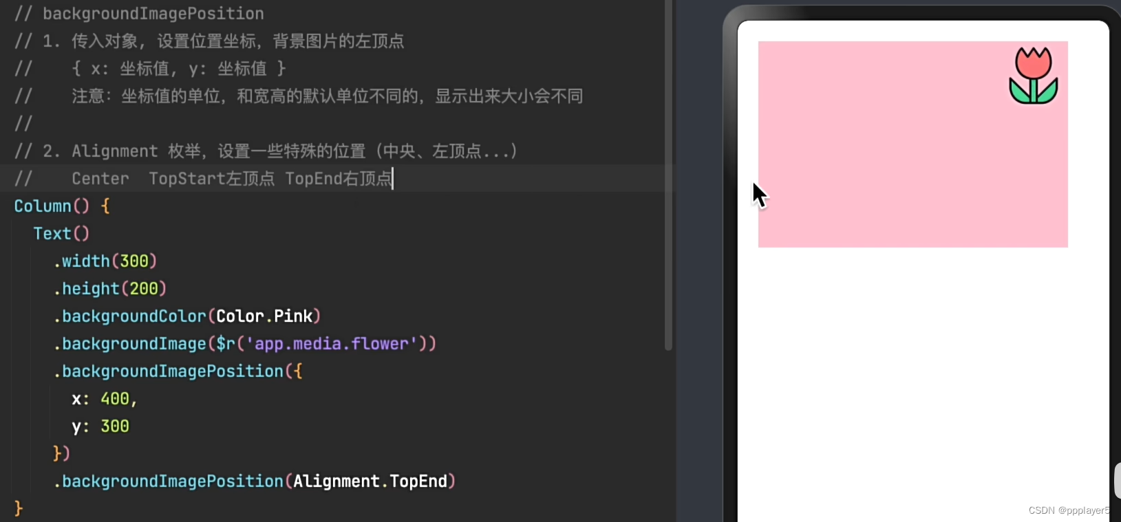
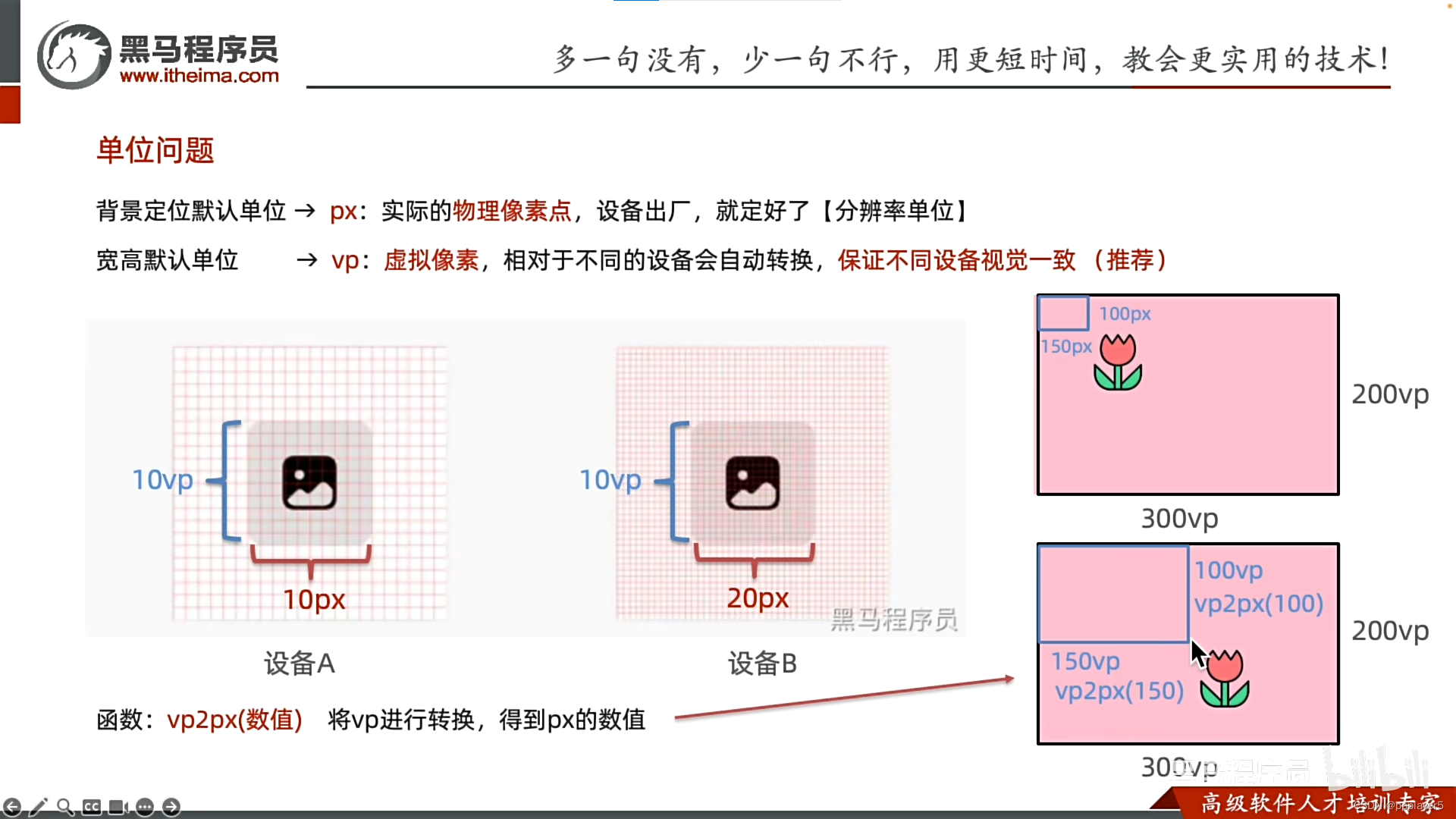
三、单位问题vp2px
四、背景尺寸
方法一:{width:尺寸,height:尺寸}
方法二:枚举ImageSize.Cover等
五、横纵布局
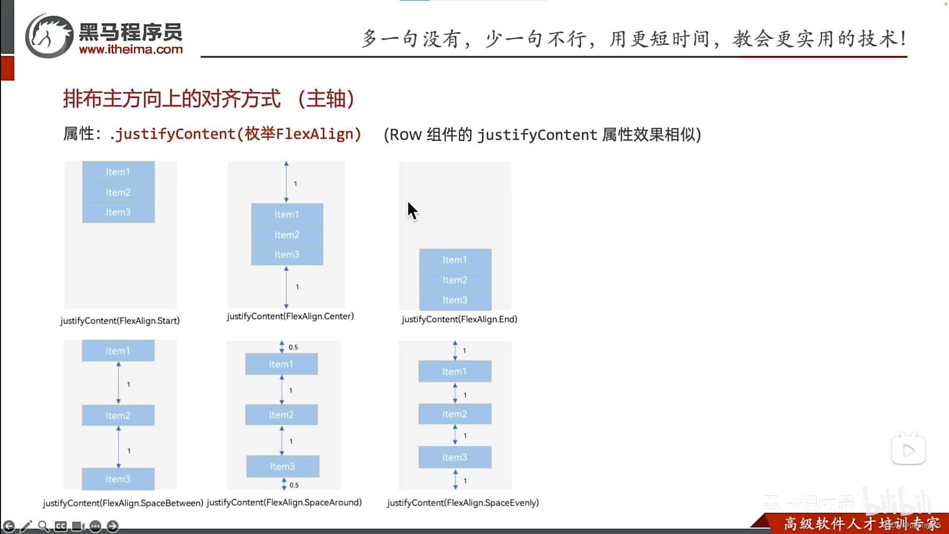
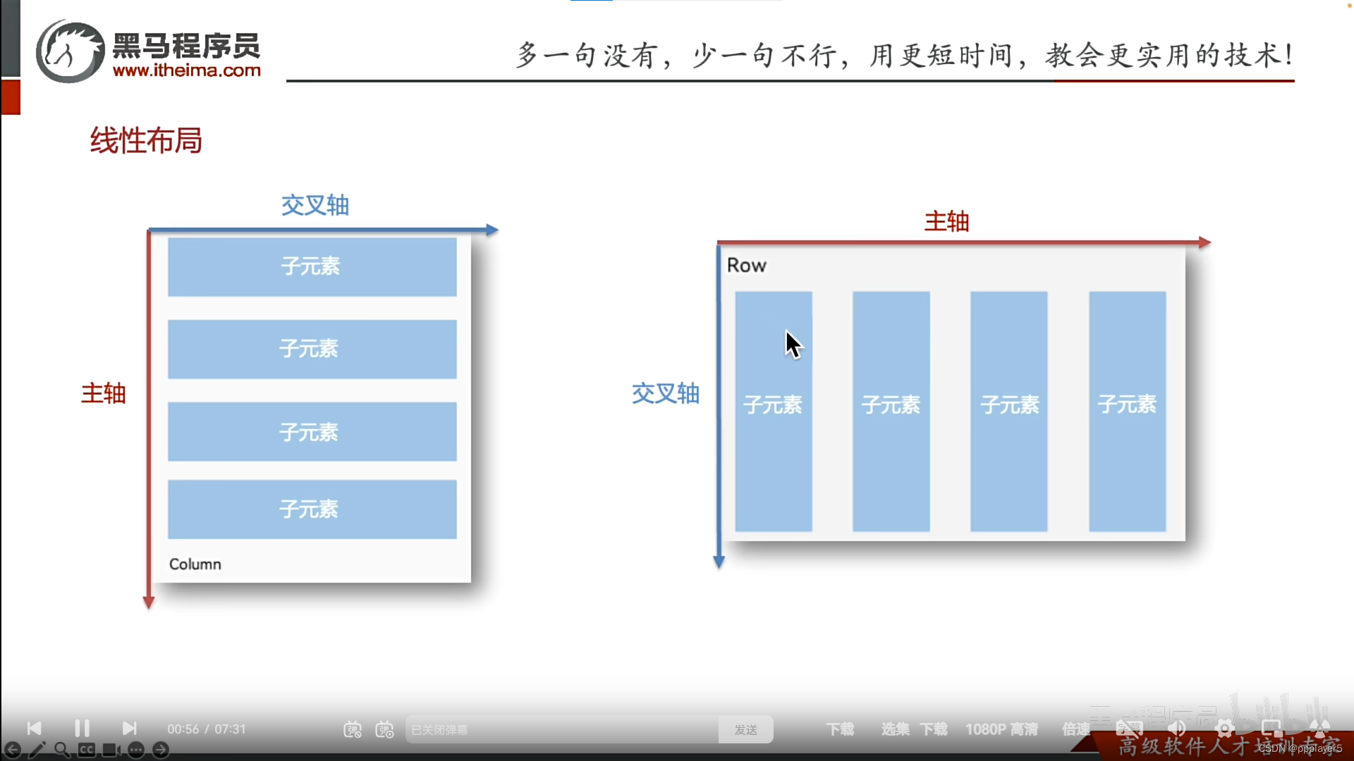
一、主轴对齐justifyContent
1.简介
2.语法
方法:.justifyContent(FlexAlign.枚举)
Column主轴是从上往下
Row主轴是从左至右
二、综合案例-个人中心
1.效果
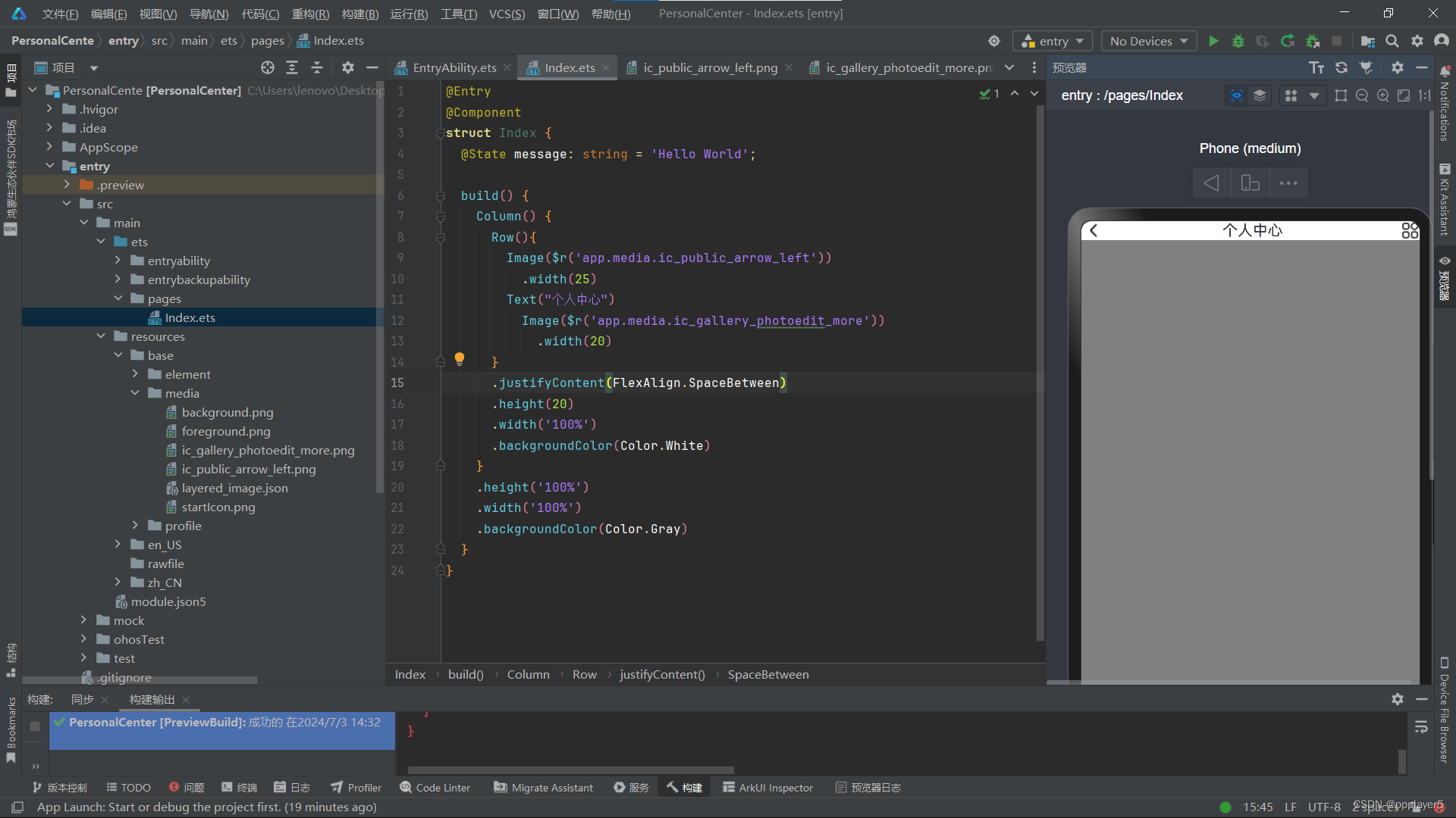
2.代码
@Entry
@Component
struct Index {
  @State message: string = 'Hello World';

  build() {
    Column() {
      Row(){
        Image($r('app.media.ic_public_arrow_left'))
          .width(25)
        Text("个人中心")
          Image($r('app.media.ic_gallery_photoedit_more'))
            .width(20)
      }
      .justifyContent(FlexAlign.SpaceBetween)
      .height(20)
      .width('100%')
      .backgroundColor(Color.White)
    }
    .height('100%')
    .width('100%')
    .backgroundColor(Color.Gray)
  }
}
3.图片


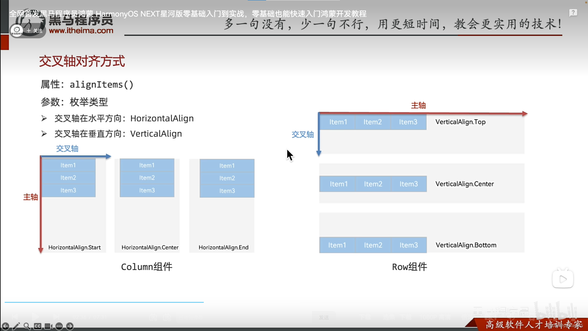
三、交叉轴对齐alignItems(HorizontalAlign/VerticalAlign)
1.简介
与主轴垂直的就是交叉轴
2.语法
交叉轴在水平方向:alignItems(HorizontalAlign.枚举)
交叉轴在竖直方向:alignItems(VerticalAlign.枚举)
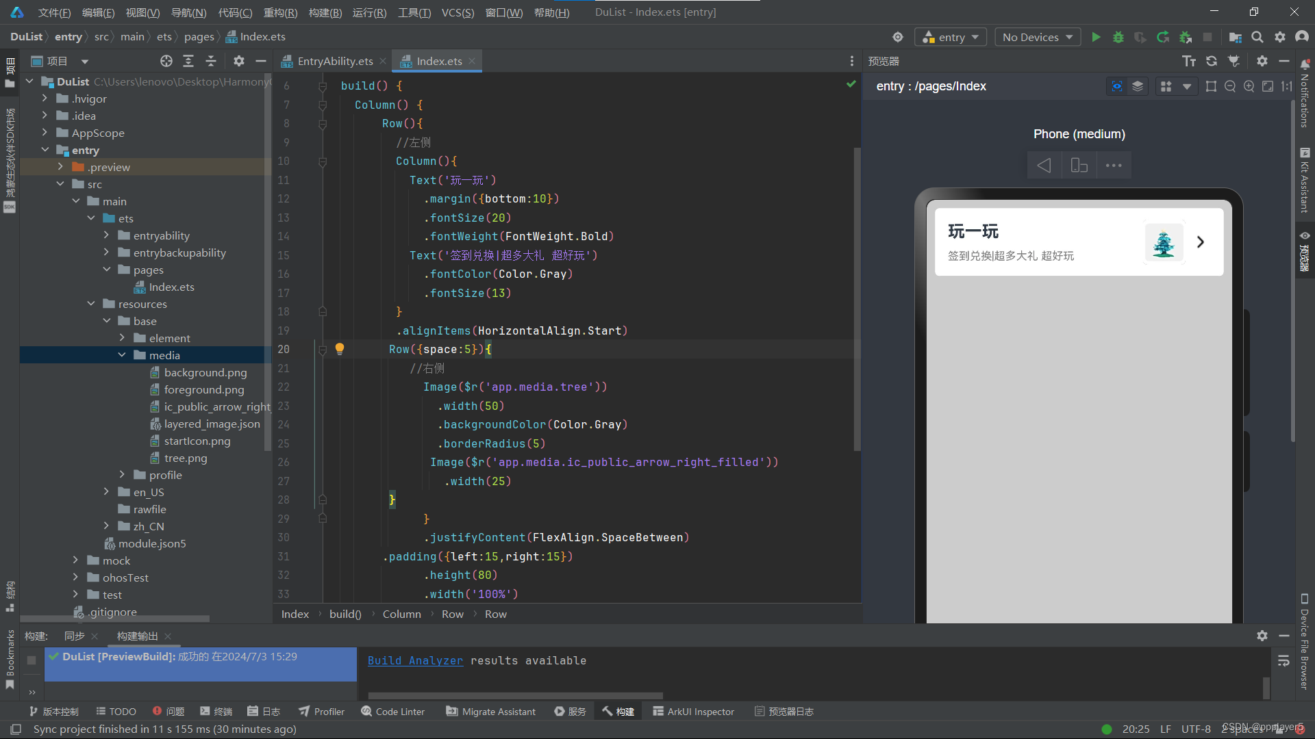
四、综合案例-得物列表项
1.效果
2.代码
@Entry
@Component
struct Index {
  @State message: string = 'Hello World';

  build() {
    Column() {
        Row(){
          //左侧
          Column(){
            Text('玩一玩')
              .margin({bottom:10})
              .fontSize(20)
              .fontWeight(FontWeight.Bold)
            Text('签到兑换|超多大礼 超好玩')
              .fontColor(Color.Gray)
              .fontSize(13)
          }
          .alignItems(HorizontalAlign.Start)
         Row({space:5}){
            //右侧
              Image($r('app.media.tree'))
                .width(50)
                .backgroundColor(Color.Gray)
                .borderRadius(5)
               Image($r('app.media.ic_public_arrow_right_filled'))
                 .width(25)
         }
              }
              .justifyContent(FlexAlign.SpaceBetween)
        .padding({left:15,right:15})
              .height(80)
              .width('100%')
              .backgroundColor('#fff')
              .borderRadius(5)
    }
    .height('100%')
    .width('100%')
    .backgroundColor('#ccc')
    .padding(10)
  }
}
3.图片

五、自适应伸缩-layoutWeight
自适应变化:在剩余空间所占部分
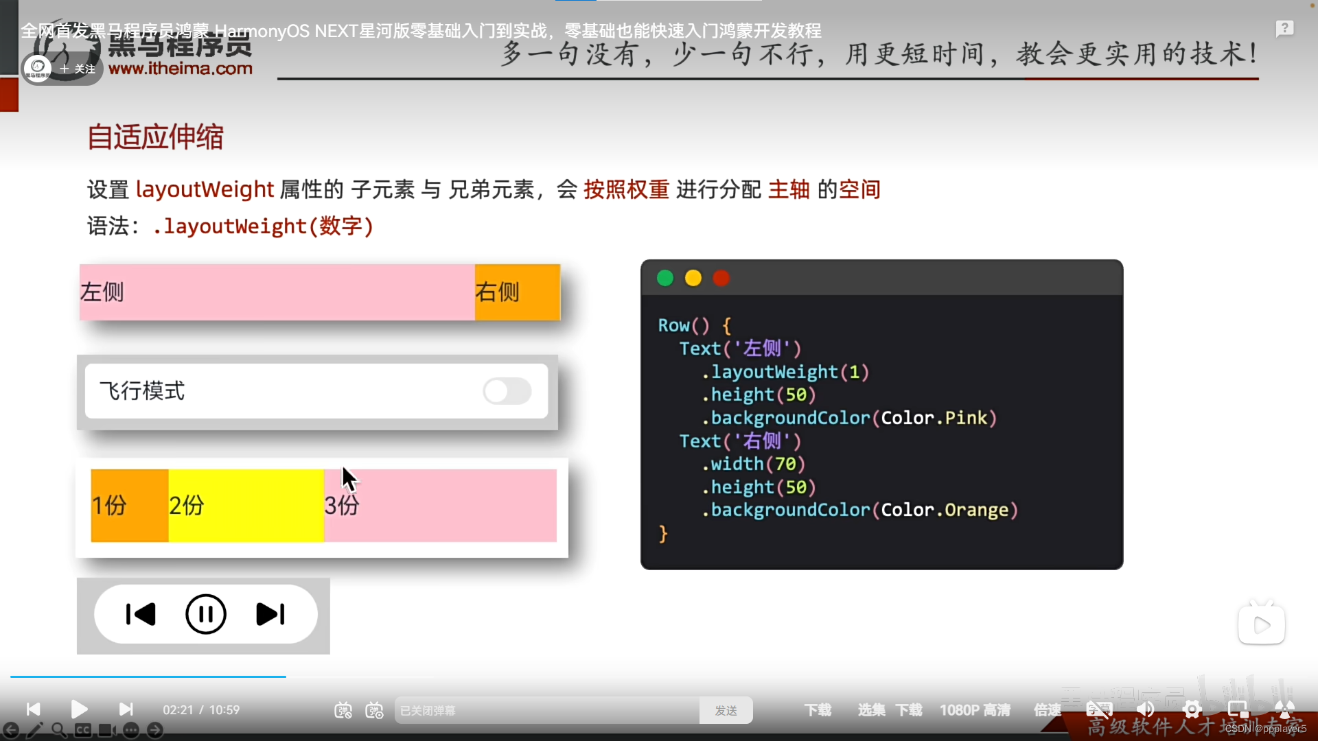
示例:
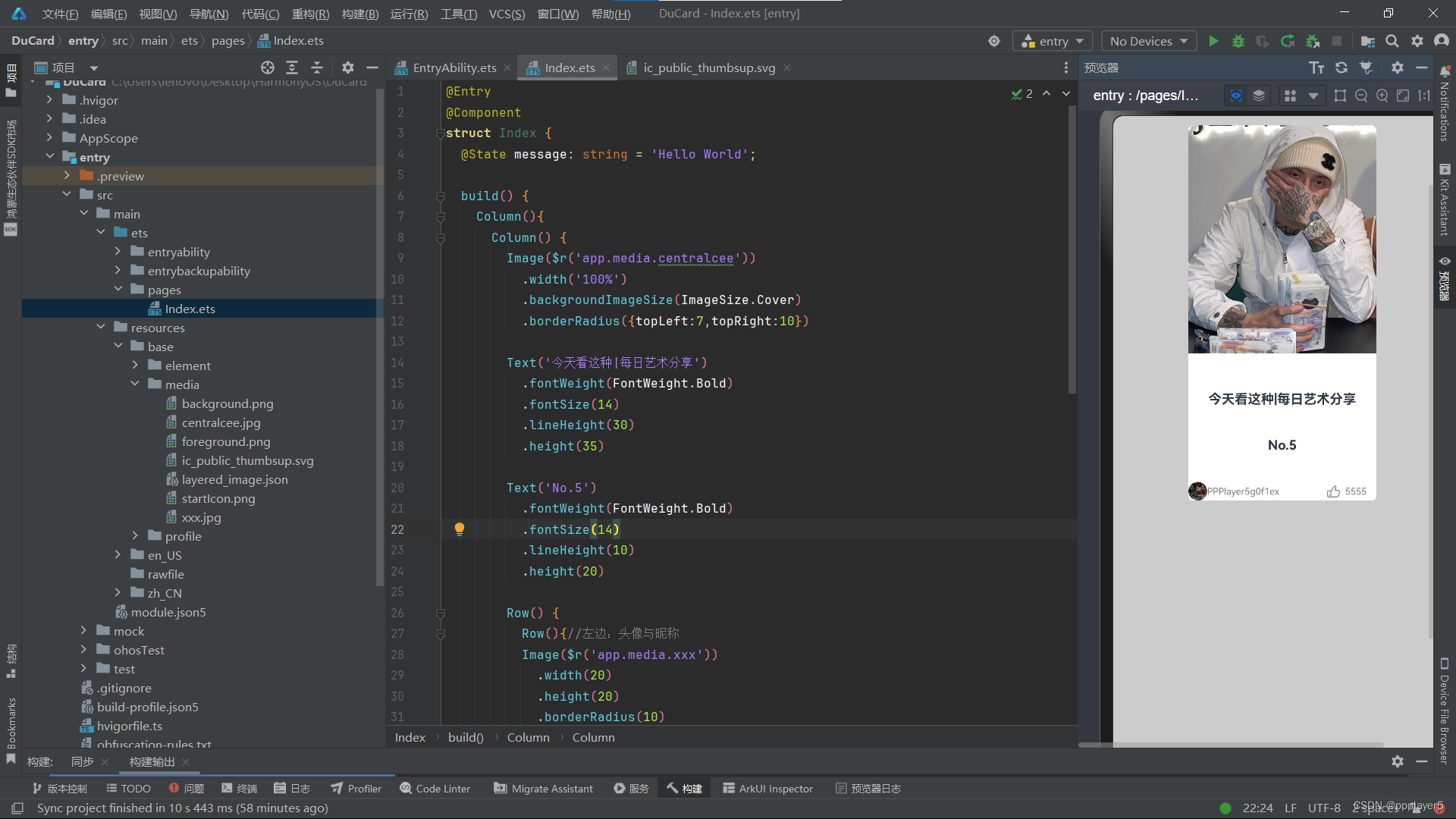
六、综合案例-得物卡片
1.效果
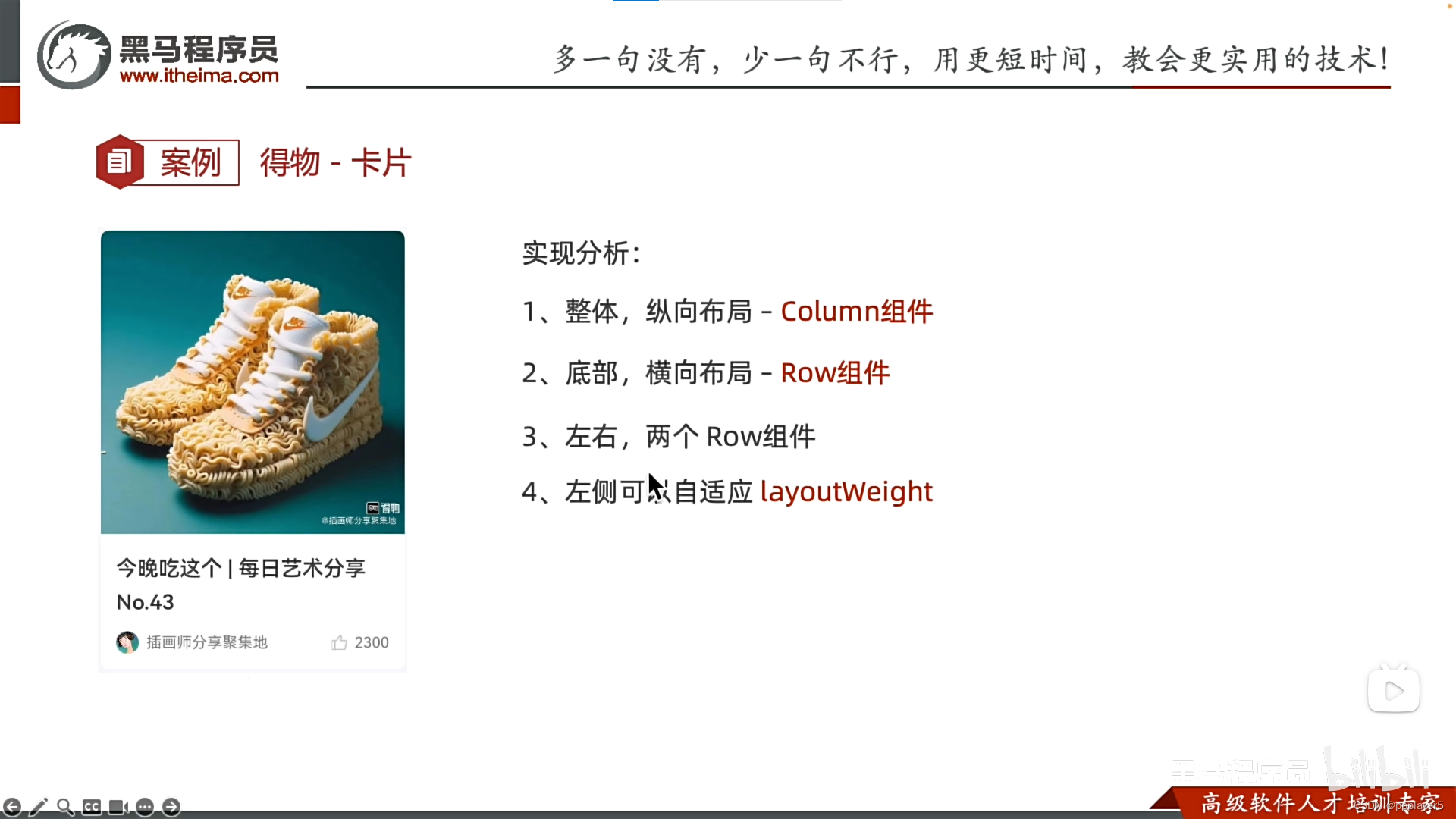
2.代码
@Entry
@Component
struct Index {
  @State message: string = 'Hello World';

  build() {
    Column(){
      Column() {
        Image($r('app.media.centralcee'))
          .width('100%')
          .backgroundImageSize(ImageSize.Cover)
          .borderRadius({topLeft:7,topRight:10})

        Text('今天看这种|每日艺术分享')
          .fontWeight(FontWeight.Bold)
          .fontSize(14)
          .lineHeight(30)
          .height(35)

        Text('No.5')
          .fontWeight(FontWeight.Bold)
          .fontSize(14)
          .lineHeight(10)
          .height(20)

        Row() {
          Row(){//左边:头像与昵称
          Image($r('app.media.xxx'))
            .width(20)
            .height(20)
            .borderRadius(10)
          Text('PPPlayer5g0f1ex')
            .fontSize(10)
            .fontColor(Color.Gray)
          }
          .layoutWeight(1)

          Row() {//右边:点赞图标与点赞数
            Image($r('app.media.ic_public_thumbsup'))
              .width(15)
              .fillColor(Color.Gray)

            Text('5555')
              .fontSize(10)
              .fontColor(Color.Gray)
              .padding({right:10,left:5})
          }
        }
      }
      .width(200)//卡片宽度
      .height(400)//定好卡片高度,方便内容展开
      .backgroundColor(Color.White)
      .borderRadius(5)
      .justifyContent(FlexAlign.SpaceBetween)
    }
    .padding(10)
    .height('100%')
    .width('100%')
    .backgroundColor('#ccc')
  }
}
3.图片
我觉得我这个页面好看点,要想向他那样就自己改


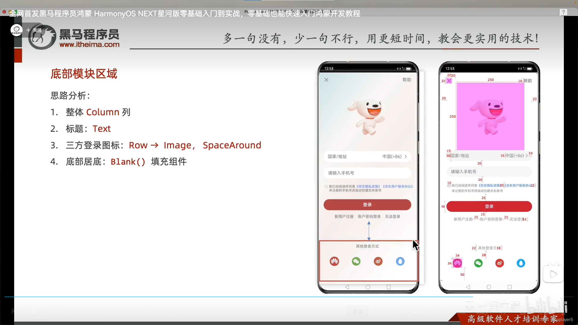
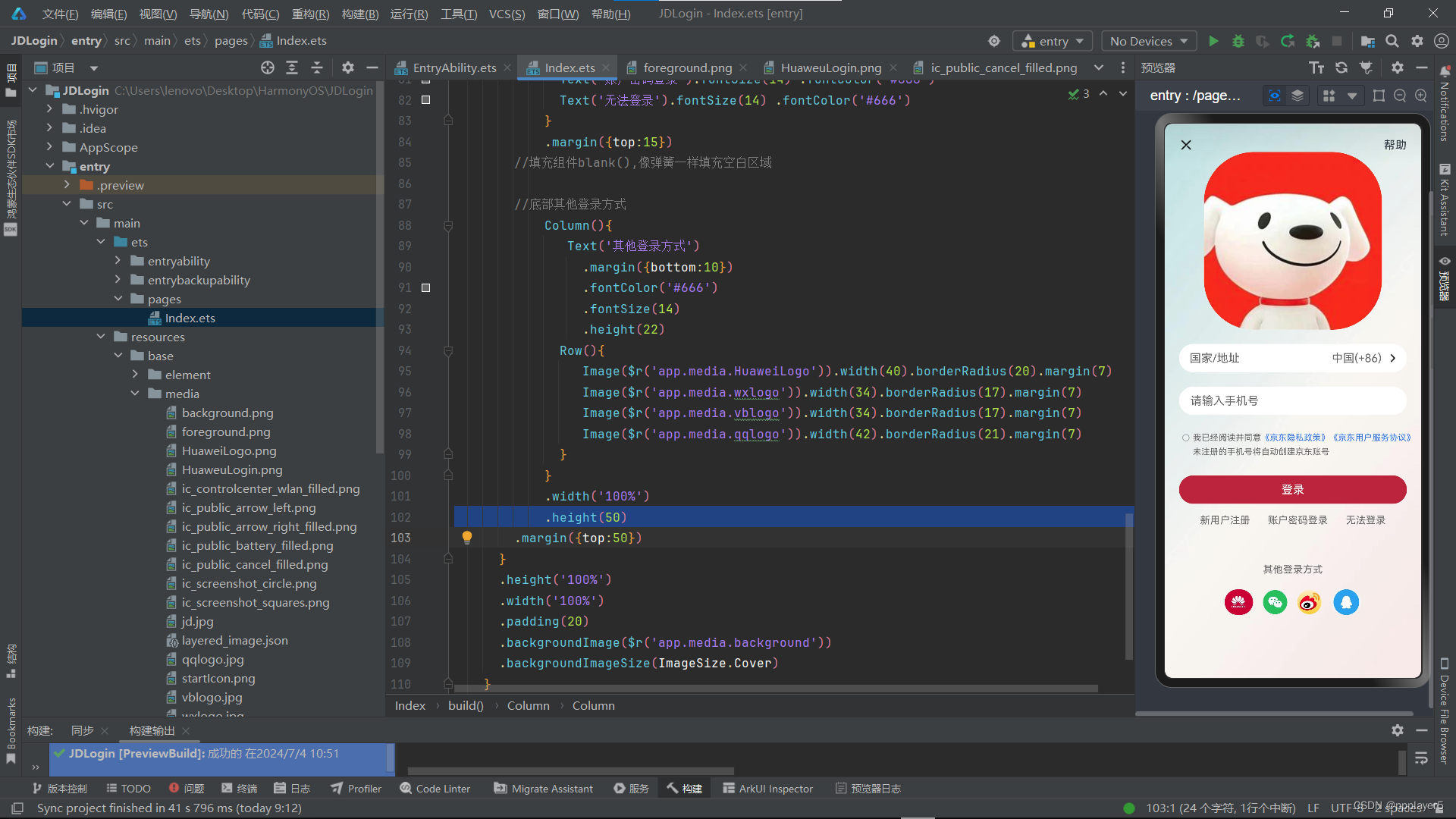
七、综合案例-*京东登录*
1.效果
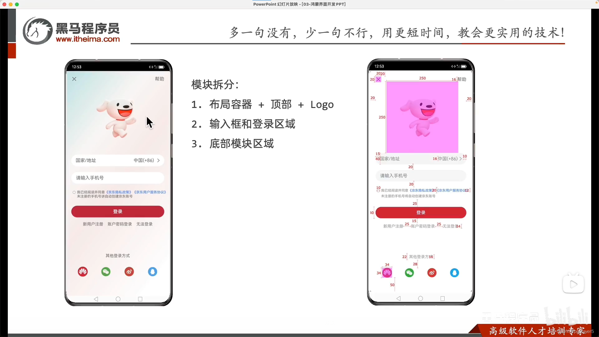
分析:整体分为三大部分
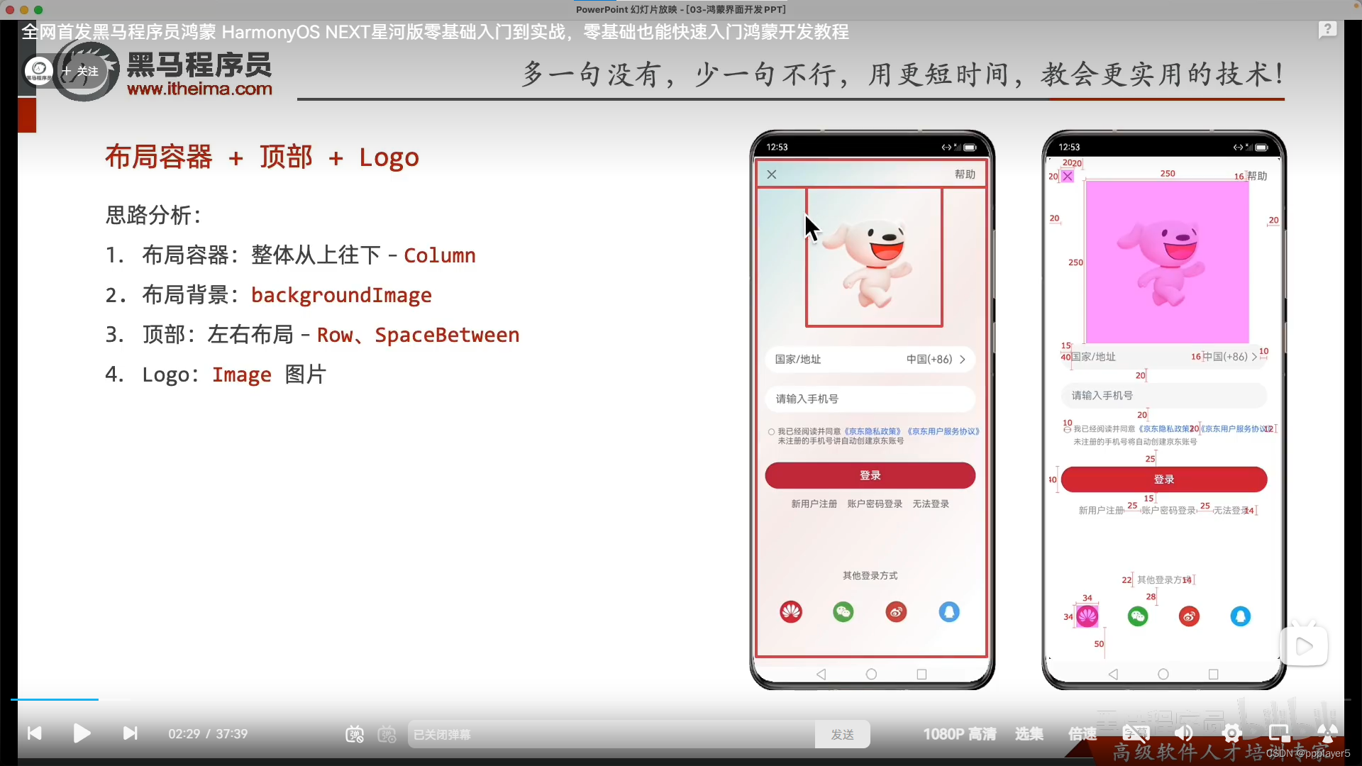
2.代码
  @Entry
  @Component
  struct Index {
    @State message: string = 'Hello World';

    build() {
      Column() {
        //顶部区域
        Row() {
          Image($r('app.media.ic_public_cancel_filled'))
            .width(20)
          Text('帮助')
        }
            .width('100%')
        .justifyContent(FlexAlign.SpaceBetween)

        //logo区域
        Image($r("app.media.jd"))
          .width(250)
          .height(250)
          .borderRadius(70)
          .margin({bottom:20})

        //国家地址(自己画)
        Row(){
              Text('国家/地址')
                .layoutWeight(1)
                .fontColor('#666')
              Text('中国(+86)')
                .margin({right:5})
                .fontColor('#666')
              Image($r('app.media.ic_public_arrow_right_filled'))
                .width(20)
                .margin({right:10})
        }
        .width('100%')
        .height(40)
        .backgroundColor(Color.White)
        .borderRadius(20)
        .padding({left:15})

        //手机号(输入框)
          TextInput({
            placeholder:'请输入手机号'
            })
            .width('100%')
            .height(40)
            .placeholderColor('#666')
            .backgroundColor(Color.White)
            .borderRadius(20)
            .margin({top:20})

        //已阅读
        Row(){
            Checkbox()
              .width(10)
              .margin({top:7})
          Text()
              {
                Span('我已经阅读井同意')
                Span('《京东隐私政策》').fontColor('#3274f6')
                Span('《京东用户服务协议》').fontColor('#3274f6')
                Span('未注册的手机号将自动创建京东账号')
              }
            .fontSize(12)
            .fontColor('#666')
            .lineHeight(20)
            }
            .alignItems(VerticalAlign.Top)
            .margin({top:20})

        //登录
            Button('登录')
              .width('100%')
              .backgroundColor('#bf2838')
              .margin({top:25})

        //新用户注册等链接
            Row({space:25}){
              Text('新用户注册').fontSize(14) .fontColor('#666')
              Text('账户密码登录').fontSize(14) .fontColor('#666')
              Text('无法登录').fontSize(14) .fontColor('#666')
            }
            .margin({top:15})
        //填充组件blank(),像弹簧一样填充空白区域

        //底部其他登录方式
            Column(){
               Text('其他登录方式')
                 .margin({bottom:10})
                 .fontColor('#666')
                 .fontSize(14)
                 .height(22)
              Row(){
                 Image($r('app.media.HuaweiLogo')).width(40).borderRadius(20).margin(7)
                 Image($r('app.media.wxlogo')).width(34).borderRadius(17).margin(7)
                 Image($r('app.media.vblogo')).width(34).borderRadius(17).margin(7)
                 Image($r('app.media.qqlogo')).width(42).borderRadius(21).margin(7)
              }
            }
            .width('100%')
            .height(50)
        .margin({top:50})
      }
      .height('100%')
      .width('100%')
      .padding(20)
      .backgroundImage($r('app.media.background'))
      .backgroundImageSize(ImageSize.Cover)
    }
  }
3.图片
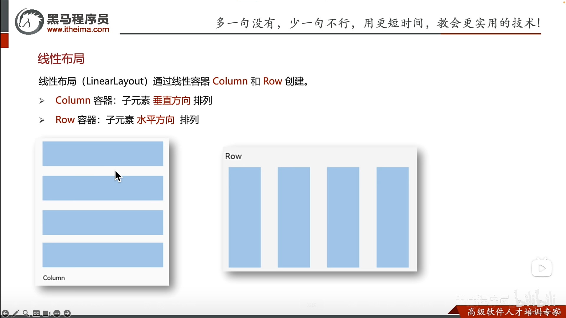
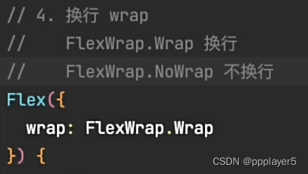
八、弹性布局
线性布局:row、column
弹性布局:涉及到换行时使用,wrap主要用于不规则换行
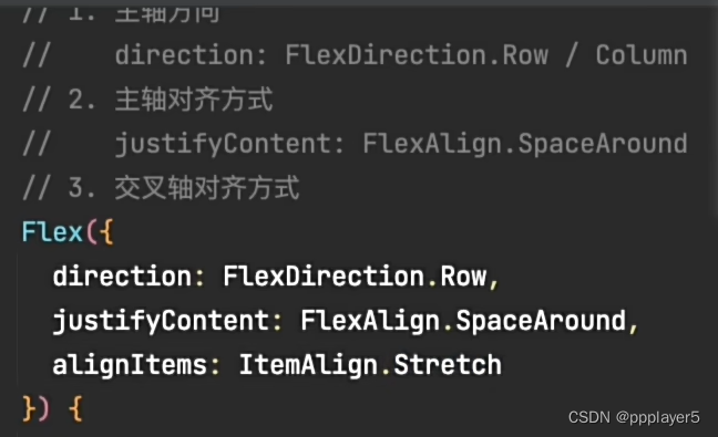
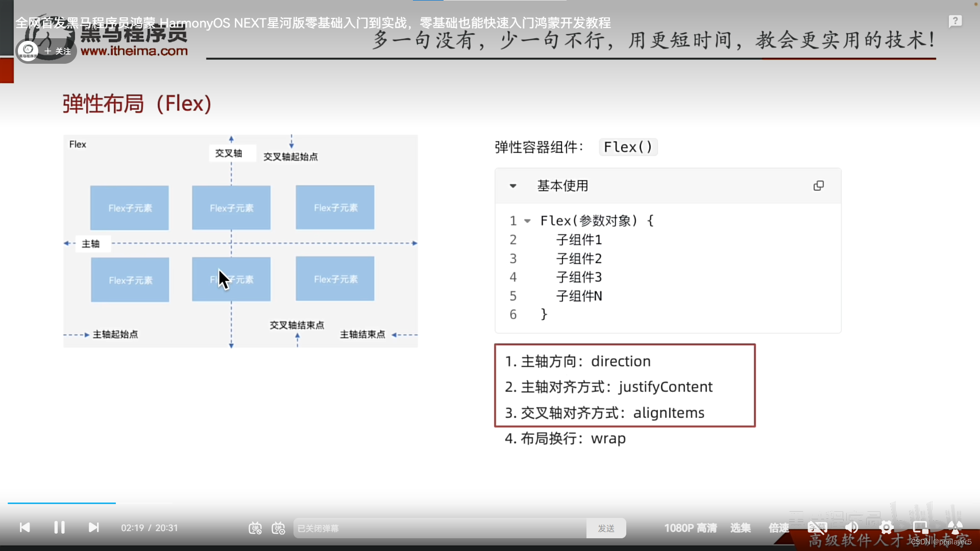 示例:1.主轴方向换为row;2.主轴对齐方式为space around;3.交叉轴对齐方式为stretch;4.换/不换行wrap/nowrap
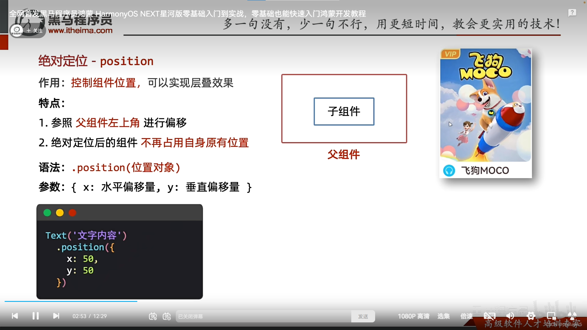
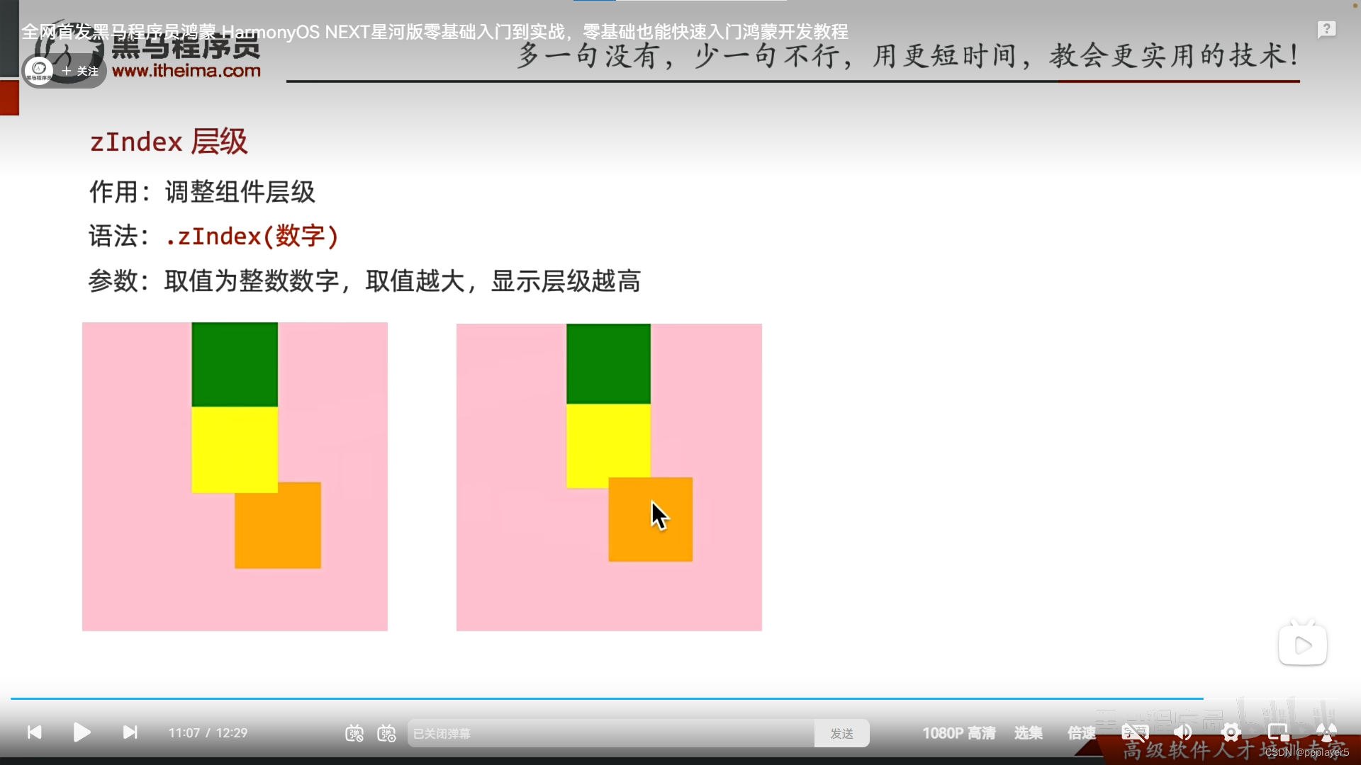
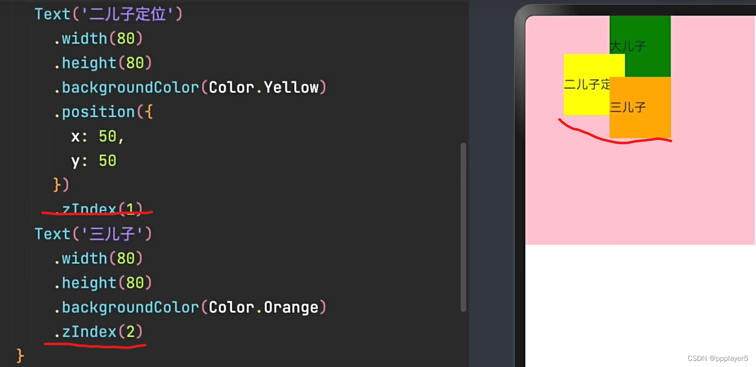
九、绝对定位position
特点:1.相对父组件左顶点偏移(调整位置);2.原本位置不占了,可以任意调整位置
3.实现层叠效果:.zIndex(数字)
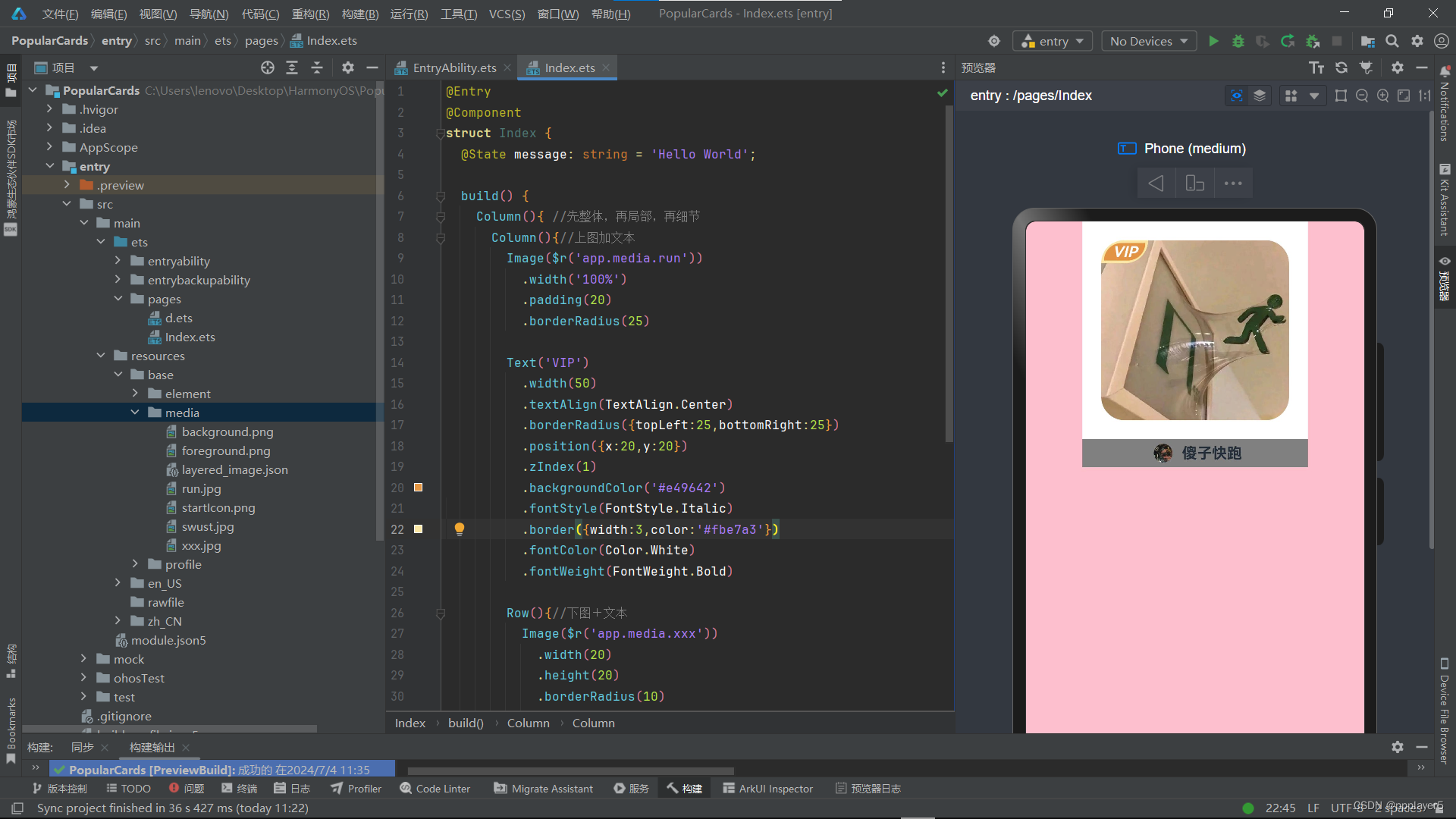
十、综合案例-人气卡片
1.效果
2.代码
@Entry
@Component
struct Index {
  @State message: string = 'Hello World';

  build() {
    Column(){ //先整体,再局部,再细节
      Column(){//上图加文本
        Image($r('app.media.run'))
          .width('100%')
          .padding(20)
          .borderRadius(25)

        Text('VIP')
          .width(50)
          .textAlign(TextAlign.Center)
          .borderRadius({topLeft:25,bottomRight:25})
          .position({x:20,y:20})
          .zIndex(1)
          .backgroundColor('#e49642')
          .fontStyle(FontStyle.Italic)
          .border({width:3,color:'#fbe7a3'})
          .fontColor(Color.White)
          .fontWeight(FontWeight.Bold)

        Row(){//下图+文本
          Image($r('app.media.xxx'))
            .width(20)
            .height(20)
            .borderRadius(10)
            .margin({left:6,right:10})
          Text('傻子快跑')
            .fontWeight(700)
        }
        .backgroundColor(Color.Grey)
        .width('100%')
        .height(30)
        .justifyContent(FlexAlign.Center)
      }
      .width(240)
      .height(260)
      .backgroundColor(Color.White)

    }
    .height('100%')
    .width('100%')
    .backgroundColor(Color.Pink)
  }
}
3.图片
十一、层叠布局Stack
部件的层叠可以使用.zindex如九中绝对定位所示。
页面的层叠使用stack:
Stack({alignContent:Alignment.枚举})//枚举:居中,居右,居左,居下,默认居中
        {

        Item1()

        Item2()

        Item3()

        }

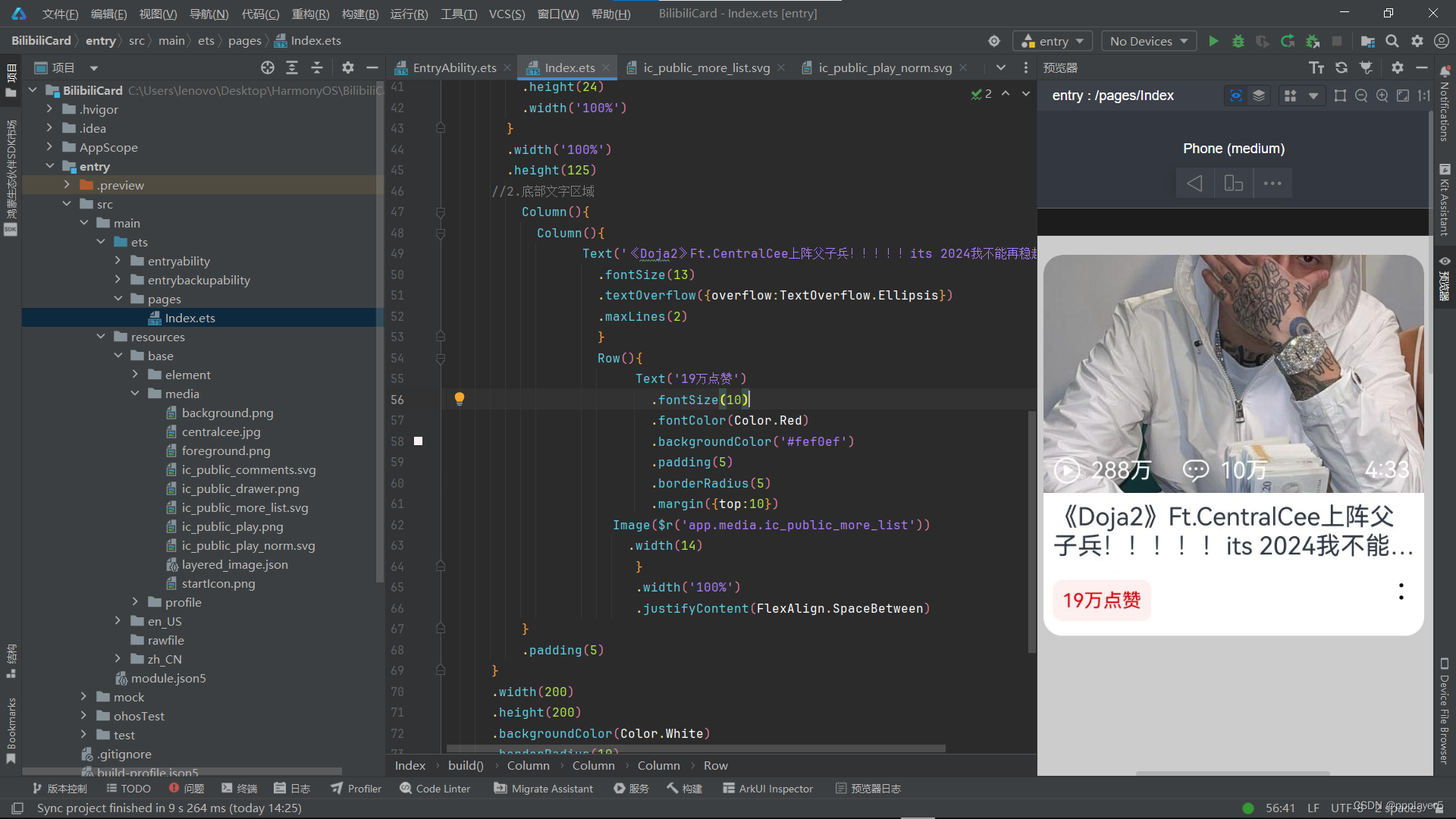
十二、综合案例-B站视频卡片
1.效果
2.代码
@Entry
@Component
struct Index {
  @State message: string = 'Hello World';

  build() {
    Column() {
      //b站视频卡片
      Column(){
        //1.上面图片区域(层叠)
        Stack({alignContent:Alignment.Bottom}){
          Image($r('app.media.centralcee'))
            .width('100%')
            .height('100%')
            .borderRadius({topLeft:10,topRight:10})
          Row(){
            Row({space:5}){
              Image($r('app.media.ic_public_play_norm'))
                .width(15)
                .fillColor(Color.White)
                .margin({left:5})
              Text('288万')
                .fontSize(12)
                .fontColor(Color.White)
                .margin({right:10})

              Image($r('app.media.ic_public_comments'))
                .width(15)
                .fillColor(Color.White)
              Text('10万')
                .fontSize(12)
                .fontColor(Color.White)
            }

            Text('4:33')
              .fontSize(12)
              .fontColor(Color.White)
              .width('100%')
              .margin({left:50})
          }
          .height(24)
          .width('100%')
        }
        .width('100%')
        .height(125)
      //2.底部文字区域
          Column(){
            Column(){
                  Text('《Doja2》Ft.CentralCee上阵父子兵!!!!!its 2024我不能再稳起!!')
                    .fontSize(13)
                    .textOverflow({overflow:TextOverflow.Ellipsis})
                    .maxLines(2)
                    }
                    Row(){
                         Text('19万点赞')
                           .fontSize(10)
                           .fontColor(Color.Red)
                           .backgroundColor('#fef0ef')
                           .padding(5)
                           .borderRadius(5)
                           .margin({top:10})
                      Image($r('app.media.ic_public_more_list'))
                        .width(14)
                         }
                         .width('100%')
                         .justifyContent(FlexAlign.SpaceBetween)
          }
          .padding(5)
      }
      .width(200)
      .height(200)
      .backgroundColor(Color.White)
      .borderRadius(10)
      .margin({top:10})
    }
    .height('100%')
    .width('100%')
    .backgroundColor('#ccc')
  }
}
3.图片
十三、综合案例-*支付宝页面*
1.效果
整体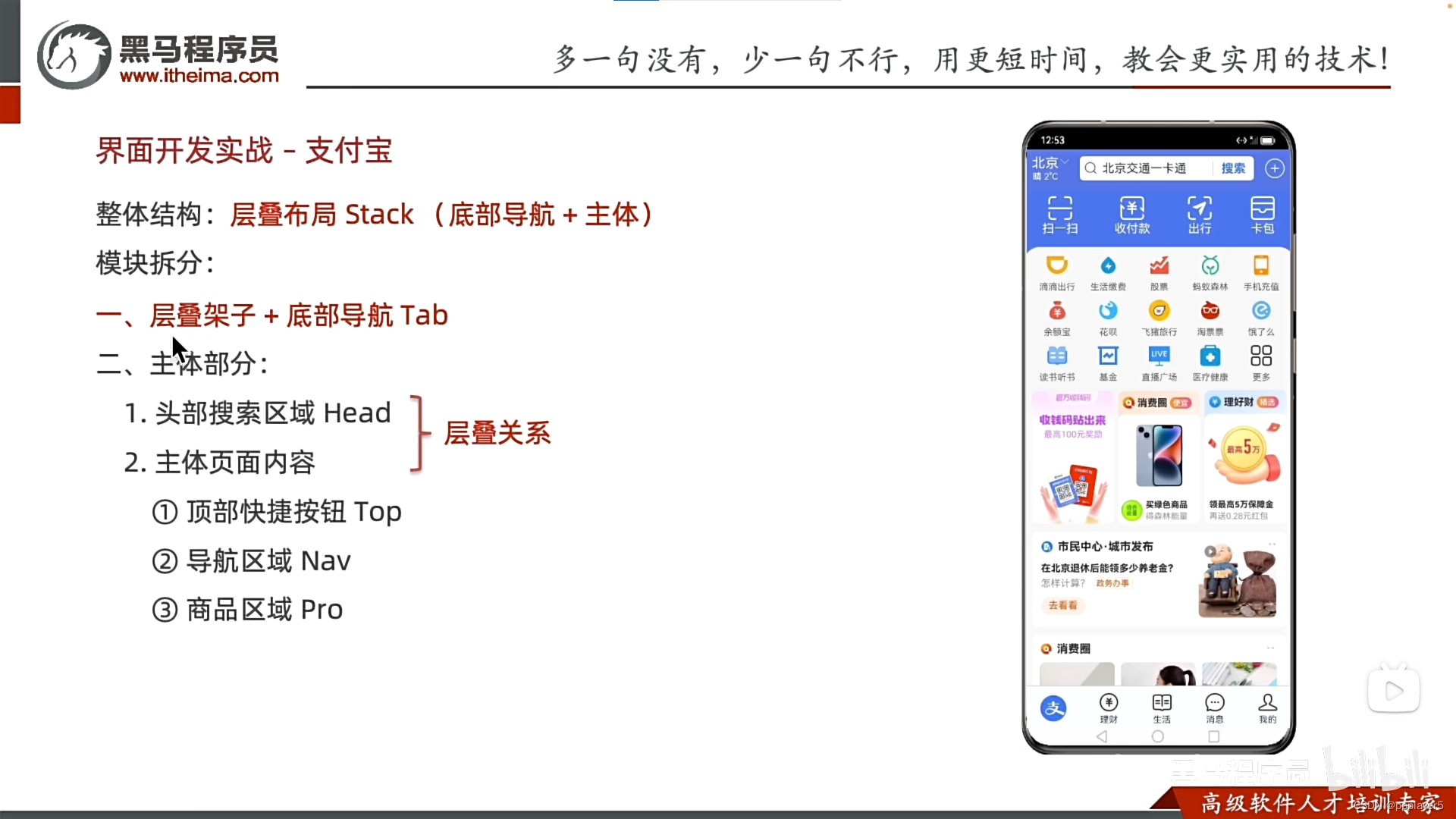
1.层叠架子+底部导航Tab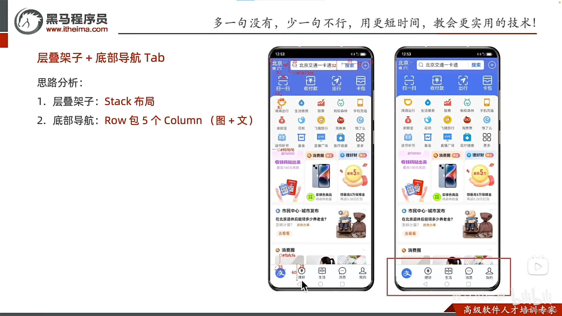
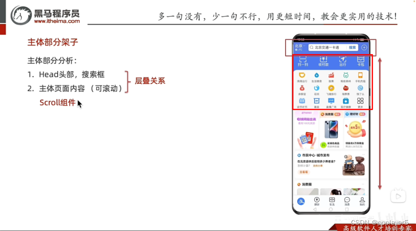
2.主体框架
滚动设置:scroll(){内容}
@Entry
@Component
struct Index {
  @State message: string = 'Hello World';

  build() { //1.整体Stack布局+底部Tab
            //2.主体区域:头部加主体页面(层叠+主页可滚动)
      Stack({alignContent:Alignment.Bottom}){
        //主体展示区
          Stack({alignContent:Alignment.Top}) {
            //头部
            Row() {
              Text('搜索区域').fontColor('#fff')
            }
            .width('100%')
            .height(60)
            .backgroundColor('#5b73de')
            .zIndex(666)

            //主体页面
            Scroll() {
              Column() {
                Text('cdsc').height(200)
                Text('cdsc').height(200)
                Text('cdsc').height(200)
                Text('cdsc').height(200)
                Text('cdsc').height(200)
                Text('cdsc').height(200)
                Text('cdsc').height(200)
              }
              .width('100%')
              .padding({top:60,bottom:60})
            }
          }
          .width('100%')
        .height("100%")
        //底部Tab导航区
        Row(){
            Column(){
              Image($r('app.media.zhifubao'))
                .width(36)
                .height(36)
                .borderRadius(18)
            }
            .layoutWeight(1)

          Column(){
            Image($r('app.media.licai'))
              .width(28)
              .margin({bottom:1})
              Text('理财')
                .fontSize(12)
          }
          .layoutWeight(1)

          Column(){
            Image($r('app.media.life'))
              .width(28)
              .margin({bottom:1})
            Text('生活')
              .fontSize(12)
          }
          Column(){
            Image($r('app.media.new'))
              .width(22)
              .margin({bottom:3})
            Text('消息')
              .fontSize(12)
          }
          .layoutWeight(1)

          Column(){
            Image($r('app.media.mine'))
              .width(24)
              .margin({bottom:1})
            Text('我的')
              .fontSize(12)
          }
          .layoutWeight(1)
        }
        .width('100%')
        .height(60)
        .backgroundColor('#fbfcfe')
      }


    .height('100%')
    .width('100%')
    .backgroundColor(Color.Pink)
  }
}
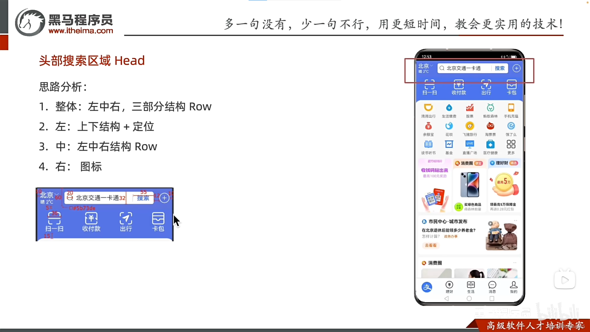
3.头部搜索区域
4.顶部快捷按钮

2.代码
@Entry
@Component
struct Index {
@State message: string = 'Hello World';
build() { //1.整体Stack布局+底部Tab
//2.主体区域:头部加主体页面(层叠+主页可滚动)
Stack({alignContent:Alignment.Bottom}){
//主体展示区
Stack({alignContent:Alignment.Top}) {
//头部
Row() {
//左边
Column(){
Text('北京').fontSize(18).fontColor('#fff')
Text('晴 2°C').fontSize(12).fontColor('#fff')
Image($r('app.media.xiangxia'))
.position({x:40,y:0})
.width(12)
.fillColor('#fff')//向下箭头要为svg格式才能改
}
//中间
Row(){//最顶部天气、搜索等
Image($r('app.media.center'))
.width(20)
.margin({left:5,right:5})
Text('北京交通一卡通')
.fontSize(16)
.layoutWeight(1)
Text('搜索')
.width(55)
.fontWeight(700)
.fontColor('#5b73de')
.textAlign(TextAlign.Center)
.border({width:{left:1},color:Color.Gray})
}
.height(32)
.layoutWeight(1)
.backgroundColor(Color.White)
.borderRadius(5)
.margin({left:25,right:25})
//右边
Row(){
Image($r('app.media.add'))
.width(22)
.fillColor(Color.White)
}
}
.padding({left:10,right:10})
.width('100%')
.height(60)
.backgroundColor('#5b73de')
.zIndex(666)
//主体页面
Scroll() {
Column() {
Row(){//top按键快捷区域
Column(){
Image($r('app.media.saoyisao'))
.width(36)
.fillColor(Color.White)
Text('扫一扫')
.fontColor(Color.White)
}
.layoutWeight(1)
Column(){
Image($r("app.media.shoufukuan"))
.width(36)
.fillColor(Color.White)
Text('收付款')
.fontColor(Color.White)
}
.layoutWeight(1)
Column(){
Image($r("app.media.chuxing"))
.width(36)
.fillColor(Color.White)
Text('出行')
.fontColor(Color.White)
}
.layoutWeight(1)
Column(){
Image($r("app.media.kabao"))
.width(36)
.fillColor(Color.White)
Text('卡包')
.fontColor(Color.White)
}
.layoutWeight(1)
}
.backgroundColor('#5b73de')
.padding({top:5,bottom:20})
//主体区域(背景色#f6f6f6)
Column(){
//导航区
Column({space:10}){
Row(){
Column(){
Image($r('app.media.didichuxing'))
.width(28).margin({bottom:8})
Text('滴滴出行')
.fontSize(12)
}
.layoutWeight(1)
Column(){
Image($r('app.media.shenghuojiaofei'))
.width(28).margin({bottom:8})
Text('生活缴费')
.fontSize(12)
}
.layoutWeight(1)
Column(){
Image($r('app.media.gupiao'))
.width(28).margin({bottom:8})
Text('股票')
.fontSize(12)
}
.layoutWeight(1)
Column(){
Image($r('app.media.mayisenlin'))
.width(28).margin({bottom:8})
Text('蚂蚁森林')
.fontSize(12)
}
.layoutWeight(1)
Column(){
Image($r('app.media.shoujicongzi'))
.width(28).margin({bottom:8})
Text('手机充值')
.fontSize(12)
}
.layoutWeight(1)
}
Row(){
Column(){
Image($r('app.media.yuerbao'))
.width(28).margin({bottom:8})
Text('余额宝')
.fontSize(12)
}
.layoutWeight(1)
Column(){
Image($r('app.media.huabei'))
.width(28).margin({bottom:8})
Text('花呗')
.fontSize(12)
}
.layoutWeight(1)
Column(){
Image($r('app.media.feizulvxin'))
.width(28).margin({bottom:8})
Text('飞猪旅行')
.fontSize(12)
}
.layoutWeight(1)
Column(){
Image($r('app.media.taopiaopiao'))
.width(28).margin({bottom:8})
Text('淘票票')
.fontSize(12)
}
.layoutWeight(1)
Column(){
Image($r('app.media.erleme'))
.width(28).margin({bottom:8})
Text('饿了么')
.fontSize(12)
}
.layoutWeight(1)
}
Row(){
Column(){
Image($r('app.media.shuben'))
.width(28).margin({bottom:8})
Text('听书读书')
.fontSize(12)
}
.layoutWeight(1)
Column(){
Image($r('app.media.jijing'))
.width(28).margin({bottom:8})
Text('基金')
.fontSize(12)
}
.layoutWeight(1)
Column(){
Image($r('app.media.zhiboguangchang'))
.width(28).margin({bottom:8})
Text('直播广场')
.fontSize(12)
}
.layoutWeight(1)
Column(){
Image($r('app.media.yibao'))
.width(28).margin({bottom:8})
Text('医疗健康')
.fontSize(12)
}
.layoutWeight(1)
Column(){
Image($r('app.media.gengduo'))
.width(28).margin({bottom:8})
Text('更多')
.fontSize(12)
}
.layoutWeight(1)
}
}
.padding(10)
//产品区
Row({space:10}){
Image($r('app.media.1'))
.width(150)
.borderRadius(5)
.layoutWeight(1)
Image($r('app.media.2'))
.width(150)
.borderRadius(5)
.borderRadius(5)
.layoutWeight(1)
Image($r('app.media.3'))
.layoutWeight(1)
}
.padding(10)
Column({space:10}){
Image($r('app.media.4'))
.width('100%')
Image($r('app.media.5'))
.width('100%')
}
.padding(10)
}
.height(1000)
.width('100%')
.backgroundColor('#fff')
.borderRadius({topLeft:20,topRight:20})
}
.width('100%')
.padding({top:60,bottom:60})
}
}
.width('100%')
.height("100%")
//底部Tab导航区
Row(){
Column(){
Image($r('app.media.zhifubao'))
.width(36)
.height(36)
.borderRadius(18)
}
.layoutWeight(1)
Column(){
Image($r('app.media.licai'))
.width(28)
.margin({bottom:1})
Text('理财')
.fontSize(12)
}
.layoutWeight(1)
Column(){
Image($r('app.media.shenghuo'))
.width(28)
.margin({bottom:1})
Text('生活')
.fontSize(12)
}
.layoutWeight(1)
Column(){
Image($r('app.media.xiaoxi'))
.width(26)
.margin({bottom:1})
Text('消息')
.fontSize(12)
}
.layoutWeight(1)
Column(){
Image($r('app.media.wode'))
.width(24)
.margin({bottom:1})
Text('我的')
.fontSize(12)
}
.layoutWeight(1)
}
.width('100%')
.height(60)
.backgroundColor('#fbfcfe')
}
.height('100%')
.width('100%')
.backgroundColor('#5b73de')
}
}3.图片


六、动态交互界面
一、字符串
1.字符串拼接与模板字符串
注意:+号两边只要有字符串就有拼接的作用(数字的话就是求和)

2.类型转化(字符串与数字)
1.字符串转数字:用于计算

2.数字转字符串
二、点击交互OnClick

三、状态管理State


计数器示例:

@Entry
@Component
struct Index {
  @State count: number = 1;

  build() {
    Row() {
      Button('-')
        .onClick(()=>{
          this.count=this.count-1
        })
      Text(this.count.toString()).margin(10)
      Button('+')
        .onClick(()=>{
          this.count=this.count+1
        })
    }
    .padding(30)
    .height('100%')
    .width('100%')
  }
}
四、运算符
1.算数运算符

2.赋值运算符

*点赞示例*:

@Entry
@Component
struct Index {
  @State color:string='#7e7e7e'//添加颜色的动态变量
  @State count:number=8888//添加数字的动态变量

  build() {
    Column() {
      Column({ space: 8}) {
        // 图片
        Image($r('app.media.eyes'))
          .width('100%')
          .borderRadius({topLeft: 6, topRight: 6})
        // 标题文字
        Text('考眼力又来了你能看到几只鸭子?')
          .fontSize(14)
          .lineHeight(18)
          .padding({left: 5, right: 5})
        // 来源和点赞
        Row(){
          Text() {
            ImageSpan($r('app.media.avatar'))//文本里面加图片用imagespan
              .width(16)
              .margin({right: 3})
            Span('视野联行眼镜')
              .fontSize(12)
              .fontColor('#7e7e7e')
          }
          Row() {
            Image($r('app.media.ic_love'))
              .margin({right: 3})
              .width(14)
              .fillColor(this.color)//调用颜色动态变量
            Text(this.count.toString())//调用数字动态变量并且将数字文本展示出来
              .fontSize(12)
              .fontColor('#7e7e7e')
          }
          .onClick(()=>{//添加点击事件:改颜色、改数字
            this.color='#ff0000'
              this.count+=1
          })

        }
        .width('100%')
        .justifyContent(FlexAlign.SpaceBetween)
        .padding({left: 5, right: 5})
      }
      .width('50%')
    }
    .padding(20)
  }
}
3.一元运算符

4.比较运算符

5.逻辑运算符

6.运算符优先级

*美团购物车示例*:

@Entry
@Component
struct Index {
  @State count:number=1
  @State oldprice:number=40.4
  @State newprice:number=20.2
  build() {
    Column() {
      Column() {
        // 产品
        Row({ space: 10}){
          // 图片
          Image($r('app.media.product1'))
            .width(100)
            .borderRadius(8)
          // 文字
          Column({space: 10}) {
            Column({ space: 6}) {
              Text('冲销量1000ml缤纷八果水果捞')
                .lineHeight(20)
                .fontSize(14)
              Text('含1份折扣商品')
                .fontSize(12)
                .fontColor('#7f7f7f')
            }
            .width('100%')
            .alignItems(HorizontalAlign.Start)
            Row(){
              // 价格
              Row({ space: 5}) {
                Text() {
                  Span('¥')
                    .fontSize(14)
                  Span(this.newprice.toFixed(2))
                    .fontSize(18)
                }
                .fontColor('#ff4000')
                Text() {
                  Span('¥')
                  Span(this.oldprice.toFixed(2))
                }
                .fontSize(14)
                .fontColor('#999')
                .decoration({type: TextDecorationType.LineThrough, color: '#999'})
              }
              // 加减
              Row() {
                Text('-')
                  .width(22)
                  .height(22)
                  .border({width:1, color: '#e1e1e1', radius: {topLeft: 5, bottomLeft: 5}})
                  .textAlign(TextAlign.Center)
                  .fontWeight(700)
                  .onClick(()=>{
                    this.count--
                  })
                Text(this.count.toString())
                  .height(22)
                  .border({width: { top:1, bottom: 1 }, color: '#e1e1e1'})
                  .padding({left: 10, right: 10})
                  .fontSize(14)
                Text('+')
                  .width(22)
                  .height(22)
                  .border({width:1, color: '#e1e1e1', radius: {topRight: 5, bottomRight: 5}})
                  .textAlign(TextAlign.Center)
                  .fontWeight(700)
                  .onClick(()=>{
                    this.count++
                  })
              }
            }
            .width('100%')
            .justifyContent(FlexAlign.SpaceBetween)
          }
          .height(75)
          .layoutWeight(1)
          .justifyContent(FlexAlign.SpaceBetween)
        }
        .width('100%')
        .alignItems(VerticalAlign.Top)
        .padding(20)

        // 结算
        Row({ space: 10 }){
          // 价格
          Column({space: 5}) {
            Text() {
              Span(`已选${this.count}件,`)
                .fontColor('#848484')
              Span('合计:')
              Span('¥')
                .fontColor('#fd4104')
              Span((this.count * this.newprice).toFixed(2))
                .fontColor('#fd4104')
                .fontSize(16)
            }
            .fontSize(14)
            Text('共减'+(this.count*(this.oldprice-this.newprice)).toFixed(2))
              .fontColor('#fd4104')
              .fontSize(12)
          }
          .alignItems(HorizontalAlign.End)
          // 结算按钮
          Button('结算外卖')
            .width(110)
            .height(40)
            .backgroundColor('#fed70e')
            .fontColor('#564200')
            .fontSize(16)
            .fontWeight(600)
        }
        .width('100%')
        .height(70)
        .backgroundColor('#fff')
        .position({x:0, y: '100%'})
        .translate({y: '-100%'})
        .padding({ left: 20, right: 20 })
        .justifyContent(FlexAlign.End)
      }
    }
    .width('100%')
    .height('100%')
    .backgroundColor('#f3f3f3')
  }
}
五、数组
1.数组查找增加删除替换
数组下标:从零开始
数组长度:数组名.length

2.遍历数组
数组的最后一项:names[names.length-1]
方法一:常用
方法二:

3.对象数组

4.foreach-渲染控制
index是序号

示例:
1.数组里面包字符串

2.数组里面包对象数组

interface Article {
  title: string
  createTime: string//创建对象数组:定义接口
}

@Entry
@Component
struct Index {
  @State articles: Article[] = [
    {
      title: '近200+自动驾驶数据集全面调研!一览如何数据闭环全流程',//创建对象数组
      createTime: '2024-01-31 09:59:43'
    },
    {
      title: 'MySQL Shell 8.0.32 for GreatSQL编译二进制包',
      createTime: '2024-01-31 09:55:53'
    },
    {
      title: '在Redis中如何实现分布式事务的一致性?',
      createTime: '2024-01-31 09:54:51'
    },
  ]

  build() {
    Scroll() {
      Column() {
        ForEach(this.articles,(item:Article,index:number)=>{//遍历对象数组
          // 单个新闻结构
          Column() {
            Text(item.title)//展示题目
              .width('100%')
              .fontSize(15)
              .fontColor('#303030')
              .lineHeight(20)
            Text(item.createTime)//展示时间
              .margin({top: 15})
              .width('100%')
              .fontSize(12)
              .fontColor('rgb(192, 192, 192)')
          }
          .padding({top: 15, bottom: 15})
          .width('100%')
          .border({
            width: {bottom: 2},
            color: {bottom: '#f4f4f4'}
          })
        })

      }
      .constraintSize({
        minHeight: '100%'
      })
    }
    .padding({ left: 13, right: 13 })
    .width('100%')
    .height('100%')
  }
}
六、语句
1.if
单分支

双分支

多分支

*购物车数字框示例*

@Entry
@Component
struct Index {
  @State count:number=1

  build() {
    Column() {
      Row() {
        Text('-')
          .width(40)
          .height(40)
          .border({width: 2, color: '#999', radius: {topLeft: 3, bottomLeft:3}})
          .textAlign(TextAlign.Center)
          .onClick(()=>{
            //大于1可以减
            if(this.count>1){this.count-=1}
            //小于1就提示
            else {//弹窗
              AlertDialog.show({
                message:'最小值为1,不能再减'
              })
            }
          })

        Text(this.count.toString())
          .height(40)
          .padding({left: 20, right: 20 })
          .border({width: {top: 2, bottom: 2}, color: '#999'})
          .fontSize(14)

        Text('+')
          .width(40)
          .height(40)
          .border({width: 2, color: '#999', radius: {topRight: 3, bottomRight: 3}})
          .textAlign(TextAlign.Center)
          .onClick(()=>{
            this.count+=1
          })

      }
    }
    .padding(20)
  }
}
2.switch

3.三元条件表达式
用于简单判断语句

4.if条件渲染

*京东加购案例*

@Entry
@Component
struct Index {
  //库存,有库存>0
@State count:number=0//无库存

  build() {
    Column() {
      Column() {
        // 底部菜单
        Row({space: 10}) {
          // 左侧菜单
          Row() {
            Column({space: 5}) {
              Image($r('app.media.ic_dianpu'))
                .width(20)
              Text('店铺')
                .fontSize(10)
                .fontColor('#262626')
            }
            Column({space: 5}) {
              Image($r('app.media.ic_kefu'))
                .width(20)
                .fillColor('#666')
              Text('客服')
                .fontSize(10)
                .fontColor('#262626')
            }
            Column({space: 5}) {
              Image($r('app.media.ic_cart2'))
                .width(20)
                .fillColor('#666')
              Text('购物车')
                .fontSize(10)
                .fontColor('#262626')
            }
          }
          .layoutWeight(1)
          .justifyContent(FlexAlign.SpaceBetween)

          if(this.count>0){
            // 右侧按钮 -- 可以购买
            Row({space: 5}) {
              Button('加入购物车')
                .width(105)
                .height(40)
                .backgroundColor('#ffcc00')
                .fontSize(14)
                .fontWeight(600)
              Button('立即购买')
                .width(105)
                .height(40)
                .backgroundColor('#f92c1b')
                .fontSize(14)
                .fontWeight(600)
            }
          }
          else {
            // 右侧按钮 -- 不能购买
            Row() {
              Button('查看类似商品')
                .width(170)
                .height(40)
                .backgroundColor('#ffcc00')
                .fontSize(14)
                .fontWeight(600)
            }
          }


        }
        .width('100%')
        .height(60)
        .backgroundColor('#f7f7f7')
        .padding({left: 20, right: 10})
        // 消息提示:库存 <= 0 显示,否则隐藏
        if (this.count<=0){
        Row() {
          // 左侧
          Row({ space: 5 }){
            Image($r('app.media.ic_lingdang'))
              .width(12)
              .fillColor('#de6a1c')
            Text('该商品暂时没有库存,看看相似商品吧')
              .fontSize(10)
              .fontColor('#de6a1c')
          }
          // 右侧
          Image($r('app.media.ic_shangjiantou'))
            .width(15)
            .padding(3)
            .fillColor('#d0662c')
            .backgroundColor('rgba(0,0,0,0.1)')
            .borderRadius(8)
        }
          .width('100%')
          .height(36)
          .backgroundColor('#fbf9da')
          .position({x: 0, y: '-36'})
          .padding({left: 20, right: 20})
          .justifyContent(FlexAlign.SpaceBetween)}

      }
      .position({x:0,y:'100%'})
      .translate({y: '-100%'})
    }
    .width('100%')
    .height('100%')
    .padding({bottom:20})
    .backgroundColor('#f2f2f2')
  }
}
5.循环语句
while

for

退出循环

综合案例-*生肖抽奖卡*
0.整体效果:

1.抽卡页面
badge角标:

Grid布局:一个3行4列的排布

数据动态渲染:
明确哪些数据需要动态效果

2.随机生肖卡页面
3.跳转效果(显隐效果控制)
动画:.animatio({duration:数字})
缩放:.scale({x:数字,y:数字})

4.抽奖效果
math.random:取随机数【0,1)
math.floor:向下取整

5.大奖页面

6.随机奖品

interface ImageCount{
  count:number
  utr:string
}

@Entry
@Component
struct Index {
  @State mask0pacity:number=0//透明度
  @State maskZindex:number=-1//层级设置,不然点不到-立即抽卡-
  @State maskX:number=0//抽卡动画:水平缩放比
  @State maskY:number=0//抽卡动画:垂直缩放比
  @State randomindex:number=-1//抽奖效果:第1到6,默认-1没有表示还没抽
  @State isget:boolean=false//中大奖的遮罩显隐
  @State arr:string[]=['pg','hw','xm']//奖池
  @State prize:string=''//默认没中奖
  @State images: ImageCount[] = [
    { utr: 'app.media.bg_00', count: 0 },
    { utr: 'app.media.bg_01', count: 0 },
    { utr: 'app.media.bg_02', count: 0 },
    { utr: 'app.media.bg_03', count: 0 },
    { utr: 'app.media.bg_04', count: 0 },
    { utr: 'app.media.bg_05', count: 0 },
]
  build() {
    Stack() {
      //首页
      Column() {
        // Grid布局的基本使用: 规则的行列布局中非常常见, 3行4列
        Grid() {
          ForEach(this.images, (item: ImageCount, index: number) => {
            GridItem() {
              Badge({
                count: item.count,
                position: BadgePosition.RightTop,
                style: {
                  fontSize: 14,
                  badgeSize: 20,
                  badgeColor: '#fa2a2d'
                }
              }) {
                Image($r(item.utr))
                  .width(100)
              }
              .width(100)
              .height('100%')
            }
          })
        }
        .columnsTemplate('1fr 1fr 1fr')
        .rowsTemplate('1fr 1fr')
        .columnsGap(10)
        .rowsGap(10)
        .width('100%')
        .height(300)
        .margin({ top: 100 })
        .padding(10)

        Button('立即抽卡')
          .backgroundColor('#de668d')
          .width(200)
          .margin({ top: 50 })
          .onClick(()=>{
            this.mask0pacity=1//点击时修改遮罩参数
            this.maskZindex=99
            this.maskX=1//点击时图片缩放
            this.maskY=1
            this.randomindex=Math.floor(Math.random()*6)//取【0,5】的整数
          })
      }
      .width('100%')
      .height('100%')

      //获取生肖卡页面(层叠效果)
      Column({space:40}) {
        Text('获得生肖卡')
          .fontColor('#fffff2')
          .fontSize(25)
          .fontWeight(FontWeight.Bold)
          .margin({top:180})
        Image($r(`app.media.img_0${this.randomindex}`))
          .width(200)
          .scale({x:this.maskX,y:this.maskY})
          .animation({duration:500})

        Button('开心收下')
          .width(200)
          .height(50)
          .backgroundColor(Color.Transparent)
          .border({width:2,color:'#fff8f1'})
          .onClick(()=>{
            this.mask0pacity=0//控制弹层隐层
            this.maskZindex=-1
            this.maskX=0//恢复缩放比为零
            this.maskY=0

            //开心收下,计算角标与刷新图片:若对象数组需要更新则修改替换整个对象
            this.images[this.randomindex]={
              utr:`app.media.img_0${this.randomindex}`,
              count:this.images[this.randomindex].count+1
            }
            //每次收完卡片,需要进行简单检索,判断是否集齐:count都大于0
            let flag:boolean=true
            for (let item of this.images){
              if(item.count==0){
                flag=false
                break
              }
            }
            this.isget=flag

            //判断中奖
            if (flag){
              let randomindex:number=Math.floor(Math.random()*3)
              this.prize=this.arr[randomindex]
            }
          })
      }
      .width('100%')
      .height('100%')
      .backgroundColor('#cc000000') //给颜色加透明度(左边小方框)
      .opacity(this.mask0pacity)//透明度设置
      .zIndex(this.maskZindex)//重叠等级设置
      .animation({duration:500})//抽卡动画

      //抽大奖页面(遮罩层)
      if (this.isget){
        Column({space:30}){
          Text('恭喜获得一部手机')
            .fontColor('#f1ecdf')
            .fontWeight(700)
            .fontSize(25)
          Image($r(`app.media.${this.prize}`))
            .width(300)
          Button('再来一次')
            .width(200)
            .height(50)
            .backgroundColor(Color.Transparent)
            .border({width:2,color:'#f1ecdf'})
            .onClick(()=>{
              this.isget=false
              this.prize=''
              this.images=[
                { utr: 'app.media.bg_00', count: 0 },
                { utr: 'app.media.bg_01', count: 0 },
                { utr: 'app.media.bg_02', count: 0 },
                { utr: 'app.media.bg_03', count: 0 },
                { utr: 'app.media.bg_04', count: 0 },
                { utr: 'app.media.bg_05', count: 0 },
              ]
            })
        }
        .width('100%')
        .height('100%')
        .justifyContent(FlexAlign.Center)
        .backgroundColor('#cc000000')
      }

    }
  }
}
七、轮播组件
1.Swiper基本用法
2.Swiper属性

3.Swiper自定义样式
设置与图片一样的宽高比:.aspectratio(数字)

八、样式&结构重用
1.@Extend:拓展组件样式、事件

2.@Styles:抽取通用属性、事件
全局定义、组件内定义(不支持传参)

3.@Builder:自定义构建函数(结构、样式、事件)

九、Scroll滚动
1.核心用法

2.常见属性

3.控制器
返回到顶部、底部等

4.事件
添加逻辑:如滚动到一定距离时显示控制器等

*滚动-京东案例*

@Entry
@Component
struct Index3 {

  // 1. 创建scroll实例对象
  myScroll: Scroller = new Scroller()
  @State yOffset: number = 0 // 实时保存y轴滚动的距离

  build() {
    Column() {
      Stack({ alignContent: Alignment.BottomEnd }) {
        // 顶部滚动区域
        // 2. 和Scroll容器绑定
        Scroll(this.myScroll) {
          Column() {
            Image($r('app.media.ic_jd_scroll_01'))
            Image($r('app.media.ic_jd_scroll_02'))
            Image($r('app.media.ic_jd_scroll_03'))
          }
        }
        .scrollBar(BarState.Off)
        .width('100%')
        .backgroundColor(Color.Orange)
        .onScroll(() => {
          this.yOffset = this.myScroll.currentOffset().yOffset
          console.log('yOffset', this.yOffset)
        })

        // 有时显示, 有时隐藏 → 条件渲染
        if (this.yOffset > 400) {
          Image($r('app.media.ic_jd_rocket'))
            .width(40)
            .backgroundColor(Color.White)
            .borderRadius(20)
            .padding(5)// .margin({right:20,bottom:20})
            .offset({ x: -20, y: -20 })
            .onClick(() => {
              // 3. 调用实例方法完成回到顶部的功能
              this.myScroll.scrollEdge(Edge.Top)
            })
        }
      }
      .layoutWeight(1)

      // 底部 tabbar 图片(后面会学)
      Image($r('app.media.ic_jd_tab'))
        .width('100%')
    }
  }
}
十、容器组件Tabs
1.基本用法
底部导航、顶部导航等

2.常用属性

3.滚动导航栏

*示例*:

4.自定义TabBar
1.导航栏图片显示

2.导航栏高亮切换

*示例*:

七、补充基础知识
一、class类

1.class类--实例属性

2.class类--构造函数

3.class类--定义方法

4.class类--静态属性与静态方法
访问的为类的属性方法

5.extends+super

6.instanceof+typeof
两个都是判断作用,typeof仅能用于简单类型
7.修饰符(readonly等)
readonly、private、protected、public...


 扫一扫
扫一扫


 8620
8620

 被折叠的 条评论
为什么被折叠?
被折叠的 条评论
为什么被折叠?
 到【灌水乐园】发言


