


一、html+css


块级标签:div、p、标题标签、列表标签
行内标签:a 、span、strong、img
html5新特性

本地存储

那么localStorage 和 sessionStorage 二者有什么区别呢?🤔️
💡 他们的区别在于:
localStorage的生命周期是永久的,除非用户清除 localStorage 信息,否则这些信息将永远存在。
sessionStorage的生命周期是临时的,一旦当前窗口或标签页被关闭了,那么通过它存储的数据也就被清空了
<!DOCTYPE html>
<html lang="en">
  <head>
    <meta charset="UTF-8" />
    <meta name="viewport" content="width=device-width, initial-scale=1.0" />
    <title>Document</title>
    <script>
      // 语句 1: 保存数据到本地存储
      localStorage.setItem("ExpireTime", "1527592757");
      localStorage.UserId = "2021008";
      // 语句 2: 根据指定名称获取本地存储中的数据
      var expireTime = localStorage.getItem("ExpireTime");
      console.log(expireTime);
      // 语句 3: 根据指定名称从本地存储中移除
      localStorage.removeItem("ExpireTime");
      // 语句 4: 清除本地存储中所有数据
      localStorage.clear();
    </script>
  </head>

  <body></body>
</html> 
css
选择器
后代选择器:父标签名和后代标签名必须用空格隔开,这样才能识别是某个标签内部的后代元素。
<!DOCTYPE html>
<html lang="en">
  <head>
    <meta charset="UTF-8" />
    <meta name="viewport" content="width=device-width, initial-scale=1.0" />
    <title>Document</title>
    <style>
      #paragraph p {
        color: lightskyblue;
      }
    </style>
  </head>
  <body>
    <div id="paragraph">
      <p>这是一个段落</p>
    </div>
  </body>
</html>
群组选择器是用于同时对几个选择器进行相同的样式设置。在使用群组选择器时,两个选择器之间必须要用英文逗号隔开
<!DOCTYPE html>
<html lang="en">
  <head>
    <meta charset="UTF-8" />
    <meta name="viewport" content="width=device-width, initial-scale=1.0" />
    <title>Document</title>
    <style>
      div,
      span {
        color: lightskyblue;
      }
    </style>
  </head>
  <body>
    <div>段落一</div>
    <span>段落二</span>
  </body>
</html>
伪类选择器

属性选择器:属性选择器就是通过正则的方式去匹配指定属性的元素,为其设置样式。

<!DOCTYPE html>
<html lang="en">
  <head>
    <meta charset="UTF-8" />
    <meta name="viewport" content="width=device-width, initial-scale=1.0" />
    <title>Document</title>
    <style>
      a[href^="#"] {
        color: rgb(179, 255, 0);
      }
      a[href$="org"] {
        color: rgb(195, 0, 255);
      }
      a[href*="un"] {
        background-color: rgb(0, 255, 149);
        color: white;
      }
    </style>
  </head>
  <body>
    <ul>
      <li><a href="#">本地链接</a></li>
      <li><a href="https://www.lanqiao.cn">蓝桥云课</a></li>
      <li><a href="https://developer.mozilla.org">MDN</a></li>
      <li><a href="https://unsplash.com">Unsplash</a></li>
    </ul>
  </body>
</html>
- 在上面代码中,我们使用
a[href^="#"]去匹配a标签中href属性值以#开头的元素。- 使用
a[href$="org"]去匹配a标签中href属性值以org结尾的元素。- 使用
a[href*="un"]去匹配a标签中href属性值包含un的元素。
子元素伪类选择器 :子元素伪类选择器就是选择某元素的子元素的一种选择器。

<!DOCTYPE html>
<html lang="en">
  <head>
    <meta charset="UTF-8" />
    <meta name="viewport" content="width=device-width, initial-scale=1.0" />
    <title>Document</title>
    <style>
      div {
        width: 100px;
        height: 100px;
        margin-top: 10px;
        background-color: rgb(0, 255, 242);
      }
      div:nth-child(2) {
        background-color: rgb(0, 255, 128);
      }
      div:nth-of-type(4) {
        background-color: rgb(111, 0, 255);
      }
    </style>
  </head>
  <body>
    <div></div>
    <div></div>
    <div></div>
    <div></div>
  </body>
</html>
预览页面,效果如下:
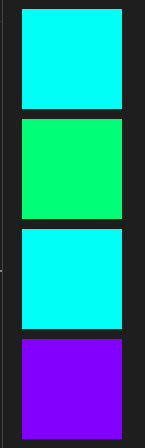
- 在代码中,我们使用
div:nth-child(2)给div的第 2 个子元素添加绿色背景颜色。 - 使用
div:nth-of-type(4)给父元素下第 4 个div子元素添加紫色背景颜色
UI 伪类选择器是通过元素的状态来选择的一种选择器。

//页面上有一个姓名输入框和一个密码输入框,当聚焦输入框时,输入框的背景颜色会发生改变,
<style>
      input:focus {
        background-color: rgb(255, 153, 0);
      }
    </style>
  </head>
  <body>
    姓名:<input type="text" /><br />
    密码:<input type="password" />
  </body>
盒子模型
boder属性

padding
margin
浮动
float: left|right;定位
固定定位:fixed 属性值用于固定定位,被固定的元素不会随着滚动条的拖动而改变位置。
     .ad-l {
        position: fixed;
        top: 100px;
        left: 0;
      }
      .ad-r {
        position: fixed;
        top: 100px;
        right: 0;
      }
相对定位:相对定位是该元素的位置相对于它原始的位置来计算的
      .ad-l {
        position: relative;

        left: -40px;
      }
绝对定位,能把元素精确地放在任意位置。——子绝父相
.ad-l {
        position: absolute;
        left: 50px;
        top: 150px;
      }
粘性定位 position: sticky
粘性定位可以被认为是相对定位(relative)和固定定位(fixed)的混合。元素在跨越特定阈值前为相对定位(此时设定的 top, right, bottom、left 阈值并不生效),之后为固定定位。粘性定位元素并未脱离文档流。
 /* TODO: 请在此补充代码实现tab栏动态固定 */
  position:sticky;
  top:0px;
css3新特性
本节实验主要给大家介绍了 CSS3 中的常用新特性,内容比较多,这里我们一起来总结一下:
- CSS3 新增选择器:包括新增属性选择器、子元素伪类选择器、UI 伪类选择器。
- 文本阴影:使用 text-shadow 属性给文本内容设置阴影效果。
- 文本溢出:使用 text-overflow 属性设置当内容溢出容器时,在页面上的显示方式。
- 圆角边框:使用 border-radius 属性设置圆角边框。
- 盒子阴影:使用 box-shadow 属性给元素添加阴影效果。
- 背景属性:包括 background-size、background-image、background-position、background-repeat。
- 渐变属性:包括线性渐变(linear-gradient)和径向渐变(radial-gradient)。
- 元素转换:包括元素旋转(rotate)、元素移动(translate)、元素缩放(scale)。
- 过渡属性:使用 transition 属性过渡的效果。
- 动画:使用 @keyframes 来定义动画。
文本阴影

<style>
      div {
        font-size: 50px;
        color: rgb(0, 153, 255);
        text-shadow: 4px 4px 3px rgb(0, 255, 179);
      }
    </style>
盒子阴影
box-shadow 属性可以用来设置一个或多个下拉阴影的框,视觉效果就像是盒子有了阴影一样。

    div {
        width: 200px;
        height: 100px;
        text-align: center;
        background-color: green;
        box-shadow: 10px 10px 5px #26ad8c;
      }
文本溢出

<style>
      p {
        border: 1px solid blue;
        width: 100px;
        height: 50px;
        overflow: hidden; /*隐藏超出文本*/
        white-space: nowrap; /*强制单行显示*/
      }
      .poem1 {
        text-overflow: clip;
      }
      .poem2 {
        text-overflow: ellipsis;
      }
    </style>
  </head>
  <body>
    <p class="poem1">木落雁南度,北风江上寒。我家襄水曲,遥隔楚云端。</p>
    <p class="poem2">乡泪客中尽,孤帆天际看。迷津欲有问,平海夕漫漫。</p>
  </body>
圆角边框

媒体查询
CSS3 加入的 @media 媒体查询使得无需修改内容,便可以使样式应用于某些特定的设备范围。媒体查询就像是样式表中的 if 语句,通过判断表达式的真假来执行特定的分支 (加载特定的式)
@media mediatype and|not|only (media feature) {
CSS-Code;
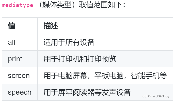
}一个完整的媒体查询由以下五部分组成:
- 必须是以
@media开头 。- 使用
mediatype指定媒体(设备)类型 。- 使用
and | not | only逻辑操作符构建复杂的媒体查询 。- 使用
media feature指定媒体特性 。- CSS-Code 位置是要设置的 CSS 样式。


下述代码做了如下操作:
- 定义媒体查询规则,当设备类型为
screen并且设备中的页面最大可见区域宽度为500px的时候,页面背景颜色为红色。 - 定义媒体查询规则,当设备类型为
screen并且设备中的页面最小可见区域宽度为800px的时候,页面背景颜色为绿色。 - 定义媒体查询规则,当设备类型为
screen并且设备中的页面最小可见区域宽度为1024px的时候,页面背景颜色为蓝色。
<style>
      @media screen and (max-width: 500px) {
        body {
          background-color: red;
        }
      }
      @media screen and (min-width: 800px) {
        body {
          background-color: green;
        }
      }
      @media screen and (min-width: 1024px) {
        body {
          background-color: blue;
        }
      }
    </style>


 462
462


 被折叠的 条评论
为什么被折叠?
被折叠的 条评论
为什么被折叠?
 到【灌水乐园】发言


