


 本文介绍了使用rpx适应不同手机屏幕尺寸的方法,以及如何在微信小程序中实现轮播图功能,包括代码展示、image组件的mode设置、lazy-load优化和自动轮播的配置。
系列文章目录
学习篇第一篇我们讲了编译器下载,项目、环境建立、文件说明与简单操作:第一篇链接
第二、三篇分析了几个重要的配置json文件,是用于对小程序进行的切换页面、改变图标、控制是否能被搜索到等的操作第二篇链接、第三篇链接
本篇将进入api、框架等的学习。
文章目录
一、rpx
为了更好的适应不同大小的手机,我们使用自适应像素来展示内容。
2)代码展示和讲解
我们在test_4.wxml中输入
<view class="box">view测试</view>
wxml是框架搭建。
view 是小程序提供的组件,box是容器组件,类似于html中的div ,是一个块级元素,占据一行。
我们在test_4.scss中加入box的对应代码
.box{
  width: 375rpx;
  height: 600rpx;
  background-color: lawngreen;
}
所有型号的手机,都自动适应为750rpx*1200rpx ,我们执行之后。
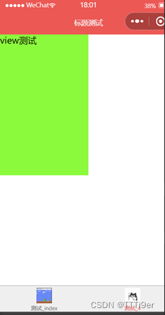
如此显示说明没有问题。
3)你可能遇到的问题cannot read property ‘setcss’ of undefined
如果你遇到cannot read property 'setcss' of undefined,请重新打开项目,这样彻底清楚缓存之后就没问题了。
二、轮播图
1)轮播图框架
我们现在test_4.wxml中完成框架的搭建
<swiper autoplay
   interval="2000"
   indicator-dots="true"
   indicator-color="#fff"
   indicator-active-color="#f3514f">
   <swiper-item>
   1
   </swiper-item>

   <swiper-item>
   23
  </swiper-item>

  <swiper-item>
   45
  </swiper-item>
</swiper>
</view>
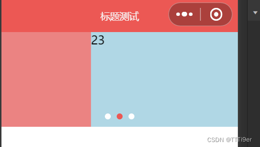
总体被view封装的,其中有swiper包含,swiper即是轮播图。有swiper-item包含的就是轮播的内容了。
在第一个<>中,autoplay是自动轮播,interval是自动轮播的时间间隔,单位是毫秒。
indicator-dots是轮播的提示点:

indicator-color是未被选择的提示点的颜色,active-color是被选择的轮播点的颜色。
2) 轮播图class的设置
之后我们在test_4.scss中完成对swiper_test。
.swiper_test{
  swiper{
     height: 300rpx;
     background-color: lightblue;
  }
  swiper-item{
   &:first-child{
     background-color: lightcoral;
   }
   &:last-child{
     background-color: black;
   }
  }
}
如图,swiper{}是整个swiper的设置,我们可以在swiper-item重写每个轮播项的设置。如图,我们重写每个轮播项的颜色,展示图如下:
3)轮播图加入图片
我们之前实现了轮播数字,现在我们要插入图片了。
1. image组件
我们需要用image组件渲染图片。image组件常用4个属性:
src: 图片地址
mode: 图片裁剪
show-menu-by-longpress 长按显示菜单
lazy-load: 懒加载
接下来会一 一介绍的。
a)mode
mode可以选择图片的裁剪格式 mode = “top left”和mode = “top right”表示在大小不够的时候,显示左上角还是右上角。
mode = "aspectFill" 表示保持长宽比自动缩放模式,保留短边,可能长边会有裁剪。
mode = "aspectFit" 这样能完整展示图片但可能留白,效果展示如下。
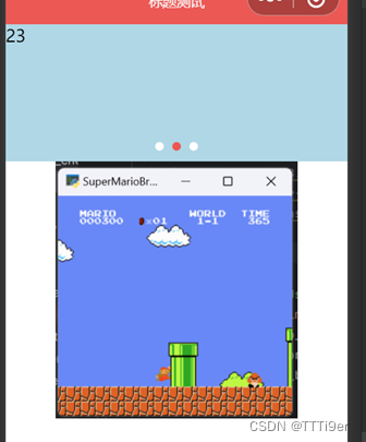
<image src="../../assets/tabbar/index.png" mode="aspectFit" />
注:请在.wxml框架文件中写以上代码尝试。
b)show-menu-by-longpress
<image src="../../assets/tabbar/index.png" mode="aspectFit" show-menu-by-longpress />
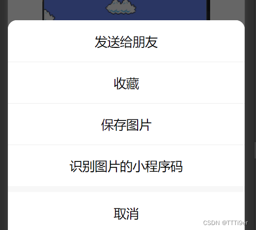
加入这个特性之后,可以长按图片。如有二维码,也可以识别二维码。
c)lazy-load
<image src="../../assets/tabbar/index.png" mode="aspectFit" show-menu-by-longpress lazy-load />
这样即可实现只有滑倒图片附近才加载,节省资源。
d)加入图片
打开wxml文件
  <swiper-item>
    <image src="../../assets/tabbar/index.png" mode="aspectFit" show-menu-by-longpress lazy-load />
   </swiper-item>
在swiper-item中加入对应的image即可。
然后再打开scss文件
swiper-item{
    image{
   width: 100%;
   height: 100%;
    }
    }
再swiper-item中写上image{},让图片占满整个各自即可~、最后成功如下,我这里没占满是因为我的图片太方了。
e)最后附上轮播图完整代码
/* pages/test_4/test_4.scss */

.box{
  width: 375rpx;
  height: 600rpx;
  background-color: lawngreen;
}
.swiper_test{

  swiper{
     height: 300rpx;
     background-color: lightblue;
  }
  swiper-item{
    image{
   width: 100%;
   height: 100%;
    }
   &:first-child{
     background-color: lightcoral;
   }
   &:last-child{
     background-color: black;
   }

  }
}
以上是scss文件
<!--pages/test_4/test_4.wxml-->
<!-- wxml是框架搭建 -->
<!-- view 是小程序提供的组件,是容器组件,类似于html中的div ,是一个块级元素,占据一行 -->
<!-- 所有型号的手机,都是750rpx -->
<!-- <view class="box">view测试</view> -->
<!-- 轮播图 -->
<view class="swiper_test">
<!-- 自动轮播 单位为毫秒 -->
<swiper autoplay
   interval="2000"
   indicator-dots="true"
   indicator-color="#fff"
   indicator-active-color="#f3514f">
   <swiper-item>
    <image src="../../assets/tabbar/index.png" mode="aspectFit" show-menu-by-longpress lazy-load />
   </swiper-item>

   <swiper-item>
   <image src="../../assets/tabbar/index.png" mode="aspectFit" show-menu-by-longpress lazy-load />
  </swiper-item>

  <swiper-item>
    <image src="../../assets/tabbar/index.png" mode="aspectFit" show-menu-by-longpress lazy-load />
  </swiper-item>
</swiper>
</view>
以上是wxml文件


 229
229


 被折叠的 条评论
为什么被折叠?
被折叠的 条评论
为什么被折叠?
 到【灌水乐园】发言


