


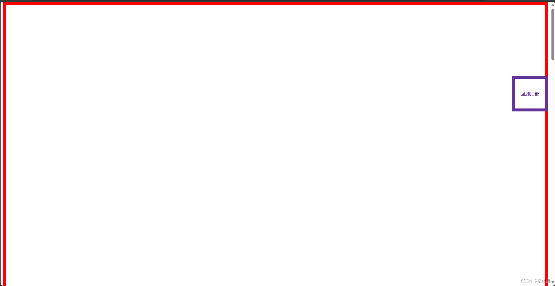
一、回到顶部案例(固定定位)
代码:
<!DOCTYPE html>
<html>
<head>
    <meta charset="utf-8">
    <title></title>
    <!-- 以下是样式表 -->
    <style>
        /* 定义一个容器,高度为 5000px,边框为 10px 宽的红色实线边框 */
        #container {
            height: 5000px;
            border: 10px solid red;
        }

        /* 定义一个“回到顶部”按钮,宽度为 100px,高度为 100px,边框为 10px 宽的紫红色实线边框
           文本居中对齐,行高为 100px,绝对定位,距离页面右侧 10px,距离页面顶部 250px */
        #back-button {
            width: 100px;
            height: 100px;
            border: 10px solid rebeccapurple;
            text-align: center;
            line-height: 100px;
            position: fixed;
            right: 10px;
            top: 250px;
        }
    </style>
</head>
<body>
    <!-- 定义一个容器,用于包含页面内容 -->
    <div id="container"></div>
    <!-- 定义一个“回到顶部”按钮,包含一个链接,点击后跳转到页面顶部的容器元素 -->
    <div id="back-button">
        <a href="#container">回到顶部</a>
    </div>
</body>
</html>
演示:
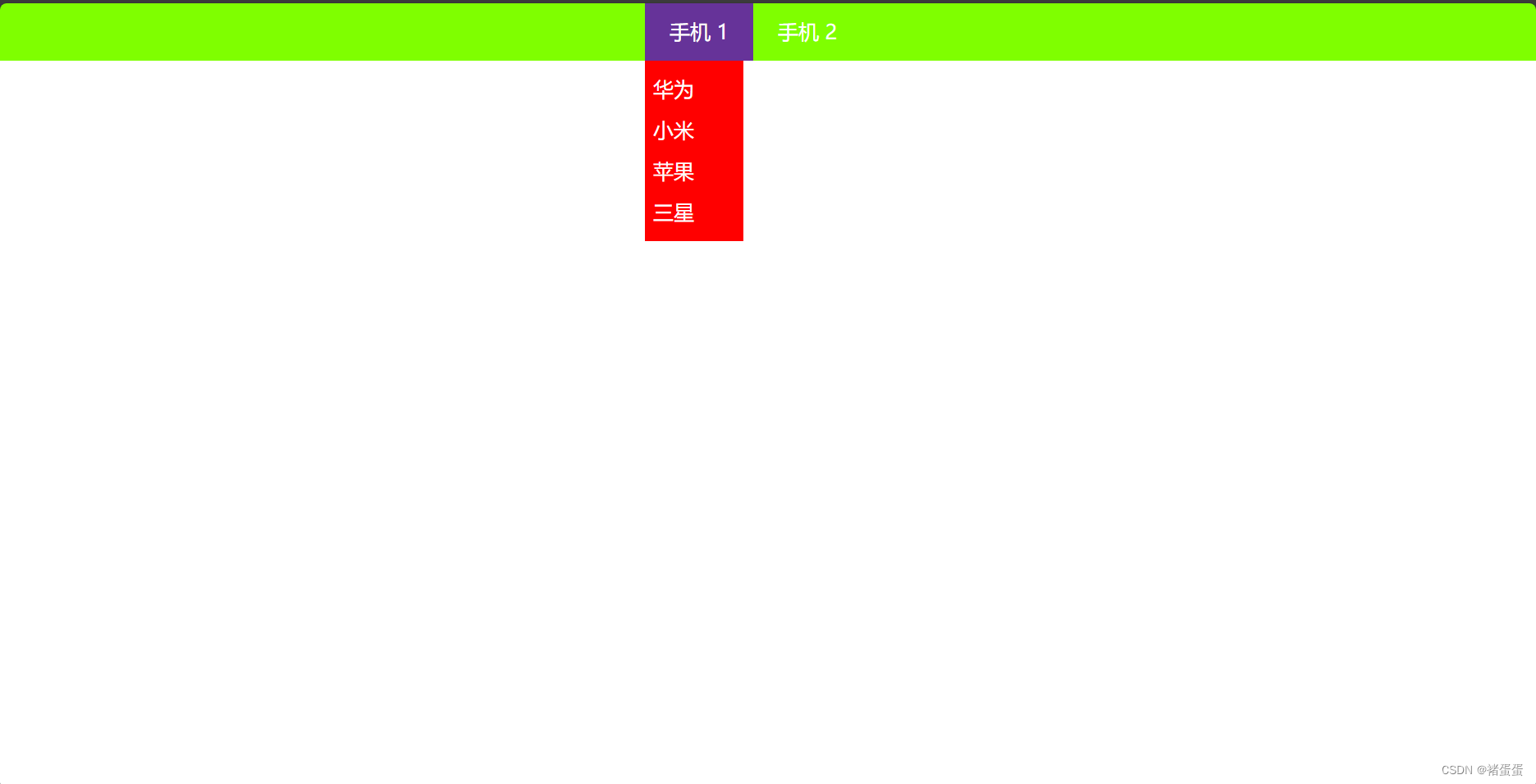
二、导航栏案例(浮动、绝对定位)
代码:
<!DOCTYPE html>
<html>
<head>
    <meta charset="utf-8">
    <title></title>
    <style>
        /* 重置所有元素的外边距和内边距为 0 */
        * {
            margin: 0;
            padding: 0;
        }

        /* 定义容器的样式 */
        #container {
            width: 100%;
            height: 70px;
            background-color: chartreuse;
        }

        /* 定义菜单的样式 */
      .menu {
            margin: auto;
            width: 300px;
        }

        /* 定义菜单项的样式 */
      .menu>div {
            color: white;
            font-size: 25px;
            float: left;
            height: 50px;
            line-height: 50px;
            padding: 10px 30px;
            position: relative;
        }

        /* 鼠标悬停时,菜单项的背景颜色变为 rebeccapurple */
      .menu>div:hover {
            background-color: rebeccapurple;
        }

        /* 鼠标悬停时,显示子菜单 */
      .menu>div:hover>.option {
            display: block;
        }

        /* 定义子菜单的样式 */
      .option {
            background-color: red;
            position: absolute;
            width: 100px;
            padding: 10px;
            left: 0px;
            top: 70px;
            display: none;
        }
    </style>
</head>
<body>
    <!-- 页面内容 -->
    <div id="container">
        <!-- 菜单 -->
        <div class="menu">
            <!-- 菜单项 1 -->
            <div>手机 1
                <!-- 子菜单 -->
                <div class="option">
                    <div>华为</div>
                    <div>小米</div>
                    <div>苹果</div>
                    <div>三星</div>
                </div>
            </div>
            <!-- 菜单项 2 -->
            <div>手机 2</div>
        </div>
    </div>
</body>
</html>
演示:


 688
688

 被折叠的 条评论
为什么被折叠?
被折叠的 条评论
为什么被折叠?
 到【灌水乐园】发言


